How to Show What Your Marketplace Suppliers Earn in a Pitch
How to present seller, chef, creator or driver earnings to investors: typical not best case, gross versus take-home, per period, against their alternative.
Supplier Earnings Slide: Show What a Typical Seller, Chef or Creator Takes Home
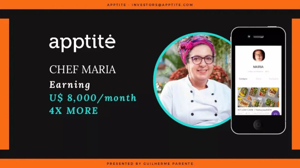
"Chef Maria. Earning US$ 8,000/month. 4x more." "Our Food Creators make serious money." "+400% Earnings per Top Boosters." If your marketplace depends on people supplying work, food, content or rides, investors will ask whether those people earn enough to stay. That is a supply-retention question, and the answer is a number: what a typical supplier keeps, per month, compared with what they could earn elsewhere. This guide compares four real slides that try to answer it, from a single success story to a payout formula with no amounts, and shows how to build a version an investor can check.
TL;DR
Show what a typical supplier earns per month (the median, not your best case), say whether that is gross sales or take-home after your fee and their costs, show how earnings vary by segment or volume, and compare it with the supplier's alternative. Add how many suppliers earn at that level and how long they stay. One story can illustrate the number; it can't replace it.
Four real slides about what suppliers earn
Each slide is shown as it appears in the company's original deck, with what it says, what we checked and what an investor still cannot tell. They show four common approaches: one story, revenue bands by segment, growth rates with no amounts, and a payout formula with no amounts.
Apptite traction slide — slide 7
App connecting customers with independent chefs for prepared meals (Brazil); page 7. Page 6 shows the same chef "Earning US$ 2,000/month" before the app.
Apptite deck, slide 7. Exact stored slide matched to this analysis.
Our analysis: The before-and-after across pages 6 and 7 is a strong storytelling choice: it names the alternative and the gain. But it is one chef, very probably chosen because she did well, and the two figures may not be on the same basis (previous income versus sales on the app). As an illustration it works; as evidence the slide needs the median chef and the number of chefs behind it.
Evidence and limitation: Our check: US$8,000 divided by page 6's US$2,000 is 4x, consistent with the printed figure. The slide doesn't say whether US$8,000 is gross sales, payout after Apptite's fee, or profit after ingredients, what period or month it refers to, or how typical Maria is among the deck's chefs.
What a founder can adapt: "Chef Maria: US$[x]/month take-home, up from US$[y]. Median active chef: US$[m] ([n] chefs, [month])."
Supporting analysis
What the deck claims: "Chef Maria. Earning U$ 8,000/month. 4X MORE." A photo of the chef and a phone showing her profile and meal kits.
Presentation choice: It shows a supplier story with a before-and-after comparison, and what it can't prove.
When it does not fit: Don't let one success story stand in for the typical supplier.
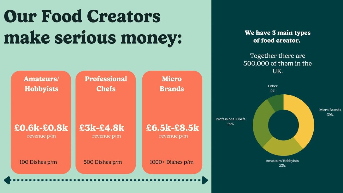
UK marketplace for home-cooked and small-brand meals; page 15 of its seed deck.
HomeCooks deck, slide 15. Exact stored slide matched to this analysis.
Our analysis: Segmenting by supplier type, with volume beside each band, is the right structure: it shows earnings scale with output and that not every creator is full-time. What's missing is the basis (revenue before HomeCooks' fee and ingredients), whether these are typical or target figures, and how many of HomeCooks' own creators are in each band.
Evidence and limitation: Our checks: revenue per dish works out at roughly £6 to £8 for hobbyists and £6 to £9.60 for professional chefs, and at most £6.50 to £8.50 for micro brands at 1,000+ dishes, so the bands are internally plausible. The slide says "revenue," not payout or profit. The donut sits under the 500,000 UK figure, so it may describe that market or HomeCooks' own creators; the slide doesn't say which.
What a founder can adapt: "[Segment]: £[x]–£[y] payout per month after our fee ([n] creators, [month]), at [d] dishes."
Supporting analysis
What the deck claims: "Our Food Creators make serious money." Three boxes: Amateurs/Hobbyists "£0.6k-£0.8k revenue p/m", "100 Dishes p/m"; Professional Chefs "£3k-£4.8k revenue p/m", "500 Dishes p/m"; Micro Brands "£6.5k-£8.5k revenue p/m", "1000+ Dishes p/m". Right: "We have 3 main types of food creator. Together there are 500,000 of them in the UK." Donut: Micro Brands 39%, Professional Chefs 29%, Amateurs/Hobbyists 23%, Other 9%.
Presentation choice: It segments earnings by supplier type and ties each band to volume.
When it does not fit: Don't leave it unclear whether a mix chart describes your suppliers or the whole market.
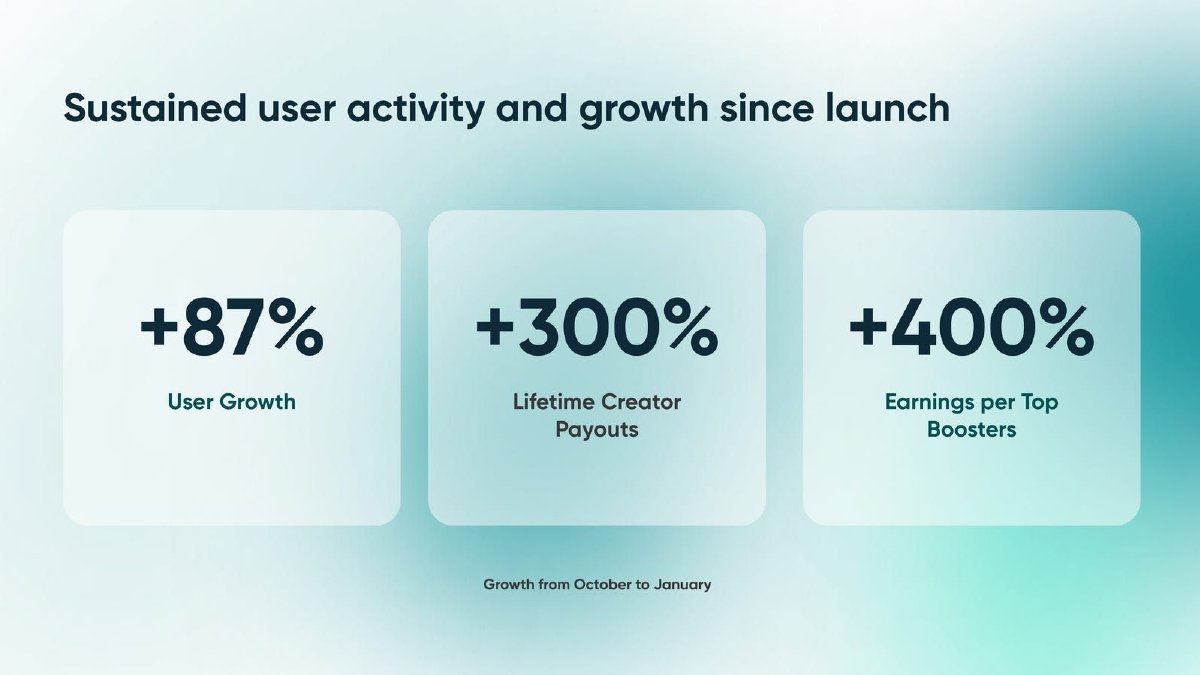
Platform paying verified creators to comment on, share and repost brand content; page 9. Page 8 gives "1,200 Creators registered" and "$120k+ Monthly recurring revenue".
Daisy deck, slide 9. Exact stored slide matched to this analysis.
Our analysis: Daisy tracks the right things, payouts and per-creator earnings, and dates the period. But growth rates without amounts can't tell an investor whether a creator earns $5 or $500 a month, and a top-earner figure says nothing about the typical creator. Showing monthly payout per active creator in October and January, with the creator count, would answer the question.
Evidence and limitation: Our checks: all three are percentage changes with no starting or ending amounts. "Top Boosters" isn't defined (top 10%? top 10?). A 300% rise in lifetime payouts over four months is expected for a young platform, because lifetime totals only go up.
What a founder can adapt: "Median monthly payout per active creator: $[x] (Oct) → $[y] (Jan); [n] active creators. Top 10%: $[z]."
Supporting analysis
What the deck claims: "Sustained user activity and growth since launch." "+87% User Growth", "+300% Lifetime Creator Payouts", "+400% Earnings per Top Boosters". Footnote: "Growth from October to January."
Presentation choice: It shows payout growth without the amounts an investor needs.
When it does not fit: Don't report earnings only as growth rates, or a lifetime total as growth.
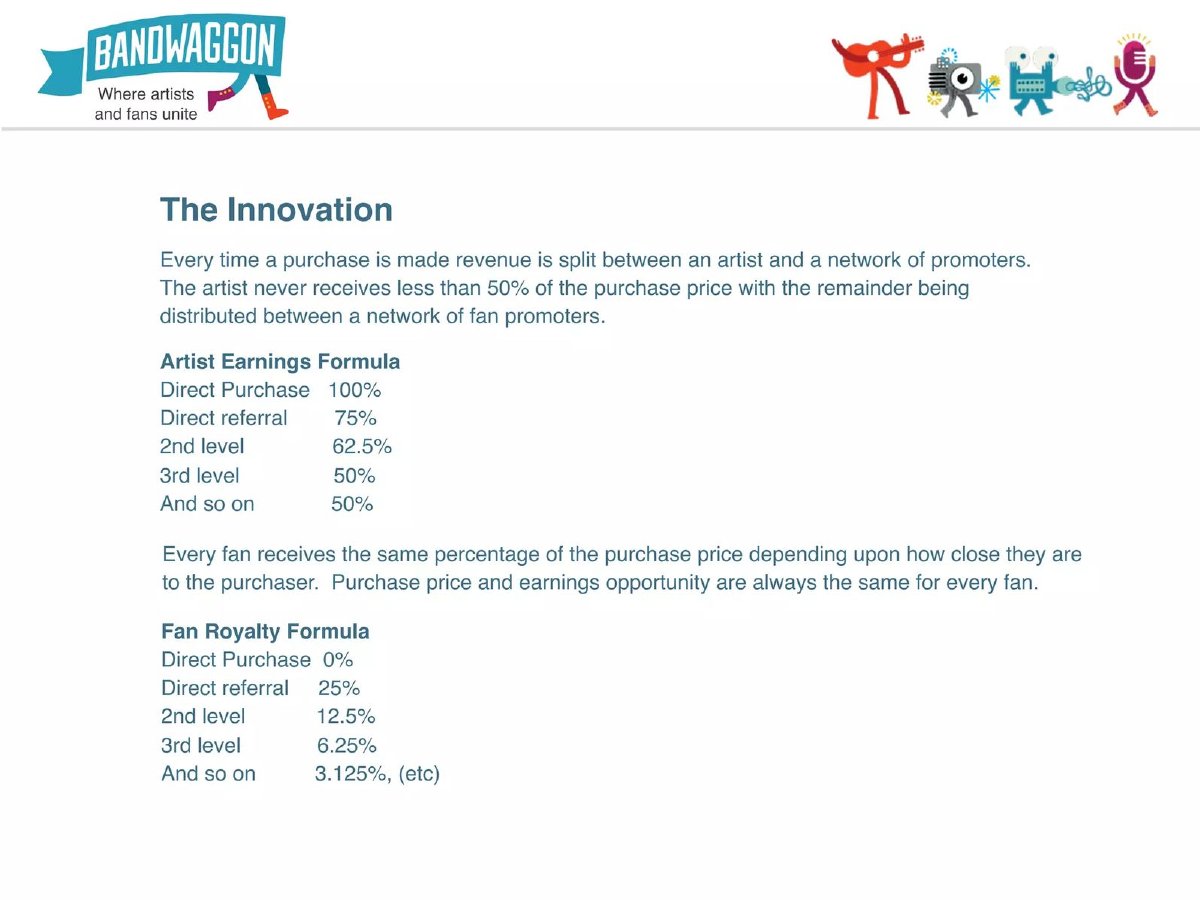
Early music marketplace where fans earn royalties for promoting artists; page 11. Earlier pages say content can sell for "as little as $.99".
Bandwagon deck, slide 11. Exact stored slide matched to this analysis.
Our analysis: A formula is a clear way to show how each sale is split, and the artist's 50% floor is a useful promise to the supply side. But it shows shares, not money. On a $0.99 download, a fan two levels away earns about 12 cents. An investor needs at least one worked example in money and some sense of what an artist earns per month for the formula to answer the supply question.
Evidence and limitation: Our checks: at a direct referral, the artist's 75% plus the fan's 25% is 100%. At the 2nd level, 62.5% plus 25% plus 12.5% is 100%, consistent. At the 3rd level, 50% plus 25% plus 12.5% plus 6.25% is 93.75%, so the slide doesn't say where the remaining 6.25% goes, or whether Bandwagon takes a fee at all.
What a founder can adapt: "On a $[price] sale via a 2nd-level referral: artist $[a], fans $[b], us $[c]. Median artist: $[m]/month."
Supporting analysis
What the deck claims: "The Innovation." "Every time a purchase is made revenue is split between an artist and a network of promoters. The artist never receives less than 50% of the purchase price." Artist Earnings Formula: Direct Purchase 100%, Direct referral 75%, 2nd level 62.5%, 3rd level 50%, "And so on 50%". Fan Royalty Formula: Direct Purchase 0%, Direct referral 25%, 2nd level 12.5%, 3rd level 6.25%, "And so on 3.125%, (etc)".
Presentation choice: It shows a payout split, and why shares alone don't answer what suppliers earn.
When it does not fit: Don't show a revenue split without a money example and your own share.
Columns report what each slide shows; a credible slide needs amounts, a basis, a typical supplier and a comparison.
Slide
Approach
Amounts shown
Basis stated
Typical supplier
Apptite p7
One chef, before and after
Yes
No
No (one case)
HomeCooks p15
Revenue bands by type
Yes (ranges)
Revenue (gross)
Partly (bands, no counts)
Daisy p9
Growth rates
No
No
No (top earners)
Bandwagon p11
Payout formula
No (shares only)
Share of price
No
Key Takeaways
Lead with the median supplier, then show the range.
Say whether the figure is gross sales, payout after your fee, or profit after their costs.
Give a period (per month, per hour) and a date.
Segment by volume or supplier type, with counts per segment.
Compare with the supplier's alternative, using the same basis.
Connect earnings to supplier retention, which is what investors are really testing.
Build your supplier earnings slide
Answer each prompt from your payout records before you design the slide.
Active suppliers. How many suppliers earned anything last month? How do you define active?
Basis. Is your figure gross sales, payout after your fee, or take-home after their costs? Estimate costs if needed.
Median. What is the median monthly payout among active suppliers? Per hour or per job, if hours vary?
Spread. What are the bands by volume or type, and how many suppliers are in each?
Alternative. What would they earn otherwise, on the same basis? Where does that figure come from?
Retention. Do higher-earning suppliers stay longer? Give six-month retention by earnings band.
Copyable framework: Median active [supplier]: [currency][x]/month [payout/take-home] ([n] suppliers, [month]). Top [y]%: [z]. Earning over [threshold]: [r]% active after six months. Alternative: [benchmark, source].
Illustrative example 1 — written by us
Before: Chef Maria. Earning U$ 8,000/month. 4X MORE.
After: Chef Maria: US$8,000 a month in sales, [x] take-home. Median active chef: US$[m] ([n] chefs, [month]).
What improved: Built from Apptite's pages 6 and 7. The median, count and take-home figures are placeholders the deck does not give.
Illustrative example 2 — written by us
Before: +400% Earnings per Top Boosters.
After: Median monthly payout per active creator: $[x] in October, $[y] in January ([n] creators); top 10%: $[z].
What improved: Built from Daisy's page 9. All amounts are placeholders.
What this guide adds to the marketplace guides
The marketplace traction guide lists supplier earnings as one supply-side measure and advises reporting money paid out to sellers alongside completed transactions. The marketplace supply guide covers recruiting and keeping supply, and the marketplace go-to-market guide shows a single supply channel with a payout split. None of them explains how to present the earnings figure itself: which supplier to show, which definition to use, what to compare it with, or how to avoid a figure an investor will discount.
This guide is for founders of marketplaces and platforms where outside people earn money: chefs, drivers, tutors, cleaners, creators, artists, sellers. It is about the slide, not tax or employment questions about how suppliers are classified, which need professional advice. It is not legal or investment advice.
Why investors care about what your suppliers earn
In most two-sided marketplaces, supply is the harder side to keep. A supplier who earns little will leave for another platform, a job or their own channel, and every departure has to be replaced at a cost. When an investor asks what suppliers earn, they are really asking three things: will suppliers stay, can you recruit more at a reasonable cost, and is your fee leaving them enough.
That makes the earnings figure part of your economics, not a feel-good number. A marketplace taking a 20% fee from suppliers who barely earn minimum wage has a fragile supply side even if its own gross margin looks good. One taking 30% from suppliers who double their income has room to raise prices or invest in demand.
Investors also know that a single success story is the easiest number to pick. They will discount it unless you show where it sits among all your suppliers.
Choose the right definition: gross, payout or take-home
Three different numbers are often all called "earnings." Gross sales is what customers paid for the supplier's goods or services. Payout is what you sent the supplier after your fee. Take-home is payout minus the supplier's own costs: ingredients, fuel, equipment, packaging, payment fees. A home cook's £4,000 of monthly sales might be a £3,200 payout after a 20% fee and £1,800 take-home after ingredients and packaging.
Use the label that matches your number, on the slide itself. If you only know gross sales or payout, say so and give a sensible estimate of supplier costs in a footnote, marked as an estimate. Payout is usually the most reliable figure you hold, because you sent the money.
Keep the basis consistent when you compare. Setting a supplier's gross sales on your platform against their previous take-home salary overstates the gain; compare take-home with take-home, or gross with gross.
Show the typical supplier, then the spread
Lead with the median monthly payout among active suppliers, and say what counts as active (for example, at least one order in the month). Then show the spread: bands by volume or supplier type, with how many suppliers sit in each. A single top earner, or an average pulled up by a few heavy sellers, tells the reader little about the supplier you need to recruit next.
Earnings per hour or per job is often more useful than per month, because part-time suppliers will drag a monthly median down for a good reason. If most of your suppliers work a few hours a week, say so and give an hourly figure too.
If you show a growth rate (earnings up 300%), give the starting and ending amounts and the number of suppliers. A percentage on a tiny base can describe a few dollars.
Compare with the supplier's alternative
Earnings mean more next to what the supplier would otherwise make: their previous job, another platform, selling directly, or the local wage for similar work. Apptite's "4x more" is this kind of comparison. To make it credible, name the alternative, use the same basis and period, and say where the comparison figure comes from (supplier survey, public wage data, their own records).
Official wage data can give a defensible benchmark for the alternative. In the US, the Bureau of Labor Statistics publishes median hourly wages by occupation, such as cooks or drivers, in its Occupational Employment and Wage Statistics; most countries publish something similar. Use the occupation and region that match your suppliers. (U.S. Bureau of Labor Statistics)
Connect earnings to retention and recruiting
The earnings figure is most persuasive when the next line shows its effect: suppliers earning above a level stay longer, refer other suppliers, or take more orders. Even a simple split works: "Suppliers earning over £1,000 a month: 82% still active after six months; under £300: 41%." That turns a feel-good number into evidence that your supply side holds.
If you have a payout formula, such as revenue shares that change with volume or referral level, show it with a worked example in money, not only percentages. A formula tells investors how earnings are split but not whether anyone earns enough to stay.
Worked example: a home-meal marketplace (hypothetical)
This is our illustration, not a figure from any deck. A platform has 420 cooks who sold at least one meal in June. It takes a 20% fee.
Weak version: "Our cooks earn up to £6,000 a month!" Strong version: "Median active cook: £640 payout in June (after our 20% fee), about £380 after ingredients (estimate). Top 10% (42 cooks): £3,100+. Cooks earning over £1,000 a month: 81% still active after six months. Comparison: UK median for cooks about £11 per hour; our median cook earns about £14 per hour on reported time." A footnote defines active, gives the cost estimate method and names the wage source.
The strong version is less exciting and far more believable. It also answers the follow-up question before it is asked: most cooks are part-time, and the full-time ones earn enough to stay.
If the typical supplier's earnings look low
Many young marketplaces find that the median supplier earns little, because most suppliers are new, part-time or testing the platform. Hiding that figure rarely works; investors will ask for it in diligence. It is better to explain it on the slide.
Split suppliers by tenure or by hours worked, and show earnings for those who have been active for three months or more, alongside the overall median. Show the trend for the same group over time, so the reader can see whether earnings rise as suppliers build repeat customers. If your fee or pricing is changing, say what that does to the median payout.
Then say what you are doing about it: more demand per supplier in launched areas, limits on new supply where orders are thin, or tools that help suppliers raise prices. A low but rising, well-explained figure is more credible than a high one with no context.
Where the slide goes in the deck
Supplier earnings usually sit on the traction slide or a supply-side page next to supplier counts and retention. Some founders use one supplier's story in the problem or solution section; that works if the median and spread appear later. Keep payout formulas on the business model slide, and repeat one money example there.
Common mistakes
Best case as typical. One top earner or "up to" figure hides the median supplier.
Unlabelled basis. Gross sales, payout and take-home differ; say which one.
Growth without amounts. +300% means nothing without the starting figure.
Lifetime totals as growth. Cumulative payouts always rise; show a monthly figure.
Formula without money. Show one sale split in currency, including your share.
Mismatched comparison. Compare take-home with take-home, over the same period.
Diagnostic checklist
The median active supplier's monthly earnings are shown.
The basis (gross, payout or take-home) is labelled.
The period and date are stated.
Earnings bands have supplier counts.
Any comparison uses the same basis and a named source.
Earnings are linked to supplier retention.
Any payout formula has a money example.
Frequently asked questions
Should I show supplier earnings in my marketplace pitch deck?
Yes, if your marketplace depends on outside suppliers such as sellers, drivers, chefs or creators. Investors use it to judge whether supply will stay. Show the median active supplier's monthly payout, the spread and how earnings relate to retention.
Should I use gross sales or payout?
Payout after your fee is usually the most reliable figure because you sent the money. Gross sales overstates what suppliers keep. Whichever you use, label it on the slide.
Can I use one supplier's success story?
As an illustration, yes, especially with a before-and-after. But pair it with the median and the number of suppliers, or investors will assume you chose the best case.
What should I compare supplier earnings with?
Their realistic alternative: a previous job, another platform or the local median wage for similar work. Official wage statistics, such as the US Bureau of Labor Statistics' occupational wage data, give a defensible benchmark. (U.S. Bureau of Labor Statistics)
How we chose these examples
Discovery (2026-10-04, run 125): run 124 found supplier earnings uncovered as a dedicated topic but had only Apptite p7. This run searched the deck index for supplier verbs (creators make, artists earn, payouts, hosts make) with numeric content, excluding public companies, and read the closest pages: marketplaceTraction.ts, marketplaceSupply.ts, marketplaceGoToMarket.ts and foodBusinessModel.ts. Each mentions supplier earnings in one line or as a payout split; none teaches basis, median, spread, comparison or retention.
Four pages from four decks were read from images rendered from the original deck files: Apptite 7 (with page 6), HomeCooks 15 (seed deck), Daisy 9 (with page 8) and Bandwagon 11 (with earlier pages for price context). All are published teardowns and none is excluded. Not used: Boxedup p8 (creators' general income as a problem statement, not platform earnings), Tasko p8 and The Host Co p4 (no amounts). All four images were prepared at 1,200 pixels wide, uploaded and re-fetched byte-identical.
Ratios and sums were recalculated from the printed figures. The worked example is our illustration. Company figures are reported as printed and not verified. The BLS page could not be fetched by our automated check (access refused); it is cited only as the publisher of US occupational wage statistics, and no BLS figure is used. Slide readings and analysis are an AI editorial model review, not human-checked.