Agenda Slide Examples: Table of Contents Slides in Pitch
When a pitch deck needs an agenda or table of contents slide, and how to make each line say something. Eight real agenda slides compared.
Agenda Slide Examples: Table of Contents Slides in Pitch Decks
Eight agenda and table-of-contents slides from real pitch decks, shown in full, compare when a contents slide helps the reader and when it only uses up a slot.
TL;DR
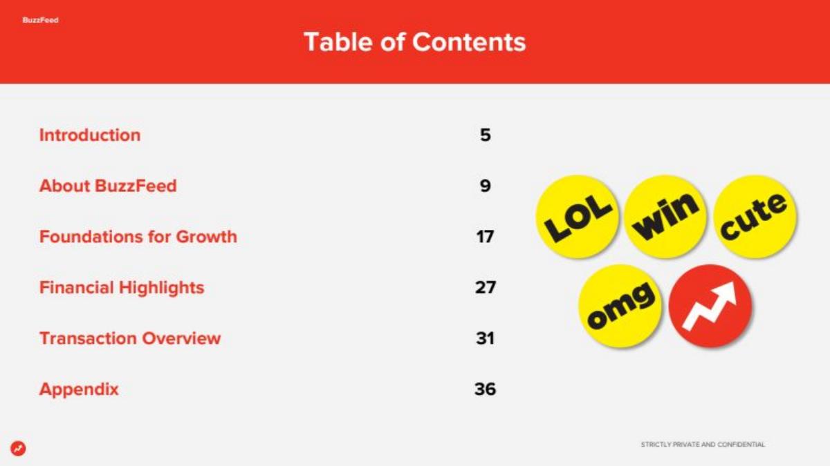
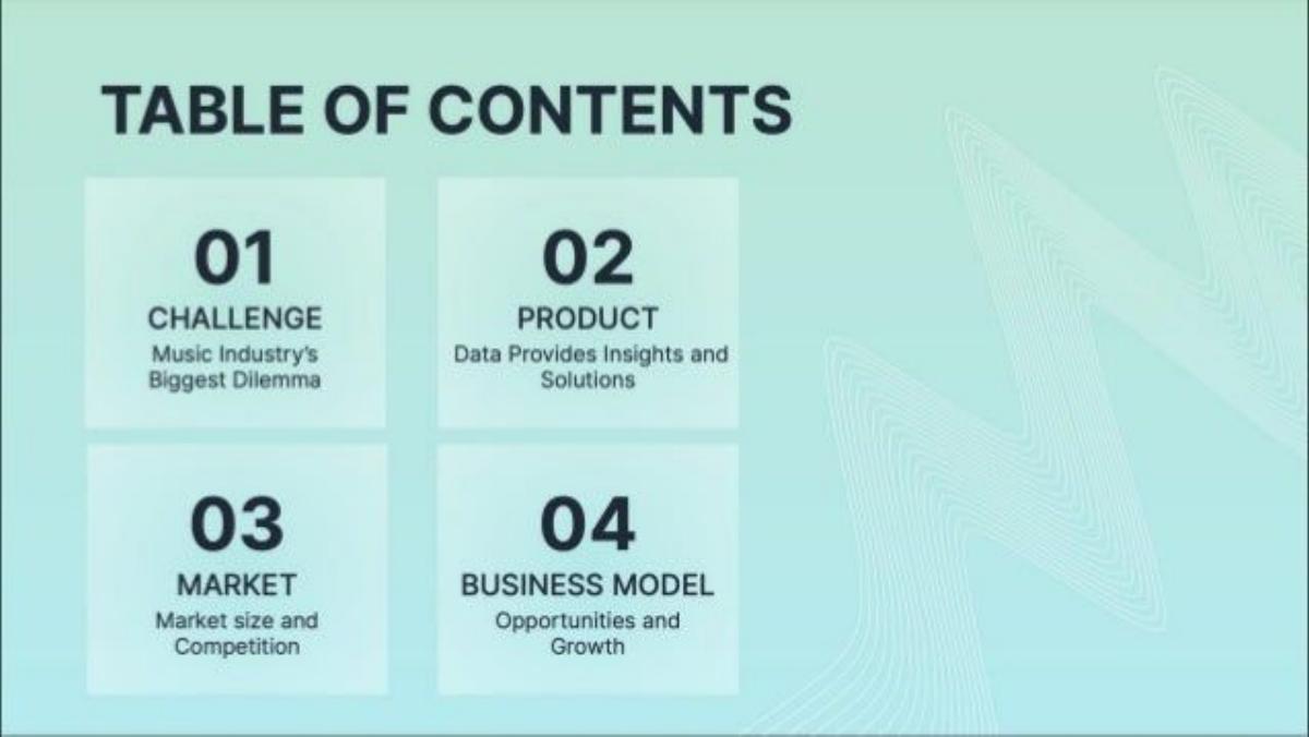
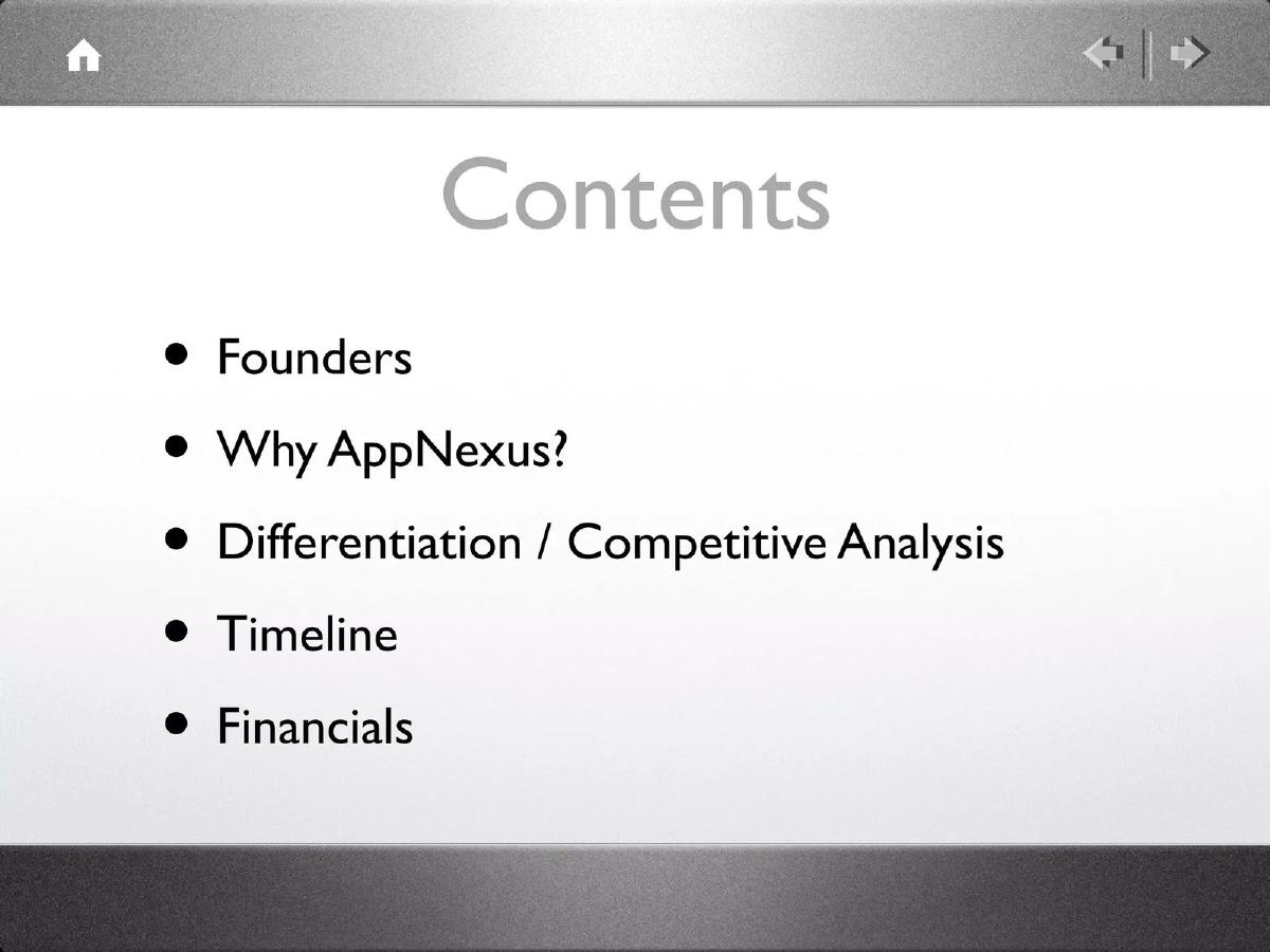
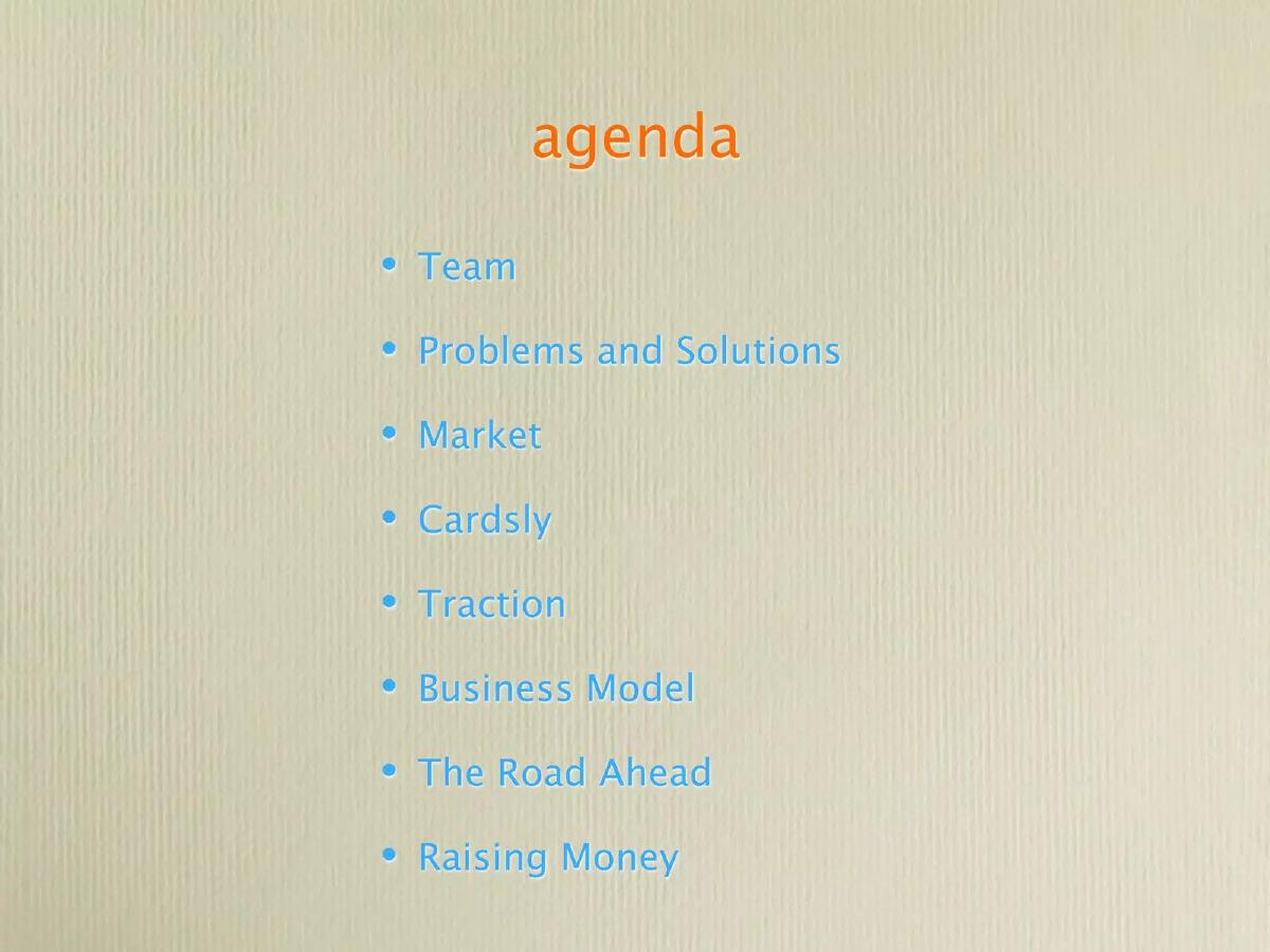
An agenda slide helps in a long deck or a structured meeting, and it helps most when each line says something rather than naming a generic section. BuzzFeed's table of contents gives page numbers for six sections in a deck that runs past slide 36, so a reader can jump to the financials. Chartmetric gives each of its four sections a one-line point, such as "Music Industry's Biggest Dilemma". Belong Health numbers seven sections and highlights the one being presented. AppNexus lists five short sections and puts the founders first. Cardsly lists eight generic labels, which tell the reader nothing the slides won't.
Agenda slides from real pitch decks
Each example shows the exact stored slide above its analysis and links to the full teardown. Stage and year are given only where the deck states them.
BuzzFeed executive summary slide — slide 4
Digital media. Investor presentation for BuzzFeed's merger with a special purpose acquisition company (SPAC), marked "Strictly private and confidential".
BuzzFeed deck, slide 4. Exact stored slide matched to this analysis.
Our analysis: In a deck of more than 36 slides read by many investors, page numbers let each reader go straight to the part they care about, such as the financials or the deal terms.
Evidence and limitation: Section names like "Introduction" and "Foundations for Growth" don't say anything on their own. For a startup deck of 12 slides, this slide would be a wasted slot.
What a founder can adapt: If your deck is long or will be read without you, add page numbers to the agenda.
Supporting analysis
What the deck claims: "Table of Contents": Introduction 5; About BuzzFeed 9; Foundations for Growth 17; Financial Highlights 27; Transaction Overview 31; Appendix 36. Brand badges ("LOL", "win", "cute", "omg") fill the right side.
Presentation choice: In a deck of more than 36 slides read by many investors, page numbers let each reader go straight to the part they care about, such as the financials or the deal terms.
When it does not fit: Section names like "Introduction" and "Foundations for Growth" don't say anything on their own. For a startup deck of 12 slides, this slide would be a wasted slot.
Music industry data and analytics. Stage and year not stated. The music problem guide uses a different slide from this deck.
Chartmetric deck, slide 2. Exact stored slide matched to this analysis.
Our analysis: Each section has a short line under its name, so the agenda previews the argument: there is a big problem, data solves it, the market is large, and the model grows.
Evidence and limitation: The lines are still general. "Music Industry's Biggest Dilemma" would be stronger if it named the dilemma; "Opportunities and Growth" could be any company.
What a founder can adapt: Put one short line under each section name that states your point for that section.
Supporting analysis
What the deck claims: "Table of Contents", four numbered tiles: 01 Challenge, "Music Industry's Biggest Dilemma"; 02 Product, "Data Provides Insights and Solutions"; 03 Market, "Market size and Competition"; 04 Business Model, "Opportunities and Growth".
Presentation choice: Each section has a short line under its name, so the agenda previews the argument: there is a big problem, data solves it, the market is large, and the model grows.
When it does not fit: The lines are still general. "Music Industry's Biggest Dilemma" would be stronger if it named the dilemma; "Opportunities and Growth" could be any company.
Healthcare services. The footer reads "Belong Health Series A Financing". The reimbursement guide uses a different slide from this deck.
Belong Health deck, slide 3. Exact stored slide matched to this analysis.
Our analysis: Numbering and highlighting the current section suit a structured meeting where the agenda is shown again between sections. "Anchor Launch" and "Pipeline Update" also hint at specific content beyond the usual headings.
Evidence and limitation: Seven sections plus an appendix is a lot to preview. Only "Anchor Launch Overview" and "Pipeline Update" say anything specific about the company.
What a founder can adapt: If you present in sections, repeat the agenda with the current section highlighted.
Supporting analysis
What the deck claims: "Agenda": 01 Introduction (highlighted); 02 Market Overview; 03 Belong Health Offering; 04 Anchor Launch Overview; 05 Pipeline Update; 06 Financial Forecast; 07 Appendix.
Presentation choice: Numbering and highlighting the current section suit a structured meeting where the agenda is shown again between sections. "Anchor Launch" and "Pipeline Update" also hint at specific content beyond the usual headings.
When it does not fit: Seven sections plus an appendix is a lot to preview. Only "Anchor Launch Overview" and "Pipeline Update" say anything specific about the company.
Advertising technology. Early deck; stage and year not stated on the slide.
AppNexus deck, slide 2. Exact stored slide matched to this analysis.
Our analysis: Five sections is short enough to take in at a glance, and leading with the founders tells investors the team is the main point of the pitch.
Evidence and limitation: "Why AppNexus?" is a question the slide doesn't answer. A few words on each item (for example what sets it apart) would make the list a preview rather than a menu.
What a founder can adapt: Order your agenda by strength, and keep it to five or six items.
Supporting analysis
What the deck claims: "Contents": Founders; Why AppNexus?; Differentiation / Competitive Analysis; Timeline; Financials.
Presentation choice: Five sections is short enough to take in at a glance, and leading with the founders tells investors the team is the main point of the pitch.
When it does not fit: "Why AppNexus?" is a question the slide doesn't answer. A few words on each item (for example what sets it apart) would make the list a preview rather than a menu.
Business card design and printing. Stage and year not stated.
Cardsly deck, slide 2. Exact stored slide matched to this analysis.
Our analysis: It is clear and tells the reader the deck follows the usual order.
Evidence and limitation: Eight generic labels say nothing the following slides won't, and they use the second slide, where an investor's attention is highest.
What a founder can adapt: If you keep an agenda like this, cut it to the sections that matter most and add a point to each.
Supporting analysis
What the deck claims: "agenda": Team; Problems and Solutions; Market; Cardsly; Traction; Business Model; The Road Ahead; Raising Money.
Presentation choice: It is clear and tells the reader the deck follows the usual order.
When it does not fit: Eight generic labels say nothing the following slides won't, and they use the second slide, where an investor's attention is highest.
Software for local businesses. The same list appears as a divider on slides 8, 12, 14 and 19, each time highlighting the next section.
Signpost deck, slide 8. Exact stored slide matched to this analysis.
Our analysis: Repeating the agenda as a divider shows the reader where they are in a long deck and what comes next.
Evidence and limitation: Four divider slides is a lot. In a short deck the dividers take slots that could carry evidence, and the section names say nothing on their own.
What a founder can adapt: In a long deck, repeat one identical agenda before each section and highlight the current one.
Supporting analysis
What the deck claims: Five lines on a dark background: Overview, Product, Market, Sales, Financials and Forecast. "Product" is bold with a short bar beside it; the others are dimmed.
Presentation choice: Repeating the agenda as a divider shows the reader where they are in a long deck and what comes next.
When it does not fit: Four divider slides is a lot. In a short deck the dividers take slots that could carry evidence, and the section names say nothing on their own.
Peer-to-peer storage marketplace. A contents slide listing slide numbers for a deck of about 29 slides.
Storemates deck, slide 2. Exact stored slide matched to this analysis.
Our analysis: Slide numbers let a reader go straight to traction or the valuation in a long deck.
Evidence and limitation: Slide 16 is not listed (the numbers jump from 15 to 17), some items are indented with no clear reason, and traction comes near the end. Fifteen lines is too many to take in at a glance.
What a founder can adapt: If you give slide numbers, check every one against the final deck before sending.
Supporting analysis
What the deck claims: "Contents" and "Slide/s": The Team & Special Advisors 3-4; Storemates Mission, Problem & Solution 5-6; Case study: How it Works 7-9; Safety & Security 10; Benefits 11; Business Aim, Achievements 12-13; Market Opportunity 14-15; Business Model, Competition Analysis 17-18; Media Coverage 19; Road to Market, use of Investment 20-23; Traction: Bookings Achieved / Income 24-25; Financial Forecast 26-27; Valuation Calculation 28; Strategic Partners 29.
Presentation choice: Slide numbers let a reader go straight to traction or the valuation in a long deck.
When it does not fit: Slide 16 is not listed (the numbers jump from 15 to 17), some items are indented with no clear reason, and traction comes near the end. Fifteen lines is too many to take in at a glance.
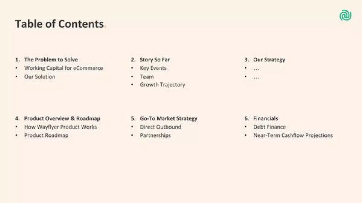
Revenue-based financing for ecommerce businesses. Six numbered sections in a grid, each with sub-points.
Wayflyer deck, slide 2. Exact stored slide matched to this analysis.
Our analysis: Sub-points under each section tell the reader what each part covers, such as debt finance and near-term cash flow under Financials, which matters for a lending business.
Evidence and limitation: The "..." placeholders under Our Strategy look unfinished. Remove placeholder text or the whole line before sharing.
What a founder can adapt: Add one or two specific sub-points under each section so the agenda previews the content.
Supporting analysis
What the deck claims: "Table of Contents": 1. The Problem to Solve (Working Capital for eCommerce; Our Solution). 2. Story So Far (Key Events; Team; Growth Trajectory). 3. Our Strategy (two bullets shown only as "..."). 4. Product Overview & Roadmap. 5. Go-To Market Strategy (Direct Outbound; Partnerships). 6. Financials (Debt Finance; Near-Term Cashflow Projections).
Presentation choice: Sub-points under each section tell the reader what each part covers, such as debt finance and near-term cash flow under Financials, which matters for a lending business.
When it does not fit: The "..." placeholders under Our Strategy look unfinished. Remove placeholder text or the whole line before sharing.
What improved: Our illustrative rewrite, not Cardsly's text. Bracketed parts are placeholders, not company facts. It turns section names into previews.
How this guide relates to the executive summary guide
The executive summary guide says a summary slide is not a table of contents: each line should state a fact an investor would otherwise have to hunt for. This guide covers the agenda slide itself, for the decks that do use one: when it earns its place and how to make it more than a list of section names.
Using the agenda as a progress marker
An agenda does not have to appear only once. Signpost repeats the same five-line list (Overview, Product, Market, Sales, Financials and Forecast) as a divider before each section, on slides 8, 12, 14 and 19, and highlights the section that is about to start with bold text and a short bar. Belong Health, already in this guide, highlights the current section in the same way. In a long deck, or one that will be read without the founder present, this tells the reader where they are and how much is left.
The cost is slots. Signpost spends four slides on dividers that carry no new information. That is reasonable in a deck of twenty or more slides that moves between distinct topics, and wasteful in a ten-slide seed deck. If you use dividers, keep them visually light, keep the list identical each time so the reader recognises it, and make sure each section they introduce is long enough to need one.
Checking the agenda against the deck
A table of contents with slide numbers is only useful if the numbers are right. Storemates lists fifteen sections with slide numbers. The numbers skip slide 16: Market Opportunity is listed as slides 14 to 15, and Business Model and Competition Analysis as slides 17 to 18. A reader can't tell from the agenda whether slide 16 was removed, merged, or left out of the list. It's a small thing, but an investor who notices it may wonder what else wasn't updated.
Wayflyer's table of contents shows a different leftover: under section 3, "Our Strategy", the two bullet points are only "...". Either the section was still being written or its contents were removed before sharing. Before you send a deck, compare the agenda line by line with the slides, update every slide number, and remove placeholder text. If you remove a section for a particular investor, remove it from the agenda too.
Order: what an agenda reveals about priorities
The order of an agenda tells an investor what the founders think matters most. Storemates puts "The Team & Special Advisors" first and "Traction: Bookings Achieved / Income" near the end, after media coverage and use of investment. Wayflyer puts "Story So Far", with key events, team and growth trajectory, second, straight after the problem. If your strongest evidence is traction, an agenda that buries it near slide 24 sends the opposite signal. Reorder the deck itself, not just the agenda, so the strongest section comes early.
An agenda also shows what is missing. Wayflyer's list has no market-size section and Storemates' has no separate competition slide (it is combined with the business model). That may be a sound choice, but a reader will notice. Use the agenda as a last check that the deck answers the questions investors at your stage will ask.
When to leave the agenda out
Most early-stage decks don't need an agenda. A seed deck of ten to fifteen slides follows an order investors already expect: problem, solution, product, market, traction, business model, team and the ask. An agenda slide in that deck repeats the order without adding anything, and it delays the first slide that makes an argument. Of the eight examples here, the ones where an agenda clearly earns its place are the long ones: BuzzFeed past slide 36, Storemates at 29 slides and Signpost past slide 19.
There are two other cases where an agenda helps. The first is a deck sent ahead of a meeting and read alone, where page numbers let a partner jump to the part they care about. The second is a structured meeting, such as a board update or a second partner meeting, where the agenda sets expectations for time. If neither applies, use the slot for an executive summary instead: a slide that states your strongest points, not just their titles.
If you keep an agenda, test it with one question: could a reader who sees only this slide say what your company does and why it is worth a meeting? If the answer is no, add a specific point to each line, as Chartmetric does, or replace the agenda with a summary.
A practical routine before sending: open the agenda next to the slide sorter, read each line aloud, and confirm that the slide numbers, section names and order match exactly. Then ask a colleague who has not seen the deck to find the financials or the traction slide using only the agenda, and time how long it takes.
Common mistakes
Agenda in a short deck. Ten slides don't need a contents page.
Generic labels. Add a point to each line.
Too many sections. Keep to five or six.
Weakest point first. Order by strength.
No navigation in a long deck. Add page numbers when readers skim.
Diagnostic checklist
The deck is long enough, or the meeting structured enough, to need an agenda.
Five or six sections at most.
Each line says something specific.
The strongest section comes first.
Page or section numbers help navigation.
Frequently asked questions
How we chose these examples
Corpus: published pitch deck teardowns on StartupFundraising.com. Founder-uploaded private decks are excluded.
Selection (2026-09-28): we searched extracted slide text for slides whose opening words include "agenda", "contents" or "table of contents" and that have a stored slide image. Excluded: design templates, investor-education decks (for example DocSend's guide), meeting agendas that are not investor pitches, and near-duplicate deck versions.
Overlap check: the executive summary guide mentions tables of contents only to say a summary is different. No other guide covers agenda slides. Chartmetric and Belong Health appear in other guides with different slides.
Update (2026-10-01): we added Signpost slide 8, Storemates slide 2 and Wayflyer slide 2, read from images made from the original deck files. Not used: Sumo Logic slide 2 (the company later listed on a stock exchange), Tesla/SolarCity and Paramount (acquisition presentations by listed companies), and WhiteHat Jr slide 9 (a section-divider agenda close to Signpost's; Signpost shows the pattern more clearly).
Review: all eight slide images were inspected (the first five on 2026-09-28, the three new ones on 2026-10-01) and matched to company, deck and slide number (AI editorial model review). No person has yet completed an editorial review of this page.
We make no claim that any slide caused a fundraising outcome.