Pitch Deck Cover Slides: Real Examples and What Works
What a pitch deck cover slide should say, with examples from real investor decks: one-liners, dates, contact details and the cover mistakes to avoid.
Pitch Deck Cover Slides: Real Examples and What Works
Compare twelve real pitch deck covers, see how each one-liner positions the company, and turn the strongest patterns into a clearer opening slide.
TL;DR
A pitch deck cover should identify the company, explain what it does in one plain sentence, and give a forwarded deck a path back to the founder. These examples show when customer-and-outcome language, category framing, a thesis line, or a bare process label helps—and where each becomes too vague.
Cover slides from real decks, and what each one teaches
Each example pairs the exact first slide stored for that public teardown with analysis of the company's wording. Statements on the slides are company claims, not independently verified facts; image reuse permission remains undocumented.
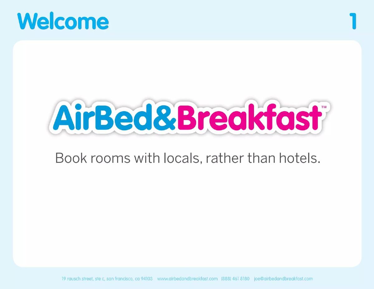
Airbnb (AirBed&Breakfast) cover slide — slide 1
Seed-era consumer marketplace deck.
Airbnb (AirBed&Breakfast) deck, slide 1. Exact stored slide matched to this analysis.
Our analysis: The sentence defines the product by contrast with the alternative everyone already knows. An investor understands the customer, the behaviour and the competitor before reading slide two.
Evidence and limitation: Do not copy the contrast format if your alternative is not a household name; "rather than [unknown incumbent]" explains nothing.
What a founder can adapt: Describe your product against the default choice your customer makes today, in the customer's own words.
Supporting analysis
What the deck claims: The cover gives the original name, AirBed&Breakfast, and one sentence: "Book rooms with locals, rather than hotels."
Presentation choice: The sentence defines the product by contrast with the alternative everyone already knows. An investor understands the customer, the behaviour and the competitor before reading slide two.
When it does not fit: Do not copy the contrast format if your alternative is not a household name; "rather than [unknown incumbent]" explains nothing.
LinkedIn deck, slide 1. Exact stored slide matched to this analysis.
Our analysis: The line is an insight rather than a description: it asks the investor to accept one idea that the rest of the deck proves. At Series B the audience already knew what LinkedIn was, so the cover could spend its line on the thesis.
Evidence and limitation: At pre-seed, an insight line without a description leaves a cold reader guessing what the company is.
What a founder can adapt: If investors already know what you do, use the cover line for the single insight the deck argues.
Supporting analysis
What the deck claims: The cover reads "Your network is bigger than you think", with "Series B", "August 2004" and "Confidential".
Presentation choice: The line is an insight rather than a description: it asks the investor to accept one idea that the rest of the deck proves. At Series B the audience already knew what LinkedIn was, so the cover could spend its line on the thesis.
When it does not fit: At pre-seed, an insight line without a description leaves a cold reader guessing what the company is.
Prolific deck, slide 1. Exact stored slide matched to this analysis.
Our analysis: A clean customer-and-outcome sentence: the reader knows the user (people running research), the benefit (easy, high quality) and the channel (online).
Evidence and limitation: "High quality" is a claim every competitor makes; make sure a later slide shows what quality means in numbers.
What a founder can adapt: Use "We make it easy to [job] for [customer]" as a first draft, then cut words until it still reads naturally.
Supporting analysis
What the deck claims: Name plus "We make it easy to run high quality research online."
Presentation choice: A clean customer-and-outcome sentence: the reader knows the user (people running research), the benefit (easy, high quality) and the channel (online).
When it does not fit: "High quality" is a claim every competitor makes; make sure a later slide shows what quality means in numbers.
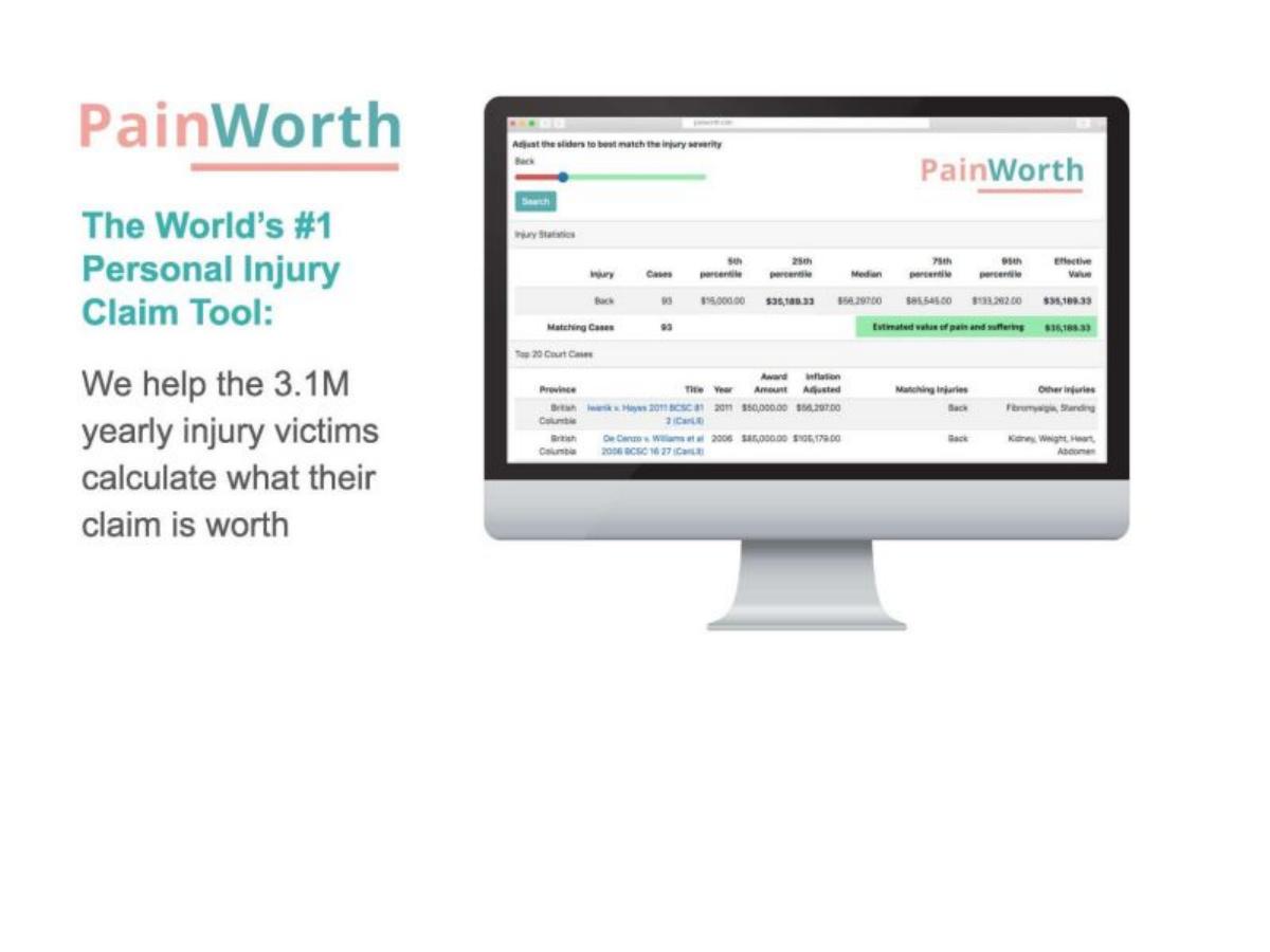
PainWorth deck, slide 1. Exact stored slide matched to this analysis.
Our analysis: The second half is excellent: customer, volume and outcome in one sentence. It quantifies the audience without needing a market-size slide.
Evidence and limitation: "World's #1" is an unverifiable superlative on the first slide. A diligent investor will ask for proof; leave rankings to the traction slide.
What a founder can adapt: Put a real, sourced count of your customers into the one-liner if it is surprising.
Supporting analysis
What the deck claims: "The World's #1 Personal Injury Claim Tool: We help the 3.1M yearly injury victims calculate what their claim is worth."
Presentation choice: The second half is excellent: customer, volume and outcome in one sentence. It quantifies the audience without needing a market-size slide.
When it does not fit: "World's #1" is an unverifiable superlative on the first slide. A diligent investor will ask for proof; leave rankings to the traction slide.
Aera Health deck, slide 1. Exact stored slide matched to this analysis.
Our analysis: A mission line plus four attributes. It is memorable and clearly positions the company in preventive health.
Evidence and limitation: Four adjectives that many competitors also use do not classify the business. A cold reader still does not know what the product is.
What a founder can adapt: If you open with a mission line, keep the attributes to words that really distinguish you.
Supporting analysis
What the deck claims: "Enabling a new era of healthcare" followed by "Preventive | Personalised | Predictive | Participatory".
Presentation choice: A mission line plus four attributes. It is memorable and clearly positions the company in preventive health.
When it does not fit: Four adjectives that many competitors also use do not classify the business. A cold reader still does not know what the product is.
Use this to choose a pattern for your stage and audience.
Pattern
Example from the corpus
Works best when
Main risk
Customer and outcome
Prolific; PainWorth
The investor knows nothing about you (pre-seed, seed)
Generic benefit words ("easy", "high quality")
Category claim
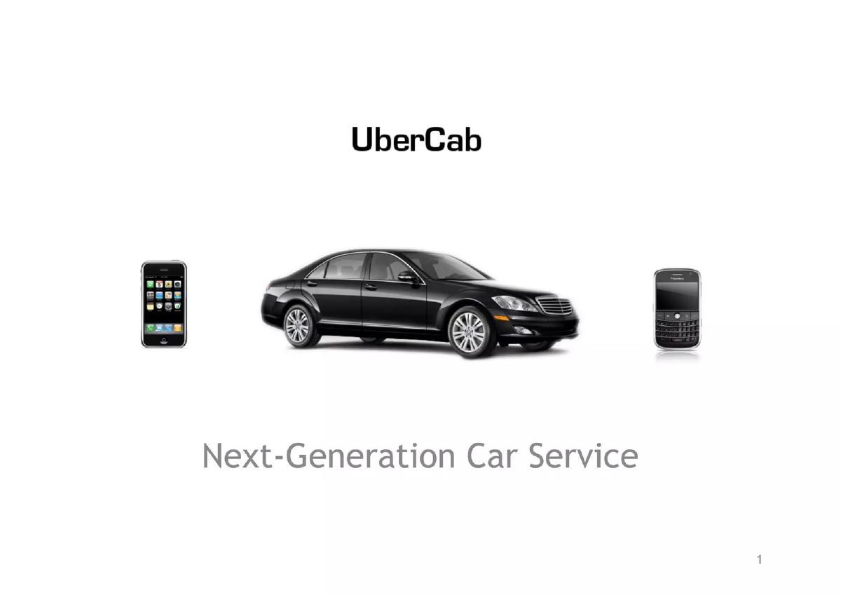
Equals; Replicated; UberCab
The category is familiar to the target investor
Explains nothing if the category is unfamiliar
Insight or thesis
LinkedIn 2004
The audience already knows the company
A cold reader cannot tell what you do
Bare label
Atropos Health; iTrustCapital
Later-stage process with known investors
Wastes the cover at early stage
Key Takeaways
Classify the company before trying to sound memorable. Airbnb's contrast with hotels and Prolific's research outcome let a cold reader understand the business immediately.
Match the line to the audience's prior knowledge. LinkedIn could lead with a thesis at Series B; Atropos Health's bare investor-presentation label would leave an unfamiliar seed investor without context.
Use specific claims you can support. PainWorth's audience count is useful only with a defensible source, while unsupported '#1' language creates an avoidable diligence question.
Design for forwarding and thumbnail reading. Boom's named founder contact survives separation from the original email, while dates and round labels should appear only when they will stay current.
Write your cover slide
Draft the words before choosing imagery. The test is whether a cold reader can classify the company in five seconds.
Company. Write the public company name exactly as investors should search for it.
Customer. Name the person or organization the product serves.
Outcome or category. State the useful change you create, or a category the target investor already understands.
Forwarding context. Add a founder contact, and only a current date or round label if it helps route the deck.
After: Northstar helps warehouse teams cut inventory-counting time
What improved: The rewrite replaces an abstract mission with a customer and a concrete job.
What the cover slide is actually for
Founders tend to treat the cover as decoration: the place for the logo, the brand colour and a hero image. Investors use it differently. A deck usually arrives as an attachment or a link among dozens of others, and the cover is what they see in a preview pane, in a forwarded email and in the thumbnail of a shared folder. Its real job is to classify the company correctly and quickly, so that the rest of the deck is read with the right frame.
Sequoia's own guide to pitching starts with "company purpose": define the company "in a single declarative sentence", and it warns that this is harder than it looks because founders slip into listing features. That sentence is exactly what belongs on the cover. If you cannot write it, the problem is not the slide design — it is that the positioning is not settled yet, and every later slide will inherit the confusion.
The cover also sets the reading level for the deck. Y Combinator's Kevin Hale argues that slides should be legible, simple and obvious: large type, bold text, a simple font and good contrast. A cover crowded with small text, a stock photograph and three taglines tells the investor to expect more of the same. (Sequoia Capital, Y Combinator)
The four elements, in order of importance
1. The company name, set large. Use the name investors will search for later. If the legal entity and the brand differ, use the brand on the cover and put the legal name in the appendix or the data room.
2. A one-line description. Aim for a sentence a stranger could repeat: who it is for and what changes for them. A category label ("Digital legal entity management") is acceptable; an outcome sentence ("We help the 3.1M yearly injury victims calculate what their claim is worth") is usually stronger because it carries the customer and the value in one line.
3. A way to reach the founder. An email address or domain. Decks get forwarded, and an investor who wants to introduce you to a partner should not have to search for your contact details.
4. Optional context: the date, the round, or the word "confidential". A date helps when the deck is a live document that changes between meetings; the round label helps when you are sending different versions to different audiences. Neither is required, and both can age the deck badly if it circulates longer than planned.
How strong covers write the one-liner
Across the covers we reviewed, the one-liners fall into four patterns. Each can work; they fail in different ways.
The customer-and-outcome sentence names who benefits and what they get: Prolific's "We make it easy to run high quality research online" or PainWorth's claim-value line. This pattern is the safest because it survives being read out of context.
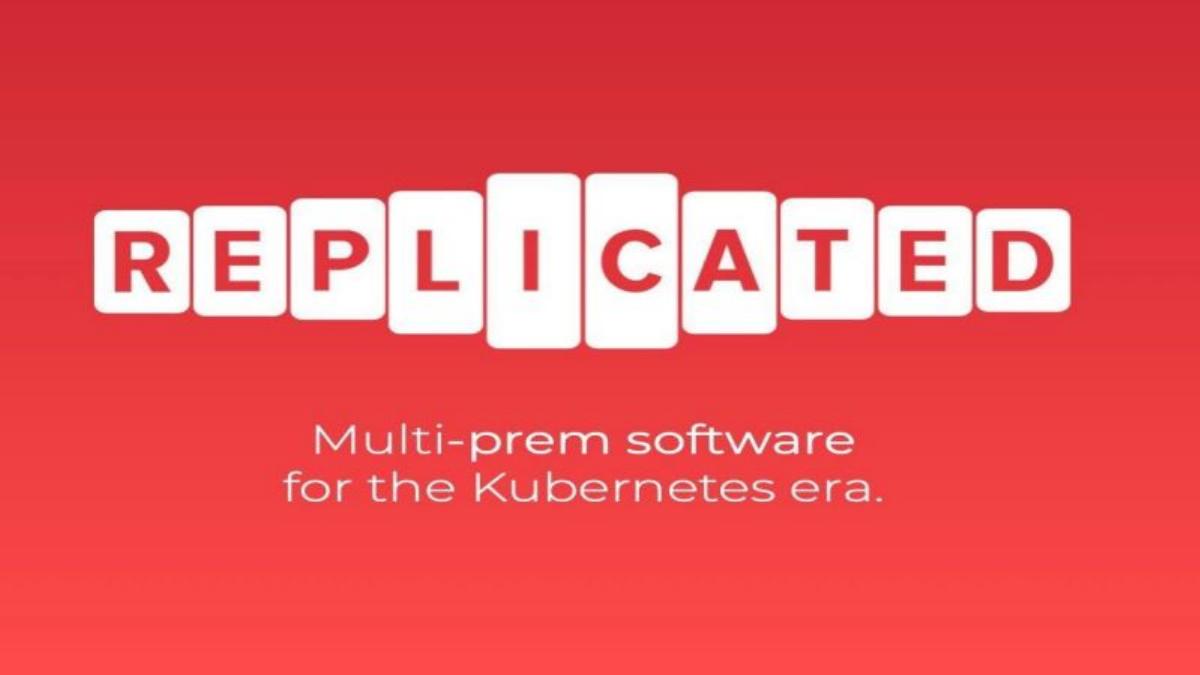
The category claim positions the company inside a market the investor already understands: Equals' "A modern spreadsheet for modern analysis" or Replicated's "Multi-prem software for the Kubernetes era". This works when the category is familiar to the target investor and the modifier ("modern", "for the Kubernetes era") signals the wedge. It fails when the investor does not know the category — then the cover explains nothing.
The mission line states the change the company wants to make, as Aera Health's "Enabling a new era of healthcare" does. Mission lines are memorable but rarely classify the business; if you use one, the next slide has to do the classifying immediately.
The bare label ("Investor Presentation", "Pitch deck") wastes the most valuable line in the deck. It is common in later-stage and corporate decks, where the audience already knows the company, and it is the pattern early-stage founders should copy least.
What changes by stage and by industry
At pre-seed and seed, the investor usually knows nothing about you, so the one-liner carries more weight than anything else on the slide. This is where a clear customer-and-outcome sentence matters most. Covers from later-stage decks in our corpus — iTrustCapital's "Series A Investment Opportunity" or Filevine's "Company Overview" — can afford to be bare because the reader is often already in a process with the company. Copying that restraint at seed removes information you need.
Regulated industries add one consideration. In fintech and healthcare, a single word on the cover can imply a licence or a clinical claim. "Bank", "insurance" or "clinically proven" on a cover will be read literally by a diligent investor. Describe what you do, not what you intend to be licensed for, and keep regulatory status for the slide where you can explain it.
Deep-tech and B2B infrastructure companies often need a category claim because the customer is technical. Replicated's cover works for investors who know Kubernetes; for a generalist, it would need the next slide to translate it.
Dates, round labels and confidentiality lines
Little Otter's cover says "Series A Fundraise Fall 2021"; LinkedIn's 2004 deck showed "Series B" and "August 2004"; Fintern's cover carried a date, a website, a contact address and a full confidentiality notice. These choices say something about how the deck will be used.
A date is useful when you update the deck during a process and want investors to know which version they hold. It becomes a liability when the process runs long: a deck dated six months ago signals a round that has not closed. If you date the cover, commit to updating it.
A round label helps an investor route the deck internally, especially at firms with separate seed and growth teams. It can hurt if you are still deciding how to structure the raise.
Confidentiality notices do not make a deck confidential; they mostly add clutter. If the content is genuinely sensitive, keep it out of the forwarded deck and share it later in a data room with access controls.
Design choices that matter and ones that do not
Legibility matters more than style. Text that is readable in a thumbnail beats elegant thin type. Contrast matters: the covers whose extracted text came through cleanly in our review tended to be the ones with simple type on a plain background, while covers set over photographs frequently produced garbled text when the slide was read automatically — a rough proxy for how hard they are to read at a glance.
What does not matter much: whether you use a photograph, a product screenshot or a plain background, as long as the text stays legible. Investors do not fund cover art. A distinctive visual can help recall after the meeting, but only if it does not compete with the one-liner.
A practical way to write your cover in ten minutes
Write five candidate one-liners using the patterns above: two customer-and-outcome sentences, two category claims and one mission line. Read each to someone outside your industry and ask them to say back what the company does. Keep the one they repeat most accurately, not the one that sounds best to you.
Then check the sentence against your problem and solution slides. The words on the cover should appear again on those slides. If the cover says "research" and the problem slide says "survey data quality", pick one vocabulary and use it throughout.
Finally, look at the cover as a thumbnail at the size of an email preview. If the name and the sentence are not readable, increase the type size and remove anything else.
Common mistakes
A slogan instead of a description. Taglines written for customers rarely classify the business for an investor. Test whether a stranger can say back what you do.
Unverifiable superlatives. "#1", "leading" or "world's first" on the cover invites the question you least want at the start of a meeting. Prove rank on the traction slide instead.
Text over busy imagery. Photographs behind text make the cover hard to read in a preview. Keep text on a plain area with strong contrast.
A stale date. A dated cover that circulates for months signals a round that has not closed. Update it or remove it.
Different words on the cover and on slide two. If the cover and the problem slide describe the company differently, the investor has to reconcile them. Use one vocabulary.
Regulatory words you cannot yet support. In fintech and health, words like "bank", "insurer" or "clinically proven" are read literally. Describe what you do today.
Diagnostic checklist
The company name is the largest text on the slide.
One sentence says who the customer is and what changes for them, or names a category the target investor knows.
A stranger can repeat what the company does after five seconds.
A real founder email or the company domain is visible.
Any date or round label is current and intentional.
No superlative claims that the deck does not prove later.
The cover is readable at thumbnail size.
The words on the cover match the words on the problem and solution slides.
Frequently asked questions
What should be on a pitch deck cover slide?
The company name, a one-sentence description of what the company does and for whom, and a way to contact the founder. A date or round label is optional.
Should the cover slide have a tagline or a description?
A description. Sequoia's guide asks founders to define the company in a single declarative sentence; that sentence belongs on the cover. Marketing taglines rarely tell an investor what the business is. (Sequoia Capital)
Should I put a date on my pitch deck cover?
Only if you will keep it current. A date helps investors know which version they hold during an active process, but an old date on a forwarded deck suggests a round that has stalled.
Do investors care about cover slide design?
They care that it is readable. Large, simple, high-contrast type matters more than imagery. Y Combinator's design guidance puts legibility first. (Y Combinator)
Should I include my logo on the cover?
A simple wordmark is enough. The name must be legible; an elaborate logo does not add information.
Is it okay to put "Confidential" on the cover?
It is harmless but does not protect anything. Share sensitive material later through a data room with access controls rather than in a deck that will be forwarded.
How we chose these examples
Corpus: published pitch deck teardowns on StartupFundraising.com. Founder-uploaded private decks are excluded entirely.
Selection: we read the extracted first-slide text of 45 decks classified as having a cover slide, from the fintech, healthtech, SaaS, marketplace, consumer and AI/ML sectors, ordered by deck year from 2025 backwards, restricted to decks that also had at least one high-confidence traction label. We added three widely studied historical decks (Airbnb, Uber, LinkedIn). Twelve covers were chosen for clarity and variety of pattern.
Review: examples were selected and described by our editorial model from the extracted slide text and then checked against that text. No person has yet reviewed these examples for this page; the review is model review, not human review.
Limitation: slide text is extracted automatically and is sometimes garbled, especially where text sits on images. We quote only text that came through cleanly and do not describe visual design we could not read.
Limitation: every cover slide in our classification is labelled with medium confidence because the label is largely positional. We did not use the label count as a statistic.
We make no claim that any cover design caused a fundraising outcome.