How product slides change from seed to Series B: from a step-by-step walkthrough of one customer journey to the modules one buyer operates and the workflow.
Product Slides by Stage: Real Seed, Series A and Series B Examples
Six product slides from seed, Series A and Series B decks, shown in full. Seed slides walk through one customer's journey step by step; Series A slides show the parts of a product one buyer runs; Series B slides show the workflow a team repeats every day.
TL;DR
A product slide should show what a customer actually does with the product. Seed slides do it as a sequence: uGift goes from "Customer sees ad" to "Receiver gets uGift and uses at the store"; Pop Shop ends with tracking "sales lift in the store and online". Series A slides show the product as modules one buyer controls: Lunchbox's dashboard covers order management, locations, discounts and customer insight; Formel pairs a digital companion, in-house doctors and individualised formulas. Series B slides show the repeat workflow: StuDocu shows how students study and discuss on the platform, while Demostack's three verbs ("Spin up a demo", "Tailor the story", "Showcase and share") are the weak example here, with almost no detail.
Product slides from seed, Series A and Series B decks
Each example shows the exact stored slide above its analysis and links to the full teardown. Seed first, then Series A and Series B. Claims are as shown on the slides; we have not verified them.
uGift product slide — slide 6
Seed. Local gift cards. Numbered journey with screens.
uGift deck, slide 6. Exact stored slide matched to this analysis.
Our analysis: A clear seed product slide: every party (buyer, receiver, merchant) and every step is visible.
Evidence and limitation: A full purchase-to-redemption journey; no figures.
What a founder can adapt: Number the steps from discovery to the moment value is delivered, and include every party.
Supporting analysis
What the deck claims: "How our product works?" Steps: "Customer sees ad for uGift on Google or sees our stand in his favorite restaurant or salon", "Customer visits site and selects what merchant he wants to buy a gift for and amount to give", "Customer makes personalized greeting card and uploads optional photo(s)", "Customer choose delivery method" (Email, SMS), "Receiver gets uGift and uses at the store", "Merchant checks security code to authenticate and accepts the uGift".
Presentation choice: Including the merchant's step answers how redemption works, which is the part investors doubt.
When it does not fit: Six steps with small screens is a lot; cut to four and enlarge the key screen.
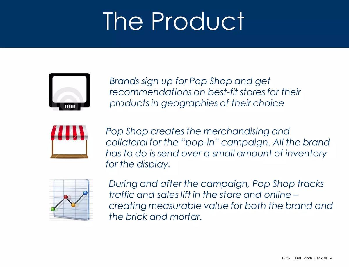
Seed. In-store pop-up campaigns for brands. Three-step text.
Pop Shop deck, slide 4. Exact stored slide matched to this analysis.
Our analysis: Shows what Pop Shop does versus what the brand does, and ends on measurement.
Evidence and limitation: A three-step service description; no figures.
What a founder can adapt: Split each step into what you do and what the customer does.
Supporting analysis
What the deck claims: "Brands sign up for Pop Shop and get recommendations on best-fit stores for their products in geographies of their choice." "Pop Shop creates the merchandising and collateral for the 'pop-in' campaign. All the brand has to do is send over a small amount of inventory for the display." "During and after the campaign, Pop Shop tracks traffic and sales lift in the store and online — creating measurable value for both the brand and the brick and mortar."
Presentation choice: "All the brand has to do" makes the customer's effort explicit and small.
When it does not fit: Text only; one photo of a pop-in display would prove the product exists.
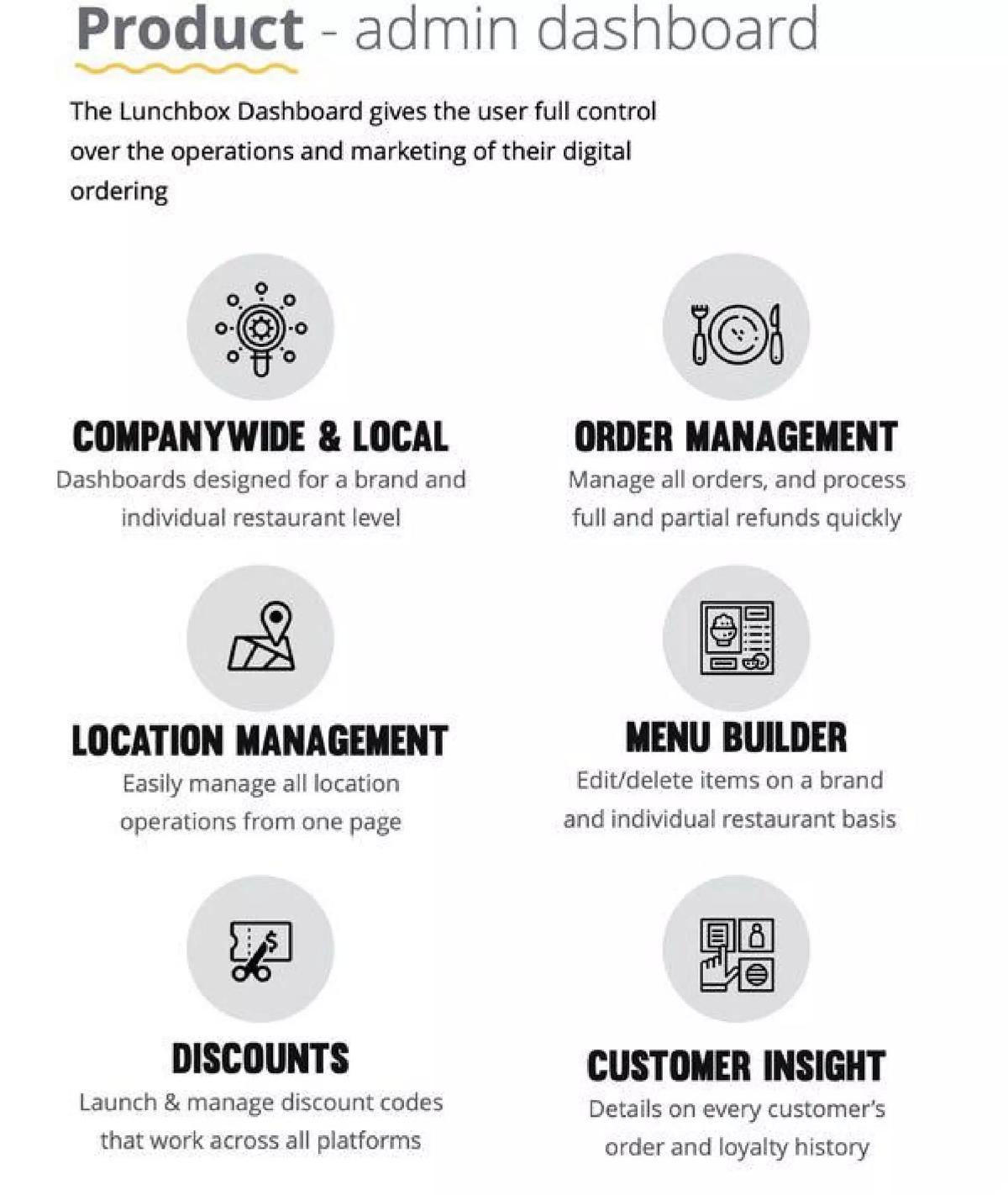
Series A. Digital ordering for restaurants. Dashboard screen with module labels.
Lunchbox deck, slide 6. Exact stored slide matched to this analysis.
Our analysis: The Series A move: the product shown as the control panel one buyer runs.
Evidence and limitation: A real dashboard screen with five labelled modules; no figures.
What a founder can adapt: Show your main screen and label each module with the job it does.
Supporting analysis
What the deck claims: "Product - admin dashboard." "The Lunchbox Dashboard gives the user full control over the operations and marketing of their digital ordering." Modules: "Order management: Manage all orders, and process full and partial refunds quickly", "Companywide & local: Dashboards designed for a brand and individual restaurant level", "Location management", "Discounts: Launch & manage discount codes that work across all platforms", "Customer insight: Details on every customer's order and loyalty history".
Presentation choice: "Brand and individual restaurant level" shows it serves multi-location chains, the larger buyer.
When it does not fit: At Series A, one usage figure (orders processed, locations live) would support the screen.
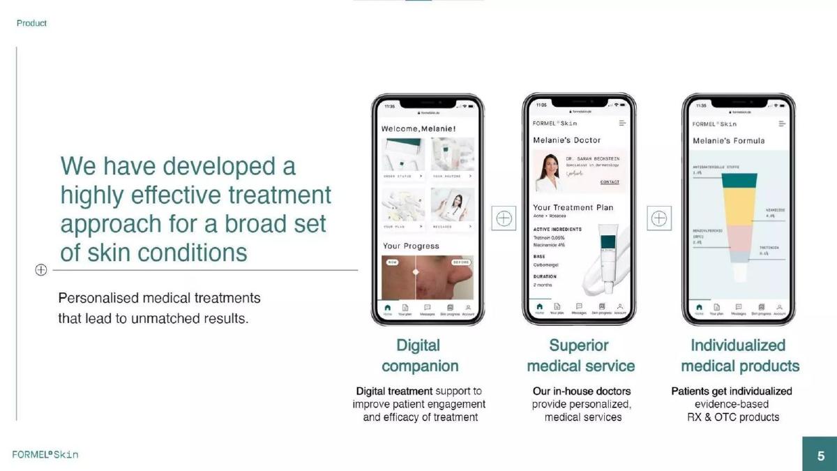
Series A. Digital dermatology. Three-part offer with app screens.
Formel deck, slide 5. Exact stored slide matched to this analysis.
Our analysis: Combines app, service and physical product into one offer, told through one patient.
Evidence and limitation: Three product components shown through one named patient; no figures.
What a founder can adapt: Show each part of your offer through the same example customer.
Supporting analysis
What the deck claims: "We have developed a highly effective treatment approach for a broad set of skin conditions." "Digital companion: Digital treatment support to improve patient engagement and efficacy of treatment." "Superior medical service: Our in-house doctors provide personalized, medical services." "Individualized medical products: Patients get individualized evidence-based RX & OTC products." Screens show "Welcome, Melanie!", "Melanie's Doctor" and "Melanie's Formula".
Presentation choice: Following "Melanie" across all three screens makes a complex offer feel like one product.
When it does not fit: "Highly effective" and "unmatched results" need a study or outcome figure on the slide.
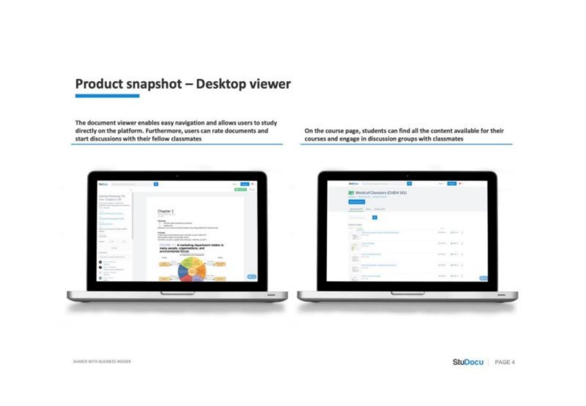
Series B. Study-material platform. Two captioned desktop screens.
StuDocu deck, slide 4. Exact stored slide matched to this analysis.
Our analysis: Shows the repeat workflow: find course material, study it, rate it, discuss it.
Evidence and limitation: Two real screens with captions describing daily use; no figures.
What a founder can adapt: Caption each screen with the action a user repeats there.
Supporting analysis
What the deck claims: "Product snapshot — Desktop viewer." "The document viewer enables easy navigation and allows users to study directly on the platform. Furthermore, users can rate documents and start discussions with their fellow classmates." "On the course page, students can find all the content available for their courses and engage in discussion groups with classmates."
Presentation choice: Ratings and discussions show why users return, which matters at Series B.
When it does not fit: A usage figure (documents viewed, weekly active students) would tie the screens to scale.
Series B. Demo environments for sales teams. Three steps over screens.
Demostack deck, slide 5. Exact stored slide matched to this analysis.
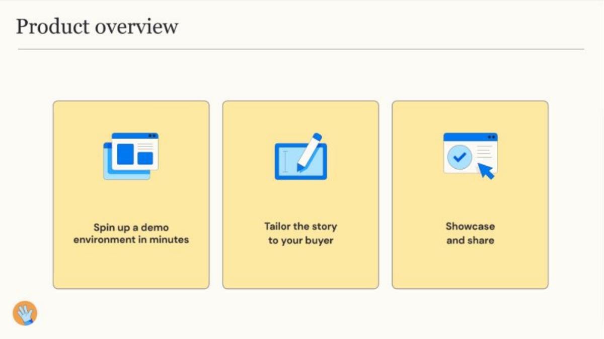
Our analysis: The weak example in this set: the workflow is named but not shown in any readable detail.
Evidence and limitation: Three verbs over small screens; no captions beyond the step names and no figures.
What a founder can adapt: Give each step one sentence on what the user does and what they get.
Supporting analysis
What the deck claims: "Product overview." Three steps: "Spin up a demo environment in minutes", "Tailor the story to your buyer", "Showcase and share".
Presentation choice: Included as a contrast; compare it with StuDocu at the same stage.
When it does not fit: "In minutes" is the one concrete claim; show the actual setup time and how it compares.
Before: Spin up a demo environment in minutes. Tailor the story to your buyer. Showcase and share.
After: A sales rep clones a live copy of the product for one prospect, edits it to show that prospect's data, and sends a link. [Add your figure, e.g. median setup time].
What improved: Our illustrative rewrite; not Demostack's wording. It names the user and what each step produces, and leaves a marked place for a real figure.
What this guide adds
The library already has a general product slide guide. This page compares product slides across funding stages, following the stage guides for problem, solution, market, traction and competition slides.
Stage labels come from the stage recorded for each published teardown, all high confidence: two seed, two Series A, two Series B. Pre-seed is left out because too few pre-seed decks in the library have a readable product slide that isn't already used in another guide. None of these six decks appears in another guide.
What changes with stage
Seed decks explain how the product works by following one customer through it (uGift, Pop Shop). The order of steps is the argument.
Series A decks show the product as a set of parts one buyer runs (Lunchbox's dashboard modules, Formel's three-part treatment). The question has moved from "does it work?" to "what does the buyer get?".
Series B decks should show the workflow a team or user repeats. StuDocu does this with captioned screens; Demostack names the steps but gives no screens detail an investor can read.
Common mistakes
Feature list instead of use. Show what the customer does, in order.
Screens without captions. Say what each screen does for whom.
Too many steps. Keep to three or four readable steps.
Unsupported quality claims. "Highly effective" needs a result on the slide.
No sign of use after seed. Add one usage figure from Series A on.
Diagnostic checklist
One named customer.
Steps, modules or workflow that fit your stage.
At least one real, captioned screen.
One usage figure with a source (Series A+).
No claims the slide can't back.
Frequently asked questions
How we chose these examples
Corpus: published pitch deck teardowns on StartupFundraising.com. Founder-uploaded private decks are excluded.
Selection (2026-09-25): we took teardowns whose recorded stage is seed, Series A or Series B with high confidence and found slides whose text begins with Product (about 48 seed, 18 Series A and 9 Series B decks qualified; only 7 pre-seed, most unreadable or already used, so pre-seed is omitted). We excluded any deck, or any other deck from the same company, already used in another guide, and kept only slides with a stored image. From the remaining candidates we chose two per stage with readable, specific content, including one deliberately weak Series B example for contrast.
Stage is the round recorded for each teardown, not a judgment about the company today.
Review: stored slide text was checked on 2026-09-25 and matched to company, deck and slide number (editorial model review). No person has yet completed an editorial review of this page.
Claims are as shown on the slides; we have not verified them. We make no claim that any slide caused a fundraising outcome.