Travel Startup Product Slide Examples: 8 Real Pitch Decks
How travel startups show their product in a pitch deck: booking flows, chat booking, hotel software and travel assistants.
Travel Product Slide: Show the Trip the Traveller Books, and the Price
A travel product slide has one job: show investors what a traveller, host or hotel actually does with the product, and what they get at the end. The best travel product slides walk through the booking in a few screens and put a real price on the last one. Weaker ones list principles such as "ease of use" or show icons instead of the product. This guide uses eight product slides from eight travel startups, from Airbnb's early three-step flow to hotel software and a chat assistant.
TL;DR
Show the booking as a short sequence of real screens and end on a price. Airbnb's early slide labels three steps, "Search by city", "Review listings" and "Book it!", with a $75 listing on the last screen. Glyde uses the same three steps for booking seats on flights, showing the price per seat and the tax. Snaptravel shows booking inside a chat, with a $223 rate against a $299 retail price. Stayflexi and Holdbar show software for the businesses travellers book with. Travel Lisa lists what its chat assistant does. Sparroow copies Airbnb's three steps with icons, which shows the limits of borrowing a layout.
Seven travel product slides
Strongest first. Each example quotes the slide and notes what an investor can and cannot work out from it.
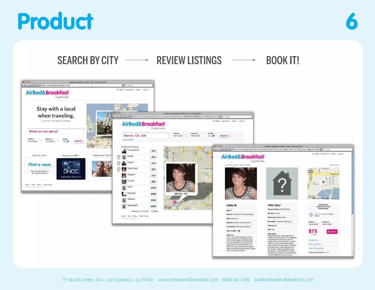
Airbnb product slide — slide 6
Early AirBed&Breakfast deck. Slide titled "Product".
Airbnb deck, slide 6. Exact stored slide matched to this analysis.
Our analysis: Investors can follow a booking from search to payment in three screens, and see the price a traveller pays.
Evidence and limitation: Screenshots of the product at the time.
What a founder can adapt: Use your own three steps and end on your own price.
Supporting analysis
What the deck claims: Three labelled steps: "Search by city" → "Review listings" → "Book it!". Three website screenshots: a home page reading "Stay with a local when traveling.", a list of results for "Denver, CO, USA" with prices beside a map, and a listing page with the host's photo, a $75 price and a "Book It" button.
Presentation choice: The labels make the slide readable in seconds even though the screenshots are small.
When it does not fit: Screens so small that only the labels can be read.
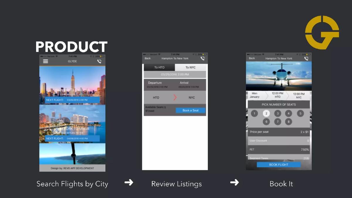
Seat booking on short flights. Slide titled "Product".
Glyde deck, slide 6. Exact stored slide matched to this analysis.
Our analysis: It shows how a traveller books seats on a flight, and that tax is shown before payment.
Evidence and limitation: App screenshots.
What a founder can adapt: Make the final screen's price and fees readable.
Supporting analysis
What the deck claims: Three phone screens labelled "Search Flights by City" → "Review Listings" → "Book It". The screens show upcoming flights, a "Hampton To New York" listing with departure and arrival and a "Book a Seat" button, and a booking screen with "Pick number of seats" (1 to 8), "Price per seat", "FET 7.50%" and "Book Flight".
Presentation choice: The flow borrows Airbnb's labels but fills them with its own screens.
When it does not fit: Prices too small to read on the slide.
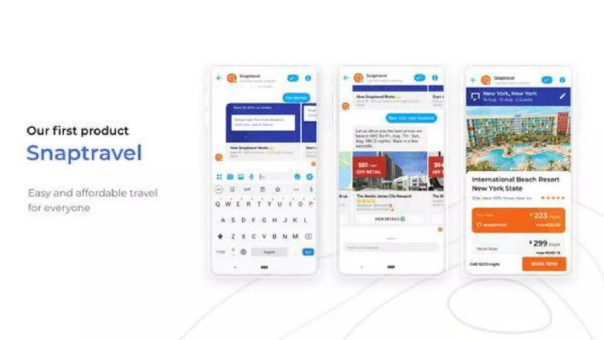
Snapcommerce deck. Slide reading "Our first product Snaptravel".
Snaptravel deck, slide 7. Exact stored slide matched to this analysis.
Our analysis: Booking happens inside a chat, and the traveller sees a price below the standard rate.
Evidence and limitation: App screenshots.
What a founder can adapt: If you save travellers money, show both prices on one screen.
Supporting analysis
What the deck claims: "Our first product" "Snaptravel" "Easy and affordable travel for everyone". Three phone screens of a chat conversation offering hotels, ending on "International Beach Resort New York State" with "$223" shown against "$299" and a "Book Now" button.
Presentation choice: Showing both prices makes the saving visible without a claim.
When it does not fit: Small text that hides what the traveller typed.
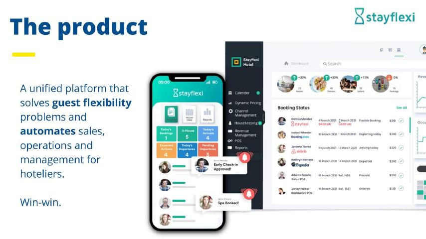
Stayflexi deck, slide 8. Exact stored slide matched to this analysis.
Our analysis: The user is the hotel, and investors can see the daily jobs the software covers.
Evidence and limitation: Product screenshots.
What a founder can adapt: Name the user and the jobs your software takes over.
Supporting analysis
What the deck claims: "A unified platform that solves guest flexibility problems and automates sales, operations and management for hoteliers." "Win-win." A phone app with today's bookings, arrivals and departures, and a desktop dashboard with menu items such as "Dynamic Pricing", "Channel Management" and "Housekeeping", and a "Booking Status" list with sources including Booking.com, Airbnb and Expedia at about $230–250.
Presentation choice: Naming the booking channels shows it works alongside the sites hotels already use.
When it does not fit: "Win-win" without saying what the guest gains.
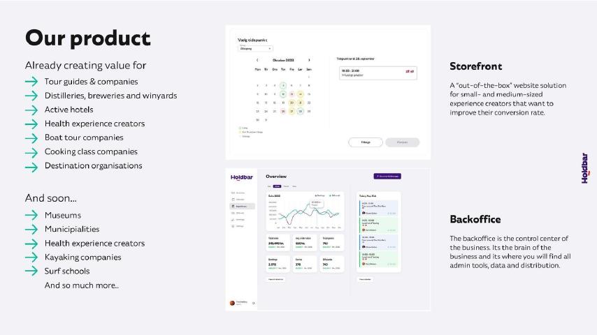
Booking software for experience providers. Slide titled "Our product".
Holdbar deck, slide 7. Exact stored slide matched to this analysis.
Our analysis: It shows both sides: the page travellers book on and the tools the business runs.
Evidence and limitation: Product screenshots and company list of customer types.
What a founder can adapt: Show one screen per user and say which customers use it today.
Supporting analysis
What the deck claims: "Storefront": "A 'out-of-the-box' website solution for small- and medium-sized experience creators that want to improve their conversion rate." "Backoffice": "the control center of the business" with "admin tools, data and distribution". "Already creating value for" tour guides, distilleries and vineyards, active hotels, health experience creators, boat tours, cooking classes and destination organisations; "And soon..." museums, municipalities, kayaking companies and surf schools.
Presentation choice: Listing current customer types shows the product is already in use.
When it does not fit: Mixing current and planned customers without a clear split.
Travel Lisa deck, slide 3. Exact stored slide matched to this analysis.
Our analysis: It lists four things the assistant does and shows the results screen.
Evidence and limitation: App screenshots and company description.
What a founder can adapt: Show one full conversation from question to answer.
Supporting analysis
What the deck claims: "She recognizes photos of popular places around the world". "Tells you summary about the places based on information over the all internet." "Suggests where to go in unfamiliar city and tells stories." "Bot learns to give more personalized recommendations over time." Two phone screens of "Find Attractions" results with "Get direction" and "More info" buttons.
Presentation choice: Building inside Messenger means travellers need no new app.
When it does not fit: Claims about learning with no example of it.
Travel booking and social app. Slide titled "Product & Service".
Sparroow deck, slide 6. Exact stored slide matched to this analysis.
Our analysis: The phone screens show a live app; the icon steps add little.
Evidence and limitation: App screenshots.
What a founder can adapt: Replace icons with the screen for each step.
Supporting analysis
What the deck claims: "Sparroow is a one stop solution traveling mobility technology, that makes every trips memorable by sharing & connecting new friends." Two phone screens labelled "Started 2020" and "Idea to Live", with booking options such as cabs, flights and hotels and a "Trip of the Day" feed. Three icon steps: "Make your Choice", "Review listings", "Book it !".
Presentation choice: "Idea to Live" tells investors the product is working.
When it does not fit: Borrowing a known layout without your own screens in it.
Whether each slide shows real screens, names the user and gives a price.
Example
Real screens
User
Price shown
Airbnb
Yes, 3 steps
Traveller
$75 listing
Glyde
Yes, 3 steps
Traveller
Per seat, plus 7.5% tax
Snaptravel
Yes, 3
Traveller
$223 against $299
Stayflexi
Yes, 2
Hotel
Room rates in bookings list
Holdbar
Yes, 2
Experience provider
No
Travel Lisa
Yes, 2
Traveller
No
Sparroow
Yes, 2, plus icons
Traveller
No
Key Takeaways
Show real screens in the order a traveller uses them.
Label each step in a few words.
End on a screen with a price.
State the offer in plain words: length of trip, what is included, the starting price.
If your customer is a business, show the screen it works in every day.
Build your travel product slide
Decide who the user is and what they end up with before you pick screens.
User. Who uses this screen: a traveller, a host, a hotel or a tour operator?
Steps. What are the three steps from opening the product to a confirmed booking?
Price. What price does the user see on the last screen?
Offer. In one line, what does the traveller get: length, what is included, starting price?
Copyable framework: [User] [step 1] → [step 2] → [step 3] and gets [result] from [price].
Illustrative example 1 — written by us
Before: An all-in-one platform for seamless travel experiences.
After: Travellers pick a city, compare three hand-checked guesthouses and book in under a minute, from $40 a night.
What improved: Our illustrative rewrite; all figures are invented for the example. It names the user, the steps and a price.
What this guide adds
The general product slide guide covers any startup. This guide covers travel, where the product is usually a booking: the traveller searches, compares and pays, and the trip happens later, somewhere else. Investors want to see that booking clearly and to know what the traveller pays. Travel also has many companies that sell to hotels, tour operators and experience providers rather than to travellers, and their product slides need to show a different user.
How we read each slide
We read each stored slide image and quote the text on it. We have not checked any company's prices, features or customer numbers, and we make no claim that any slide affected a fundraising outcome.
Three ways travel startups show the product
The booking flow: three or four screens in order, each labelled, ending on a booking button. Airbnb, Glyde and Sparroow use this, all with the same three labels.
The offer: one screen with the promise written beside it in large type, such as trip length, what is included and the starting price.
The working screen: for software sold to hotels or tour operators, the dashboard or calendar the business uses daily, with a line on what it replaces. Stayflexi and Holdbar do this.
Chat products sit between these: Snaptravel and Travel Lisa show the conversation itself, with the result the traveller gets inside it.
What investors check on a travel product slide
Can they follow the booking? A traveller should get from search to paid in a few steps, and the slide should show each one.
What does it cost the traveller? A price on the final screen, as on Airbnb's $75 listing or Snaptravel's $223 rate, tells investors who the product is for.
Who is the user? Hotel software and traveller apps look similar in a deck. Stayflexi says plainly that its product is for hoteliers.
Is it live? Sparroow writes "Started 2020" and "Idea to Live". A slide that shows a working product is stronger than one showing designs.
Common mistakes on travel product slides
Principles instead of the product: some travel decks list goals such as "extreme ease of use" and "known for speed" with no screen at all.
Icons instead of screens: Sparroow's right-hand panel uses a magnifying glass, a clipboard and a hand for its three steps. Its left-hand phone screens do far more work.
No price: Holdbar, Stayflexi and Travel Lisa show the product but not what it costs. That can sit on the business model slide, but say so.
Unreadable screenshots: several of these slides shrink the screens so far that only the headings can be read. Crop to the part that matters.
Choosing which screens to show
Pick the screens a first-time user sees, in order, and stop at payment or confirmation. Three is usually enough.
Crop each screen to what changes between steps: the search box, the list of results, the price and the book button.
Write a two- or three-word label under each screen, as Airbnb and Glyde do, so investors can follow without reading the screens.
If the product does something unusual, such as hiding the destination, say it in large type beside the screen.
Adapting the slide to your type of travel business
Booking marketplaces for stays, flights or tours should show search, results and booking, with a price on the last screen.
Packaged or surprise trips should state trip length, what is included and the starting price per person.
Software for hotels and tour operators should show the main dashboard or calendar and name the jobs it takes over, such as bookings, pricing or check-in.
Chat assistants and booking bots should show one real conversation that ends in a recommendation or booking.
Borrowing a proven layout
Three of these slides use the same three labels: Airbnb's "Search by city → Review listings → Book it!", Glyde's "Search Flights by City → Review Listings → Book It" and Sparroow's "Make your Choice → Review listings → Book it!". The pattern works because it matches how people book travel. Glyde fills each step with its own screens, so the slide still shows its product: seat counts, price per seat and tax. Sparroow pairs the steps with icons, so the copied layout says less about its product than its own phone screens do.
If you borrow a known layout, fill it with your own screens and your own price. The layout earns attention; the screens earn belief.
Where the price belongs
Travel investors look for the price early, because it tells them who the traveller is and how much each booking can earn. Airbnb, Glyde and Snaptravel put a price on the product slide itself. Holdbar, Stayflexi and Travel Lisa leave it out, which is fine only if the next slide covers it.
Check the screens before the deck goes out. Use real or clearly labelled sample listings, make sure the dates, prices and currencies on each screen agree with each other, and remove test data, placeholder names and debug banners. If the product is not live yet, label the screens as designs or prototypes, because an investor who later finds that a screen shows a feature that does not exist will discount the rest of the deck. If you have both a traveller side and a supplier side, such as hotels or tour operators, show one screen from each and say which side pays. Two clear screens with labels usually do more than six small ones. (General guidance, not drawn from the slides below.)
If your price changes by date or demand, show one real example and say it is an example, such as a typical weekend night or a starting price per person. A range with no example leaves investors guessing what an ordinary booking looks like.
Common mistakes
Principles instead of screens. Show the product itself.
Icons for each step. Use the real screen for each step.
No price. Show what the user pays, or point to the slide that does.
Unreadable screenshots. Crop to the part that changes.
User unclear. Say whether it is for travellers or businesses.
Plans shown as live. Label designs and live screens.
Diagnostic checklist
User named.
Real screens in booking order.
Each step labelled.
Price on the final screen.
Offer stated in one line.
Live and planned features labelled.
Frequently asked questions
What should a travel product slide show?
Real screens in the order a traveller uses them, each labelled, ending on a screen with a price. Airbnb's early slide does this in three steps with a $75 listing.
How many screens should a travel product slide have?
Usually three: search, results and booking. A single screen works if you state the offer beside it: trip length, what is included and the starting price.
What if my travel product is for hotels or tour operators?
Show the dashboard or calendar they use every day and name the jobs it covers, as Stayflexi does for hoteliers and Holdbar does for experience providers.
Is it fine to copy Airbnb's product slide layout?
The three-step layout is easy to follow, and Glyde uses it well with its own screens. Fill each step with your own screens and price; icons alone, as on part of Sparroow's slide, say little.
How we chose these examples
Corpus: published pitch deck teardowns on StartupFundraising.com. Founder-uploaded private decks are excluded.
Removed in v2 (2026-10-05): Nimbus, because a page of its deck carries a restriction notice. Selection (2026-10-01): we searched extracted slide text across the full corpus for product slides from travel startups. We shortlisted 12 slides from 12 companies not used in other guides, viewed all 12 and kept 8.
Not used: Lola p10 (product principles with no product shown), The 3 Travellers p8 (text list only), Uthando African Experiences p8 (icons only) and Wingly p6 (three icons, no product shown).
Review: stored slide images were read at full size on 2026-10-01 against company, deck and slide number (editorial model review). No person has yet completed an editorial review of this page. We did not verify any company's prices, features or customers.