Loan Losses and Default Rates in a Lending Pitch Deck
How a lending or credit startup should show default, loss and arrears rates in a pitch deck: define the measure, show loan age.
Loan Losses in a Lending Pitch Deck: Define the Rate, Show Loan Age, Pick a Fair Benchmark
If you lend money, investors judge your traction partly by how much of it comes back. Five real decks show five ways to present that: Fintern plots arrears by months since lending against a market curve and its own plan, Clearbanc shows a falling quarterly loss rate with no scale, Diamond Finance sets a 0% default rate beside bank and lender averages, Kut Auto Finance quotes partner organisations' loss results, and Bazaar compares its non-performing loans with a footnoted industry figure. Each choice decides whether an investor can trust the number.
TL;DR
Show credit performance with four things on the slide: the exact measure (arrears, default, charge-off or net loss, and after how many days late), how old the loans are when measured, the size of the book behind the rate, and a benchmark defined the same way. A young loan book always looks safe, so the most convincing layout plots losses by months since lending (a vintage or seasoning curve) against a comparable curve, as Fintern does. A single low rate with no definition, age or scale, like a 0% default rate, tells an investor very little.
Five real credit-performance slides
Each slide below is shown as it appears in the company's original deck, with what it says, what we checked and what an investor still cannot tell.
Fintern traction slide — slide 8
UK consumer lender using open banking data. The page header reads "Confidential copy for discussion"; the deck is published in our library and already used in a live guide.
Fintern deck, slide 8. Exact stored slide matched to this analysis.
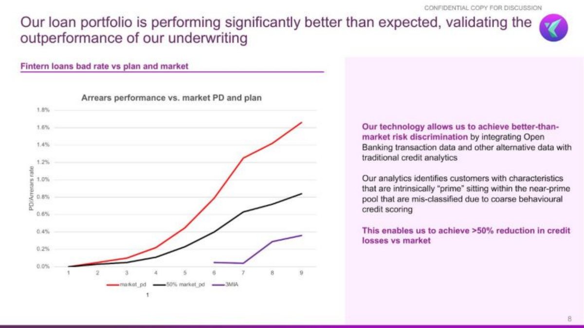
Our analysis: The strongest layout in this set: losses by loan age, against a market curve and the company's own pricing plan. Limits: "t" is not labelled as months, the third line's label is hard to read, the chart mixes "PD" (a probability of default, a forecast) with an arrears rate (an observed figure), and the number of loans behind the line is not given. The line covers only t=6 to t=9, so most of the curve is unobserved.
Evidence and limitation: Directly visible: at t=9 the market line is about 1.65%, the 50% line about 0.83% and the third line about 0.35% (our readings of the chart). The third line starts at t=6 and stays near 0.05% until t=7. 0.35 divided by 1.65 is about 0.21, so at t=9 the plotted Fintern line sits at roughly a fifth of the market curve.
What a founder can adapt: Plot cumulative losses by months since lending, label the axis unit, and say how many loans or how much money each point covers.
Supporting analysis
What the deck claims: "Our loan portfolio is performing significantly better than expected, validating the outperformance of our underwriting." Chart "Arrears performance vs. market PD and plan", subtitle "Fintern loans bad rate vs plan and market", vertical axis "PD/arrears rate" from 0% to 1.8%, horizontal axis "t" from 1 to 9, three lines: market_pd, 50% market_pd and a third line. Text: "This enables us to achieve >50% reduction in credit losses vs market."
Presentation choice: Comparing losses at the same loan age removes the young-book flattery that a single blended rate hides.
When it does not fit: Don't mix a predicted default probability and an observed arrears rate on one axis without saying which line is which.
Revenue-based funding for e-commerce companies, 2019.
Clearbanc deck, slide 14. Exact stored slide matched to this analysis.
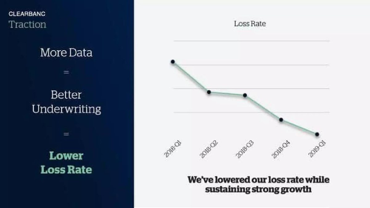
Our analysis: A direction-only chart. The falling line could reflect better underwriting, as claimed, or simply that the latest quarters' advances are youngest and have not yet had time to be lost. Without values or loan age, an investor cannot separate the two.
Evidence and limitation: Directly visible: five points, each lower than or level with the one before, ending at the lowest. No vertical axis values, no definition of loss rate and no volume figure appear on the page.
What a founder can adapt: Add the axis values, state the loss definition and measure each quarter's advances at the same age.
Supporting analysis
What the deck claims: "More Data = Better Underwriting = Lower Loss Rate." Chart "Loss Rate", five quarterly points from 2018-Q1 to 2019-Q1, falling. "We've lowered our loss rate while sustaining strong growth."
Presentation choice: It shows the claim investors want to hear, but in a form that cannot be checked.
When it does not fit: Don't plot loss rate by calendar quarter of lending without saying how long each quarter's loans have been outstanding.
Non-bank lender. The page carries no date or country label; the comparison groups are banks and non-bank financial institutions (NBFIs).
Diamond Finance deck, slide 13. Exact stored slide matched to this analysis.
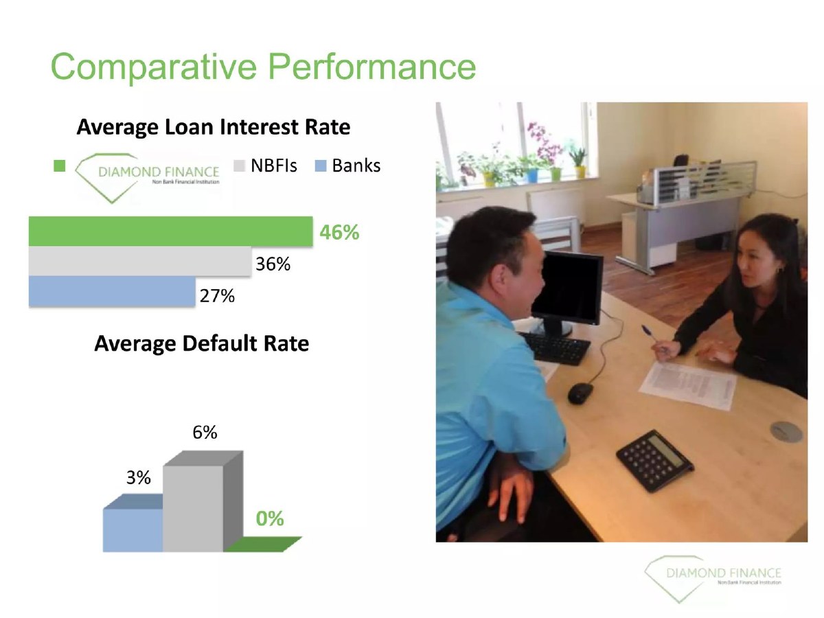
Our analysis: Price and risk on one page is a good habit. But a 0% default rate is the figure investors trust least, because it usually means a small or young book. Paired with the highest interest rate in the comparison, it raises the question of whether losses have not yet appeared.
Evidence and limitation: Directly visible: the six figures above. Not stated: definition of default, period, number or value of loans, portfolio age or the source of the bank and NBFI figures.
What a founder can adapt: If your default rate is zero, say how many loans, how old they are, and how many days late counts as default.
Kut Auto Finance deck, slide 9. Exact stored slide matched to this analysis.
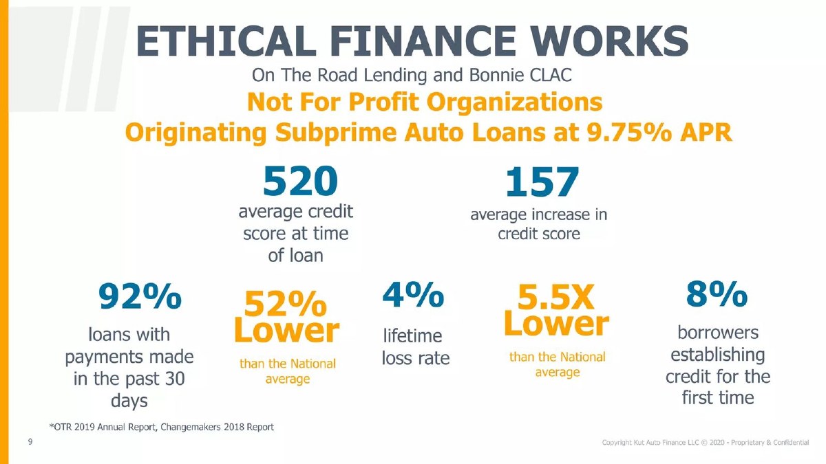
Our analysis: Reference-model evidence: it argues that this kind of lending can work, not that this company's book performs. That is honest when labelled, and the headline names the organisations. A reader skimming the large numbers could still take the 4% lifetime loss rate as the company's own.
Evidence and limitation: Directly visible: all figures describe two named not-for-profit lenders, not Kut Auto Finance's own loans, and are footnoted to their reports. The page does not say which figures the "52% lower" and "5.5X lower" comparisons attach to, or which national average is used.
What a founder can adapt: Put "Results of [partner], not our loans" in the headline, and pair each comparison with the figure it compares.
Supporting analysis
What the deck claims: "Ethical finance works. On The Road Lending and Bonnie CLAC. Not For Profit Organizations Originating Subprime Auto Loans at 9.75% APR." Figures: 520 average credit score at time of loan; 157 average increase in credit score; 92% loans with payments made in the past 30 days; 52% lower than the national average; 4% lifetime loss rate; 5.5X lower than the national average; 8% borrowers establishing credit for the first time. Footnote: "OTR 2019 Annual Report, Changemakers 2018 Report."
Presentation choice: It shows how a pre-launch lender can use outside evidence, and where that evidence stops.
When it does not fit: Don't float multipliers like "5.5X lower" without saying which measure and which average they refer to.
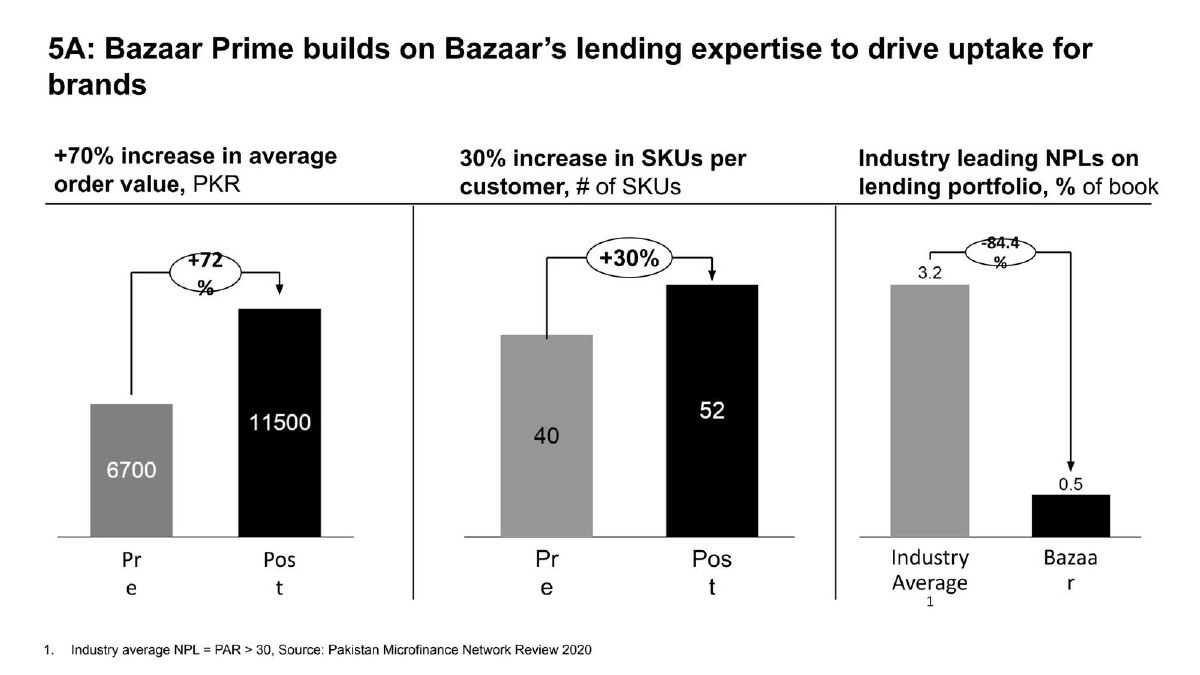
B2B retail marketplace in Pakistan that also lends to retailers. Page 25 is one of three panels on its lending product.
Bazaar deck, slide 25. Exact stored slide matched to this analysis.
Our analysis: The benchmark footnote is the best in this set: an investor can see what the industry figure measures and where it comes from. The gap is on Bazaar's side. Retailer inventory loans tied to orders may be shorter and differently secured than microfinance loans, so the comparison needs Bazaar's own measure and loan term to be like for like.
Evidence and limitation: Our check: (3.2 − 0.5) ÷ 3.2 = 84.375%, which rounds to the printed 84.4%. 11,500 ÷ 6,700 = 1.716, an increase of about 72% (the panel heading rounds it to 70%). 52 ÷ 40 = 1.30. The benchmark is defined and sourced; Bazaar's own NPL definition, period, book size and portfolio age are not stated.
What a founder can adapt: Write one footnote covering both bars: the same days-late test, the period, and the size of your book.
Supporting analysis
What the deck claims: "Industry leading NPLs on lending portfolio, % of book": Industry Average 3.2, Bazaar 0.5, arrow labelled -84.4%. Footnote: "Industry average NPL = PAR > 30, Source: Pakistan Microfinance Network Review 2020." Neighbouring panels: average order value 6,700 to 11,500 PKR (+72%), SKUs per customer 40 to 52 (+30%).
Presentation choice: It shows how much a one-line benchmark footnote adds, and what the same line should say about your own figure.
When it does not fit: Don't compare a short-term, order-linked loan book with a different loan type without saying so.
The five labels a credit-performance figure needs, and which of them each slide provides.
Slide
Measure defined
Loan age shown
Book size
Benchmark defined
Own loans
Fintern p8
Partly (PD/arrears mixed)
Yes (t = 1 to 9)
No
Partly (market PD, unsourced)
Yes
Clearbanc p14
No
No (calendar quarters)
No
None
Yes
Diamond Finance p13
No
No
No
No (unsourced averages)
Yes
Kut Auto Finance p9
Partly (lifetime loss, 30-day payments)
Partly (lifetime)
No
No (unnamed national average)
No (partner results)
Bazaar p25
Industry side only (PAR above 30)
No
No
Yes (source and definition)
Yes
Key Takeaways
Name the measure and its trigger: 30 days late, 90 days late, written off, or net of recoveries. These numbers differ by multiples for the same loans.
Show loan age. Losses rise as loans mature, so a rate on a young book understates final losses; plot by months since lending where you can.
Give the scale: number of loans or amount lent behind the rate. A falling line with no axis values, like Clearbanc's, shows direction only.
Benchmark like for like: same measure, borrower type, product and period. Bazaar footnotes its industry definition but not its own.
Keep borrowed evidence apart. Results from partners or a model you plan to copy are not your loan book; label them as such.
Put losses next to pricing. Diamond Finance charges the highest rate in its comparison; investors will read the default rate against that.
Build your credit-performance slide
Answer each line before you design the chart. A blank is a diligence question waiting to happen.
Measure. Arrears, default, charge-off or net loss after recoveries? At how many days late?
Loan age. How many months has the average loan been outstanding? Can you plot by months since lending?
Scale. Number of loans and total amount lent behind the rate.
Benchmark. Which source, which borrower type, same measure and same period?
Evidence type. Own loans, partner results or planned figures? Say which in the label.
Price. Average rate or yield on the same loans, so losses can be read against income.
Copyable framework: [Measure, days-late test] on [number] loans / [amount] lent since [date], by months since lending; [benchmark] from [source, year] uses the same test. Average rate charged: [x]%.
After: No loan 90+ days late among our [number] loans ([amount]) since [date]; average loan age [x] months. Bank and NBFI figures: [source, year, same 90-day test].
What improved: Built from Diamond Finance's page 13; the bracketed values are placeholders because the slide does not give them. Turns an unverifiable zero into a checkable statement.
Illustrative example 2 — written by us
Before: Loss Rate, 2018-Q1 to 2019-Q1 (no axis)
After: Net loss rate at month 6 after funding, by quarter of funding: [x]% (2018-Q1) to [y]% (2019-Q1), on [amount] advanced.
What improved: Built from Clearbanc's page 14; values are placeholders. Fixing the measurement age stops younger quarters looking better only because they are younger.
Why a lending startup's loss rate needs more labels than other traction
For most startups, revenue is traction. For a lender, revenue is interest and fees, and the real question is how much principal comes back. That makes the loss or default rate the figure an investor checks first, and also the one most easily flattered. A lender growing fast has mostly new loans on its book; new loans have not yet had time to go bad, so any rate calculated on the whole book today will be low.
Regulators and banks therefore define these measures precisely. The Federal Reserve, for example, publishes delinquency rates separately from charge-off rates, and defines a charge-off rate as a bank's net charge-offs (loans written off minus recoveries) during a quarter divided by its average loans outstanding over that quarter. A pitch deck does not need regulatory precision, but it does need to say which kind of figure it shows, because an arrears rate, a default rate and a net loss rate on the same loans can differ several times over. (Board of Governors of the Federal Reserve System)
The seasoning problem, and how a vintage curve solves it
Loans go bad over time. A group of loans made in the same month (a vintage) usually shows few problems in its first months and more as it ages, until losses level off near the end of the loan term. If you report one blended rate across all loans, and most of your loans were made recently, the rate understates where your losses will end up.
The fix is to measure each vintage at the same age and plot the result by months since lending. That is what Fintern's page 8 does: the horizontal axis runs from 1 to 9 (months on book, by our reading; the axis is labelled only "t") and each line shows the cumulative arrears or default rate at that age. An investor can then compare a young lender with a market curve at the same age, rather than comparing a six-month-old book with a market's lifetime figure.
If your book is too young for a curve, say so: give the age of the book and the measure, and avoid presenting the rate as a final loss figure.
Choosing a benchmark an investor will accept
Most lending decks compare their rate with something: banks, other lenders, a national average or a plan. The comparison only works when both sides use the same measure, borrower type and period. Bazaar's page 25 footnotes its industry figure as PAR above 30 days (the share of the portfolio with a payment more than 30 days late) from the Pakistan Microfinance Network's 2020 review, which lets a reader check the benchmark. It does not say whether its own 0.5% uses the same 30-day test, or that its loans to retailers resemble microfinance loans.
Diamond Finance compares its average default rate with banks and non-bank lenders but states no definition, source or period for any of the three. Kut Auto Finance compares its partners' results with an unnamed national average. The pattern to copy is Bazaar's footnote, extended to your own figure: one line saying what both numbers measure, where the benchmark comes from and which period it covers.
Own results, partner results and planned results
Three kinds of evidence appear on these slides and should never be mixed without labels. Own results are your loan book. Partner or reference results come from organisations whose model you follow; Kut Auto Finance's page 9 reports figures for two not-for-profit lenders, footnoted to their 2019 annual report and a 2018 report, under the headline "Ethical finance works". Planned results are what you expected when you set prices; Fintern draws a "50% market_pd" line, which by our reading is a target of half the market's expected default rate.
Borrowed and planned evidence are legitimate. A new lender often has nothing else. But the slide must make the source obvious in the headline or label, not only in a footnote, so the investor does not treat a partner's lifetime loss rate as your traction.
Put losses beside what you charge
A loss rate means little without the income it eats into. A lender charging 46% can afford losses that would sink one charging 10%, and a lender with very low losses may simply be turning away too many applicants. Diamond Finance shows its average interest rate (46%, against 36% for non-bank lenders and 27% for banks) on the same page as its default rate, which is the right instinct: the investor sees price and risk together. What is missing is the cost of funds and the book size that would turn those two rates into a margin.
The fintech business-model guide covers the full income-minus-costs structure for lenders. On the traction slide, the minimum is to put the loss rate next to the yield or average rate on the same loans.
Carry the same loss assumption into your forecast and ask
Investors will compare the loss rate on your traction slide with the loss assumption in your financial model. If the traction slide shows 0.5% of the book in arrears but the forecast assumes 4% lifetime losses, both can be right, because they measure different things at different loan ages, but the deck should say how one leads to the other. If the forecast assumes losses lower than anything you have observed, expect that line to be challenged first.
The same applies to the ask. If part of the raise funds loans rather than operations, state the loss rate you assumed when sizing it and the measure behind that figure. A lender that keeps one definition from traction slide to forecast to use of funds gives an investor a single number to test, instead of three that cannot be reconciled.
Common mistakes
Undefined rate. Arrears, default, charge-off and net loss differ by multiples; name the one you show and its days-late test.
Young book shown as final. A blended rate on recent loans understates eventual losses; show loan age or a seasoning curve.
No scale. A chart with no values or loan count shows direction only.
Mismatched benchmark. Comparing your 90-day default rate with an industry 30-day arrears figure, or a different loan type, flatters you and will be caught.
Borrowed results as traction. Partner or reference-model results belong in a clearly labelled panel, not beside your own metrics.
Forecast and observed on one axis. A predicted default probability and an observed arrears rate are different things; label each line.
Diagnostic checklist
The measure and its days-late test are on the slide.
Loan age is shown, ideally as losses by months since lending.
The number of loans or amount lent is given.
Every benchmark has a source, year and matching definition.
Own, partner and planned figures are labelled separately.
Printed percentages and multiples recalculate from the printed figures.
The loss rate sits beside the rate or yield charged on the same loans.
Frequently asked questions
Should I show default rate or loss rate?
Ideally both, labelled. A default or arrears rate shows how many borrowers stopped paying; a net loss rate shows how much money you did not recover after collections. Investors price the business on net losses, but use arrears as an early warning. (Board of Governors of the Federal Reserve System)
My loan book is only a few months old. What can I show?
Show early arrears by months since lending, state the book's age and size, and avoid calling the figure a loss rate. If you rely on partner or industry results to show the model works, label them as such.
Is a 0% default rate a good thing to show?
Only with context. With no loan count or loan age, investors usually read 0% as a sign that the book is too small or young to have losses yet. Give the numbers that let them judge.
Where should the full vintage table go?
Put one simplified curve on the traction slide and the full vintage table, with definitions, in the appendix or data room. Use the same definitions in both.
How we chose these examples
Discovery (2026-10-04): a slide-first search of the durable corpus index for credit-performance figures (default, loss, charge-off, arrears, NPL and vintage terms). Closest content read: the live fintech traction and fintech business-model guides (the business-model guide names cost of funds and expected losses as cost lines; neither shows or explains a loss-rate slide), the live fintech fundraising page (lists loss rates among metrics investors want, in one sentence) and the drafts on actuals versus forecast, ahead-of-plan traction and contribution margin (Carma's default rate appears only as one input). None teaches how to present and label a lender's credit losses.
Five pages were read from images rendered from the original deck files: Fintern 8 (stored image reused and compared with the original), Clearbanc 14, Diamond Finance 13, C-Corp (Kut Auto Finance) 9 and Bazaar 25 (four new uploads at 1200px wide). All five teardowns are published, none appears in our corpus exclusions, and no removal or deletion request names them. Two pages carry confidentiality labels from the original deck; both decks are published in our library. Bank and listed-lender presentations were excluded. CollateralEdge page 7 (market loss rate only) and Carma page 7 (already used for a different lesson) were set aside.
Figures were checked by recalculation where printed; chart readings are marked as ours, and unlabelled values are not estimated. Company figures are not verified. Before-and-after examples use placeholders where the slide gives no value. Recommendations are our editorial reading, not financial or lending advice. Drafted with AI assistance and checked by an editorial model against the slide images; not reviewed by a person.