Field-Trial Results in an Agtech Pitch Deck: Sites
How farming and growing startups should present yield trials in a pitch deck: what the product was compared with, how many sites and seasons.
Field-Trial Results in Your Pitch Deck: Show Investors the Yield Gain Is Real and Repeatable
Before an agtech startup has much revenue, its strongest traction is often a trial: the crop yielded more, or the same with less fertiliser, or the greenhouse lost fewer plants. Investors know that crop yields swing from field to field and year to year, so a single percentage tells them little until they know what it was compared with, where, how often and how consistently. Four real slides from three companies show the range. Aphea.Bio splits its wheat and maize results by climate zone and adds a win rate. Phospholutions compares its fertiliser with growers' standard practice across two seasons at half the phosphorus. Moleaer shows one grower's greenhouse against the aeration it replaced. This guide shows what each lets an investor judge, where a headline goes further than its chart, and how to build a trial slide that survives the first technical question.
TL;DR
A field-trial slide should answer five questions in this order. What was the product compared with: untreated check strips, the grower's standard practice, or a competing product? Where and when: how many sites, in which regions, across how many seasons? How big was the effect, in the crop's own unit (bushels per acre, tonnes per hectare, kg per square metre) and as a percentage of the comparison? How consistent: the spread across sites or zones and the share of sites where the product won? And what is it worth: the gain multiplied by the crop price, minus the product's cost per acre. Aphea.Bio's wheat slide answers four of these; Phospholutions answers the comparison and seasons well but hides the per-site spread; Moleaer gives a clean comparison at one grower with no repeat.
Four real field-trial slides
Each slide below is shown as it appears in the company's original deck, with what it says, what we checked and what an investor still cannot tell. They run from most to least informative about repeatability.
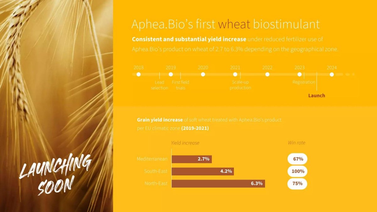
Aphea.Bio traction slide — slide 7
Belgian biostimulant company (microbial products that help crops use nutrients); page 7 of its 13-page deck from the €70M round, the first of two product pages.
Aphea.Bio deck, slide 7. Exact stored slide matched to this analysis.
Our analysis: The most complete trial slide in the set. Splitting by zone and adding a win rate answers the repeatability question better than any average could, and the headline range is honest. Adding the comparison and site counts would make it nearly diligence-ready.
Evidence and limitation: Directly visible: three seasons (2019–2021), three zones, a yield gain and win rate for each, and a headline range that matches the chart exactly. Not stated: the comparison (untreated at the same reduced fertiliser, or full fertiliser), the number of sites per zone, how a win is defined, or whether the three seasons are pooled. The win rates (67%, 75%, 100%) suggest small site counts, since 67% and 75% are typical of three and four trials, but the slide does not confirm this.
What a founder can adapt: Add "vs [comparison], [n] sites per zone; win = treated yield above check" under the chart.
Supporting analysis
What the deck claims: "Aphea.Bio's first wheat biostimulant. Consistent and substantial yield increase under reduced fertilizer use of Aphea.Bio's product on wheat of 2.7 to 6.3% depending on the geographical zone." Timeline: lead selection 2018, first field trials 2019, scale-up production 2021, registration and launch 2023–2024. Chart: "Grain yield increase of soft wheat treated with Aphea.Bio's product per EU climatic zone (2019-2021)": Mediterranean 2.7%, win rate 67%; South-East 4.2%, 100%; North-East 6.3%, 75%.
Presentation choice: It shows how splitting results by region and adding a win rate makes a modest yield gain credible.
When it does not fit: Don't leave the comparison unstated when the claim is "under reduced fertilizer use".
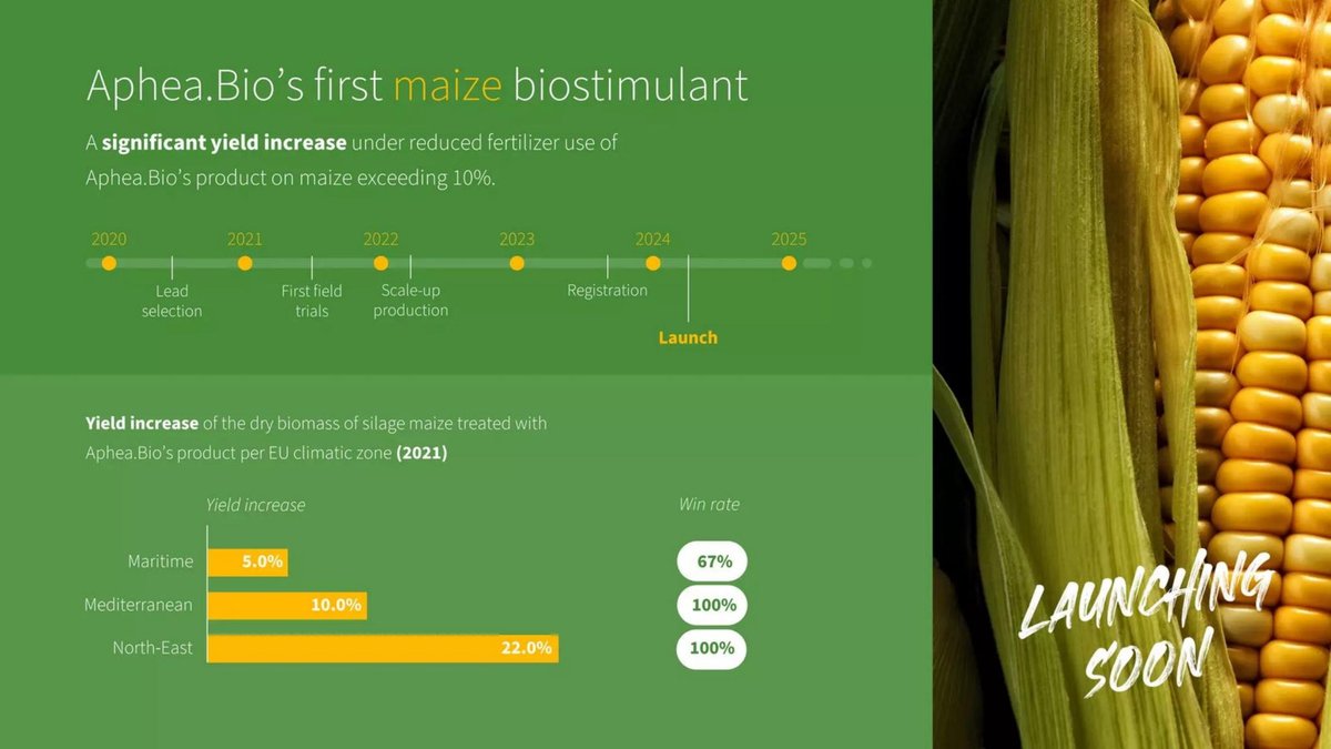
The same deck's second product page, for a maize biostimulant one year behind the wheat product.
Aphea.Bio deck, slide 8. Exact stored slide matched to this analysis.
Our analysis: Placed directly after the wheat page, this shows how a headline can outrun its chart. The chart itself is honest and informative; the sentence above it summarises the best two zones and drops the season count. A reader comparing the two pages will also notice the measure changes from grain to biomass.
Evidence and limitation: Our check: one of three zones exceeds 10% (North-East, 22.0%); one equals it (10.0%); one is half of it (5.0%). The unweighted average of the three is 12.3%, so "exceeding 10%" holds only as an average, and only if the zones carry similar weight, which the slide does not show. All results are from one season (2021), the first year of field trials. The measure also changes from the wheat page: dry biomass of silage maize, not grain yield.
What a founder can adapt: "First-season (2021) silage biomass gain of 5% to 22% by zone, average about 12%."
Supporting analysis
What the deck claims: "Aphea.Bio's first maize biostimulant. A significant yield increase under reduced fertilizer use of Aphea.Bio's product on maize exceeding 10%." Timeline: lead selection 2020, first field trials 2021, scale-up 2022, registration and launch 2024. Chart: "Yield increase of the dry biomass of silage maize … per EU climatic zone (2021)": Maritime 5.0%, win rate 67%; Mediterranean 10.0%, 100%; North-East 22.0%, 100%.
Presentation choice: It shows why a trial headline must match the chart's range and the number of seasons.
When it does not fit: Don't summarise a range with a threshold most zones don't reach.
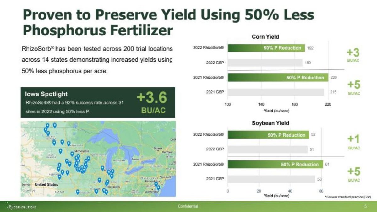
US fertiliser-efficiency company (RhizoSorb, a coating that keeps phosphorus available to roots); page 7 of a 22-page deck.
Phospholutions deck, slide 7. Exact stored slide matched to this analysis.
Our analysis: Strong on the comparison and on scale: grower standard practice, two seasons, two crops, a site map and an Iowa sub-result with a site count. The title claim (same yield at half the input) is well supported; the "increased yields" text claims a little more than modest gains of 1.6% to 2.3% on corn can show. Adding the per-site range and a value per acre would turn a strong slide into a complete one.
Evidence and limitation: Our checks: corn +3 on 189 is 1.6% and +5 on 215 is 2.3%; soybean +1 on 51 is 2.0% and +5 on 56 is 8.9%. The comparison is clear and commercially relevant: half the phosphorus against what the grower normally does. The corn axis starts at 100 bu/acre while the soybean axis starts at 0, so the corn gaps look several times larger than they are. The chart gives averages with no site count or spread per bar; "success rate" is not defined.
What a founder can adapt: Start both axes at zero, print the percentage beside each gain, and add "n sites; range [a] to [b]" per year.
Supporting analysis
What the deck claims: "Proven to Preserve Yield Using 50% Less Phosphorus Fertilizer." "RhizoSorb® has been tested across 200 trial locations across 14 states demonstrating increased yields using 50% less phosphorus per acre." "Iowa Spotlight: RhizoSorb® had a 92% success rate across 31 sites in 2022 using 50% less P", "+3.6 BU/AC". Corn yield (bu/acre): 2022 RhizoSorb 192 vs GSP 189 (+3); 2021 220 vs 215 (+5). Soybean: 2022 52 vs 51 (+1); 2021 61 vs 56 (+5). Footnote: "Grower standard practice (GSP)". A US map of trial sites.
Presentation choice: It shows the most commercially relevant comparison, a yield-neutral input saving, and how a truncated axis changes the reading.
When it does not fit: Don't truncate one chart's axis and not the other's on the same slide.
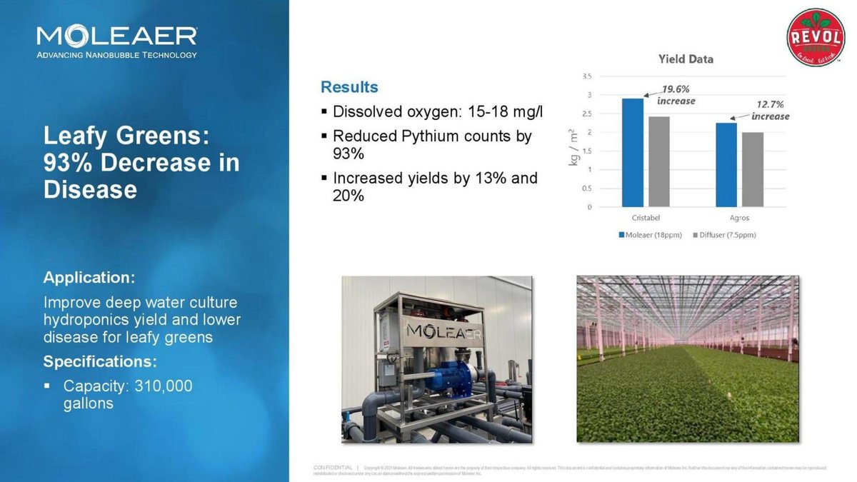
US nanobubble technology company (equipment that dissolves oxygen into water) selling to greenhouses and water users; page 9 of a 13-page deck, one of several application case pages. The Revol Greens logo appears at top right.
Moleaer deck, slide 9. Exact stored slide matched to this analysis.
Our analysis: A clean case study: the comparison, unit and mechanism are all on the page, and the headline matches the chart. Its limit is repeatability: one site and an unknown number of cycles. As a customer result it works well; as proof the effect generalises, it needs a second grower or a cycle count.
Evidence and limitation: Directly visible: a named comparison (the diffuser growers already use), the crop's own unit (kg/m²), two varieties and a mechanism measurement (dissolved oxygen and Pythium, a root disease). The text rounds 12.7% and 19.6% to "13% and 20%", which is fair. Not stated: how many crop cycles, beds or replicates, the trial dates, or whether the comparison ran at the same time in the same greenhouse. It is one grower.
What a founder can adapt: Add "[n] crop cycles, [dates], same greenhouse" and, when available, a second grower's result.
Supporting analysis
What the deck claims: "Leafy Greens: 93% Decrease in Disease." "Results: Dissolved oxygen: 15-18 mg/l. Reduced Pythium counts by 93%. Increased yields by 13% and 20%." "Application: Improve deep water culture hydroponics yield and lower disease for leafy greens." "Specifications: Capacity: 310,000 gallons." Chart "Yield Data" (kg/m²): Cristabel, Moleaer (18ppm) vs Diffuser (7.5ppm), "19.6% increase"; Agros, "12.7% increase". Photos of the unit and the greenhouse.
Presentation choice: It shows a single-customer trial against the incumbent equipment, with the mechanism measured beside the yield.
When it does not fit: Don't present one grower's result as a general yield claim without the cycle count.
The five questions a trial slide should answer, and which each slide covers.
Slide
Comparison
Sites and seasons
Effect size
Spread or win rate
Value per acre
Aphea.Bio p7 (wheat)
Not stated
3 zones, 2019–2021; sites not counted
2.7%–6.3%
Range and win rate by zone
Not shown
Aphea.Bio p8 (maize)
Not stated
3 zones, 2021 only
5%–22%; headline says over 10%
Range and win rate by zone
Not shown
Phospholutions p7
Grower standard practice, half P
200 locations, 14 states; 2021–2022
+1 to +5 bu/ac
Iowa 92% of 31 sites; no spread per bar
Not shown
Moleaer p9
Incumbent diffuser
One grower; cycles not stated
12.7%, 19.6% (kg/m²)
Not shown
Not shown
Key Takeaways
Name the comparison. "Untreated", "grower standard practice" and "previous equipment" answer different questions.
Report the spread, not the best site. Aphea.Bio's wheat range of 2.7% to 6.3% by zone is more credible than a single headline.
Give a win rate and define it: the share of sites or plots where the product out-yielded the comparison.
Count sites and seasons on the slide. One season can be a weather accident; two or more, across regions, is evidence.
Show the gain in the crop's unit and in money. Three bushels per acre of corn is about 1.6%, and worth a specific number of dollars against the product's price.
Make the headline match the chart. Aphea.Bio's maize headline says "exceeding 10%", but only one of its three zones exceeds 10%.
Build your trial line
Answer each prompt before you put a yield figure on a slide.
Comparison. What exactly did the product beat: untreated checks, grower standard practice, or a competitor? At what input rate?
Scale. How many sites, in which regions, with how many replicates, over how many seasons?
Effect. What is the average gain in the crop's unit, and as a percentage of the comparison?
Consistency. What is the range across sites or zones, and at how many sites did the product win? How is a win defined?
Value. At a dated crop price, what is the gain worth per acre, and what does the product cost per acre?
Headline. Does the sentence above the chart match the chart's range and season count?
Copyable framework: [n] sites, [regions], [seasons] vs [comparison]: average +[x] [unit] ([y]%); range [a] to [b]; ahead at [w] of [n] sites. At $[price]/[unit], +$[value] per acre vs $[cost] product cost.
Illustrative example 1 — written by us
Before: A significant yield increase under reduced fertilizer use of Aphea.Bio's product on maize exceeding 10%.
After: First-season (2021) silage maize trials in 3 EU zones vs [comparison]: biomass +5% to +22% by zone, about 12% on average; product ahead in [w] of [n] trials.
What improved: Built from Aphea.Bio's page 8. The range and average are our reading of its chart; the comparison and trial counts are placeholders the slide does not give.
Illustrative example 2 — written by us
Before: RhizoSorb® has been tested across 200 trial locations across 14 states demonstrating increased yields using 50% less phosphorus per acre.
After: At half the phosphorus, corn matched or beat grower standard practice: +3 bu/ac (1.6%) in 2022 and +5 (2.3%) in 2021, across [n] sites; range [a] to [b].
What improved: Built from Phospholutions' page 7. Percentages are our calculation from its chart; site counts and ranges are placeholders.
Why a trial needs more than one number
Yields vary for reasons that have nothing to do with the product: soil differences across a single field, rainfall, planting date, pests, the hybrid or variety planted. Agronomists deal with this by replicating treatments across many strips or plots and randomising where each treatment goes, so that a lucky strip cannot pass for a product effect. Iowa State's guidance on on-farm trials adds that results become most useful when they are shared from many sites within a region and across years, because that is how a grower sees how the product interacts with weather and soil.
An investor reading a trial slide is asking the same thing a grower asks: will this work on fields I haven't seen, in a year I can't predict? A single percentage cannot answer that. A slide that names the comparison, the number of sites and seasons, the spread and the share of sites won gives a reader something to weigh. The slides below are ranked by how much of that they show.
This guide is about presenting trial results honestly on a slide. It is not agronomic advice and does not replace a trial protocol or the statistical analysis in your data room. Regulated products (fertilisers, biostimulants, crop protection) also face registration rules that are outside the scope of this page. (Iowa State University Extension, Integrated Crop Management)
What was the product compared with?
The comparison decides what the result means. Against an untreated check, a gain shows the product does something. Against the grower's standard practice, a gain shows it beats what farmers do today, which is the commercially relevant test. Against a competing product or a previous piece of equipment, it shows a switching reason. Oregon State University's extension guide on farm experiments gives a whole section to the importance of a control for this reason: without a stated baseline, a yield figure has nothing to be measured against.
The three companies here use three different baselines. Phospholutions compares its product with "GSP", defined in the footnote as grower standard practice, and does so while cutting phosphorus by half, so the claim is "same or better yield with half the input". Moleaer compares its nanobubble aeration (18 ppm dissolved oxygen) with a conventional diffuser (7.5 ppm) in the same greenhouse. Aphea.Bio's slides say "under reduced fertilizer use" but do not state the comparison on the page: an investor cannot tell whether the 4.2% is against untreated plots at the same reduced fertiliser rate, or against full fertiliser. Of the three, that is the question most worth adding. (Oregon State University Extension Service)
Sites, seasons and the spread
One field in one year is a demonstration, not a trial. The useful counts are sites (separate fields or farms), replicates within a site (repeated strips or plots), and seasons. Illinois agronomist Emerson Nafziger, writing on farmdoc about on-farm strip trials, puts the problem plainly: a single strip will always yield differently from the strip next to it, so the only way to measure that variability is to apply the same treatment to several strips and compare.
Phospholutions states its scale in text, "tested across 200 trial locations across 14 states", and its chart covers two seasons for two crops. What the chart does not show is how many of the 200 locations sit behind each bar, or how much the result varied between them; the bars are averages with no spread. Aphea.Bio does the reverse: it gives no site count, but splits each crop by EU climate zone and shows a range, which tells the reader the gain is not one lucky region. Moleaer shows one grower and does not say over how many crop cycles.
The strongest presentation combines both: "24 sites in 3 regions, 2 seasons; average +4.1 bu/ac; range −3 to +11; product ahead at 17 of 24 sites." That one line tells an investor the effect is modest, positive on average, and not universal, which is more believable than a single figure. (farmdoc, University of Illinois)
Win rate: useful, but define it
A win rate is the share of sites, plots or trials where the product out-yielded the comparison. It is one of the most useful figures on a trial slide because it answers the grower's real question: if I try this, how likely is it to pay off on my farm? Aphea.Bio prints a win rate beside each zone, and Phospholutions reports a "92% success rate across 31 sites" in Iowa.
Neither defines it on the slide. A win could mean any positive difference, a difference larger than the trial's measurement error, or a gain large enough to cover the product's cost. Those give very different percentages from the same data. Write the definition next to the number ("wins = sites where treated yield exceeded the check"), and give the count as well as the percentage: 67% of three sites and 67% of thirty are very different levels of evidence.
From yield gain to money per acre
Investors and growers both convert yield into money. A gain of 3 bushels per acre of corn is about 1.6% on a 189-bushel baseline; its value is 3 times the corn price, and the grower keeps that only after paying for the product. If the product saves an input instead, as Phospholutions claims with half the phosphorus, the saving per acre belongs on the same line.
None of the four slides makes that conversion on the trial page itself. That is common, because crop prices move, but it leaves the reader to do the sum. Put a dated price and the product's cost per acre in a footnote and show the net figure. If the net gain is small at today's prices, say so and explain what else the grower gets (input savings, lower risk, a sustainability premium), rather than letting a percentage imply more than it pays.
Make the headline and the chart agree
The fastest way to lose a technical investor is a headline stronger than its own chart. Aphea.Bio's maize page says "A significant yield increase … exceeding 10%", while its chart shows 5.0% in the maritime zone, 10.0% in the Mediterranean zone and 22.0% in the north-east. Only one zone exceeds 10%; one equals it. The simple average of the three zones is about 12.3%, which would support the headline only if each zone carried similar weight, and the slide does not say. All three figures also come from a single season (2021). The wheat page, by contrast, states its range plainly: "2.7 to 6.3% depending on the geographical zone".
Phospholutions' title promises "Proven to Preserve Yield Using 50% Less Phosphorus Fertilizer", which its chart supports; the text below adds "demonstrating increased yields", which the chart shows by small margins. Its corn chart starts its axis at 100 bushels per acre, so a 3-bushel difference looks much larger than its 1.6%; the soybean chart beside it starts at zero. Moleaer's text rounds its chart's 12.7% and 19.6% to "13% and 20%", which is fair. Read your headline against your own chart before an investor does.
Worked example: one trial, shown both ways (hypothetical)
This is our illustration, not a figure from any deck. A biological seed treatment is tested against untreated check strips on corn at 24 sites in three US states over two seasons, with three replicated strips per site. The average yield is 199.1 bushels per acre treated against 195.0 untreated: +4.1 bu/ac, or 2.1%. Individual sites range from −3 to +11 bu/ac, and the treatment is ahead at 17 of 24 sites (71%).
Weak version: "Up to 11 bushels more per acre." That is true at one site and misleading as a summary. Strong version: "24 sites, 3 states, 2 seasons vs untreated check: average +4.1 bu/ac (2.1%); range −3 to +11; ahead at 17 of 24 sites. At $4.50 per bushel, +$18.45 per acre against a $12 product cost: about $6.45 net per acre."
The strong version is less exciting and more fundable. It shows the investor that the company knows its effect size, knows its variability and knows what the grower keeps, which is exactly what they will ask about in diligence.
Common mistakes
No stated comparison. A gain against untreated plots and a gain against grower practice mean different things.
Best site as the headline. "Up to" figures describe one field. Lead with the average and the range.
One season presented as proven. Say how many seasons; one year can be weather.
Undefined win rate. Define a win and give the site count beside the percentage.
Truncated axis. Starting a yield axis above zero makes small gains look large.
Headline stronger than chart. A threshold most zones miss is not a fair summary of the range.
Diagnostic checklist
The comparison and its input rate are named on the slide.
Sites, regions and seasons are counted.
The gain is shown in the crop's unit and as a percentage.
The range across sites or zones is shown, not only the average or best result.
A win rate is given with its definition and site count.
The value per acre is shown against the product's cost, with a dated price.
Chart axes start at zero, or the break is marked.
The headline matches the chart.
Frequently asked questions
How many trial sites does an agtech startup need before showing results?
There is no fixed number, but say how many you have. A handful of sites in one season is early evidence and should be labelled as such; results across several regions and at least two seasons are much more persuasive, because yields vary with weather and soil. (Iowa State University Extension, Integrated Crop Management)
Should I compare against untreated plots or grower standard practice?
Grower standard practice is the commercially relevant comparison, because it shows whether the product beats what a farmer does today. Untreated checks show the product has an effect. If you have both, show both and label each. (Oregon State University Extension Service)
What is a win rate in a field trial?
The share of sites or plots where the treated crop out-yielded the comparison. Define it on the slide (any positive difference, or a gain above a threshold) and give the number of sites, because a percentage of three sites is weak evidence.
Is a small yield gain worth showing?
Yes, if it is consistent and pays for itself. A 2% gain that wins at most sites and earns more per acre than the product costs can be a strong business; show the money per acre so investors can see it.
How we chose these examples
Discovery (2026-10-04, runs 41-42): after topic-led and finance-term searches stopped producing candidates, we searched the corpus index for industry-specific measures. Searches for store-level retail measures, insurance loss ratios and freemium conversion returned listed companies or topics already covered. A search for yield-improvement terms returned four startup pages that present field or greenhouse trial results in different ways. Closest content read: the live agtech solution guide (which uses Phospholutions' product page and advises naming the trials, but does not teach trial presentation), the live clinical-evidence guide (health studies), the live paid-pilots guide (commercial pilots) and the mechanism-to-evidence draft (a software retention claim). None teaches comparisons, sites and seasons, spread, win rates or value per acre for yield trials.
Four pages were read from images rendered from the original deck files: Aphea.Bio 7 and 8, Phospholutions 7 (small print read at 300 dpi) and Moleaer 9. All four images were prepared at 1200px wide and uploaded through the standing slide-image workflow, then re-fetched byte-identical. Set aside: CBDS Health / GrowBuddy (one grower's anecdote in a listed-company structure), Phospholutions 10 (margin per acre, a business-model lesson), iFarm 6 and Hacker Unit 2 (claims without trial figures).
Percentages and averages were calculated from the printed figures; where a slide does not define a term, we say so rather than assume. The worked example is hypothetical. Company figures are reported as printed and not verified. This guide explains presentation, not agronomic or investment advice. Slide readings and analysis are an AI editorial model review, not human-checked.