Elevator Pitch Slide: What to Write on Slide Two of a Pitch
What should an elevator pitch slide say? Three real slides show the four answers it needs: what you do, for whom, why it is different, and the proof or ask.
Elevator Pitch Slide: Answer What, Who, Why You and What Proves It in Four Sentences
Many deck templates, including the widely copied accelerator outline that starts with "Vision / Elevator Pitch", put a short pitch on slide two. It is the slide between the cover's one-line description and the detailed problem slide, and it has one job: let a reader who stops here know what the company is and why it is worth a meeting. This guide uses three real elevator pitch slides to show what that paragraph must answer, and the two common ways it goes wrong.
TL;DR
Write the elevator pitch slide as three or four short sentences that answer, in order: what the company does, who it is for, what makes it different, and the strongest proof or the ask. The delivery company in our examples comes close: "3 year-old delivery aggregator company" "with 100%+ annual consecutive growth rates", "seeking $1M in funding", "to expand physical coverage". Next's paragraph clearly says what it does and for whom, but gives no proof or difference. Cogxio's "To be THE UBER for Discover, Meet and Plan." shows the main risk: an analogy and three icons instead of plain answers.
Three elevator pitch slides, read in full
Each slide was rendered from the original deck at full size and read in full. We did not check any figure against the companies' records.
Next executive summary slide — slide 2
Social music discovery app. Slide 2, after the cover.
Next deck, slide 2. Exact stored slide matched to this analysis.
Our analysis: A good description that stops short of a pitch.
Evidence and limitation: Clear what and who; no difference, proof or date.
What a founder can adapt: Add one sentence on what is different and one dated fact.
Supporting analysis
What the deck claims: "ELEVATOR PITCH"; "Next solves the problem of social music discovery by providing a mobile platform that encourages active engagement from musicians and listeners. It gives listeners a fun and engaging way to find music they love and provides artists with an enviroment dedicated to featuring their music."
Presentation choice: Shows the two answers most often missing.
When it does not fit: Describing a hoped-for experience ("fun and engaging") as the benefit.
Last-mile delivery aggregator. Slide 2, after the cover.
Delivery aggregator deck, slide 2. Exact stored slide matched to this analysis.
Our analysis: The most complete of the three.
Evidence and limitation: What, proof, ask and a comparable, in one sentence across five lines; customer not named.
What a founder can adapt: Name the customer and show the sales figure.
Supporting analysis
What the deck claims: "3 year-old delivery aggregator company"; "with 100%+ annual consecutive growth rates, $ M Sales in 2014 and full last-mile couriers IT integration" (figure hidden by a star graphic); "is seeking $1M in funding under $3M pre-money valuation"; "to expand physical coverage and develop SaaS platform"; "concept is proven by British metapack.com (Index Ventures baked, $33M Series B in 2013)".
Presentation choice: Shows all four answers fitting on one slide.
When it does not fit: Growth rates without a base.
Location-based dating app. Slide 2, after the cover.
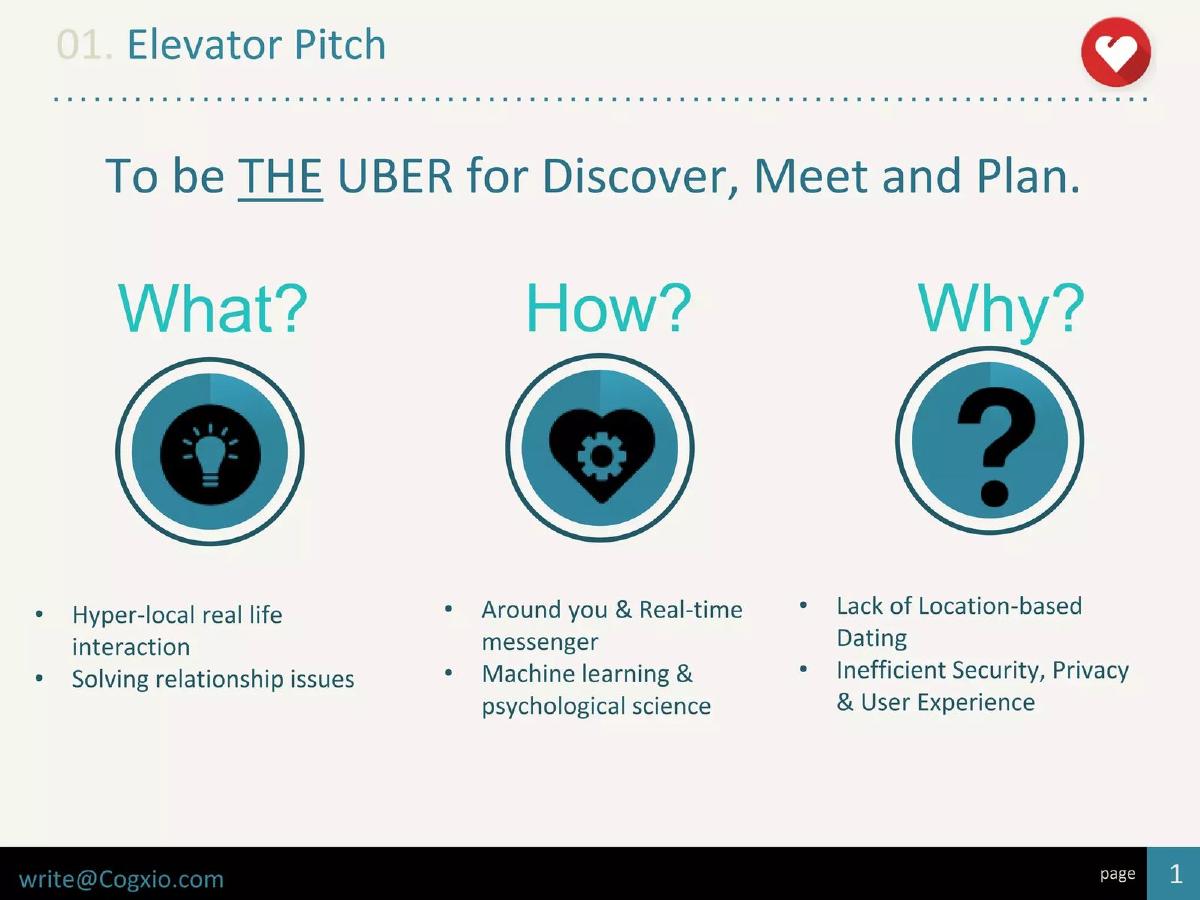
Cogxio deck, slide 2. Exact stored slide matched to this analysis.
Our analysis: The right questions, answered too vaguely.
Evidence and limitation: An ambition slogan and fragments under icons; the word dating appears only in the last column.
What a founder can adapt: Replace the slogan and icons with three plain sentences.
Supporting analysis
What the deck claims: "01. Elevator Pitch"; "To be THE UBER for Discover, Meet and Plan."; What? "Hyper-local real life interaction", "Solving relationship issues"; How? "Around you & Real-time messenger", "Machine learning & psychological science"; Why? "Lack of Location-based Dating", "Inefficient Security, Privacy & User Experience".
Presentation choice: Shows how analogy and icons crowd out plain answers.
When it does not fit: Leading with what you want to become.
What the company does, who it is for, what is different, and proof or ask.
Example
Format
What
Who
Different
Proof or ask
Next
Paragraph
Yes
Yes
No
No
Delivery aggregator
One sentence in lines
Yes
Partly
Partly (comparable)
Yes, both
Cogxio
Slogan and icons
Partly
No
Feature list
No
Key Takeaways
Answer four questions: what, for whom, why different, what proves it.
Use plain words a stranger understands; save analogies for the cover or not at all.
Put your single strongest fact in the paragraph.
Say what you do now, not only what you want to become.
Keep it to the length you could say aloud in 30 seconds.
Write your elevator pitch
Write one sentence for each prompt, then read them aloud in under 30 seconds.
What. In plain words, what does the company do today?
Who. Who uses or pays for it?
Different. What do you do that the usual alternative doesn't?
Proof. What is your single strongest dated fact?
Ask. Do you want to state the amount you are raising here?
Copyable framework: [Company] is a [plain description] for [customer]. Unlike [usual alternative], it [difference]. Since [date], [strongest fact]. We are raising [amount] to [main use].
Illustrative example 1 — written by us
Before: "To be the Netflix of fitness."
After: "Pulse is a subscription app with live strength classes for people over 50. Unlike general fitness apps, every class is led by a physiotherapist. Since launching in May 2025, 1,800 members pay monthly. We are raising $1.5M to add classes for joint recovery."
What improved: Our illustrative rewrite; the company and figures are invented for the example. It replaces an analogy with the four answers.
The question this guide answers
Founders using common templates often ask what goes on the "elevator pitch" slide, and how it differs from the cover and the executive summary. Our cover guide covers the one-line description under the logo. Our executive summary guides cover a full one-page overview with sections for problem, solution, market and team. Our vision guide covers the long-term ambition. None answers what a short paragraph on slide two should contain.
The difference matters. A one-liner can only say what the company is. A full summary repeats the deck. The elevator pitch sits between them: long enough to answer the questions an investor asks in the first minute, short enough to read at a glance. Getting it right means a reader who skims only the first few slides still knows what you do, who it is for and why it might matter.
How we chose and read the examples
We searched saved slide text in the teardown library for slides titled "Elevator Pitch" near the start of the deck. Many decks use the title; we left out teaching decks about how to pitch, decks whose company could not be identified as a real startup, and listed companies. We kept three slides that use three different formats: a prose paragraph, a list of short phrases that reads as one sentence, and an icon grid under a slogan.
The examples are Next (social music discovery app), an unnamed delivery aggregator whose deck is listed as a logistics delivery SaaS deck, and Cogxio (location-based dating app). Each slide was rendered from the original deck at full size and read in full. We did not check any figure against the companies' records. We dropped one further candidate whose deck appears to be a teaching example rather than a real company's deck.
A clear paragraph without proof: Next
Next's slide two carries a small label, "ELEVATOR PITCH", and one paragraph: "Next solves the problem of social music discovery by providing a mobile platform that encourages active engagement from musicians and listeners. It gives listeners a fun and engaging way to find music they love and provides artists with an enviroment dedicated to featuring their music."
This does two of the four jobs well. A reader learns what the product is (a mobile platform for music discovery) and who it serves (listeners and musicians, with a benefit for each). It uses plain words and fits in a single read.
What it leaves out is why Next rather than the many existing ways to find music, and any fact that shows people want it: no user count, no pilot, no launch date. "Fun and engaging" describes a hope, not a result. The misspelling of "environment" is small, but on a slide with one paragraph every word is read. Adding one sentence on what is different and one fact, even a waitlist count with a date, would turn a clear description into a pitch.
A complete pitch in phrases: the delivery aggregator
The delivery company's slide is titled "Elevator Pitch" and lists five lines that read as one sentence: "3 year-old delivery aggregator company"; "with 100%+ annual consecutive growth rates, $ M Sales in 2014 and full last-mile couriers IT integration" (the sales figure is covered by a star graphic in the version we have); "is seeking $1M in funding under $3M pre-money valuation"; "to expand physical coverage and develop SaaS platform that would bridge e-commerce and last-mile"; and "concept is proven by British metapack.com (Index Ventures baked, $33M Series B in 2013)".
This covers all four jobs. What: a delivery aggregator. Proof: three years old, growth above 100% a year, sales in 2014 and an integration with couriers. Ask: $1M at under $3M pre-money. Why it might matter: a comparable British company raised a large round. Writing it as one sentence split into lines makes it easy to read aloud and easy to scan.
What it cannot establish: who the customers are (online shops, couriers or both) is not stated, and "100%+" has no base. The comparison to Metapack shows investors have funded a similar idea, not that this company will succeed. And the slide jumps from a delivery business today to a software platform it plans to build, without saying how the two connect. A reader would want the customer named and the sales figure visible.
A slogan and icons instead of answers: Cogxio
Cogxio's slide is headed "01. Elevator Pitch". Under it: "To be THE UBER for Discover, Meet and Plan." Below are three large icons labelled "What?", "How?" and "Why?", each with two bullets: "Hyper-local real life interaction" and "Solving relationship issues"; "Around you & Real-time messenger" and "Machine learning & psychological science"; "Lack of Location-based Dating" and "Inefficient Security, Privacy & User Experience".
The structure is a sensible idea: what, how and why are the right questions. But the answers are fragments, and the slogan does more harm than good. "THE UBER for Discover, Meet and Plan" asks the reader to work out what Uber has to do with meeting people, and the word "dating" appears only in the third column. A reader finishing the slide may still not know that this is a dating app, who uses it, or whether anyone does yet.
What it cannot establish: any traction or difference beyond the list of features. The icons take most of the space and carry no information. The same content, written as "Cogxio is a dating app that suggests people nearby to meet in person, using [method]. Unlike [alternative], it [difference].", would answer more in less room.
The four answers and the order to give them
Across the three slides, the pattern is clear. The paragraph should answer what the company does, who it is for, what is different, and what proves it or what you are asking for. The order matters: start with the plain description so every later sentence has context, then the customer, then the difference, then the fact or ask that makes the reader want the next slide.
Proof does not have to be revenue. A pilot with a named type of customer, a waitlist with a date, a launch with early usage, or a relevant founder background can all fill the last sentence. What matters is that there is one concrete fact, so the paragraph is not only description.
Vision or elevator pitch: keep them apart
Many templates title this slide "Vision / Elevator Pitch", which invites founders to write an ambition instead of a description. Cogxio's "To be THE UBER" is an example: it says what the company wants to become, not what it is. Put the long-term ambition on its own slide later, or in one closing phrase. Slide two should describe the company as it is today, so the reader understands the rest of the deck.
If you only have room for one, choose the description. Investors can imagine an ambition once they understand the business; they cannot judge a business from an ambition alone.
Do you need this slide at all?
If the cover's one-liner is clear and the next slide is a strong traction or problem slide, a separate elevator pitch slide can be repetitive. It earns its place when the deck will be emailed and skimmed, when the business needs two or three sentences to explain, or when you want the ask stated up front. For a live pitch, the founder usually says this paragraph aloud, and the slide can be shorter or dropped.
Whatever you decide, write the paragraph anyway. It is the same text you will use in an introduction email, on an application form and as the opening of a call, so it should be consistent everywhere.
Testing the paragraph before it goes in the deck
Read the paragraph to someone who does not know the company, then ask them three questions: what does it do, who is it for, and why might it work. If they cannot answer all three in their own words, the paragraph is not doing its job, however polished it sounds. Next's slide would pass the first two questions and fail the third; Cogxio's would struggle with the first.
Then check every claim for a date and a unit. "100%+ annual consecutive growth" needs the starting figure; "3 year-old" needs nothing more. Remove adjectives that the reader cannot check, such as "fun", "revolutionary" or "the most efficient", unless a fact on the same slide backs them. Finally, compare the paragraph with the cover and the next slide, and cut any sentence that only repeats them word for word.
Common mistakes
Analogy instead of description. Say what you do in plain words first.
Ambition instead of today. Describe the company as it is; save vision for later.
No proof. Add one concrete, dated fact.
Icons and fragments. Write full sentences; icons add no information.
Customer left out. Name who uses or pays.
Diagnostic checklist
Says what the company does in plain words.
Names the customer.
States one difference.
Includes one dated fact or the ask.
Can be read aloud in 30 seconds.
Frequently asked questions
How long should an elevator pitch slide be?
Three or four short sentences, roughly what you can say aloud in 30 seconds.
Is it the same as the executive summary?
No. A summary covers every section of the deck; the elevator pitch answers only what, who, why different and what proves it.
Should I include the amount I'm raising?
It can help in an emailed deck, as the delivery company did. Leave it out if the ask slide explains it better.
Can I use an analogy like "the Uber for X"?
Only after a plain description, and only if the comparison is obvious. Otherwise it makes readers do the work.
How we chose these examples
Corpus: published pitch deck teardowns on StartupFundraising.com. Founder-uploaded private decks are excluded.
Selection (2026-10-01): we searched extracted slide text for slides titled "Elevator Pitch" near the start of a deck, excluded teaching decks, decks without an identifiable real company and listed companies, and kept three slides in three formats.
Review: the three slides were rendered from the source decks at full size on 2026-10-01 and read in full against company, deck and page number (editorial model review, with AI assistance in drafting). No figure was checked against company records. No person has yet completed a human editorial review of this draft.