Google Trends on a Pitch Deck: What Search Interest Can
A rising Google Trends line shows growing curiosity, not a market or a lead. Four real slides show how to label search data.
Google Trends on a Pitch Deck: What Search Interest Can and Cannot Prove
A Google Trends chart is one of the easiest pieces of evidence a founder can add to a deck: type a phrase, screenshot the line, and show that interest is rising. Investors see these charts often, and they know their limits. The line is a relative index, not a count of people. It measures curiosity, not spending. And a spike in the last few weeks can come from one news story. This guide uses four real slides to show how to present search data so it supports your argument without claiming more than it shows.
TL;DR
Use search data to show that interest in a problem or category is changing, and label it so the reader knows what the line measures: the exact search term, the country, the period, the date you pulled it, and that 100 means the peak in that window, not 100 searches. Paramark's chart does this well, with labelled events explaining each rise and a footnote tying the term to its product. Cuponomia shows a long rise in one country with the source named, but puts it beside a market-size figure the chart can't support. Sanity Group gives an exact source link and date, then calls a last-week spike proof of being 'the leading brand', which the chart's own average bars contradict. Get Into Nuclear uses absolute monthly searches to make a sharper point, that people don't search for the jobs, but gives no source. Pair search data with a claim it can carry: rising attention, not market share.
Four uses of search data, from a well-labelled trend to an overclaimed spike
Each slide is read at full size. Quotes are exact; chart values are read from gridlines and are approximate.
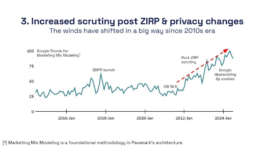
Paramark market slide — slide 12
Marketing measurement software. Why-now slide with an annotated Trends line.
Paramark deck, slide 12. Exact stored slide matched to this analysis.
Our analysis: Direction-of-interest claim with relevance explained; country, pull date and index meaning not stated.
Evidence and limitation: Index roughly 25 to 50 until about 2021, rising to 100 in 2024.
What a founder can adapt: Add country, period, pull date and '100 = peak'; note that events were marked by you.
Supporting analysis
What the deck claims: "3. Increased scrutiny post ZIRP & privacy changes". "Google Trends for Marketing Mix Modeling" with footnote "Marketing Mix Modeling is a foundational methodology in Paramark's architecture". Events marked: GDPR launch, iOS 14.5, Post-ZIRP scrutiny, Google deprecating 3p cookies.
Presentation choice: Shows search data matched to a claim it can carry.
When it does not fit: Implying each marked event caused the rise beside it.
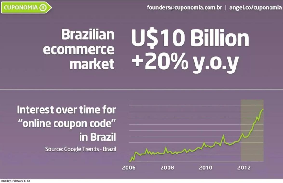
Brazilian coupon site. Market headline over a Trends line.
Cuponomia deck, slide 10. Exact stored slide matched to this analysis.
Our analysis: Relevant demand signal, but paired with an unsourced market figure it cannot support.
Evidence and limitation: Term, country and source named; long window; steep rise from 2012.
What a founder can adapt: Source the market figure separately; check local-language terms.
Supporting analysis
What the deck claims: "Brazilian ecommerce market U$10 Billion +20% y.o.y". "Interest over time for \"online coupon code\" in Brazil, Source: Google Trends - Brazil", 2006 to early 2013, recent period shaded.
Presentation choice: Shows a well-chosen term undermined by its pairing.
When it does not fit: Placing a search index under a market-size headline.
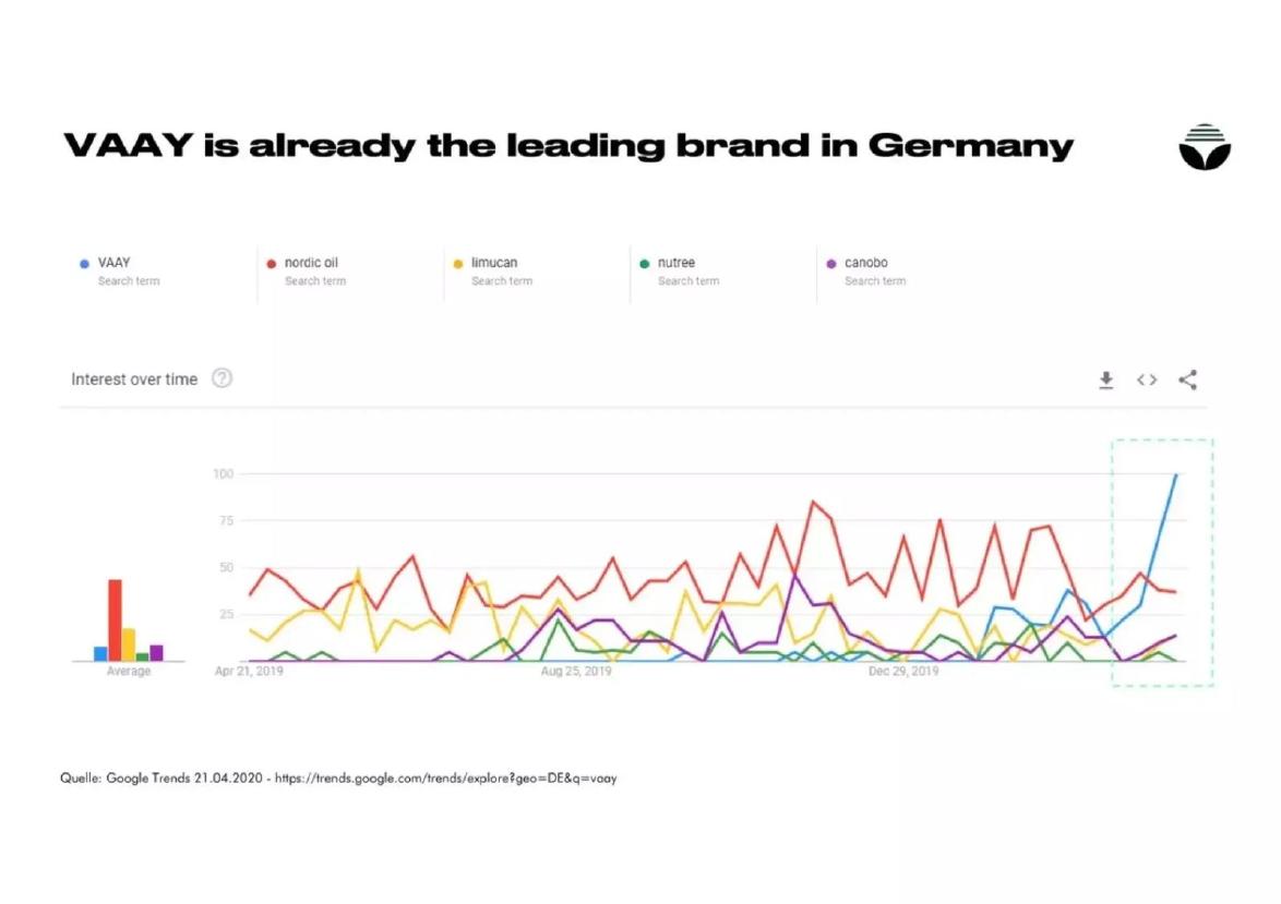
CBD brand VAAY. Trends comparison of five brand terms in Germany.
Sanity Group deck, slide 8. Exact stored slide matched to this analysis.
Our analysis: Exemplary sourcing, but a recent spike is presented as leadership the chart does not show.
Evidence and limitation: VAAY near zero until early 2020, spiking to 100 in the final weeks; average bars show nordic oil highest and VAAY among the lowest.
What a founder can adapt: Headline the surge ('overtook competitors within weeks of launch') and keep the averages visible.
Supporting analysis
What the deck claims: "VAAY is already the leading brand in Germany". Terms: VAAY, nordic oil, limucan, nutree, canobo. "Quelle: Google Trends 21.04.2020 - https://trends.google.com/trends/explore?geo=DE&q=vaay".
Presentation choice: Shows how a headline can overreach a well-sourced chart.
When it does not fit: Calling search interest market leadership.
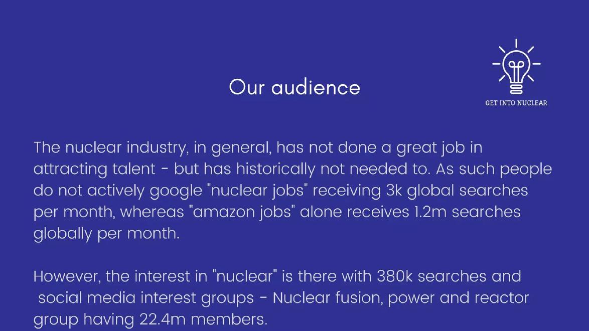
Get Into Nuclear deck, slide 12. Exact stored slide matched to this analysis.
Our analysis: Uses low search volume to support a go-to-market argument; unsourced.
Evidence and limitation: Absolute search counts with a comparison; no tool, date or period for the 380K figure.
What a founder can adapt: Name the keyword tool and date, and give the period for each figure.
Supporting analysis
What the deck claims: "people do not actively google \"nuclear jobs\" receiving 3k global searches per month, whereas \"amazon jobs\" alone receives 1.2m searches globally per month." "the interest in \"nuclear\" is there with 380k searches and social media interest groups ... having 22.4m members."
Presentation choice: Shows search data used to show an absence, not a rise.
When it does not fit: Mixing search counts and group memberships without saying how each was counted.
Labelling, claim made and whether the data supports it.
Example
Term and country
Period and pull date
Claim
Supported by the data
Paramark
Term yes, country no
Period shown, pull date no
Rising interest in its method
Yes
Cuponomia
Yes
Period shown, pull date no
Market size and growth (headline)
No; supports rising interest only
Sanity Group
Yes, with link
Yes
Leading brand
No; supports a recent surge
Get Into Nuclear
Terms yes; 'global'
No
People don't search for nuclear jobs
Plausibly; unsourced
Key Takeaways
A Trends line is relative: 100 is the peak in your chosen window, not a count.
Label term, country, period and the date you pulled the data.
Use search data for direction of interest, not market size or share.
Explain spikes with dated events, or don't lean on them.
Low search volume can be evidence too, if the argument needs it.
Plan your search-data slide
Answer these before you take the screenshot.
Claim. What statement about attention does this support?
Term. Which exact words do your buyers search, in which language and country?
Window. Is the period long enough to tell a trend from a spike?
Label. Have you stated term, country, period, pull date and what 100 means?
Better evidence. Do you have customer data that should go here instead?
Copyable framework: "Searches for '[term]' in [country] rose [about X times] between [start] and [end] (Google Trends, pulled [date]; 100 = peak in period)."
Illustrative example 1 — written by us
Before: "VAAY is already the leading brand in Germany"
After: "VAAY searches overtook every competitor in Germany within weeks of launch (Google Trends, Apr 2019 to Apr 2020, pulled 21.04.2020)"
What improved: Our illustrative rewrite. It keeps the slide's sourcing and claims only what the chart shows.
The question this guide answers
This guide answers one founder question: can I use Google search data on my deck, and if so, how do I present it so investors take it seriously?
Our why-now and market-size guides cover the case for timing and how big a market is. Some published guides show a search chart in passing as part of a problem slide. None explains what search data actually measures, which claims it supports and which it doesn't, or how to label it. That matters because a mislabelled Trends chart is one of the quickest ways to lose a careful investor's trust on an otherwise sound slide.
How we chose and read the examples
We searched extracted slide text across the library for 'Google Trends', 'search volume', 'monthly searches' and similar phrases. There were 25 matches, several of them repeats from different versions of the same deck. We excluded listed-company presentations and kept four slides from private companies that show different uses of search data: Paramark (a category trend explained with events), Cuponomia (a long trend in one country), Sanity Group (a brand comparison) and Get Into Nuclear (absolute search counts). We also rendered Claap's problem slide, but its search chart is a thumbnail too small to read, so we left it out.
Each slide was rendered from its source deck and read at full size. We did not re-run any of the searches in Google Trends or check the figures against other tools. We judge only what each slide shows and how it labels it.
What a Google Trends line actually measures
Google Trends does not show how many people searched. It shows each week's or month's search share for a term, scaled so that the highest point in the chosen window is 100. Every other point is a percentage of that peak. Change the window, the country or the comparison terms and the whole line rescales.
This has three consequences for a deck. First, a line rising from 25 to 100 means interest roughly quadrupled relative to all searches, but it could be from very small numbers. Second, two terms on one chart are scaled to the higher one, so a comparison is fair only within that chart. Third, the last point is often partial or noisy, and a single news story can cause a spike that fades.
Keyword tools that report absolute monthly searches are a different source with different limits: their figures are estimates, they vary between tools, and they rarely say how they were calculated. Either way, the reader needs to know which kind of number they're looking at.
A trend explained with events: Paramark
Paramark's slide is headed '3. Increased scrutiny post ZIRP & privacy changes', with the subtitle 'The winds have shifted in a big way since 2010s era'. The chart is labelled 'Google Trends for Marketing Mix Modeling' with a footnote: 'Marketing Mix Modeling is a foundational methodology in Paramark's architecture'. The line runs from before 2016 to 2024, mostly between 25 and 50 until about 2021, then climbs to 100 in 2024. Four events are marked: 'GDPR launch' at a spike around 2018, 'iOS 14.5', 'Post-ZIRP scrutiny', and 'Google deprecating 3p cookies'. A dashed red arrow traces the rise.
This is search data used well. The claim is about direction: interest in the method Paramark is built on has risen sharply since about 2021. The events give plausible reasons for the rise, and the footnote explains why this term is relevant to the company rather than leaving the reader to guess. The slide doesn't claim the rise is a market size or that Paramark caused it.
Two things would make it stronger. The slide doesn't state the country or exactly when the data was pulled, and the axis label doesn't explain that 100 is the peak, not a count. And the events are labels the company placed on the chart; they're reasonable, but they aren't proof that each event caused the rise next to it. One line, 'Worldwide, Jan 2015 to [month] 2024, 100 = peak; events marked by us', would close both gaps.
A long trend beside a number it can't support: Cuponomia
Cuponomia's slide has two halves. The top states 'Brazilian ecommerce market U$10 Billion +20% y.o.y'. The bottom is a line chart: 'Interest over time for "online coupon code" in Brazil, Source: Google Trends - Brazil', running from 2006 to about the start of 2013, flat and noisy for years and then rising steeply from 2012. The most recent stretch is shaded. The deck page is dated Tuesday, February 5, 2013.
The chart is labelled better than most: it names the term, the country and the source, and the long window shows that the recent rise is unusual, not just a seasonal bump. For a coupon site, rising searches for coupon codes are directly relevant demand evidence, closer to buying intent than most search terms.
The problem is the pairing. The $10 billion market figure and 20% growth have no source on the slide, and the chart below them can't support either number: a search index can't show how big ecommerce is or how fast it grows. Placed together, they invite the reader to treat the line as proof of the headline. The term is also written in English; the slide doesn't say whether Brazilian searches in Portuguese show the same pattern, which an investor familiar with the market would ask.
Separate the two claims. Source the market figure on its own. Use the search chart for what it does show: that searching for coupon codes in Brazil roughly took off in 2012.
A spike presented as leadership: Sanity Group
Sanity Group's slide headline is 'VAAY is already the leading brand in Germany'. Below is a screenshot of Google Trends comparing five search terms: VAAY, nordic oil, limucan, nutree and canobo, from April 21, 2019 to about April 2020. The source line reads 'Quelle: Google Trends 21.04.2020' with the full Trends link, including 'geo=DE'. For most of the year nordic oil is highest, often between 25 and 85. VAAY's line is near zero until early 2020, then rises in the final weeks to 100, inside a dashed box. Bars on the left show each term's average over the year: nordic oil's is by far the tallest, and VAAY's is among the shortest.
The labelling is excellent: exact terms, exact country, exact date pulled and a link anyone can follow. Few deck charts are this checkable.
But the headline claims more than the chart shows. A final-week spike to the window's peak shows that VAAY searches surged very recently, probably around a launch or campaign. It doesn't show leadership. Over the year shown, the chart's own average bars put nordic oil well ahead and VAAY near the bottom. And search interest isn't sales: 'leading brand' would need revenue or unit share, which a Trends chart can't give.
An accurate headline would say what the box shows: 'VAAY searches overtook every competitor in Germany within weeks of launch'. That's still a strong signal and it's one the chart supports. If the surge held, a later pull would be the evidence for leadership in attention, and sales data would be the evidence for leadership in the market.
Low search volume as the argument: Get Into Nuclear
Get Into Nuclear's slide, titled 'Our audience', is text only. It says the nuclear industry 'has not done a great job in attracting talent - but has historically not needed to. As such people do not actively google "nuclear jobs" receiving 3k global searches per month, whereas "amazon jobs" alone receives 1.2m searches globally per month.' It goes on: 'However, the interest in "nuclear" is there with 380k searches and social media interest groups - Nuclear fusion, power and reactor group having 22.4m members.'
This slide does something the others don't: it uses search data to show an absence. Few people search for nuclear jobs, but many are interested in nuclear topics, so a recruiting platform has to reach people who aren't yet looking. That's a coherent go-to-market argument, and the comparison with Amazon jobs, 1.2 million against 3,000, roughly 400 times as many, makes the scale clear.
The gaps are about source. The slide doesn't say which tool produced the monthly figures, when they were pulled, or what period the 380,000 searches for 'nuclear' cover, since unlike the others it isn't described as monthly. The 22.4 million group members is a different kind of figure, a combined membership count that may include duplicates across groups. A source line naming the tool and date, and the period for each figure, would make the argument checkable.
How to put search data on your deck
Choose the claim first. Search data supports statements about attention: interest in a problem is rising, a category is taking off in a country, people aren't searching for a solution yet, your brand searches jumped after launch. It doesn't support market size, revenue, share or willingness to pay.
Pick the term your buyers use. Use the language and wording real customers search, in the right country. If you sell in Brazil, check the Portuguese terms. If the term isn't your product's name, add one line explaining the link, as Paramark's footnote does.
Label the chart fully. Term, country, period, date pulled and what 100 means. If you mark events, say you marked them.
Use a window long enough to show a trend. Several years shows whether a rise is new; a few months can't tell a trend from a news spike. If your point is a recent spike, say so in the headline.
Keep comparisons fair. Comparing brand terms works only for brands with similar naming; a generic brand name collects unrelated searches. Report the averages as well as the latest point.
For absolute counts, name the tool. Keyword-tool estimates differ, so say which you used and when.
When to leave search data out
If your buyers don't search for solutions, as in much enterprise and public-sector selling, search data says little either way and takes space better used for customer evidence.
If your line is flat or falling and your argument doesn't depend on attention, don't include it to fill a market slide. And if you have real customer data, such as signups, waitlist growth or sales, it outranks search interest. Use search data as context, not as your strongest evidence.
What these examples can and cannot show
These four slides show how founders have presented search data and how well the labels and headlines match what the charts show. They cannot show whether the search trends continued, whether any company's market claims are accurate, or whether the slides helped the companies raise money.
We did not re-run any searches or check the figures against Google Trends or keyword tools; Trends data is resampled over time, so a fresh pull of the same terms might not match exactly. Our reading of each chart's values is approximate, from the gridlines as drawn.
Common mistakes
Index read as a count. 100 is the peak in the window, not 100 searches.
Attention read as market. Search interest can't show size, revenue or share.
Spike read as trend. A last-few-weeks jump needs a longer window or a later pull.
Missing labels. Term, country, period and pull date belong on the chart.
Unsourced volumes. Name the keyword tool and date for absolute counts.
Diagnostic checklist
Claim is about attention, not market size.
Exact term, in the buyer's language.
Country and period stated.
Pull date and '100 = peak' noted.
Events marked as your annotation.
Averages shown in brand comparisons.
Frequently asked questions
Is Google Trends good enough evidence for a pitch deck?
For showing that interest is changing, yes, if labelled. For market size or sales, no; use it as context beside stronger evidence.
Should I compare my brand's searches with competitors'?
Only if the brand names are distinctive enough to avoid unrelated searches, and show the averages over the period, not just the latest point.
How we chose these examples
Corpus: published pitch deck teardowns on StartupFundraising.com. Founder-uploaded private decks are excluded.
Selection (2026-10-01): we searched extracted slide text for 'Google Trends', 'search volume', 'monthly searches' and similar (25 matches), excluded listed-company presentations, repeats and unreadable thumbnails, and kept four slides showing different uses of search data.
Review: the four slides were rendered from the source decks at full size on 2026-10-01 and read in full against company, deck and page number (editorial model review, with AI assistance in drafting; not human-reviewed). No search was re-run and no figure was checked against Google Trends or keyword tools.