Insurtech Traction Slide: Premiums, Revenue and Loss Ratio
Which traction numbers an insurance startup should show depends on whether it carries risk, runs an MGA or distributes for a carrier.
Insurtech Traction Slide: Which Metrics Fit an Insurer, an MGA or a Broker
Seven slides from six insurance startups' pitch decks: Alan, Pineapple, Faye, Angle Health, Koffie and Inshur. For each, we record which business the company runs (insurer, managing general agent or distributor), which premium or revenue figure the slide shows, whether a loss ratio appears and on what basis, and what the slide leaves unknown.
TL;DR
Start by saying which kind of insurance business you are, because that decides which numbers are yours. Premiums written (often called gross written premium, or GWP) are what policyholders pay for the policies you sell. They are never simply your revenue. An insurer keeping the risk books premium as revenue as it is earned over each policy's term, so written premium runs ahead of revenue; reinsurance ceded reduces it further. A broker, distributor or managing general agent (MGA, a company that sells and often underwrites policies on a licensed insurer's behalf) earns a share of those premiums, as commission or a fee. So an MGA or broker should show premiums written as the measure of volume, its own revenue or take rate (revenue divided by premiums) as the measure of what it earns, and the period for both. A loss ratio (claims divided by premiums for the same policies and period) matters most when you carry the risk or when your pay depends on how the policies perform, and it is only meaningful when the slide says which claims, which premiums and which period.
The slides here show each piece. Alan's page 21 sets its own health insurance, where gross margin is "based on claims / premium ratio", beside a protection product it distributes for the insurer CNP, where it says "No Loss Ratio risk at this stage". Pineapple's page 16 states its pay as "15% GWP" and the carrier's underwriting profit as capped at 15%. Faye's page 6 defines take rate as "Rev/GWP" and lists it next to loss ratio, with every value redacted. Angle Health's page 7 shows "Annualized Premiums" in its bullets but charts "Annual Revenue Run Rate", defined in a footnote as monthly gross revenue times 12, and lists loss ratios for 2021 and 2022 year to date with the values left blank. Koffie charts premiums written by month with no axis values and compares its first 12 months with Lemonade, Root and others from statutory filings, S-1s and estimates. Inshur describes itself as a "capital light MGA+TPA" and gives no figures on that page.
Insurance traction slides from real pitch decks
Each example records the company's role, which premium or revenue figure the slide shows, whether a loss ratio appears and on what basis, and what to copy or avoid. "Our calculation" marks arithmetic we did; the slides do not show it.
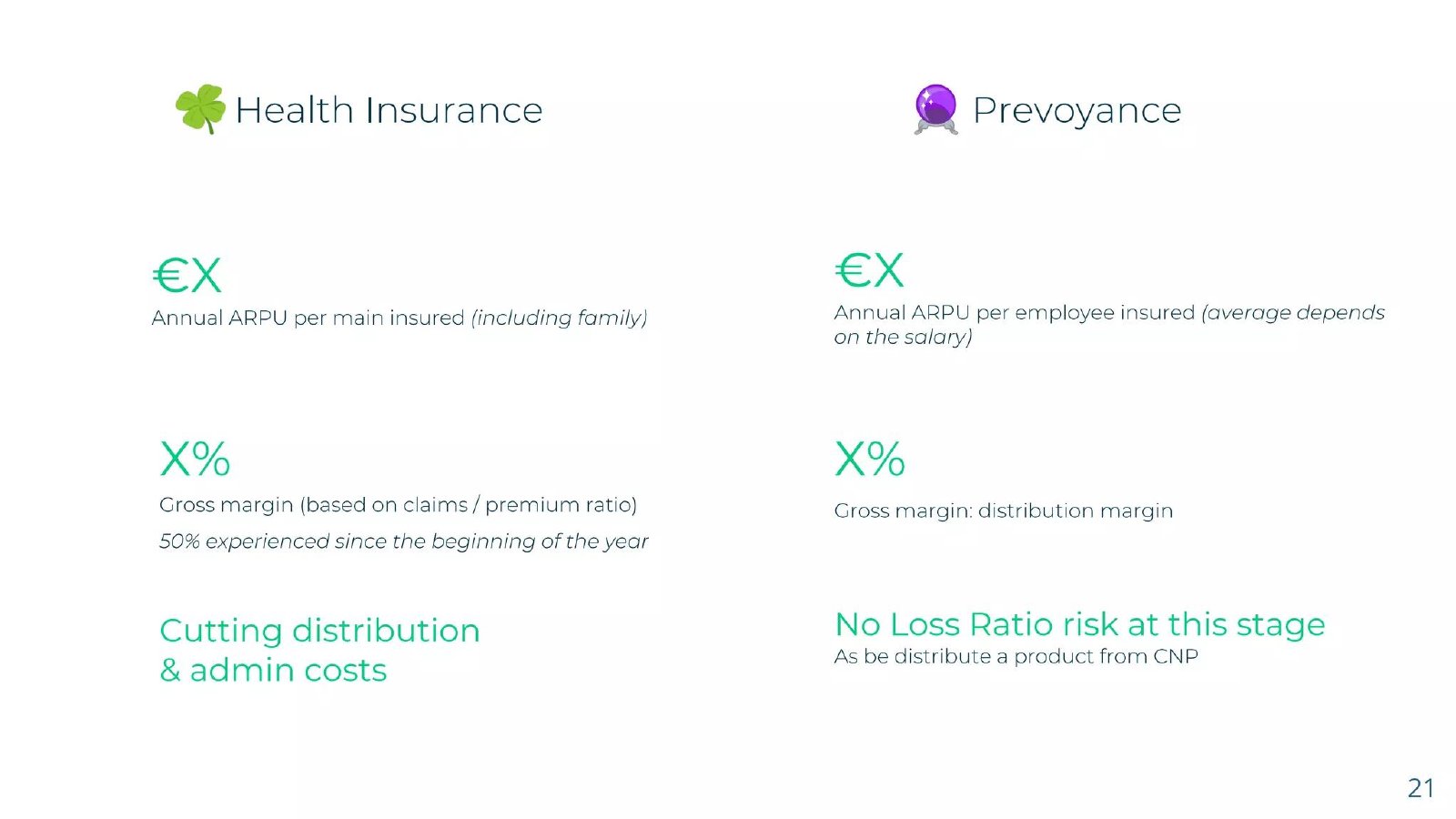
Alan traction slide — slide 21
French health insurer, 2017 Series A deck. Own health product beside a distributed CNP product.
Alan deck, slide 21. Exact stored slide matched to this analysis.
Our analysis: The slide separates the risk Alan carries from the product it only distributes.
Evidence and limitation: Values are placeholders; the 50% has no stated base or definition.
What a founder can adapt: Say what the 50% measures and on what premium base.
Supporting analysis
What the deck claims: Health: €X ARPU, X% gross margin "based on claims / premium ratio", "50% experienced since the beginning of the year". Prevoyance: €X ARPU, X% "distribution margin", "No Loss Ratio risk at this stage".
Presentation choice: It tells the reader which margin depends on claims and which does not.
When it does not fit: Don't leave a key percentage without its label.
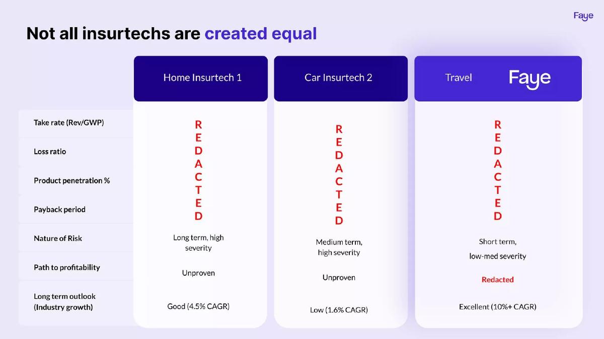
U.S. travel insurance, $10M Series A deck. Comparison with two unnamed insurtechs.
Faye deck, slide 6. Exact stored slide matched to this analysis.
Our analysis: Definitions survive the redaction.
Evidence and limitation: Every performance figure is redacted; peers are unnamed.
What a founder can adapt: Keep the definitions; give the period for each figure in the full version.
Supporting analysis
What the deck claims: Rows: take rate (Rev/GWP), loss ratio, product penetration, payback period — all redacted; nature of risk short term, low-med severity for travel; industry growth 4.5%, 1.6% and 10%+ CAGR.
Presentation choice: The reader knows exactly how take rate is calculated.
When it does not fit: Don't compare loss ratios across lines without the period and risk length.
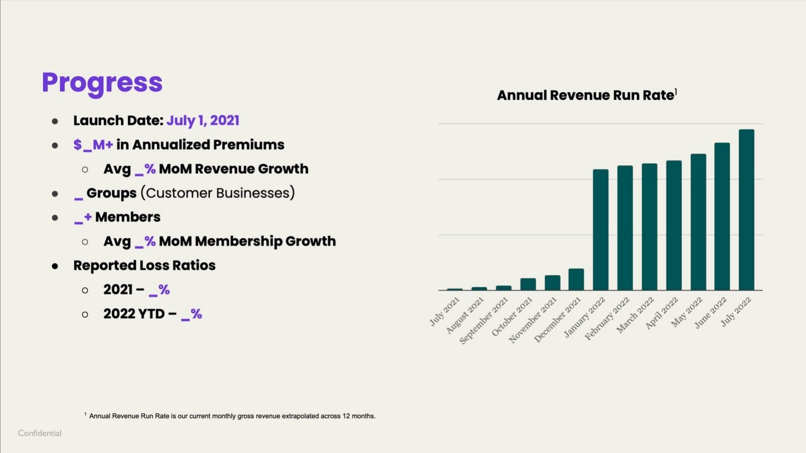
U.S. employer health plans, launched July 2021. Progress page; values blank in this copy.
Angle Health deck, slide 7. Exact stored slide matched to this analysis.
Our analysis: Good structure for loss ratio periods; premiums and revenue not reconciled.
Evidence and limitation: No values; chart has no axis figures. Bars step up sharply in January 2022.
What a founder can adapt: Say whether annualized premiums equal revenue, and name the run-rate month.
Supporting analysis
What the deck claims: "$_M+ in Annualized Premiums"; groups, members and MoM growth; "Reported Loss Ratios 2021 – _%, 2022 YTD – _%"; chart of Annual Revenue Run Rate, footnoted as monthly gross revenue × 12.
Presentation choice: Named periods and a defined run rate make the figures checkable once filled in.
When it does not fit: Don't headline premiums and chart revenue without linking them.
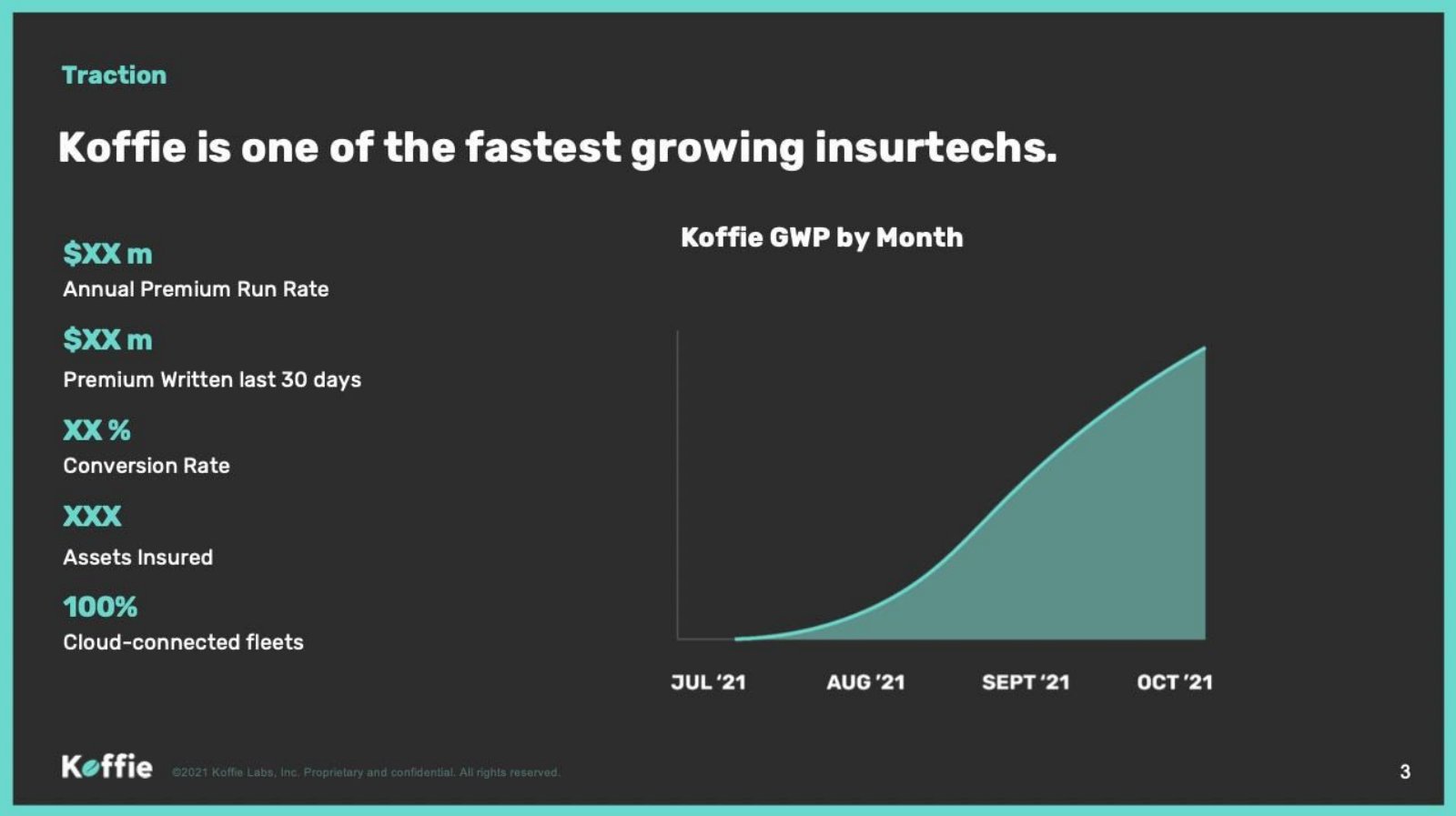
U.S. trucking insurance, 2021 deck. Traction page; values masked.
Koffie deck, slide 3. Exact stored slide matched to this analysis.
Our analysis: Sound premium metrics with a dated window.
Evidence and limitation: No values or axis figures; role (insurer or agent) not stated.
What a founder can adapt: State the role and show revenue beside premiums.
Supporting analysis
What the deck claims: "$XX m Annual Premium Run Rate"; "$XX m Premium Written last 30 days"; conversion rate; assets insured; GWP by month, July to October 2021.
Presentation choice: Last-30-days premium is measured and dated.
When it does not fit: Don't leave the reader guessing how much premium becomes revenue.
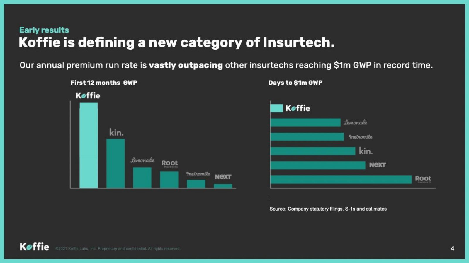
Koffie deck, slide 4. Exact stored slide matched to this analysis.
Our analysis: Days to a premium milestone is a fair idea; the peer set is not like for like.
Evidence and limitation: No values; Koffie's own premiums start in July 2021, so its 12-month figure cannot be fully measured.
What a founder can adapt: Compare the same measured period and mark each estimate.
Supporting analysis
What the deck claims: "First 12 months GWP" and "Days to $1m GWP" bars for Koffie, Kin, Lemonade, Root, Metromile and Next; source: "Company statutory filings, S-1s and estimates".
Presentation choice: Different launch years, lines and roles, with filings and estimates mixed.
When it does not fit: Don't set a projected first year against peers' actual results.
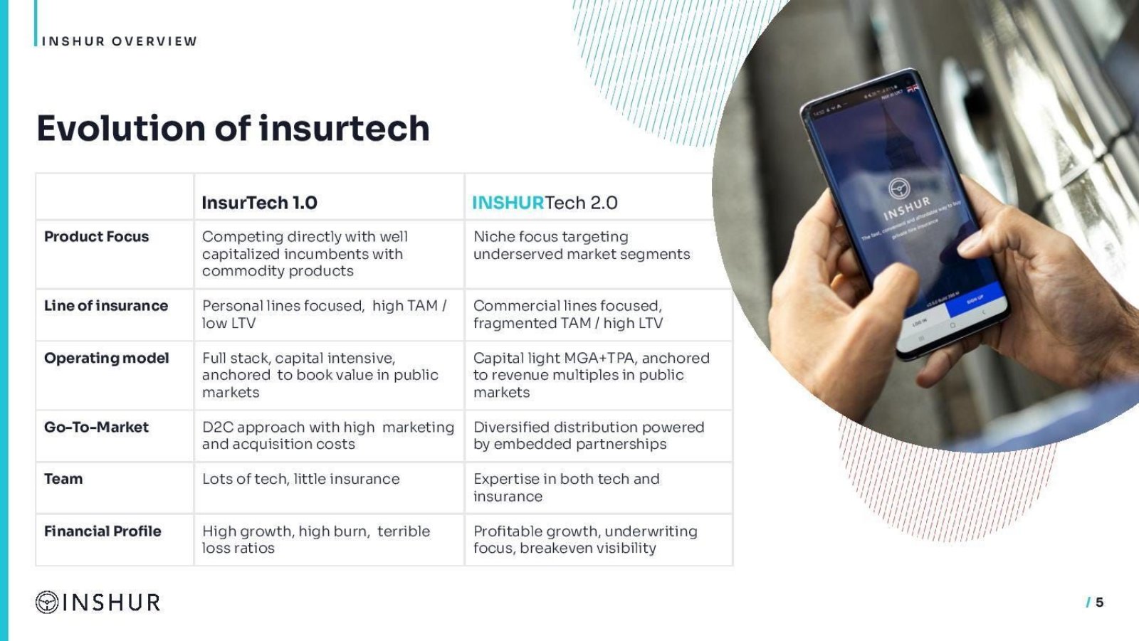
Commercial insurance for ride-hail drivers. Series B deck; positioning page.
Inshur deck, slide 5. Exact stored slide matched to this analysis.
Our analysis: A clear self-description of role.
Evidence and limitation: No figures; the loss ratio remark describes other insurtechs.
What a founder can adapt: Follow with premiums placed, revenue and take rate for a stated period.
Supporting analysis
What the deck claims: "Capital light MGA+TPA, anchored to revenue multiples" versus "Full stack, capital intensive"; "Profitable growth, underwriting focus" versus "terrible loss ratios".
Presentation choice: Tells the reader to judge Inshur on fees and premiums placed.
When it does not fit: Don't claim an underwriting edge without a loss ratio to back it.
Columns report what each slide states or leaves out; checks are our calculations.
Example
Role stated
Premium figure
Revenue figure
Loss ratio
Alan p21
Insurer and distributor
No
ARPU (placeholder)
Basis named; distributed product has none
Pineapple p16
Agent with carrier
No totals
15% of GWP
Carrier's profit capped at 15%
Faye p6
Not on this page
Redacted
Take rate defined, redacted
Redacted
Angle Health p7
Implied insurer
Annualized premiums (blank)
Run rate, defined
2021 and 2022 YTD (blank)
Koffie p3
Not stated
Run rate, last 30 days (masked)
No
No
Koffie p4
Not stated
First-year GWP vs peers
No
No
Inshur p5
MGA + TPA
No
No
Mentioned for peers only
Key Takeaways
Name your role first. Alan's page 21 separates the product where it carries claims from the one it distributes for CNP.
Premiums written are volume, not revenue. Pineapple's slide states its pay as 15% of GWP, so its revenue is a fraction of the premiums it sells.
Define take rate. Faye's "Rev/GWP" label tells the reader exactly how it is calculated, even with the values redacted.
Keep premiums and revenue apart on one slide. Angle Health's bullets give premiums while its chart shows revenue run rate.
A loss ratio needs a basis: which claims, which premiums, which period. Angle Health's 2021 and 2022 YTD split is the right structure.
Compare like with like. Koffie's first-12-month premiums against companies that launched years earlier, from mixed sources, is not a like-for-like test.
Build your insurance traction line
Fill in each field for one stated period. Mark any estimate or projection on the slide.
Role. Insurer, MGA, broker or a mix, and for which products?
Premiums. Premiums written (gross, and net if you are the insurer) for which period?
Revenue. Your revenue for the same period, and the take rate or commission rate?
Breadth. Policies in force, customers or members, insured assets?
Loss ratio. If you carry or share risk: incurred over earned, which policies, which period, as of when?
Comparisons. Same measure, same period from launch, source for each peer?
Copyable framework: [Role] for [line]. [Period]: [premiums] premiums written, [revenue] revenue ([take rate]% take rate), [policies] policies in force. Loss ratio [x]% (incurred over earned, policies written [period], as of [date]) — or: claims risk carried by [insurer].
Illustrative example 1 — written by us
Before: $XX m Annual Premium Run Rate
After: MGA for small trucking fleets. October 2021: $[X]M premiums written (run rate $[12X]M), $[Y]K commission revenue ([Y/X]% take rate); risk carried by [insurer].
What improved: Our illustrative rewrite of Koffie's line; all values are placeholders. It states the role, links premiums to revenue and names the month behind the run rate.
Insurer, MGA or distributor: why the role decides the metrics
Insurance startups use the same words for different businesses. An insurer (also called a carrier) holds a licence, collects premiums, keeps the money set aside for claims and pays them. Its revenue is the premium it earns over the life of each policy, and its main cost is claims. A managing general agent sells policies on behalf of an insurer and often has authority to price them, approve them and handle claims, but the insurer's balance sheet carries the risk. A broker or distributor sells another company's policy and takes a commission. Some startups are more than one of these at once, or move from one to another as they grow.
The role decides what the traction slide should lead with. For an insurer, premiums written and the claims they produce are both its own numbers, so an investor will ask for premiums, earned premium, loss ratio and the expenses on top. For an MGA or distributor, the premiums belong to the insurer, and the startup's revenue is its commission or fee. Showing only premiums makes the business look many times larger than its revenue. Showing only revenue hides how much business the startup actually places, which is what insurers and investors use to judge distribution strength.
The honest structure, then, is volume plus share. Premiums written for a stated period, the startup's revenue for the same period, and either the take rate or the commission rate that links them. Where the startup's pay changes with claims, through a profit commission or a share of underwriting profit, the loss ratio becomes part of its revenue story too, and the slide should say so.
Slides that state the role and how the startup is paid
Alan's page 21, from its 2017 Series A deck, has two columns. Under "Health Insurance", the product it underwrites itself, it shows "€X Annual ARPU per main insured (including family)", "X% Gross margin (based on claims / premium ratio)" with the note "50% experienced since the beginning of the year", and "Cutting distribution & admin costs". Under "Prevoyance" (French workplace protection cover such as disability and death benefits), it shows "€X Annual ARPU per employee insured (average depends on the salary)", "X% Gross margin: distribution margin", and "No Loss Ratio risk at this stage — As be distribute a product from CNP" (the slide's own wording). The main values are placeholders in this copy. What the slide gets right is the split: where Alan carries the claims, it measures margin through the claims-to-premium ratio; where it only distributes, it says its margin is a distribution margin and that the claims risk is not its own. The one thing an investor would ask is what the 50% refers to. The note sits under the claims-based margin and reads as a margin or ratio experienced so far that year, but the slide does not say whether it is the margin or the claims ratio, and it gives no premium base.
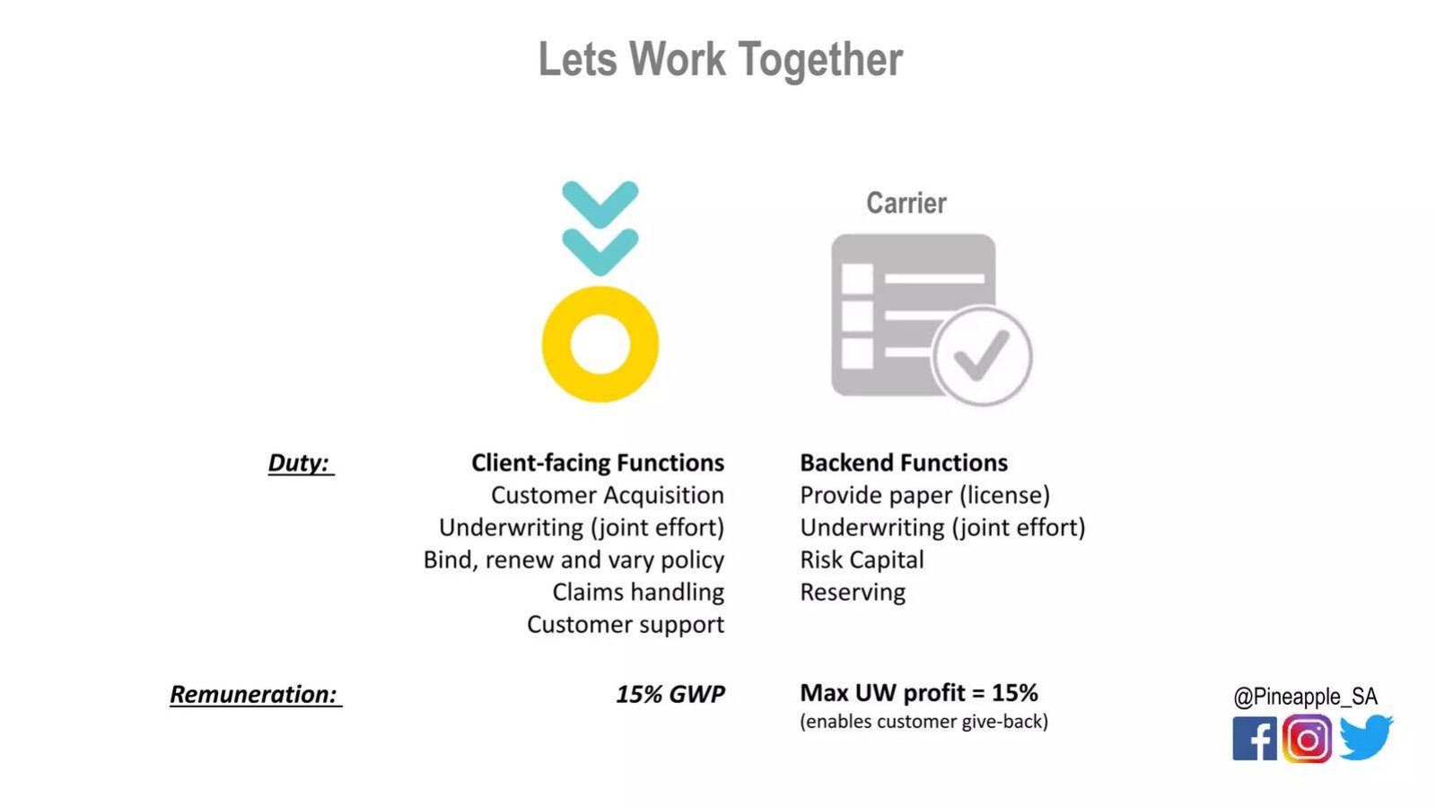
Pineapple's page 16, "Lets Work Together", is from a South African startup's deck for an insurer innovation award. It splits duties between Pineapple and a carrier. Pineapple takes "Client-facing Functions": customer acquisition, underwriting (a joint effort), binding, renewing and varying policies, claims handling and customer support. The carrier takes "Backend Functions": providing the licence ("paper"), joint underwriting, risk capital and reserving. Under "Remuneration" it shows "15% GWP" for Pineapple and "Max UW profit = 15% (enables customer give-back)" for the carrier. That is unusually clear. It tells the reader that Pineapple's revenue is 15% of the premiums it writes, so premiums are the volume and 15% is the take rate. Our calculation, for illustration only: every 1,000 rand of premiums written would give Pineapple 150 rand. The slide does not show any premium totals, so it describes the model rather than traction.
Inshur's page 5, "Evolution of insurtech", from the deck behind a $19 million round that Business Insider reported in October 2024, is a two-column comparison of "InsurTech 1.0" and "INSHURTech 2.0". Under operating model it describes the older group as "Full stack, capital intensive, anchored to book value in public markets" and itself as "Capital light MGA+TPA, anchored to revenue multiples in public markets". Under financial profile it says "High growth, high burn, terrible loss ratios" against "Profitable growth, underwriting focus, breakeven visibility". The page carries no figures, so it shows nothing about Inshur's performance. Its value here is the self-description: by calling itself an MGA and third-party administrator (a firm that handles claims and policy administration for an insurer), Inshur tells an investor to read its numbers as fees and commissions on premiums placed with insurers, not as an insurer's premiums and claims. A traction slide that follows this page should show exactly that.
Premiums and revenue on the same slide
Faye's page 6, "Not all insurtechs are created equal", from its $10 million Series A deck, compares "Home Insurtech 1", "Car Insurtech 2" and Faye in travel across seven rows: "Take rate (Rev/GWP)", "Loss ratio", "Product penetration %", "Payback period", "Nature of Risk", "Path to profitability" and "Long term outlook (Industry growth)". The first four rows are covered by a large "REDACTED" in each column. The visible rows describe the risk as "Long term, high severity" for home, "Medium term, high severity" for car and "Short term, low-med severity" for travel, give path to profitability as "Unproven", "Unproven" and "Redacted", and long-term industry growth as 4.5%, 1.6% and "10%+" CAGR. The redaction removes every figure an investor would test. The useful part that survives is the label: take rate is defined on the slide as revenue divided by GWP, so anyone reading the unredacted version knows exactly what was divided by what. The comparison also sets loss ratio beside the nature of the risk, which is the right context: a short-term, lower-severity line can be expected to settle claims faster than home or car, but the slide cannot show that Faye's ratio is better without the values.
Angle Health's page 7, "Progress", is from the deck behind a $58 million raise Business Insider reported in January 2023. It lists "Launch Date: July 1, 2021", "$_M+ in Annualized Premiums", "Avg _% MoM Revenue Growth", "_ Groups (Customer Businesses)", "_+ Members", "Avg _% MoM Membership Growth" and "Reported Loss Ratios: 2021 – _%, 2022 YTD – _%". The right-hand chart, "Annual Revenue Run Rate", runs monthly from July 2021 to July 2022 with no axis values; its footnote says "Annual Revenue Run Rate is our current monthly gross revenue extrapolated across 12 months". Every number is blank in this copy. The structure, though, shows two things worth copying and one to fix. Worth copying: the loss ratio is given for two named periods, a full year and a year to date, rather than as a single undated figure, and it is called "reported", which signals it comes from filed or accounting figures. Also worth copying: the run-rate footnote states the calculation. To fix: the bullets lead with annualized premiums and the chart shows annualized revenue, and the slide does not say whether they are the same thing. For a company that underwrites its own health plans, premiums may well be most of its revenue, but the reader has to assume it.
The chart shape adds a caution. Read from the bars, run rate jumps sharply between December 2021 and January 2022, which fits employer health plans renewing on 1 January. A monthly run rate taken in a renewal month will look very different from one taken mid-year, so the month behind the run rate matters as much as the formula.
Premium growth charts and comparisons with other insurers
Koffie's page 3, "Traction", from its 2021 deck (Business Insider reported its Series A in July 2022), is headed "Koffie is one of the fastest growing insurtechs." Its left column lists "$XX m Annual Premium Run Rate", "$XX m Premium Written last 30 days", "XX % Conversion Rate", "XXX Assets Insured" and "100% Cloud-connected fleets". The chart, "Koffie GWP by Month", rises from July to October 2021 with no axis values. The metric choice is sound for a company placing trucking insurance: premiums written in the last 30 days is a dated, measured figure, the run rate annualises it, and assets insured counts trucks covered. With the values masked, the slide establishes only the shape of growth over four months. It does not say whether Koffie is the insurer or places the policies with one, so the reader cannot tell how much of the premium becomes Koffie's revenue.
Koffie's page 4, "Early results", is headed "Koffie is defining a new category of Insurtech" and says "Our annual premium run rate is vastly outpacing other insurtechs reaching $1m GWP in record time." Two bar charts with no values compare "First 12 months GWP" for Koffie, Kin, Lemonade, Root, Metromile and Next, and "Days to $1m GWP" for the same group, with Koffie the tallest and the shortest bar. The source line reads "Company statutory filings, S-1s and estimates." The idea of measuring days to a premium milestone is a fair way to show early speed. The comparison has three problems an investor will spot. First, Koffie had been writing premiums for only a few months when the deck was made (its own page 3 chart starts in July 2021), so its "first 12 months" figure must be partly projected or annualised. Second, the peers launched in different years, in different lines (home, car, small business) and with different roles, so their first-year premiums are not like for like. Third, the source line mixes filings with estimates without saying which figures are which. A fairer version would compare the same measured period, name the source for each bar, and mark any estimate.
The general lesson is that premium comparisons across insurers need the same definition (written or earned, gross or net of reinsurance), the same period from launch, and the same line of business where possible. If any of those differ, say so on the slide.
When a loss ratio belongs on the slide, and what it needs
A loss ratio is claims divided by premiums. The version most investors expect is incurred claims (paid plus reserves for claims not yet paid) over earned premiums (the part of each policy's premium that relates to the period already passed), for the same policies and the same period. A young book of policies usually shows a low ratio at first because many claims have not been reported yet, and the ratio rises as those claims come in. That is why the period and the basis matter more than the number itself.
The slides here show when it belongs. Alan measures its own health insurance through claims against premiums and states plainly that its distributed product carries no loss ratio risk. Angle Health, underwriting its own plans, lists reported loss ratios by year. Pineapple's carrier keeps underwriting profit capped at 15%, which means the loss ratio decides how much is left for the customer give-back, so it matters to Pineapple's customers even though Pineapple is paid on premiums. Faye puts loss ratio in a comparison table but redacts it. Inshur uses "terrible loss ratios" to describe other insurtechs, not to report its own.
If you are an insurer, or your pay depends on claims, show the loss ratio with its basis: "Loss ratio 62% (incurred claims over earned premium, policies written January to December 2023, as of March 2024)". If you are a pure distributor, it is honest to say the ratio is not your risk, as Alan does, and point investors to the measures that are yours: premiums placed, commission rate, renewal rate and cost to acquire a policyholder. Do not quote a loss ratio without the period, and do not compare a few months of a new book with a mature insurer's full-year figure.
How to build an insurtech traction slide
Put your role in the slide's subtitle or footnote: insurer, MGA, broker or a mix, and for which products. Then give volume and share for the same period: premiums written (gross, and net of reinsurance if you are the insurer) and your revenue, with the take rate or commission rate that links them. If you show a run rate, define it, as Angle Health does, and name the month it is based on.
Add the counts that show breadth: policies in force, customers or members, and, for commercial lines, the insured assets or employers. Add renewal or retention if you have a full year of policies. If you carry risk or share in it, add the loss ratio with its basis and periods. If you compare yourself with other insurers, use the same measure and period, name the source for each, and mark estimates.
If you must hide figures, keep the definitions visible. Faye's redacted table still tells a reader how take rate is calculated, and Angle Health's blanked bullets still show which periods the loss ratio covers. Those labels are what allow an investor to ask for the numbers in a data room and know what they are receiving.
Common mistakes
Premiums shown as revenue. If you are paid a share, show both and the rate that links them.
Role not stated. Say whether you are the insurer, an MGA or a distributor.
Loss ratio without a basis. Give claims, premiums, policies and period.
Young book shown as proven. Early loss ratios rise as claims are reported; say how mature the book is.
Unlike peer comparisons. Match measure, period from launch and line of business.
Undefined run rate. State the formula and the month it is based on.
Diagnostic checklist
Your role is stated for each product.
Premiums written and revenue appear for the same period.
The take rate or commission rate is shown or calculable.
Any run rate is defined and dated.
A loss ratio, if shown, names its basis and period.
Peer comparisons use the same measure and period, with sources.
Frequently asked questions
Is gross written premium my revenue?
Only if you are the insurer, and even then revenue is earned premium over the policy term. An MGA or broker earns a share: Pineapple's slide gives its pay as 15% of GWP.
Should an MGA show a loss ratio?
Show it if your pay or your carrier relationship depends on it, with its basis and period. If the risk is entirely the carrier's, say so, as Alan does for the product it distributes.
What is a take rate in insurance?
Your revenue divided by the premiums you write or place. Faye's slide defines it as "Rev/GWP".
Can I compare my premiums with Lemonade or Root?
Only on the same measure and period from launch, with a source for each. Koffie's comparison mixes filings and estimates and sets a part-projected first year against peers' results.
How do I show premiums if the numbers are confidential?
Keep the labels and definitions visible. Angle Health's blanked page still shows loss ratio periods and a defined run rate.
How we chose these examples
Selection (2026-10-01): a coverage review compared insurance decks in the corpus index (docs/seo/artifacts/corpus-search) with existing guides and found no guide that explains premiums written, take rate or loss ratio on a traction slide. Candidate pages came from searches for loss ratio, gross written premium, GWP and policies sold, excluding listed insurers.
Eleven candidate pages were rendered from the original deck files and read at full size; seven are used: Alan 21, Pineapple 16, Faye 6, Angle Health 7, Koffie 3 and 4, and Inshur 5. Left out: Hourly 19 (chart blurred in the source file, figures unreadable), Faye 5 (a market claim of "excellent loss ratios" with no figure), Alan 8 (product page, off topic) and Cachet 8 (a hypothetical saving for a partner insurer, not traction).
Eligibility was judged at each deck's date; all six companies were private when their decks were made. Round sizes and dates come from the teardown records and the Business Insider articles listed in sources. Figures are as printed; most values in these copies are redacted or placeholders, and we did not have the companies' underlying data. How we built this: drafted and checked with AI assistance (editorial model review against the original slide images); no human editor has reviewed this guide.