Web3 Traction Slides: 6 Real Crypto Pitch Deck Examples
How crypto and web3 startups show traction: exchange volume against named competitors, wallet users with forecasts marked, shipped products with counts.
Web3 Traction Slides: Real Crypto Pitch Deck Examples
Six traction slides from crypto and web3 decks (an exchange, a wallet, a crypto data company, a launchpad, an early bitcoin exchange and a trading aggregator), shown in full. Crypto decks often mix two kinds of numbers: the company's own usage and activity in the wider market. Investors want the first. The stronger slides show the company's own volume or users over time; the weaker ones chart the market or partners and leave the company's share unclear.
TL;DR
A web3 traction slide should show the company's own users or volume over time, not the market's. FTX tables its daily volume growth against seven named exchanges. BRD charts wallet users by year and colours forecasts differently from actuals. Messari lists three shipped products, each with a count. Lithium gives an oversubscribed raise, a community fund and five signed launches, plus social follower counts. Coinbase's early slide charts Bitcoin network activity rather than its own. 1inch shows a table of partners' volume with no figure for 1inch itself, the weakest example here.
Web3 traction slides
Each example shows the exact stored slide above its analysis and links to the full teardown. Stronger examples first. Claims and figures are as shown on the slides; we have not verified them.
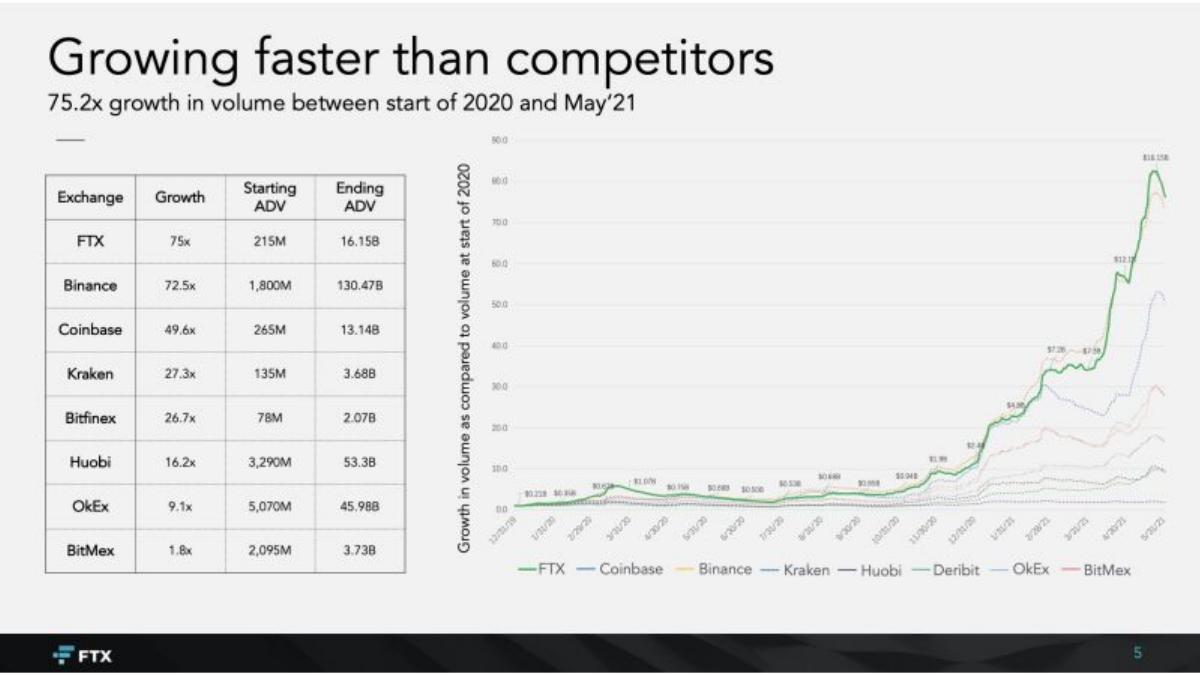
FTX traction slide — slide 5
Series B (recorded). Crypto derivatives exchange. A table and a line chart, start of 2020 to May 2021. FTX's November 2022 bankruptcy is public record; the slide is included only as a format example.
FTX deck, slide 5. Exact stored slide matched to this analysis.
Our analysis: The strongest structure here: one measure, one period, and the starting and ending values shown, so a reader can see FTX grew fastest but from a far smaller base than Binance.
Evidence and limitation: The company's own average daily volume at two dates, with seven named competitors measured the same way; no users, revenue or source for the competitor figures.
What a founder can adapt: Compare your volume with named peers on the same measure and dates, and show the starting and ending values.
Supporting analysis
What the deck claims: "Growing faster than competitors." "75.2x growth in volume between start of 2020 and May'21." A table with columns "Exchange", "Growth", "Starting ADV", "Ending ADV": FTX 75x, 215M to 16.15B; Binance 72.5x, 1,800M to 130.47B; Coinbase 49.6x, 265M to 13.14B; then Kraken, Bitfinex, Huobi, OkEx and BitMex. The chart plots growth multiples by exchange over time.
Presentation choice: Showing start and end values next to the growth multiple stops a fast rate on a small base from being misread.
When it does not fit: Leaving out the data source for competitor figures; name it in a footnote.
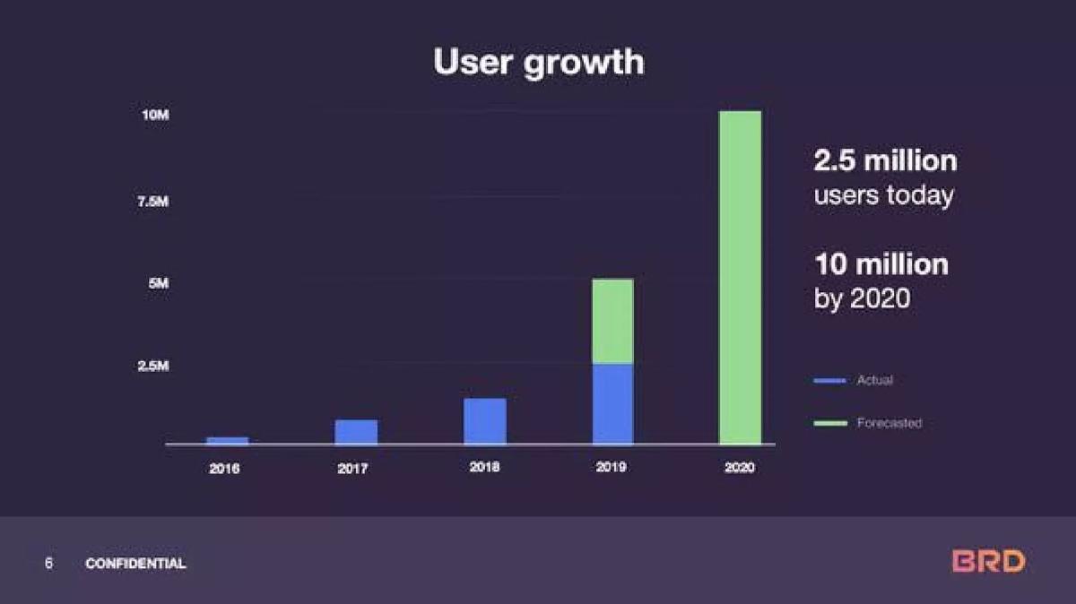
Growth stage (recorded). Mobile crypto wallet. Yearly bars, 2016 to 2020, with two numbers beside them.
BRD deck, slide 6. Exact stored slide matched to this analysis.
Our analysis: Clear and honest about what is real: an investor can see 2.5 million actual users and that everything above it is a projection.
Evidence and limitation: Users by year on a labelled axis, with the 2019 bar split between actual and forecast and the 2020 bar all forecast; no definition of a user and no activity measure.
What a founder can adapt: Chart users by period, colour forecasts separately, and say what counts as a user.
Supporting analysis
What the deck claims: "User growth." Bars on an axis from 0 to 10M for 2016 to 2020; legend "Actual" and "Forecasted". "2.5 million users today." "10 million by 2020."
Presentation choice: Colouring forecasts differently lets the slide show ambition without passing it off as traction.
When it does not fit: User counts with no activity measure; add monthly active wallets or transactions.
Seed (recorded). Crypto launchpad and incubation fund. Three icons with text and a row of social counts.
Lithium deck, slide 5. Exact stored slide matched to this analysis.
Our analysis: Useful for a launchpad because signed launches show a pipeline, but the one completed raise gives no dollar figure and the social counts carry more of the slide than they should.
Evidence and limitation: One completed raise, a community-funded amount, signed upcoming launches and follower counts; no amount raised for VICEWRLD and no year.
What a founder can adapt: Give the amount raised on each completed launch and the date, then list signed launches.
Supporting analysis
What the deck claims: "Highlights to date." "Successful IDO: VICEWRLD raised via our launchpad. Raise was oversubscribed by 250% and attracted lots of interest." "Incubation fund: Initial incubation fund was raised with $330,000 from our community. Current value c. $360,000." "5 Launches planned: As of September, we have 5 launches signed for over the next 8 weeks via our launchpad." "Socials": "4,271 telegram members", "10,900 Twitter followers", "622 Youtube subscribers".
Presentation choice: For a platform, completed deals and a signed pipeline matter more than followers.
When it does not fit: "Oversubscribed by 250%" with no base amount; state what was raised against what target.
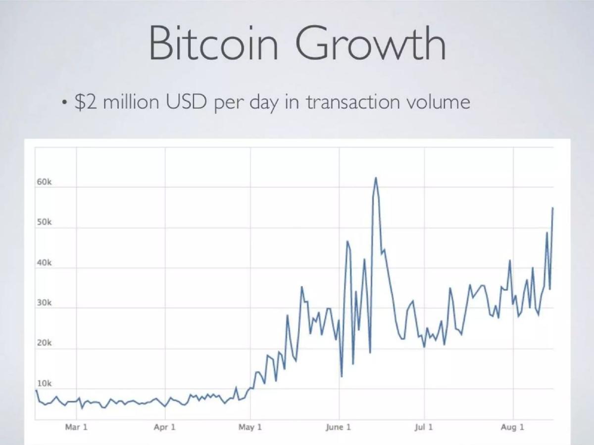
Seed (recorded). Early bitcoin wallet and exchange. One line chart, March to August, no year shown.
Coinbase deck, slide 4. Exact stored slide matched to this analysis.
Our analysis: Weaker for contrast: this is a market slide titled as growth. It argues the market is taking off, which may have been the right story at seed, but it shows no Coinbase traction.
Evidence and limitation: A chart of activity on the Bitcoin network with an unlabelled unit, and one volume figure; nothing about Coinbase's own users or volume.
What a founder can adapt: If you show market growth, label it as the market and put your own users or volume beside it.
Supporting analysis
What the deck claims: "Bitcoin Growth." "$2 million USD per day in transaction volume." A daily line on an axis from 10k to 60k, from March 1 to early August.
Presentation choice: Included to show the difference between market momentum and company traction; investors will ask which is which.
When it does not fit: A chart with no unit or year; say what the line counts and when.
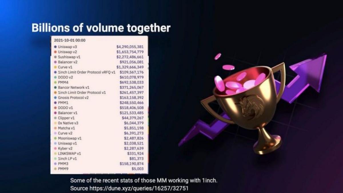
Series B (recorded). Decentralised exchange aggregator. A table screenshot beside an illustration.
1inch deck, slide 6. Exact stored slide matched to this analysis.
Our analysis: The weakest example: it cites a source, which is good, but the table is mostly other protocols' volume and the reader cannot tell how much went through 1inch.
Evidence and limitation: Volume by protocol and market maker from a cited public dashboard; no total for 1inch, no period for the figures and no trend.
What a founder can adapt: Pull your own routed volume from the same dashboard, chart it by month, and keep the source link.
Supporting analysis
What the deck claims: "Billions of volume together." A table dated "2021-10-01 00:00" listing protocols and dollar figures, including "Uniswap v3 $4,290,055,381", "Sushiswap v1 $2,272,486,661" and "1inch Limit Order Protocol v1 $261,457,397". "Some of the recent stats of those MM working with 1inch. Source https://dune.xyz/queries/16257/32751".
Presentation choice: Included for contrast; a cited source helps only if the number it supports is the company's own.
When it does not fit: Screenshots of long tables; give one total and one trend.
Whether the numbers are the company's own, whether there is a time axis, and whether forecasts or sources are marked.
Example
Business
Company's own figure
Time axis
Forecasts or source
FTX
Exchange
Daily volume
Start 2020 to May 2021
No source
BRD
Wallet
Users
Yearly
Forecasts coloured
Messari
Crypto data
Signed projects, product counts
No
No
Lithium
Launchpad
Launches, fund size, followers
No
No
Coinbase
Bitcoin exchange
No (market chart)
March to August
No
1inch
Exchange aggregator
No total
One date
Source cited
Key Takeaways
Show your own volume, users or wallets, not the whole market's.
Put dates on the axis and mark forecasts separately from actuals.
If you compare with competitors, use the same measure and period for all.
Treat community follower counts as supporting evidence, not the headline.
Build your web3 traction slide
Lead with your own usage over time, and keep market figures clearly separate.
Own usage. Monthly active wallets, users or transactions, by month.
Volume. Your own volume or value locked by month, with the source.
Forecasts. Mark projected periods separately from actuals.
Market context. If you show market data, label it as the market and keep it secondary.
Copyable framework: [n] monthly active [wallets/users] in [month], up from [n] in [month]. [Volume] routed through [product] in [period] (source: [dashboard]).
Illustrative example 1 — written by us
Before: Billions of volume together. Some of the recent stats of those MM working with 1inch.
After: $[amount] routed through 1inch in [month], up from $[amount] in [month] (source: [dashboard link]). [n] market makers connected.
What improved: Our illustrative rewrite; not 1inch's wording. Bracketed parts are placeholders to fill with real facts. It states the company's own volume, adds a trend and keeps the source.
What this guide adds
The library has a web3 product guide and sector traction guides for fintech, logistics, proptech, media and others, but no web3 traction guide. This page looks at one question specific to crypto decks: whether the numbers on the slide belong to the company or to the market around it.
Sector labels come from the sector recorded for each published teardown (high confidence for FTX, BRD and Lithium; medium for Messari, Coinbase and 1inch). The web3 product guide uses a different FTX slide; none of these six slides appears in another guide.
Three kinds of numbers in crypto traction slides
Company usage over time (FTX, BRD): the company's own volume or users by period.
Market or partner activity (Coinbase, 1inch): charts or tables of activity the company takes part in but does not own.
Common mistakes
Market numbers as traction. Charts of the whole network or of partners do not show your own growth.
Forecasts blended in. Colour or label projected periods separately.
Rates with no base. Put starting and ending values next to any multiple or percentage.
Followers as the headline. Community counts support usage figures; they do not replace them.
Diagnostic checklist
Your own users, wallets or volume by month.
Forecasts clearly marked.
A source for on-chain or competitor figures.
Market data labelled and kept secondary.
Frequently asked questions
How we chose these examples
Corpus: published pitch deck teardowns on StartupFundraising.com. Founder-uploaded private decks are excluded.
Selection (2026-09-27): we took teardowns whose recorded sector is web3, with a stored slide image and slide text about growth, users, volume, members or results to date. We read the candidates and viewed seven slide images, left out market-size and token-sale slides, a slide already used in another guide (Seam), a second FTX statistics slide (one slide per company) and a carbon-credit momentum slide with no stored image (Flowcarbon), and kept six. Coinbase and 1inch are included as weaker examples for contrast.
Sector is the category recorded for each teardown (high confidence for FTX, BRD and Lithium; medium for Messari, Coinbase and 1inch). Stages as recorded: FTX and 1inch, Series B; BRD, growth; Messari, Lithium and Coinbase, seed.
Review: stored slide images were checked on 2026-09-27 and matched to company, deck and slide number, and quoted text was read from the images (editorial model review). No person has yet completed an editorial review of this page.
Claims and figures are as shown on the slides; we have not verified them. We make no claim that any slide caused a fundraising outcome.