Consumer Competition Slide: Real Pitch Deck Examples
How consumer startups present competition in a pitch deck: name what shoppers use today, compare on what they care about, and show why they would switch.
Consumer Competition Slide: Real Pitch Deck Examples
Eight competition slides from consumer startups, shown in full, compare how each names what customers buy or use today, which qualities it compares on, and whether it gives a reason for someone to switch.
TL;DR
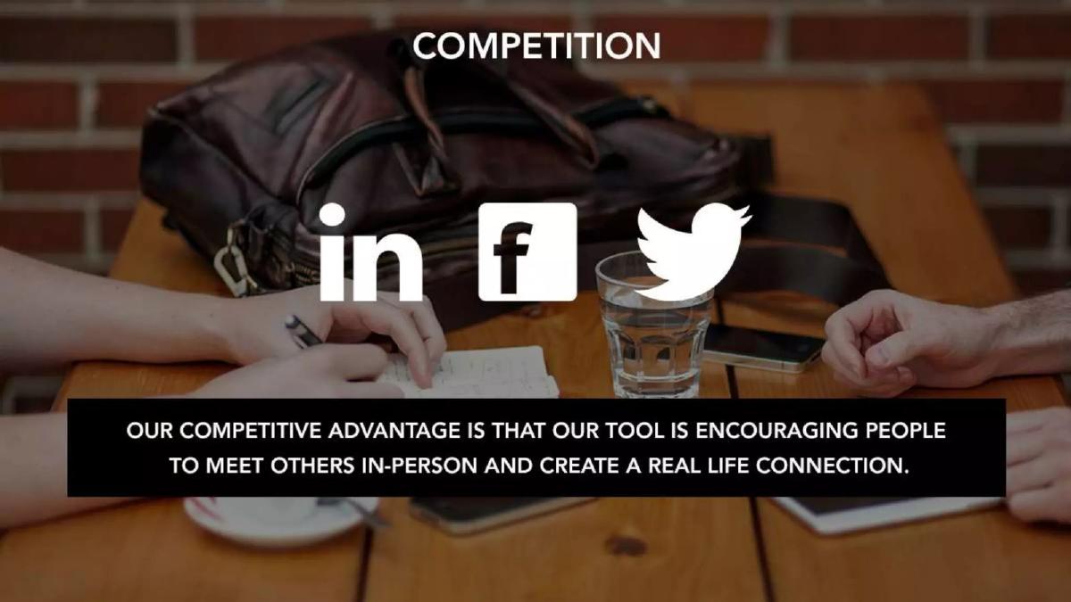
A consumer competition slide should name what the customer buys or uses today, compare on the two or three things that customer cares about, and give one reason they would switch. Tripea names its key competitor, KAYAK Explore, lists its limits ("4 clicks and 3 browser tabs") and sets its own advantage against each one ("1 click and 1 browser tab"). Selecty shows the apple sauce pouches already on the shelf and their combined "48% market share." CornFinger compares brands on three qualities a buyer would weigh: lifestyle, performance and eco-friendliness. Brunch Box shows the LinkedIn, Facebook and Twitter logos with one line of advantage, which names no product its customers actually use to meet people.
Consumer competition slides from real pitch decks
Each example shows the exact stored slide above its analysis and links to the full teardown. Claims are as shown on the slides; we have not verified them.
Tripea competition slide — slide 4
Budget travel planning. One named competitor with a screenshot, its limits, Tripea's answers and possible new entrants.
Tripea deck, slide 4. Exact stored slide matched to this analysis.
Our analysis: Each advantage answers a listed weakness, so the comparison is point by point.
Evidence and limitation: Click and tab counts as stated; no user research shown.
What a founder can adapt: Pick the one product your customer uses most, list its limits, and answer each.
Supporting analysis
What the deck claims: "Key Competitor: KAYAK Explore." Limits: "Limited to Flights only", "No social media integration", "High friction: 4 clicks and 3 browser tabs between final customized trip and buying page." "Tripea Competitive Advantage: Integrates other bookings (Hotels, Cars, Restaurants, etc.)… Low friction: 1 click and 1 browser tab." Potential entrants (TripAdvisor, Priceline, Orbitz, Expedia) "will have to: Create budget-minded travel planning tool…"
Presentation choice: "4 clicks and 3 browser tabs" against "1 click and 1 browser tab" is a difference a traveller would feel.
When it does not fit: The defensibility box ("software technology patents", "exclusivity partnership") claims protection without evidence; name the patent or partner or drop it.
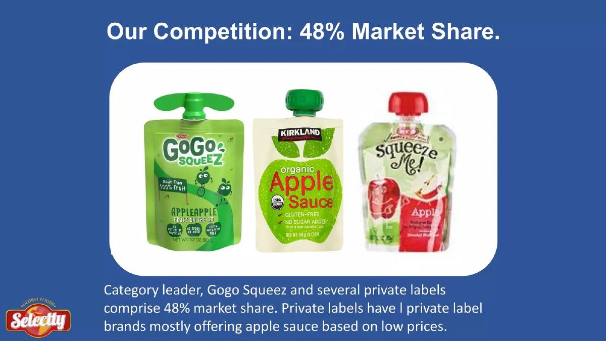
A fruit snack brand. A photo of three competing pouches and one caption.
Selecty deck, slide 6. Exact stored slide matched to this analysis.
Our analysis: It shows exactly what sits on the shelf next to the product, including store brands competing on price.
Evidence and limitation: 48% market share as stated; no source given.
What a founder can adapt: Photograph the shelf your product will sit on and name the leader and the store brands.
Supporting analysis
What the deck claims: "Our Competition: 48% Market Share." "Category leader, Gogo Squeez and several private labels comprise 48% market share. Private labels have I private label brands mostly offering apple sauce based on low prices."
Presentation choice: For a grocery product, the competitors are the packets beside you; a photo says that faster than a table.
When it does not fit: Cite the source for 48%, fix the garbled caption, and say how Selecty differs from the apple sauce on low prices.
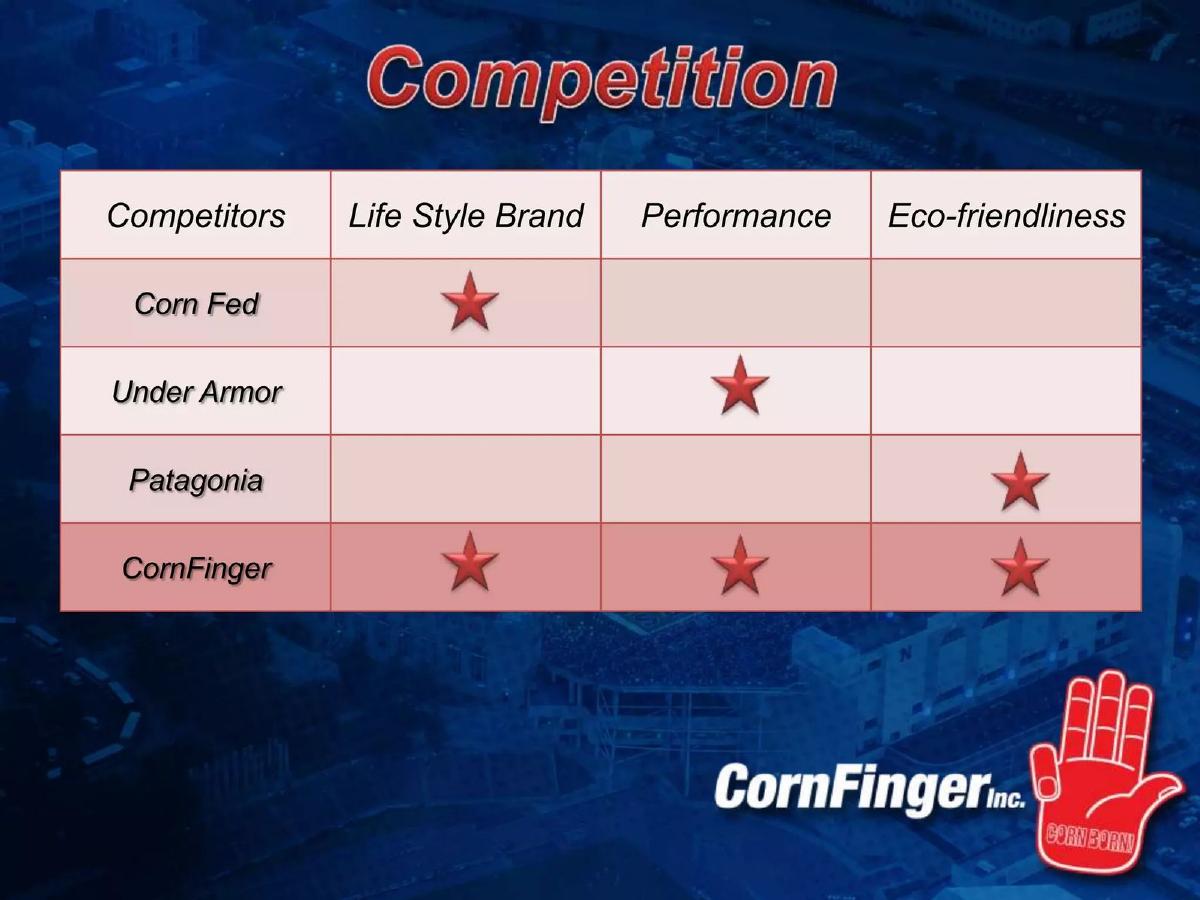
A sports apparel brand. A table of four brands against three qualities.
CornFinger deck, slide 6. Exact stored slide matched to this analysis.
Our analysis: It picks one strong brand per quality, so each rival is shown as good at something.
Evidence and limitation: Self-assessment; no product tests or prices.
What a founder can adapt: Choose two or three qualities your buyer compares, and the best-known brand for each.
Supporting analysis
What the deck claims: Columns: "Life Style Brand", "Performance", "Eco-friendliness." Corn Fed has lifestyle; Under Armour has performance; Patagonia has eco-friendliness; CornFinger claims all three.
Presentation choice: The three columns are qualities a sports fan buying apparel would actually weigh.
When it does not fit: Claiming all three with the same stars is hard to believe; add the evidence (fabric, certification, price) for each.
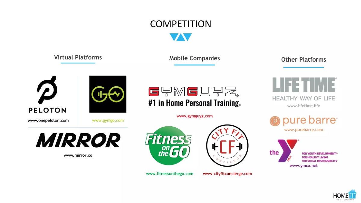
In-home personal training. Competitor logos grouped into three kinds.
HomeFit deck, slide 6. Exact stored slide matched to this analysis.
Our analysis: Grouping shows the three ways a customer could get fit instead: a screen at home, a trainer who comes to you, or a gym.
Evidence and limitation: Names and logos only.
What a founder can adapt: Group rivals by the choice they represent for the customer.
Supporting analysis
What the deck claims: "Virtual Platforms": Peloton, Mirror, GoGo. "Mobile Companies": GymGuyz ("#1 in Home Personal Training"), Fitness on the Go, City Fit Concierge. "Other Platforms": Life Time, Pure Barre, the Y.
Presentation choice: It includes the gym, the option most customers already have.
When it does not fit: Add one line per group saying where HomeFit is better (price, convenience, results); logos alone don't give a reason to switch.
A 2011 social dining and cooking video app. A feature table against named sites.
Mivesta deck, slide 6. Exact stored slide matched to this analysis.
Our analysis: Each rival has a few ticks, so the slide admits where they are already good.
Evidence and limitation: Feature ticks; no usage figures.
What a founder can adapt: If you use a table, give real rivals real ticks.
Supporting analysis
What the deck claims: Columns: Food Network, AllRecipes & FoodBuzz, SocialEyes & Stickam, Ustream & YouTube, Mivesta. Rows: "Written recipes and photos", "User video library", "Educational Chef or Pro videos", "Social sharing or commentary", "Live video streaming events", "Interactive Video streams." "Bakespace.com and Justin.tv are 2 other startups in related space."
Presentation choice: Naming two startups in a related space shows the founders looked beyond the obvious brands.
When it does not fit: Mivesta ticks every row; replace some features with the reason a home cook would choose it over YouTube.
A virtual shopping mall. A two-by-two of customer experience against technology.
The360Mall deck, slide 4. Exact stored slide matched to this analysis.
Our analysis: Naming the physical malls (Westfield, Stockland) admits that shoppers' real alternative is going to the mall.
Evidence and limitation: Placement is the founders' judgement.
What a founder can adapt: Put the option customers use most on the chart, even if it isn't a startup.
Supporting analysis
What the deck claims: Axes: "Good customer experience" to "Poor customer experience"; "Low-Tech" to "High-Tech." Westfield and Stockland: good experience, low tech. BIG W and JB Hi-Fi: in the middle. The Virtual Mall and Trillenium: poor experience. The360Mall: top right.
Presentation choice: "Customer experience" is an axis a shopper understands.
When it does not fit: "High-Tech" is the founders' measure, not the shopper's; swap it for something they value, such as time to find an item.
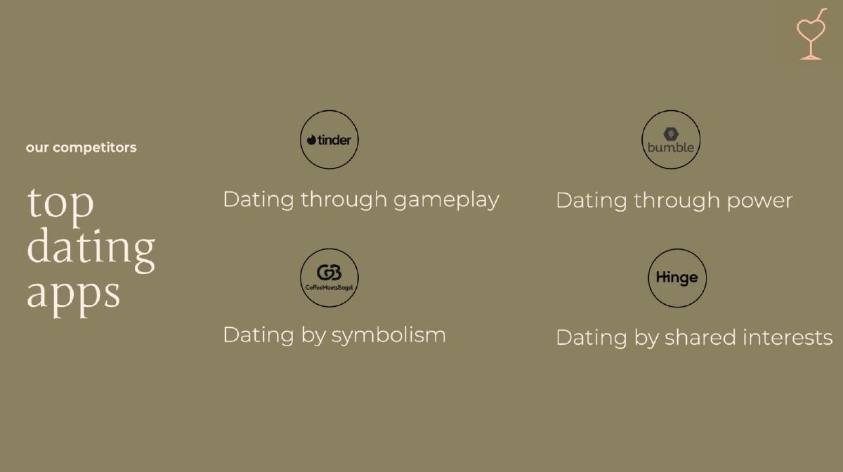
A dating app. A partial example: four named apps, each with a one-line label.
First Round's On Me deck, slide 4. Exact stored slide matched to this analysis.
Our analysis: Each app gets its own positioning line, which shows the founders understand how the leaders differ.
Evidence and limitation: No figures.
What a founder can adapt: Describe each rival's position in a few words.
Supporting analysis
What the deck claims: "Our competitors: top dating apps." Tinder: "Dating through gameplay." Bumble: "Dating through power." Coffee Meets Bagel: "Dating by symbolism." Hinge: "Dating by shared interests."
Presentation choice: The labels are short enough to read in seconds.
When it does not fit: Add a fifth line for yourself: the slide never says how First Round's On Me dates differently.
An app for meeting people over brunch. A weaker example, included on purpose: three social network logos over a photo.
Brunch Box deck, slide 6. Exact stored slide matched to this analysis.
Our analysis: The logos are general social networks, not what someone uses to meet new people over a meal (Meetup, Bumble BFF, local event groups).
Evidence and limitation: None.
What a founder can adapt: Name the apps and habits people use today to meet strangers in person.
Supporting analysis
What the deck claims: "Competition": LinkedIn, Facebook, Twitter logos. "Our competitive advantage is that our tool is encouraging people to meet others in-person and create a real life connection."
Presentation choice: It shows how picking giants in a nearby category hides the real competition.
When it does not fit: Turn the advantage sentence into a comparison: what those options fail at, and what Brunch Box does instead.
Whether each slide names what customers use today, compares on qualities they care about, and gives a reason to switch.
Example
Today's choice named
Customer-relevant comparison
Reason to switch
Tripea
Yes (KAYAK Explore)
Yes (clicks, tabs, bookings)
Yes (point by point)
Selecty
Yes (shelf photo, 48%)
Partly (price)
No
CornFinger
Yes (three brands)
Yes (three qualities)
Partly (claims all three)
HomeFit
Yes (three groups)
No
No
Mivesta
Yes (five sites)
Partly (features)
Partly (ticks every row)
The360Mall
Yes (physical malls)
Partly (experience axis)
Partly (top-right placement)
First Round's On Me
Yes (four apps)
Yes (positioning lines)
No
Brunch Box
No (adjacent giants)
No
Partly (one sentence)
Key Takeaways
Name the specific products customers use today, including the default choice (a big brand, a store's own label, doing nothing).
Compare on qualities a customer would notice, not internal features.
Set each weakness of the competitor against something you do differently.
Include a number where you can: market share, price, clicks, time.
Every ticked column for you and none for others looks unconvincing; show where rivals are strong.
Build your consumer competition slide
Start from what your customer does today.
Today's choice. What does your customer buy, use or do today instead? Name the top two or three, including the default.
Qualities. Which two or three qualities decide the purchase for them (price, time, taste, trust)?
Weakness. Where does each option fall short on those qualities? Use a number if you can.
Switch. What single advantage would make someone change, and what does it cost them to switch?
Copyable framework: Today [customer] uses [option], which [weakness, with a number]. With [product] they [advantage, with a number].
Illustrative example 1 — written by us
Before: Competitors: Amazon, Walmart, Target. We are better, faster and cheaper.
After: Today, parents buy school uniforms at the school shop: one size run, open two afternoons a week, $38 a shirt. We deliver in 2 days at $24, with free exchanges for size.
What improved: Our illustrative rewrite; figures are invented for the example. It names the real alternative, its weaknesses and a measured advantage.
What this guide adds
The general competition slide guide covers any business. Consumers can switch at almost no cost and often compare on price, convenience and brand rather than features. This guide compares how consumer decks show what shoppers would give up and gain by switching.
The marketplace competition guide covers two-sided businesses; this guide covers products sold to or used by individual people.
Three things a consumer competition slide shows
Today's choice: the named products or habits customers use now (Tripea, Selecty, HomeFit).
Comparison: the qualities customers weigh, laid out side by side (CornFinger, Mivesta, The360Mall).
Reason to switch: one advantage that answers a named weakness (Tripea, First Round's On Me).
Strong slides cover all three. Most real slides cover one or two.
Common mistakes
Giants from a nearby category. Name what customers use for this job, not the largest companies in the space.
Leaving out the default. Store brands, gyms, physical shops and doing nothing are real competition.
Ticks on every row. Show where rivals are strong; it makes your advantage believable.
Founder-centred axes. "High-tech" matters to you; price and time matter to shoppers.
No reason to switch. Logos alone don't say why anyone would change.
Diagnostic checklist
Names the two or three options customers use today, including the default.
Compares on qualities a customer would notice.
Shows at least one area where a rival is strong.
States one advantage that answers a named weakness.
Uses a number (share, price, time) where possible.
Frequently asked questions
How we chose these examples
Corpus: published pitch deck teardowns on StartupFundraising.com. Founder-uploaded private decks are excluded.
Selection (2026-09-25): we searched extracted text of slides 2–6 for slides beginning with competition, competitors or competitive landscape in decks whose recorded sector is consumer, food and beverage, fashion, beauty, fitness, dating, social, travel, retail or e-commerce, excluding marketplace, fintech and business software. About twenty candidates were read; slides that list only the company's own advantages without naming a competitor were set aside. Brunch Box is kept as a weaker contrast.
Overlap check: none of these eight slides appears in another guide. Agave Games, a strong candidate, was not reused because the general competition guide already uses its slide. Selecty and Mivesta appear elsewhere with different slides.
Review: all eight stored slide images were inspected on 2026-09-25 and matched to company, deck and slide number (editorial model review). No person has yet completed an editorial review of this page.
Claims are as shown on the slides; we have not verified them. We make no claim that any slide caused a fundraising outcome.