Pitch Deck Competition Slides: Real Examples and What Works
How to build a pitch deck competition slide investors believe: landscape maps, comparison tables and advantage lists.
Pitch Deck Competition Slides: Real Examples and What Works
Compare twelve real competition slides across software, security, finance, payments, property, healthcare and games, then choose the clearest format for your market.
TL;DR
A competition slide should name what customers use today and explain one or two checkable reasons they would switch. These examples show when a landscape, comparison table, advantage list, or two-by-two clarifies the market—and where each format can undermine credibility.
Competition slides from real decks
Each example pairs the exact competition slide from its public deck with specific analysis when the image is available. Company claims remain unverified; missing exact images are recorded and never replaced with unrelated slides.
Anima competition slide — slide 9
Design-to-code SaaS, seed-era deck.
Verified source excerpt — slide 9
Groups the field into image-based handoff and prototyping tools (Zeplin, InVision), no-code website builders (Webflow) and the major design tools (Sketch, Figma, Adobe XD), and writes one sentence for each on what it does not do — most notably, that none generates runnable code.
The exact competition slide image is not present in the stored slide-image set. No substitute is used.
Our analysis: The slide orients the investor in a crowded category, then isolates one checkable difference. Calling the design tools allies rather than competitors turns platform risk into a distribution argument.
Evidence and limitation: The slide is text-heavy. In a live pitch, keep one line per group and move the detail to speaker notes or the appendix.
What a founder can adapt: For each competitor group, write the single sentence a customer would use to explain why it does not solve their problem. If you cannot write it, the group may be a closer competitor than you think.
Supporting analysis
What the deck claims: Groups the field into image-based handoff and prototyping tools (Zeplin, InVision), no-code website builders (Webflow) and the major design tools (Sketch, Figma, Adobe XD), and writes one sentence for each on what it does not do — most notably, that none generates runnable code.
Presentation choice: The slide orients the investor in a crowded category, then isolates one checkable difference. Calling the design tools allies rather than competitors turns platform risk into a distribution argument.
When it does not fit: The slide is text-heavy. In a live pitch, keep one line per group and move the detail to speaker notes or the appendix.
Lists legacy vendors (including Cisco, Forescout and Fortinet) with a shared profile — perpetual licensing, configuration complexity, on-site hardware, vendor lock-in — then lists Portnox advantages: cloud-native, no hardware, vendor-agnostic, stronger SaaS integrations, built for mid-market IT teams.
The exact competition slide image is not present in the stored slide-image set. No substitute is used.
Our analysis: It competes on model, not features. Naming the buyer (resource-constrained mid-market IT) makes each advantage read as a fix for a real constraint.
Evidence and limitation: Claims such as "customer sentiment neutral or negative" need a source in the appendix or a reference customer ready to confirm them.
What a founder can adapt: If your incumbents share a business model, describe the model once and contrast it with yours, instead of comparing company by company.
Supporting analysis
What the deck claims: Lists legacy vendors (including Cisco, Forescout and Fortinet) with a shared profile — perpetual licensing, configuration complexity, on-site hardware, vendor lock-in — then lists Portnox advantages: cloud-native, no hardware, vendor-agnostic, stronger SaaS integrations, built for mid-market IT teams.
Presentation choice: It competes on model, not features. Naming the buyer (resource-constrained mid-market IT) makes each advantage read as a fix for a real constraint.
When it does not fit: Claims such as "customer sentiment neutral or negative" need a source in the appendix or a reference customer ready to confirm them.
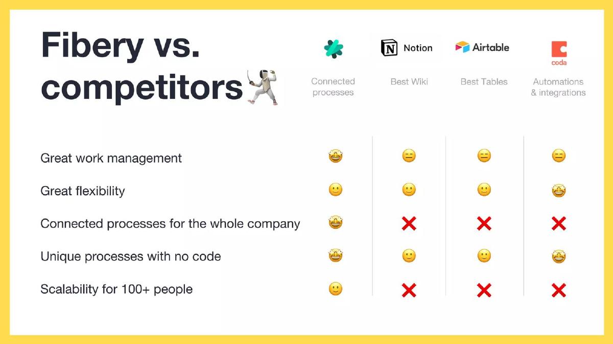
Fibery deck, slide 6. Exact stored slide matched to this analysis.
Our analysis: Two well-known rivals and five rows is readable in seconds. The rows describe outcomes a buyer cares about rather than internal features.
Evidence and limitation: Where a competitor wins a row, show it. A table where the startup wins nearly every row invites the investor to discount the whole slide.
What a founder can adapt: Pick the two or three rivals the investor will name first, and choose rows a customer would use when choosing between you.
Supporting analysis
What the deck claims: A compact comparison table against Notion and Airtable with rows for great work management, great flexibility, connected processes for the whole company, unique processes with no code, and scalability for 100+ people.
Presentation choice: Two well-known rivals and five rows is readable in seconds. The rows describe outcomes a buyer cares about rather than internal features.
When it does not fit: Where a competitor wins a row, show it. A table where the startup wins nearly every row invites the investor to discount the whole slide.
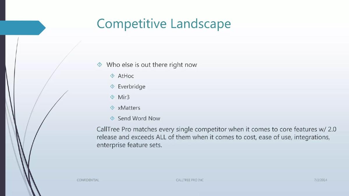
CallTree Pro deck, slide 6. Exact stored slide matched to this analysis.
Our analysis: It names the real incumbents rather than hiding them, which shows the founders know the category buyers compare.
Evidence and limitation: "Exceeds all of them" on four dimensions at once is hard to believe and easy to challenge. Narrow claims survive diligence better.
What a founder can adapt: Keep the named field, but replace broad superiority claims with one or two advantages you can prove with a customer or a price sheet.
Supporting analysis
What the deck claims: Names AtHoc, Everbridge, MIR3, xMatters and Send Word Now, claims feature parity with the 2.0 release, and says the product exceeds all of them on cost, ease of use, integrations and enterprise features.
Presentation choice: It names the real incumbents rather than hiding them, which shows the founders know the category buyers compare.
When it does not fit: "Exceeds all of them" on four dimensions at once is hard to believe and easy to challenge. Narrow claims survive diligence better.
Personal-finance software; an early deck from before the product's public launch (the corpus also holds duplicate copies of this deck).
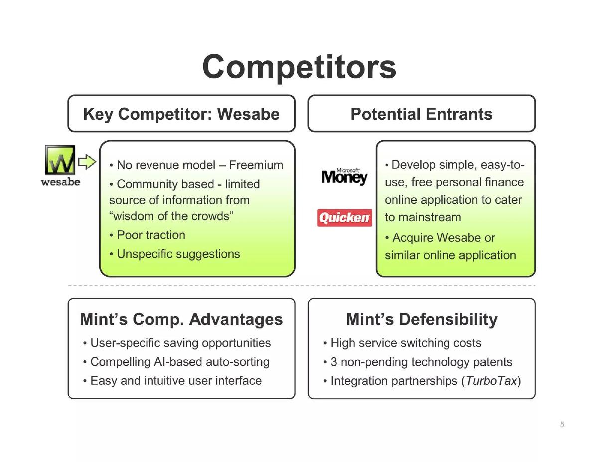
Mint deck, slide 5. Exact stored slide matched to this analysis.
Our analysis: It separates today's rival from tomorrow's threat, and splits "why we are better" from "why it lasts" — two questions investors ask separately.
Evidence and limitation: The judgements of Wesabe ("poor traction") are unsourced assertions about a competitor, and the slide does not explain why incumbents would not simply build the product.
What a founder can adapt: Give the incumbent that could copy you its own box, with the specific move you expect from it, and keep defensibility distinct from features.
Supporting analysis
What the deck claims: Four boxes: a key competitor, Wesabe (described as having no revenue model, community-based advice, poor traction and unspecific suggestions); potential entrants Microsoft Money and Quicken, which might build a simple free online application or acquire Wesabe; Mint's advantages (user-specific saving opportunities, AI-based auto-sorting, an easy interface); and its defensibility (switching costs, three patents described as "non-pending", and a TurboTax integration partnership).
Presentation choice: It separates today's rival from tomorrow's threat, and splits "why we are better" from "why it lasts" — two questions investors ask separately.
When it does not fit: The judgements of Wesabe ("poor traction") are unsourced assertions about a competitor, and the slide does not explain why incumbents would not simply build the product.
Title and escrow services; the slide's footnote dates its headcount research to 15 September 2020.
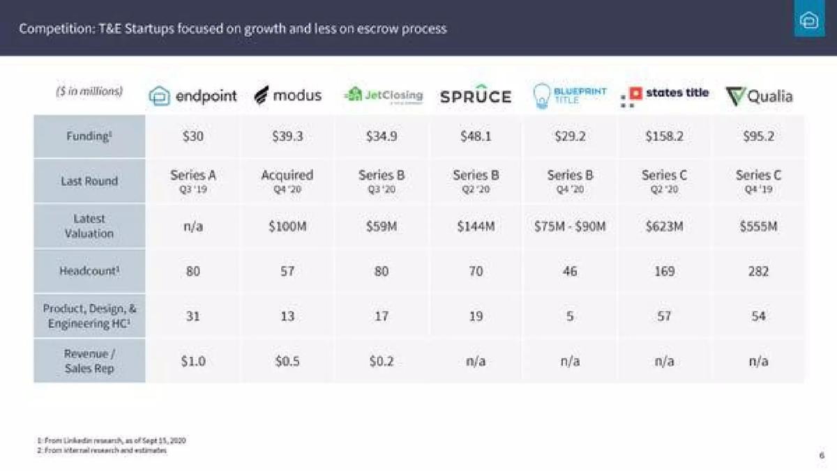
Endpoint deck, slide 6. Exact stored slide matched to this analysis.
Our analysis: Instead of feature ticks, it compares how well funded and staffed rivals are — useful when investors already know the category and want to know who is winning capital.
Evidence and limitation: The only efficiency metric (revenue per rep) is missing for four of six rivals, so the table does not prove the headline; label estimates as the footnote does.
What a founder can adapt: In a well-funded category, show rivals' funding and team size with dated sources, then say plainly why your approach wins despite it.
Supporting analysis
What the deck claims: Headed "T&E startups focused on growth and less on escrow process", a table compares Endpoint with Modus, JetClosing, Spruce, Blueprint Title, States Title and Qualia on funding, last round, latest valuation, headcount, product and engineering headcount, and revenue per sales rep. Headcounts come from LinkedIn research; revenue per rep is from internal research and estimates, and is n/a for most rivals.
Presentation choice: Instead of feature ticks, it compares how well funded and staffed rivals are — useful when investors already know the category and want to know who is winning capital.
When it does not fit: The only efficiency metric (revenue per rep) is missing for four of six rivals, so the table does not prove the headline; label estimates as the footnote does.
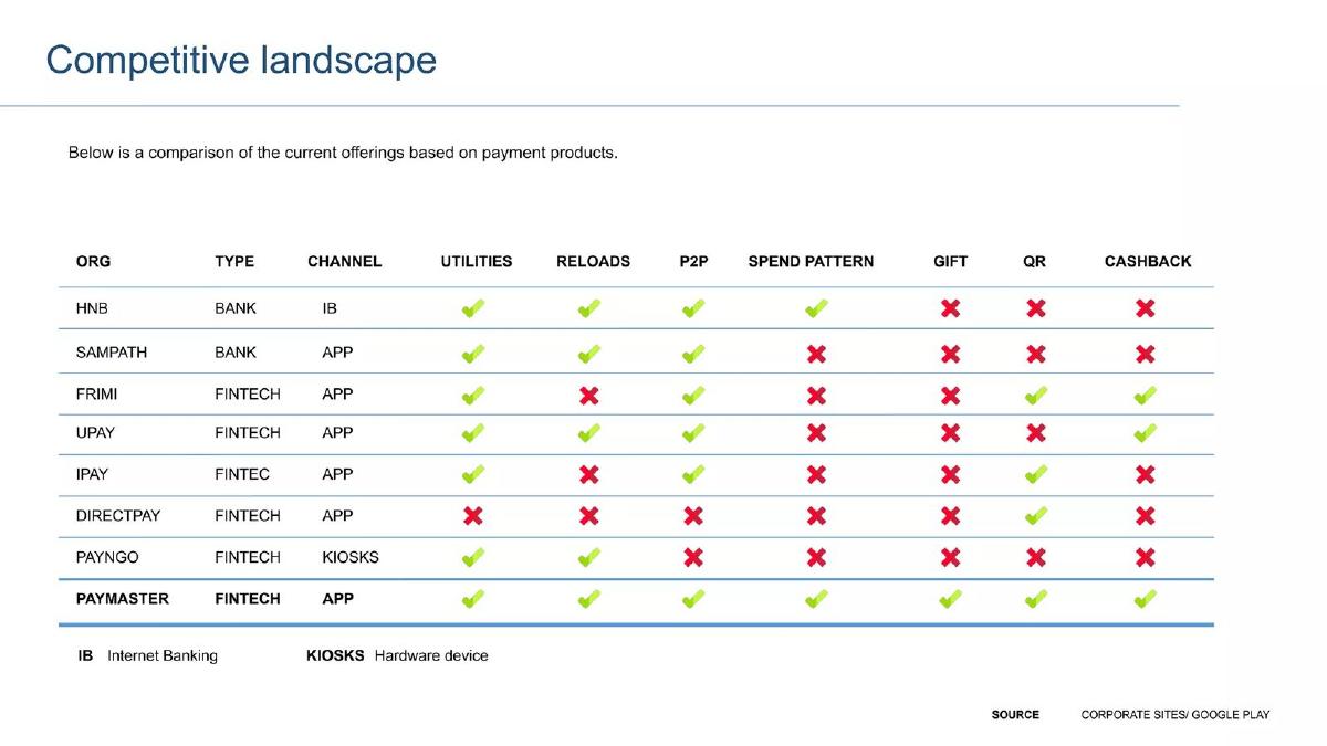
A consumer payments app in Sri Lanka, compared with banks and other fintech apps.
Paymaster deck, slide 4. Exact stored slide matched to this analysis.
Our analysis: Naming banks alongside fintechs shows the real alternatives a consumer has, and citing public sources makes each tick checkable.
Evidence and limitation: Paymaster is the only row with every column ticked, which is exactly the pattern investors discount; features are also easy to copy, so the slide needs a reason the lead lasts.
What a founder can adapt: Include incumbents outside your category — banks, kiosks, manual methods — and cite where each capability claim comes from.
Supporting analysis
What the deck claims: A table compares two banks (HNB, Sampath), five fintech apps and a kiosk network (PayNGo) with Paymaster across utilities, reloads, peer-to-peer payments, spend patterns, gifts, QR and cashback; the source is given as corporate sites and Google Play.
Presentation choice: Naming banks alongside fintechs shows the real alternatives a consumer has, and citing public sources makes each tick checkable.
When it does not fit: Paymaster is the only row with every column ticked, which is exactly the pattern investors discount; features are also easy to copy, so the slide needs a reason the lead lasts.
A planned substance-use-disorder treatment provider in a local service area.
DHC deck, slide 6. Exact stored slide matched to this analysis.
Our analysis: For a local service business the relevant field really can be one provider, and the contrast — generalist versus specialist — is a clear strategic choice.
Evidence and limitation: "More client-oriented" is a promise, not evidence, and the slide ignores the status quo (no treatment, or travelling elsewhere); a slide of dense sentences is also hard to read in a live pitch.
What a founder can adapt: If your market is geographic, define the area and name the providers inside it; frame the difference as a choice of focus.
Supporting analysis
What the deck claims: States that the only competition in the area is Kentucky River Community Care, a comprehensive care organisation spreading resources across many services, and that DHC will focus solely on substance use disorders and be more client-oriented.
Presentation choice: For a local service business the relevant field really can be one provider, and the contrast — generalist versus specialist — is a clear strategic choice.
When it does not fit: "More client-oriented" is a promise, not evidence, and the slide ignores the status quo (no treatment, or travelling elsewhere); a slide of dense sentences is also hard to read in a live pitch.
Cross-border medical access connecting patients in China with US doctors and hospitals; stage not stated on the slide.
My US Doctor deck, slide 5. Exact stored slide matched to this analysis.
Our analysis: The title concedes that the market already has players, which is more credible than claiming none. Putting founding years next to each name also tells the reader how established the incumbents are.
Evidence and limitation: Competitors are described only by what they lack, and My US Doctor only by what it has — a symmetrical checklist that stacks the comparison. There is no evidence (price, volume, customer choice) that the missing features matter to buyers.
What a founder can adapt: Name the two or three providers your customer would actually use today, and describe each by the specific thing it cannot do for that customer.
Supporting analysis
What the deck claims: Titled "Competition Already There — but We Do It Differently and Better". Three columns with logos and founding years: Saint Lucia Consulting (2010) listed with what it lacks (no doctor network, no proprietary technology, no way to choose doctors or hospitals, no online reservation); Beijing 301 Telemedicine Center (1997), described as having no US component; and My US Doctor (2015), highlighted in green with a US doctor and hospital network, tele-consultation, online medical records and online reservation.
Presentation choice: The title concedes that the market already has players, which is more credible than claiming none. Putting founding years next to each name also tells the reader how established the incumbents are.
When it does not fit: Competitors are described only by what they lack, and My US Doctor only by what it has — a symmetrical checklist that stacks the comparison. There is no evidence (price, volume, customer choice) that the missing features matter to buyers.
Classified-ads marketplace in Nepal; stage and year not stated on the slide.
Nepsify deck, slide 6. Exact stored slide matched to this analysis.
Our analysis: The two-column layout keeps the rivals and the positioning on one slide, and the differentiator is concrete: a business-listing API rather than another consumer classifieds site.
Evidence and limitation: Letgo is a global app while the others are local sites, so the list mixes very different threats without saying which matters most. "Focus on UI and UX" is something any competitor can claim, and the paragraph format is hard to read quickly.
What a founder can adapt: Put the named alternatives on the left and one specific positioning choice on the right; lead with the choice a competitor would find hardest to copy.
Supporting analysis
What the deck claims: Titled "Competitors & how we differ". A plain list of four sites — Hamrobazar.com, Chito.com, Hatemalo.com and Letgo.com — beside a paragraph saying competitors are concentrated in certain cities and do not target businesses, while Nepsify will let businesses list and pull the same listings into their own websites through an API, give users their own URLs, and focus on UI and UX.
Presentation choice: The two-column layout keeps the rivals and the positioning on one slide, and the differentiator is concrete: a business-listing API rather than another consumer classifieds site.
When it does not fit: Letgo is a global app while the others are local sites, so the list mixes very different threats without saying which matters most. "Focus on UI and UX" is something any competitor can claim, and the paragraph format is hard to read quickly.
Data and analytics for finance professionals, seed.
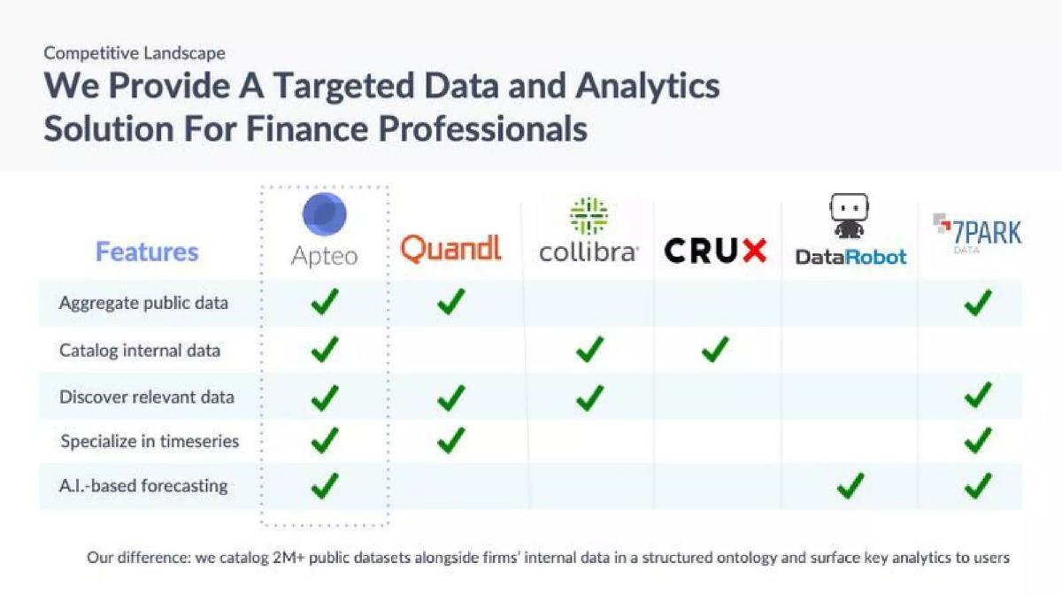
Apteo deck, slide 6. Exact stored slide matched to this analysis.
Our analysis: The table shows each rival covers part of the job, and the closing sentence states the difference in words rather than leaving the investor to count ticks.
Evidence and limitation: Named incumbents in data tooling change quickly through acquisitions; check the field is current before sending.
What a founder can adapt: End any comparison table with one sentence that states your difference. Investors remember the sentence, not the grid.
Supporting analysis
What the deck claims: A feature table against Quandl, Collibra, Crux, DataRobot and 7Park with rows for aggregating public data, cataloguing internal data, discovering relevant data, time-series specialisation and AI-based forecasting, followed by an explicit "our difference" line: cataloguing 2M+ public datasets alongside a firm's internal data in a structured ontology.
Presentation choice: The table shows each rival covers part of the job, and the closing sentence states the difference in words rather than leaving the investor to count ticks.
When it does not fit: Named incumbents in data tooling change quickly through acquisitions; check the field is current before sending.
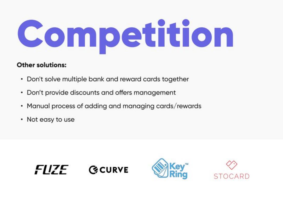
Card Blanch deck, slide 6. Exact stored slide matched to this analysis.
Our analysis: It frames competition around gaps in the customer's current options, which is how a consumer actually decides to try something new.
Evidence and limitation: "Not easy to use" is subjective. Replace it with a measurable step count or time, or remove it.
What a founder can adapt: Write your competition slide as the list of things customers still have to do by hand with today's options.
Supporting analysis
What the deck claims: Lists what other solutions (including Curve and Stocard) do not do: handle bank and reward cards together, manage discounts and offers, or remove the manual work of adding cards — and notes they are not easy to use.
Presentation choice: It frames competition around gaps in the customer's current options, which is how a consumer actually decides to try something new.
When it does not fit: "Not easy to use" is subjective. Replace it with a measurable step count or time, or remove it.
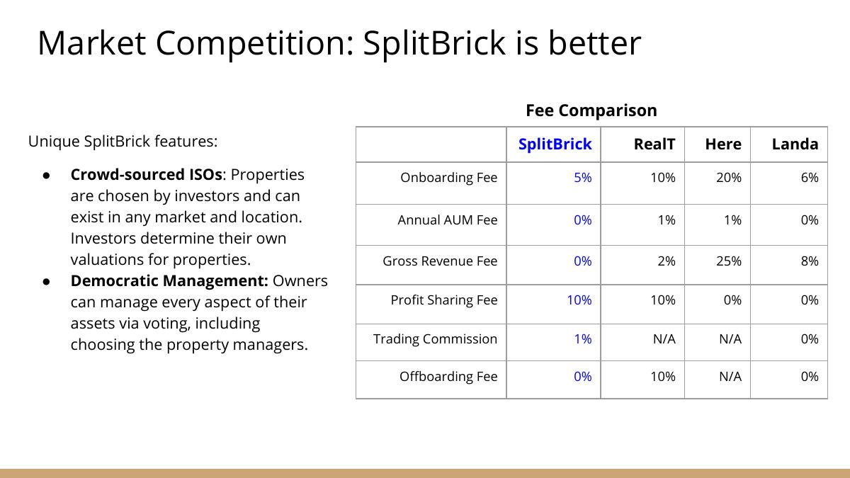
SplitBrick deck, slide 6. Exact stored slide matched to this analysis.
Our analysis: Price is a checkable difference. An investor can verify a fee table in minutes, which makes it far stronger than a claim of being "better".
Evidence and limitation: The headline "SplitBrick is better" adds nothing the table does not already prove. Let the numbers speak.
What a founder can adapt: If you compete on cost, show the actual fee lines side by side and explain how your cost structure supports them.
Supporting analysis
What the deck claims: A fee comparison with named fractional-property platforms (including RealT) across onboarding, annual AUM and gross revenue fees, with SplitBrick shown at a lower onboarding fee and zero AUM fee, plus features such as investor-chosen properties and investor-set valuations.
Presentation choice: Price is a checkable difference. An investor can verify a fee table in minutes, which makes it far stronger than a claim of being "better".
When it does not fit: The headline "SplitBrick is better" adds nothing the table does not already prove. Let the numbers speak.
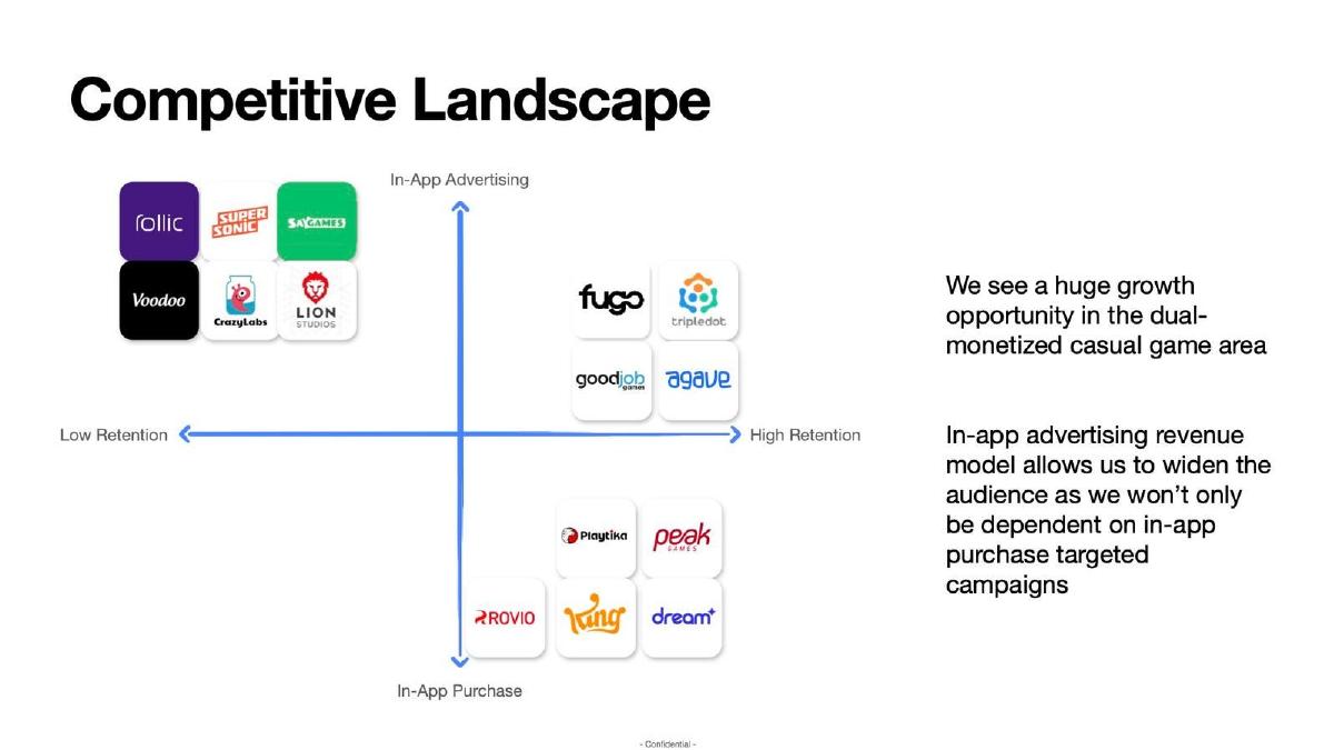
Agave Games deck, slide 5. Exact stored slide matched to this analysis.
Our analysis: Both axes are real trade-offs in mobile games — how a game earns and how long players stay — so the chart reads as analysis rather than decoration.
Evidence and limitation: Placing yourself alone in the best quadrant needs evidence. Link the claim to retention data or the team's past titles.
What a founder can adapt: If you use a two-by-two, pick axes that customers or the industry already use to describe the market.
Supporting analysis
What the deck claims: A two-by-two with in-app advertising versus in-app purchase on one axis and low versus high retention on the other, placing established studios such as Rovio and Peak, and arguing for an opportunity in dual-monetised casual games.
Presentation choice: Both axes are real trade-offs in mobile games — how a game earns and how long players stay — so the chart reads as analysis rather than decoration.
When it does not fit: Placing yourself alone in the best quadrant needs evidence. Link the claim to retention data or the team's past titles.
Use the format that matches the shape of your market, not the one that makes you look best.
Format
Best when
Main risk
Landscape map
The market is crowded or unfamiliar to the investor
Becomes a logo wall with no stated difference
Comparison table
Two to five known rivals the investor will name
Rows chosen only where the startup wins
Advantage list
Incumbents share a business model you are replacing
Claims about incumbents without evidence
Two-by-two chart
Both axes are real customer trade-offs
Axes invented so the startup sits alone top-right
Status-quo comparison
The main alternative is doing nothing or a manual process
Understates switching cost and inertia
Key Takeaways
State the difference in words, not only symbols. Apteo closes its feature grid with a plain-language difference, making the intended conclusion explicit.
Choose a format that reflects the market. Anima groups a crowded field, while Fibery compares two familiar rivals across a short set of buyer outcomes.
Tie advantages to a specific buyer constraint. Portnox's cloud model matters because its stated mid-market IT buyer has limited resources for hardware and maintenance.
Name the company that could enter. Mint's slide gives Microsoft Money and Quicken their own box as potential entrants and states what they might do, rather than waiting for the question.
Treat precision as a credibility test. SplitBrick's fee lines are checkable; broad claims such as CallTree Pro's superiority across several dimensions need stronger support.
Build your competition slide
Start with the customer's actual alternatives, then choose the simplest format that makes one durable difference visible.
Alternatives. List direct rivals, adjacent tools, manual work, and the do-nothing option.
Buyer criterion. Name the one or two outcomes customers use to choose among them.
Proof. Attach a price, deployment fact, customer result, or other checkable support to each claimed advantage.
Durability. Explain why an incumbent cannot quickly erase the difference.
Copyable framework: Customers use [alternatives]. We win for [buyer] because [checkable difference], supported by [evidence].
Illustrative example 1 — written by us
Before: We are better than every competitor
After: Mid-market IT teams deploy without on-site hardware
What improved: The rewrite names the buyer and a checkable operating difference.
What investors are really checking on this slide
Founders often read the competition slide as a test of whether they have rivals. Investors read it as a test of whether the founder understands the market. A founder who says there is no competition is telling the investor one of two things: either there is no demand for the product, or the founder has not looked. Neither helps the round.
Sequoia's guide to writing a business plan puts it directly: name your "direct and indirect competitors" and "show that you have a plan to win." The instruction is short, but it contains both halves of the slide. The first half is a fair description of the field. The second half is a reason to believe the company will take share, which usually rests on a difference in the product, the distribution or the cost structure.
A useful discipline is to decide what single point the slide must leave behind. On a competition slide, that point is almost always the difference that matters most to the customer. Everything else on the slide — logos, rows, groupings — is supporting evidence for that one difference, and anything that does not support it can move to the appendix. (Sequoia Capital)
Who counts as a competitor
The honest answer is broader than most founders like. A competitor is anything the customer uses to solve the problem today, including tools that were not built for it. For a design-to-code product, that means other design handoff tools, prototyping tools and website builders, even if none of them generates code. For a mass-notification product, it means the established enterprise alerting vendors. For a local addiction-treatment provider such as DHC, it can be a single comprehensive care organisation in the same area.
It also includes the status quo. Spreadsheets, email threads, an internal script, a part-time analyst, or simply accepting the loss are all real alternatives. When the do-nothing option is the main competitor, say so: it tells the investor the sales motion is about creating urgency rather than winning a bake-off, which changes how they think about your go-to-market plan.
Finally, include the company that could enter. Mint's early deck does this in a dedicated box headed "Potential Entrants". If a large platform could add your feature, the investor is already thinking about it. Naming the risk and explaining why the platform is unlikely to prioritise it, or why you would still win on focus, is more persuasive than leaving it out and waiting for the question in the meeting.
The three formats that appear in real decks
Landscape map. Competitors grouped by category, often with a one-line note on what each group does and does not do. This format suits crowded markets where the investor needs orientation before a comparison makes sense. The Anima deck uses it well: it groups tools by what they are for, then states in a sentence what each one does not do.
Comparison table. The startup and two to five alternatives in columns, with rows for the capabilities customers care about. This format suits markets with a small number of known rivals. The risk is that founders choose rows only where they win. A table with one honest row where a competitor is ahead is more credible than a table of unbroken ticks.
Advantage list. A short list of legacy weaknesses on one side and the startup's advantages on the other. This format suits categories where the incumbents share a common model — perpetual licences, on-site hardware, long implementations — and the startup's pitch is a different model. The Portnox deck contrasts legacy network-access vendors with a cloud-native approach in exactly this way.
The two-by-two chart deserves a warning of its own. It can work when both axes are things customers genuinely trade off and when competitors are placed where a neutral observer would put them. It fails when the axes are invented so that only the startup can score high on both. Investors see many of these, and a chart that looks engineered weakens the rest of the deck.
How to write the difference so it survives diligence
The strongest competition slides make a claim that an investor can check with one customer call. "Easier to use" is not checkable; "deploys without on-site hardware" is. "Better data" is not checkable; "the only product in the list that generates runnable code from the design file" is. When you draft the slide, underline every claim and ask whether a reference customer would repeat it without prompting.
Tie the difference to a reason customers care. A cost advantage matters when buyers are cost-constrained; a speed advantage matters when the problem is urgent. The Portnox slide does this by naming its buyer — resource-constrained mid-market IT teams — so the advantages (no hardware, no maintenance) read as solutions to that buyer's constraint rather than as features.
Say why the advantage lasts. Investors will ask what stops a competitor copying the feature. Acceptable answers include a data asset that grows with use, integrations that take time to build, a distribution channel competitors cannot reach, a cost structure they cannot match without cannibalising their own revenue, or regulatory work already done. "We will execute faster" is not an answer on its own, though speed combined with one of the others can be. (Sequoia Capital)
Where the slide goes and how much space it gets
In most seed decks the competition slide sits after the product and business model and before the team or the ask. By that point the investor understands what the product does, so the comparison has meaning. Putting competition first, before the investor knows what the company sells, forces them to compare things they do not yet understand.
One slide is almost always enough. If the market is crowded, put a landscape overview in the main deck and a detailed feature comparison in the appendix, ready for the partner meeting. A deck with three competition slides usually signals that the founder is worried about the question rather than confident in the answer.
Keep the slide legible. Kevin Hale's design advice for YC founders — large type, simple layouts, high contrast — matters more here than almost anywhere, because competition slides attract logos and small print. If the investor has to zoom in to read which company is which, the slide has failed at its only job. (Y Combinator)
Handling the "what about Google?" question
Every founder in a market adjacent to a large platform faces this question. The slide should anticipate it, not avoid it. The best answers are specific: the platform's customers are a different segment; the feature would conflict with the platform's core revenue; the platform has tried and retreated; or the startup's product depends on a workflow the platform does not own.
If the platform is a partner rather than a threat, say that too. Anima's slide describes the major design tools as allies, not competition, because its product sits on top of them. That framing turns a potential objection into a distribution point: the more designers use those tools, the larger Anima's market becomes.
Avoid pretending the risk is zero. Investors do not expect you to eliminate platform risk; they expect you to have thought about it and to have a reason the company can build a durable position before the platform notices.
Common mistakes
Claiming there is no competition. It suggests either no demand or no research. Name the status quo and the adjacent players instead.
Rigging the two-by-two. Axes chosen so only you score high are obvious to experienced investors and weaken trust in every other slide.
Winning every row. An honest row where a competitor leads makes the rest of the table believable.
Listing features instead of reasons to switch. Customers switch for outcomes: lower cost, less time, less risk. Features are the evidence, not the headline.
Leaving out the obvious incumbent. If the investor thinks of a rival you did not show, they assume you missed it or are hiding it.
Ignoring the platform risk. If a large company could add your feature, address it on the slide or in the notes before the investor asks.
Unreadable logos. Twenty small logos cannot be read on a laptop screen. Group them and label the groups.
Diagnostic checklist
The slide names the alternatives a customer uses today, including the status quo.
Direct rivals the investor already knows are shown.
One or two differences are stated in plain, checkable words.
Each difference is tied to why the target customer cares.
There is a reason the advantage lasts.
Any claim about a competitor could be supported with a source or a customer.
The slide is readable at laptop size without zooming.
Detailed feature comparisons are in the appendix, not the main deck.
Frequently asked questions
What should a competition slide include?
The real alternatives customers use today, the one or two differences that make customers switch, and a reason those differences last. Sequoia's guidance is to name direct and indirect competitors and show a plan to win. (Sequoia Capital)
Is it ever fine to say we have no competitors?
Almost never. Even a new category competes with the status quo and with adjacent tools. Show those instead of making the claim.
Should I use a two-by-two matrix?
Only if both axes are genuine customer trade-offs and competitors are placed fairly. Otherwise a table or a short advantage list is clearer.
How many competitors should I show?
Enough that the investor sees you know the field — often three to eight named companies, grouped if needed. Put exhaustive lists in the appendix.
Where does the competition slide go in a pitch deck?
Usually after product and business model, so the investor understands what is being compared, and before the team and the ask.
How do I show competitors are strong without weakening my pitch?
Acknowledge what they do well, then show the segment or model where they cannot follow. Fair descriptions make your difference more believable.
How we chose these examples
Corpus: published pitch deck teardowns on StartupFundraising.com. Founder-uploaded private decks are excluded entirely.
Selection: our slide-type classifier is not reliable enough to pick examples, so we searched extracted slide text for competition terms (competition, competitive landscape, competitors, competitive advantage, how we compare) within the first sixteen slides. We read 45 matching slides and chose nine that clearly show one of the formats above. In the 2026-09-24 image upgrade we searched slides two to six (the range held in our image archive), inspected each candidate image, replaced Carma (slide not archived) with Mint, and added Endpoint, Paymaster and DHC.
Review: examples were selected and described by our editorial model from the extracted slide text and, where an image is shown, the slide image. No person has yet reviewed these examples for this page.
Claims quoted are the companies' own statements on their slides, often from older decks; we have not verified them and markets may have changed.
We make no claim that any competition slide caused a fundraising outcome.