Consumer App Product Slides: 7 Real Pitch Deck Examples
How consumer app startups show their product: real phone screens with a feature list, screens in the order a user moves through them.
Consumer App Product Slides: Real Pitch Deck Examples
Seven product slides from consumer app decks (fashion rental, shoppable photo labels, social music, AI dating, trip planning, car-and-cabin travel, and a pet app), shown in full. A consumer product is judged in seconds on a phone, so investors want to see what the person actually sees and does. The stronger slides show real screens in the order someone uses them; the weaker ones describe the product in paragraphs.
TL;DR
A consumer app product slide should show real phone screens and what the user does on each. By Rotation puts five app screens around a list of nine things a user can do. LABELit shows the two sides of its product, a question ("Want") and an answer ("Have"), each on a real screen with a caption. EchoMe walks through three steps (connect, broadcast or tune in, discover) with screens under each. Ditto shows two steps on a phone and a laptop. Sneak shows one trip-planning screen with a single callout. Freewheel draws five icons for the traveller's journey but no screen. Kriddr describes a planned feature in paragraphs, the weaker example here.
Consumer app product slides
Each example shows the exact stored slide above its analysis and links to the full teardown. Stronger examples first. Claims and figures are as shown on the slides; we have not verified them.
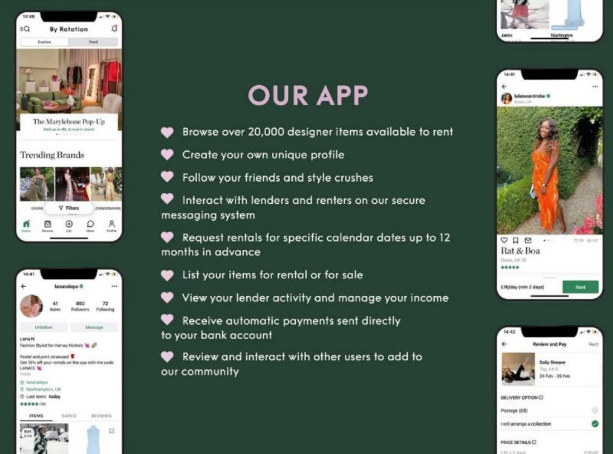
By Rotation product slide — slide 4
Seed stage (recorded). Peer-to-peer fashion rental app. Real screens around a feature list.
By Rotation deck, slide 4. Exact stored slide matched to this analysis.
Our analysis: The clearest example here: the investor sees the actual app and reads what both renters and lenders can do in it.
Evidence and limitation: Real screens and one figure ("20,000 designer items"); the screens are small.
What a founder can adapt: Surround your list of actions with the real screens where each happens.
Supporting analysis
What the deck claims: "Our App." "Browse over 20,000 designer items available to rent." "Create your own unique profile." "Follow your friends and style crushes." "Interact with lenders and renters on our secure messaging system." "Request rentals for specific calendar dates up to 12 months in advance." "List your items for rental or for sale." "View your lender activity and manage your income." "Receive automatic payments sent directly to your bank account." "Review and interact with other users to add to our community." Five app screens (browse, profile, listing, checkout).
Presentation choice: Covering both sides (renting and lending) shows the marketplace works from each user's phone.
When it does not fit: Nine bullets is a lot; group them by user (renter, lender) or cut to five.
Seed stage (recorded). Shoppable labels on photos. Two sides of the product.
LABELit deck, slide 4. Exact stored slide matched to this analysis.
Our analysis: Explains a new behaviour through one concrete example on each side: someone asks, someone answers, everyone can shop.
Evidence and limitation: Two real screens with worked examples; no usage figures.
What a founder can adapt: If your app depends on two kinds of user action, show one screen for each with a real example.
Supporting analysis
What the deck claims: "How does it work? Want and Haves." "Want: If a user sees a product in a picture but don't know what it is, he simply asks the community. We call it a Want." "Have: A completed label with price and product info is a Have. Now every user can shop that item." Two screens with captions ("Seems as if Paula likes the bow tie a lot..."; "That's Natalie Portman on the streets of L.A....").
Presentation choice: Naming the two actions ("Want", "Have") gives the investor words to remember the product by.
When it does not fit: The captions are long; one line per screen would read faster.
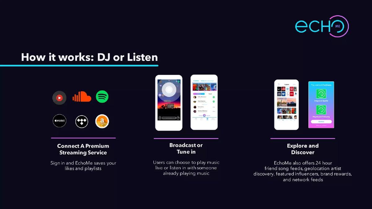
Stage not disclosed (recorded). Social music listening. Three steps with screens.
EchoMe deck, slide 3. Exact stored slide matched to this analysis.
Our analysis: Shows the path from sign-in to the core action (DJ or listen) to discovery.
Evidence and limitation: Three steps with real screens; the third step lists five features in one sentence.
What a founder can adapt: Make step one the setup, step two the core action and step three what keeps people coming back.
Supporting analysis
What the deck claims: "How it works: DJ or Listen." "Connect A Premium Streaming Service: Sign in and EchoMe saves your likes and playlists." "Broadcast or Tune in: Users can choose to play music live or listen in with someone already playing music." "Explore and Discover: EchoMe also offers 24 hour friend song feeds, geolocation artist discovery, featured influencers, brand rewards, and network feeds." Streaming service logos and app screens.
Presentation choice: Starting with "connect the service you already use" answers the obvious question: where does the music come from?
When it does not fit: The third step crams in five features; show one.
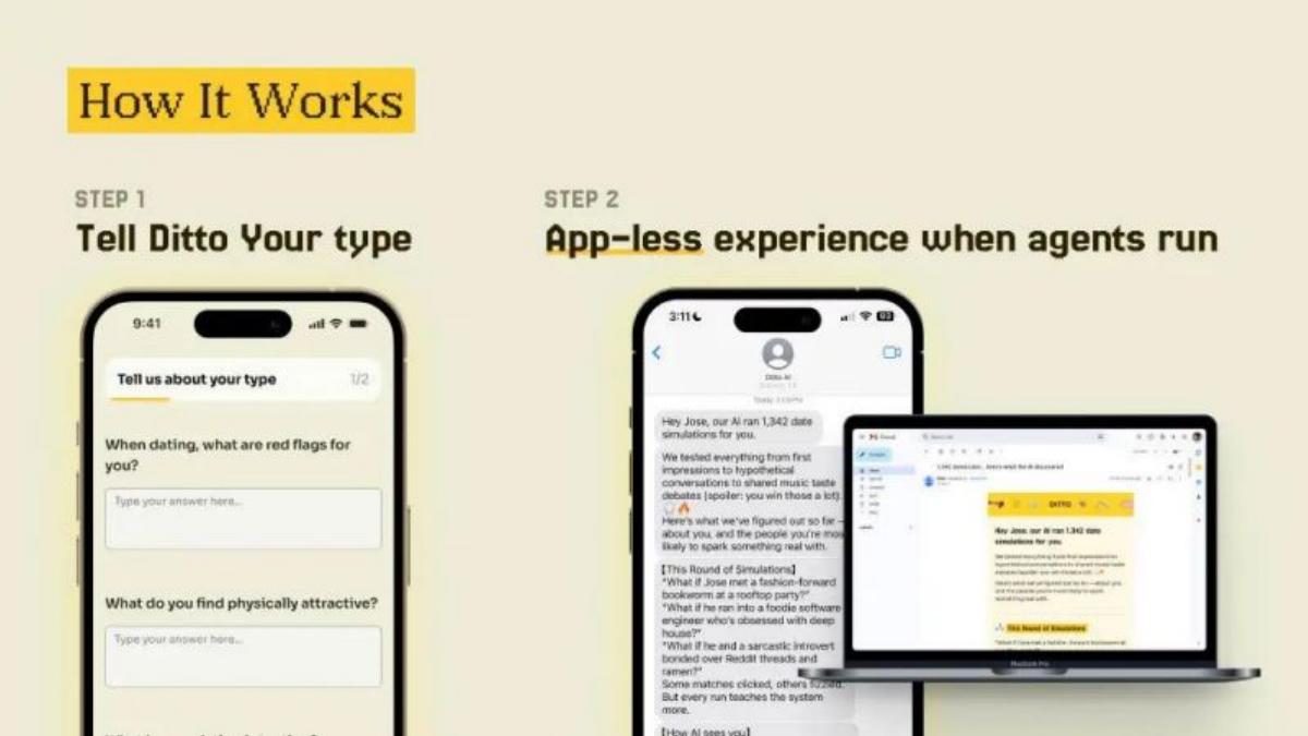
Seed stage (recorded). AI-assisted dating. Two steps on phone and laptop.
Ditto deck, slide 6. Exact stored slide matched to this analysis.
Our analysis: Shows what the user puts in and what they get back, in two steps.
Evidence and limitation: Two real screens; the output text is too small to read on the slide.
What a founder can adapt: Show the input step and the result step, and make the result the larger of the two.
Supporting analysis
What the deck claims: "How It Works." "Step 1: Tell Ditto Your type." A phone questionnaire ("When dating, what are red flags for you?", "What do you find physically attractive?"). "Step 2: App-less experience when agents run." A phone and laptop showing a written summary of simulated conversations.
Presentation choice: The input questions are readable and make the product concrete immediately.
When it does not fit: Enlarge the output; it is the part the investor most wants to read.
Stage not disclosed (recorded). Trip planning app. One screen with a callout.
Sneak deck, slide 6. Exact stored slide matched to this analysis.
Our analysis: Simple and readable: the investor sees the itinerary a user ends up with.
Evidence and limitation: One real screen and one caption; no figures.
What a founder can adapt: If one screen captures the value, show it large and point to the one thing that matters.
Supporting analysis
What the deck claims: "How It Works." One phone screen ("Build Itinerary", map, "My Trip Itinerary" with places and "GO" buttons) and a callout: "Get trip summary & booking options."
Presentation choice: One large screen with one callout is easier to read than several small ones.
When it does not fit: Add how the user got there (search, pick places) if the title promises "How it works".
Stage not disclosed (recorded). Car-and-cabin trip booking. Five-step journey in icons.
Freewheel deck, slide 4. Exact stored slide matched to this analysis.
Our analysis: Tells a clear story from need to repeat booking, but the investor never sees the app.
Evidence and limitation: A user journey with a named persona; no app screen.
What a founder can adapt: Keep the journey, and put a real screen under the browse and book steps.
Supporting analysis
What the deck claims: "How It Works. FREEWHEEL provides a seamless experience, allowing people to quickly book trips." Five icons: "Margie experiences feelings of discontent & need for a diversion from everyday life." "Navigates to and downloads FREEWHEEL app on device of choice." "Browses for favorite car models, hotel locations and range of travel dates." "Experiences the magic of driving off-the-grid in a remote location." "Earns loyalty points and perks for her next trip with FREEWHEEL."
Presentation choice: A named user and a loop back to the next trip show the team has thought about retention.
When it does not fit: Don't let icons stand in for the product itself.
Seed stage (recorded). Pet app. A planned feature described in paragraphs.
Kriddr deck, slide 5. Exact stored slide matched to this analysis.
Our analysis: Included for contrast: an honest description of a future feature, but nothing an investor can see.
Evidence and limitation: Paragraphs describing planned work ("will record", "will build"); no screen.
What a founder can adapt: Show a mock-up of the recording screen and one line on what exists today.
Supporting analysis
What the deck claims: "AI: Bark Recognition Technology." "Overview: Methods to build an effective artificial intelligence stack for animals and pets are starting to become widely used..." "User-Interface: Pet owners will record their animal sounds using a feature similar to talk-to-text within the app..." "Future Goals: These initial responses will build the foundation for later iterations applying machine learning to better predict the animals' needs."
Presentation choice: It is clear that this is planned, not live, which is useful context.
When it does not fit: Don't put a page of text on a product slide.
Before: Pet owners will record their animal sounds using a feature similar to talk-to-text within the app... [three paragraphs]
After: [Mock-up: record screen] Record your dog's bark. [Mock-up: result] See what it might mean. Status: [what is live today]; recognition planned.
What improved: Our illustrative rewrite; not Kriddr's wording. Bracketed parts are placeholders to fill with real facts. It turns paragraphs into two screens and a clear status line.
What this guide adds
The library already has a general product slide guide, product slides by stage, and SaaS, fintech, healthcare, edtech, climate, food, media, marketplace, AI, real estate and developer tool product guides, plus consumer problem, solution, market, competition, team, traction and business-model guides. The consumer solution guide explains how decks describe the fix; this page looks at how the app itself is shown to an investor.
Sector labels come from the sector recorded for each published teardown (high confidence for all seven). None of these seven slides appears in another guide. Other slides from the By Rotation, EchoMe and Kriddr decks are used elsewhere in the library for different lessons.
Four ways consumer decks show the product
Screens plus features (By Rotation, Sneak): real screens with the actions or outcome listed beside them.
Screens in order (EchoMe, Ditto): one step per screen, left to right.
Two sides (LABELit): the request one user makes and the answer another gives, each on a screen.
Icons or paragraphs (Freewheel, Kriddr): the journey drawn as icons, or the product described in text. The investor sees no app.
Common mistakes
No screen. Icons and paragraphs don't show the app.
Screens too small. Two readable screens beat five tiny ones.
Too many features. Show the core action; save the rest for the demo.
Planned shown as live. Mark what exists today.
Diagnostic checklist
Real, readable phone screens.
Screens in the order a user goes.
A short caption per screen.
The result the user ends with.
Live vs planned marked.
Frequently asked questions
How we chose these examples
Corpus: published pitch deck teardowns on StartupFundraising.com. Founder-uploaded private decks are excluded.
Selection (2026-09-27): we took teardowns whose recorded sector is consumer (high or medium confidence) with a stored slide image and readable text mentioning the product, how it works, the app, screens or features. We viewed twelve candidate slides, left out slides already used in other guides, a second product slide from a deck whose product slide is already analysed elsewhere (Foursquare), a second slide from the same deck (LABELit's tools slide) and weaker duplicates of the same approach (Connected2.me, Nearby, Friendfiz), and kept seven that show different ways of presenting a consumer app. Kriddr is included as a weaker example for contrast.
Sector is the category recorded for each teardown (high confidence for all seven). Stages as recorded: By Rotation, LABELit, Ditto and Kriddr, seed; EchoMe, Sneak and Freewheel, not disclosed.
Review: stored slide images were checked on 2026-09-27 and matched to company, deck and slide number, and quoted text was read from the images (editorial model review). No person has yet completed an editorial review of this page.
Claims and figures are as shown on the slides; we have not verified them. We make no claim that any slide caused a fundraising outcome.