Healthcare Product Slides: 7 Real Pitch Deck Examples
How health startups present their product: care pathways with turnaround times, real software screens, device specs, delivery models and platform stacks.
Healthcare Product Slides: Real Pitch Deck Examples
Seven product slides from health decks (teledermatology, surgical analytics, clinic kiosks, women's clinics, employee health benefits, health engagement and pain care), shown in full. The strongest ones follow one patient or one clinician through the product and say who does each step; the weakest describe a platform the company plans to build.
TL;DR
A healthcare product slide should show who uses the product at each step of care, and what they get at the end. MedX's DermSecure slide follows a mole scan from a technician to a contracted dermatologist ("<2 min/scan") to a medical report with a "2 day turnaround" and three possible outcomes. ORHub shows its real analytics screens and lists the surgical data they cover. UAH labels every instrument in its kiosk and gives its size, power and connection needs. Penda Health shows its clinics in the middle and the two channels that bring patients in. Fijoya and Well describe employee and member platforms in a sentence or a layer diagram, and Clearing describes a platform it says it will become "over time"; these are the weaker examples here.
Healthcare product slides
Each example shows the exact stored slide above its analysis and links to the full teardown. Stronger examples first. Claims, times and specs are as shown on the slides; we have not verified them.
MedX (DermSecure) product slide — slide 6
Teledermatology software. A six-step care pathway with photos.
MedX (DermSecure) deck, slide 6. Exact stored slide matched to this analysis.
Our analysis: The clearest healthcare product slide here: an investor can see who does each step, how long it takes and what the patient gets.
Evidence and limitation: Times per step and three outcomes; no scan volumes or price on this slide.
What a founder can adapt: Draw your product as the patient's path through care, with who acts and how long each step takes, ending in the result the patient receives.
Supporting analysis
What the deck claims: "Telemedicine Software Platform(DermSecure): Many Points of Service + Remote Dermatologist Assessment." Steps: "Scan performed by trained technician; process takes minutes" → "DermSecure Network Cloud-based platform" (HIPAA and PIPEDA badges) → "Dermatologists contracted to read scans Hub & Spoke Model" → "SIAscan assessment (<2 min/scan)" → "Medical Report: To clinic, patient, family physician; 2 day turnaround" → "Outcomes: Mole is not suspicious; Mole needs to be watched; image stored for future comparison; Mole suspicious; appointment at dermatologist expedited".
Presentation choice: Naming the technician and the contracted dermatologist shows how the service scales without hiring specialists at every site.
When it does not fit: Six boxes, six photos and three logos compete for attention; the stock photos add little and could be cut.
Surgical analytics software. Real dashboards on screens.
ORHub deck, slide 3. Exact stored slide matched to this analysis.
Our analysis: Shows that the product exists and where its data comes from (the hospital or surgery centre record).
Evidence and limitation: Real screens and named data sources; no customer or result on this slide.
What a founder can adapt: Show one real screen and name the system your data comes from.
Supporting analysis
What the deck claims: "Solution." "Easy to use, powerful analytics software that automatically translates all surgical data into one comprehensive report." "Real Time Fresh Data", "Smart Device Enabled", "Integrated across care teams, physicians and executives". Data covered: "Surgical Techniques", "Device Implantation", "Location", "Product Usage", "All Clinical Parameters". "ORHub's Surgical Spotlight uses data captured in the hospital or ASC EHR or manual systems to create a rich analytics dashboard to manage the business of surgery effectively, with real information."
Presentation choice: For software sold to hospitals, the data source answers the first integration question.
When it does not fit: Four screens are too small to read; show one screen large with one highlighted number (for example cost per case).
UAH deck, slide 4. Exact stored slide matched to this analysis.
Our analysis: Makes a hardware product concrete: every instrument is named with what it measures, and the site requirements are listed.
Evidence and limitation: Device parts and specs; no sites, visits or price.
What a founder can adapt: Label your device's parts with what each does for the patient, and list what a site needs to install it.
Supporting analysis
What the deck claims: "UAH e-Health clinic kiosk & personal health management platform." Labelled instruments: "Blood pressure cuff", "Weight scale", "Thermometer", "Magnascope", "Stethoscope", "Otoscope", "Pulse oximeter", "Medications: may be e-prescribed by the provider to your pharmacy of choice". "Kiosk spec": "Height: 7.6 feet", "Width: 13.6 feet", "Depth: 5 feet", "Weight: 130 lbs (59 kg)", "Switch selectable 120/240 VAC", "2.5 amps", "Connectivity: Min 1 Mbps". "Powered By VSee".
Presentation choice: Space, power and bandwidth are what a pharmacy or employer asks before installing a kiosk.
When it does not fit: The telemedicine partner (VSee) appears only as a logo; say what it provides. The 7.6 ft × 13.6 ft figures read like height and width swapped; check specs before sending.
Seed stage. Outpatient clinics for women, Kenya. Delivery model.
Penda Health deck, slide 4. Exact stored slide matched to this analysis.
Our analysis: Shows the clinic as the product and the two routes that bring patients to it.
Evidence and limitation: Services and patient channels; no clinic count, visit volume or price.
What a founder can adapt: Put your service in the centre and draw the channels that bring patients in.
Supporting analysis
What the deck claims: "Penda Health Delivery Model." "Penda Health Centres: Outpatient medical centres for women": "Family planning", "STIs and HIV", "Cervical and breast cancer screening", "Treatment for reproductive health Issues". Two channels with arrows labelled "Customers": "Penda Health Group Visits: Educational outreach to women's groups" and "Penda Health Factory Partnerships: Partnerships with EA's largest factories".
Presentation choice: For a care provider, how patients arrive matters as much as the services offered; one diagram shows both.
When it does not fit: No numbers: add clinics open, visits per month or the price of a visit.
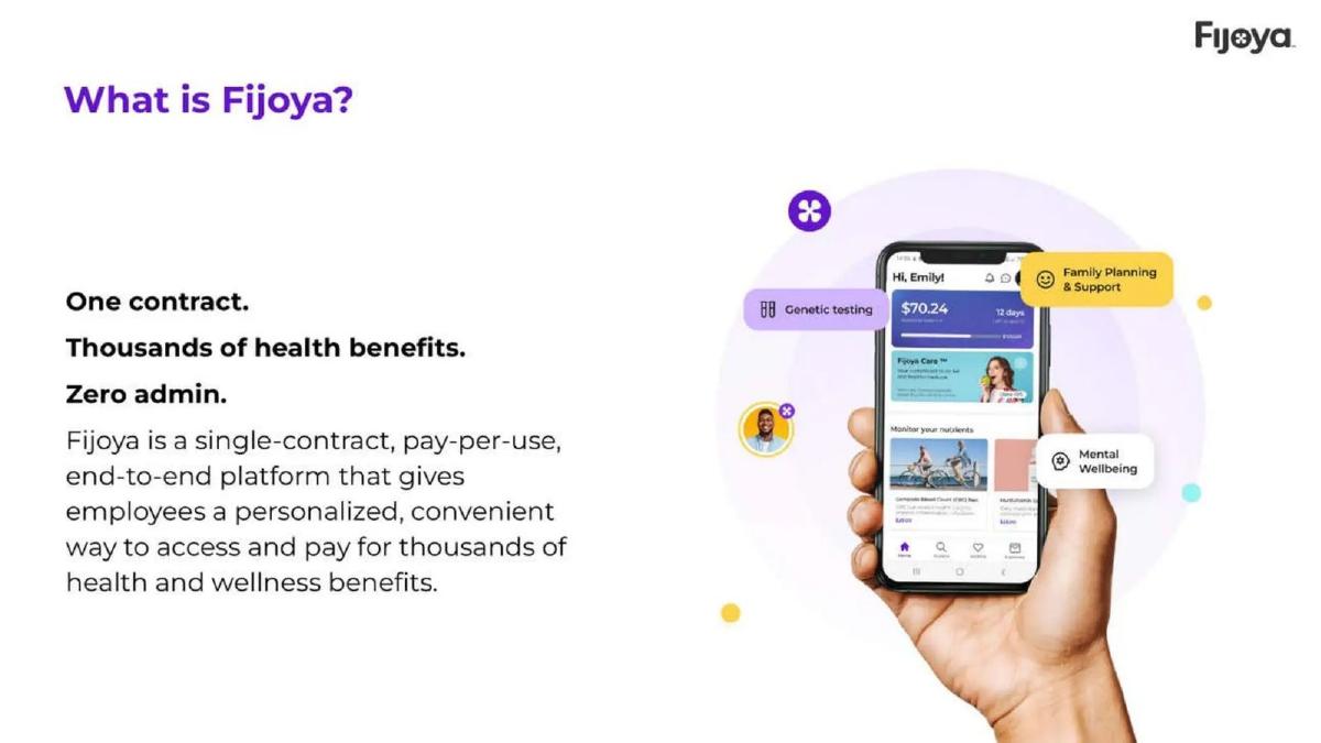
Employee health benefits platform. One-line promise with an app screen.
Fijoya deck, slide 2. Exact stored slide matched to this analysis.
Our analysis: The three short lines state the benefit to the employer (one contract, no admin) and the employee (many benefits) quickly.
Evidence and limitation: A promise and one app screen; no employer count or price.
What a founder can adapt: Write one line for each side of the product (the buyer and the user) and show the screen the user sees.
Supporting analysis
What the deck claims: "What is Fijoya?" "One contract. Thousands of health benefits. Zero admin." "Fijoya is a single-contract, pay-per-use, end-to-end platform that gives employees a personalized, convenient way to access and pay for thousands of health and wellness benefits." App screen with a balance of "$70.24"; tags: "Genetic testing", "Family Planning & Support", "Mental Wellbeing".
Presentation choice: "Pay-per-use" tells an employer how they will be billed, which is often the first question for benefits.
When it does not fit: "Thousands of health benefits" is not shown; name three that employees use most and what the $70.24 balance represents.
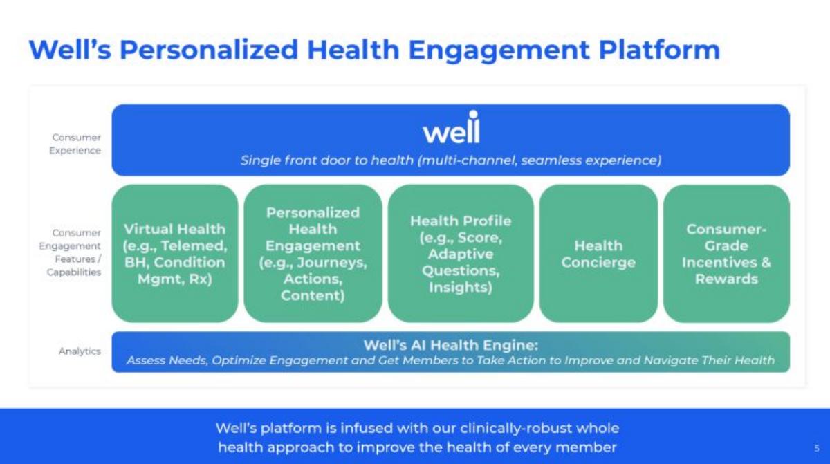
Series A. Health engagement platform for members. Layer diagram.
Well deck, slide 5. Exact stored slide matched to this analysis.
Our analysis: A tidy map of what the platform includes, from what the member sees to the engine underneath.
Evidence and limitation: Capabilities in layers; no member outcome or engagement figure.
What a founder can adapt: If you use a layer diagram, mark which parts you built and which you partner for, and add one engagement result.
Supporting analysis
What the deck claims: "Well's Personalized Health Engagement Platform." Top layer: "Single front door to health (multi-channel, seamless experience)". Five capabilities: "Virtual Health (e.g., Telemed, BH, Condition Mgmt, Rx)", "Personalized Health Engagement (e.g., Journeys, Actions, Content)", "Health Profile (e.g., Score, Adaptive Questions, Insights)", "Health Concierge", "Consumer-Grade Incentives & Rewards". Bottom layer: "Well's AI Health Engine: Assess Needs, Optimize Engagement and Get Members to Take Action to Improve and Navigate Their Health".
Presentation choice: Layer diagrams help investors see how many parts are built versus bought, if the slide says which.
When it does not fit: Five boxes of capabilities with no member in the picture; show what one member does in their first week.
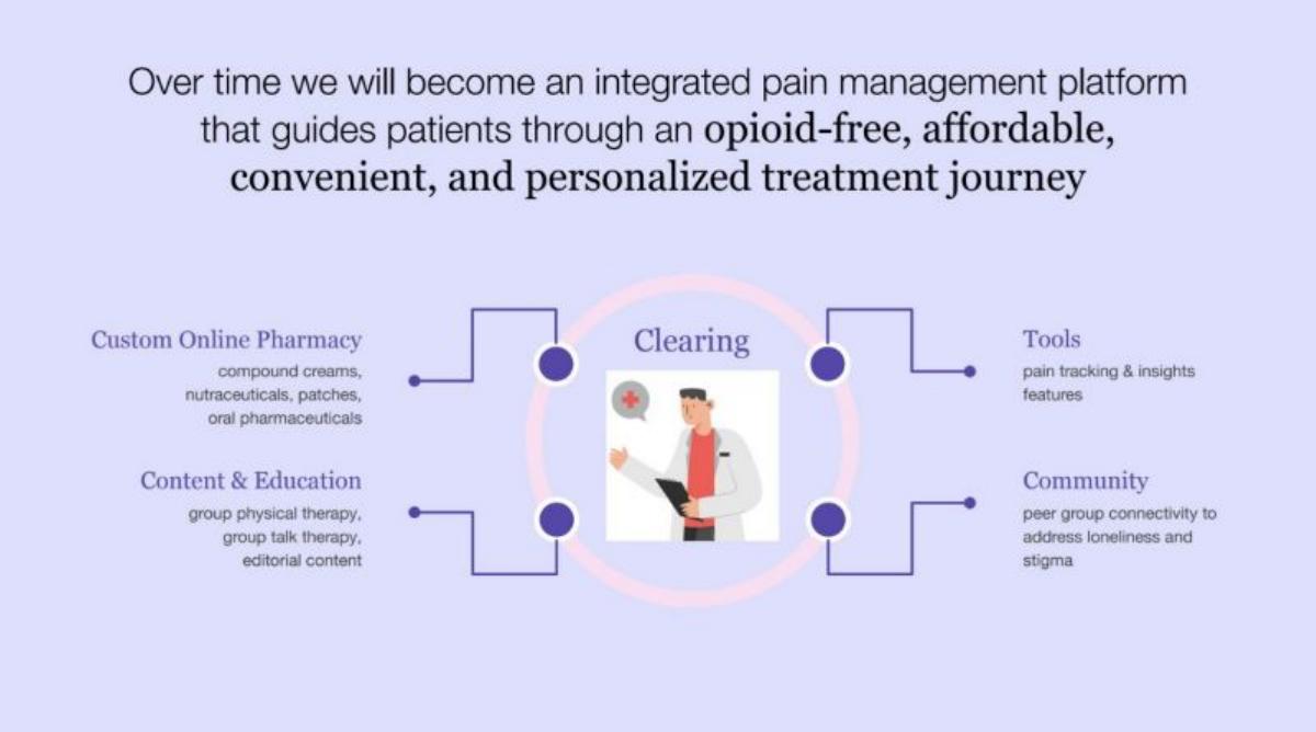
Clearing deck, slide 6. Exact stored slide matched to this analysis.
Our analysis: A weaker example: it describes where the company is heading rather than what a patient can use now.
Evidence and limitation: A future plan; the slide does not say which parts exist today.
What a founder can adapt: Mark what is live today and what comes later, and put today's product first.
Supporting analysis
What the deck claims: "Over time we will become an integrated pain management platform that guides patients through an opioid-free, affordable, convenient, and personalized treatment journey." Four parts around "Clearing": "Custom Online Pharmacy: compound creams, nutraceuticals, patches, oral pharmaceuticals", "Content & Education: group physical therapy, group talk therapy, editorial content", "Tools: pain tracking & insights features", "Community: peer group connectivity to address loneliness and stigma".
Presentation choice: Included for contrast: vision hubs are common in health decks and leave investors unsure what is live.
When it does not fit: "Over time" with no dates; add a date or a milestone for each part.
How the product is presented, whether the user is shown, and whether the slide includes a number.
Example
Health type
Presented as
User shown
Numbers on slide
MedX (DermSecure)
Teledermatology
Care pathway
Patient, technician, dermatologist
Minutes per scan, 2-day turnaround
ORHub
Surgical analytics
Real screens + data sources
Care teams, executives
Only inside screenshots
UAH
Clinic kiosk
Labelled device + specs
Patient (implied)
Size, power, bandwidth
Penda Health
Women's clinics
Delivery model
Women patients
No
Fijoya
Employee benefits
Promise + app screen
Employer, employee
One app balance
Well
Health engagement
Layer diagram
Members (general)
No
Clearing
Pain care
Future platform hub
Patients (general)
No
Key Takeaways
Follow one patient or clinician through the product, step by step.
Say who does each step: technician, clinician, software or patient.
Show a real screen or the real device, not only icons.
State one number per step where you have it (minutes, days).
Separate what exists today from what you plan to build.
Build your healthcare product slide
Start from one patient or clinician and the result they get, then show the steps in between.
User. Who uses it first: patient, clinician, technician, employer or hospital team.
Steps. The 3–5 steps of care the product covers, and who performs each.
Time or result. One number per step where you have it (minutes, days, visits) and the final result.
Live today. Which parts exist now, and which are planned.
Copyable framework: [User] [step 1, who, time] → [step 2] → [result in X days]. Live today: [parts]. Next: [parts, date].
Illustrative example 1 — written by us
Before: Over time we will become an integrated pain management platform that guides patients through an opioid-free, affordable, convenient, and personalized treatment journey.
After: A patient with chronic pain [gets a prescribed compound cream from our online pharmacy] and [tracks pain in the app]. Live today: [parts]. Next: [group therapy, date].
What improved: Our illustrative rewrite; not Clearing's wording. Bracketed parts are placeholders to fill with real facts. It starts from one patient and separates what is live from what is planned.
What this guide adds
The library already has a general product slide guide, product slides by stage, and fintech and SaaS product guides, plus healthcare problem and solution guides. This page looks only at health decks, where the product usually sits inside a care process with clinicians, patients and sometimes regulators, and investors want to see where it fits in that process.
Sector labels come from the sector recorded for each published teardown (high confidence for MedX, Penda Health, Well and Clearing; medium for ORHub, UAH and Fijoya). None of these seven slides appears in another guide. MedX's deck is also used in the healthcare problem guide, but for a different slide.
Four ways health decks show the product
Care pathway (MedX DermSecure): each step of care in order, with who performs it, how long it takes and what the patient receives at the end.
Real product (ORHub, UAH): actual dashboards or the physical device, labelled with what each part does. These answer "does it exist?" without a separate slide.
Delivery model (Penda Health): where care happens and how patients reach it. For a care provider, the clinic and its channels are the product.
Platform descriptions (Fijoya, Well, Clearing): a one-line promise, a layer diagram or a future hub. Easy to make, but they leave the investor asking what a patient or employee actually does first.
Common mistakes
Platform without a patient. Show one user moving through the product.
Vision presented as product. Mark what is live today.
Icons instead of the real thing. Show a real screen or device.
No time or result. Add minutes, days or the outcome the user gets.
Partners as logos only. Say what each partner provides.
Diagnostic checklist
One named user.
Steps of care in order, with who does each.
A real screen or device.
At least one time or result.
Live parts separated from planned parts.
Frequently asked questions
How we chose these examples
Corpus: published pitch deck teardowns on StartupFundraising.com. Founder-uploaded private decks are excluded.
Selection (2026-09-26): we took teardowns whose recorded sector is healthtech and whose slide is classified as a product slide, with a stored image and readable text. We read the candidates, left out slides that were not about the product (team, market or unrelated content filed under this sector) and slides already used in another guide (Formel, Included Health's partnerships slide, Beam, Feel Therapeutics), and kept seven that show different ways of presenting a health product. Clearing is included as a weaker example for contrast.
Sector is the category recorded for each teardown (confidence given in the section above). Stages are shown only where recorded with high confidence (Penda Health and Clearing, seed; Well, Series A).
Review: stored slide images were checked on 2026-09-26 and matched to company, deck and slide number, and quoted text was read from the images (editorial model review). No person has yet completed an editorial review of this page.
Claims, times and specs are as shown on the slides; we have not verified them. We make no claim that any slide caused a fundraising outcome.