Marketplace Product Slides: 8 Real Pitch Deck Examples
How marketplace startups present their product: the buyer's journey screen by screen, a two-sided diagram with the money flow.
Marketplace Product Slides: Real Pitch Deck Examples
Eight product slides from marketplace decks (tours, art, student relocation, hiring, dating, travel content, on-course food delivery and classifieds), shown in full. A marketplace has at least two sides, so the product slide has to show what the buyer does and what happens on the other side. The stronger slides show real screens in order or draw both sides with the money between them; the weaker ones describe the product in text.
TL;DR
A marketplace product slide should show the buyer's path through the product and where the other side and the money come in. Kangarooo shows four phone screens from browsing tours to a booked ticket. Kollecto shows three steps from a taste questionnaire to paying for art monthly. Relobuddy draws international students on one side, local helpers on the other, and what each pays or earns. UnitesUs shows the ranked candidate list an employer actually sees. Kama and AdventureClicknBlog label real screens; CaddySnack shows one menu screen. Nepsify describes its two user types in paragraphs with no screen, the weaker example here.
Marketplace product slides
Each example shows the exact stored slide above its analysis and links to the full teardown. Stronger examples first. Claims and figures are as shown on the slides; we have not verified them.
Kangarooo product slide — slide 4
Seed stage (recorded, medium sector confidence). Tours and activities marketplace. Four phone screens in sequence.
Kangarooo deck, slide 4. Exact stored slide matched to this analysis.
Our analysis: The clearest buyer journey here: an investor can follow a tourist from browsing to a ticket in four steps.
Evidence and limitation: Four real screens with captions and a time claim ("less than 5 minutes"); no usage figures and no source for the time claim.
What a founder can adapt: Line up your real screens in the order a buyer uses them and end on the completed booking or order.
Supporting analysis
What the deck claims: "The Product." "Kangarooo simple and pleasant user interface which helps people find a tour in less than 5 minutes." Steps under four phone screens: "Browse available tourist activities" → "Compare reviews and prices" → "Select, book and pay" → "Have fun!" (a ticket screen).
Presentation choice: Ending on the ticket screen shows the transaction completes inside the product, which is where a marketplace earns.
When it does not fit: The tour operators (the other side) don't appear; add one line or screen for what they do.
Art marketplace with personal advisors. Three steps with screens.
Kollecto deck, slide 2. Exact stored slide matched to this analysis.
Our analysis: Shows the full buyer path and puts the human advisor at the centre, which is what separates it from a plain listing site.
Evidence and limitation: Three steps, two with real phone screens (an artwork and a payment options screen); no figures.
What a founder can adapt: If a person is part of your product, show where they step in and what they do for the buyer.
Supporting analysis
What the deck claims: "How It Works. Become an Art Collector. Get a personal stylist for your walls." "Get your own art advisor: Fill out a simple taste questionnaire and meet your Art Advisor." "Get the perfect piece: Your advisor learns what you like, finds & emails art, negotiates prices, and more!" "Pay for art over time: Pay for art you love using fixed monthly payments."
Presentation choice: The payment screen ("3 monthly payments", "6 monthly payments") shows how the purchase happens, not just the browsing.
When it does not fit: Artists and galleries (the supply side) aren't mentioned; say where the art comes from.
Seed stage (recorded). Relocation help for international students. Two-sided diagram.
Relobuddy deck, slide 5. Exact stored slide matched to this analysis.
Our analysis: The only slide here that shows both sides and the money flow on one page, including how supply is screened.
Evidence and limitation: A diagram of both sides and the platform, with "$" arrows; the commission rate is left as "$%" and there are no figures.
What a founder can adapt: Draw buyers on one side, suppliers on the other, your platform between, and label what each does and pays.
Supporting analysis
What the deck claims: "We're creating a platform to connect international students with locals, who set up personal accounts for them." Students: "Choose a local Relobuddy", "Select/pay for relocation services", "Meet their Relobuddy to collect personal account details". Relobuddy: "Manages the online platform", "Collects a $% of transactions", "Screens & approves local Relobuddies". Locals: "Sign up as a Relobuddy", "Pass our screening", "Set up & deliver personal accounts", "Get paid".
Presentation choice: "Pass our screening" answers the trust question a marketplace for personal services gets first.
When it does not fit: No product screen; pair the diagram with one real screen, and replace "$%" with the actual rate when you have it.
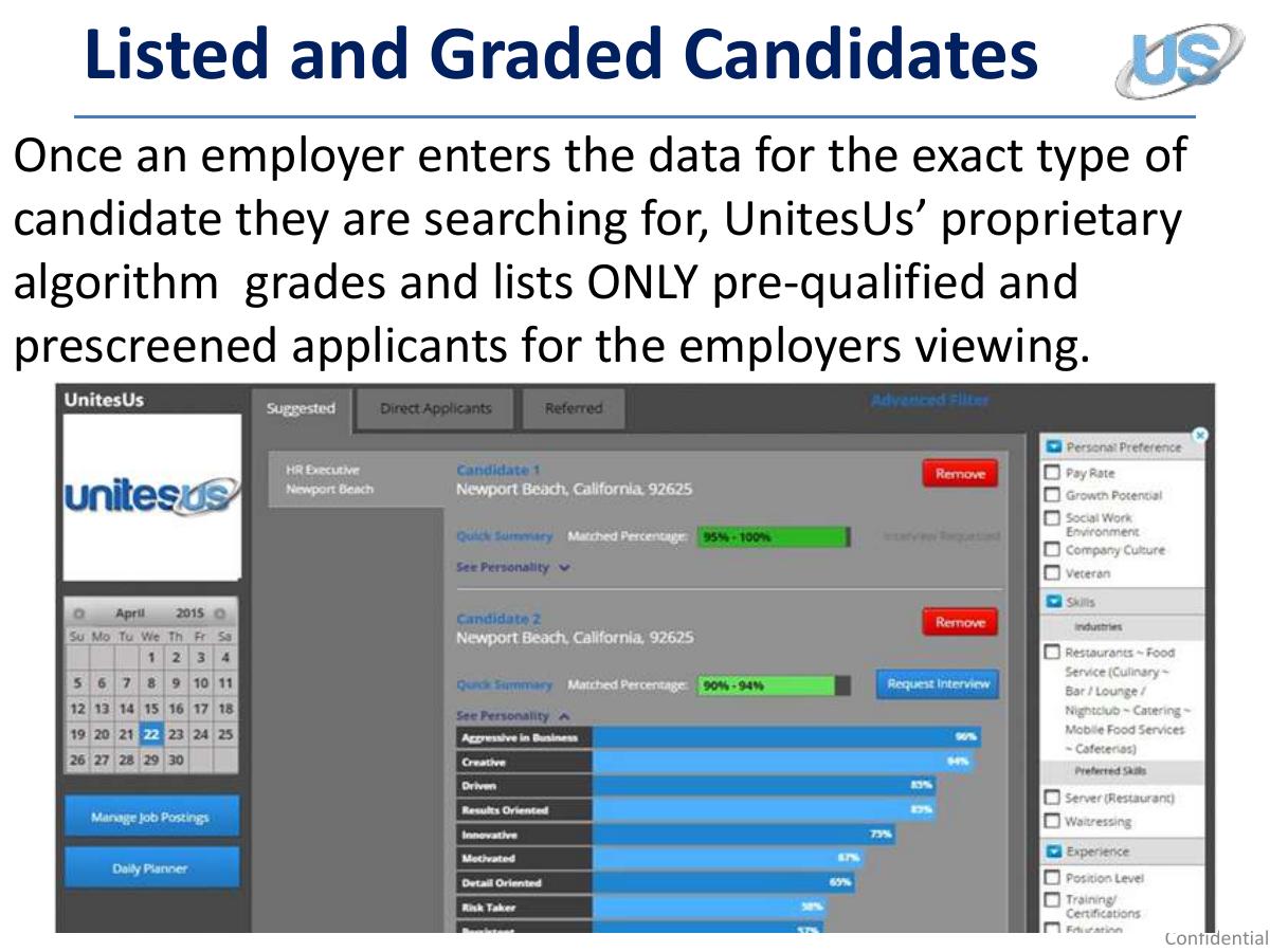
Seed stage (recorded, medium sector confidence). Hiring platform. The result screen an employer sees.
UnitesUs deck, slide 6. Exact stored slide matched to this analysis.
Our analysis: Shows the output the paying side receives, which is the most convincing part of a matching product.
Evidence and limitation: A real product screen with match percentages; how the grading works is not explained on this slide.
What a founder can adapt: Show the result screen your buyer gets (the match, the shortlist, the quote), not the input form.
Supporting analysis
What the deck claims: "Listed and Graded Candidates." "Once an employer enters the data for the exact type of candidate they are searching for, UnitesUs' proprietary algorithm grades and lists ONLY pre-qualified and prescreened applicants for the employers viewing." The screenshot shows candidates with a "Matched Percentage" (for example "95% - 100%") and personality bars.
Presentation choice: A ranked list with match scores makes "proprietary algorithm" concrete.
When it does not fit: The screenshot text is too small to read at slide size; crop to two candidates and enlarge.
Pre-seed (recorded). Dating with booked dates. Two labelled screens.
Kama deck, slide 4. Exact stored slide matched to this analysis.
Our analysis: Shows a step most dating decks skip (after the date) and links it to repeat use, but covers one part of the product only.
Evidence and limitation: Two real screens with captions; the churn label is a claim with no figure.
What a founder can adapt: If your product has a step competitors skip, give it screens and say what it changes.
Supporting analysis
What the deck claims: "Solution. Tinder + OpenTable. On Steroids." "Post-Date." "Feedback Screen" and "Re-Date Screen". "They had a nice time together, and after the date - they give Kama their feedback." "Accordingly, they will either become 'soul mates' and re-date. Or - they'll depart as 'discoveries'." A callout labels the re-date screen "Churn Rate Destroyer #2".
Presentation choice: The "Tinder + OpenTable" line gives a quick reference point before the screens.
When it does not fit: "Churn Rate Destroyer" needs a number; the restaurant side (OpenTable half) isn't shown.
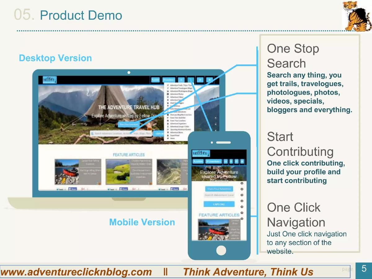
Seed stage (recorded, medium sector confidence). Adventure travel content hub. Desktop and mobile screens with labels.
AdventureClicknBlog deck, slide 6. Exact stored slide matched to this analysis.
Our analysis: Shows both user roles (searchers and contributors), but the features are generic and the screens are small.
Evidence and limitation: Real desktop and mobile screens with three labelled features; no usage figures.
What a founder can adapt: Name each side's main action next to the screen where it happens.
Supporting analysis
What the deck claims: "Product Demo." "Desktop Version", "Mobile Version". "One Stop Search: Search any thing, you get trails, travelogues, photologues, photos, videos, specials, bloggers and everything." "Start Contributing: One click contributing, build your profile and start contributing." "One Click Navigation."
Presentation choice: "Start contributing" signals the supply side (bloggers) is part of the product.
When it does not fit: "One click" features are expected; spend the labels on what is specific to you.
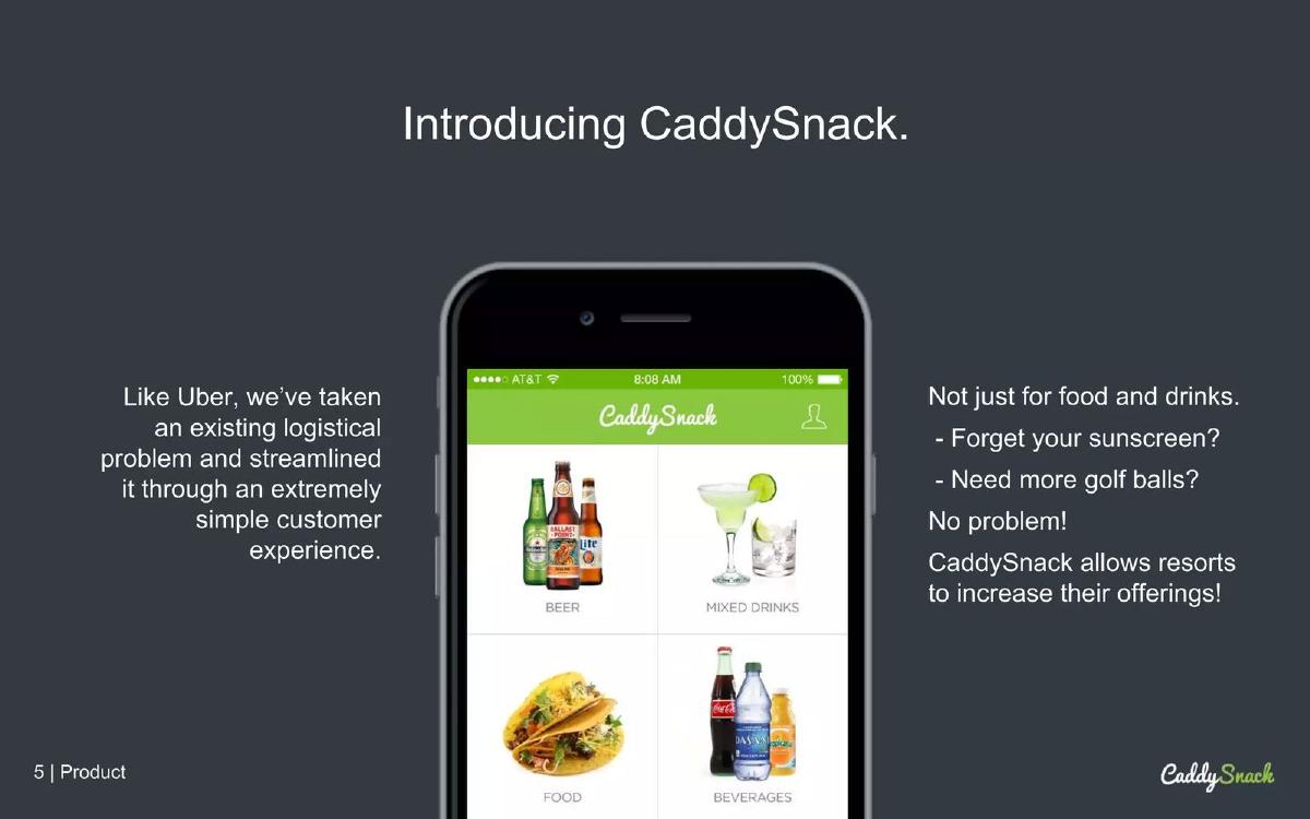
Golf-course food and drink ordering. One phone screen.
CaddySnack deck, slide 6. Exact stored slide matched to this analysis.
Our analysis: Proves the app exists and names both sides (golfers and resorts), but shows only the first screen of the order.
Evidence and limitation: One real menu screen; no figures.
What a founder can adapt: Add the next two screens (order, delivery on the course) so the investor sees the whole order.
Supporting analysis
What the deck claims: "Introducing CaddySnack." "Like Uber, we've taken an existing logistical problem and streamlined it through an extremely simple customer experience." "Not just for food and drinks. Forget your sunscreen? Need more golf balls? No problem! CaddySnack allows resorts to increase their offerings!" The screen shows menu categories: beer, mixed drinks, food, beverages.
Presentation choice: The line about resorts adding items says what the supply side gets.
When it does not fit: "Like Uber" is a comparison, not a description; say how the order reaches the golfer.
Seed stage (recorded). Classifieds marketplace. Text only.
Nepsify deck, slide 5. Exact stored slide matched to this analysis.
Our analysis: Included for contrast: it names both user types and an API, but the investor has to read paragraphs and imagine the product.
Evidence and limitation: Two paragraphs and two icons; no screens and no figures.
What a founder can adapt: Turn each paragraph into one screen and a one-line caption.
Supporting analysis
What the deck claims: "How and who can benefit." "An Individual: An individual can simply login and post their ad or requirements for free. Sign up and sign in process is simple. Can do with FB or Google id too." "Business Entity: Any individual can create the business entity... Our API lets businesses to pull the relevant content from us to their websites."
Presentation choice: Useful features (free posting, social sign-in, an API) are buried in body text.
When it does not fit: Sign-up details ("Can do with FB or Google id") don't belong on a product slide.
How the product is presented, whether both sides of the marketplace appear, and whether a real screen is shown.
Example
Marketplace
Presented as
Real screen
Both sides shown
Kangarooo
Tours
Four screens in sequence
Yes
Buyer only
Kollecto
Art
Three steps
Yes
Buyer and advisor
Relobuddy
Relocation
Two-sided diagram with money
No
Yes
UnitesUs
Hiring
Result screen
Yes
Employer only
Kama
Dating
Two labelled screens
Yes
Users only
AdventureClicknBlog
Travel content
Labelled desktop + mobile
Yes
Searchers and contributors
CaddySnack
On-course ordering
One screen + text
Yes
Named, not shown
Nepsify
Classifieds
Paragraphs
No
Named, not shown
Key Takeaways
Show the buyer's steps in order, one real screen per step.
Show the other side too: who supplies, and what they do.
Mark where money changes hands, even without the rate.
Show the result a buyer gets (a booking, a match, a ranked list).
Replace paragraphs with a screen and a one-line caption.
Build your marketplace product slide
Start with the buyer's path, then add the other side and where money moves.
Buyer steps. Three or four steps from search to completed transaction, one real screen each.
Supply side. What the seller or provider does, in one line or one screen.
Money. Where payment happens and what you keep (use a placeholder if the rate is not final).
Result. The booking, match or order the buyer ends with.
Copyable framework: [Buyer: search] → [compare] → [book and pay] → [result]. [Supplier: lists / accepts / delivers]. We keep [rate] of each transaction.
Illustrative example 1 — written by us
Before: An individual can simply login and post their ad or requirements for free.
After: [Screen: post an ad in [N] steps] → [Screen: buyer finds it] → [Screen: contact / pay]. Businesses: [what they get]. We earn [how].
What improved: Our illustrative rewrite; not Nepsify's wording. Bracketed parts are placeholders to fill with real facts. It replaces a paragraph with the steps and both sides.
What this guide adds
The library already has a general product slide guide, product slides by stage, and fintech, SaaS, healthcare, edtech, climate, food and media product guides, plus marketplace problem, solution, supply, business-model, competition, go-to-market, market and traction guides. The marketplace solution guide explains how decks describe the fix; this page looks at how the product itself is shown, and at the one question that is specific to marketplaces: does the slide show both sides?
Sector labels come from the sector recorded for each published teardown (high confidence for Kollecto, Relobuddy, Kama, CaddySnack and Nepsify; medium for Kangarooo, UnitesUs and AdventureClicknBlog). None of these eight slides appears in another guide. Other slides from the Kangarooo, Kama, Nepsify and Relobuddy decks are used elsewhere in the library for different lessons.
Four ways marketplace decks show the product
Buyer journey in screens (Kangarooo, Kollecto): the steps a buyer takes, left to right, each with a real screen and a caption.
Two-sided diagram (Relobuddy): both sides drawn, what each does, and arrows for the money. Shows how the marketplace works, but not the product screens.
The result the buyer sees (UnitesUs) or labelled screens (Kama, AdventureClicknBlog, CaddySnack): one screen that proves the product exists, with features called out.
Plain description (Nepsify): paragraphs explaining who can use it. Quick to make, but the investor has to imagine the product.
Common mistakes
Only the buyer side. Show what suppliers do too.
No transaction. End on the booking, order or payment.
Paragraphs instead of screens. One screen and one caption per step.
Comparison instead of description. "Like Uber" doesn't say how yours works.
Unreadable screenshots. Crop and enlarge the part that matters.
Diagnostic checklist
Buyer steps in order, with real screens.
Supply side shown or stated.
Where money changes hands.
The result the buyer gets.
Screens readable at slide size.
Frequently asked questions
How we chose these examples
Corpus: published pitch deck teardowns on StartupFundraising.com. Founder-uploaded private decks are excluded.
Selection (2026-09-27): we took teardowns whose recorded sector is marketplace (high or medium confidence) with a stored slide image and readable text mentioning the product, how it works, screens or a demo. We read the candidates, left out slides already used in other guides (including Pop Shop's product slide, used elsewhere) and slides that were not about the product, and kept eight that show different ways of presenting a marketplace product. Nepsify is included as a weaker example for contrast.
Sector is the category recorded for each teardown (confidence given in the section above). Stages are shown only where recorded (Kangarooo, Relobuddy, UnitesUs, AdventureClicknBlog and Nepsify, seed; Kama, pre-seed); stage is not recorded for Kollecto and CaddySnack.
Review: stored slide images were checked on 2026-09-27 and matched to company, deck and slide number, and quoted text was read from the images (editorial model review). No person has yet completed an editorial review of this page.
Claims and figures are as shown on the slides; we have not verified them. We make no claim that any slide caused a fundraising outcome.