How education startups present their product: worked examples, real screens, content libraries, school delivery steps and one-line formulas.
Edtech Product Slides: Real Pitch Deck Examples
Seven product slides from education decks (child safety, kids' apps, skills testing, school counselling, teacher training, online courses and childcare software), shown in full. The strongest ones walk through one real case or show the product next to a result; the weakest describe the design in general words.
TL;DR
An edtech product slide should show what happens for one learner, teacher or parent when they use the product. TheBullyTracker follows one sample child from her usernames to a flagged post to a text, email or report for her parent. Curious Hat shows its four app icons and a downloads chart on the same slide. iMocha lists the skill areas its tests cover ("2,000+ Skills"). Siembra shows its counsellor app screens and what each user receives, and InOpen maps its delivery to schools from officer visit to follow-up. Bookneto explains itself with a one-line formula (WordPress + an expert = Bookneto), and Kangarootime describes its software as "intuitive" and "beautiful"; these are the weaker examples here.
Edtech product slides
Each example shows the exact stored slide above its analysis and links to the full teardown. Stronger examples first. Claims and figures are as shown on the slides; we have not verified them.
TheBullyTracker product slide — slide 6
Seed stage. Cyberbullying alerts for parents. Worked example.
TheBullyTracker deck, slide 6. Exact stored slide matched to this analysis.
Our analysis: The clearest edtech product slide here: an investor sees exactly what goes in, what the system catches and what the parent gets.
Evidence and limitation: One worked case through the product; no user numbers or price.
What a founder can adapt: Run one sample learner or parent through your product, from what they enter to what they receive.
Supporting analysis
What the deck claims: "TheBullyTracker.com Product & Service Offerings." "Cyberbullying Protection Service (CPS)." "BullyTracker Database": "Child's name (Michelle Webb)", "Use unique identifiers: MWebb (username), @FastRunnerMW (Twitter Handle), Webby (nickname)", "Added to list of keywords and phrases associated with cyber bullying". → "Alert and Workflow Engine", "Tweet found: "@FastrunnerMW you're fat and ugly, we all know that!! OMG"" → "Text", "Email", "Reports" → "Parent Notification".
Presentation choice: A realistic sample case makes an invisible monitoring service concrete in one read.
When it does not fit: Say how quickly the parent is alerted and how often a flag is wrong; both are the next questions.
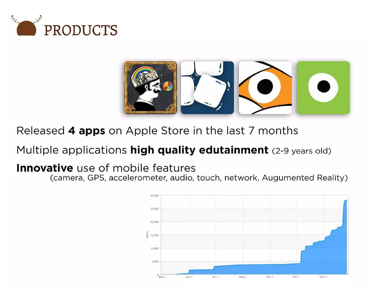
Seed stage. Educational apps for young children. Products with downloads chart.
Curious Hat deck, slide 4. Exact stored slide matched to this analysis.
Our analysis: Puts what was built next to evidence that people use it, which most product slides leave for later.
Evidence and limitation: Four apps and a units chart; the chart does not say whether units are downloads or sales.
What a founder can adapt: Show what you have shipped and one usage chart beside it, with the user's age or role named.
Supporting analysis
What the deck claims: "Products." Four app icons. "Released 4 apps on Apple Store in the last 7 months", "Multiple applications high quality edutainment (2-9 years old)", "Innovative use of mobile features (camera, GPS, accelerometer, audio, touch, network, Augumented Reality)". Chart of "Units" from May to November, rising to just under 30,000.
Presentation choice: The age range (2–9) names the user, and the chart answers "does anyone want this?" on the same slide.
When it does not fit: Label the chart (downloads, paid units or active users) and name each app under its icon.
School counselling communication app. Screens plus features.
Siembra deck, slide 6. Exact stored slide matched to this analysis.
Our analysis: Names three users (counsellors, students, parents) and what each gets, and labels this as phase 1.
Evidence and limitation: Real screens and features; no schools or users.
What a founder can adapt: Show real screens and say what each type of user gets from them.
Supporting analysis
What the deck claims: "Phase 1 Delivery – Counselor Connect." Desktop and five phone screens. "Communication platform for counselors", "Enables 1-to-1 and group distribution of notices, information, & reminders", "Real-time and off-line communication", "Enables parent communication", "Daily/weekly/monthly activity reports for parents", "Gathers data to track acknowledgments, responses, productivity metrics", "Designed for ease of use", "Scalable architecture for more users and new feature additions".
Presentation choice: "Phase 1" tells investors what exists now and implies more to come.
When it does not fit: Eight bullets; cut the generic ones ("ease of use", "scalable architecture") and add schools using it.
Computer science curriculum for schools. Delivery process.
InOpen deck, slide 5. Exact stored slide matched to this analysis.
Our analysis: Shows that the product is a service delivered to schools, with teacher training and follow-up visits.
Evidence and limitation: Delivery steps only; no schools, time per step or price.
What a founder can adapt: If you deliver into schools, show the steps from first visit to ongoing support, with how long each takes.
Supporting analysis
What the deck claims: "Product Delivery and Model." "Education Officer Visit" → "Classroom Observation", "Understand the requirement of management and school", "Design and customization of course content". "Implementation": "Onsite teacher training (TPACK based)", "Handholding visits" → "Student's evaluation", "Classroom observation", "Attending grievances".
Presentation choice: For school products, implementation support is often what the school buys; this makes it visible.
When it does not fit: The looping diagram is hard to follow; a numbered left-to-right sequence would read faster.
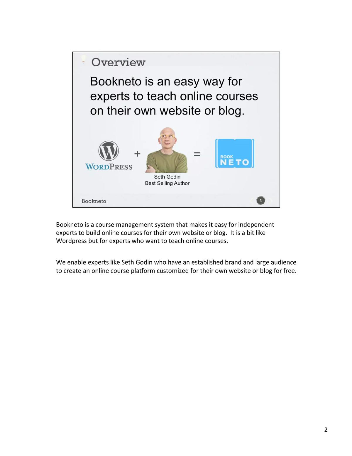
Seed stage. Online course software for experts. One-line formula. The stored page includes the deck's printed notes.
Bookneto deck, slide 2. Exact stored slide matched to this analysis.
Our analysis: The formula explains the idea quickly by combining a known product with the type of customer.
Evidence and limitation: An analogy and a named example; the slide does not say Seth Godin is a user.
What a founder can adapt: Use one comparison to a known product, then show the product itself on the next slide.
Supporting analysis
What the deck claims: "Overview." "Bookneto is an easy way for experts to teach online courses on their own website or blog." "WordPress + [Seth Godin, Best Selling Author] = Bookneto". Notes under the slide: "It is a bit like Wordpress but for experts who want to teach online courses." "We enable experts like Seth Godin who have an established brand and large audience to create an online course platform customized for their own website or blog for free."
Presentation choice: A familiar comparison ("a bit like WordPress") saves a paragraph.
When it does not fit: Using a well-known person's photo can imply they are a customer; say clearly if they are an example only.
Series B. Childcare centre management software. Screen plus description.
Kangarootime deck, slide 6. Exact stored slide matched to this analysis.
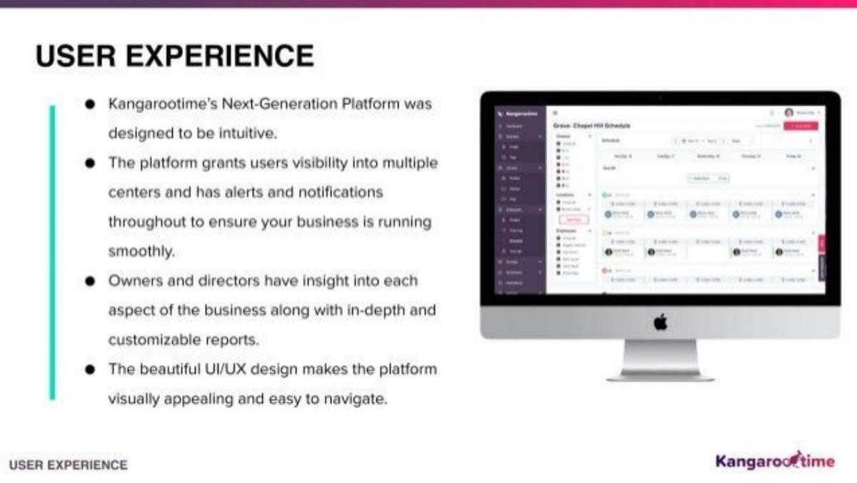
Our analysis: A weaker example: a real screen, but the text describes the design in general terms instead of a task.
Evidence and limitation: A screen and general claims; no usage figures.
What a founder can adapt: Replace design adjectives with one task and the time it takes (for example, scheduling a week's staff).
Supporting analysis
What the deck claims: "User Experience." "Kangarootime's Next-Generation Platform was designed to be intuitive." "The platform grants users visibility into multiple centers and has alerts and notifications throughout to ensure your business is running smoothly." "Owners and directors have insight into each aspect of the business along with in-depth and customizable reports." "The beautiful UI/UX design makes the platform visually appealing and easy to navigate." Screen showing a centre schedule.
Presentation choice: Included for contrast: "intuitive" and "beautiful" are claims investors cannot check from the slide.
When it does not fit: The screen is too small to read; enlarge it and highlight the one feature the text is about.
How the product is presented, which users are named, and whether the slide includes a number.
Example
Edtech type
Presented as
Users named
Numbers on slide
TheBullyTracker
Child online safety
Worked example
Child, parent
No
Curious Hat
Kids' apps
Products + usage chart
Children 2–9
4 apps, units chart
iMocha
Skills testing
Content library grid
Employers (implied)
2,000+ skills
Siembra
School counselling
Screens + features
Counsellors, students, parents
No
InOpen
School curriculum
Delivery process
Schools, teachers, students
No
Bookneto
Course software
One-line formula
Experts
No
Kangarootime
Childcare software
Screen + description
Owners, directors
No
Key Takeaways
Walk through one real case: one learner, one teacher or one parent.
Name every user the product serves (student, teacher, parent, school).
Show a real screen, and put one usage number next to it.
For content products, show the scope of what is covered.
Replace words like "intuitive" with what the user can now do.
Build your edtech product slide
Start from one learner, teacher or parent, then show what they do and get.
Users. Who uses it and who pays: learner, teacher, parent, school or employer.
One case. One sample user from first action to result.
Real product. One screen, app or content sample, large enough to read.
One number. Usage, coverage or time saved, placed beside the product.
Copyable framework: [User] [does X in the product] → [gets Y]. [Buyer] sees [Z]. [Number] beside a real screen.
Illustrative example 1 — written by us
Before: Kangarootime's Next-Generation Platform was designed to be intuitive.
After: A centre director [builds next week's staff schedule for three centres in one screen]. [Add a real figure, e.g. time taken before and after.]
What improved: Our illustrative rewrite; not Kangarootime's wording. Bracketed parts are placeholders to fill with real facts. It replaces a design claim with a task a user completes.
What this guide adds
The library already has a general product slide guide, product slides by stage, and fintech, SaaS and healthcare product guides, plus edtech problem and solution guides. This page looks only at education decks, where the buyer (a school, parent or employer) is often not the person who uses the product, and investors want to see how both are served.
Sector labels come from the sector recorded for each published teardown (high confidence for TheBullyTracker, Curious Hat, Siembra, InOpen and Kangarootime; medium for iMocha and Bookneto). None of these seven decks appears in another guide.
Four ways edtech decks show the product
Worked example (TheBullyTracker): one sample case run through the product from start to finish, ending with what the parent receives.
Product plus proof (Curious Hat): what was built and a usage chart on the same slide.
Scope and screens (iMocha, Siembra): the breadth of a content library, or the screens each user sees with a list of what they get.
Process, formula and description (InOpen, Bookneto, Kangarootime): the steps of a service, a one-line analogy or a general description. Useful framing, but they leave the investor asking what a learner or teacher actually does.
Common mistakes
Design adjectives. Replace "intuitive" with a task and a result.
Only the buyer shown. Show the learner and the payer.
Unlabelled charts. Say what the numbers count.
Famous names without context. Say whether they are customers or examples.
Unreadable screens. Show one screen large, with one feature highlighted.
Diagnostic checklist
Every user named (learner, teacher, parent, buyer).
One real case or task shown.
A readable screen or content sample.
At least one labelled number.
No design adjectives without evidence.
Frequently asked questions
How we chose these examples
Corpus: published pitch deck teardowns on StartupFundraising.com. Founder-uploaded private decks are excluded.
Selection (2026-09-26): we took teardowns whose recorded sector is edtech (high or medium confidence) and whose slide is classified as a product slide, with a stored image and readable text. We read the candidates, left out slides that were not about the product (team, mission, market or financial slides filed under this type), slides with only a sentence of text (Wilco) and decks already used in another guide (StuDocu), and kept seven that show different ways of presenting an education product. Kangarootime is included as a weaker example for contrast.
Sector is the category recorded for each teardown (confidence given in the section above). Stages are shown only where recorded with high confidence (TheBullyTracker, Curious Hat and Bookneto, seed; iMocha, Series A; Kangarootime, Series B).
Review: stored slide images were checked on 2026-09-26 and matched to company, deck and slide number, and quoted text was read from the images (editorial model review). No person has yet completed an editorial review of this page.
Claims and figures are as shown on the slides; we have not verified them. We make no claim that any slide caused a fundraising outcome.