How to Prove a Network Effect in a Pitch Deck: Show Value
How to show investors a network effect with data, not a diagram: plot what each user gets against how big the network around them is.
Network Effect Evidence: Show the Value to Each User Rising as the Network Grows
"The network effect is explosive." "Strong defensive moat supported by 2 network efforts." "Revi Network Effects Are Beginning to Take Place." Many decks claim a network effect; few show one. A network effect means each new user makes the product more valuable to the users already there. That is a claim about a relationship, so the evidence has to be a relationship too: something that gets better for a user as the network around them gets bigger. This guide compares four real slides that try to show it, from one that plots exactly that relationship to one that shows engagement figures with no network size at all, and shows how to build the chart from your own data.
TL;DR
To prove a network effect, chart a measure of value to each user (retention, activity, match rate, price or speed) against the size or density of the network that user can reach, such as users in their neighbourhood, sellers in their city or members in their group. If the value rises as the network grows, and you have ruled out the obvious other explanations, you have evidence. Growth, engagement or referral figures on their own are not that evidence, however strong.
Four real slides that claim a network effect
Each slide is shown as it appears in the company's original deck, with what it says, what we checked and what an investor still cannot tell. They run from the slide that plots value against network density to the one that shows engagement with no network measure.
Nextdoor flywheel slide — slide 15
Neighbourhood social network; page 15 of a July 2021 deck prepared for its public listing, so the company was already large.
Nextdoor deck, slide 15. Exact stored slide matched to this analysis.
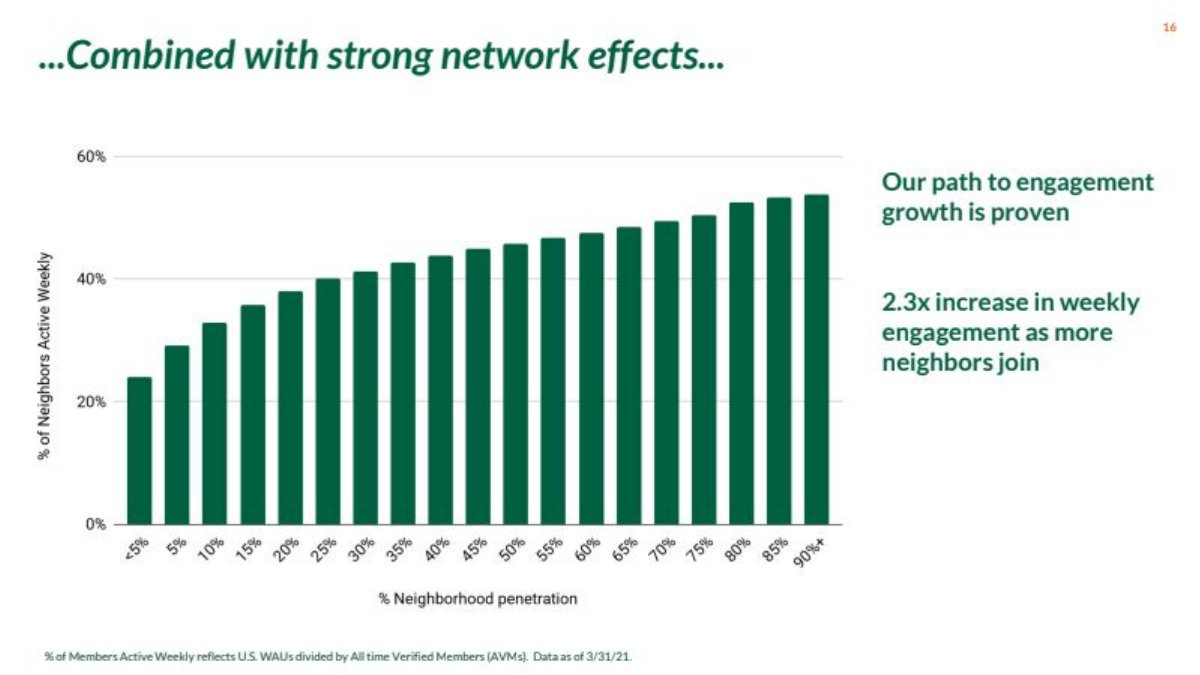
Our analysis: This is the evidence the flywheel guide describes: value to each user (share active weekly) plotted against the density of the network they can reach (penetration of their own neighbourhood). Measuring density by neighbourhood rather than nationally is the key choice. The remaining question is selection: neighbourhoods that adopt heavily may be more engaged anyway. A version tracking the same neighbourhoods over time would answer it.
Evidence and limitation: Our check: reading the bars, about 54% divided by about 24% is roughly 2.3x, consistent with the printed figure. The footnote defines the measure and date. The slide doesn't say how many neighbourhoods are in each band, or whether the high-penetration neighbourhoods differ from the others in other ways.
What a founder can adapt: "[Value measure] by [local density band]: [low] → [high] ([n] markets per band, [date]). Same markets over time: [x] → [y]."
Supporting analysis
What the deck claims: Headline "...Combined with strong network effects...". Bar chart: "% of Neighbors Active Weekly" (vertical axis, 0 to 60%) against "% Neighborhood penetration" in bands from under 5% to 90%+. The bars rise from roughly 24% to roughly 54%. Text: "Our path to engagement growth is proven" and "2.3x increase in weekly engagement as more neighbors join." Footnote: "Total Members Active Weekly reflects U.S. WAUs divided by All-time Verified Members (ATVM). Data as of 3/31/21."
Presentation choice: It plots value per user against local network density, with the measure and date defined.
When it does not fit: Don't show a density curve without saying how many markets sit in each band.
One-click checkout with a shared shopper account across merchants; page 8 of a July 2021 private-round deck (marked Confidential).
Bolt deck, slide 8. Exact stored slide matched to this analysis.
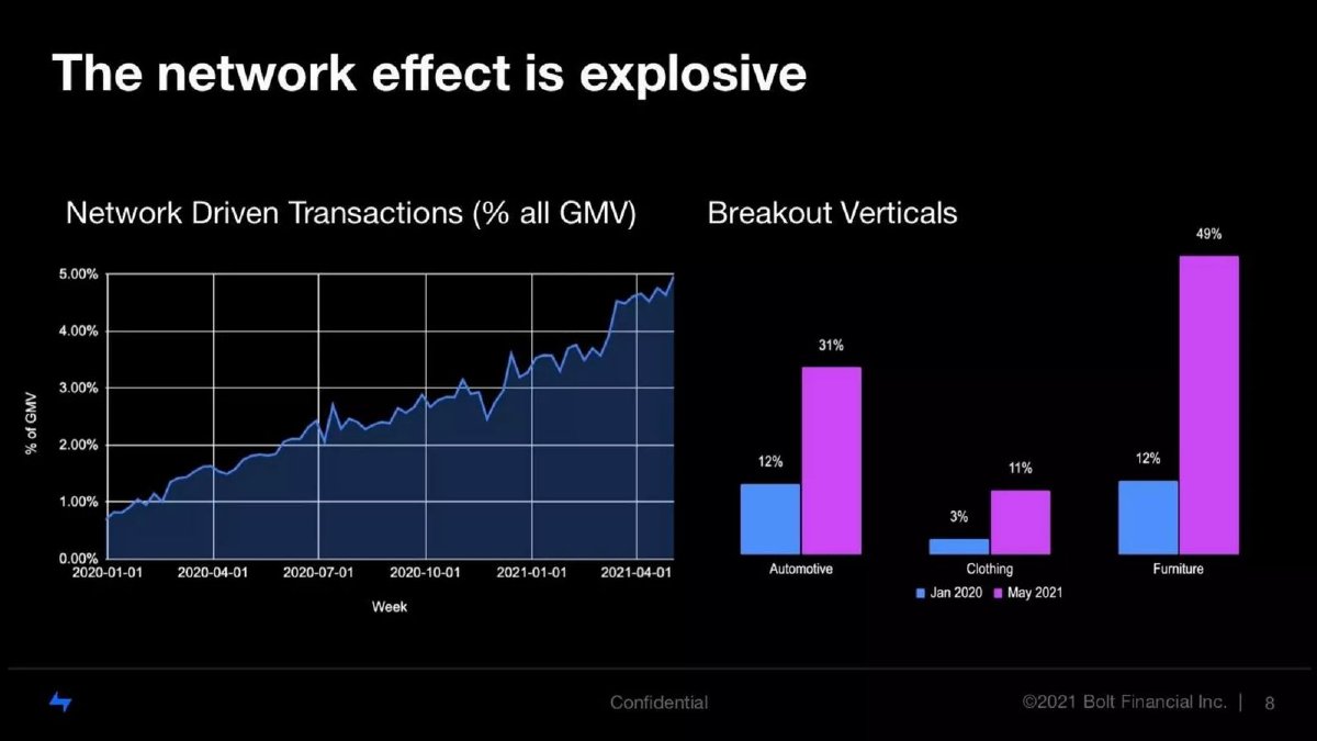
Our analysis: A share of activity that exists only because of the network is a sound measure for a checkout network, and the rise over 16 months by week is clear. The vertical bars help, because they suggest the share is highest where the network is densest. But without a definition, and with the vertical shares compared across two dates rather than against network size, the reader can't separate the network from Bolt simply growing. "Explosive" also overstates a share that is about 5% of total GMV.
Evidence and limitation: Our checks: the slide doesn't define "network driven transaction"; in the context of the deck's pitch for one shopper account across stores, we read it as checkouts by shoppers whose account came from elsewhere in the network, but that is our reading. Overall, about 5% of GMV in April 2021; the vertical figures are much higher, and the slide doesn't say what share of GMV those verticals represent.
What a founder can adapt: "Network checkouts (shopper account created at another merchant) as % of GMV: [x]% → [y]%; by merchant density: [a]% → [b]%."
Supporting analysis
What the deck claims: Headline "The network effect is explosive". Left: weekly line chart "Network Driven Transactions (% all GMV)" rising from under 1% in January 2020 to about 5% in April 2021. Right: "Breakout Verticals", Jan 2020 vs May 2021: Automotive 12% → 31%, Clothing 3% → 11%, Furniture 12% → 49%.
Presentation choice: It uses a share of network-only activity, the right kind of measure for a shared-account network.
When it does not fit: Don't label a metric "network driven" without defining it on the slide.
Data labelling for machine learning; page 18 (printed 22) of its Series C deck.
Scale AI deck, slide 18. Exact stored slide matched to this analysis.
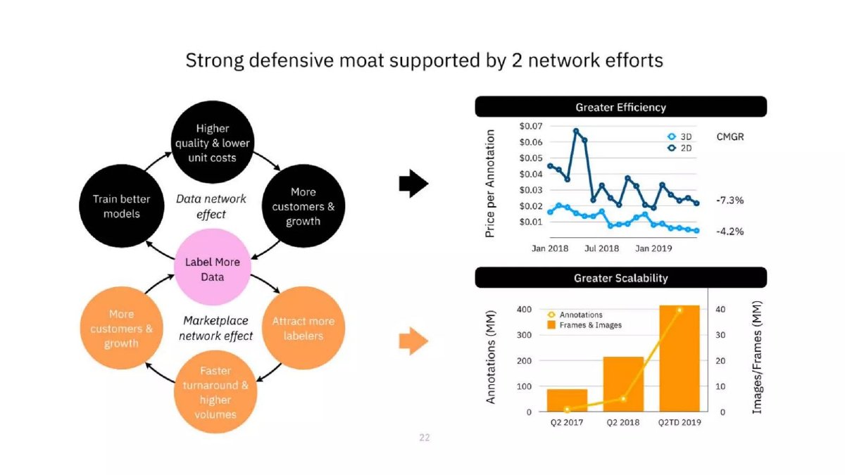
Our analysis: The charts show the company getting cheaper and bigger. That fits the diagram, but it would also fit economies of scale or better tooling, with no users benefiting from each other. To support the marketplace claim, the slide would need turnaround or price plotted against the number of active labelers; to support the data claim, model accuracy against data volume. The diagram explains the mechanism; the charts measure growth.
Evidence and limitation: Our checks: the slide doesn't say which CMGR belongs to which line; we read -7.3% as 2D and -4.2% as 3D from their positions, but the labels are ambiguous. Falling price per annotation and rising volume are both shown over time, not against the number of labelers or customers.
What a founder can adapt: "Turnaround time by active labelers per task type: [x]h at [n] → [y]h at [m]. Model accuracy by labelled volume: [a]% → [b]%."
Supporting analysis
What the deck claims: Headline "Strong defensive moat supported by 2 network efforts". Left: two loops, a "Data network effect" (label more data → train better models → higher quality and lower unit costs → more customers) and a "Marketplace network effect" (more customers → attract more labelers → faster turnaround and higher volumes). Right: "Greater Efficiency", "Price per Annotation" for 3D and 2D from January 2018 to 2019, with CMGR of -7.3% and -4.2%; "Greater Scalability", annotations and frames/images in millions for Q2 2017, Q2 2018 and Q2TD 2019.
Presentation choice: It shows the difference between evidence of a network effect and evidence of scale.
When it does not fit: Don't present falling unit cost alone as proof of a network effect.
Ordering and revenue automation for local businesses, with cross-selling between businesses on its network; page 14.
Revi deck, slide 14. Exact stored slide matched to this analysis.
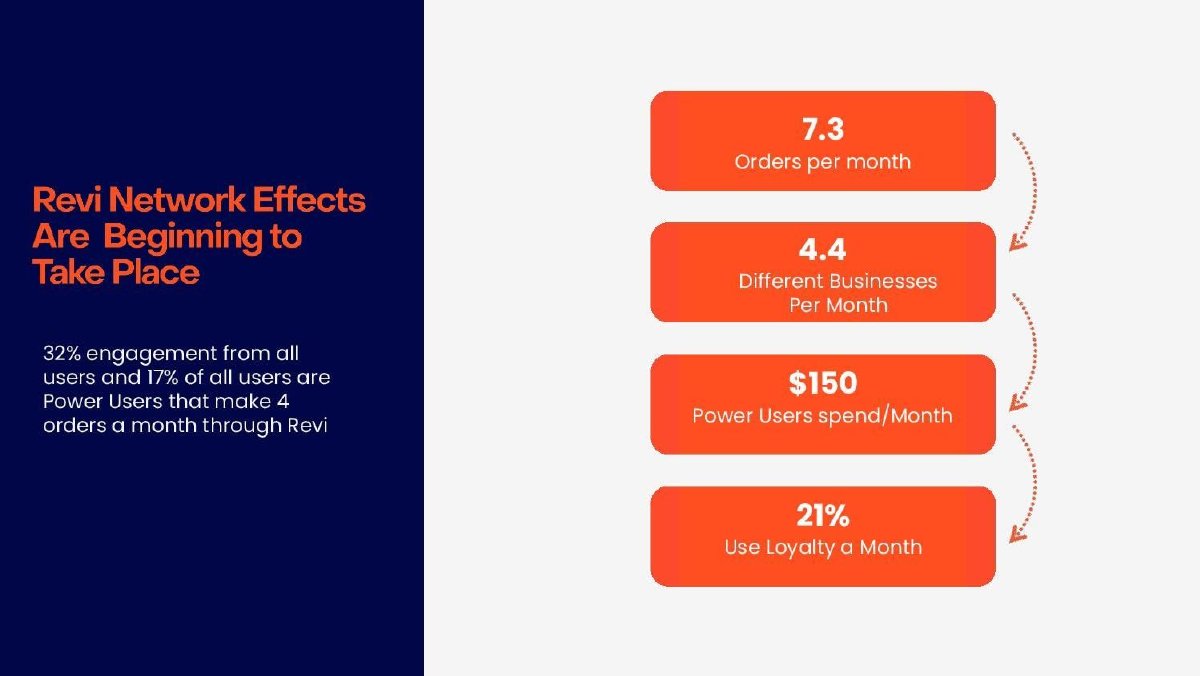
Our analysis: "4.4 different businesses per month" is the most network-like figure in the set: it suggests users order across several businesses on Revi. But no figure is shown against the number of businesses available to a user, so the slide shows engagement, not a network effect. Its own headline, "beginning to take place", is appropriately cautious; the figures need a network axis to back it.
Evidence and limitation: Our checks: the slide doesn't say which users the 7.3 orders and 4.4 businesses describe (all users or power users), what "engagement" means, or over what period. The left text says power users make 4 orders a month, while the box says 7.3 orders per month; both may be right for different groups, but the slide doesn't say.
What a founder can adapt: "Orders per user by businesses on Revi within 2 km: [x] with under 5 → [y] with over 20 ([n] users, [month])."
Supporting analysis
What the deck claims: Headline "Revi Network Effects Are Beginning to Take Place". "32% engagement from all users and 17% of all users are Power Users that make 4 orders a month through Revi." Four stacked figures joined by arrows: "7.3 Orders per month", "4.4 Different Businesses Per Month", "$150 Power Users spend/Month", "21% Use Loyalty a Month".
Presentation choice: It shows engagement figures presented as network evidence, and what is missing.
When it does not fit: Don't present engagement figures as a network effect without a measure of network size.
A network-effect claim needs a value measure plotted against network size. Columns report what each slide shows.
Slide
Value measure
Plotted against
Defined and dated
What it supports
Nextdoor p15
% of neighbours active weekly
Neighbourhood penetration
Yes (footnote, 3/31/21)
Network effect, subject to selection
Bolt p8
Network-driven % of GMV
Time; two dates by vertical
Dated; not defined
Network spreading; not yet value by size
Scale AI p18
Price per annotation; volume
Time
Dated; CMGR labels ambiguous
Scale and growth
Revi p14
Orders, businesses, spend
Nothing
Neither
Engagement
Key Takeaways
Name the value that improves for an existing user when a new one joins.
Put network size or density on the horizontal axis and that value on the vertical axis.
Measure density where users actually interact: a neighbourhood, a city, a team.
Define any "network-driven" metric on the slide; an undefined label can't be checked.
Separate a network effect from economies of scale and from simple growth.
Say what else could explain the pattern, and how you checked.
Build your network-effect slide
Answer each prompt from your own data before you design the slide.
Value. What gets better for an existing user when a new user joins? Name one measurable thing.
Network unit. Where do users interact: neighbourhood, city, company, group, category? Measure density there.
Bands. Group markets or users into three to six density bands. How many are in each?
Curve. What is the average value measure in each band? Does it rise?
Over time. In markets that grew denser, did the value measure rise for the same users or markets?
Alternatives. Could selection, user tenure, scale economics or product changes explain the pattern? What did you check?
Copyable framework: [Value] rises with [network density]: [low band] → [high band] ([n] markets, [date]). Same markets over time: [x] → [y]. Definitions: [footnote].
Illustrative example 1 — written by us
Before: Network Driven Transactions (% all GMV): about 5%.
After: Checkouts by shoppers whose account was created at another merchant: [x]% of GMV where merchant density is low, [y]% where high (April 2021).
What improved: Built from Bolt's page 8. The definition is our reading and the density split is a placeholder the slide does not give.
Illustrative example 2 — written by us
Before: 4.4 Different Businesses Per Month.
After: Businesses ordered from per user per month: [a] where under 5 are on Revi nearby, [b] where over 20 are ([n] users, [month]).
What improved: Built from Revi's page 14. The bands and values are placeholders.
What this guide adds to the flywheel guide
The flywheel slide guide explains the difference between a network effect, virality and a referral channel, and lists the kinds of evidence that would support a network-effect claim. It also notes that none of its own examples shows that evidence directly. This guide fills that gap: it uses slides that do put numbers behind the claim and shows how to build the chart, choose the measure and present the caveats.
It is about evidence, not diagrams. If you need to explain how your loop works, the flywheel guide covers that. If your advantage comes from data that improves the product, the data moat guide is closer. This guide is for founders who believe each new user makes the product better for others and want a slide that shows it. It is not legal or investment advice.
Start with the value, not the label
Write one sentence before you design anything: when a new user joins, what gets better for a user who is already here? For a neighbourhood app it might be more useful posts to read. For a marketplace, faster matches or more choice. For a checkout network, a shopper who is already logged in at a new store. For a team tool, more colleagues to work with.
That sentence tells you what to measure. NFX's network effects guide defines them as mechanisms where "every new user makes the product/service/experience more valuable to every other user" and lists them alongside brand, embedding and scale as separate sources of defensibility. Keep that separation in mind: a company can get cheaper as it grows (scale) without users getting anything from each other (a network effect).
If you can't write the sentence, the slide is probably about growth or acquisition. That is still worth showing, but under a different heading. (NFX)
Build the chart: value on one axis, network size on the other
The clearest evidence is a chart with the size of the network a user can reach on the horizontal axis and the value they get on the vertical axis. Network size should be measured at the level where users interact. A national user count says little about a neighbourhood app; the share of households in a given neighbourhood says a lot. For a local marketplace use sellers or buyers per city; for a workplace tool use the share of a company's staff on the product.
Group users or markets into bands by density (for example under 5%, 5 to 10%, 10 to 20% penetration), then show the average value for each band. Use a measure that reflects real use: weekly active share, 90-day retention, orders per user, time to match, fill rate or price. Give the definition and the date in a footnote.
Two variants also work. A time series can show value rising in the same markets as they fill up, which helps separate the network from differences between markets. And a before-and-after comparison can show what happened to existing users when a new group of users arrived.
Check the explanations that aren't a network effect
A rising curve is evidence, not proof. Investors will ask what else could explain it. The common alternatives are worth checking before the meeting.
Selection: places or groups with high density may have been more engaged to begin with. Wealthier or more connected neighbourhoods might both join earlier and use the product more. Showing the same markets over time, or comparing markets that started similar, helps.
Maturity: dense markets are often older markets, and users who have been around longer use a product differently. If you can, compare users with the same tenure.
Scale economics: lower prices or faster delivery as volume grows may come from spreading fixed costs, better tools or cheaper suppliers, not from users helping each other. That is valuable, but it is economies of scale. Label it accurately.
Product changes: if you improved the product while the network grew, some of the gain is the product. A footnote naming major launches in the period is enough.
When a share of transactions is the right measure
Some networks create value by letting a user carry something from one place to another: an account, a reputation, a payment method, a connection. Here a useful measure is the share of activity that only happens because of the network, such as checkouts by shoppers whose account was created at a different store, or orders placed with a second business found through the first.
That share must be defined precisely, because the label "network-driven" can mean many things. Say what counts, what the denominator is (all transactions, all value, all active users), and over what period. If the share is rising, show it by market or by cohort so the reader can see it rising as the network fills, not only as the company grows.
Worked example: a local services marketplace (hypothetical)
This is our illustration, not a figure from any deck. A marketplace for home cleaners operates in 12 cities. The founder believes more cleaners in a city mean faster bookings and better repeat rates for customers.
She groups cities by active cleaners per 10,000 households: under 2, 2 to 5, and over 5. Median time from request to confirmed booking falls from 19 hours to 7 hours to 3 hours across the bands; 90-day customer repeat rate rises from 22% to 31% to 38%. In the four cities that moved from the lowest band to the middle one during the year, repeat rate rose from 21% to 29%.
Weak version: "Strong network effects: 12 cities, 40,000 bookings." Strong version: "More cleaners per city, faster bookings and more repeat customers: booking time 19h → 7h → 3h, 90-day repeat 22% → 31% → 38% across density bands (n = 12 cities, Q2). Same pattern in four cities as they grew." A footnote adds the definitions and notes that the densest cities are also the oldest.
Where the evidence goes in the deck
A network-effect chart belongs where you argue defensibility: the flywheel, competition or why-now part of the deck. One chart is usually enough. If you also have referral or virality figures, keep them on the traction or go-to-market slide and label them as acquisition. Putting both under one heading invites the reader to discount both.
If you don't yet have enough markets or users to draw a curve, say what you will measure and when. A slide that says "We expect booking time to fall as cleaner density rises; we will report it by city from Q3" is more credible than a confident label with no number behind it.
Common mistakes
Label without a number. "Strong network effects" with nothing measured is an assertion.
Growth as proof. More users or more volume over time shows growth, not value per user rising.
Scale called a network. Lower unit cost with volume is an economy of scale; label it that way.
National density. Measure density where users interact, not across the whole company.
Undefined network metric. "Network-driven" needs a definition and a denominator.
Ignored selection. Dense markets may differ in other ways; show the same markets over time if you can.
Diagnostic checklist
The slide names what improves for an existing user when a new one joins.
A value measure is plotted against network size or density.
Density is measured at the level where users interact.
Each band or market count is shown.
Metrics are defined and dated in a footnote.
Scale economies and growth are labelled separately from the network effect.
At least one alternative explanation is addressed.
Frequently asked questions
How do you prove network effects to investors?
Show a measure of value to each user, such as retention, activity, match speed or price, rising as the size or density of the network they can reach increases. A chart by local density band, or the same markets tracked as they fill up, is the clearest form.
Is user growth evidence of a network effect?
Not on its own. Fast growth can come from marketing, virality or a strong product. A network effect means each user gets more value as others join, so you need a value measure, not just a user count.
What is the difference between a network effect and economies of scale?
Economies of scale make the company cheaper to run as volume grows. A network effect makes the product more valuable to users as more users join. A company can have either without the other, and investors treat them as different kinds of advantage. (NFX)
What if I'm too early to show a network-effect curve?
Say what you will measure and when, and show the early sign you do have, labelled honestly. A stated measurement plan is more credible than a confident label with no data.
How we chose these examples
Discovery (2026-10-04, run 123): following run 121's plan to check thinly covered slide types, we read the flywheel slide guide, which lists the evidence a network-effect claim needs and states that none of its examples shows it. We searched the corpus for "network effect" with numeric content and read the closest pages: flywheelSlide.ts, dataMoatSlide.ts, whyUsSlide.ts, tractionDauMau.ts and drafts/goToMarketViralLoop.ts. None teaches plotting value against network size.
Four pages from four decks were read from images rendered from the original deck files: Nextdoor 15, Bolt 8, Scale AI 18 and Revi 14. All are published teardowns and none is excluded. Nextdoor's deck is dated July 2021 and was prepared for its public listing; we use it because its chart is the clearest example of the measure, and it is already used in the library. Howdy p19, Moonlight p16 and HomeCooks p19 also mention network effects; they were not used because their figures are referral or acquisition shares, which the flywheel guide already covers. All four images were prepared at 1,200 pixels wide, uploaded and re-fetched byte-identical.
Ratios were recalculated from the printed or charted figures, and bar values read from the chart are approximate. The worked example is our illustration. Company figures are reported as printed and not verified. The NFX source was read in its published text. Slide readings and analysis are an AI editorial model review, not human-checked.