DAU/MAU and Engagement on a Pitch Deck: Which Users Are
How startups show daily and monthly active users, DAU/MAU, time spent and sessions on a pitch deck: who counts as active, which users the ratio covers.
How to Show DAU, MAU and Engagement on Your Pitch Deck So Investors Can Trust Them
Thirteen slides from real pitch decks that show daily or monthly active users, a DAU/MAU ratio, time spent or sessions. For each, we record what the slide says, which users the figures cover, whether they are measured or assumed, and whether the numbers agree with each other.
TL;DR
Engagement numbers tell an investor how often people come back, which matters more than how many signed up. The DAU/MAU ratio (daily active users divided by monthly active users) is the common shorthand: at 50%, the average monthly user shows up about every other day. Investors want four things alongside it: what counts as "active", which users are included, the period measured, and the absolute counts so the ratio can be checked. A ratio of a small or hand-picked group, a time-spent figure with no base, or an assumed ratio shown as if it were achieved all make the slide harder to trust.
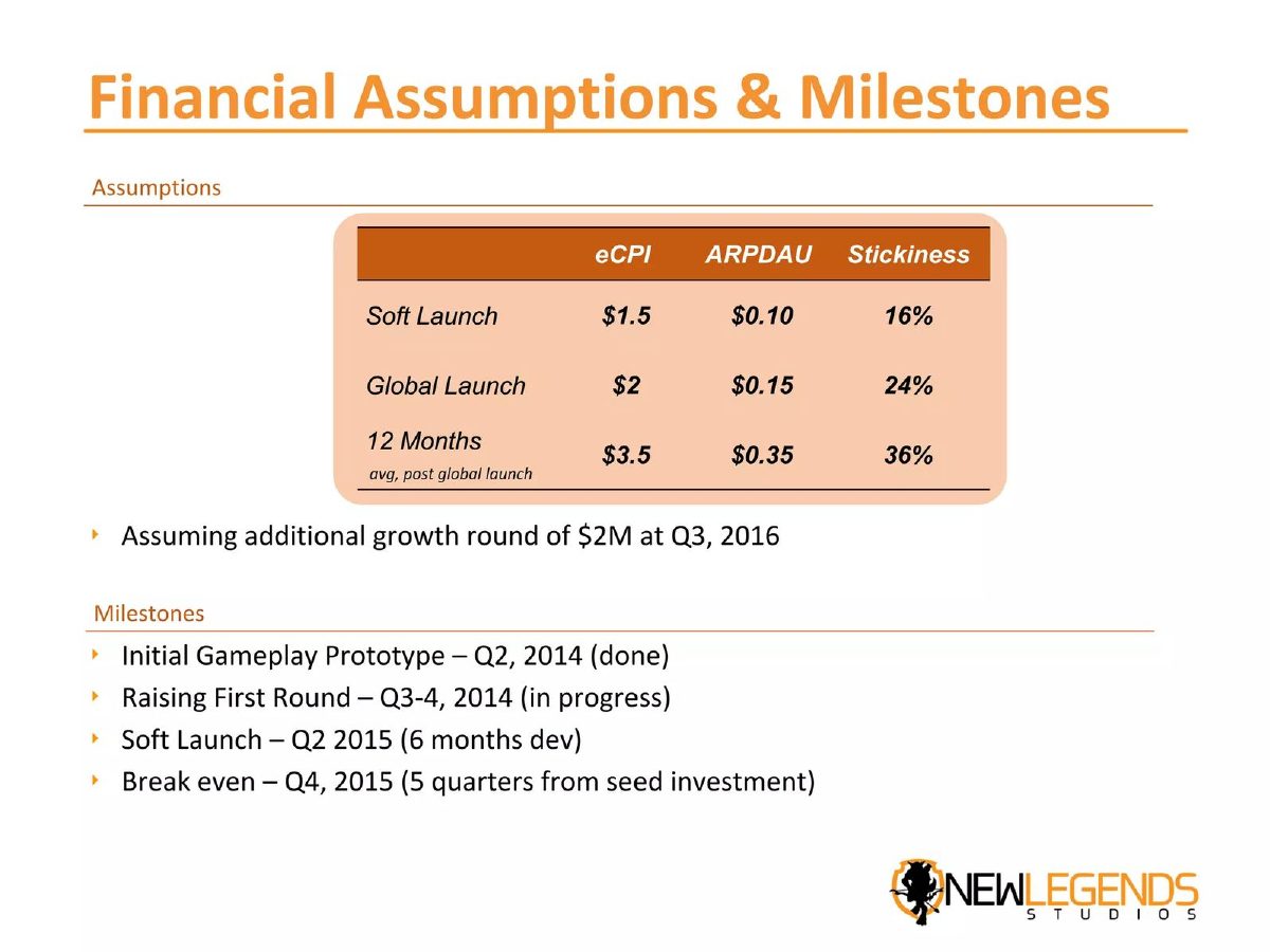
In this set, Innovamat shows the counts behind its ratios, and they divide exactly: 8,717 weekly over 9,382 monthly teachers is 92.9%, and 109,752 over 137,632 students is 79.7% (our checks). Wunderlist's 500,000 daily users at a 50% ratio imply about one million monthly users, a fifth of the more than five million registered (our calculation). Hometalk's 550K daily over 9M monthly is about 6%, a website pattern it does not call a ratio. At the other end, Tract's 30% DAU/MAU describes creators, who its own footnote says are 5% of users; Legends Studios' 16% to 36% "stickiness" is a plan assumption; and Villoid's "20 minutes per day" has no base at all.
Engagement slides from real pitch decks
Each example records what the slide states, which users the figures cover, whether they are measured or assumed, and what to copy or avoid. "Our calculation" marks arithmetic we did; the slides do not show it.
Innovamat traction slide — slide 7
Maths education for schools. October 2021 usage.
Innovamat deck, slide 7. Exact stored slide matched to this analysis.
Our analysis: Counts, ratio, period and base all shown.
Evidence and limitation: Our checks: both ratios divide exactly; monthly coverage 93.8% of teachers and 78.6% of students.
What a founder can adapt: Define what counts as active.
Supporting analysis
What the deck claims: Teachers 8,717 WAU, 9,382 MAU, 92.9% WAU/MAU out of 10,000; students 109,752 WAU, 137,632 MAU, 79.7% out of 175,000.
Presentation choice: An investor can rebuild every figure.
When it does not fit: Don't show a ratio without the counts behind it.
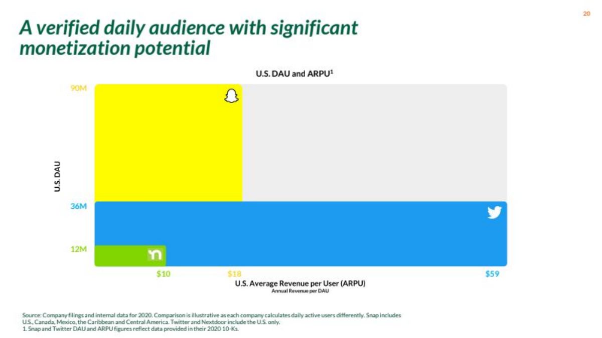
Nextdoor deck, slide 19. Exact stored slide matched to this analysis.
Our analysis: A fair cross-company comparison.
Evidence and limitation: Sources and year given; differences disclosed.
What a founder can adapt: Show how revenue per user would rise.
Supporting analysis
What the deck claims: U.S. DAU and annual revenue per DAU: Nextdoor 12M at $10, Snap 90M at $18, Twitter 36M at $59; footnote: illustrative, each company defines DAU differently.
Presentation choice: The caveats are on the slide.
When it does not fit: Don't compare DAU across companies without the caveats.
Columns report what each slide states or leaves out; checks are our calculations.
Example
Metric shown
Counts shown
Users covered
Measured or assumed
Innovamat
WAU/MAU 92.9%, 79.7%
Yes
All teachers, students
Measured, Oct 2021
Wunderlist
DAU/MAU 50%
DAU and registered
All
Measured
Hometalk
None (our 6.1%)
DAU and MAU
All
Measured
Tract
DAU/MAU 30%
No
Creators (5%)
Measured
Front
DAU/MAU 75%
No
Not stated
Measured
Supernormal
200K DAU
Target only
All
Target
Legends Studios
Stickiness 16–36%
No
All
Assumed
Little Orange
5,000 DAU
Installs
All
Projected
Kinnu
DAU/MAU about 20%
Installs only
Not stated
Measured
Medal
Redacted
No
Not stated
Measured
Rapchat
320 min a month
MAU
Not stated
Measured
Villoid
20 min a day
No
Not stated
Not stated
Nextdoor
U.S. DAU vs peers
Yes
U.S.
Measured, 2020
Key Takeaways
Show the counts behind the ratio. Innovamat's WAU and MAU divide exactly to its percentages (our check).
Say which users are included. Tract's engagement figures cover creators, 5% of its users.
Separate registered, monthly and daily users. Wunderlist's figures imply a fifth of registered users are active monthly (our calculation).
Label assumptions. Legends Studios' stickiness rising to 36% is a financial-plan input, not a result.
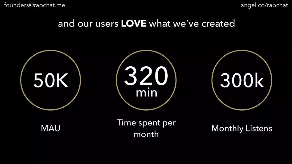
Give a base for time spent. Villoid's 20 minutes per day and Rapchat's 320 minutes per month do not say per whom.
Compare only like with like. Nextdoor's footnote warns each company counts daily users differently.
Build your engagement line
Fill in each field. If a value is a target or assumption, say so on the slide.
Active. What action counts as active?
Counts. DAU, WAU and MAU for which month?
Ratio. Which ratio fits how the product is used?
Users covered. All users, or a subset such as paying users?
Time spent. Minutes per day or month, per which users?
Trend. How has the ratio moved over recent months?
Copyable framework: [Month]: [DAU] daily and [MAU] monthly active users (active = [action]); DAU/MAU [ratio]%, up from [earlier]% in [month]. [Subset] users: [ratio]%.
Illustrative example 1 — written by us
Before: 20 minutes per day
After: March: monthly active users averaged 20 minutes a day in the app (base: [MAU] users; active = opened and browsed).
What improved: Gives Villoid's figure a base, a period and a definition (placeholders where the slide gives nothing).
What DAU, MAU and DAU/MAU tell an investor
Monthly active users (MAU) counts the people who used the product at least once in a month. Daily active users (DAU) counts them on an average day. Their ratio measures how habitual the product is: 20% means the average monthly user comes on about six days a month; 50% means about fifteen. Social and messaging apps aim high; tools used for a task once a week will be lower by nature. Weekly active users (WAU) sits between the two, and WAU/MAU is often the better measure for products used on working days or in school weeks.
The ratio is only as good as the definition of "active". Opening the app, receiving a notification, loading a page or completing a real action all produce different counts. The slide should say which one is used, especially if the number will be compared with another company. Nextdoor's slide does this well: its footnote says the comparison with Snap and Twitter is illustrative because each company calculates daily users differently.
The second question is which users are counted. A ratio for the most engaged group, such as paying users, creators, or one school's teachers, will be higher than for everyone. That is useful to show, but only when the slide says so. The third is the period: an early product's ratio over one month after a launch campaign can look very different a year later. The fourth is the base: a ratio should come with the counts so an investor can see whether 35% means 350 people or 350,000.
Time spent and sessions per user raise the same questions. Minutes per day of whom: every registered user, every monthly user, or the most active? Over what period? A figure that answers those questions is evidence of engagement. A large number on its own is not.
Slides that show the counts behind the ratio
Innovamat's page 7, "Strong customer satisfaction and stickiness", shows October 2021 usage for two groups. Classroom Manager: 8,717 WAU and 9,382 MAU teachers, 92.9% WAU/MAU, "Out of 10,000 teachers". App usage: 109,752 WAU and 137,632 MAU students, 79.7% WAU/MAU, "Out of 175,000 students". Our checks: 8,717 divided by 9,382 is 92.9%, and 109,752 divided by 137,632 is 79.7%. Our calculations also show monthly coverage: 93.8% of the 10,000 teachers and 78.6% of the 175,000 students were active in the month. The slide chooses WAU/MAU rather than DAU/MAU, which suits a school product used on weekdays, and it gives the month, the counts and the total base. The one thing an investor would ask next is what counts as active.
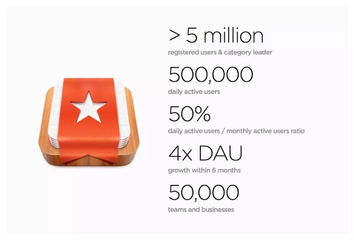
Wunderlist's page 2 shows "> 5 million registered users & category leader", "500,000 daily active users", "50% daily active users / monthly active users ratio", "4x DAU growth within 6 months" and "50,000 teams and businesses". Our calculations: 500,000 at a 50% ratio implies about one million monthly users, which is about 20% of the more than five million registered; and daily users are at most 10% of registered users. The slide separates the three levels, which is the honest approach. It does not give the monthly figure directly, the definition of active, or the starting point of the fourfold growth.
Hometalk's page 17, "Engagement on Hometalk", lists "Average of over 2 min 30 sec per visit", "2.8 page views per visit", "550K daily active users" and "9M monthly active user". Our calculation: 550K divided by 9M is about 6.1%. The slide does not print that ratio, and it would not flatter the company, but a low ratio is typical for a website people find through search. Showing both counts is honest. The per-visit figures describe sessions, not users, so the slide does not say how many minutes a typical user spends in a month.
Ratios for a subset of users, and targets shown beside results
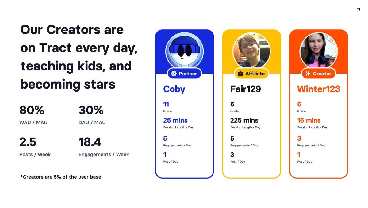
Tract's page 11, "Our Creators are on Tract every day, teaching kids, and becoming stars", shows "80% WAU / MAU", "30% DAU / MAU", "2.5 Posts / Week" and "18.4 Engagements / Week", with three creator profiles showing session lengths of 25, 225 and 16 minutes a day. A footnote says "Creators are 5% of the user base". The heading and profiles suggest the metrics describe creators, and the footnote tells the investor they are a small group. That is honest about the subset, but the slide does not say plainly whether the ratios cover creators only or all users, and it gives no counts. The profiles are hand-picked, and the 225-minute daily session of one 6th-grader is an individual, not an average.
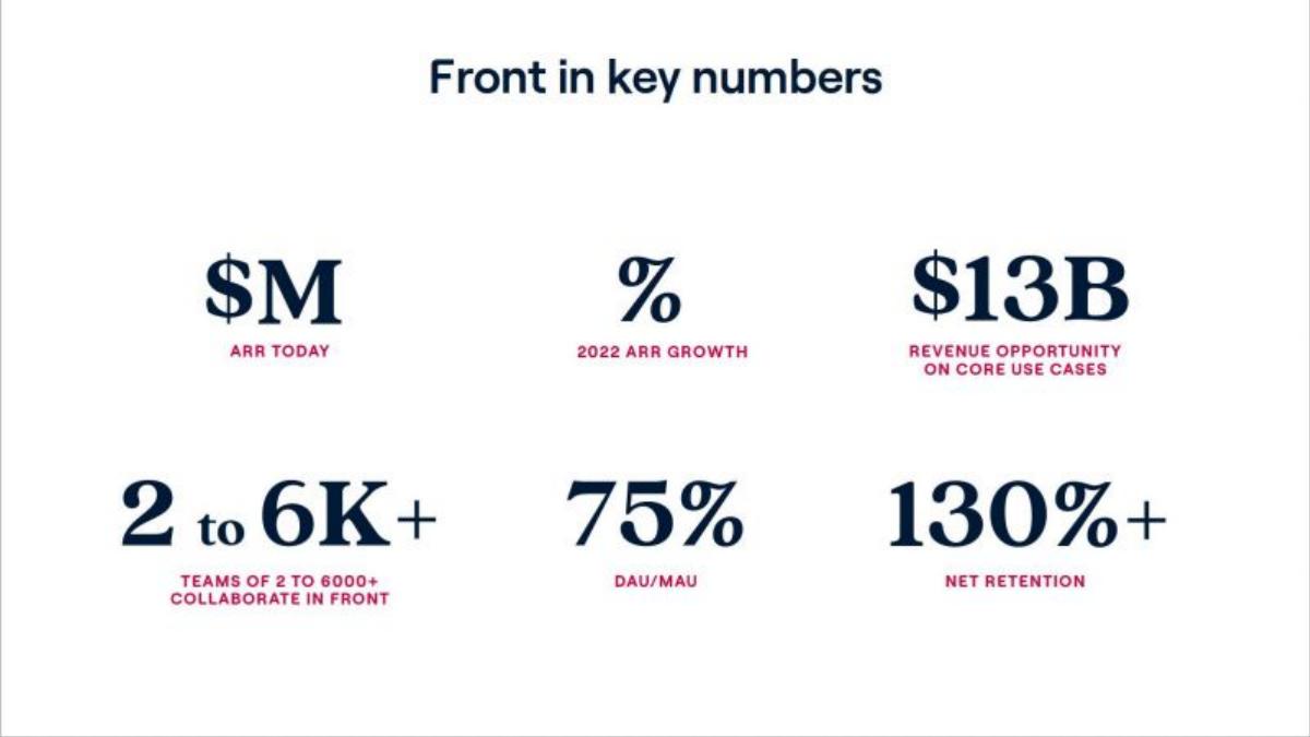
Front's page 2, "Front in key numbers", shows "75% DAU/MAU" alongside "2 to 6K+ teams of 2 to 6000+ collaborate in Front", "130%+ net retention" and a "$13B revenue opportunity on core use cases"; the ARR and ARR growth values are blank in this copy. For a work email tool, a 75% ratio means the average monthly user is in the product on most working days. The slide gives no user counts, so the ratio's base cannot be checked here, and the definition of active is not stated.
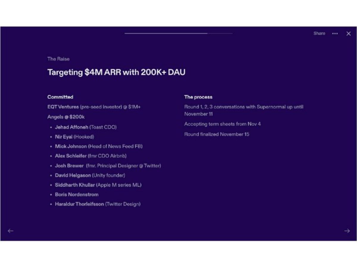
Supernormal's page 13, "The Raise", is headed "Targeting $4M ARR with 200K+ DAU" and lists committed investors. Our calculation: $4M divided by 200,000 daily users is $20 of annual revenue per daily user. The 200K is a target for the end of the round, not a result, and the heading makes that clear. What the slide does not show is the current DAU from which the target is set.
Assumed engagement and hidden values
Legends Studios' page 14, "Financial Assumptions & Milestones", is a game studio's plan. It assumes eCPI (effective cost per install) of $1.5, $2 and $3.5, ARPDAU (average revenue per daily user) of $0.10, $0.15 and $0.35, and "Stickiness" of 16%, 24% and 36% at soft launch, global launch and 12 months after global launch. The slide labels these as assumptions, which is correct. It does not say why the ratio would more than double after launch, and every other figure in the plan depends on it. A stated reason, for example a comparable game's figure or a test result, would make the assumption easier to accept.
Little Orange's page 7, "User Acquisition Projection (First 12 months)", plans "50000+ app installs", "Average 5000+ daily active users" and "100+ daily installs", with the daily users "Based on product UX and content". Our calculation: 5,000 daily users from 50,000 installs is 10% of installs active on an average day. The slide is clearly a projection. The basis given, product experience and content, is a hope rather than evidence; a pilot result or a comparable app would support it.
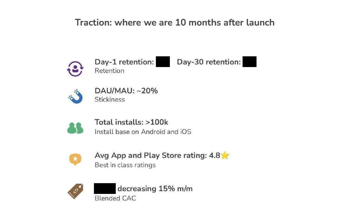
Kinnu's page 9, "Traction: where we are 10 months after launch", shows "DAU/MAU: ~20%", "Total installs: >100k" and an app-store rating of 4.8, while the day-1 and day-30 retention values and the blended CAC figure are blacked out. The ratio is given without counts, so an investor cannot tell how many monthly users it rests on out of the 100,000 installs. Keeping the ratio visible while hiding retention is a reasonable choice when figures are sensitive, but the slide then establishes only the ratio.
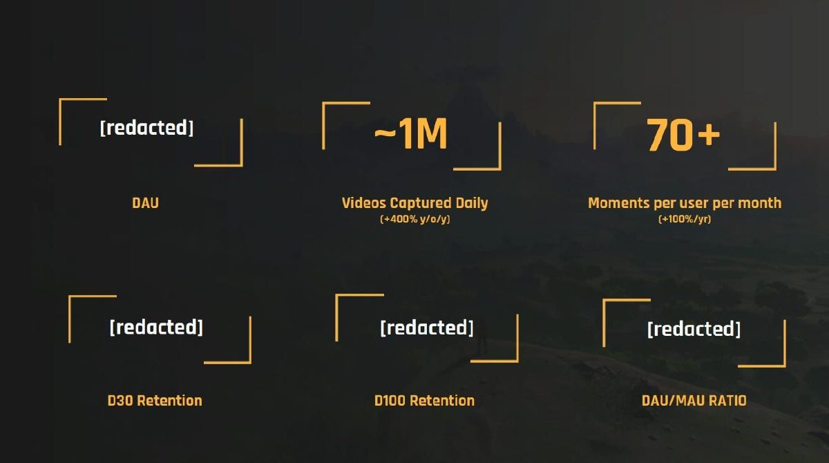
Medal's page 5 shows "~1M Videos Captured Daily (+400% y/o/y)" and "70+ Moments per user per month (+100%/yr)", with DAU, D30 retention, D100 retention and DAU/MAU ratio all "[redacted]". The two visible figures are activity counts. Without the daily users, "per user" cannot be scaled, and an investor cannot tell whether a million daily videos come from a large casual base or a small intense one.
Time spent without a base, and comparisons across companies
Rapchat's page 7, "and our users LOVE what we've created", shows "50K MAU", "320 min Time spent per month" and "300k Monthly Listens". Our calculations: 300,000 listens over 50,000 monthly users is 6 listens per user a month; and if the 320 minutes is per monthly user, it is about 10.7 minutes a day. The slide does not say whether 320 minutes is the average of all monthly users or of the most active, which is the difference between a strong figure and an ordinary one.
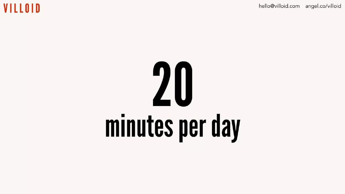
Villoid's page 2 says "20 minutes per day" and nothing else. The figure has no base (all users, active users, or the top group), no period and no count of users. It may be true, but as shown it is a headline, not a measurement.
Nextdoor's page 19, "A verified daily audience with significant monetization potential", compares U.S. DAU and annual revenue per daily user: Nextdoor 12M at $10, Snap 90M at $18 and Twitter 36M at $59. The footnote says the source is company filings and internal data for 2020, that "Comparison is illustrative as each company calculates daily active users differently", and that Snap's figure covers more countries than the U.S. That is the right way to compare engagement across companies: give the source, the year and the known differences. The chart argues that Nextdoor's revenue per user could rise, which is a claim about the future; the slide shows the gap, not the path to closing it.
How to show engagement on your slide
Give the counts and the ratio together: DAU, WAU or MAU, and the ratio that matters for how the product is used. Define active in a footnote, for example "opened the app and completed at least one lesson". State the month or period. If the ratio covers a subset, such as paying users or creators, say so in the label, and add the same ratio for all users if you have it.
For time spent, give the base and the period: "average 11 minutes a day per monthly active user, March". Show a trend if you have more than one month. If you compare yourself with another company, name the source and year and note the differences in definition, as Nextdoor does.
For a plan, label the engagement figures as assumptions and give their basis: a pilot, a soft launch, or a comparable product. Investors will test every downstream figure against the engagement assumption, so it is the one to support best.
Common mistakes
Ratio without counts. Show DAU and MAU so the ratio can be checked.
Subset shown as everyone. Label ratios for creators or payers.
Registered users as active. Keep registered, monthly and daily apart.
Assumption shown as result. Label planned stickiness and give its basis.
Time spent without a base. Say per whom and for which period.
Unqualified comparisons. Note how other companies define DAU.
Diagnostic checklist
Active is defined.
DAU, WAU or MAU counts appear with the ratio.
The period is stated.
The users covered are named.
Time spent has a base and period.
Targets and assumptions are labelled.
Cross-company comparisons carry their caveats.
Frequently asked questions
What is a good DAU/MAU ratio for a pitch deck?
It depends on how the product is used. Wunderlist shows 50% for a daily to-do app; Hometalk's counts imply about 6% for a website people find through search (our calculation). Show the counts so investors can judge.
Should I use DAU/MAU or WAU/MAU?
Use the one that matches usage. Innovamat uses WAU/MAU for a school product used on weekdays.
Can I show engagement for my best users only?
Yes, if labelled. Tract's footnote says creators are 5% of users; the label should say so too.
How do I show engagement in a financial plan?
Label it as an assumption and give a basis. Legends Studios labels its stickiness but does not say why it rises from 16% to 36%.
Is time spent a good metric to show?
Only with a base. Rapchat's 320 minutes a month and Villoid's 20 minutes a day do not say per whom.
How we chose these examples
Search (2026-09-30): the durable corpus index (docs/seo/artifacts/corpus-search, 70,729 unique pages, deduplicated by deck-file sha256 + page) was searched for DAU/MAU, stickiness, daily active users, DAU, minutes per day or session, sessions per user and time spent per; about 110 pages matched after excluding public companies and SPACs.
Twenty candidate pages were rendered from the original public deck files and read from the images; thirteen are used: Innovamat 7, Wunderlist 2, Hometalk 17, Tract 11, Front 2, Supernormal 13, Legends Studios 14, Little Orange 7, Kinnu 9, Medal 5, Rapchat 7, Villoid 2 and Nextdoor 19.
Left out after image review: Kona 2 (every figure is an X% placeholder, the same lesson as Medal), Flick 2 (a founder's past DAU, not the company's), Toutiao 21 (a DAU figure inside an infrastructure description). Not used because the page already appears in another guide: Renaissance 5, Seam Social 2, Spinach 6 and Laoshi 10.
Figures are as printed on each slide; we did not have the companies' underlying data. How we built this: drafted and checked with AI assistance (editorial model review against the original slide images); no human editor has reviewed this guide.