Villoid's 2015 pitch deck is a masterclass in visual storytelling and social proof, designed to secure later-stage funding by highlighting high engagement and celebrity involvement. The deck relies heavily on large-format typography and minimal text, focusing on three core pillars: a massive addressable market ($90B global fashion e-commerce), significant user traction (25,000 active community members and 500,000 style boards), and the star power of Creative Director Alexa Chung. While the deck lacks traditional financial projections, unit economics, or a detailed competitive analysis, it com…
Key takeaways
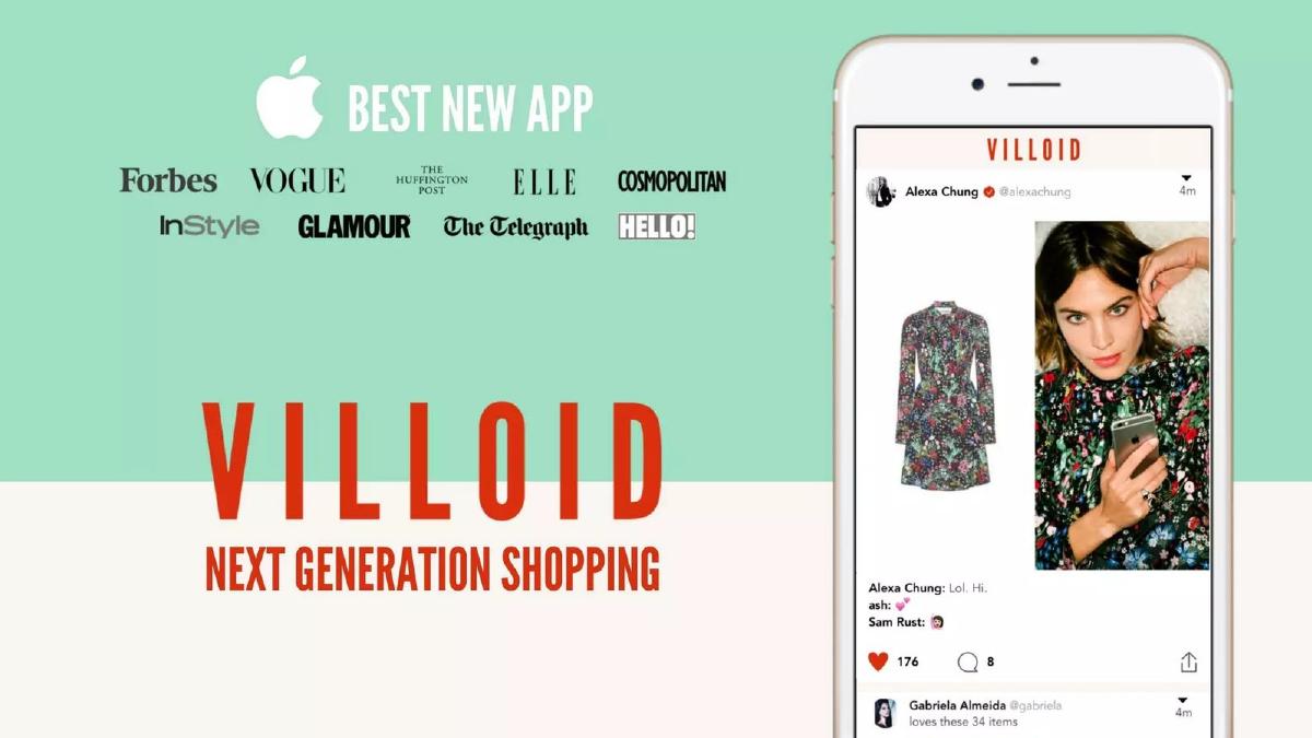
- The deck leads with high-tier media validation, including Apple's 'Best New App' and features in Vogue, Forbes, and Elle (Slide 1).
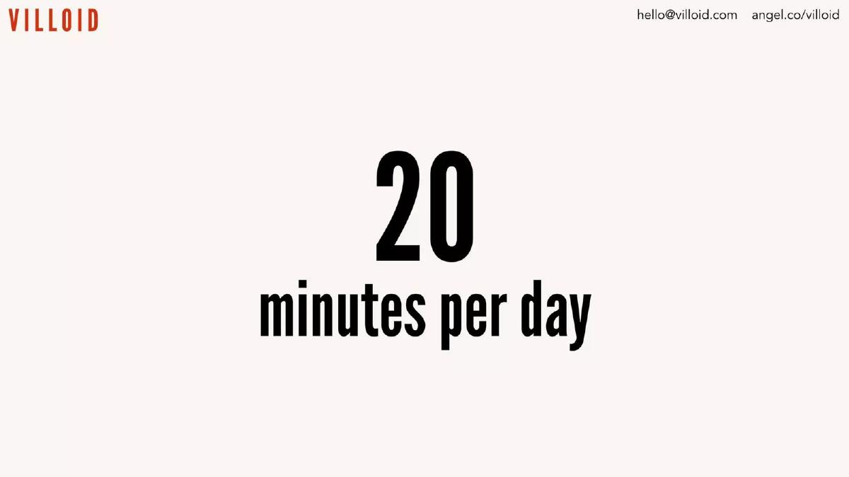
- User engagement is prioritized over raw user count, highlighting that users spend 20 minutes per day on the app (Slide 2).
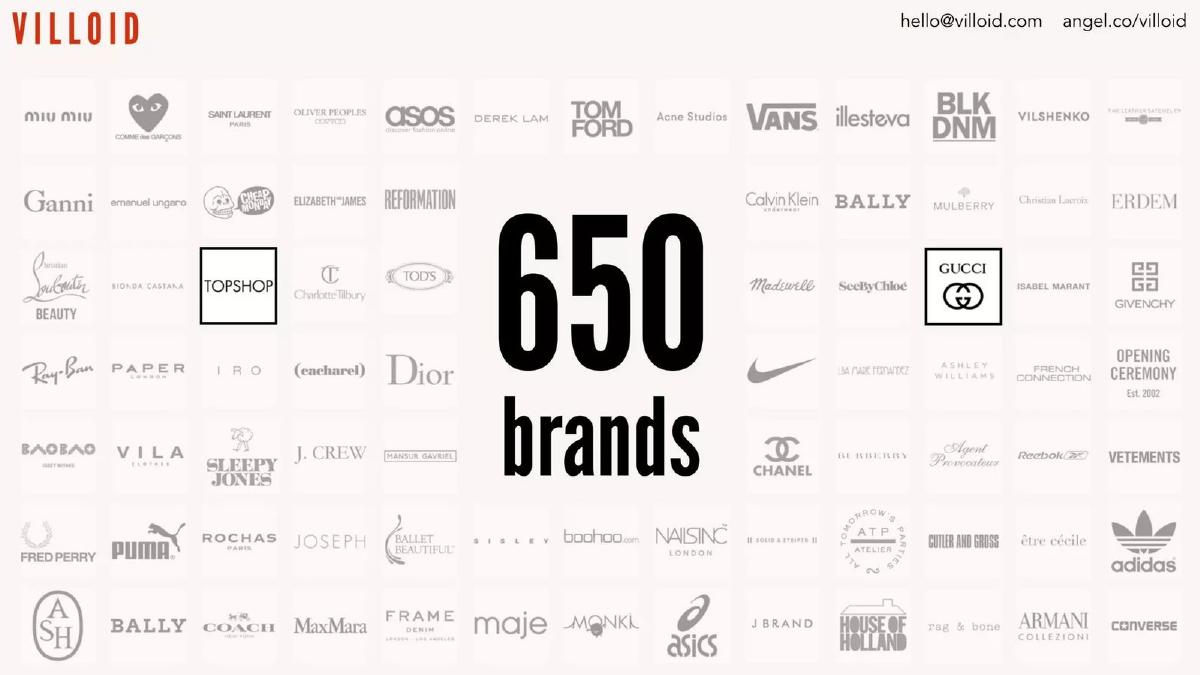
- The platform had already secured partnerships or listings with 650 brands, including luxury names like Gucci and Dior, by the time of the pitch (Slide 4).
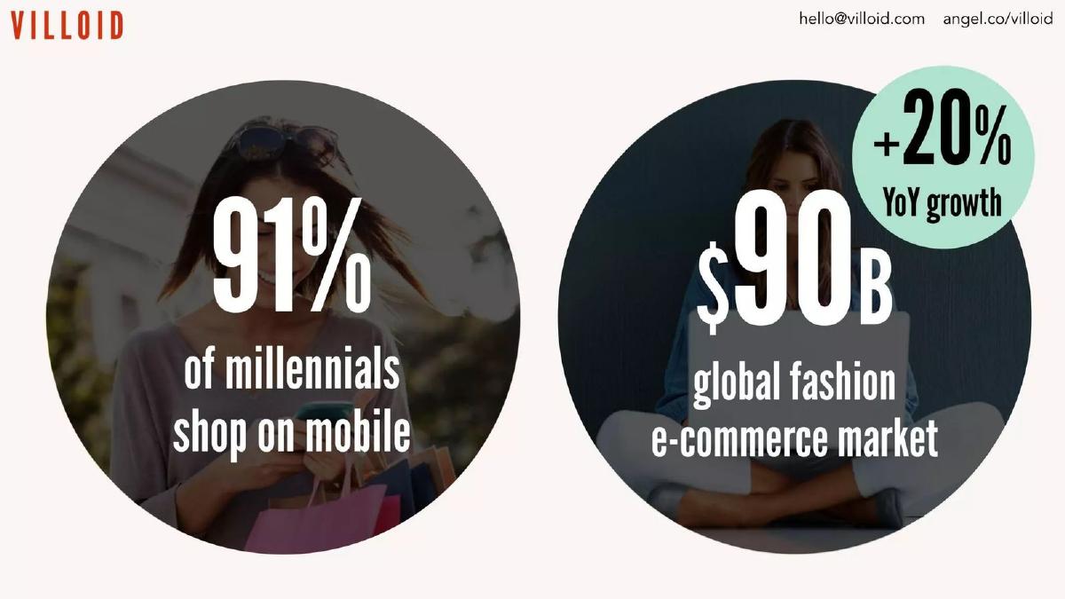
- Market validation is built on the fact that 91% of millennials shop on mobile within a $90B global market (Slide 5).
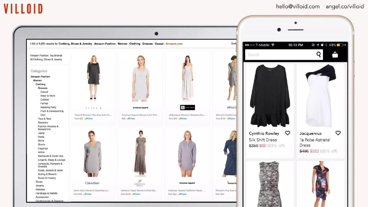
- The deck uses a 'show, don't tell' approach to product utility, contrasting flat e-commerce listings with curated style boards (Slides 7-9).
- Traction is evidenced by the creation of 500,000 user-generated style boards (Slide 10).
- A 10% 'click to buy' rate is used as the primary efficiency metric for the platform's conversion funnel (Slide 11).
- The team slide emphasizes pedigree, citing experience at McKinsey & Company and Rocket Internet, alongside Alexa Chung's 5M social followers (Slide 12).
Villoid: The High-Fashion Social Marketplace
Villoid’s 2015 pitch deck is a quintessential example of 'less is more.' With only 14 slides and a heavy emphasis on visual branding, the deck seeks to position the company at the intersection of social media and e-commerce. The company, based in Norway (though the catalogue listing mentions Ohio, the founders and website are Norwegian), raised $7.3 million using this narrative. The deck is less about the mechanics of logistics and more about the power of curation and celebrity influence.
The Hook: Validation and Engagement
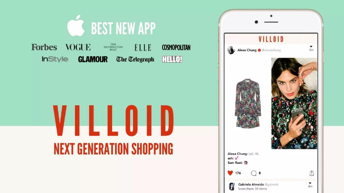
Slide 1: Title and Social Proof The opening slide does not waste time explaining what the app does. Instead, it uses the Apple logo and the 'Best New App' badge to establish immediate technical credibility. Below this, a 'wall of logos' including Vogue, Forbes, Elle, and Cosmopolitan suggests that the fashion establishment has already given Villoid its blessing. The tagline 'Next Generation Shopping' is vague but aspirational.
Slide 2: Time Spent The deck moves immediately to a retention metric: '20 minutes per day.' In the world of mobile apps, time spent is a proxy for stickiness. By leading with this, Villoid argues that they aren't just a shop, but a destination that commands user attention comparable to social networks like Instagram or Pinterest.
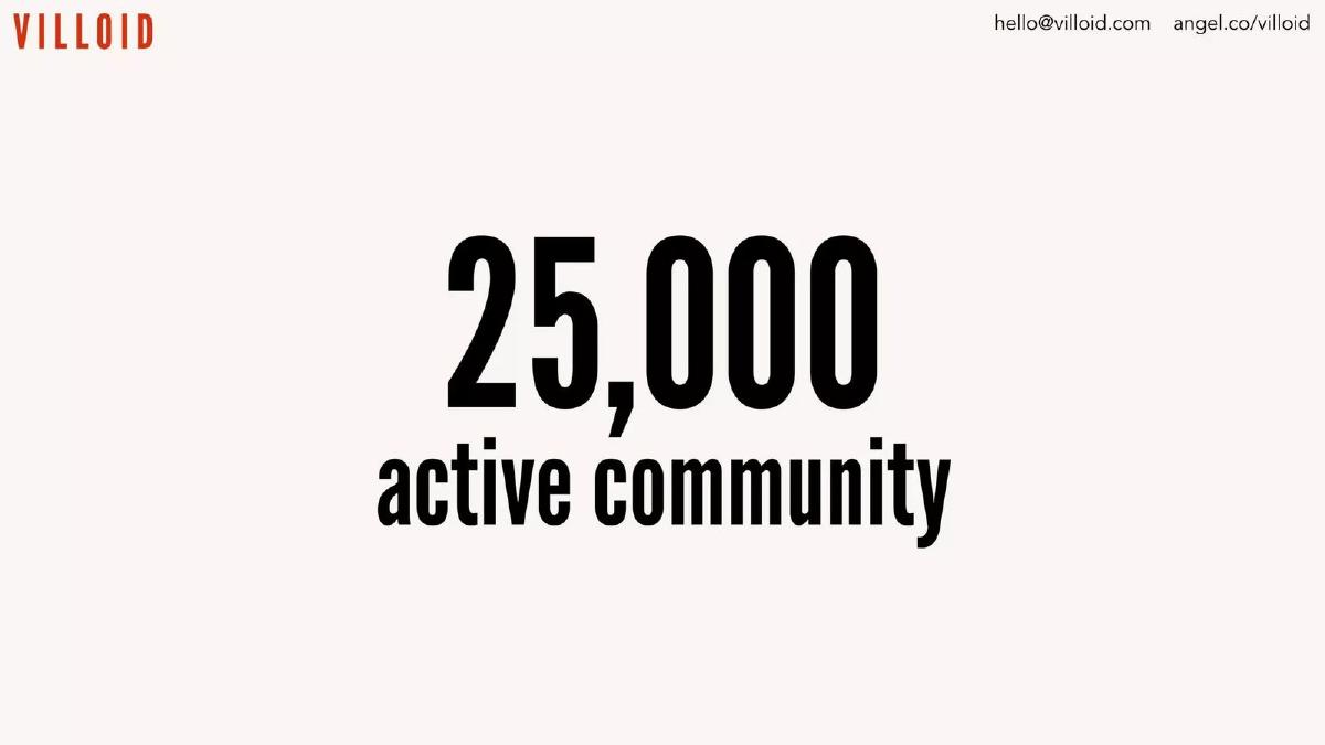
Slide 3: Community Size '25,000 active community.' While 25,000 is a relatively small number for a global app, the proximity to the '20 minutes' slide suggests these are power users. The deck prioritizes the quality of the user base over the sheer volume of downloads.
Supply and Market Opportunity
Slide 4: The Brand Ecosystem This slide features a grid of logos representing '650 brands.' The inclusion of Topshop, Gucci, Dior, and Adidas shows a range from high-street to luxury. For a marketplace, this slide proves that the 'inventory' problem has been solved, either through direct partnerships or affiliate integrations.
Slide 5: The Macro Trend Villoid anchors its existence in two stats: '91% of millennials shop on mobile' and a '$90B global fashion e-commerce market' growing at 20% YoY. This is the standard 'Why Now?' slide, justifying the shift from desktop-based shopping (like Amazon) to mobile-first social shopping.
The Product: Curation Over Catalogues
Slide 6: The Problem (Visualized) This slide shows a side-by-side comparison of a traditional Amazon-style grid on a laptop versus the Villoid mobile interface. The Amazon side looks cluttered and utilitarian, while the Villoid side looks like a curated fashion magazine. It’s a classic 'Old Way vs. New Way' comparison.
Slides 7-9: The Power of Context These slides use a visual metaphor to explain the value of 'Style Boards.' Slide 7 shows a plain grey sofa versus a styled living room. Slide 8 shows a red dress versus a complete 'look' including makeup and accessories. Slide 9 reinforces this with another product-to-context comparison. The message is clear: Villoid helps users visualize how products fit into their lives, which drives higher intent to buy.
Slide 10: User-Generated Content '500,000 style boards.' This metric proves that the community is not just consuming content but creating it. In 2015, user-generated content (UGC) was a major buzzword, and 500,000 boards from 25,000 users implies that each active user is creating an average of 20 boards, indicating extreme engagement.
Conversion and The Team
Slide 11: The Bottom Line '10% click to buy.' This is the deck's 'money slide.' It bridges the gap between a social app and a retail business. A 10% conversion rate from content to a retail link is exceptionally high, suggesting that the curation described in the previous slides actually works.
Slide 12: The Founders and The Star The team slide is split between operational expertise and cultural influence. Jeanette Dyhre Kvisvik (CEO), Jarle Snertingdalen (Product), and Karin Kallman (Marketing) bring pedigree from McKinsey & Company and Rocket Internet. However, the focal point is Alexa Chung, the Creative Director. Her '5M social media followers' represent a massive, built-in marketing engine that requires zero CAC (Customer Acquisition Cost).
Slide 13: The Advisors This slide highlights advisors from Tumblr, Klarna, and The Guardian. These logos represent expertise in social media, fintech/payments, and media—the three pillars of Villoid’s business model.
Slide 14: Closing The final slide repeats the branding from Slide 1 but adds contact information and an AngelList URL. It maintains the minimalist aesthetic to the end.
What Works in the Villoid Deck
The deck’s greatest strength is its visual restraint . In an industry like fashion, the deck itself must look 'fashionable.' By avoiding bullet points and long paragraphs, the founders demonstrate an understanding of their brand's aesthetic. The social proof is also handled expertly; instead of claiming they are popular, they show the Apple 'Best New App' badge and Alexa Chung’s follower count, letting the data speak for itself.
The comparison slides (6-9) are also highly effective. They take a complex psychological concept—the difference between utilitarian shopping and aspirational curation—and make it instantly understandable through simple imagery. This is a much stronger approach than writing a slide about 'the psychology of the consumer journey.'
What is Missing from the Villoid Deck
Despite raising $7.3 million, this deck is missing several critical components typically found in a later-stage pitch:
Financials and Projections: There is no mention of revenue, GMV (Gross Merchandise Volume), or burn rate. While the 10% click-to-buy rate is impressive, it doesn't tell the investor how much money the company is actually making. · The Ask: The deck does not state how much money they are looking to raise or what they plan to do with the capital. Usually, a 'Use of Funds' slide is mandatory to show that the founders have a plan for scaling. · Competitive Landscape: In 2015, the social shopping space was crowded with players like Polyvore, Wanelo, and even Pinterest. Villoid does not address how it differs from these incumbents beyond the involvement of Alexa Chung. · Unit Economics: There is no data on LTV (Lifetime Value) or CAC. For a later-stage round, investors generally want to see that the machine is efficient—that for every dollar spent on marketing, more than a dollar is returned in profit.
What Founders Should Copy
Founders in consumer-facing or highly visual industries should take notes on Villoid’s metric-focused minimalism . If you have one or two 'killer' metrics (like 20 minutes per day or a 10% conversion rate), give them their own slides. Don't bury them in a chart with ten other less-important data points.
Additionally, the 'pedigree by association' strategy used on the team and advisor slides is powerful. If you have a high-profile team member or advisor, don't just list their name in a small font. Use their headshot and the most recognizable logo associated with their career. It builds instant trust with investors who may not know you personally but definitely know McKinsey, Rocket Internet, or Alexa Chung.
Finally, the side-by-side comparison on Slide 6 is a perfect way to illustrate a product's value proposition. If your software is meant to replace a clunky, existing process, show the clunky process and your sleek solution next to each other. It eliminates the need for a 'Problem' slide filled with text that an investor might skim over.
Final Thoughts
Villoid’s deck is a 'vibe' deck. It sells a feeling and a community rather than a spreadsheet. While this approach is risky and requires very strong traction metrics to back it up, it worked for Villoid because they had the numbers (500k boards) and the star power (Chung) to make the vision feel inevitable. For founders without a celebrity creative director, more detail on unit economics and the competitive moat would likely be necessary to achieve a similar result.
Frequently asked questions
- Why does the deck focus so much on Alexa Chung?
- In the fashion industry, influence is currency. By highlighting Alexa Chung as Creative Director (Slide 12) and her 5 million followers, Villoid demonstrates a built-in, low-cost customer acquisition channel. This reduces the perceived risk for investors regarding marketing spend, as a major fashion icon is directly tied to the brand's identity and growth.
- Is a 10% click-to-buy rate considered high for e-commerce?
- Yes, a 10% click-to-buy rate (Slide 11) is significantly higher than standard e-commerce conversion rates, which often hover between 2% and 3%. However, it is important to note that 'click-to-buy' usually measures the intent to purchase (clicking a link to a retailer) rather than a completed transaction on the platform itself, which is a common metric for affiliate-style marketplaces.
- How does Villoid define its 'active community'?
- Slide 3 cites a '25,000 active community.' The deck does not explicitly define 'active' (e.g., Daily Active Users vs. Monthly Active Users), but when paired with Slide 2's claim of '20 minutes per day,' it suggests a highly engaged core group rather than a massive, passive audience. This focus on depth of engagement is a common tactic for early-stage social commerce apps.
- What is the significance of the 650 brands listed on Slide 4?
- For a fashion marketplace, supply-side credibility is vital. Listing 650 brands, including high-end labels like Saint Laurent, Chanel, and Givenchy, signals to investors that Villoid has successfully navigated the difficult process of brand onboarding or has a robust integration with major retail aggregators, ensuring the app is a viable shopping destination.
- Why are there no financial projections in this deck?
- This deck appears to be a 'vision and traction' deck rather than a technical one. Later-stage rounds often involve a separate data room with detailed P&L statements. By keeping the deck focused on brand, team, and engagement, Villoid maintains a high-level narrative of cultural relevance, which is often more persuasive in the fashion-tech sector than speculative five-year spreadsheets.