How media, advertising and social startups present their product: real app screens in sequence, ad units at actual size.
Media Product Slides: Real Pitch Deck Examples
Seven product slides from media, advertising and social decks (TV advertising, company audio, shoppable ads, a fan social network, live sports chat, early Foursquare and a creator brand group), shown in full. The strongest ones show the real product on screen and explain what the user does at each step; the weakest name brands or features without showing how anything works.
TL;DR
A media product slide should show the real screen and what the user or advertiser does with it. Vibe shows its campaign builder with channel reach figures, plus "500 Apps & Channels", "5 minutes setup" and a G2 rating. Storyboard walks through three phone screens from sign-in to playing an episode. AdKiosks shows its ad units at their actual sizes with products and prices inside. ShowMobile labels a real app screen with six features, and Fan Stream shows its live audio and live video screens side by side. Foursquare's first deck explains the product in plain text to users and to advertisers, and Kyra names four sub-brands without showing any product; these are the weaker examples here.
Media product slides
Each example shows the exact stored slide above its analysis and links to the full teardown. Stronger examples first. Claims and figures are as shown on the slides; we have not verified them.
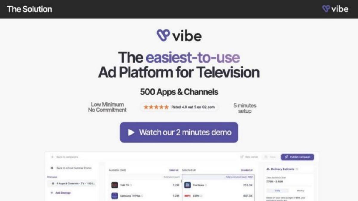
Vibe product slide — slide 6
Series A. Self-serve TV advertising. Product screen with proof points.
Vibe deck, slide 6. Exact stored slide matched to this analysis.
Our analysis: The strongest media product slide here: the claim ("easiest-to-use") is backed on the same slide by setup time, a public rating and the tool itself.
Evidence and limitation: A real product screen, a third-party rating and setup time; no customer or spend figures on this slide.
What a founder can adapt: Put your real screen under your headline and back "easy" or "fast" with a time and a public rating.
Supporting analysis
What the deck claims: "The Solution." "The easiest-to-use Ad Platform for Television." "500 Apps & Channels." "Low Minimum, No Commitment." "Rated 4.9 out 5 on G2.com." "5 minutes setup." "Watch our 2 minutes demo." The screen shows a campaign builder listing channels with estimated reach (for example "Fox News 755.3K", "ESPN 601.3K") and a "Delivery Estimate" panel.
Presentation choice: Reach figures next to named channels show an advertiser what they are buying before they ask.
When it does not fit: The demo button doesn't work in a PDF; link the demo in the email or appendix instead.
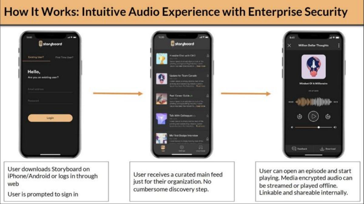
Seed stage. Private podcasts for companies. Three screens in sequence.
Storyboard deck, slide 4. Exact stored slide matched to this analysis.
Our analysis: Shows the product exactly as an employee would use it, and fits the security point into each step.
Evidence and limitation: Three real screens with captions; no usage figures.
What a founder can adapt: Show three screens in the order a user sees them, with one caption each.
Supporting analysis
What the deck claims: "How It Works: Intuitive Audio Experience with Enterprise Security." "User downloads Storyboard on iPhone/Android or logs in through web. User is prompted to sign in." → "User receives a curated main feed just for their organization. No cumbersome discovery step." → "User can open an episode and start playing. Media encrypted audio can be streamed or played offline. Linkable and shareable internally."
Presentation choice: "Encrypted" and "shareable internally" answer the enterprise buyer's first question without a separate security slide.
When it does not fit: Add how many companies or listeners use it; the flow is clear but there's no sign of use.
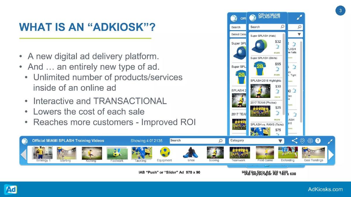
Shoppable display ads. Ad units shown at real size.
AdKiosks deck, slide 3. Exact stored slide matched to this analysis.
Our analysis: Shows the new ad format inside standard ad sizes, so a media buyer sees it fits existing inventory.
Evidence and limitation: Ad formats at standard sizes; "lowers the cost of each sale" has no figure.
What a founder can adapt: Show your ad or content format at the exact size it runs, with a real example inside.
Supporting analysis
What the deck claims: "What is an 'AdKiosk'?" "A new digital ad delivery platform. And … an entirely new type of ad." "Unlimited number of products/services inside of an online ad." "Interactive and TRANSACTIONAL." "Lowers the cost of each sale." "Reaches more customers - Improved ROI." Mock-ups labelled "IAB 'Push' or 'Slider' Ad 970 x 90", "IAB Film Strip Ad 300 x 600" and "IAB SkyScraper Ad 160 x 600", showing products with prices ("$32", "$65").
Presentation choice: Naming the standard IAB sizes answers "can publishers run this?" without a word of explanation.
When it does not fit: Add one campaign's result (click or sale rate against a standard banner) to support the ROI claim.
Fan social network for TV shows. Labelled app screen.
ShowMobile deck, slide 2. Exact stored slide matched to this analysis.
Our analysis: Each feature label points at a real screen, so the investor sees the product while reading what it does.
Evidence and limitation: A real app screen with six features; no user figures.
What a founder can adapt: Place one real screen in the middle and label its key features around it.
Supporting analysis
What the deck claims: "ShowMobile Social Network." Around a phone screen: "Closed, COPPA-compliant, moderated by sophisticated technology and humans." "Fans earn ShowMobile Stars for interacting." "Leaderboard status encourages participation." "Users can elect to have their posts appear on Facebook, Twitter, or any open-API platform." "Posts can be scripted on behalf of cast members." "Fans can see virtual gifts from others."
Presentation choice: "COPPA-compliant" and "moderated" address child-safety questions a TV network partner would raise.
When it does not fit: Say who each feature is for (fans, networks or cast); the list mixes all three.
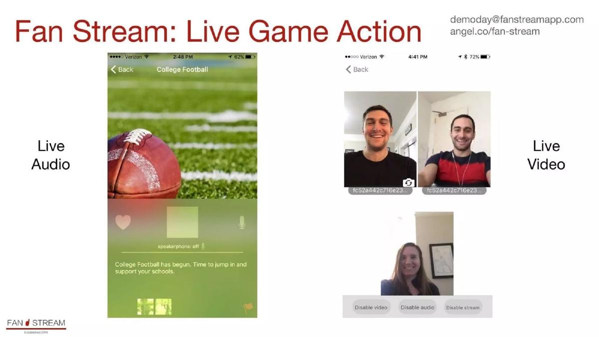
Seed stage. Live audio and video chat for sports fans. Two real screens.
Fan Stream deck, slide 5. Exact stored slide matched to this analysis.
Our analysis: Real screenshots show the product works, including a live video call between fans.
Evidence and limitation: Two working screens; no usage or retention figures.
What a founder can adapt: Show the product in use with real people, not a stock image.
Supporting analysis
What the deck claims: "Fan Stream: Live Game Action." Left: "Live Audio" screen for "College Football" ("College Football has begun. Time to jump in and support your schools."). Right: "Live Video" screen with three fans on camera and controls "Disable video", "Disable audio", "Disable stream".
Presentation choice: Seeing real people in a live call is more convincing than a mock-up for a social product.
When it does not fit: Add one line on what the user does and one usage figure; the slide has only two labels.
Seed stage. Early location-based social app. Plain-text description.
Foursquare deck, slide 2. Exact stored slide matched to this analysis.
Our analysis: A weaker slide visually, but it does one thing well: it says what the product means to users and, separately, to advertisers.
Evidence and limitation: A text description only; no screen.
What a founder can adapt: Keep the "to users / to advertisers" split and add a screenshot for each.
Supporting analysis
What the deck claims: "What is foursquare?" "Think: part friend-finder, part social city-guide, part social-game. Foursquare is a mobile application that helps you keep up with your friends while using game mechanics to encourage and reward users for experiencing new things." "In it's current form, foursquare is a website, an iPhone application, an SMS service and an API." "To users, foursquare is a tool used for finding friends, navigating the city and rewarding oneself for discovering bars + restaurants + good times." "To brands and advertisers, foursquare is a platform that both encourages and rewards customers for participating in experiences that take place in the real world." "Foursquare is a privately-held, two person startup based out of NYC."
Presentation choice: Included for contrast: clear wording, but an investor has to imagine the app.
When it does not fit: A full page of text; cut to three lines and let a screen do the rest.
Series A. Gen Z creator media group. Four sub-brands.
Kyra deck, slide 4. Exact stored slide matched to this analysis.
Our analysis: A weaker example: it shows how the company is organised, but not what any of the four products looks like or achieves.
Evidence and limitation: Four named units with one line each; no figures or screens.
What a founder can adapt: Give each unit one figure (followers, brands served, revenue share) and one screen or post.
Supporting analysis
What the deck claims: "What we've built." "The kyra creative empire." "A content ecosystem that engages gen z and inspires creators at every touchpoint." "Kyra originals: a collection of owned & operated tiktok publications." "Kyra platform: transforming how brands & creators partner on tiktok." "Kyra profile: globally recognized gen z creators, managed by kyra." "Kyra studios: creative & production services fueled by gen z expertise."
Presentation choice: Included for contrast: brand names over photos of people don't show the product.
When it does not fit: "Empire" and "every touchpoint" are labels, not evidence.
How the product is presented, whether it is shown as it really is, and which figures are on the slide.
Example
Media type
Presented as
Real product shown
Figures on slide
Vibe
TV advertising
Product screen + proof points
Yes (screen)
500 channels, 5 min setup, 4.9 G2
Storyboard
Company audio
Three screens in sequence
Yes (screens)
No
AdKiosks
Display ads
Ad units at real size
Yes (mock-ups)
Ad sizes, product prices
ShowMobile
Fan social network
Labelled app screen
Yes (screen)
No
Fan Stream
Live sports chat
Two live screens
Yes (screens)
No
Foursquare
Location social app
Plain text
No
No
Kyra
Creator media group
Four sub-brands
No (photos)
No
Key Takeaways
Show the real screen, not a logo or a photo of people.
Walk through the steps a user takes, one screen per step.
For ad products, show the ad unit at its real size.
Add one or two proof points (reach, setup time, rating).
Say what the product does for each side: viewers and advertisers.
Build your media product slide
Start from the real screen, then add what the user does and one proof point.
Real screen. The screen or ad format a user or advertiser actually sees.
Steps. Two or three steps the user takes, one screen each.
Both sides. What it does for viewers and what it does for advertisers.
Proof point. Reach, setup time, rating or usage.
Copyable framework: [Screen 1: user does X] → [Screen 2: Y] → [Screen 3: Z]. For advertisers: [what they get]. [Proof point].
Illustrative example 1 — written by us
Before: Kyra platform: transforming how brands & creators partner on tiktok.
After: Kyra platform: brands brief [N] creators in one place; [N] campaigns run in [period]. [Screen of a brief].
What improved: Our illustrative rewrite; not Kyra's wording. Bracketed parts are placeholders to fill with real facts. It replaces a slogan with what the product does and a count.
What this guide adds
The library already has a general product slide guide, product slides by stage, and fintech, SaaS, healthcare, edtech, climate and food product guides, plus media problem, solution and market guides. This page looks only at media, advertising and social decks, where the product is usually an app or an ad format and the screen itself is the best evidence.
Sector labels come from the sector recorded for each published teardown (high confidence for Storyboard, AdKiosks and Kyra; medium for Vibe, ShowMobile, Fan Stream and Foursquare). None of these seven slides appears in another guide. A different slide from Vibe's deck is used in the investors slide guide.
Four ways media decks show the product
Product screen with proof (Vibe): the working tool, with reach figures, setup time and a rating on the same slide.
Step-by-step screens (Storyboard, Fan Stream): real phone screens in the order a user sees them, each with a caption.
Ad unit at real size (AdKiosks) or a labelled screen (ShowMobile): the format itself, with its features called out around it.
Plain description or brand list (Foursquare, Kyra): text explaining the product, or sub-brand names over photos. Quick to make, but the investor has to imagine the product.
Common mistakes
Logos instead of screens. Show the product itself.
Photos of people, not the product. Use real screenshots.
"Easiest" with no proof. Add setup time or a public rating.
Only one side of the market. Say what advertisers and viewers each get.
A page of text. Cut to three lines plus a screen.
Diagnostic checklist
A real screen or ad format.
Steps in the order a user sees them.
Viewer and advertiser value stated.
At least one proof point.
Claims backed on the same slide.
Frequently asked questions
How we chose these examples
Corpus: published pitch deck teardowns on StartupFundraising.com. Founder-uploaded private decks are excluded.
Selection (2026-09-26): we took teardowns whose recorded sector is media (high or medium confidence) and whose slide is classified as a product slide, with a stored image and readable text. We read the candidates, left out slides that were not about the product (problem, opportunity, team, overview and financial slides filed under this type), slides already used in other guides and large listed-company decks, and kept seven that show different ways of presenting a media product. Foursquare and Kyra are included as weaker examples for contrast.
Sector is the category recorded for each teardown (confidence given in the section above). Stages are shown only where recorded with high confidence (Storyboard, Fan Stream and Foursquare, seed; Vibe and Kyra, Series A).
Review: stored slide images were checked on 2026-09-26 and matched to company, deck and slide number, and quoted text was read from the images (editorial model review). No person has yet completed an editorial review of this page.
Claims and figures are as shown on the slides; we have not verified them. We make no claim that any slide caused a fundraising outcome.