How founders present a waitlist in a pitch deck: size, date, growth, who signed up, where they came from and what happened when invited.
How to Show a Waitlist on Your Pitch Deck: Size, Growth, Who Signed Up and Conversion
Twelve slides from real pitch decks that use a waitlist as evidence. We record what each slide states, what a reader can work out from it, and what it leaves unknown.
TL;DR
A waitlist number on its own tells an investor very little, because signing up usually costs the person nothing. It becomes evidence when the slide answers five questions: how many, as of when, how fast it grew and over what period, who is on it (and whether they are the buyers you plan to charge), and what happened when you let people in. Of the twelve slides below, Levels comes closest: a dated count with an earlier comparison point, a chart, low stated ad spend, and a paying beta alongside the list. No slide in this set states the share of invited people who became paying customers.
The most common gaps are an undated total (Autolotto, Hoard), a growth rate with no starting count (Atom Limbs, Halp), a count that mixes the waitlist with social followers (Kama), and a waitlist turned into a revenue figure without saying how many will convert (Novoflow). Each is fixable with numbers most founders already have.
Waitlist slides from real pitch decks
Each example shows the exact page from the original public deck above its analysis and links to the full teardown. Figures are the companies' own and have not been verified. Page numbers are PDF pages.
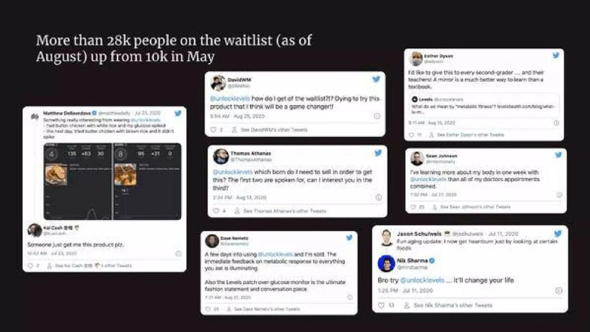
Levels traction slide — slide 3
Metabolic health app using continuous glucose monitors. Slide 3 of a 16-page deck.
Levels deck, slide 3. Exact stored slide matched to this analysis.
Our analysis: Two dated counts let a reader compute growth without trusting a percentage: by our calculation at least 18,000 added, about 2.8 times, in roughly three months.
Evidence and limitation: The months have no exact day or year on the headline, and the tweets are chosen testimonials, not a measure of the list. Nothing says how many on the list were invited or paid.
What a founder can adapt: Give the current count with its date and one earlier dated count in the same sentence.
Supporting analysis
What the deck claims: Headline: "More than 28k people on the waitlist (as of August) up from 10k in May." The rest of the slide is screenshots of public tweets about the product, dated July and August 2020.
Presentation choice: Two dated counts let a reader compute growth without trusting a percentage: by our calculation at least 18,000 added, about 2.8 times, in roughly three months.
When it does not fit: The months have no exact day or year on the headline, and the tweets are chosen testimonials, not a measure of the list. Nothing says how many on the list were invited or paid.
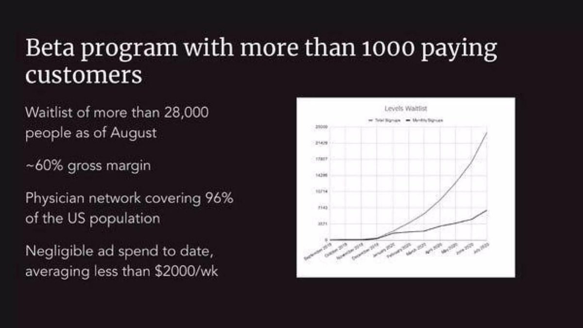
Same deck, a later summary slide that places the waitlist next to paying users.
Levels deck, slide 11. Exact stored slide matched to this analysis.
Our analysis: The waitlist sits beside a paying beta and a stated ad budget, so a reader can see both that some demand already pays and that the list was not bought with heavy advertising.
Evidence and limitation: The slide does not say whether the paying customers came from the waitlist, or what share of invitees paid. Make chart labels legible at slide size.
What a founder can adapt: Put acquisition spend next to the waitlist count, and if you have paying users, show them on the same slide.
Supporting analysis
What the deck claims: "Beta program with more than 1000 paying customers"; "Waitlist of more than 28,000 people as of August"; "~60% gross margin"; "Physician network covering 96% of the US population"; "Negligible ad spend to date, averaging less than $2000/wk". A chart titled "Levels Waitlist" shows two rising lines ending in July 2020; its axis labels are too small to read reliably in the published file.
Presentation choice: The waitlist sits beside a paying beta and a stated ad budget, so a reader can see both that some demand already pays and that the list was not bought with heavy advertising.
When it does not fit: The slide does not say whether the paying customers came from the waitlist, or what share of invitees paid. Make chart labels legible at slide size.
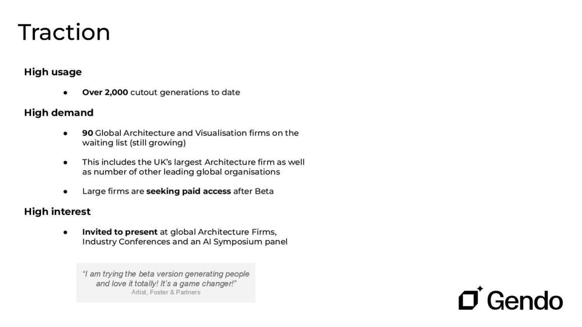
AI image generation for architects. "Traction" slide in a 16-page deck.
Gendo deck, slide 15. Exact stored slide matched to this analysis.
Our analysis: It counts businesses rather than individuals and says what kind of business they are, which is what a reader of a business-software deck needs to judge whether the list matches the paying customer.
Evidence and limitation: "Seeking paid access" has no count and no price, and the list has no date. Usage (2,000 generations) is not tied to how many firms produced it.
What a founder can adapt: For a business product, count firms, name the type, and name the most significant firm if you have permission.
Supporting analysis
What the deck claims: "High usage: Over 2,000 cutout generations to date." "High demand: 90 Global Architecture and Visualisation firms on the waiting list (still growing); This includes the UK's largest Architecture firm as well as number of other leading global organisations; Large firms are seeking paid access after Beta." "High interest: Invited to present at global Architecture Firms, Industry Conferences and an AI Symposium panel." A beta-user quote attributed to Foster + Partners.
Presentation choice: It counts businesses rather than individuals and says what kind of business they are, which is what a reader of a business-software deck needs to judge whether the list matches the paying customer.
When it does not fit: "Seeking paid access" has no count and no price, and the list has no date. Usage (2,000 generations) is not tied to how many firms produced it.
Kinspire deck, slide 11. Exact stored slide matched to this analysis.
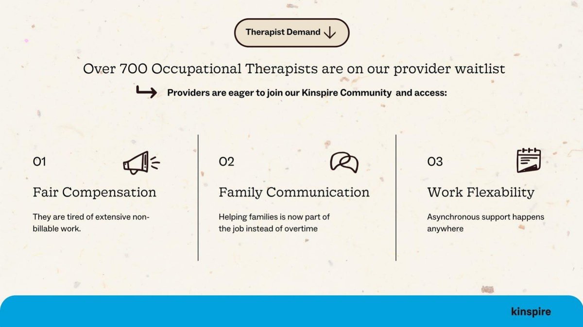
Our analysis: A waitlist of the people who deliver the service shows a marketplace can recruit its supply side, a different question from whether customers want it.
Evidence and limitation: No date or growth, and the three reasons are the company's framing rather than survey results. The slide does not say how many providers are credentialed or active.
What a founder can adapt: If supply is your constraint, show a provider waitlist with its date, and state how many providers you need to serve your first markets.
Supporting analysis
What the deck claims: "Over 700 Occupational Therapists are on our provider waitlist." "Providers are eager to join our Kinspire Community and access:" 01 Fair Compensation ("They are tired of extensive non-billable work"), 02 Family Communication, 03 Work Flexibility.
Presentation choice: A waitlist of the people who deliver the service shows a marketplace can recruit its supply side, a different question from whether customers want it.
When it does not fit: No date or growth, and the three reasons are the company's framing rather than survey results. The slide does not say how many providers are credentialed or active.
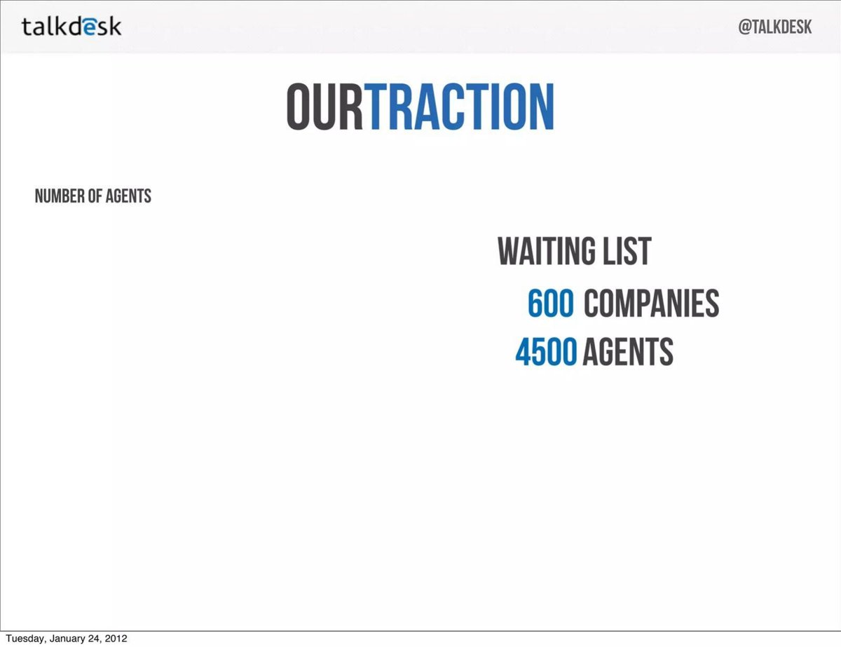
Cloud call-centre software. "Our Traction" slide; the page footer reads "Tuesday, January 24, 2012".
Talkdesk deck, slide 22. Exact stored slide matched to this analysis.
Our analysis: Counting both companies and seats maps the list onto a per-seat price: by our calculation about 7.5 agents per company on average.
Evidence and limitation: The page carries a footer date but no growth, source or conversion. The "Number of agents" area has no figure on this page.
What a founder can adapt: Count the unit you charge for as well as the number of accounts.
Supporting analysis
What the deck claims: "Number of agents" as a section label; "Waiting list: 600 companies, 4500 agents."
Presentation choice: Counting both companies and seats maps the list onto a per-seat price: by our calculation about 7.5 agents per company on average.
When it does not fit: The page carries a footer date but no growth, source or conversion. The "Number of agents" area has no figure on this page.
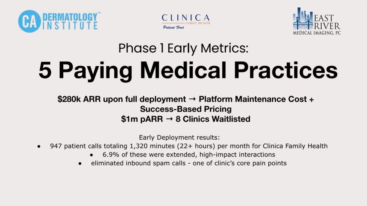
AI phone agents for medical practices. Nine-page deck; logos of CA Dermatology Institute, Clinica and East River Medical Imaging at the top.
Novoflow deck, slide 6. Exact stored slide matched to this analysis.
Our analysis: It separates paying practices from waitlisted clinics, but then attaches a revenue figure to the waitlist, which a reader must treat as a forecast.
Evidence and limitation: "pARR" is not defined. By our calculation $1m ÷ 8 ≈ $125,000 per waiting clinic versus $280k ÷ 5 ≈ $56,000 per paying practice; the slide gives no reason for the difference.
What a founder can adapt: If you value a waitlist, show count × expected price × assumed conversion, and define every abbreviation.
Supporting analysis
What the deck claims: "Phase 1 Early Metrics: 5 Paying Medical Practices." "$280k ARR upon full deployment → Platform Maintenance Cost + Success-Based Pricing." "$1m pARR → 8 Clinics Waitlisted." Early deployment results: "947 patient calls totaling 1,320 minutes (22+ hours) per month for Clinica Family Health", "6.9% of these were extended, high-impact interactions", "eliminated inbound spam calls".
Presentation choice: It separates paying practices from waitlisted clinics, but then attaches a revenue figure to the waitlist, which a reader must treat as a forecast.
When it does not fit: "pARR" is not defined. By our calculation $1m ÷ 8 ≈ $125,000 per waiting clinic versus $280k ÷ 5 ≈ $56,000 per paying practice; the slide gives no reason for the difference.
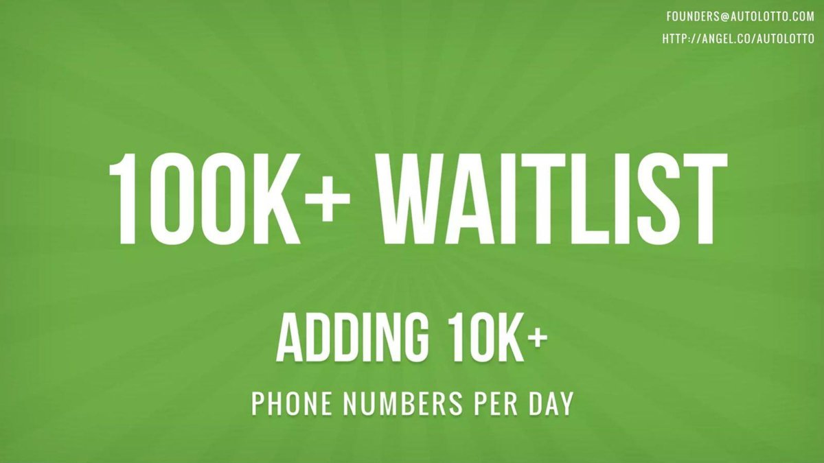
Mobile lottery ticket app. Twelve-page deck; the slide is a single statement.
Autolotto deck, slide 11. Exact stored slide matched to this analysis.
Our analysis: It gives a size and a rate, and names the unit (phone numbers), which is more specific than "sign-ups".
Evidence and limitation: Without a date or period, a reader cannot tell whether 10K a day is a sustained rate or a one-day spike; at that rate the whole list could be about ten days old (our calculation).
What a founder can adapt: Give the date of the count and the number of days over which the daily rate was measured.
Supporting analysis
What the deck claims: "100K+ WAITLIST. Adding 10K+ phone numbers per day." Contact details in the corner.
Presentation choice: It gives a size and a rate, and names the unit (phone numbers), which is more specific than "sign-ups".
When it does not fit: Without a date or period, a reader cannot tell whether 10K a day is a sustained rate or a one-day spike; at that rate the whole list could be about ten days old (our calculation).
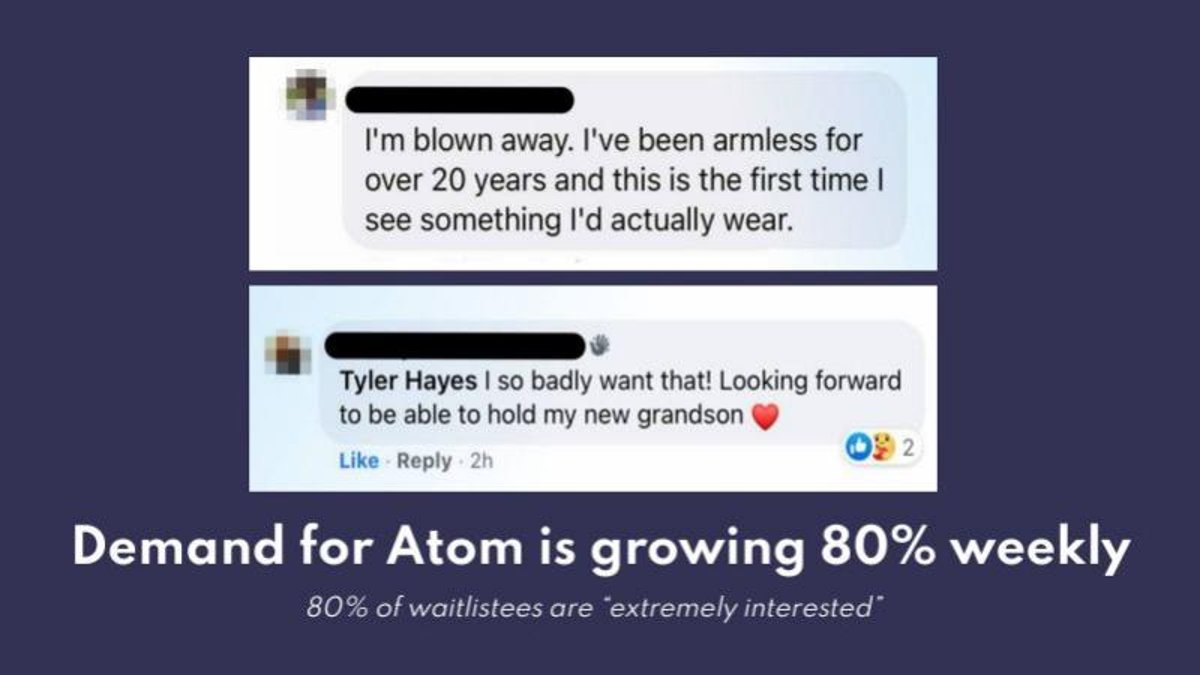
Prosthetic arm company. The slide shows two social-media comments from prospective users above its claims.
Atom Limbs deck, slide 12. Exact stored slide matched to this analysis.
Our analysis: It tries to measure intent among people on the list, not just their number, which is the right instinct for a high-price medical product.
Evidence and limitation: Neither 80% has a base: no waitlist count, no period for the weekly growth, no count of respondents. "Demand" is not defined as sign-ups, enquiries or something else.
What a founder can adapt: Give the number surveyed, the exact question and the answer scale next to any share of respondents.
Supporting analysis
What the deck claims: "Demand for Atom is growing 80% weekly." Subline: "80% of waitlistees are 'extremely interested'." Comments: "I'm blown away. I've been armless for over 20 years and this is the first time I see something I'd actually wear" and "I so badly want that! Looking forward to be able to hold my new grandson".
Presentation choice: It tries to measure intent among people on the list, not just their number, which is the right instinct for a high-price medical product.
When it does not fit: Neither 80% has a base: no waitlist count, no period for the weekly growth, no count of respondents. "Demand" is not defined as sign-ups, enquiries or something else.
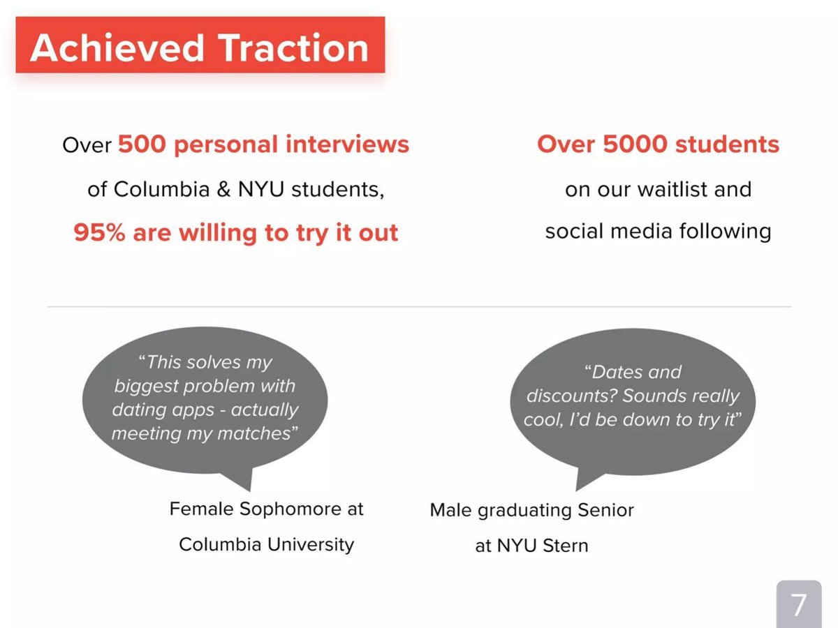
Dating app for university students. "Achieved Traction" slide.
Kama deck, slide 7. Exact stored slide matched to this analysis.
Our analysis: It pairs a waitlist with interview research, but merges the waitlist with social followers so neither can be read on its own.
Evidence and limitation: The 5,000 cannot be split into sign-ups and followers. "Willing to try" is a stated intention; by our calculation 95% of 500 is about 475 students, if the percentage applies to all 500.
What a founder can adapt: Report waitlist sign-ups and followers as two numbers, each with a date.
Supporting analysis
What the deck claims: "Over 500 personal interviews of Columbia & NYU students, 95% are willing to try it out." "Over 5000 students on our waitlist and social media following." Two quotes attributed to a female sophomore at Columbia and a male graduating senior at NYU Stern.
Presentation choice: It pairs a waitlist with interview research, but merges the waitlist with social followers so neither can be read on its own.
When it does not fit: The 5,000 cannot be split into sign-ups and followers. "Willing to try" is a stated intention; by our calculation 95% of 500 is about 475 students, if the percentage applies to all 500.
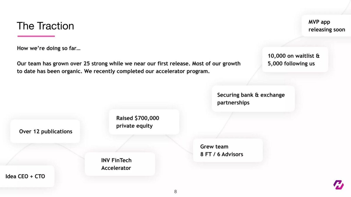
Crypto investing app. "The Traction" slide drawn as a timeline of milestones.
Hoard deck, slide 8. Exact stored slide matched to this analysis.
Our analysis: It keeps waitlist and followers as separate counts and says how the list was built, so a reader can weigh demand apart from audience.
Evidence and limitation: No date for the 10,000, no growth, and "organic" is unquantified. Pre-launch, the slide cannot show conversion, so say when the first invite wave will happen.
What a founder can adapt: Quantify "mostly organic": give the share of sign-ups from unpaid channels and what paid acquisition cost.
Supporting analysis
What the deck claims: "10,000 on waitlist & 5,000 following us"; "MVP app releasing soon"; "Our team has grown over 25 strong while we near our first release. Most of our growth to date has been organic. We recently completed our accelerator program." Other milestones: raised $700,000 private equity, over 12 publications, INV FinTech Accelerator, securing bank and exchange partnerships.
Presentation choice: It keeps waitlist and followers as separate counts and says how the list was built, so a reader can weigh demand apart from audience.
When it does not fit: No date for the 10,000, no growth, and "organic" is unquantified. Pre-launch, the slide cannot show conversion, so say when the first invite wave will happen.
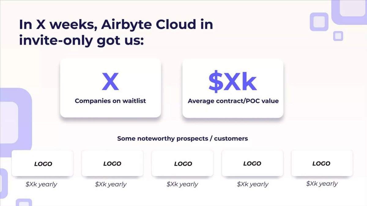
Data integration software. The teardown is labelled as its Series B deck; the published version replaces every figure with X.
Airbyte deck, slide 16. Exact stored slide matched to this analysis.
Our analysis: Even redacted, it shows a complete structure: a period, a company count, an average contract or proof-of-concept value, and named prospects each with a yearly value.
Evidence and limitation: The published slide proves nothing because every number is hidden; mixing "prospects" and "customers" under one heading also blurs who has paid.
What a founder can adapt: Use this layout for a business waitlist: weeks since opening, companies waiting, average value, and your most significant prospects with their value.
Supporting analysis
What the deck claims: "In X weeks, Airbyte Cloud in invite-only got us: X Companies on waitlist; $Xk Average contract/POC value." "Some noteworthy prospects / customers": five boxes labelled LOGO, each "$Xk yearly".
Presentation choice: Even redacted, it shows a complete structure: a period, a company count, an average contract or proof-of-concept value, and named prospects each with a yearly value.
When it does not fit: The published slide proves nothing because every number is hidden; mixing "prospects" and "customers" under one heading also blurs who has paid.
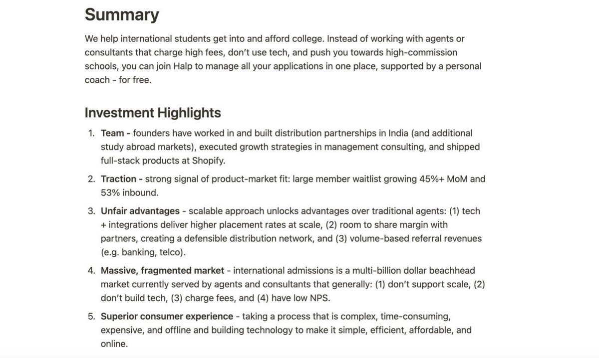
Free college-application help for international students. Page 1 is a written summary with five investment highlights.
Halp deck, slide 1. Exact stored slide matched to this analysis.
Our analysis: It gives a growth rate and a source split (53% inbound), two facts most waitlist slides omit.
Evidence and limitation: "Large" has no number and the monthly rate has no period, so it cannot be checked. A waitlist for a free service does not show willingness to pay; the slide calls it product-market fit, which is the company's claim.
What a founder can adapt: Put the count and period beside the rate, and define "inbound" (unpaid, referral, partner?).
Supporting analysis
What the deck claims: Highlight 2: "Traction - strong signal of product-market fit: large member waitlist growing 45%+ MoM and 53% inbound." Other highlights cover team, unfair advantages, a "massive, fragmented market" and consumer experience.
Presentation choice: It gives a growth rate and a source split (53% inbound), two facts most waitlist slides omit.
When it does not fit: "Large" has no number and the monthly rate has no period, so it cannot be checked. A waitlist for a free service does not show willingness to pay; the slide calls it product-market fit, which is the company's claim.
Each cell reports only what the slide itself states. "Not stated" means the page gives no figure.
Example
Count and unit
Date / growth
Who is on it
Source / cost
Conversion or commitment
Levels (3)
28k+ people
As of August; up from 10k in May
Not stated
Not stated
Not stated
Levels (11)
28,000+ people
As of August; chart to July 2020
Not stated
Ad spend under $2,000/wk
1,000+ paying beta customers; link to list not stated
Gendo
90 firms
Not stated ("still growing")
Architecture and visualisation firms; UK's largest named by type
Not stated
Large firms "seeking paid access", count not stated
Kinspire
700+ therapists (supply side)
Not stated
Occupational therapists
Not stated
Not stated
Talkdesk
600 companies; 4,500 agents
Footer date 24 Jan 2012; no growth
Not stated
Not stated
Not stated
Novoflow
8 clinics
Not stated
Medical clinics
Not stated
"$1m pARR" forecast; 5 other practices paying
Autolotto
100K+ phone numbers
Adding 10K+ a day; no date
Not stated
Not stated
Not stated
Atom Limbs
Not stated
80% weekly, no base or period
Not stated
Not stated
80% "extremely interested", respondents not stated
Kama
5,000+ waitlist and followers combined
Not stated
Columbia and NYU students
Not stated
95% of 500+ interviewed willing to try
Hoard
10,000 waitlist; 5,000 followers
Not stated
Not stated
"Mostly organic", unquantified
Pre-launch
Airbyte
X companies (redacted)
X weeks (redacted)
Named prospects (redacted)
Not stated
$Xk average contract/POC value (redacted)
Halp
"Large", number not stated
45%+ month on month, no period
Prospective international students
53% inbound
Not stated
Key Takeaways
Date the count and give a second point. Levels: "More than 28k people on the waitlist (as of August) up from 10k in May."
Name the unit you are counting. Talkdesk counts both "600 companies" and "4500 agents"; for software sold per seat, both numbers matter.
Say who is on the list. Gendo's "90 Global Architecture and Visualisation firms", including "the UK's largest Architecture firm", tells a reader far more than a bare sign-up count.
Keep waitlist, followers and paying users apart. Kama's "5000 students on our waitlist and social media following" cannot be split into either figure.
A growth rate needs its base and period. "Growing 80% weekly" (Atom Limbs) and "45%+ MoM" (Halp) cannot be checked without the starting count and the weeks or months measured.
A revenue figure built on a waitlist is a forecast. Novoflow's "$1m pARR → 8 Clinics Waitlisted" is potential revenue if those clinics buy, not revenue.
Write your waitlist line
Fill in what you know. Leave a field blank rather than guess, and label any forecast as a forecast.
Count and unit. How many people, companies or seats, as of what date?
Growth. What was the count at an earlier dated point?
Who. What kind of person or company, and do they match the buyer you will charge?
Source and cost. Where did sign-ups come from, and what did acquiring them cost?
Commitment. Did anyone give more than an email: a deposit, a survey answer, a request for paid access? How many?
Conversion. Of those invited, how many activated and how many paid?
Copyable framework: [Count] [unit] on the waitlist as of [date], up from [count] on [date]; [share]% from [source] at [cost]. Invited [n] in [month]: [a] activated, [p] paid.
Illustrative example 1 — written by us
Before: Huge waitlist growing 80% weekly
After: 4,200 on the waitlist on 1 March, up from 1,300 on 1 February; 70% via referrals, $0 ad spend. Invited 300: 120 active after a week, 35 paid.
What improved: Placeholder figures showing the format: dated counts, source and cost, and conversion from an invite wave replace an uncheckable rate.
What a waitlist can and cannot prove
A waitlist is a list of people or companies who asked to be told when a product is available. It shows that a message reached people and that some of them acted on it. It does not show that they will pay, that they match the customer in your financial model, or that they will stay once they use the product.
Investors therefore read a waitlist as a leading indicator. It is most persuasive before launch, when nothing stronger exists, and when the slide gives the facts that let a reader judge its quality. Once you have paying users, the waitlist becomes supporting evidence next to them, as it does on Levels' slide 11.
This guide is about the waitlist itself. The pre-order guide covers hardware demand where money changes hands (pre-orders, deposits, crowdfunding), and the pre-revenue traction guide covers pilots and letters of intent. Where a slide here also shows paying users, we note it only to explain how it changes what the waitlist means.
Six facts that turn a sign-up count into evidence
Size and date: the count, and the date it was measured. A number without a date cannot be compared with anything, and a reader cannot tell whether it is last week's figure or last year's.
Growth over a stated period: two or more dated counts, or a chart with labelled axes. A percentage growth rate is only meaningful next to its starting count and period; 80% weekly growth from 50 people is a different fact from 80% weekly growth from 50,000.
Who is on it: the kind of person or company, and whether they are the buyer you plan to charge. A consumer list can be described by segment; a business list by company count, company type and, where possible, named firms.
Where they came from: how the list was built (press, referral, paid ads, a partner, organic word of mouth) and what it cost. A list bought with advertising proves less about demand than one built without it, and the acquisition cost matters for the financial model.
Commitment: anything beyond an email address, such as a deposit, a survey answer, a completed application or a request for paid access. Say how many people gave it.
Conversion when invited: of the people you let in, how many activated and how many paid. This is the fact that turns a waitlist from interest into demand, and it is the one missing from every slide in this set.
Reading growth figures: dated counts versus rates
Levels gives two dated counts: 10k in May and more than 28k as of August. Our calculation: the list grew by at least 18,000 people, or about 2.8 times, in roughly three months. The slide does not give exact dates in May and August, so the period could be anywhere from about two and a half to four months; the tweets pictured are dated July and August 2020, which places the counts in 2020 but is our inference from the screenshots, not a date the slide states.
Autolotto states a rate without a date: "100K+ waitlist, adding 10K+ phone numbers per day." Our calculation: at 10,000 a day, the whole list could have been built in about ten days, or the rate could be a recent peak on a list built over months. The slide does not say which, or over how many days the 10K+ was measured, so a reader cannot tell whether the rate is sustained.
Atom Limbs and Halp give percentage rates only. "Growing 80% weekly" compounded for four weeks would multiply a list about 10.5 times (our calculation, 1.8 to the fourth power); growth at that rate rarely lasts, which is why a reader will ask how many weeks it covers and from what base. Halp's "45%+ MoM" has the same gap. Neither slide states a starting count, a current count or a period.
Recommendation: give dated counts first and let the reader compute the rate, or give the rate with its base and period in the same line. If growth has slowed, a dated series shows it honestly; a single peak rate hides it.
Counting the right unit: people, companies, seats and providers
Talkdesk's slide, dated Tuesday, January 24, 2012 in the page footer, lists a waiting list of 600 companies and 4,500 agents. Our calculation: about 7.5 agents per company on average. For a product priced per agent, the agent count is the one that maps to revenue; the company count shows how many sales conversations it represents. The slide does not say how many of either became customers.
Gendo counts firms, not people, and names the largest: 90 architecture and visualisation firms, including the UK's largest architecture firm. For a business product, one named firm can matter more than a thousand anonymous sign-ups, because it shows the buyer the pricing assumes. The slide also claims that large firms are "seeking paid access after Beta", but it does not say how many.
Kinspire's waitlist is on the supply side: "Over 700 Occupational Therapists are on our provider waitlist." In a marketplace that needs therapists before it can serve families, a supply waitlist answers a different question from a customer waitlist: can the company recruit the people who deliver the service? The slide gives the reasons providers want to join (fair compensation, family communication, work flexibility), which are the company's claims, not survey results.
Recommendation: count the unit your revenue model charges for, and if you have both sides of a marketplace, give both counts separately with their dates.
Keeping different kinds of interest apart
Kama combines two things in one number: "Over 5000 students on our waitlist and social media following." A follower and a waitlist sign-up are different actions, and the slide does not say how many of the 5,000 are each, or whether some people are counted twice. Next to it, "Over 500 personal interviews of Columbia & NYU students, 95% are willing to try it out" is a separate piece of research evidence; our calculation puts 95% of 500 at about 475 people, if exactly 500 were interviewed and the percentage applies to all of them.
Hoard keeps the two apart: "10,000 on waitlist & 5,000 following us", and adds that "most of our growth to date has been organic". Separate counts let a reader weigh each; the organic claim is useful but unquantified, since the slide does not say what share of sign-ups came without paid acquisition.
Levels' slide 11 puts the waitlist next to stronger evidence: a "Beta program with more than 1000 paying customers", about 60% gross margin, and "Negligible ad spend to date, averaging less than $2000/wk". The paying beta shows that at least some demand turns into revenue; the ad spend figure shows the list was not simply bought. The slide does not say whether the 1,000 paying customers came from the waitlist or what share of invited people paid.
When a waitlist becomes a revenue forecast
Novoflow reports "5 Paying Medical Practices", "$280k ARR upon full deployment" and "$1m pARR → 8 Clinics Waitlisted". Both dollar figures are conditional: the $280k is what the five practices would pay once fully deployed, and the $1m is labelled pARR, which the slide does not define but which reads as potential or projected ARR from eight clinics that are waiting. Our calculation: $1m across 8 clinics implies about $125,000 per clinic, against about $56,000 per practice implied by $280k across 5. The slide does not explain why a waiting clinic would be worth more than twice a deployed one; the clinics may be larger, or the figure may assume more services, so this is missing information, not a proven error.
Airbyte's slide is a template with every number replaced by X: "In X weeks, Airbyte Cloud in invite-only got us: X Companies on waitlist, $Xk Average contract/POC value", with five redacted logos marked "$Xk yearly". Even redacted, its structure is instructive: a period, a company count, an average contract or proof-of-concept value, and named prospects with a value each. A reader of the filled-in version could multiply count by value; a reader of the published version can only see the format.
Recommendation: if you attach money to a waitlist, show the arithmetic (count × expected price × expected conversion), label the result as a forecast, and state the conversion rate you assumed and where it came from.
What to add if you have it: invites, activation and payment
None of the twelve slides states what share of people invited off the waitlist became active or paying users. If you have run even a small invite wave, that is the most valuable line you can add: for example, "Invited 500 in June; 210 activated within 7 days; 64 paid after the trial." Those are placeholder numbers to show the format, not figures from any deck here.
If you have not yet invited anyone, say so and give the evidence of commitment you do have: survey answers with the number of respondents, requests for paid access with a count, or deposits. Atom Limbs' "80% of waitlistees are extremely interested" is this kind of evidence, but without the number surveyed, the question asked or the answer scale, a reader cannot tell how strong it is.
Common mistakes
An undated total. A count with no date cannot be compared or checked for staleness.
A rate with no base. Percentage growth means little without the starting count and the period measured.
Followers counted as sign-ups. Social followers and waitlist sign-ups are different actions; give separate numbers.
The wrong unit. Count what your price charges for: seats, firms, clinics or providers, not only email addresses.
A waitlist valued as revenue. Attaching ARR to people who have not bought is a forecast; show the assumed conversion.
No word on invites. If you have let anyone in, the share who activated and paid is the most persuasive number you have.
Diagnostic checklist
The count states its unit and the date it was measured.
At least one earlier dated count, or a legible chart, shows growth.
The slide says who is on the list and whether they match the paying customer.
Waitlist, followers, survey respondents and paying users are counted separately.
The main acquisition source and cost are stated, or left out knowingly.
Any revenue attached to the list is labelled as a forecast with its assumptions.
Results of any invite wave (activated, paid) are stated.
Frequently asked questions
Is a waitlist good traction for a pitch deck?
It is the weakest kind of traction that still counts, because joining usually costs nothing. It is useful before launch, and stronger when the slide dates it, shows growth, says who signed up and how, and reports what happened when people were invited. Levels shows it beside a paying beta, which is the most persuasive arrangement in this set.
Should I show my waitlist as a growth rate or as a number?
Give dated numbers first. A rate such as Atom Limbs' "80% weekly" or Halp's "45%+ MoM" cannot be checked without the starting count and period, while Levels' "up from 10k in May" to "28k as of August" lets a reader compute the growth themselves.
Can I combine my waitlist with social media followers?
Keep them separate. Hoard gives "10,000 on waitlist & 5,000 following us" as two numbers; Kama's "5000 students on our waitlist and social media following" cannot be split, so a reader cannot tell how many actually asked for the product.
Can I put a revenue figure on my waitlist?
Only as a labelled forecast with its arithmetic. Novoflow attaches "$1m pARR" to eight waitlisted clinics without defining pARR or giving a price or conversion assumption; a reader should treat it as potential, not revenue.
How we chose these examples
Search (2026-09-30): the durable corpus index (docs/seo/artifacts/corpus-search, 70,729 unique pages across every deck page, deduplicated by deck-file sha256 + page) was searched for waitlist, wait list, wait-list and waiting list. Existing guides were read first: pre-orders (Clair Health's waitlist beside pre-orders), pre-revenue traction, the main traction guide and market validation mention waitlists only in passing, so this guide asks a question none of them answers.
Seventeen candidate pages were rendered from the original public deck files and read from the images; twelve are used: Levels 3 and 11, Gendo 15, Kinspire 11, Talkdesk 22, Novoflow 6, Autolotto 11, Atom Limbs 12, Kama 7, Hoard 8, Airbyte 16, Halp 1. Levels 3 was already stored; eleven images were stored from the original PDFs on 2026-09-30.
Left out: Monzo 8 (waitlist as a growth mechanic, no figures; its source page count could not be verified for image storage), Wreno 9 (every figure marked Confidential, a lesson Airbyte already shows), Upstream 7 and Diagram 53 (wording overlaps lessons already covered), Exeq 16 (source file unavailable), and pages where "waiting list" describes a problem in healthcare or housing rather than demand for the company's product.
No slide found states the share of invited waitlist members who became paying customers. How we built this: drafted and checked with AI assistance (editorial model review against the original slide images); no human editor has reviewed this guide.