Problem Slide Statistics: 7 Real Pitch Deck Examples
Which number should lead your problem slide? Seven real problem slides compared: one headline figure with a gap, stacked evidence, your own user data.
Problem Slide Statistics: Choosing the Number That Proves the Pain
Most problem slides use a statistic. This guide compares seven real ones to answer a narrower question: which number should you lead with, and how should you show where it came from?
TL;DR
Lead with the one number that shows the gap between what customers need and what they get today, and show its source on the slide. Charta Health does this in two lines: "100% of US healthcare providers review medical charts", "costing at least $85 billion every year", then "less than 2% of charts are actually reviewed". inDinero uses its own customers instead of market research: "90% of our users have never tried using QuickBooks before". Womco and Hive show sources on the slide (research references and a named source). Hardbacon shows four percentages at equal weight, so no single number leads, and Front's figures (215 billion emails a day, 54% business email) show that email is big rather than that it is painful.
Problem slides that use statistics
Each example shows the exact stored slide above its analysis and links to the full teardown. Stronger examples first. Statistics are quoted as shown on the slides; we have not verified them.
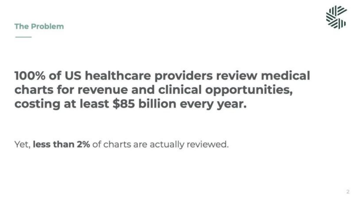
Charta Health problem slide — slide 2
Software for reviewing medical charts. A two-sentence problem slide with no images.
Charta Health deck, slide 2. Exact stored slide matched to this analysis.
Our analysis: The "Yet" turns market size into a gap the product can close.
Evidence and limitation: Three numbers set up one contrast: everyone does this, it costs a lot, and almost none of it gets done. No source is shown on the slide.
What a founder can adapt: Write your problem as a sentence with a turn: what everyone does or spends, then how little of it works.
Supporting analysis
What the deck claims: "100% of US healthcare providers review medical charts for revenue and clinical opportunities, costing at least $85 billion every year." "Yet, less than 2% of charts are actually reviewed."
Presentation choice: An investor remembers "less than 2%" because it is the problem in one figure.
When it does not fit: Add a source for the $85 billion and 2% figures; as shown, both are unattributed company claims.
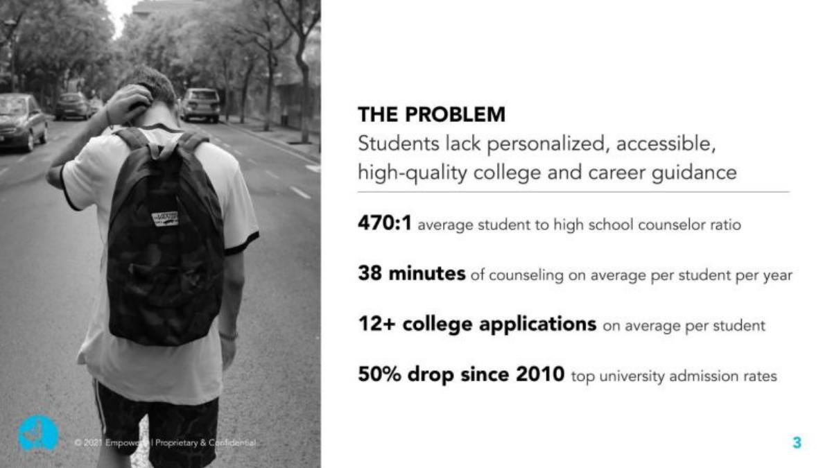
College and career counselling. One problem sentence and four supporting figures beside a photo.
Empowerly deck, slide 3. Exact stored slide matched to this analysis.
Our analysis: A stack that works because no two numbers make the same point.
Evidence and limitation: Each figure covers a different side of the problem: too few counsellors, too little time, more applications, harder admissions.
What a founder can adapt: If you use several numbers, give each one a different job: supply, time, workload, stakes.
Supporting analysis
What the deck claims: "Students lack personalized, accessible, high-quality college and career guidance." "470:1 average student to high school counselor ratio." "38 minutes of counseling on average per student per year." "12+ college applications on average per student." "50% drop since 2010 top university admission rates."
Presentation choice: Together the four figures explain why students need more help than schools can give.
When it does not fit: No sources are shown; add a footnote for each figure.
Finance software for small businesses. Three problem statements, one statistic and three user posts.
inDinero deck, slide 2. Exact stored slide matched to this analysis.
Our analysis: Clear about whose number it is, which makes it hard to dispute and shows the company already has users.
Evidence and limitation: The one statistic comes from the company's own users and says so.
What a founder can adapt: If you have users or survey respondents, use a number from them and say how many people it covers.
Supporting analysis
What the deck claims: "Business owners don't do accounting. 90% of our users have never tried using QuickBooks before." "Business owners don't plan their finances." "No automated solution to tracking finances. QuickBooks + Excel are still manual ways to record transactions." Three social posts complain about QuickBooks.
Presentation choice: Early-stage founders often have better data on their own users than on the market; saying "our users" makes that a strength.
When it does not fit: Say how many users the 90% is based on; without it the figure's weight is unclear.
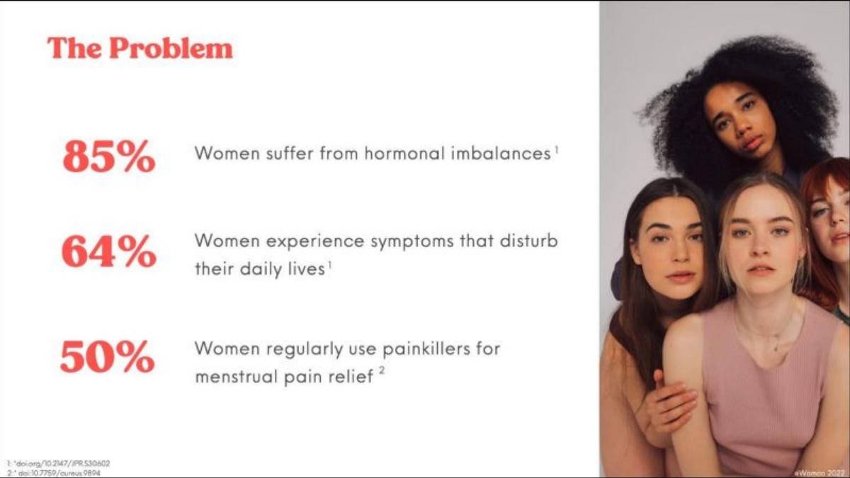
Women's hormonal health. Three large percentages with footnoted references.
Womco deck, slide 2. Exact stored slide matched to this analysis.
Our analysis: The only slide here where a reader can check where every number came from.
Evidence and limitation: Each figure carries a superscript linked to a reference on the slide.
What a founder can adapt: Add small numbered footnotes for any research figure, especially in health, finance or other regulated areas.
Supporting analysis
What the deck claims: "85% Women suffer from hormonal imbalances." "64% Women experience symptoms that disturb their daily lives." "50% Women regularly use painkillers for menstrual pain relief." Footnotes at the bottom of the slide give two research references.
Presentation choice: Health claims draw scrutiny; visible references answer the first diligence question in advance.
When it does not fit: The three numbers get more severe from prevalence to daily impact to painkiller use; lead with the one closest to what your product fixes.
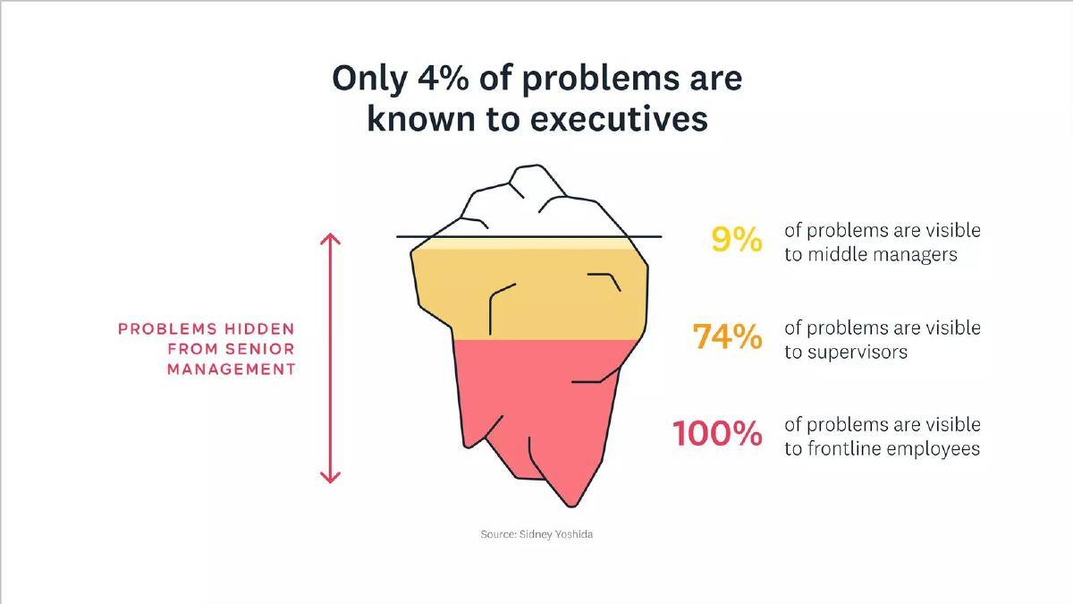
Employee feedback software. One headline figure explained with an iceberg diagram.
Hive deck, slide 4. Exact stored slide matched to this analysis.
Our analysis: The headline figure alone makes the case; the diagram shows the buyer where the information is lost.
Evidence and limitation: A single headline number, a diagram that shows the drop at each level and a named source.
What a founder can adapt: Turn your key number into a simple picture of where the problem happens.
Supporting analysis
What the deck claims: "Only 4% of problems are known to executives." "9% of problems are visible to middle managers." "74% of problems are visible to supervisors." "100% of problems are visible to frontline employees." "Source: Sidney Yoshida."
Presentation choice: It gives an executive buyer a reason to care: they are the people who see least.
When it does not fit: A name alone is a thin citation; give the publication and year so an investor can find it.
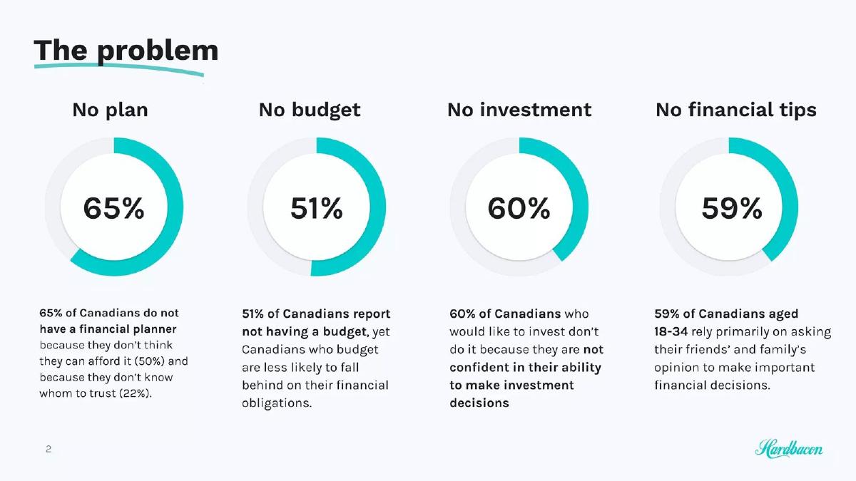
Personal finance app for Canadians. Four ring charts at equal size.
Hardbacon deck, slide 2. Exact stored slide matched to this analysis.
Our analysis: Every number gets the same size and colour, so the slide has no headline; a reader has to decide which problem matters most.
Evidence and limitation: Four figures between 51% and 65%, each describing a different gap, with no source on the slide.
What a founder can adapt: Pick the one gap your product closes first and make it the headline; move the others into small text or the appendix.
Supporting analysis
What the deck claims: "No plan: 65% of Canadians do not have a financial planner…" "No budget: 51% of Canadians report not having a budget…" "No investment: 60% of Canadians who would like to invest don't do it because they are not confident…" "No financial tips: 59% of Canadians aged 18-34 rely primarily on asking their friends' and family's opinion…"
Presentation choice: Useful contrast with Charta Health: more numbers, less focus.
When it does not fit: Don't give four statistics equal weight; the figures are also unattributed.
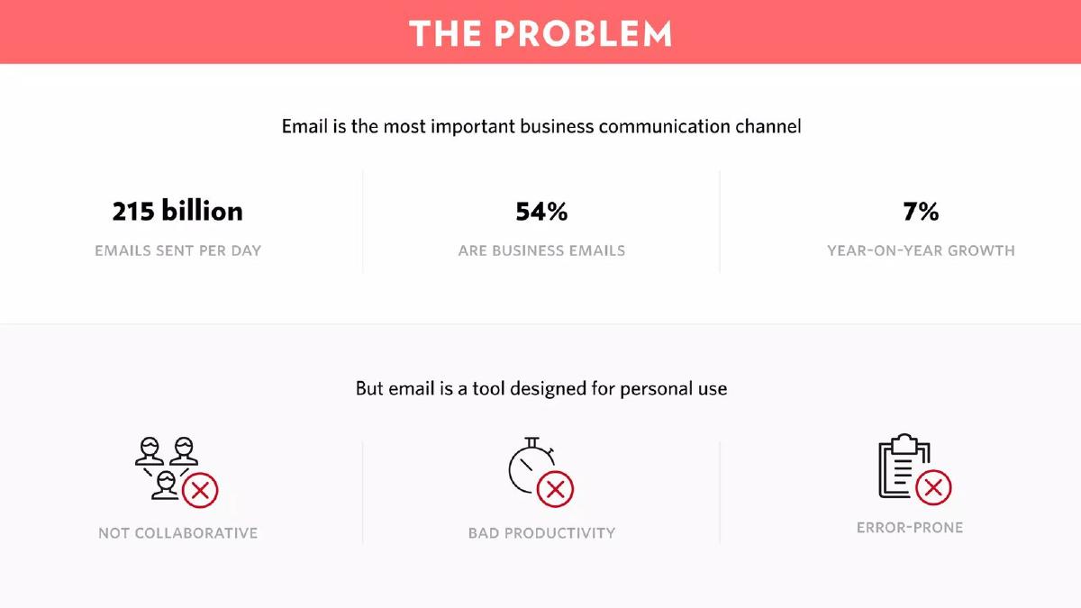
Shared email for teams. Three market figures above three problem icons.
Front deck, slide 2. Exact stored slide matched to this analysis.
Our analysis: The statistics support a market-size point, while the problem itself goes unquantified.
Evidence and limitation: The numbers show email is large and growing; the pain appears only as three icon labels with no figures.
What a founder can adapt: If your top numbers describe the market, add one that measures the pain, such as time lost or errors made.
Supporting analysis
What the deck claims: "Email is the most important business communication channel." "215 billion emails sent per day." "54% are business emails." "7% year-on-year growth." "But email is a tool designed for personal use": "Not collaborative", "Bad productivity", "Error-prone".
Presentation choice: Contrast: the numbers are prominent but don't measure the problem the product solves.
When it does not fit: Don't let market-size figures stand in for problem evidence.
Whether the lead number shows pain or size, how many figures compete for attention and whether the source is visible.
Example
Lead number
Shows
Figures shown
Source on slide
Charta Health
Less than 2% of charts reviewed
Gap
3
No
Empowerly
470:1 student to counsellor
Shortage
4 (different jobs)
No
inDinero
90% of our users never tried QuickBooks
Behaviour
1
Own users
Womco
85% of women
Prevalence
3
Yes (references)
Hive
Only 4% known to executives
Gap
4 (one headline)
Named source
Hardbacon
None (four equal)
Several gaps
4 (equal weight)
No
Front
215 billion emails a day
Market size
3
No
Key Takeaways
One headline number beats four equal ones.
The strongest number shows a gap, not a market size.
Your own customer data is persuasive when you say whose it is.
Put the source on the slide, even as a small footnote.
Supporting numbers should each add a new piece of the problem.
Choose your problem statistic
List every number you could use, then keep the one that shows the gap most clearly.
Candidates. Every figure you have about the problem: market research, public data, your own users or survey.
Pain or size. Mark each one: does it show something failing, or just that the area is big?
Headline. The one pain figure your product changes most directly.
Support. At most two more figures, each describing a different part of the problem.
Source. Where each figure comes from, in a footnote: study, dataset or "our N users".
Copyable framework: [Who] [does or spends X] — yet only [headline figure] [outcome]. Source: [study, year] or [N of our users].
Illustrative example 1 — written by us
Before: 65% of Canadians do not have a financial planner. 51% report not having a budget. 60% who would like to invest don't. 59% aged 18-34 rely on friends and family.
After: Only [X]% of Canadians aged 18-34 get financial advice from anyone but friends and family. [Supporting figure on budgeting.] Source: [survey, year].
What improved: Our illustrative rewrite; not Hardbacon's wording. It leads with the figure closest to a young user and adds the missing source.
What this guide adds
The general problem slide guide covers how to frame a customer's pain, and the industry guides show how that looks in each sector. This page covers one decision every founder makes on that slide: which statistic to use, how many to show and how to cite them.
Four of these decks (Charta Health, Empowerly, inDinero, Hive) also appear in other guides for a different lesson; here we look only at how they use numbers. Hardbacon and Womco appear for the first time.
Three questions to ask of any problem statistic
Does it show pain or just size? "215 billion emails a day" shows size. "Less than 2% of charts are actually reviewed" shows a failure.
Whose number is it? A figure from your own users, a named study or a public dataset each carries different weight. An unattributed figure invites the question.
Does each extra number add something? Empowerly's four numbers each describe a different part of the counselling shortage. Hardbacon's four repeat the same kind of point.
Common mistakes
Market size posing as pain. A big market is not a problem; measure what fails for the customer.
Equal-weight numbers. Four figures at the same size leave the reader to choose a headline.
No source. Unattributed numbers become the first diligence question.
Repeating numbers. Supporting figures should each add a new piece of the problem.
Undisclosed sample. "90% of our users" needs the number of users behind it.
Diagnostic checklist
One headline number that shows a gap.
No more than two supporting figures.
Each figure makes a different point.
Source or sample on the slide.
Numbers tied to what your product fixes.
Frequently asked questions
How we chose these examples
Corpus: published pitch deck teardowns on StartupFundraising.com. Founder-uploaded private decks are excluded.
Selection (2026-09-25): we searched stored slide text for slides headed Problem that contain a percentage and have a stored slide image, then inspected each image. We kept seven slides that show distinct ways of using numbers; Opendoor and Ownwell were considered and left out because the lesson overlapped with examples already chosen.
Four decks also appear in other guides for different lessons; version 2 of our production rules allows reuse when the lesson is materially different.
Review: stored slide text and images were checked on 2026-09-25 and matched to company, deck and slide number (editorial model review). No person has yet completed an editorial review of this page.
Statistics are quoted as shown on the slides; we have not verified them or the references cited. We make no claim that any slide caused a fundraising outcome.