How software startups show their product on one slide: workflow diagrams, setup steps with a screenshot, the user and developer views, feature grids.
SaaS Product Slides: Real Pitch Deck Examples
Seven product slides from software decks, shown in full. The strongest show the product doing its job, either as a real screen or as a step-by-step flow. The weakest give a one-line description with nothing to look at.
TL;DR
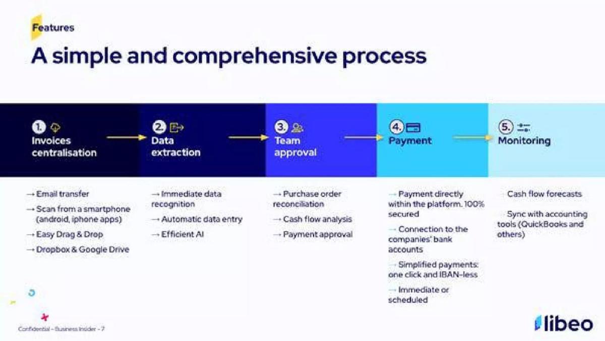
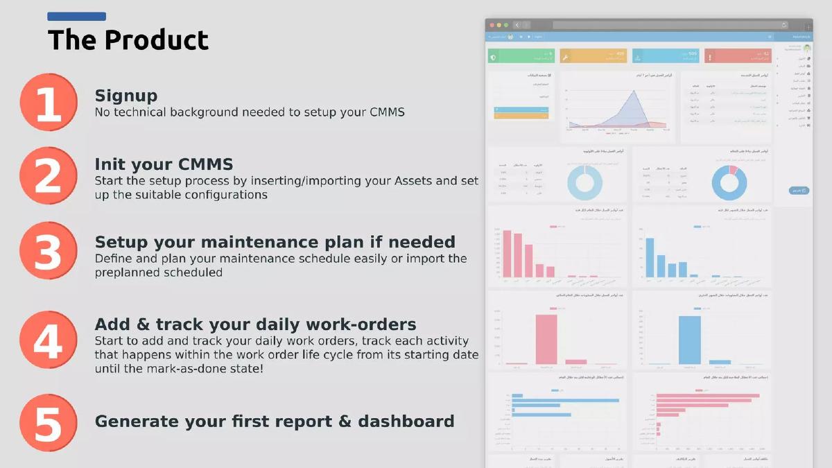
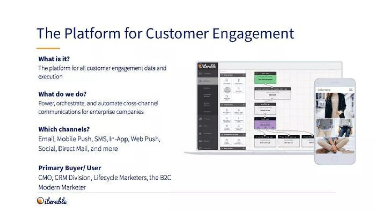
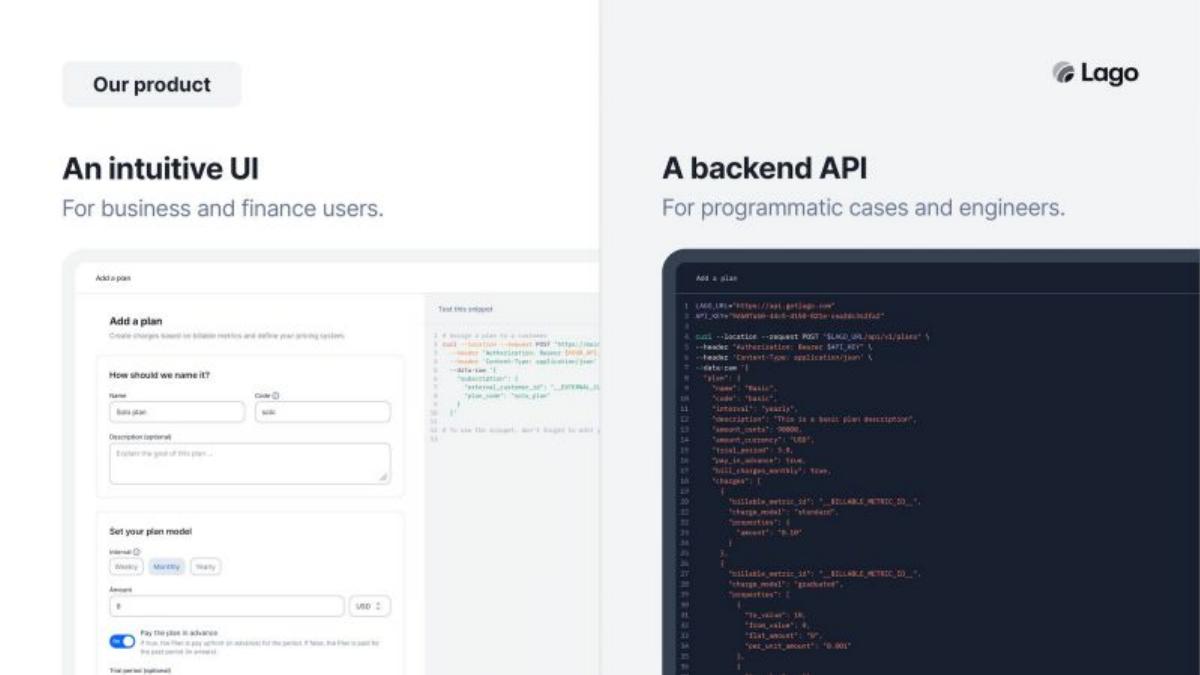
A SaaS product slide should show what a user actually does in the product and what comes out. Libeo lays out its invoice process in five steps, from "Invoices centralisation" to "Monitoring", and lists what happens at each one. AssetsHub pairs five numbered setup steps ("Signup" to "Generate your first report & dashboard") with a real dashboard screenshot. Iterable answers four questions (what it is, what it does, which channels, who buys) next to a product screen. Lago shows two views of the same product: "An intuitive UI" for finance users and "A backend API" for engineers. apheris draws how data moves through its system and states the key promise: "data never leaves the local environment". Scedule lists eight features in a grid, which is thorough but hard to take in. Daybreak is a weaker example: one sentence and no picture of the product.
SaaS product slides
Each example shows the exact stored slide above its analysis and links to the full teardown. Stronger examples first. Claims are as shown on the slides; we have not verified them.
Libeo product slide — slide 5
Invoice payment software for small businesses. A five-step band with bullets under each step.
Libeo deck, slide 5. Exact stored slide matched to this analysis.
Our analysis: An investor can follow one invoice through the product and see every job it replaces.
Evidence and limitation: The full path of an invoice, from arrival to accounting.
What a founder can adapt: Lay out your product as the steps of the customer's task, with two or three details under each.
Supporting analysis
What the deck claims: "Features. A simple and comprehensive process." Steps: "Invoices centralisation" (email transfer, scan from a smartphone, drag & drop, Dropbox & Google Drive), "Data extraction" (immediate data recognition, automatic data entry), "Team approval" (purchase order reconciliation, cash flow analysis, payment approval), "Payment" ("Payment directly within the platform. 100% secured", connection to the companies' bank accounts, "one click and IBAN-less"), "Monitoring" (cash flow forecasts, sync with accounting tools such as QuickBooks).
Presentation choice: Ordering features as the steps of a real task makes a long list easy to read.
When it does not fit: Add one screenshot so the steps connect to a real product.
Maintenance management software. Five numbered steps beside a dashboard screenshot.
AssetsHub deck, slide 5. Exact stored slide matched to this analysis.
Our analysis: Shows how a new customer goes from sign-up to a working report, and what that report looks like.
Evidence and limitation: Setup steps plus a real screen of the end result.
What a founder can adapt: Show the path from sign-up to first result, and a screen of that result.
Supporting analysis
What the deck claims: "The Product." "1 Signup: No technical background needed to setup your CMMS." "2 Init your CMMS" (import assets, set up configurations). "3 Setup your maintenance plan if needed." "4 Add & track your daily work-orders" ("from its starting date until the mark-as-done state"). "5 Generate your first report & dashboard." Right side: a screenshot of the reporting dashboard.
Presentation choice: Steps plus a screenshot answer both "how does it work?" and "is it real?"
When it does not fit: Say how long setup takes; "CMMS" needs explaining for non-specialists.
Customer messaging software for marketers. Four questions and answers beside desktop and mobile screens.
Iterable deck, slide 3. Exact stored slide matched to this analysis.
Our analysis: Answers the questions an investor would ask in order, with the product visible beside them.
Evidence and limitation: What it does, the channels it covers, the buyer and a product screen.
What a founder can adapt: Use the same four questions for your product: what, what it does, where, for whom.
Supporting analysis
What the deck claims: "The Platform for Customer Engagement." "What is it? The platform for all customer engagement data and execution." "What do we do? Power, orchestrate, and automate cross-channel communications for enterprise companies." "Which channels? Email, Mobile Push, SMS, In-App, Web Push, Social, Direct Mail, and more." "Primary Buyer/User: CMO, CRM Division, Lifecycle Marketers, the B2C Modern Marketer."
Presentation choice: Naming the buyer on the product slide links the product to who pays for it.
When it does not fit: "Power, orchestrate, and automate" is vague; one concrete example task would help.
Usage billing software. Two panels, each with a real screen.
Lago deck, slide 3. Exact stored slide matched to this analysis.
Our analysis: Shows that finance teams and engineers can each use the product their own way.
Evidence and limitation: The same task shown as a screen and as code.
What a founder can adapt: If your product has two kinds of users, give each one a panel with their screen.
Supporting analysis
What the deck claims: "Our product." Left: "An intuitive UI. For business and finance users" with a screenshot of the "Add a plan" form. Right: "A backend API. For programmatic cases and engineers" with the code for the same plan.
Presentation choice: When two different people use a product, showing both views explains the sale.
When it does not fit: The screenshots are small; enlarge the key part or add a caption on what it does.
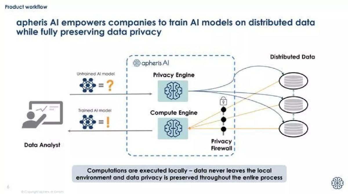
Software for training AI on private data. A flow diagram.
apheris deck, slide 6. Exact stored slide matched to this analysis.
Our analysis: Explains a technical product in one picture and highlights the buyer's main concern: privacy.
Evidence and limitation: A diagram of how data and models move, with the key promise stated.
What a founder can adapt: Draw who does what and where the data goes; put your main promise in a box.
Supporting analysis
What the deck claims: "Product workflow." "apheris AI empowers companies to train AI models on distributed data while fully preserving data privacy." Diagram: a data analyst sends an untrained model through a "Privacy Engine" and "Compute Engine" to distributed data behind a "Privacy Firewall", and gets a trained model back. "Computations are executed locally – data never leaves the local environment and data privacy is preserved throughout the entire process."
Presentation choice: For infrastructure with no obvious screen, a simple diagram does the job of a screenshot.
When it does not fit: Keep diagram labels short and readable at a glance.
Meeting scheduling software. A phone image and eight feature boxes.
Scedule deck, slide 4. Exact stored slide matched to this analysis.
Our analysis: Thorough, but eight equal boxes make it hard to see which feature matters most.
Evidence and limitation: Eight features, each explained; a phone image.
What a founder can adapt: Pick the two or three features that win customers and move the rest to backup.
Supporting analysis
What the deck claims: "Product." "Scedule provides scheduling-productivity for knowledge workers." Boxes: "Smart availability matching", "Occasion-specific workflows", "Scheduling without boundaries", "Private & business calendars", "Smart calendar app", "Compatibility", "Meeting rooms & virtual tool", "Enterprise integration", each with one sentence. "For details, please refer to backup."
Presentation choice: Shows the range of the product; the backup note is a good way to keep detail off the main slide.
When it does not fit: Eight equal-weight boxes; the phone image is too small to show the product.
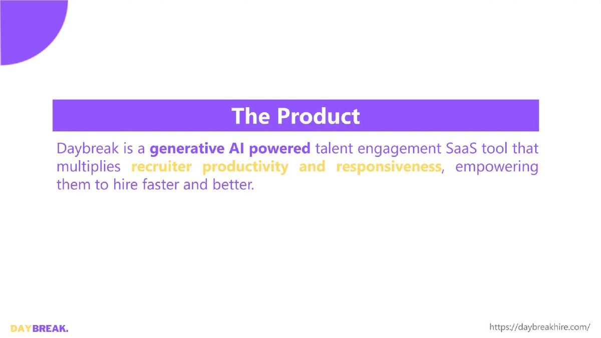
Recruiting software. One sentence on a plain slide.
Daybreak deck, slide 3. Exact stored slide matched to this analysis.
Our analysis: A weaker example: an investor learns the category but not what a recruiter actually does in the product.
Evidence and limitation: A description only; no screen, steps or example.
What a founder can adapt: Add a screen of one task, such as a drafted candidate message, and what it saves the recruiter.
Supporting analysis
What the deck claims: "The Product." "Daybreak is a generative AI powered talent engagement SaaS tool that multiplies recruiter productivity and responsiveness, empowering them to hire faster and better."
Presentation choice: Included for contrast: a sentence can't show the product working.
When it does not fit: "Multiplies productivity" needs a number or a before-and-after.
Before: Daybreak is a generative AI powered talent engagement SaaS tool that multiplies recruiter productivity and responsiveness.
After: A recruiter picks a role → Daybreak drafts a message to each matching candidate → the recruiter sends [N] in [minutes]. [Screenshot of the drafted message].
What improved: Our illustrative rewrite; not Daybreak's wording. It adds the user's steps and a screen, with marked places for real figures.
What this guide adds
The library has a general product-slide guide, a product-slides-by-stage guide and a fintech product guide. This page looks only at software sold by subscription, where investors need to see quickly what a user does in the product each day and who that user is.
The seven decks cover invoice payment for small businesses (Libeo), maintenance management (AssetsHub), marketing messaging (Iterable), usage billing (Lago), private AI training (apheris), meeting scheduling (Scedule) and recruiting (Daybreak). None of these decks appears in another guide.
Four ways software decks show the product
Step-by-step flow (Libeo, AssetsHub): what the user does first, second, third. Easy to follow and shows how quickly they get value.
Questions answered beside a screen (Iterable): what it is, what it does, for whom, next to what it looks like.
Two views (Lago): one for business users, one for developers. Useful when two different people use the product.
Diagram or feature list (apheris, Scedule): explains how it works or everything it does. Clear when the diagram is simple; hard to read when the list is long.
Common mistakes
Description only. Show a screen or a flow.
Too many features. Lead with the two or three that win customers.
No user named. Say who uses it every day.
Unreadable screenshots. Crop to the part that matters.
Vague verbs. Replace "empower" and "orchestrate" with a real task.
Diagnostic checklist
A real screen or clear diagram.
The user's steps in order.
The daily user named.
One key promise stated.
Extra features moved to backup.
Frequently asked questions
How we chose these examples
Corpus: published pitch deck teardowns on StartupFundraising.com. Founder-uploaded private decks are excluded.
Selection (2026-09-25): we searched stored slide text for slides headed Product, Our Product, Platform, How It Works or Features that mention SaaS, dashboards, APIs, integrations, workflows or B2B, excluded decks already used in another guide, and kept slides with a stored image. Of 24 candidates checked, 9 were already used elsewhere and 7 had no stored image. Of the remaining 8, Macrometa (a fit framework, not the product), UtilizeCore (usage figures) and ArchFormation (a competitor table) were left out. Daybreak is included as a weaker example for contrast.
Company descriptions come from the slides themselves.
Review: stored slide text and images were checked on 2026-09-25 and matched to company, deck and slide number (editorial model review). No person has yet completed an editorial review of this page.
Claims are as shown on the slides; we have not verified them. We make no claim that any slide caused a fundraising outcome.