Kompyte’s pitch deck is an exercise in extreme minimalism. With only 12 slides and almost no body text, the presentation relies entirely on the strength of its metrics and the caliber of its customer base. The deck effectively establishes a massive problem—$25 billion wasted on manual competitor tracking—and positions its automated solution as the industry standard. By showcasing 20% month-over-month growth and a logo cloud featuring giants like IBM, Cisco, and Microsoft, Kompyte shifts the burden of proof from their technology to their market momentum. While it lacks a traditional team slide…
Key takeaways
- The deck leads with a massive scale metric, claiming 1M companies tracked on slide 3.
- Social proof is the primary driver, with slide 4 stating that half of the 30 major logos shown are paying customers.
- The problem is quantified as a labor inefficiency, with 6.5M marketers spending 4 hours a week on manual tracking (slide 5).
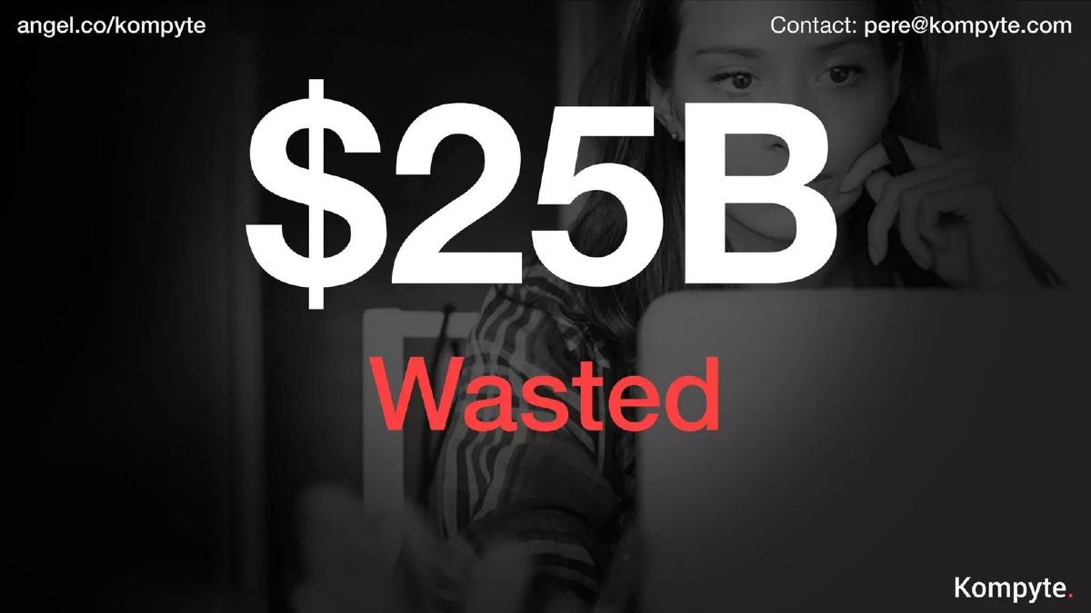
- The financial impact of the problem is valued at $25B 'Wasted' on slide 6.
- Growth is visualized as a 'rocket ship' chart showing a rise from near $0 to over $23K MRR between 2015 and 2017 (slide 10).
- The company maintains a consistent 20% month-over-month growth rate as of slide 10.
- The deck completely omits a team slide, focusing entirely on the product and market traction.
- Product functionality is shown through high-fidelity screenshots of 'Web changes' and 'Benchmarking' (slides 7 and 8).
The Minimalist Power of Social Proof
The Kompyte pitch deck is a fascinating example of the 'less is more' philosophy in startup fundraising. In an era where many founders feel the need to pack 40 slides with dense technical specifications and multi-year financial models, Kompyte opted for a 12-slide narrative that relies almost exclusively on high-impact numbers and recognizable logos. Founded in 2014, the company set out to automate competitive intelligence, a task traditionally handled by junior marketers with spreadsheets. This teardown examines how they used a lean deck to raise $4.1 million by focusing on traction and the sheer scale of the problem.
Slides 1-3: Setting the Scale
Slide 1: Title Slide The deck opens with a clean, dark-themed title slide. The company name, Kompyte , is prominent, followed by the sub-header: "Real-Time Competitor Tracking Software." The background image of a coin-operated viewfinder overlooking a city is a literal metaphor for 'looking at the competition.' It establishes the brand identity immediately: simple, observational, and tech-forward.
Slide 2: The Observer This is a transition slide featuring a black-and-white photo of a person in a hoodie walking down a street. There is no text other than the company logo. While visually striking, it serves primarily as a 'breath' in the presentation, likely used by the presenter to set the stage for the manual labor involved in 'stalking' competitors before Kompyte existed.
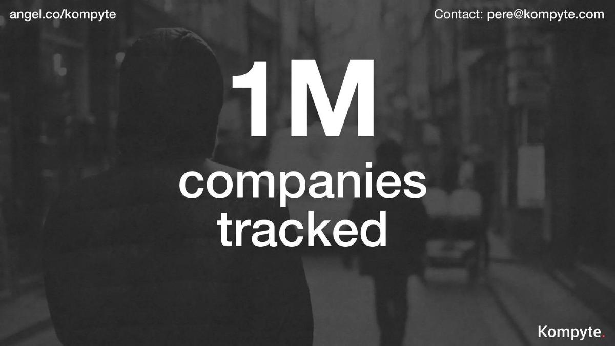
Slide 3: The Big Number Kompyte hits the investor with a massive metric early: "1M companies tracked." By putting this on slide 3, they establish that this is not a prototype or a small-scale tool. They are already operating at a scale that suggests a robust data ingestion engine. This number serves to validate the 'Real-Time' claim from the title slide; you don't track a million companies manually.
Slides 4-6: The Problem and the Proof
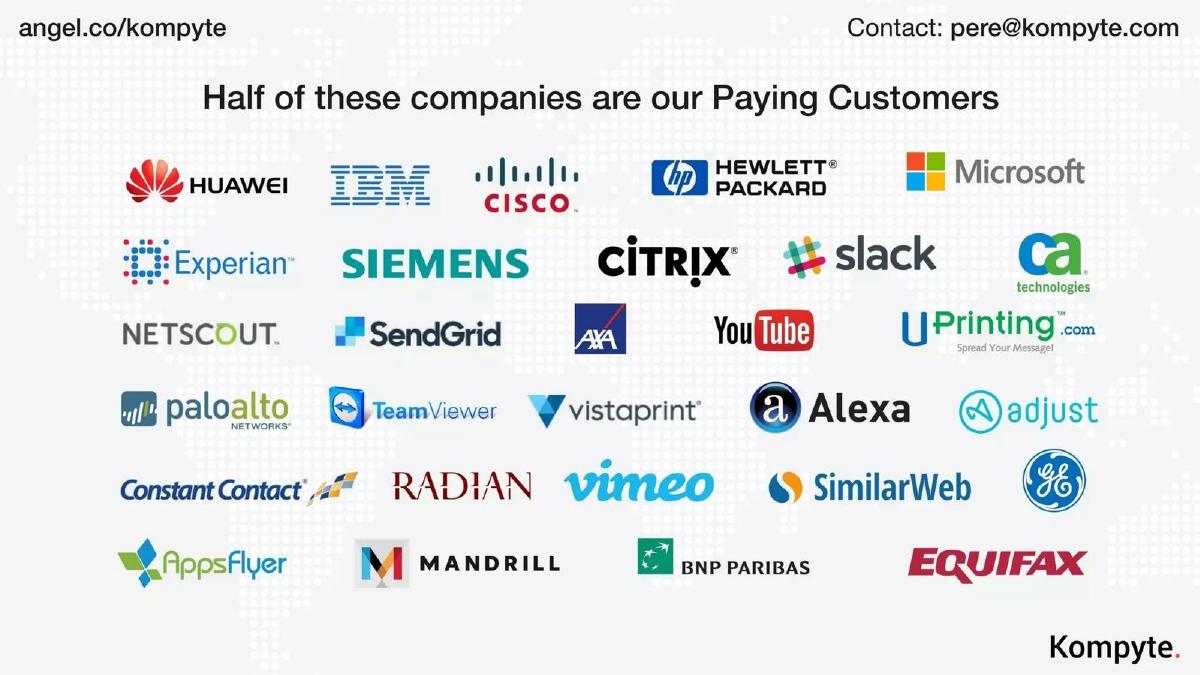
Slide 4: The Logo Cloud This is perhaps the most important slide in the deck. It features 30 high-profile logos, including Huawei, IBM, Cisco, Hewlett Packard, Microsoft, Slack, YouTube, and GE. The text at the top reads: "Half of these companies are our Paying Customers." This is a sophisticated way to show traction. Instead of a boring list, they use a 'guess which ones' approach that implies their software is good enough for the world's largest enterprises. It simultaneously shows the types of companies they track and the types of companies that find their data valuable enough to buy.
Slide 5: The Market Inefficiency The deck moves to the 'Problem' phase. It identifies a target audience of "6.5M marketers" and a pain point of "4 hours/week." The red arrow indicates a transition from the person to the time spent. This slide quantifies the labor cost of competitive intelligence. It suggests that the current status quo is a manual, time-consuming process that millions of professionals are forced to endure.
Slide 6: The Economic Impact Following the logic of the previous slide, Kompyte puts a dollar value on the problem: "$25B Wasted." The word 'Wasted' is highlighted in red. This is a classic 'Total Addressable Market' (TAM) slide, but framed as an 'Efficiency Gap.' It tells the investor that there is a multi-billion dollar opportunity in simply giving those 4 hours a week back to those 6.5 million marketers.
Slides 7-9: The Solution and the Vision
Slide 7: Product - Web Changes We finally see the product. The slide shows a laptop screen displaying a 'Before and After' comparison of a website (specifically a Salesforce pricing page). On the left, a sidebar shows icons for RSS, social media, and web search, indicating the sources Kompyte monitors. This slide visualizes the core value proposition: the software automatically detects and highlights changes in a competitor's digital footprint.
Slide 8: Product - Benchmarking The second product slide shows a dashboard titled "Benchmark." It displays charts for 'Top Paid Companies' and 'Top Paid Keywords.' This demonstrates that Kompyte isn't just a 'change detector' but an analytical tool that helps users understand competitor spend and SEO strategy. The UI looks clean and professional, reinforcing the 'enterprise-ready' feel established by the logo cloud.
Slide 9: The Vision A high-concept slide with the text "Compete Smarter." The image shows a chess piece being confronted by a Lego Darth Vader with a lightsaber. It’s a playful way to suggest that Kompyte gives users an 'unfair' or technological advantage in a traditional game of business strategy. It signals the company's ambition to disrupt the 'old way' of doing things.
Slides 10-12: Traction and Contact
Slide 10: The Growth Rocket This is the 'Money Slide.' It features a line graph of MRR (Monthly Recurring Revenue) overlaid on a rocket launch. The y-axis shows increments up to $23K . The x-axis covers Jan 2015 to Jan 2017 . To the right, three key stats are listed: "80 Companies," "20% MoM growth," and "$1M raised." This slide proves that the company has found product-market fit and is in a period of consistent, high-velocity growth. While $23K MRR is relatively low for a 'Later' stage round, the 20% month-over-month growth rate is the metric that captures investor interest.
Slide 11: The Question Mark The deck returns to the logo cloud from slide 4, but this time a large white question mark is superimposed over it. This is a psychological closer. It asks the investor: 'Who is next?' or 'Which of these will you help us capture?' It brings the focus back to the massive market opportunity and the blue-chip companies already in their orbit.
Slide 12: Contact Information The deck ends as it began, with the viewfinder image and the company's contact details: pere@kompyte.com , www.kompyte.com , and their AngelList profile . It is professional, concise, and provides a clear next step for interested parties.
What Works in This Deck
1. Extreme Clarity: You can read this entire deck in under 60 seconds and understand exactly what the company does, who they serve, and how fast they are growing. In a world of over-complicated pitches, this brevity is a superpower.
2. Social Proof as a Foundation: By leading with the fact that they track 1 million companies and serve half of the world's biggest tech logos, Kompyte bypasses the 'will anyone buy this?' question. They move straight to 'how big can this get?'
3. Quantified Pain: They don't just say 'tracking competitors is hard.' They say it costs 6.5 million people 4 hours a week, resulting in $25 billion of wasted capital. This makes the problem feel urgent and expensive.
4. Consistent Growth: The 20% MoM growth figure on slide 10 is the 'North Star' metric. For a SaaS company, maintaining that level of growth over a two-year period is a strong signal of a scalable sales process.
What Is Missing
1. The Team Slide: This is the most glaring omission. Investors invest in people, especially at the early stages. Not seeing the founders' backgrounds or their previous exits is a significant gap that would require a follow-up conversation.
2. The Ask: The deck never specifies how much money they are looking for or what they plan to do with it. While this might be intentional for a teaser deck, a full pitch usually includes a 'Use of Funds' slide to show strategic thinking.
3. Unit Economics: While we see MRR growth, we don't see Customer Acquisition Cost (CAC), Lifetime Value (LTV), or Churn. For a SaaS business, these 'efficiency metrics' are just as important as top-line growth when raising millions of dollars.
4. Competitive Landscape: Ironically, for a competitive intelligence company, they don't show their own competitors. Investors want to know how Kompyte differs from tools like SEMRush, SpyFu, or Crayon.
What a Founder Should Copy
1. The 'Logo Tease': If you have a mix of users and paying customers, the 'Half of these are paying' approach is a brilliant way to showcase your reach without being misleading. It suggests a massive pipeline of potential conversions.
2. The 'Wasted Money' Frame: Instead of just showing your TAM, show the cost of the problem you are solving. It creates a much more visceral reaction in the reader.
3. High-Fidelity Screenshots: Don't use mockups if you have a working product. Kompyte's use of actual dashboard screens (slides 7 and 8) builds trust that the technology is real and functional.
4. Minimalist Design: Use one big idea per slide. If you have a great metric, give it the whole slide. Don't bury your 20% growth rate in a corner; make it the hero of the page.
Conclusion
The Kompyte deck is a masterclass in 'Traction-First' pitching. It assumes that if the numbers are good enough and the customers are big enough, the rest of the details (team, competition, financials) can be handled in the meeting. While it takes a risk by omitting the human element (the team), its focus on a $25 billion inefficiency and a 20% growth rate makes for a compelling, high-velocity narrative that clearly resonated with investors to the tune of $4.1 million.
Frequently asked questions
- Why does the deck lack a team slide?
- In some high-traction scenarios, founders choose to let the metrics speak for themselves. Kompyte’s 20% MoM growth and enterprise customer list (IBM, Microsoft) suggest a team capable of execution. However, for most startups, omitting the team slide is a high-risk move that can lead to immediate rejection if the traction isn't world-class.
- Is $23K MRR enough to raise a 'Later' stage round?
- The catalogue facts list the stage as 'Later,' but the MRR shown on slide 10 ($23K+) is more typical of a Seed or early Series A round in 2014-2017. The 'Later' designation may refer to a subsequent round or a classification error in the database, as the deck itself reflects early-stage scaling.
- How does Kompyte define its competitive advantage?
- The deck emphasizes 'Real-Time' and automation. By contrasting the 4 hours per week marketers spend manually (slide 5) with their automated tracking of 1M companies, they position themselves as a productivity tool that eliminates a $25B waste of human capital.
- What is the significance of the logo cloud on slide 4?
- It is a 'double-threat' slide. It shows both who they track (market breadth) and who pays them (market depth). Stating that 'half of these companies are our Paying Customers' among names like Huawei, IBM, and Slack provides massive enterprise credibility.
- Why is the 'Ask' missing from the deck?
- This is common in 'teaser' decks or decks used for live presentations where the specific terms of the round are discussed in person. By omitting the ask, the deck remains evergreen for different investor conversations, though it leaves the reader guessing about the capital requirements.