Elyse28 is an AI-powered health coaching platform aimed at chronic disease prevention in women. Their 9-slide pitch deck is a masterclass in minimalism, relying on high-impact visuals and sparse text to convey a complex medical value proposition. The deck identifies a target market of 40 million women suffering from conditions like Endometriosis and PCOS (Slide 2). It showcases a product ecosystem consisting of a virtual coaching app and a physical biomarker testing kit (Slides 4-5). Most notably, the deck reports a $40k MRR with 50-70% margins as of October (Slide 7). While the deck excels a…
Key takeaways
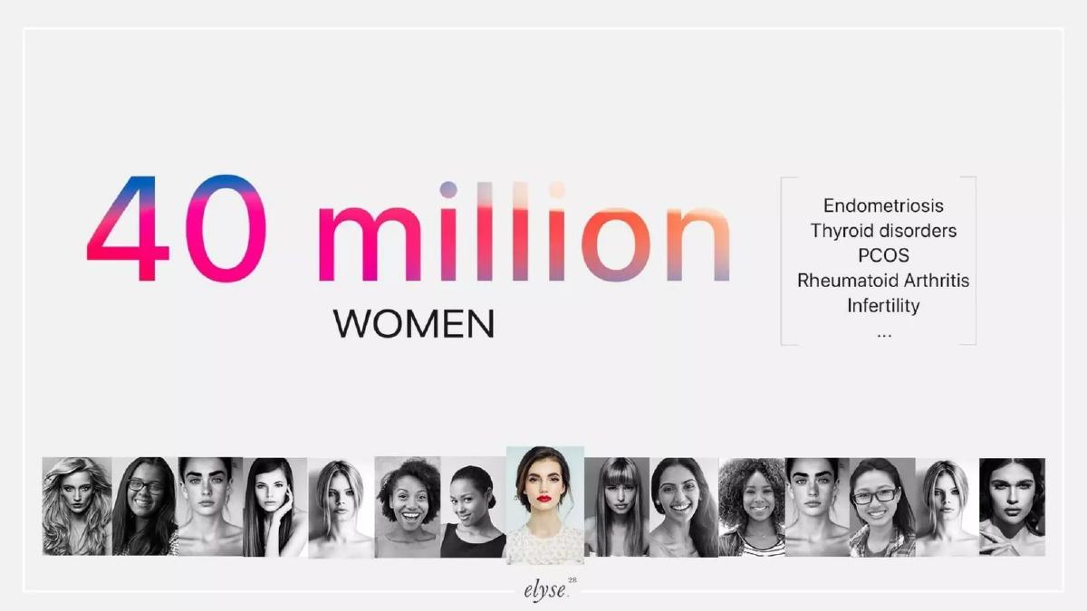
- The company targets a market of 40 million women suffering from chronic conditions like Endometriosis and PCOS as shown on slide 2.
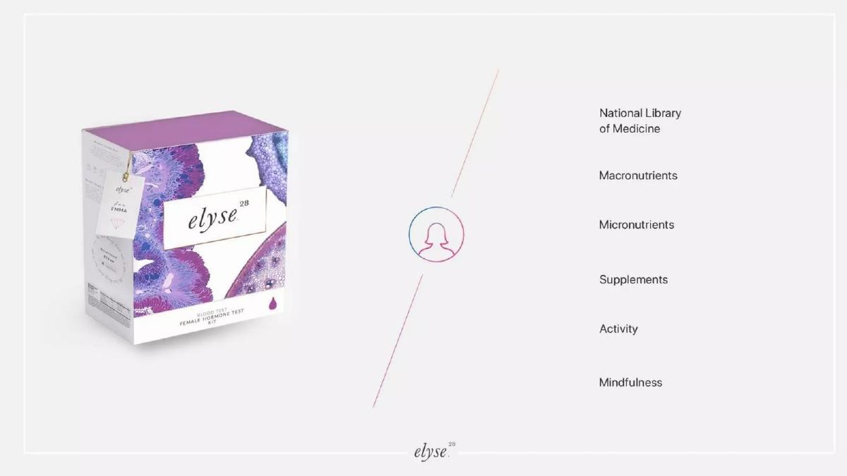
- The product combines 24/7 virtual health coaching with physical biomarker testing kits pictured on slide 5.
- Traction is clearly demonstrated with a bar chart showing growth from May to October, reaching $40k MRR on slide 7.
- The business model operates on a 50-70% margin according to the traction data on slide 7.
- The founding team claims a combined 25 years of experience in health tech on slide 8.
- The deck highlights institutional pedigree with logos from Johns Hopkins, Microsoft, and Columbia University on slide 8.
- The presentation completely omits a specific funding ask or use-of-funds breakdown.
- There is no mention of the competitive landscape or direct rivals in the digital health space.
The Minimalist Approach to FemTech Fundraising
The Elyse28 pitch deck, dating from 2017, is a striking example of the 'less is more' philosophy in startup presentations. Comprising only nine slides, the deck avoids the dense blocks of text and complex diagrams common in the healthcare sector. Instead, it uses high-quality lifestyle photography and bold typography to build a narrative around women's chronic health management. While this approach is excellent for capturing attention, it leaves several technical and strategic questions unanswered for a sophisticated investor.
Slides 1-3: Problem and Market Identification
Slide 1: Title Slide The deck opens with a high-resolution image of a woman using a smartphone, immediately establishing the consumer-facing, mobile-first nature of the product. The tagline is simple: 'Personalized healthcare for women.' The branding is clean, utilizing a serif font for 'elyse' and a superscript '28,' likely referencing the typical menstrual cycle length.
Slide 2: Market Size Slide 2 quantifies the opportunity with a bold '40 million WOMEN' headline. It specifically lists the conditions the platform targets: Endometriosis, Thyroid disorders, PCOS, Rheumatoid Arthritis, and Infertility. By listing these specific, often underserved conditions alongside a row of diverse female portraits, the company establishes both the scale and the human element of the problem.
Slide 3: The Daily Pain Point This slide focuses on the user experience. It uses a '7 min' metric, though it is unclear if this refers to the time spent in the app or the frequency of symptoms. It lists 'Daily symptoms' including 'Murder cramps,' 'Depression,' 'Hair loss,' 'Weight gain,' and 'Fatigue.' The use of colloquial terms like 'murder cramps' suggests a brand voice that aims to resonate deeply with the frustrations of its target demographic rather than sticking to clinical jargon.
Slides 4-6: The Solution and Product Ecosystem
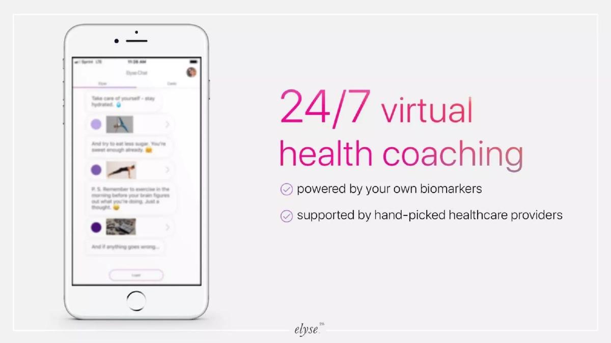
Slide 4: Virtual Coaching The solution is introduced as '24/7 virtual health coaching.' A mobile mockup shows a chat interface with suggestions for hydration and exercise. The slide makes two key claims: the service is 'powered by your own biomarkers' and 'supported by hand-picked healthcare providers.' This indicates a 'human-in-the-loop' AI model where technology facilitates the coaching, but medical professionals provide the underlying credibility.
Slide 5: The Biomarker Kit This slide introduces the physical component of the business: the 'elyse 28 Female Hormone Test Kit.' This is a critical slide because it moves the company from a pure software play into the diagnostics space. The slide lists data sources including the National Library of Medicine, Macronutrients, Micronutrients, Supplements, Activity, and Mindfulness. This suggests a holistic data integration strategy where blood work is combined with lifestyle tracking.
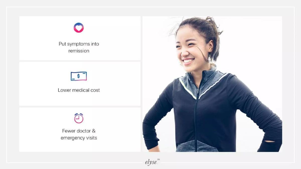
Slide 6: Outcomes The value proposition for the user and the system is summarized here. The three pillars are: 'Put symptoms into remission,' 'Lower medical cost,' and 'Fewer doctor & emergency visits.' This slide attempts to bridge the gap between a consumer wellness app and a serious medical intervention tool that could potentially appeal to enterprise payers or insurers, though the deck remains focused on the consumer throughout.
Slides 7-9: Traction, Team, and Contact
Slide 7: Traction and Revenue This is the most 'investor-ready' slide in the deck. It features a bar chart showing growth from May to October. The headline figure is '$40k MRR' with a '50-70% margin.' The growth curve is aggressive, showing the revenue more than doubling between August and October. This level of traction for an early-stage startup in 2017 would have been a significant signal of product-market fit.
Slide 8: The Team The team slide features six individuals, led by Zivana Zerjal (CEO) and Alex Vidovich (CTO). The headline emphasizes they are 'Repeat founders' with a 'Combined 25 years experience in health tech.' The inclusion of logos from Johns Hopkins University, Microsoft, and Columbia University provides institutional validation, although the specific roles these individuals held at those organizations are not detailed.
Slide 9: Contact The deck concludes with a repeat of the cover imagery and contact information, including an email address, website, and a link to their AngelList profile. Notably, there is no 'Ask' on this slide or any other. There is no mention of how much money the company is seeking to raise or what the milestones for the next round of funding would be.
What Works in the Elyse28 Deck
Visual Cohesion: The deck is aesthetically consistent. The color palette (pinks, purples, and blues) and the high-quality photography create a premium feel that aligns with a high-margin consumer health product. This builds trust in the brand's ability to market to women.
Clear Traction: Slide 7 is the strongest slide. In a sea of qualitative claims, a clear bar chart showing $40k MRR and healthy margins provides the hard evidence investors need to take a meeting. It proves that people are willing to pay for the solution.
Specific Problem Targeting: Rather than saying they help with 'women's health,' they list specific chronic conditions like PCOS and Endometriosis. This shows a deep understanding of the medical niches that are currently underserved by general practitioners.
What is Missing from the Elyse28 Deck
The Funding Ask: The most glaring omission is the lack of a 'The Ask' slide. Investors need to know how much is being raised, the terms (if applicable), and how the funds will be allocated (e.g., 40% engineering, 30% marketing). Without this, the deck feels more like a company overview than a fundraising tool.
Competitive Landscape: The digital health and FemTech space was already becoming crowded in 2017. The deck does not mention competitors or explain why Elyse28’s approach to hormone testing and coaching is superior to existing players or traditional medical routes.
Technical Depth: The company describes itself as 'AI powered' in its catalogue listing, but the deck does not explain what the AI actually does. Does it automate the coaching? Does it predict symptom flare-ups? For a tech-focused investor, the lack of a 'How it Works' slide regarding the algorithm is a missed opportunity.
Go-To-Market Strategy: While the traction slide shows growth, it doesn't explain how that growth was achieved. Is it through Facebook ads? Partnerships with clinics? Influencer marketing? A slide on customer acquisition costs (CAC) and strategy would have added significant weight.
Founder's Playbook: What to Copy
Use 'Human' Language: Copy the way Elyse28 uses terms like 'murder cramps' (Slide 3). It shows you understand your customer's lived experience better than a clinical textbook does. This creates immediate empathy with the reader.
Highlight Hybrid Models: If your startup has a physical component (like the test kit on Slide 5) and a digital component, show them together. It demonstrates a 'moat'—it is much harder for a competitor to replicate a business that involves physical logistics and lab testing than a pure app.
Lead with Experience: If you have a team with decades of combined experience, aggregate it into a single headline like 'Combined 25 years experience' (Slide 8). It is a much more powerful statement than listing individual years of service for each person.
Keep it Focused: The 9-slide format is excellent for a first-touch deck. It is designed to be read in under two minutes, which is often all the time a busy VC will give a cold deck. Use this deck as a template for a 'teaser' that secures the first meeting, but be prepared with a much more detailed 'Data Room' deck for the follow-up.
Frequently asked questions
- What is the core problem Elyse28 is solving?
- Elyse28 addresses the lack of personalized care for women suffering from chronic conditions. Slide 2 lists specific ailments such as Endometriosis, Thyroid disorders, PCOS, Rheumatoid Arthritis, and Infertility, affecting an estimated 40 million women. The deck suggests current solutions fail to manage daily symptoms like 'murder cramps,' depression, and hair loss effectively, which the platform aims to mitigate through continuous coaching.
- How does the Elyse28 product actually work?
- Based on slides 4 and 5, the product is a hybrid solution. It includes a mobile app providing 24/7 virtual health coaching powered by the user's own biomarkers. These biomarkers are collected via a physical 'Female Hormone Test Kit.' The coaching is supported by human healthcare providers and integrates data points like macronutrients, micronutrients, supplements, activity, and mindfulness to put symptoms into remission.
- What is the current financial status of the company according to the deck?
- Slide 7 shows significant early traction. The company reported $40,000 in Monthly Recurring Revenue (MRR) as of October 2017. The chart shows a steady month-over-month increase starting from a very low base in May. Additionally, the company claims to operate with healthy margins between 50% and 70%, suggesting a scalable software-plus-services model.
- Who are the people behind Elyse28?
- The team is led by CEO Zivana Zerjal and CTO Alex Vidovich. Slide 8 highlights a total of six core team members, including specialists in Lab work, AI, and development. They emphasize 'Repeat founders' and a 'Combined 25 years experience in health tech.' The slide also displays logos from prestigious institutions like Johns Hopkins University and Columbia University, implying past affiliations or partnerships.
- What critical information is missing from this pitch deck?
- The deck is extremely lean, omitting several standard venture components. There is no 'Ask' slide detailing how much capital is being raised or the valuation. It lacks a competitive matrix to show how it differs from other health apps. Furthermore, there is no detailed go-to-market strategy or unit economics beyond the high-level margin percentage. The 'AI' component mentioned in the company description is not explained technically within the slides.