Kickfolio’s 2012 pre-seed deck is a study in 'show, don't tell.' Operating in a mobile-first era where app discovery was a multi-billion dollar problem, Kickfolio offered a way to run interactive iOS apps directly in a web browser. The deck eschews traditional business plan sections like 'Competition' or 'Business Model' in favor of high-fidelity mockups of the product integrated into major platforms like Yelp, TechCrunch, and Facebook. With a lean 14-slide count, the presentation leans heavily on social proof—including a Quora thread questioning if the tech is 'voodoo'—and a clear traction l…
Key takeaways
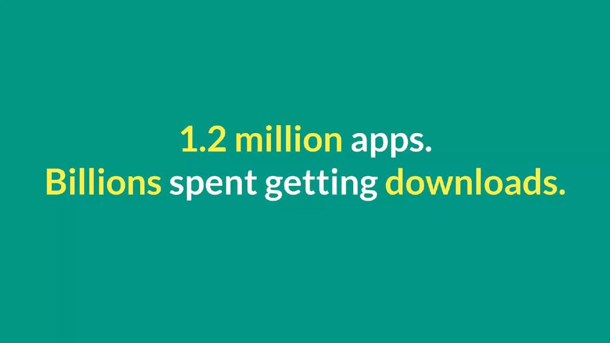
- The deck identifies a massive market opportunity by citing 1.2 million apps and billions spent on downloads on slide 3.
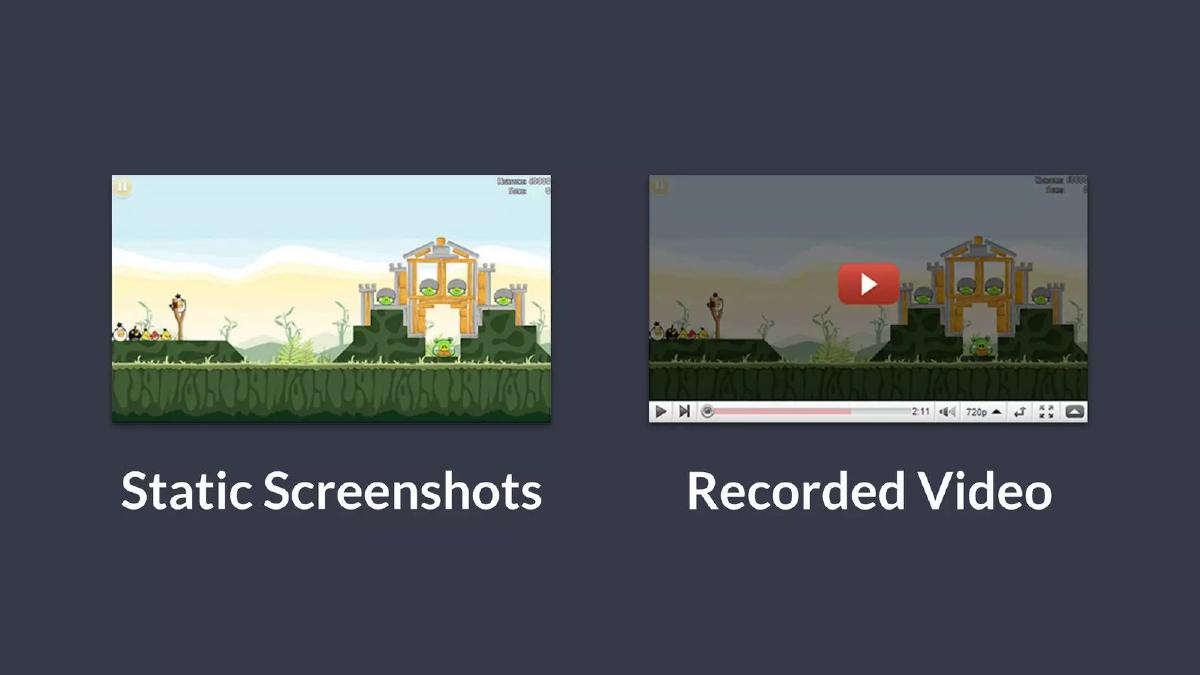
- It frames the existing solutions—static screenshots and recorded videos—as inadequate for app marketing on slide 4.
- Product utility is demonstrated through four key features: Easy App Upload, Private Test Page, Works On All Devices, and Embed Your Apps on slide 5.
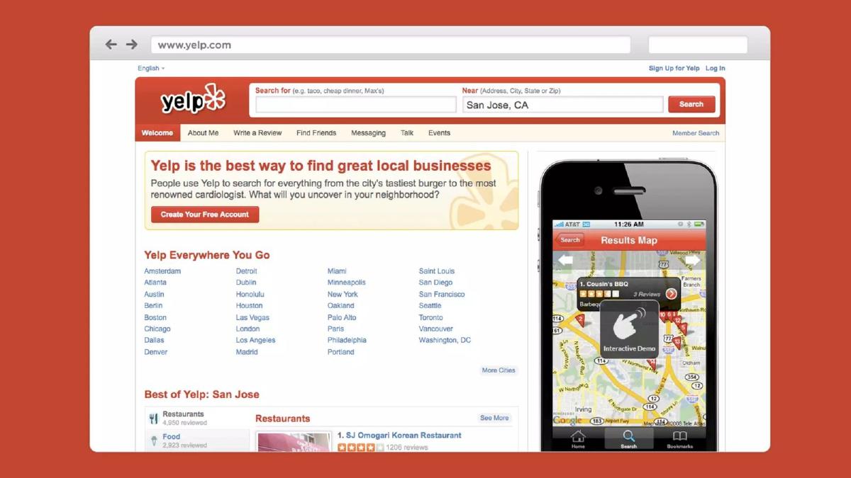
- Visual mockups on slides 6, 7, and 8 show the product's versatility by embedding interactive demos in Yelp, TechCrunch, and Facebook environments.
- Traction is evidenced by a growth chart showing a climb from near zero to 2,000+ signups between Dec 15 and Jan 12 on slide 9.
- The deck uses unconventional social proof, including a Quora screenshot on slide 12 where users speculate on the technical possibility of the product.
- The fundraising ask is explicit: $500,000 total, with $275,000 already committed at the time of the presentation on slide 13.
- The deck completely omits a team slide, financial projections, and a detailed competitive landscape analysis.
The 'Show, Don't Tell' Pre-Seed Strategy
Kickfolio’s 2012 pitch deck is a relic of the early mobile gold rush, but its structural logic remains highly relevant for technical founders today. The company, which later rebranded to App.io, focused on a single, powerful technical hook: running native iOS apps in a web browser using HTML5 and CSS. At a time when the App Store was becoming overcrowded, this was a significant value proposition for developers desperate for better conversion rates.
The Hook and the Problem (Slides 1-4)
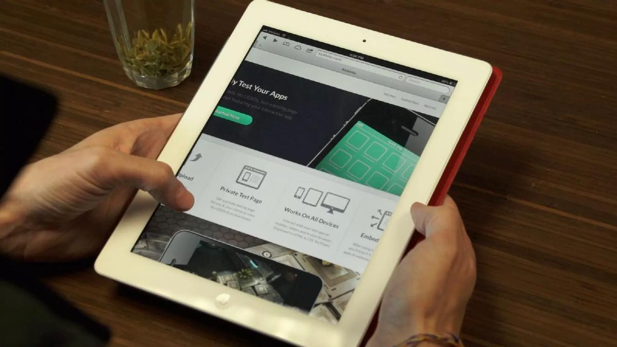
Slide 1 is a minimalist title slide featuring the Kickfolio logo. It establishes a clean, professional brand identity immediately. Slide 2 provides a contextual image of an iPad running the Kickfolio website, emphasizing that this is a cross-device solution. This is a subtle but effective way to signal that the product is already live and functional.
Slide 3 defines the market scale with two punchy lines: '1.2 million apps. Billions spent getting downloads.' This sets the stage for a 'pain point' that is both massive and expensive. Slide 4 then identifies the weakness in the current marketing stack. It shows 'Static Screenshots' and 'Recorded Video' side-by-side. The implication is clear: these formats are passive and fail to capture the actual experience of using an app.
The Solution and Product Capabilities (Slide 5)
Slide 5 acts as the primary product explainer. It breaks the service down into four pillars: Easy App Upload (no SDKs or code changes required), Private Test Page (for client viewing without UDIDs), Works On All Devices (HTML & CSS, no Flash), and Embed Your Apps . This slide is critical because it addresses the technical hurdles (no SDK) and the distribution advantage (embeddable) in one view.
Visual Proof: The Use Cases (Slides 6-8)
Instead of listing features in bullet points, Kickfolio uses Slides 6, 7, and 8 to show the product in the wild. These are high-fidelity mockups of the product integrated into the most relevant platforms of the era:
Slide 6: An interactive demo embedded on a Yelp business page. · Slide 7: An interactive demo inside a TechCrunch article about the app Vine. · Slide 8: An interactive demo appearing directly in a Facebook news feed.
These slides do the heavy lifting of the 'Vision' section. They show an investor exactly how Kickfolio becomes a ubiquitous layer of the mobile web.
Traction and Social Proof (Slides 9-12)
Slide 9 is a standard but effective traction chart. It shows a linear growth curve of signups, specifically noting '2000+ signups in 6 weeks' from December 15 to January 12. For a pre-seed company, this velocity is the primary metric that matters.
Slides 10 and 11 lean into testimonials. While quotes like 'Shut up and take my money' (Slide 10) are somewhat cliché, Slide 11 and Slide 12 provide a unique form of social proof. Slide 12 shows a Quora thread titled 'How does Kickfolio work in simulating iOS apps?' The quote on Slide 11—'At this point elves or voodoo are contenders'—highlights the perceived technical impossibility of what they built. This frames the founders as high-tier engineers without needing a formal bio slide.
The Ask and Contact (Slides 13-14)
Slide 13 is the 'Ask' slide. It is remarkably direct: 'We’re Raising $500,000' with '$275k committed' highlighted in yellow. This is a textbook example of how to close a deck. It tells the investor exactly what is needed and demonstrates that other investors have already done the due diligence and committed capital. Slide 14 provides the contact information and a link to their AngelList profile.
What Works in the Kickfolio Deck
The most successful element of this deck is its visual economy . The founders understood that their product—an interactive app in a browser—was hard to explain but easy to understand once seen. By using mockups of TechCrunch and Facebook, they allowed investors to visualize the product's utility in a real-world context.
Furthermore, the traction slide (Slide 9) is perfectly timed. It follows the product demonstration, proving that the 'magic' shown in the mockups is already attracting a user base. The use of the Quora screenshot is also a brilliant move; it uses a third-party platform to validate the technical 'moat' of the company, suggesting that their solution is so advanced it baffles the community.
What is Missing from the Kickfolio Deck
Despite its effectiveness, the deck has several glaring omissions that would be considered risky today:
No Team Slide: There is absolutely no mention of who the founders are, their backgrounds, or their previous successes. In early-stage investing, the 'who' is often as important as the 'what.' · No Business Model: The deck never explains how Kickfolio intends to make money. Is it a SaaS subscription for developers? A per-click model for embedded demos? A white-label enterprise solution? The deck is silent on revenue. · No Competition: There is no mention of other app-streaming services or mobile marketing platforms. This suggests a 'blue ocean' strategy, but investors usually want to see an awareness of the competitive landscape. · No Unit Economics: While they show signups, they don't show the cost of acquisition (CAC) or any engagement metrics beyond the initial signup.
What a Founder Should Copy
Founders should emulate the 'Show, Don't Tell' approach of slides 6-8. If your product is embeddable or integrates with other platforms, show those integrations in high fidelity. It bridges the gap between a technical concept and a market reality.
The transparency of the 'Ask' (Slide 13) is also worth copying. Stating exactly how much of the round is already committed creates 'FOMO' (fear of missing out) and signals that the company has momentum. Finally, the use of unconventional social proof —like the Quora thread—is a great way to demonstrate technical defensibility without using jargon-heavy 'How it Works' slides that might bore a non-technical investor.
Frequently asked questions
- What was the primary problem Kickfolio was solving?
- Kickfolio addressed the friction in app discovery and testing. In 2012, users had to download an app to experience it. As shown on slide 4, the only marketing tools available were static screenshots and videos. Kickfolio enabled 'interactive demos' that allowed users to try an app in a browser without a download, reducing the barrier to entry for potential users.
- How did Kickfolio demonstrate product-market fit in this deck?
- The deck uses a traction chart on slide 9 showing over 2,000 signups in a six-week window. This rapid growth, combined with the 'Embed Your Apps' feature shown on slide 5, suggested that developers were eager for a way to distribute interactive versions of their software across the web and social media.
- Why are there so many slides showing other websites like Yelp and Facebook?
- Slides 6, 7, and 8 are 'use case' slides. They illustrate how Kickfolio’s technology could live inside existing high-traffic ecosystems. By showing an interactive demo on a Yelp page or a Facebook news feed, the founders demonstrated the product's potential to transform standard web browsing into an app-discovery experience.
- Is the lack of a team slide a red flag?
- In a modern Series A deck, yes. However, for a 2012 pre-seed deck, Kickfolio relied on the 'magic' of the technology and early traction to carry the narrative. While the catalogue facts don't list the founders, the deck's focus on the Quora 'how does this work?' thread suggests the technical achievement was their primary selling point.
- What was the specific fundraising goal?
- According to slide 13, Kickfolio was seeking $500,000. Crucially, they noted that $275,000 was already committed. This creates a sense of urgency and 'social proof' for new investors, showing that the round is more than 50% filled and likely to close soon.