Lighthouse’s 10-slide Seed deck is a study in minimalism, opting for large-font emotional hooks over traditional data density. Raising $125,000 in 2016, the company positioned itself as the missing 'system of record' for managers, analogous to Salesforce for sales or GitHub for engineers. The deck successfully establishes a high-stakes problem—the $65,000 cost of employee turnover—and validates its solution with logos from Hulu, LinkedIn, and Zendesk. However, the deck is notably absent of product screenshots, a specific financial ask, or a detailed roadmap. It functions more as a narrative t…
Key takeaways
- The deck identifies a specific financial pain point of $65,000 as the cost of losing an employee on slide 2.
- It uses a central emotional hook, 'People leave managers, not companies,' to define the problem on slide 3.
- Social proof is established early through a list of 'Over 395 paying managers' on slide 7.
- The company positions itself as a category leader by comparing the lack of manager tools to established giants like Salesforce and GitHub on slide 9.
- The founding team highlights past experience at recognizable tech companies including KISSmetrics and Sparkcentral on slide 8.
- The deck contains zero product screenshots or feature lists, focusing entirely on the outcome of being a 'better manager' (slide 4).
- There is no 'Ask' slide detailing how much capital is being raised or how it will be spent.
- Market sizing (TAM/SAM/SOM) is omitted in favor of a broad horizontal appeal to all managers.
The Minimalist Narrative: Lighthouse's 10-Slide Strategy
Lighthouse entered the HR and productivity space in 2016 with a clear, albeit narrow, focus: helping managers retain talent. The pitch deck used for their $125,000 Seed round is an example of extreme minimalism. With only 10 slides and very few words per slide, the deck aims to provoke an emotional response and demonstrate early market validation rather than provide a deep dive into technical architecture or financial projections.
Slide 1: The Hook
The title slide is functional and clean. It features the Lighthouse logo and the tagline: "Software to be a better manager." This immediately identifies the target user and the primary benefit. There is no ambiguity about what the company does, which is a strength in early-stage pitching.
Slide 2: The Cost of the Problem
Slide 2 displays a single figure in large red text: "$65,000" . A small source link at the bottom attributes this to the cost of employee turnover. By leading with a high-dollar figure, the founders establish the 'stakes' of the problem before even describing the product. It transforms 'better management' from a 'nice-to-have' soft skill into a direct financial imperative.
Slide 3: The Human Insight
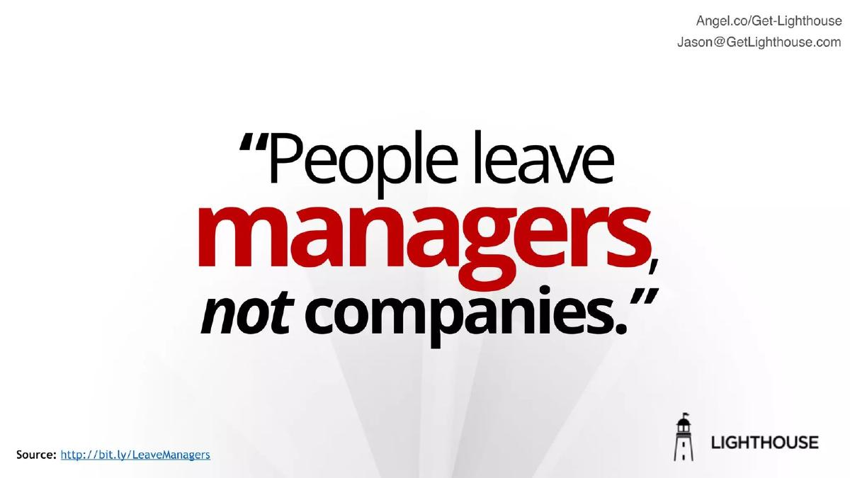
This slide features the quote, "People leave managers, not companies." This is the emotional core of the pitch. It identifies the manager as the single point of failure in employee retention. For an investor, this slide validates the choice of the 'manager' as the primary customer persona, rather than the HR department or the CEO.
Slide 4: The Solution
The solution slide is a mirror of the title slide, stating that Lighthouse "Makes you a better manager." It is notable that there is no 'How' on this slide. The deck assumes that if the investor agrees with the problem (turnover is expensive) and the cause (bad managers), they will be interested in a tool that claims to solve it, regardless of the specific features.
Slides 5 & 6: The Persona Case Study
These two slides function as a mini-narrative. Slide 5 introduces "Anna, Support Director," and Slide 6 shows "Anna, Operations Director + Lighthouse." This implies a career progression or a success story tied to the use of the tool. However, the slides are perhaps too sparse; they lack a testimonial or specific metrics regarding Anna’s performance, relying instead on the visual implication of growth.
Slide 7: Traction and Social Proof
This is arguably the most important slide in the deck. It states the company has "Over 395 paying managers" and displays logos for Hulu, LinkedIn, Zendesk, Fletchers Solicitors, and LHV Pank. For a $125K Seed round, having nearly 400 paying users at Tier-1 tech companies provides significant de-risking. It proves that managers are willing to open their own wallets (or departmental budgets) for this solution.
Slide 8: The Team
The team slide focuses on three individuals: Jason Evanish (CEO), Jay Byoun (Founding Engineer), and Julian Nguyen (UX Engineer). Rather than long bios, the slide uses logos of former employers to establish pedigree. Notable mentions include KISSmetrics, Backupify, and Sparkcentral. This signals to investors that the team has experience building and scaling SaaS products in established startups.
Slide 9: Category Positioning
This slide uses a classic 'X for Y' comparison. It shows Salesforce for Sales, HubSpot for Marketers, and GitHub for Engineers. The final column shows Managers with a red question mark. This positions Lighthouse not just as a tool, but as the potential 'System of Record' for an underserved professional category. It suggests a massive market opportunity by association with these multi-billion dollar companies.
Slide 10: The Closing
The final slide repeats the logo and provides contact information, including an AngelList link and the CEO's email. Like the rest of the deck, it is minimalist and focused on the next step: starting a conversation.
What Lighthouse Got Right
1. Quantifying the Pain: By putting a $65,000 price tag on the problem early, they moved the conversation from HR theory to bottom-line impact. 2. High-Signal Social Proof: The logos on slide 7 are impressive for a Seed stage company. Mentioning 'paying' managers is a crucial distinction that separates them from free beta tools. 3. Clear Positioning: The comparison to Salesforce and GitHub on slide 9 helps investors quickly categorize the business model and potential scale.
What is Missing from the Deck
1. The Product: There is not a single screenshot of the software. Investors are left wondering if this is a dashboard, a communication tool, a training platform, or an AI coach. 2. The Business Model: While they mention 'paying managers,' they don't disclose the price point, the LTV, or the CAC. 3. The Ask: The deck does not state how much they are raising or what the milestones for the next 18 months look like. 4. Competition: The deck ignores the crowded HR tech and 'manager tool' landscape, which is a common omission that investors usually flag.
Founder's Takeaway
If you have strong traction (like 395 paying users) and a recognizable team pedigree, you can get away with a minimalist 'narrative' deck. Lighthouse used this presentation as a door-opener to secure meetings where the missing details (product, financials, ask) could be discussed in person. However, for founders without that level of early validation, more detail on the 'how' and the 'how much' is typically required.
Frequently asked questions
- How much did Lighthouse raise with this deck?
- According to catalogue data from Failory, Lighthouse raised $125,000 in a Seed round in 2016. The deck itself does not state the amount raised or the terms of the investment, which is common for decks used in initial outreach or hosted on platforms like AngelList.
- What is the primary problem Lighthouse solves?
- The deck frames the problem as employee turnover caused by poor management. Slide 2 quantifies this at $65,000 per lost employee, and slide 3 uses the quote 'People leave managers, not companies' to argue that improving individual manager performance is the key to reducing these costs.
- Who are the target customers for this software?
- The deck targets B2B customers, specifically managers within organizations. Slide 7 shows that they had already secured over 395 paying managers from companies like Hulu, LinkedIn, and Zendesk at the time of the pitch, suggesting a bottom-up or team-lead adoption model.
- Does the deck show how the product works?
- No. The Lighthouse deck is entirely devoid of product visuals, UI mockups, or feature descriptions. It relies on the value proposition of 'Software to be a better manager' (slide 1) without explaining the specific mechanics of how the software achieves that goal.
- What is missing from this pitch deck?
- The deck lacks several standard components: a detailed market size analysis, a competitive landscape, a business model/pricing slide, a roadmap, and a specific financial ask. It is a 'teaser' style deck focused on narrative and traction rather than operational detail.