Monetsu (formerly myMoneycloud) utilized a high-level, visual-first 9-slide deck to secure $300,000 in seed funding in 2013. The deck avoids dense financial projections and market sizing in favor of a simple narrative: Bitcoin is currently 'Confusing' and 'Risky,' and Monetsu provides a 'Familiar Experience.' By showcasing a UI that mirrored traditional online banking, the founders aimed to bridge the gap between technical crypto-infrastructure and mainstream usability. While the deck lacks a business model, competition analysis, and a specific 'ask' slide, it successfully leveraged the pedig…
Key takeaways
- The deck identifies two primary friction points for Bitcoin in 2013: it is 'Confusing' and 'Risky' (Slide 3).
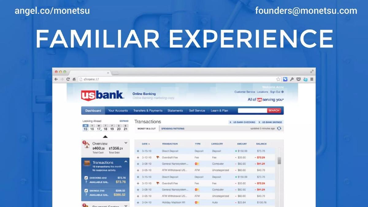
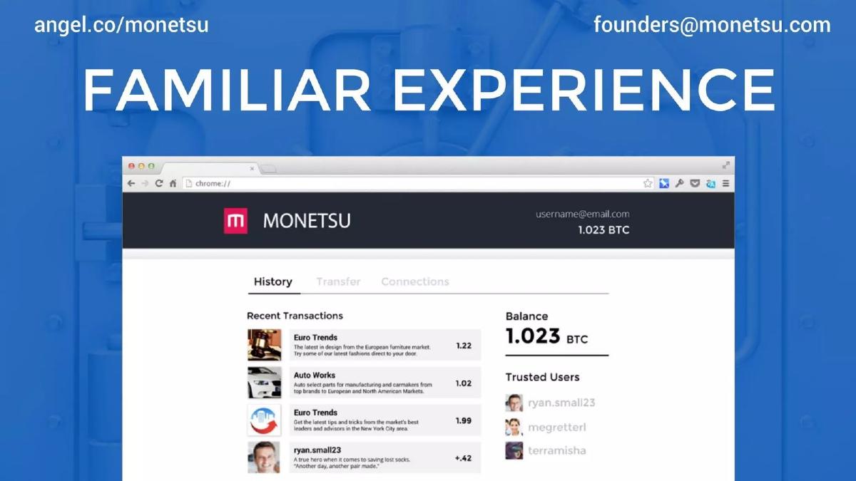
- Monetsu uses a side-by-side UI comparison to show how their product mimics the 'Familiar Experience' of a US Bank dashboard (Slides 4 and 5).
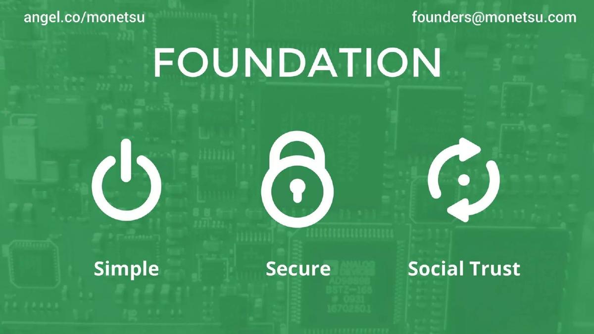
- The product foundation is built on three pillars: Simple, Secure, and Social Trust (Slide 6).
- The team slide highlights specialized roles in Security and Cryptography, signaling technical depth (Slide 7).
- Founders leveraged brand associations with Google and Groupon to establish professional legitimacy (Slide 7).
- The deck contains zero mentions of revenue models, pricing, or customer acquisition costs.
- Market size is addressed only through a generic 'Growth' icon rather than specific data points (Slide 8).
- The presentation ends with a direct call to action to visit a beta site using a specific access code: 'invest500' (Slide 9).
The 2013 Bitcoin Context
To understand the Monetsu deck, one must recall the state of Bitcoin in 2013. It was the year Bitcoin first hit $1,000, but it was also the era of the Silk Road bust and the looming Mt. Gox collapse. The barrier to entry was technical and intimidating. Monetsu’s deck, consisting of only nine slides, attempts to solve this by stripping away the complexity. It is a 'visual-first' deck that relies on the viewer's existing knowledge of the crypto-boom to fill in the gaps left by the lack of data.
Slides 1-2: The Hook and The Vision
Slide 1: Title Slide The deck opens with a minimalist dark blue background, a red square logo featuring a stylized 'M', and the tagline: 'Connect with Bitcoin.' It includes the company's AngelList URL and a generic founders' email address. This immediately positions the deck as a tool for platform-based fundraising (like AngelList) rather than a deep-dive partner presentation.
Slide 2: The Mission Slide 2 defines the category: 'ONLINE BANKING FOR BITCOIN.' The sub-headline, 'Making Bitcoin banking easy and safe,' establishes the two core pillars of their value proposition. By using the word 'Banking,' they are attempting to borrow the trust and structure of the traditional financial system for a decentralized asset.
Slide 3: The Problem Statement
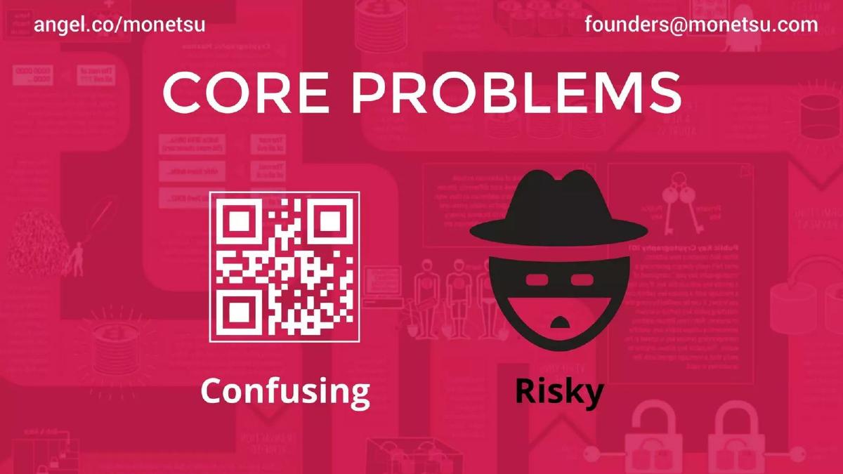
Slide 3: Core Problems The problem slide is remarkably sparse. It uses two icons—a QR code and a 'hacker' in a fedora—to represent the two main hurdles: 'Confusing' and 'Risky.' In 2013, managing private keys and long alphanumeric addresses was a significant barrier to mainstream adoption. By labeling these as the 'Core Problems,' Monetsu sets the stage for a solution that prioritizes UX and security.
Slides 4-5: The Solution through Familiarity
Slide 4: Familiar Experience (Traditional) This is a clever tactical move. Instead of showing their own product first, they show a screenshot of a standard US Bank online dashboard. It features transaction lists, balances, and navigation tabs. This anchors the investor's mind in what 'normal' looks like.
Slide 5: Familiar Experience (Monetsu) The following slide shows the Monetsu interface. The design language is nearly identical to the previous slide: a 'History' tab, a 'Transfer' tab, and a clear 'Balance' in BTC. By placing these slides back-to-back, Monetsu makes the argument that their product requires zero learning curve. If you can use a bank account, you can use Monetsu. This is the 'Aha!' moment of the deck.
Slides 6-7: The Foundation and The Team
Slide 6: Foundation This slide reiterates the values: 'Simple,' 'Secure,' and 'Social Trust.' The inclusion of 'Social Trust' is an interesting nod to the 'Social Network' aspect mentioned in their catalogue description, suggesting a peer-to-peer connection layer that goes beyond just a wallet.
Slide 7: Our Team For a seed round, the team is often the most important slide. Monetsu presents four members: Robert David McLeod (Business), Jack Baker (Developer), Clayten Hamacher (Security), and Dmytro Dvynyaninov (Cryptography). The logos for Bitcoin, Google, and Groupon are placed at the bottom. While it doesn't specify which founder worked where, the association is intended to signal that this isn't just a group of hobbyists, but professionals with experience at scale.
Slides 8-9: The Opportunity and The Close
Slide 8: Opportunity This is the weakest slide in the deck. It features three icons for 'Disruptive,' 'Growth,' and 'Solution' with the text 'Grab it.' It offers no market data, no user growth numbers, and no financial targets. It relies entirely on the investor's belief that Bitcoin is a growing market.
Slide 9: Thank You The deck concludes with a 'Thank You' and a call to action. It directs investors to 'beta.monetsu.com' and provides an access code: 'invest500.' This creates a sense of exclusivity and encourages immediate engagement with the live product.
What Works in the Monetsu Deck
1. The 'Familiarity' Comparison: The strongest part of this deck is the side-by-side comparison between traditional banking and the Monetsu UI. It effectively communicates the product's purpose without needing a single paragraph of text. For an early-stage investor, seeing a clean, functional UI that solves a known UX problem is highly persuasive.
2. Extreme Focus: The deck does not try to be everything to everyone. It focuses strictly on the user experience. In a time when Bitcoin was seen as a playground for cryptographers, a deck that promised to make it 'simple' stood out.
3. Technical Credibility: By specifically calling out 'Security' and 'Cryptography' as dedicated roles on the team slide, the founders addressed the 'Risky' problem they identified on Slide 3. This shows alignment between the problem they are solving and the talent they have recruited.
What is Missing from the Monetsu Deck
1. Business Model: There is absolutely no indication of how Monetsu makes money. Do they charge a monthly fee? A transaction fee? A spread on currency exchange? Without this, the deck is a product pitch, not a business pitch.
2. Market Sizing: While 'Bitcoin' was a buzzword in 2013, a professional deck should still quantify the opportunity. How many people were using Bitcoin? What was the daily transaction volume? Monetsu ignores these metrics entirely.
3. Competitive Landscape: By 2013, Coinbase was already gaining significant traction, having been founded in 2012. Monetsu does not explain how it differs from existing wallets or exchanges, which is a major red flag for investors looking for a competitive moat.
4. The Ask: The deck never states how much money they are looking for or what they plan to do with the capital. While this might be omitted for a public-facing deck, it leaves the presentation feeling unfinished.
What a Founder Should Copy
1. The 'Show, Don't Tell' Approach: If your product's main advantage is ease of use, don't write a slide about it. Show a screenshot of the complicated incumbent and a screenshot of your simple solution. Monetsu’s Slides 4 and 5 are a perfect example of this.
2. Clear Problem/Solution Alignment: The deck identifies 'Confusing' and 'Risky' as the problems and then highlights 'Simple' and 'Secure' as the foundation. This internal consistency makes the narrative easy to follow and remember.
3. Minimalist Design: While this deck goes perhaps too far into minimalism, the lack of clutter ensures that the investor's eye goes exactly where the founder wants it to go. In a world of text-heavy decks, a clean, icon-driven presentation can be refreshing.
Final Analysis
Monetsu’s deck is a product of its time—a period of 'irrational exuberance' in the early crypto space where a good UI and a team with 'Google' on their resume could secure a $300,000 seed check. As a standalone document, it is insufficient for a modern Series A, but as a teaser for a Seed round, it succeeds in its primary goal: sparking enough curiosity to get a meeting and a beta login. It proves that you don't need 20 slides to convey a vision, provided that vision is clear and the timing is right.
Frequently asked questions
- How much did Monetsu raise with this deck?
- According to catalogue data from pitchdeckhunt.com, Monetsu raised $300,000 in a Seed round in 2013. The deck itself does not state the amount being raised or the valuation sought, which is common for decks intended for public platforms like AngelList.
- What is the primary value proposition of Monetsu?
- The value proposition is the simplification of Bitcoin through a 'Familiar Experience.' As shown on Slides 4 and 5, the company intended to make crypto-currency management look and feel exactly like a traditional online banking portal, reducing the cognitive load for new users.
- Who were the founders of Monetsu?
- Slide 7 lists the four-person team: Robert David McLeod (Business), Jack Baker (Developer), Clayten Hamacher (Security), and Dmytro Dvynyaninov (Cryptography). Their backgrounds include ties to Google, Groupon, and the Bitcoin community.
- Is there a business model included in the deck?
- No. The deck is entirely focused on the product interface and the high-level problem. There is no mention of transaction fees, subscription models, or how the company intended to generate profit from the 'Online Banking for Bitcoin' service.
- What is missing from this pitch deck?
- This deck is missing several standard components: a Market Size (TAM/SAM/SOM) slide, a Competitor Matrix, a Go-To-Market strategy, Financial Projections, and a specific 'Use of Funds' or 'Ask' slide.