Notion’s Series C pitch deck is characterized by its extreme minimalism and focus on a singular narrative: the fragmentation of modern work tools. Spanning 19 slides, the deck identifies 'Silo'd' and 'Scattered' information as the primary inhibitors of productivity. Rather than relying on complex financial modeling or competitive matrices, Notion leans heavily on its product-led growth, citing over 1,000,000 happy users on slide 10 and showcasing logos like Duolingo and Lattice on slide 11. The deck serves as a strategic roadmap for moving from a consumer-favorite tool to an enterprise-grade…
Key takeaways
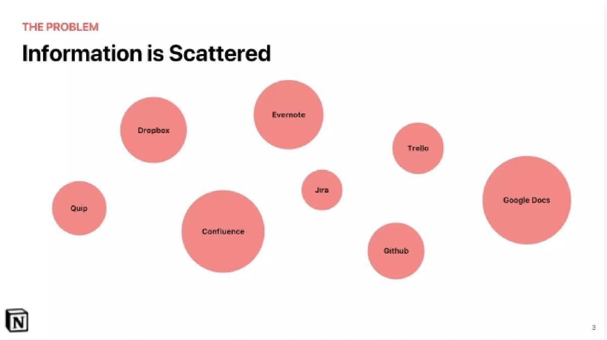
- The deck identifies eight specific competitors by logo on slide 3, including Google Docs, Evernote, and Trello, to illustrate information fragmentation.
- Notion claims a user base of 1,000,000+ on slide 10, emphasizing significant scale at the time of the presentation.
- The core value proposition is defined on slide 5 as organizing all company work in 'one single workspace.'
- Product functionality is categorized into three pillars on slide 6: Notes + docs, Knowledge base, and Tasks + projects.
- The deck uses a historical timeline on slides 16 and 17 to frame Notion as the 'Phase 5' consolidation of the SaaS era.
- Enterprise readiness is signaled on slide 15 through features like Single Sign-On, unlimited version history, and ownership of all data.
- The deck completely omits a team slide, financial projections, and a specific funding 'ask' amount.
- Slide 12 explicitly states that as companies grow, communication and cross-functional collaboration become 'both more complex and more important.'
The Minimalist Power of Notion's Series C Deck
Notion is widely recognized for its clean aesthetic and flexible product architecture. Its Series C pitch deck, consisting of 19 slides, is a direct reflection of that brand identity. The deck does not overwhelm the reader with spreadsheets or technical jargon; instead, it focuses on a high-level narrative about the evolution of work and the necessity of tool consolidation. By the time this deck was circulated, Notion had already achieved significant market pull, allowing them to focus on vision and scale rather than basic survival metrics.
The Problem: Fragmentation and Silos
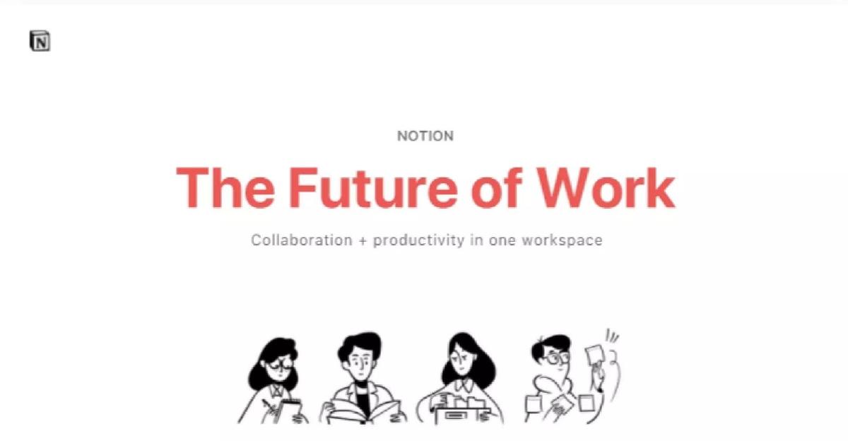
Slide 1 opens with the bold title 'The Future of Work,' accompanied by Notion's signature hand-drawn illustrations. This sets a tone of human-centric design. The deck immediately moves into the 'Problem' phase. Slide 2 and Slide 3 define the issue in two words: 'Silo'd' and 'Scattered.' Slide 3 is particularly effective, showing a cluster of red circles containing logos for Dropbox, Evernote, Trello, Quip, Confluence, Jira, Github, and Google Docs. This visualizes the cognitive load placed on modern workers who must jump between disparate platforms to complete a single project.
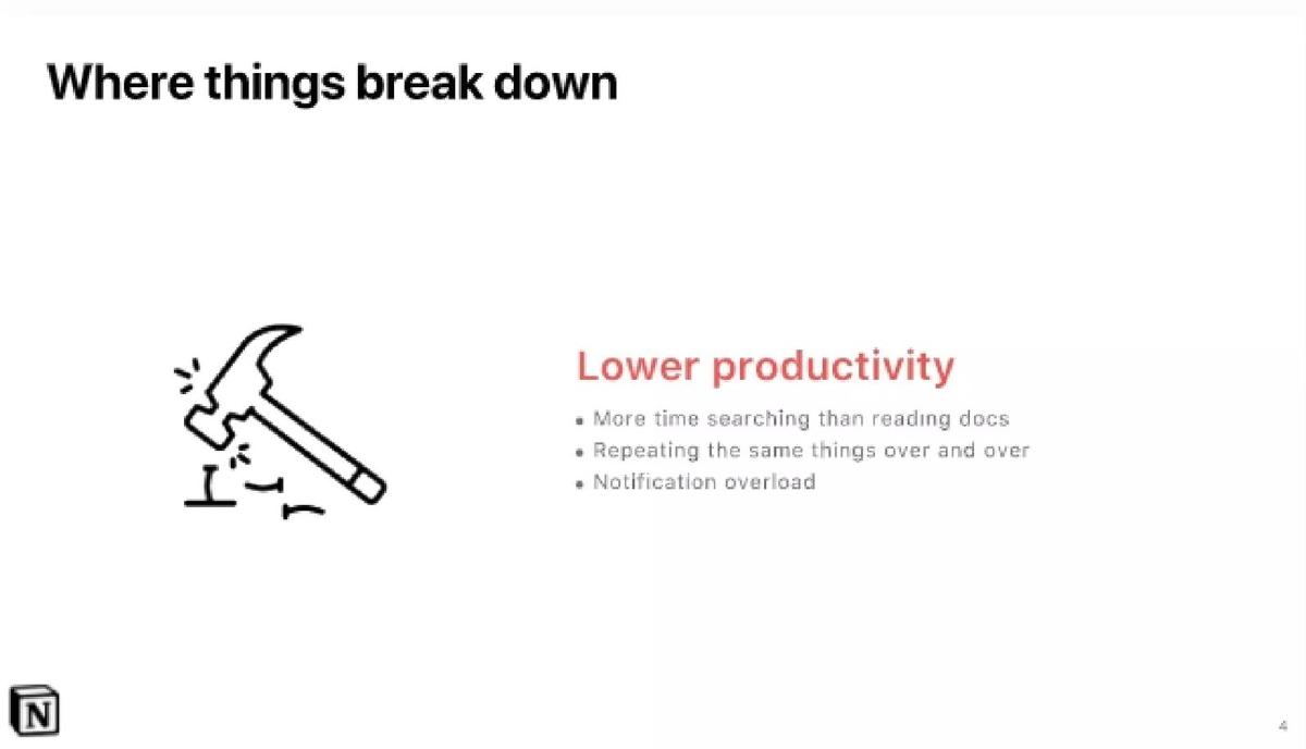
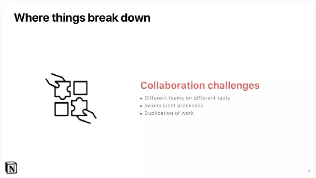
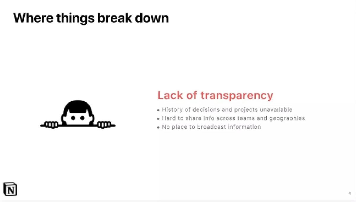
Slides 4, 4a, and 4b (labeled as 'Where things break down') drill deeper into the consequences of this fragmentation. The deck identifies three specific pain points: Lower productivity (more time searching than reading), Collaboration challenges (different teams on different tools), and Lack of transparency (history of decisions unavailable). These slides use minimal text and simple icons, ensuring the investor focuses on the universal pain of 'notification overload' and 'duplication of work.'
The Solution: The All-in-One Workspace
Slide 5 introduces the solution: 'Organize all of your company's work in one single workspace.' This is the core thesis of Notion. Slide 6 breaks this down into three functional pillars: Notes + docs, Knowledge base, and Tasks + projects. By grouping these, Notion argues that it isn't just a note-taking app; it is a replacement for an entire stack of software.
Slide 7 is a pivotal visual that mirrors the 'scattered' logos from Slide 3. Here, the Notion logo sits at the center of a hub, with arrows pointing inward from Asana, Evernote, Google Docs, Confluence, Github, Jira, and Trello. The message is clear: Notion is the destination where all these workflows converge. To prove the product is real and functional, Slides 8 and 9 provide 'How it works' demos for both desktop and mobile, showing a clean interface with a simple 'Today' to-do list.
Traction and Social Proof
For a Series C round, investors require proof of product-market fit. Slide 10 delivers this with a massive figure: 'Just one of our 1,000,000+ happy users...' The slide includes a quote from a 'Team Plan' customer emphasizing that Notion puts work 'a click away.' This milestone is crucial because it demonstrates that Notion has moved past the early adopter phase and into mass-market territory.
Slide 11 reinforces this traction by displaying logos of 'happy brands,' including Duolingo, Lattice, and ZEIT. The selection of these logos is strategic; they represent modern, high-growth tech companies that other businesses look to for productivity trends. Slide 12 then pivots back to the 'Why,' stating that as companies grow, communication becomes more complex. This serves as a bridge to the enterprise argument: Notion isn't just for individuals; it is essential for scaling organizations.
The Macro Narrative and Appendix
Slides 16 and 17 (found in the 'Our Story' section) provide a historical timeline of work tools. It categorizes history into phases: Phase 1 (Unified paper), Phase 2 (Fragmented early PC), Phase 3 (Unified Microsoft era), and Phase 4 (Internet era of fragmented SaaS). Notion positions itself as 'Phase 5: Consolidation of SaaS to future.' This framing is a classic storytelling technique used to make a company's success seem like a historical inevitability.
The deck concludes with an Appendix . Slide 15 is the most important of these, listing 'Enterprise benefits.' To justify a Series C valuation, Notion must show it can capture high-contract-value enterprise customers. The features listed—Single Sign-On (SSO), dedicated CSM, and ownership of all data—are the 'boring' but necessary requirements for IT departments in large corporations. This slide proves that Notion is ready to move beyond the 'prosumer' market.
What Works in the Notion Deck
Visual Consistency: The deck uses the same font, color palette (red and black), and illustration style as the Notion app itself. This creates a seamless brand experience for the investor.
The 'Hub' Visual: Slide 7 is the strongest slide in the deck. It perfectly illustrates the value proposition of consolidation without needing a single word of explanation. It turns a crowded market of competitors into a list of 'integrations' or 'sources' for the Notion ecosystem.
Historical Framing: By using the 'Phase 1 to Phase 5' timeline, Notion elevates itself from a tool to a movement. Investors love to back companies that are 'fixing' a broken era of technology.
What is Missing from the Notion Deck
The Team Slide: There is no mention of the founders or the leadership team. While Notion was famous enough by Series C to potentially skip this, it is a standard component that is noticeably absent.
Financials and Unit Economics: The deck contains no mention of Revenue, Burn Rate, LTV (Lifetime Value), or CAC (Customer Acquisition Cost). This suggests that either these were shared in a separate data room or that the 1,000,000+ user figure was the primary metric used to drive interest.
The Ask: The deck does not state how much money is being raised or how the funds will be allocated. This is common in highly competitive late-stage rounds where the 'ask' is often negotiated based on investor appetite rather than a fixed target.
What a Founder Should Copy
Focus on the 'One Thing': Notion doesn't try to explain every feature. They focus entirely on the concept of 'consolidation.' Founders should identify the single biggest trend they are riding and make it the centerpiece of their deck.
Use Competitor Logos to Your Advantage: Instead of a defensive competitive matrix, Notion uses competitor logos to illustrate the problem . If you are in a crowded market, show how the existence of so many tools is the reason your product needs to exist.
Signal Enterprise Readiness Early: Even if you are a consumer-facing app, including a slide like 'Enterprise benefits' (Slide 15) shows investors that you have a path to high-margin, recurring revenue at scale.
Final Thoughts
The Notion Series C deck is a masterclass in 'less is more.' It assumes the investor is already aware of the product's popularity and focuses instead on the strategic 'Why' and the 'Where next.' By framing the current state of software as a fragmented mess, Notion makes its all-in-one workspace feel like the only logical solution for the future of work.
Frequently asked questions
- Why does the deck omit a team slide?
- At the Series C stage, Notion was already a well-known entity in the venture capital ecosystem. The brand and its massive user growth (1,000,000+ users) acted as a proxy for team quality. For a late-stage company, the focus shifts from 'who are we' to 'how big is the market we are consolidating.'
- How does Notion address competition without a traditional matrix?
- Instead of a 'check-box' grid, Notion uses slide 3 to show a scattered cloud of logos like Jira, Slack, and Dropbox. This frames competitors not as rivals to beat individually, but as a collective problem of 'scattered information' that Notion solves by absorbing their functions into one place.
- What is the significance of the 'Our Story' timeline?
- Slides 16 and 17 provide a macro-economic context for Notion's existence. By labeling the current era as 'Phase 4' (fragmented SaaS) and Notion as 'Phase 5' (consolidation), the founders position the company as an inevitable evolution of the software industry rather than just another app.
- Is this deck too simple for a Series C round?
- While it lacks the data density typical of late-stage decks, it reflects Notion's product philosophy: simplicity and clarity. The presence of high-profile logos like Duolingo and the million-user milestone provide enough 'hard proof' to allow the rest of the deck to remain visionary and high-level.
- What are the 'Enterprise benefits' mentioned in the appendix?
- Slide 15 lists six key features: Unlimited workspaces, Ownership of all data, Unlimited version history, Access to new features, Dedicated CSM, and Single Sign-On. These are standard requirements for selling into large corporations, indicating Notion's intent to move upmarket.