The Rize pitch deck is a masterclass in extreme minimalism, relying on large-scale typography and single-metric slides to convey a sense of urgency and momentum. Founded in 2015, the company targeted the millennial savings crisis, identifying a market of 80 million individuals saving 'NOTHING.' The deck stands out for its transparency regarding a non-traditional revenue model—a 'pay what you want' average of $2.40 per month—and a remarkably short 2.5-month payback period. While the deck lacks traditional financial projections or a detailed competitive matrix, it leans heavily on the team's co…
Key takeaways
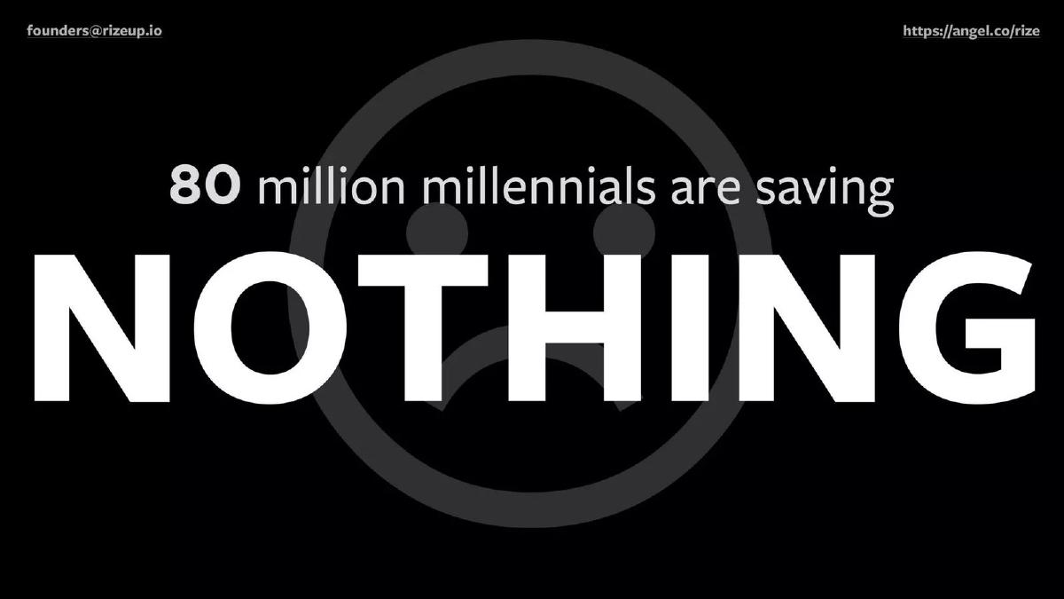
- The deck identifies a massive total addressable market by stating 80 million millennials are saving nothing (Slide 2).
- Rize defines its target user behavior as saving $300 per month, representing 10% of their income (Slide 3).
- The product strategy is distilled into three pillars: Goals, Peer Comparison, and Moving the Money (Slides 4-6).
- Traction is demonstrated by a single, high-impact figure: 5,000 signups in the last 2 months (Slide 7).
- The revenue model is unconventional, showing a 'Pay what you want' average of $2.40 per month (Slide 8).
- Unit economics are highlighted via a 2.5-month payback period, suggesting efficient customer acquisition (Slide 9).
- The deck cites a $40 billion marketing spend in the broader sector as the backdrop for their opportunity (Slide 10).
- The team slide emphasizes a cross-disciplinary approach of Finance, Behavioral Design, and Tech (Slide 11).
The Rize Pitch Deck: Minimalism as a Fundraising Strategy
The Rize pitch deck, used during their 2015 Series A journey, is a notable example of 'less is more.' With only 12 slides and almost no body text, the deck relies on the 'Blink' test—the idea that an investor should understand the core value proposition within seconds of looking at a slide. The company, which eventually raised $13.4 million, focuses on the intersection of behavioral psychology and personal finance.
The Hook: A Generational Crisis
Slide 1: Title The deck opens with the Rize logo and the tagline: 'Save more for the life you want.' It is clean, using a dark purple-to-red gradient background with sunburst lines. The contact email and AngelList link are visible in the corners, establishing immediate transparency.
Slide 2: The Problem Rize doesn't use bullet points to describe the problem. Instead, it uses a black background with a large, white, bold font stating: '80 million millennials are saving NOTHING.' A faint sad-face icon sits in the background. This is a classic 'hair on fire' problem slide, framing the market opportunity as a massive void in the current financial ecosystem.
Slide 3: The Target Behavior Slide 3 transitions to a calming green gradient with a photo of someone lying in a field. The text reads: '$300 per month, 10% of their income.' This slide defines the 'North Star' metric for the user. It isn't just about saving; it is about a specific, achievable financial habit that Rize intends to facilitate.
The Solution: Three Pillars of Behavioral Design
Slide 4: Pillar 1 - Goals The deck introduces the product through three numbered slides. Slide 4 shows a target icon and the word 'Goals.' This addresses the psychological need for a 'why' in financial planning. By focusing on goals rather than just balances, Rize attempts to make saving emotional rather than clinical.
Slide 5: Pillar 2 - Peer Comparison Slide 5 features a speedometer icon and the text 'Peer Comparison.' This is the behavioral design element. By showing users how they stack up against their peers, Rize leverages social pressure and benchmarking to drive engagement—a common tactic in successful 'fin-health' apps.
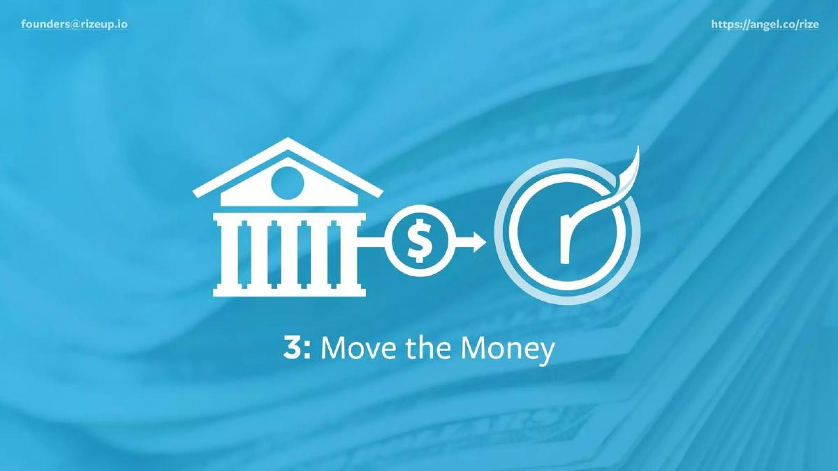
Slide 6: Pillar 3 - Move the Money The final product slide shows an icon of a bank connecting to the Rize logo via a dollar sign. The text 'Move the Money' represents the utility layer. This is the 'how'—the automated transfer of funds that removes the friction of manual saving.
Traction and Unconventional Economics
Slide 7: Growth Momentum Against a background of a space shuttle launch, Slide 7 displays the number '5,000' in massive type, followed by 'signups in the last 2 months.' This provides the necessary proof of concept. For a Series A deck in 2015, 2,500 signups per month was a strong indicator of early product-market fit, especially if achieved with minimal spend.
Slide 8: The Revenue Model This is perhaps the most controversial slide in the deck. It states: 'Pay what you want, $2.40 average per month.' Rize opted for a 'tip' or voluntary payment model. While this demonstrates high user affinity (users are choosing to pay for a service they could get for free), it also raises questions about long-term scalability and ARPU (Average Revenue Per User) ceilings.
Slide 9: Unit Economics To counter concerns about the low $2.40 revenue figure, Slide 9 highlights a 'Payback 2.5 months.' This is a critical metric. It tells investors that despite the low revenue per user, the cost to acquire those users is even lower. A 2.5-month payback period is exceptional for B2C fintech, suggesting a highly efficient acquisition engine.
Market Context and The Team
Slide 10: The Opportunity Slide 10 notes a '$40b marketing spend.' This likely refers to the amount traditional banks and financial institutions spend to acquire customers. Rize is positioning itself as the efficient alternative that can capture the same audience without the bloated legacy costs.
Slide 11: The Team The team slide is dense with credibility. It features Justin Howell (CEO), Rishi Kumar (CTO), Kirk Voltz (Design), and Mizel Djukic (Growth). Below the headshots, the founders list: '20 years in technology | 20 years in finance | Degree in Psychology from Harvard | 2 successful exits.' The bottom of the slide is a 'logo soup' of previous employers, including Bain Capital, JP Morgan Chase, Bank of America, and The Economist. This slide does the heavy lifting of proving the team has the 'right to win' in a highly regulated space.
Slide 12: Closing The deck ends as it began, with the logo and tagline. It offers no 'Thank You' or 'Q&A' slide, maintaining the minimalist aesthetic to the very end.
What Works in the Rize Deck
Extreme Clarity: There is no jargon. The deck uses simple icons and large numbers to tell a story. An investor can flip through this in 60 seconds and understand exactly what the business does. · Behavioral Focus: By explicitly mentioning 'Behavioral Design' on the team slide and 'Peer Comparison' as a core feature, Rize differentiates itself from 'dumb' savings accounts. They are selling a change in human behavior, not just a software tool. · Efficiency Metrics: Highlighting the 2.5-month payback period is a smart move. It shifts the conversation from 'How will you survive on $2.40?' to 'How fast can we pour capital into this efficient acquisition machine?'
What is Missing from the Rize Deck
Competitive Landscape: The deck completely ignores competitors like Acorns, Digit, or Qapital, which were active in 2015. Investors usually want to see how a startup differentiates itself from direct rivals. · Financial Projections: There are no charts showing projected growth, burn rate, or the path to a $100M+ revenue run rate. The deck assumes the investor will buy into the vision based on current traction alone. · The Ask: As noted, the deck does not state how much money is being raised or what the milestones for the next 18 months are. This information might have been reserved for the verbal pitch or a follow-up data room. · Regulatory/Compliance Detail: Fintech involves heavy regulation. The deck does not mention banking partners or how they handle the 'Move the Money' aspect from a legal standpoint.
What a Founder Should Copy
The 'One Big Number' Rule: Use slides that feature a single, undeniable metric (like Slide 7's 5,000 signups). It creates a focal point that sticks in the investor's mind. · Credibility Through Association: If your team has worked at prestigious firms, use the logos. Slide 11 uses logos effectively to build a 'wall of trust' that offsets the risk of a new, unproven brand. · Problem Framing: Start with a massive, relatable problem. Slide 2's '80 million millennials' is a perfect example of framing a market not by its dollar value, but by the number of people suffering from a specific pain point.
Frequently asked questions
- What is the primary problem Rize aims to solve?
- According to Slide 2, the primary problem is the millennial savings crisis. The deck explicitly states that 80 million millennials are saving 'NOTHING.' Rize positions itself as the behavioral solution to this inertia, aiming to convert non-savers into active participants by automating the process through goal-setting and peer comparisons.
- How does Rize make money according to the deck?
- Slide 8 reveals a 'Pay what you want' revenue model. Rather than a fixed subscription or transaction fee, the company reports an average revenue of $2.40 per month per user. This suggests a voluntary contribution model, which was a popular fintech experiment in the mid-2010s to build trust and reduce friction during onboarding.
- What are the core features of the Rize platform?
- The platform is built on three pillars shown in Slides 4, 5, and 6: 1) Goals, which provide the 'why' for saving; 2) Peer Comparison, which uses social proof and behavioral psychology to encourage higher savings rates; and 3) Move the Money, the automated execution of transferring funds from a bank to the Rize account.
- Is there a specific 'Ask' or valuation mentioned in the slides?
- No. The 12-slide deck provided does not include a slide detailing the specific dollar amount being raised, the valuation, or the intended use of funds. While catalogue data indicates a $13.4 million total raise, the deck itself focuses entirely on the problem, the solution, and the team's credentials.
- What is the significance of the 2.5-month payback period?
- Slide 9 highlights a 2.5-month payback period. In the context of a $2.40 average monthly revenue, this implies a Customer Acquisition Cost (CAC) of approximately $6.00. For a Series A fintech, this suggests highly efficient organic or viral growth, which is likely why the founders chose to highlight this specific metric over gross margins.