Sharebee’s 2016 seed deck is a study in minimalist storytelling. Spanning 22 slides, the presentation relies heavily on full-bleed imagery to establish the emotional pain of cluttered living and the clinical, 'expensive' nature of traditional self-storage. The deck transitions from these pain points into a clean product walkthrough and impressive traction metrics, specifically an 80% quarter-over-quarter growth rate. While the deck lacks a formal 'Ask' slide or detailed unit economics, it successfully anchors the investment opportunity in a massive $100B Total Addressable Market (TAM). The fo…
Key takeaways
- The deck highlights a massive 1000% increase in consumer goods over the last three decades on slide 3.
- Market demand is validated by the fact that 15,000,000 households pay for storage monthly, as shown on slide 4.
- Traditional storage is framed as 'Expensive,' 'Inconveniently Located,' and full of 'Hidden fees' on slide 7.
- Traction is demonstrated through a bar chart showing booked sales growing from CAD 100,000 in Q4 2018 to over CAD 300,000 in Q2 2019 on slide 10.
- The company claims a consistent 80% Quarter-over-Quarter (QoQ) growth rate on slide 11.
- The product includes an 'Online Photo Catalog' for users to manage stored items remotely, illustrated on slide 16.
- The Total Addressable Market (TAM) is valued at $100B globally, with $40B in the US and $4B in Canada, according to slides 19-21.
- The deck omits a specific funding ask, valuation, or breakdown of how the $525,600 raised would be allocated.
The Visual Narrative of Sharebee
Sharebee’s pitch deck is a departure from the text-heavy presentations common in the mid-2010s. Instead of leading with complex data, the founders chose to lead with a visceral emotional hook. The deck uses 22 slides to tell a story of consumerism, the resulting clutter, and the outdated solutions currently available to homeowners. By the time the investor reaches the financial data, the problem has been framed so clearly that the solution feels inevitable.
Slides 1-4: The Macro Problem
The deck opens with a simple title slide (Slide 1) featuring the logo and the tagline: Storage unit in your pocket . This immediately sets the stage for a mobile-first, tech-enabled solution to a physical problem. Slide 2 is a full-bleed image of an incredibly cluttered room, serving as a wordless 'Problem' slide. It requires no explanation; every viewer understands the stress of too much stuff.
Slide 3 provides the quantitative weight to the visual image, stating there has been a 1000% increase in consumer goods in the last 3 decades . This is followed by Slide 4, which defines the current market behavior: 15,000,000 Households pay for storage monthly . By starting with these macro trends, Sharebee establishes that they are not creating a new need, but rather capturing an existing, massive behavior.
Slides 5-7: The Villain Arc
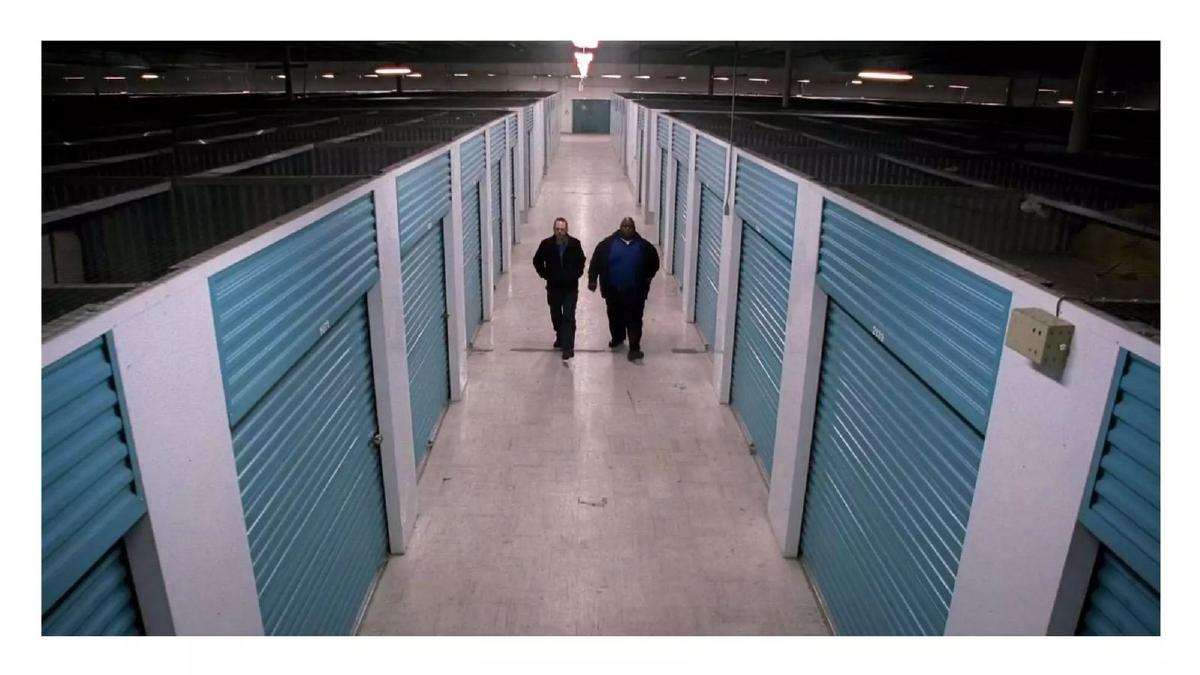
Slides 5 and 6 use stark, almost depressing imagery of traditional self-storage facilities. Slide 5 shows two men walking down a sterile, blue-doored hallway, while Slide 6 shows a facility that looks indistinguishable from a prison block. This is a deliberate psychological tactic to make the current market leaders look like 'the old way'—cold, industrial, and uninviting.
Slide 7 explicitly lists the grievances against these traditional players: Expensive , Inconveniently Located , Hidden fees , and Lack of Service . By the end of this section, the investor is primed to want a 'hero' to disrupt this unpleasant status quo.
Slides 8-11: The Hero and the Proof
Slide 8 reintroduces the Sharebee logo, acting as a transition into the solution. Slide 9 provides social proof, showing five-star reviews from users like Parisa N. and Jean-François B. The slide claims 500+ 5 stars reviews across Facebook, Google, and Sharebee. This is a crucial inclusion for a peer-to-peer platform, where trust is the primary currency.
Traction is the focus of Slides 10 and 11. Slide 10 displays a bar chart of Booked Sales . The figures are exact: CAD 100,000.00 in Q4 2018 , rising to CAD 150,000.00 in Q1 2019 , and peaking at over CAD 300,000.00 in Q2 2019 . Slide 11 distills this into a single, powerful metric: 80% QoQ (Quarter-over-Quarter) growth. For a seed-stage company, this level of growth is the primary driver of investor interest.
Slides 12-16: Product Walkthrough
The deck then moves into a 'Day in the Life' of a user named Nicole. Slide 12 shows her selecting a storage plan on a laptop, with options ranging from 5'x5' (25 ft²) to 10'x20' (200 ft²) . Slide 13 shows the scheduling interface for pickup, and Slide 14 shows the booking confirmation and a referral prompt ( Get my first $50 ).
Slide 15 simplifies the entire value proposition into a three-step graphic: Free Pickup , Store in one of our secure locations , and Deliver on-demand . This highlights that Sharebee isn't just a marketplace for space; they are managing the logistics. Slide 16 introduces the Online Photo Catalog , showing a user's dashboard with photos of a Couch/Sofa (3-seat) , Coffee Table , and TV . This feature is the 'Storage unit in your pocket' promised on the first slide.
Slides 17-22: The Team and the Market
After a brief visual callback to the 'prison' storage imagery on Slide 17 (likely used as a 'Why now?' or 'The Alternative' reminder during a live pitch), Slide 18 introduces the founders. Maxime Villemure (CEO) is linked to McGill and Six Sigma , while Adlene Barouche (CTO) brings experience from JPMorgan Chase , Sony , and Twitter . This balances the CEO's business/process background with the CTO's high-scale tech pedigree.
The deck closes with a 'Market Size' crescendo. Slide 19 identifies a $4B market in Canada , Slide 20 identifies $40B in the US , and Slide 21 claims a $100B TAM (Total Addressable Market). The final slide (Slide 22) summarizes the three most important facts for an investor to remember: 80% QoQ Growth , $300K+ Sales Q2 2019 , and 1,000+ Customers Served .
What Works in the Sharebee Deck
The most successful element of this deck is its emotional anchoring . By using high-quality, evocative imagery of cluttered homes and prison-like storage units, the founders create a 'villain' out of the incumbent industry. This makes the Sharebee solution feel like a relief rather than just another app.
Furthermore, the traction data is unambiguous . Using 'Booked Sales' instead of vague 'Gross Merchandise Volume' (GMV) or 'User Signups' gives investors a clear picture of the company's ability to generate revenue. The 80% QoQ growth rate is a 'goldilocks' metric—high enough to be exciting, but grounded in the actual dollar figures shown on the previous slide.
Finally, the Product Walkthrough (Slides 12-16) is excellent. It doesn't just show screenshots; it tells a story of a user journey. The inclusion of the 'Online Photo Catalog' is a 'wow' feature that differentiates Sharebee from a simple Craigslist-style listing site.
What is Missing from the Sharebee Deck
Despite its visual strengths, the deck has several glaring omissions that would likely be addressed in a follow-up due diligence meeting. Most notably, there is no 'Ask' slide . The deck never specifies how much money they are looking for, what the valuation expectations are, or how the funds will be allocated. While the catalogue listing states they raised $525,600, that information is not present in the slides themselves.
There is also a complete lack of unit economics . For a marketplace business that includes 'Free Pickup' (Slide 15), investors need to know the Cost of Customer Acquisition (CAC) and the Lifetime Value (LTV). If the cost of the truck and movers for the 'Free Pickup' exceeds the first six months of storage fees, the business model may not be sustainable at scale. The deck ignores these operational costs entirely.
Lastly, there is no competitor analysis . In 2016, the peer-to-peer storage space was becoming crowded with players like Neighbor and Clutter. By not mentioning the competition, Sharebee misses the chance to explain why their specific model (perhaps their focus on the Canadian market or their specific insurance partnership with Intact Insurance, mentioned in their self-description but not the slides) is superior.
What a Founder Should Copy
Founders should emulate Sharebee's minimalist aesthetic . Each slide has one job and one primary message. This prevents 'death by bullet point' and keeps the audience focused on the speaker during a live presentation. The use of full-bleed imagery to establish the 'Problem' is a masterclass in storytelling.
The Founder Slide (Slide 18) is also a great template. Instead of long bios, they use recognizable logos to establish credibility instantly. If you have worked at a major tech firm or attended a top-tier university, the logo does more work than a paragraph of text ever could.
Finally, the Summary Slide (Slide 22) is a perfect way to end a pitch. It leaves the three most impressive numbers on the screen during the Q&A session, ensuring that the final impression left on the investors is one of growth and momentum.
Company: Sharebee · Sector: Peer-to-Peer Storage / Marketplace · Stage: Seed · Year: 2016 · Slides: 22 · Deck Type: Investor Pitch Deck · Outcome: Raised $525,600 · HQ: Montréal, Québec, Canada
Frequently asked questions
- How does Sharebee differentiate itself from traditional self-storage?
- Sharebee positions itself as a peer-to-peer alternative that is 60% cheaper and more conveniently located than traditional facilities. The deck uses slides 5 through 7 to visually compare traditional storage to a prison-like environment, highlighting pain points such as high costs, hidden fees, and a lack of service, which Sharebee aims to solve through a digital-first, community-based model.
- What specific traction did Sharebee show to investors?
- The deck presents clear financial growth, showing booked sales increasing from CAD 100,000 in Q4 2018 to over CAD 300,000 by Q2 2019 (Slide 10). They also emphasize an 80% quarter-over-quarter growth rate (Slide 11) and conclude the deck by stating they have served over 1,000 customers (Slide 22).
- What is the 'Online Photo Catalog' feature mentioned in the deck?
- On slide 16, Sharebee showcases a digital interface where users can view photos of their stored items (e.g., sofas, coffee tables, TVs). This feature allows customers to manage their inventory remotely and request specific items for 'Deliver on-demand' service, bridging the gap between physical storage and digital convenience.
- Who are the founders and what is their background?
- The company was led by Co-founder and CEO Maxime Villemure and Co-founder and CTO Adlene Barouche. Slide 18 highlights their backgrounds, including education at McGill University and professional experience at high-profile firms such as JPMorgan Chase, Sony, and Twitter, providing the team with significant technical and business credibility.
- What are the major omissions in the Sharebee pitch deck?
- The deck is notably missing a 'Use of Funds' or 'The Ask' slide, which typically details how much capital is being raised and where it will be spent. Additionally, there is no mention of unit economics (CAC/LTV), a competitive landscape analysis, or a detailed roadmap for future expansion beyond the current Canadian and US market figures.