Taskly, a to-do management webapp from 2009, utilized a highly visual, low-text pitch deck to introduce its natural language processing (NLP) and semantic analysis features. The deck is notable for its refusal to ask for capital, explicitly stating on slide 10 that they were raising 'Nothing.' Instead, the presentation serves as a product showcase and team introduction, highlighting founders Roman Kutanov and Dmitry Gorshkov. With a focus on flexibility ('Supports any workflow') and social integration, the deck relies on the founders' prior portfolio—including projects like Rock Start and Fra…
Key takeaways
- The deck explicitly states the company is raising 'Nothing' on slide 10, likely using the deck as a recruiting or partnership tool rather than a traditional capital raise.
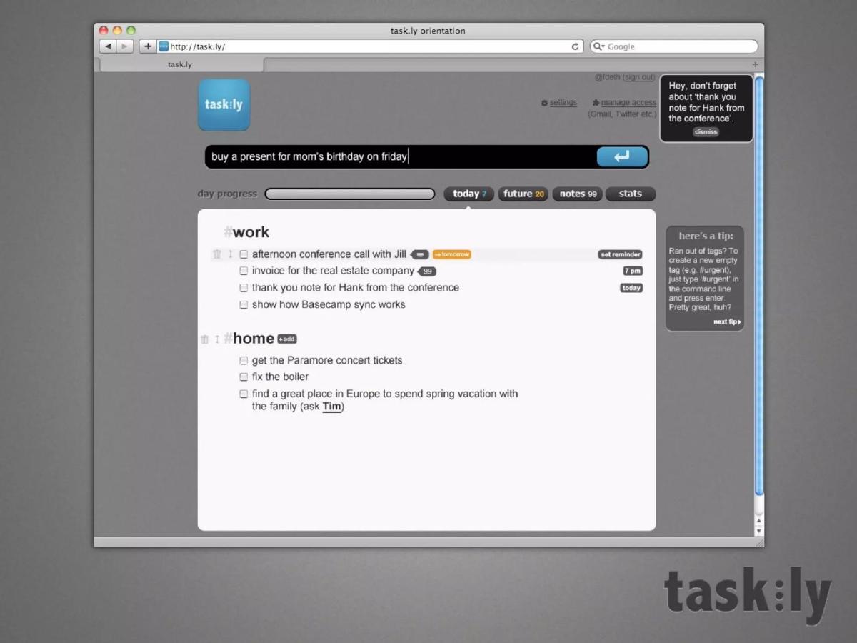
- Natural language processing is demonstrated via a UI mockup on slide 2, showing a command-line style input for tasks like 'buy a present for mom’s birthday on friday.'
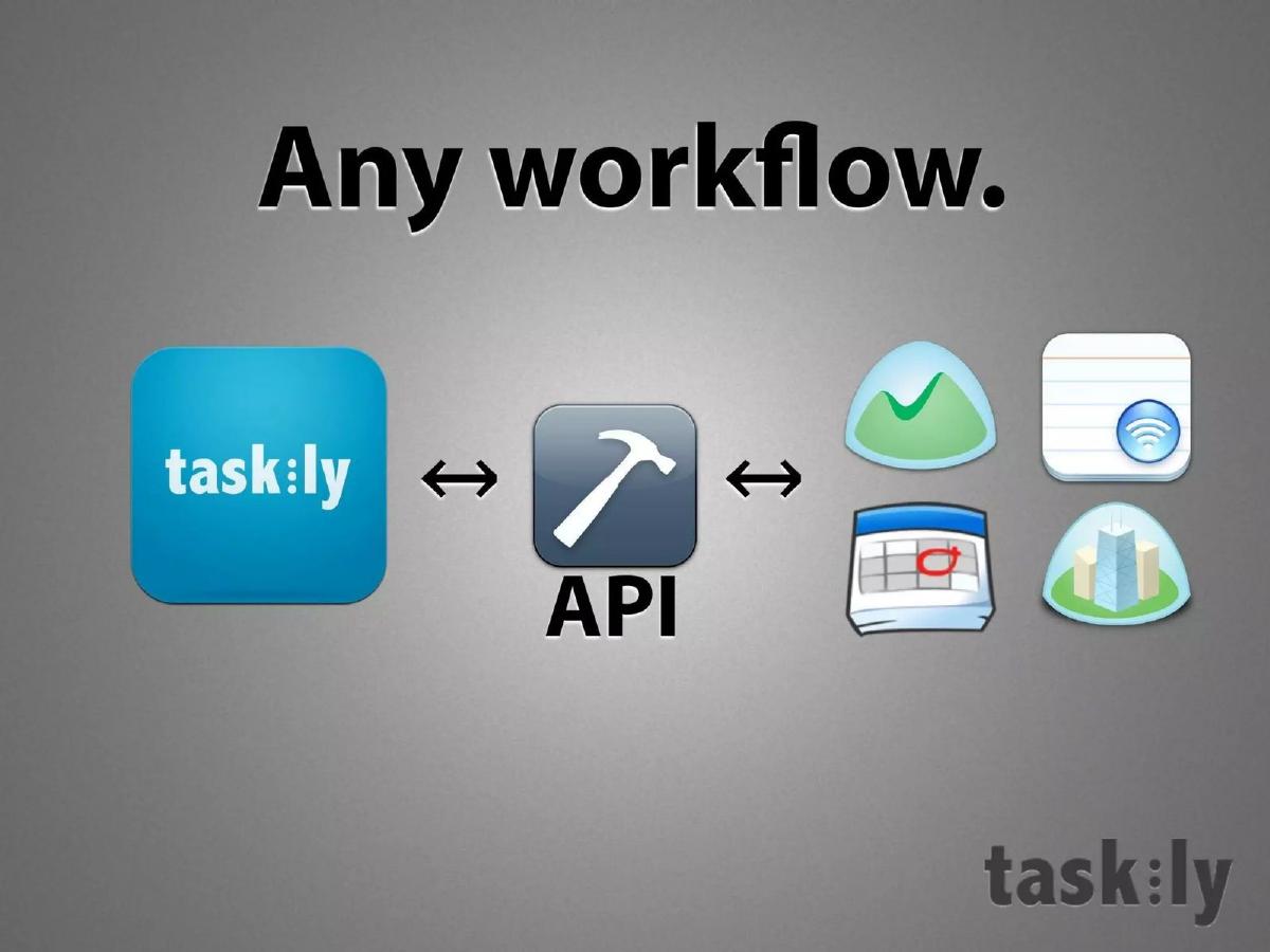
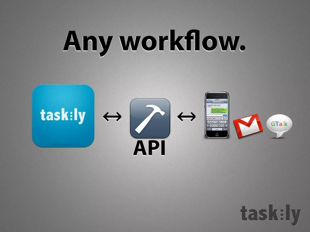
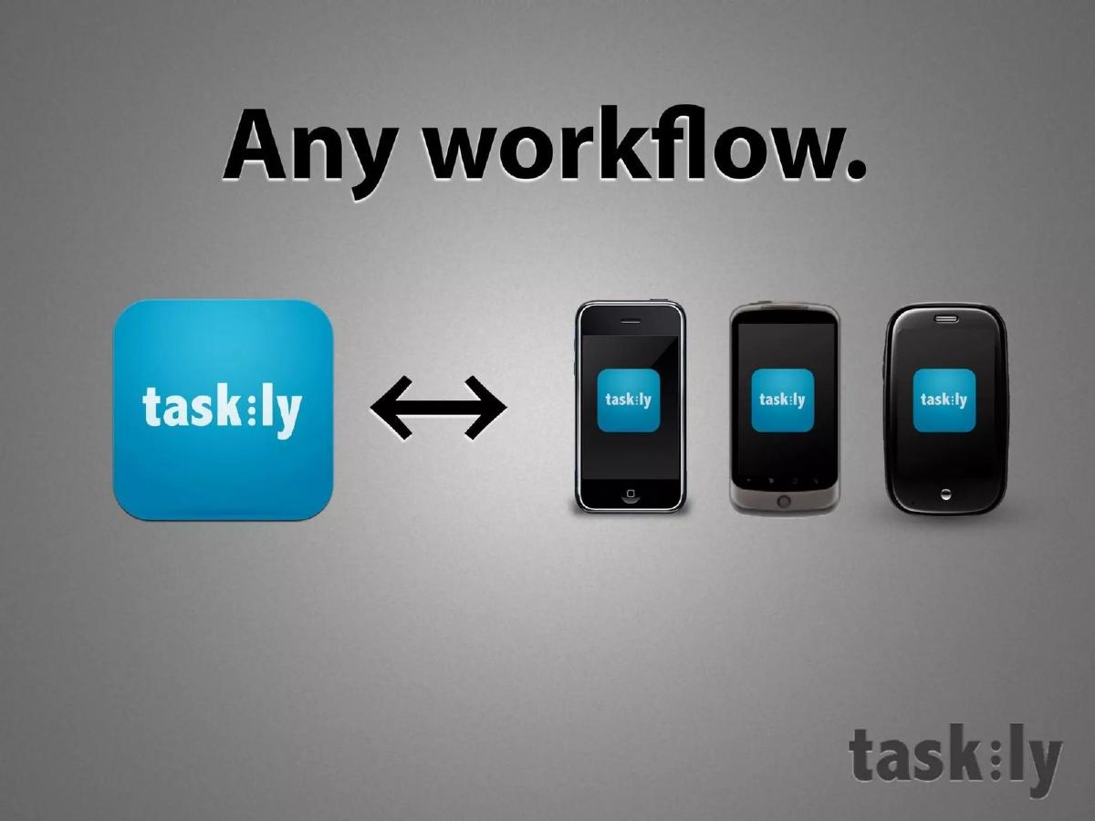
- The product positioning emphasizes flexibility, claiming to support 'Any workflow' through an API and integrations with Gmail, GTalk, and mobile devices (slide 3).
- User acquisition strategy is high-level, citing Public Relations, Social Graph, and Word of Mouth as the primary drivers (slide 6).
- The founders use avatars instead of professional headshots on the team slide (slide 7), emphasizing a developer-centric, 'hacker' culture.
- Credibility is built through a 'Our works' slide (slide 8) featuring logos for previous projects like Rock Start, FragFeed, and Crowdly.
- The deck identifies 'Everyone has a unique workflow' as a core problem (slide 14), positioning Taskly as the adaptable solution.
- Social integration is a key feature, with slide 4 suggesting users can 'Get help' by connecting tasks to Facebook, LinkedIn, Twitter, and Tumblr.
The Minimalist Vision of Taskly
The Taskly pitch deck from 2009 is a fascinating artifact from a transitional period in web development. It arrived at a time when 'productivity' was becoming a crowded category, yet Natural Language Processing (NLP) was still a relatively novel feature for consumer-facing web applications. The deck itself is remarkably sparse, consisting of 28 slides (14 of which are analyzed here) that prioritize visual impact and brief statements over data-heavy tables or long-form explanations. This teardown examines a deck that breaks several fundamental rules of fundraising, most notably by claiming to raise no money at all.
Introduction and Product Interface
Slide 1: Title The deck opens with a simple, high-resolution icon of the Taskly logo—a blue rounded square with white lowercase typography. There is no tagline, no date, and no presenter name. It establishes a brand-first aesthetic immediately.
Slide 2: Product Mockup The second slide is the most information-dense in the entire deck. It shows a browser window containing the Taskly interface. The core value proposition is visible in the input bar: "buy a present for mom’s birthday on friday." This demonstrates the NLP engine's ability to parse dates and intent from a single string of text. The UI includes tabs for "today (7)," "future (20)," "notes (99)," and "stats." It also shows a sidebar with a tip about using tags (e.g., #urgent) and a notification reminder. This slide successfully proves that a functional product exists.
Workflow and Integration
Slide 3: Any workflow. This slide uses icons to explain the technical ecosystem. Taskly is connected via an "API" (represented by a hammer icon) to mobile devices, Gmail, and GTalk. The message is clear: Taskly is not a silo; it is a layer that sits on top of the tools users already use. The bidirectional arrows suggest data syncs across all these platforms.
Slide 4: Get help. Taskly introduces a social component here. By showing the logos for Facebook, LinkedIn, Twitter, and Tumblr leading to a 'people' icon, the deck suggests that tasks can be shared or outsourced to a user's social network. In 2009, 'social productivity' was a major trend, and this slide aligns Taskly with that movement.
Slide 5: Value Proposition This slide summarizes the product in three bullet points: "Uber easy to use," "Supports any workflow," and "Actually helps to get things done." It is a bold, if subjective, set of claims that serves to transition the deck from product features to company strategy.
Growth and Market Focus
Slide 6: Where will users come from. The go-to-market strategy is simplified into three pillars: Public Relations, Social Graph, and Word of Mouth. While these are standard for consumer apps, the deck lacks any specific detail on how they will execute these strategies. There is no mention of ad spend, partnerships, or specific influencers.
Slide 9: We aim for the West. This slide features a world map with the Taskly logo positioned in Eastern Europe/Russia, while the United States, Canada, Western Europe, and Australia are shaded black. It is a clear statement of geographic intent. For a team based outside the US, this is a necessary slide to convince Western investors that the product is built for their primary markets.
The Team and Pedigree
Slide 7: The Team. The founders, Roman Kutanov (tech) and Dmitry Gorshkov (design, business), are represented by illustrated avatars rather than photos. Their Twitter handles (@kutanov and @fdeth) are provided. This choice reinforces a 'hacker' or 'indie developer' vibe, which was common in the early Web 2.0 era but might be seen as unprofessional in a modern Series A pitch.
Slide 8: Our works. This is the 'social proof' slide. It features logos for several other projects: Rock Start, FragFeed, Revo Print, and Crowdly, all dated 2009. This suggests a high velocity of shipping and that Taskly is part of a larger portfolio of work by an experienced duo. It answers the 'Why this team?' question by pointing to their track record of building and launching products.
The Non-Ask and Conclusion
Slide 10: What we’re raising. In a surprising move, the slide simply says "Nothing." accompanied by a 'no' symbol. This is a psychological tactic. By presenting a deck that says they don't need money, the founders are either looking for strategic partnerships, talent, or are using the 'hard to get' approach to attract investors who want to pre-empt a future round. It is the definitive 'anti-pitch.'
Slide 11: Come say hi The contact slide provides the URL, a hello@ email address, and the Twitter handle. It maintains the minimalist theme to the very end.
Slide 12: #WIN A final branding slide featuring a notepad icon and a hashtag. This is very much a product of its time, leaning into the early Twitter culture of 2009.
Problem Definition (The Appendix)
Slide 13: 3 problems. This appears to be the start of a 'Problem' section that perhaps should have come earlier in the deck. It sets up a numbered list.
Slide 14: 02 Everyone has a unique workflow The second problem identified is the lack of flexibility in existing tools. This justifies the "Supports any workflow" claim made earlier in the deck. It suggests that other to-do apps are too rigid, whereas Taskly adapts to the user.
What Works in This Deck
The primary strength of the Taskly deck is its visual clarity . In an era where decks were often cluttered with text, Taskly uses large icons and minimal copy to convey complex ideas like API integrations and social sharing. The product-first approach is also effective; by showing the UI on slide 2, they immediately prove they can build what they are describing. The social proof on slide 8 is vital, as it compensates for the lack of user growth metrics by showing the founders are prolific creators.
What is Missing
The omissions in this deck are significant. There is no market size analysis (TAM/SAM/SOM), which makes it difficult for an investor to judge the potential scale of the business. There is no business model or mention of how the company intends to make money—a common omission in 2009, but a glaring one nonetheless. Most importantly, there are no metrics . We don't know if Taskly has 10 users or 10,000. Finally, the lack of a clear ask (Slide 10) makes the purpose of the deck ambiguous. If they aren't raising money, what do they want from the person viewing the deck?
What a Founder Should Copy
Founders should emulate the clean, icon-driven design of this deck. It is very easy to skim, and the core message of each slide is unmistakable. The demonstration of NLP through a simple text string in a mockup is a perfect way to show technical capability without getting bogged down in backend explanations. Additionally, the geographic focus slide (Slide 9) is a smart move for international teams to signal their market alignment early on. However, founders should be wary of the 'raising nothing' tactic unless they have a very specific strategic reason for doing so, as it can often come across as a gimmick rather than a position of strength.
Conclusion
Taskly’s deck is a relic of a time when 'shipping' was the ultimate currency. It relies on the charisma of the product and the history of the founders rather than the cold hard logic of spreadsheets. While it lacks the structural rigor required for a modern venture capital raise, its emphasis on user experience and technical flexibility remains a relevant lesson for any founder building in the productivity space today. The deck succeeds as a brand statement, even if it fails as a traditional financial instrument.
Frequently asked questions
- Why does the deck say they are raising 'Nothing'?
- On slide 10, Taskly explicitly states they are raising 'Nothing.' This is a rare tactic in pitch decks. In 2009, this was often used as a 'teaser' to build interest among investors without appearing desperate for cash, or the deck may have been intended for a demo day where the goal was visibility rather than an immediate term sheet. It positions the founders as being in control of their own runway.
- How does Taskly differentiate itself from other 2009-era to-do apps?
- Taskly focuses on two main differentiators: Natural Language Processing (NLP) and workflow flexibility. Slide 2 shows a single input bar for complex task creation, and slide 5 summarizes their value proposition as 'Uber easy to use' and 'Supports any workflow.' By using an API-first approach (slide 3), they aimed to integrate into existing habits rather than forcing a new one.
- What is the significance of the 'Our works' slide?
- Slide 8 is the deck's primary source of 'social proof.' By listing previous projects like Rock Start and FragFeed, founders Roman Kutanov and Dmitry Gorshkov are signaling that they are experienced builders. This is crucial for a deck that lacks metrics, as it shifts the investor's focus from the current product's traction to the team's historical ability to ship software.
- Is the lack of a business model a red flag?
- In the context of 2009 consumer web startups, the 'growth first, monetize later' mentality was common. However, by modern standards, the total omission of revenue streams or unit economics is a significant gap. The deck relies entirely on product vision and team pedigree, which makes it a high-risk 'bet on the founders' type of pitch.
- What does 'We aim for the West' mean on slide 9?
- Slide 9 shows a world map with North America, Western Europe, and Australia highlighted. This indicates that while the founders may be based elsewhere (the logo is placed near Eastern Europe/Russia), their target market is the English-speaking Western world. It’s a strategic clarification for investors regarding their intended user base and market focus.