The Manpacks deck is a relic of the early 2010s subscription boom, yet its structural simplicity remains relevant. Eschewing traditional market size slides and complex financial modeling, the founders used a 12-slide narrative to illustrate a specific lifestyle problem: men neglecting basic hygiene and apparel. The deck relies on a 'Dave' persona to build empathy before pivoting to a clean UI mockup and a heavy-hitting social proof slide featuring major media logos like The New York Times and NBC. While it lacks unit economics and a formal competitive analysis, the inclusion of Dave McClure a…
Key takeaways
- The deck uses a character-driven narrative (Dave) across slides 2 through 6 to illustrate the problem and solution without using a single bullet point.
- Slide 3 explicitly identifies the problem as 'girl repellant' clothing, positioning the brand as a lifestyle improvement tool rather than just a retailer.
- The product is introduced as a bundle including condoms (Slide 6), signaling a focus on the 'active' young male demographic.
- Slide 9 provides significant social proof by aggregating six Twitter testimonials and five major media logos, including Maxim and Inc.
- The team slide (Slide 10) highlights specific technical and operational experience, such as 8 years of retail management and 15 years of web development.
- The 'Ask' slide (Slide 11) utilizes FOMO by stating the round is already 70% committed.
- The deck completely omits market size (TAM/SAM/SOM), revenue projections, and customer acquisition cost (CAC) data.
- The visual design is minimalist, using a consistent blue and white color palette that matches the product's UI shown on Slide 8.
The Narrative-First Approach to Seed Funding
The Manpacks pitch deck is a classic example of a 'personality' deck. In the early stages of a consumer startup, investors aren't just buying into a business model; they are buying into a brand's ability to capture a specific cultural moment. Manpacks, founded in 2011, sought to solve the 'guy problem' of forgetting to buy underwear, socks, and toiletries. Their 12-slide deck is remarkably light on text and heavy on visual storytelling, a tactic that works well when the problem is universal and the solution is a matter of convenience and branding.
Slides 1-3: Establishing the Persona
Slide 1 introduces the company with the tagline 'Fixing guy problems.' It is clean, minimalist, and establishes the brand's primary color palette. The inclusion of an AngelList link and a Twitter handle directly on the title slide was a forward-thinking move in 2011, signaling that the company was already active in the startup ecosystem.
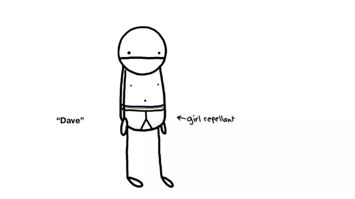
Slide 2 and Slide 3 introduce 'Dave.' Dave is a stick figure wearing worn-out, striped underwear. Slide 3 adds the label 'girl repellant' with an arrow pointing to his waistband. This is a brilliant, if blunt, way to define the problem. It isn't just that men need new socks; it's that their current habits are negatively impacting their social lives. By framing the problem through the lens of dating and self-presentation, Manpacks moves from a 'commodity' service to a 'lifestyle' necessity.
Slides 4-6: The Visual Solution
Slide 4 shows the immediate transformation. Dave is now wearing clean, blue Manpacks-branded underwear. There are no words on this slide because the visual contrast with Slide 3 does the talking. Slide 5 takes the narrative to its logical conclusion, placing the stick-figure Dave between two real-world models in bikinis. It is an aspirational, humorous exaggeration of the product's value proposition.
Slide 6 introduces a key product expansion: 'NOW WITH CONDOMS.' This is a critical slide for investors because it demonstrates an understanding of the 'bundle' economics. Selling just underwear is a low-frequency business; selling a recurring 'pack' of essentials that includes high-margin items like condoms and toiletries increases the average order value (AOV) and makes the subscription more 'sticky.'
Slides 7-8: Why It Works and How It Looks
Slide 7 finally uses bullet points to answer 'Why buy?' The reasons given are 'Limited Time Offers,' 'Discovery of New Products,' and 'Women.' The mention of 'Women' suggests that a portion of their customer base (or a key motivator for their male base) is driven by the preferences of partners. This slide is the closest the deck gets to a traditional 'Value Proposition' slide.
Slide 8 provides a high-fidelity mockup of the user dashboard. This is a 'de-risking' slide. It shows that the product isn't just a concept; it is a functional web application. Investors can see the specific brands being sold (Saxx, Sir Richard's, Mozo) and the pricing ($17 for briefs, $15 for condoms). Crucially, the UI includes 'Snooze' and 'Modify your pack' buttons, which addresses the common investor concern that subscription boxes lead to 'subscription fatigue' and high churn.
Slide 9: Validation and Social Proof
This is arguably the most important slide in the deck. Under the header 'People Love Us,' Manpacks displays six curated tweets from users. This proves organic traction and 'brand love.' Below the tweets are the logos for Inc., Maxim, Thrillist, The New York Times, and NBC . For a pre-seed company, this level of earned media is an incredibly strong signal. It tells investors that the 'story' of Manpacks is already being told by major outlets, which lowers the cost of future customer acquisition.
Slides 10-12: The Team and The Ask
Slide 10 introduces Ken Johnson (CEO) and Andrew Draper (CTO). The slide highlights their 'boots on the ground' experience: Johnson with 8 years in retail management and Draper with 15 years in web development. Below the founders is a row of advisors and investors, most notably Dave McClure of 500 Startups . Having a 'celebrity' investor or advisor on the team slide is a classic way to build instant trust with other angels.
Slide 11 is the 'Ask.' They are raising $500k . The most effective part of this slide is the '70% Committed' graphic. This creates a sense of urgency (FOMO). If an investor likes the deck, they know they have to move quickly because the round is nearly closed. The slide also includes a humorous incentive: 'Invest now & get your next year of underwear free.'
Slide 12 is a repeat of the title slide, serving as a backdrop for Q&A while keeping the contact information visible.
What Works in This Deck
The 'Dave' Narrative: By using a character, the founders avoid the 'death by bullet point' trap. They tell a story that is easy to remember and easy to retell to other partners in a firm. · Extreme Focus: The deck doesn't try to be everything to everyone. It is clearly for a specific demographic of men and the investors who understand that demographic. · Social Proof: The combination of Twitter testimonials and major media logos on Slide 9 provides a 'wall of credibility' that offsets the lack of hard financial data. · Transparency of the Round: Stating that the round is 70% committed is a powerful closer. It shifts the power dynamic from the founder 'asking' for money to the investor 'wanting' to get in before it's too late.
What Is Missing
Unit Economics: There is no mention of Customer Acquisition Cost (CAC) or Lifetime Value (LTV). In the subscription space, these are the only metrics that ultimately matter for long-term viability. · Market Size: While the problem is clear, the scale of the opportunity is never quantified. There is no mention of the total addressable market for men's basics. · Competition: The deck ignores the existence of traditional retailers (Target, Walmart) and emerging D2C competitors. A slide explaining why a man would choose Manpacks over a trip to the local department store would have been valuable. · Financial Projections: There is no 'Roadmap' or 'Use of Funds' slide. Investors are told how much is being raised, but not exactly how that $500k will be spent to reach the next milestone.
What a Founder Should Copy
The 'Snooze' Feature: If you are building a subscription business, show the investor how you handle the 'too much stuff' problem. Slide 8 does this perfectly. · The Credibility Row: If you have notable advisors or early investors, put their logos and faces front and center. It acts as a 'seal of approval' for your business. · Minimalist Design: Notice how few words are on each slide. This forces the presenter to speak and the audience to listen, rather than everyone spending the meeting reading a wall of text. · The Narrative Arc: Start with a relatable character in a bad situation, show the 'magic' of the product, and end with the 'proof' that others are already buying it.
Frequently asked questions
- Why is there no market size slide in the Manpacks deck?
- In 2011, the 'subscription box for X' model was a novel and understood trend. Manpacks likely assumed investors already understood the massive size of the men's apparel and toiletries market. Instead of proving market size, they focused on proving 'market fit' through their specific brand voice and the social proof shown on Slide 9. For a $500k angel round, character and traction often trump TAM calculations.
- Is the use of stick figures and humor appropriate for a professional pitch?
- For a B2C consumer brand, yes. The humor on Slides 3 and 6 demonstrates that the founders understand their customer's psyche. It shows they can build a brand that resonates with men who find shopping for essentials a chore. This 'irreverent' tone was a key differentiator for successful early-2010s startups like Dollar Shave Club and Manpacks.
- How did they raise $500k without showing any financial metrics?
- The deck relies on 'Proxy Credibility.' Slide 10 lists Dave McClure and 500 Startups as part of the team/advisors. When high-profile investors are already committed (Slide 11 shows 70% committed), new investors often focus less on the spreadsheets and more on the momentum and the team's ability to execute, which is highlighted by the founders' long tenure in retail and dev.
- What is the significance of Slide 8 showing a 'Snooze' button?
- Slide 8 is a product mockup that addresses a major hurdle in subscription e-commerce: overstock. By showing 'Modify your pack,' 'Snooze,' and 'Ship Now' options, they demonstrate to investors that they have built a flexible platform that reduces churn by giving users control over their delivery frequency.
- What is the biggest weakness of this deck by modern standards?
- The total lack of unit economics. Today's investors would demand to see the Lifetime Value (LTV) of a subscriber versus the Cost Per Acquisition (CPA). While Slide 9 shows people love the service, it doesn't prove that the business can be profitable at scale. Modern founders should include at least one slide on margins and growth channels.