Maker's Row, the New York marketplace connecting brands with American manufacturers, published a 14-slide pitch deck template in August 2015. It is a blank framework, not a company deck: every slide is an instruction like "Pain point #1" or "Statistic #1". The structure is sound and the brevity coaching is genuinely good, but the template has no traction slide, no milestones slide and no ask slide — a founder who fills it in exactly never states a number they generated or an amount they want.
Key takeaways
- The Maker's Row file is a pitch deck template, not a pitch deck — 14 PowerPoint slides dated 28 August 2015, with instructions in place of content on every slide.
- Its strongest instruction is on slide 2: keep the elevator pitch to one minute and five words if possible, a forcing function most templates never provide.
- The template's "Market Validation" slide asks for third-party industry statistics rather than the founder's own traction data, which is the wrong kind of evidence for an investor meeting.
- There is no traction slide anywhere in the 14-slide structure, so revenue, growth, retention and pipeline have no home in a deck built from it.
- There is no ask slide: the raise appears only as the question "What would you do with any $ if you had the chance?" at the bottom of the financials slide.
- Team is slide 13 of 14, which inverts the real decision hierarchy at pre-seed and seed, where investors are largely underwriting the founders.
- Product appears on slide 7, too late for the physical-product brands that made up the Maker's Row audience — the product should be visible in the first two minutes.
- The template does ask for unit economics, LTV and CAC by name, which was more financially rigorous than most 2015 templates aimed at small consumer brands.
What this deck actually is
This is not a pitch deck. It is a pitch deck template , published by Maker's Row — the New York marketplace that connects apparel and product brands with American manufacturers — and distributed to the founders and small-brand owners in its community. The file is 14 slides, built in PowerPoint 2013, and dated 28 August 2015. Slide 1 says it plainly: the Maker's Row wordmark, and under it, "PITCH DECK TEMPLATE."
Every slide after that is an instruction, not a claim. "Pain point #1. Pain point #2. Pain point #3." "Statistic #1. Statistic #2. Statistic #3." "Name, Title, Contact info." There is no company being pitched here, no traction, no ask, no team. What you are looking at is the skeleton a hardware and consumer-goods marketplace thought its founders should hang their story on in 2015.
That makes it worth tearing down for a different reason than a real deck. A real deck tells you whether one company was fundable. A template tells you what an entire community of founders was being taught to believe about fundraising — which slides matter, in what order, and what counts as evidence. If thousands of small brand owners downloaded this and filled in the blanks, this file shaped a lot of first meetings. So the question is not "would this company get funded." It is: if a founder followed these 14 slides exactly, what deck would come out the other end, and would it survive an investor meeting?
The short answer: they would end up with a structurally sound, well-sequenced deck that is missing the two things investors decide on. We will get to which two.
Slide-by-slide walkthrough
Slide 1 — Cover: "Maker's Row / Pitch Deck Template"
A clean title card. The Maker's Row lockup stacked over the words "PITCH DECK TEMPLATE." Nothing else — no subtitle, no date, no version number, no "how to use this" note.
Worth noticing what is not here, because it is the first thing a founder using the template will copy: there is no slot for the company name, the one-line descriptor, the round, or the date. A real cover slide does four jobs in four seconds — who you are, what you do, what stage, when. This template teaches founders that the cover is decoration. It is not. It is the slide that is on screen while people find their seats and open their laptops, and it is the slide that gets screenshotted into an email forward.
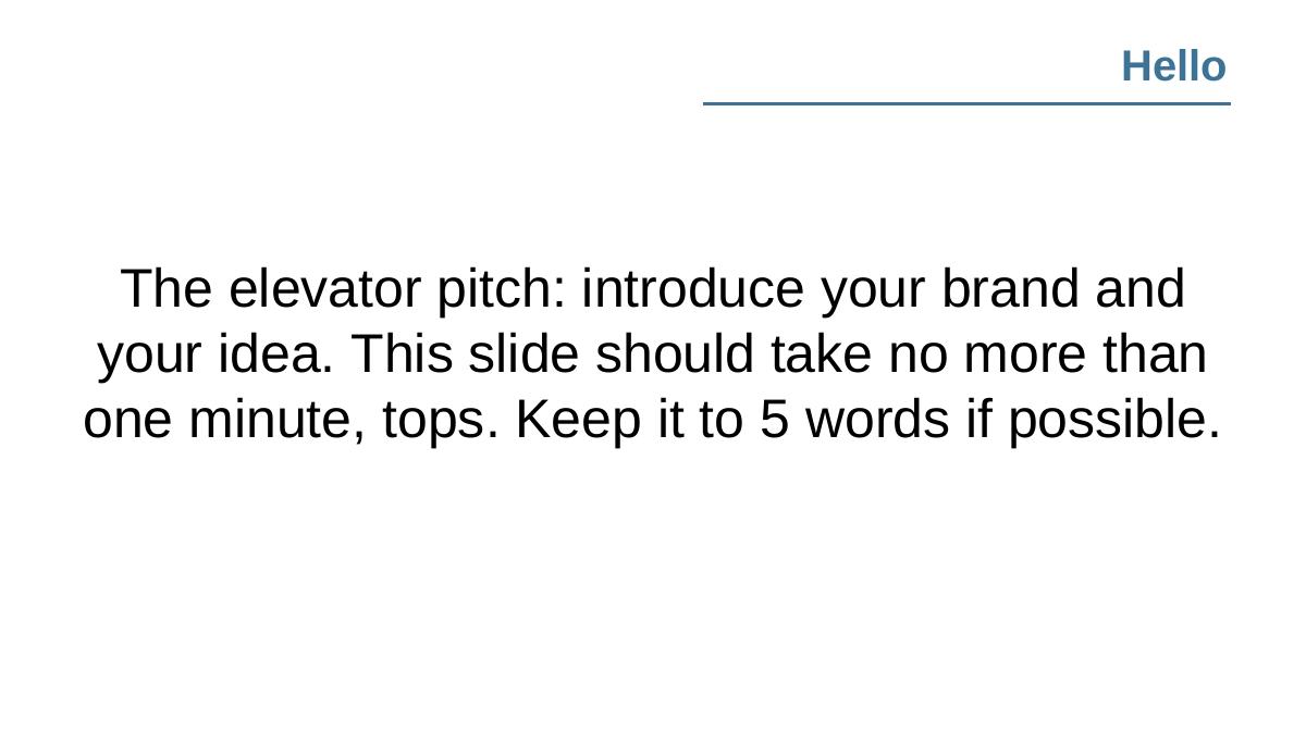
Slide 2 — "Hello"
The instruction: "The elevator pitch: introduce your brand and your idea. This slide should take no more than one minute, tops. Keep it to 5 words if possible."
This is the best advice in the file, and it is on slide 2 where it belongs. Two things are right about it. First, it gives a time budget, not just a topic — one minute — which is the constraint most founders violate. Second, "keep it to 5 words if possible" is an aggressive, useful forcing function. Founders who cannot compress their company into five words usually cannot compress it into fifty either, and the five-word attempt exposes that in the rehearsal room instead of in the meeting.
The weakness is the word "Hello." A slide titled "Hello" invites a founder to write a greeting rather than a claim. The strongest version of this slide is not a hello — it is a sentence a listener could repeat accurately to a colleague an hour later.
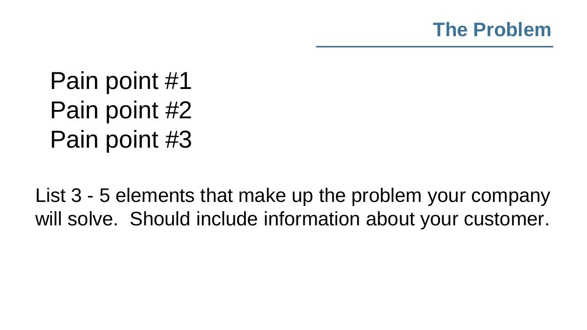
Slide 3 — "The Problem"
Structure: three bullets — Pain point #1, #2, #3 — with the note, "List 3 – 5 elements that make up the problem your company will solve. Should include information about your customer."
The "should include information about your customer" clause is the part most templates omit, and it is the part that separates a problem slide from a complaint slide. A problem without a named sufferer is a market observation. "Independent apparel brands cannot find domestic factories that will take runs under 500 units" is a problem. "Manufacturing is broken" is a mood.
The flaw is the range: 3 to 5 pain points. Five problems is not a problem slide, it is a list of grievances, and it dilutes the one pain the company is actually organised around. Investors buy one problem. A deck that presents five is telling them the founder has not decided yet.
Slide 4 — "How we'll fix it"
Solution #1, #2, #3, with: "Solutions should be kept brief — after all, why would anyone invest in a company that can't summarise its purpose in a matter of seconds?"
The brevity instruction is right and the symmetry with slide 3 is right — three problems, three solutions, mapped one to one, is a clean rhetorical structure that reads fast. The template deserves credit for enforcing the pairing implicitly.
What is missing is the word why . This slide asks the founder what they built, never why that particular solution beats the obvious alternatives, and never why the customer would change behaviour to adopt it. Plenty of decks die here: the solution is plausible, and nobody in the room believes anyone would switch to it.
Slide 5 — "Market Validation"
Statistic #1, #2, #3, with: "Choose the most crucial data that backs up your claims and intentions — while it can be tempting to go into as much detail as possible, brevity will make strengthen the impact of your data." (The typo is in the original file.)
This is the most consequential slide in the template, and it is mis-taught. "Market validation" here means third-party statistics — industry reports, category growth numbers, survey data. Notice the framing: data that "backs up your claims and intentions." That is validation of the thesis, not of the company.
Real market validation is your data: signups, waitlist conversion, repeat purchase, retention curves, letters of intent, paying pilots. A founder who follows this slide literally will fill it with three impressive-sounding industry statistics and never show a single number they generated themselves. In a 2015 seed meeting that might survive. In any meeting since, it will not.
Slide 6 — "Market Size"
The instruction: "This is where you discuss the market size: will it be worth the investors' while (and money)? Demonstrate that the market is big enough to necessitate funding."
Accurate framing of the investor's question, and honest about why the slide exists: venture money requires a large outcome, so the market must be able to contain one. But the template offers no method. No TAM/SAM/SOM structure, no bottom-up instruction, no warning against the single most common failure on this slide — quoting a giant top-down industry figure the company could never plausibly address.
The one line that would have fixed this slide: "Build this number from units and price, not from a research firm's headline." It is not here, and its absence is exactly why so many founder decks in this era opened market size with a $200 billion number and closed it with no credibility.
Slide 7 — "The Product"
"Describe the core functions of the product. Include images if possible, prototypes, illustrations, etc."
Reasonable, and the "images if possible" cue matters for the Maker's Row audience specifically — physical product brands whose deck is often stronger as photographs than as prose. For a hardware or apparel company, one clean product shot outperforms a paragraph.
The problem is placement. The product arrives on slide 7 of 14, after two full slides of market argument. For a product-led company — which describes almost every brand in the Maker's Row community — the thing itself should appear no later than slide 4. Investors form an opinion of a physical product in about two seconds, and delaying that moment does not build suspense, it builds impatience.
Slide 8 — "The Business Model"
"Discuss your chosen business model, and address why it's right for your brand."
One sentence for the single slide most founders get wrong. There is no prompt for price, margin, channel, order value, or repeat rate. "Why it's right for your brand" is a qualitative question; investors are asking a quantitative one: what do you charge, what does it cost you, and what is left over.
For a consumer-goods audience this is a real miss. Gross margin is the number that determines whether a product brand is a venture business or a good small business, and this template never asks for it.
Slide 9 — "Market Adoption"
Three questions: "How will you foster the use of your product? How much will it cost? How will your product have an edge on the competition? This is crucial, as investors will want to know how you plan to share your product with a large audience."
This is the go-to-market slide under a softer name, and "how much will it cost" is the sharpest question in the entire template — it is customer acquisition cost, asked in plain language a first-time founder will actually answer. Most templates from this period skipped acquisition cost entirely.
Two flaws. It bundles a competitive-edge question into a distribution slide, which encourages hand-waving on both. And it asks for a plan without asking for evidence: no prompt for the channels already tested, the cost per acquisition observed, or the conversion rate measured. Plans are free. Tested channels are not.
Slide 10 — "Competition"
"You can acknowledge your competition — and the niche you fill — with a competitor analysis positioning matrix."
Note the verb: "You can acknowledge your competition." Not "you must map." The permissive framing is a tell for how the competition slide was treated in 2015 — an optional courtesy rather than a diligence requirement.
The recommended format, a 2x2 positioning matrix, is also the format most likely to produce a dishonest slide. Founders pick the two axes on which they win, place themselves in the top right, and scatter competitors elsewhere. Experienced investors read that matrix backwards: they look at the axes chosen and ask what got left out. A feature comparison table with honest checkmarks, including places where the incumbent is better, does more for credibility than any quadrant.
Slide 11 — "Competitive Advantages"
"For the money you're asking for, you can't just shake up your industry in the short term. Here, outline the longevity and endurance of your brand by noting long-term competitive advantages."
This is a moat slide, and separating it from the competition slide is a defensible choice — competitors are today, moat is five years out. The language of "longevity and endurance" points at durability rather than novelty, which is the right instinct.
But "long-term competitive advantages" is left completely undefined. There is no list of the things that actually compound: proprietary supply relationships, exclusive manufacturing capacity, brand, data, switching costs, network effects, regulatory position. For a Maker's Row audience, the honest answer is often supply-side exclusivity — and nothing in the template surfaces that.
Slide 12 — "Financial Rundown"
"Here, you can include info such as: Unit Economics, LTV, CAC. What would you do with any $ if you had the chance?"
Unit economics, lifetime value and acquisition cost is the correct short list, and asking for them in 2015 from a community of apparel and product founders was genuinely ahead of the average template of its era.
Then the slide collapses. "What would you do with any $ if you had the chance?" is the ask and the use of funds — the reason the meeting exists — reduced to a hypothetical afterthought at the bottom of a financials slide. There is no prompt for the amount raised, the round type, the runway it buys, the milestones it funds, or the revenue forecast. A founder who fills in this template exactly will leave the room having never said a number they want.
This is the template's single largest failure, and it is worth being precise about why: an ask is not a request for money, it is a statement of a plan. "We are raising $1.5M to reach $X in monthly revenue across Y accounts in 18 months" tells an investor how the founder thinks. "What would you do with any $" tells them nothing.
Slide 13 — "Team"
"This slide should be all about the founders: Why are you qualified? Are you an award-winning designer? What is your insight? Why should someone invest in you and your vision?"
"What is your insight?" is the best question on this slide and one of the best in the deck — founder-market fit expressed as a question rather than a résumé line. The "award-winning designer" example is a direct read on the audience: Maker's Row served fashion and product designers, and the template speaks their language.
The placement is the problem. Team is slide 13 of 14, arriving after every argument has been made. At pre-seed and seed, the team is frequently the decision, not the footnote — most investors at that stage are underwriting people because there is not yet enough business to underwrite. Team belongs in the first four slides, or at minimum immediately after the solution.
Slide 14 — "Thank You!"
A closing slide with contact details is correct and frequently forgotten, so credit where it is due. But the final slide is prime real estate and a thank-you wastes it. The strongest last slide restates the ask and the single most important number, with contact details underneath — because it is the slide that stays on screen through the entire Q&A, which is where most of the actual conversation happens.
What this deck does better than most startup pitch decks
It gives time budgets, not just topics. "No more than one minute, tops" on the opening slide is the kind of constraint that changes behaviour. Most templates tell you what to cover and never tell you how long you get. · It forces brevity repeatedly. Three separate slides push compression — five words if possible, keep solutions brief, brevity strengthens data. For an audience prone to over-explaining a craft product, that repetition is deliberate and useful. · It ties the problem to a named customer. "Should include information about your customer" is a small clause that prevents the most common problem-slide failure: describing an industry irritation with no sufferer attached. · It asks for acquisition cost in plain English. "How much will it cost?" gets a first-time founder to CAC without the acronym, and it sits in the distribution slide where the answer actually lives. · It names unit economics, LTV and CAC explicitly. In a 2015 template aimed at small consumer-product brands, that is a more rigorous financial prompt than most generic decks of the period offered. · It separates competitors from durable advantage. Two distinct slides — who you are up against now, and why you still win in five years — is a structure many founders never build on their own. · It asks "what is your insight?" on the team slide, which reframes team from credentials to earned perspective. That is the right question, even if it is on the wrong slide number. · It ends with contact information. Trivially easy, routinely skipped, and it is how the follow-up email gets sent.
Where this deck would fail in an investor meeting
There is no ask slide. The amount, round, valuation expectation, runway and use of funds appear nowhere except as "what would you do with any $ if you had the chance?" A founder following this template exactly never states a number. · There is no traction slide. Revenue, growth, customers, retention, pipeline, pilots — none of it has a home. "Market Validation" points at third-party statistics instead, so a company with real numbers has nowhere to put them. · Team is slide 13 of 14. At the stage this template targets, that ordering inverts the actual decision hierarchy. · Product appears on slide 7. For physical-product founders — the exact audience — the product should be visible in the first two minutes. · No milestones or timeline. Nothing asks what happens in the next 12 to 18 months, which is the horizon the money is being raised against. · The business model slide asks no numbers. No price, no gross margin, no order value, no repeat rate — for a consumer-goods brand, margin is the whole conversation. · Competition is optional. "You can acknowledge your competition" invites the founder to skip it, and the recommended 2x2 rewards flattering axis selection. · Market size has no method. No bottom-up instruction, no warning against top-down industry headlines, so the slide defaults to the least credible version of itself. · 14 slides with no appendix guidance. Nothing tells the founder where the detailed financials, cohort data, or supply chain specifics go when an investor asks — which they will.
Template structure vs. what a funded seed deck actually contains
Section Maker's Row template (2015) Seed deck that gets a second meeting
Cover Title only, no company/stage fields Company, one-line descriptor, stage, date
Opening "Hello" — elevator pitch, 5 words Same, plus the single headline metric
Problem 3–5 pain points, customer named One problem, one customer, quantified cost of it
Solution 3 brief solutions Solution plus why the customer switches
Product Slide 7, images encouraged Slide 3–4, shown before it is explained
Traction Absent — "market validation" uses third-party stats Own data: revenue, growth rate, retention, pipeline
Market size Discussed, no method Bottom-up: units x price, with the assumption shown
Business model Qualitative, "why it's right" Price, gross margin, order value, repeat rate
Go-to-market Plan plus cost question Channels tested, CAC observed, payback period
Competition Optional 2x2 matrix Honest feature table, incumbents included
Moat "Longevity and endurance", undefined Named mechanism: supply, data, brand, switching cost
Financials Unit economics, LTV, CAC Same, plus 18–24 month forecast and assumptions
Team Slide 13, credentials plus insight Slide 4–5, founder-market fit made explicit
The ask Absent (a hypothetical question) Amount, use of funds, milestones it buys
Close "Thank you" plus contact Ask restated, headline metric, contact
How you would rebuild this template into a deck that raises
Add an ask slide and give it a number. Amount, round, what it funds, what milestone it reaches. Put it at slide 12 and restate it on the final slide. This is the single change that does the most work. · Split "Market Validation" into two slides. One for the market thesis using third-party data, one for your traction using only numbers you generated. If you have no traction, say so on the slide and show the pilot or waitlist instead of hiding behind industry statistics. · Move team to slide 4. Keep the "what is your insight?" prompt — it is the best question in the file — and answer it in one sentence per founder, tied to why this company and not another. · Move product to slide 3 for physical goods. Photograph first, explanation second. If the product is real, showing it early buys you attention for everything after. · Put numbers in the business model slide. Price, unit cost, gross margin, average order value, repeat rate. Five numbers, one slide. · Force market size bottom-up. Replace "discuss the market size" with "units x price = your number, and show the assumption behind each." Keep the top-down figure as a footnote, if at all. · Make competition mandatory and honest. Swap the 2x2 for a comparison table that includes at least one row where a competitor beats you, and one line on why that does not matter yet. · Define the moat with a named mechanism. Not "longevity and endurance" — pick one of supply exclusivity, proprietary data, brand, switching costs, network effects, or regulatory position, and defend that one. · Add a milestones slide. What the next 18 months produce, in three or four dated checkpoints. It converts the ask from a request into a plan. · Add an appendix. Detailed financials, cohorts, supply chain, unit-level breakdowns. Keep the main deck at 14 slides and let the appendix absorb the diligence questions.
The transferable lesson
A template is a hypothesis about what matters. This one, published to a community of American product founders in 2015, got the sequencing of the story mostly right and the evidence entirely wrong. It has a slide for every argument and no slide for a single fact about the company doing the arguing — no traction, no revenue, no milestones, and no ask. Fill it in perfectly and you produce a deck that is well-structured, easy to follow, and impossible to say yes to.
That failure mode did not disappear with the template. It is the most common pattern in decks reviewed today: a founder builds a beautiful narrative arc, then puts nothing underneath it that an investor can verify or act on. The structure passes. The substance is missing. And because the structure feels finished, the founder never notices the hole.
The fix is unglamorous. Go through your deck slide by slide and ask, for each one: what fact on this slide did I generate? If the honest answer for most slides is "none — this is an argument, not evidence," you have a template deck, whatever it looks like. Then find the ask. If a stranger could read your entire deck and not know how much you are raising or what it buys, the deck is not finished, no matter how many slides it has.
Frequently asked questions
- Is the Maker's Row pitch deck a real investor deck?
- No. The file is a pitch deck template published by Maker's Row, the marketplace that connects brands with American manufacturers. Slide 1 says "PITCH DECK TEMPLATE" under the Maker's Row wordmark, and every subsequent slide contains placeholder instructions such as "Pain point #1" and "Statistic #1" rather than any company's actual data, traction or funding ask.
- What is Maker's Row?
- Maker's Row is a New York-based online marketplace that connects apparel, accessory and consumer-product brands with manufacturers and factories in the United States. Founded in 2012, it built a large community of small brand owners and independent designers, and published educational resources — including this 2015 pitch deck template — to help those founders raise money and grow.
- How many slides are in the Maker's Row pitch deck template?
- Fourteen. The sequence is: cover, Hello (elevator pitch), The Problem, How we'll fix it, Market Validation, Market Size, The Product, The Business Model, Market Adoption, Competition, Competitive Advantages, Financial Rundown, Team, and a Thank You slide with contact details. The file was created in PowerPoint 2013 and dated 28 August 2015.
- What is missing from the Maker's Row pitch deck template?
- Three things investors decide on. There is no traction slide, so a company's own revenue, growth and retention numbers have nowhere to live. There is no milestones or timeline slide. And there is no ask slide — the raise appears only as a hypothetical question tacked onto the financials slide, so the amount, use of funds and runway are never stated.
- Which slides from this template should founders copy?
- Copy the one-minute, five-word elevator pitch constraint on slide 2, the instruction to name the customer inside the problem slide, the plain-English acquisition cost question on the Market Adoption slide, the explicit request for unit economics, LTV and CAC, and the team prompt "What is your insight?" — which reframes team from résumé to earned perspective.
- Is a 2015 pitch deck template still useful today?
- As a story skeleton, partly — the problem, solution, market, model, competition, team arc has not changed. As a complete framework, no. Modern seed decks lead with product and team, prove the market with the founder's own data rather than industry statistics, build market size bottom-up, and always close on an explicit ask with the milestones it funds.