Obie.ai’s 2017 Seed deck is a masterclass in 'less is more' visual storytelling. Spanning only 9 slides, the deck avoids dense text blocks in favor of iconography and interface mockups. It identifies a clear pain point—the overwhelming number of SaaS tools causing information silos—and presents a solution that requires 'no more software' by living inside existing chat tools like Slack. While the deck lacks traditional financial projections, a business model, or a specific 'Ask' slide, it leans heavily on its Y Combinator pedigree and a 30% month-over-month growth rate to build credibility. Th…
Key takeaways
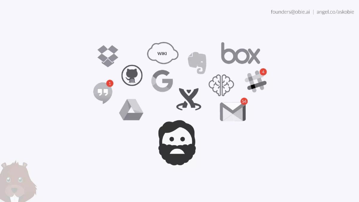
- The deck identifies the 'SaaS sprawl' problem using icons for 12 different platforms including Dropbox, Google Drive, and GitHub on Slide 2.
- Obie.ai positions itself as a frictionless layer with the phrase 'No more software' on Slide 3, emphasizing that it integrates into existing workflows.
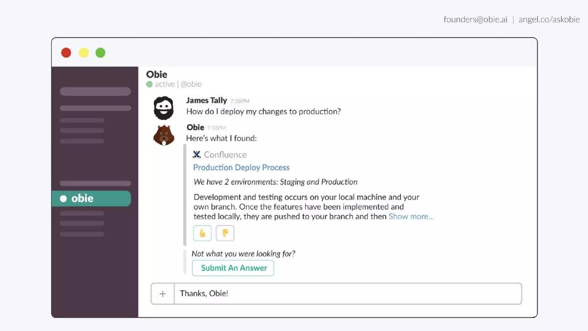
- The product is demonstrated through a Slack interface mockup on Slide 5, showing a direct answer sourced from Confluence.
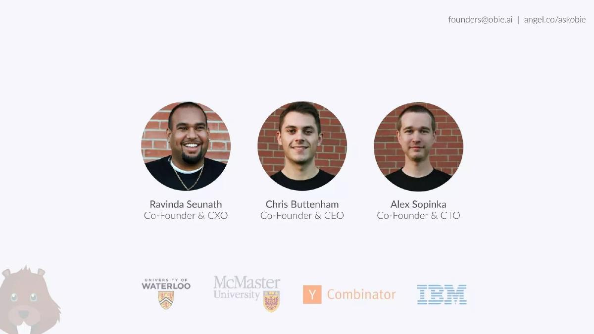
- The founding team highlights strong institutional backing with logos for Y Combinator and IBM on Slide 6.
- Traction is represented by a single growth curve showing an increase from 100 to 1,600 teams between June 2016 and April 2017 (Slide 7).
- The company claims a 30% Month-over-Month (MoM) growth rate as of April 2017 (Slide 7).
- Social proof is established on Slide 8 through logos of recognizable customers like Shutterfly, Mercer, and Soylent.
- The deck completely omits a business model, market size analysis (TAM/SAM/SOM), and a specific funding request.
The Obie.ai Pitch Deck: Minimalist Visual Storytelling
Obie.ai (now part of Lessonly/Seismic) produced a 9-slide deck for its 2017 Seed round that serves as a case study in minimalist design. At a time when AI startups were often bogged down by technical jargon and complex architectural diagrams, Obie.ai chose to focus on the user experience and the sheer volume of integrations. The deck is light on text, heavy on iconography, and relies on the viewer to connect the dots between the problem of information silos and the solution of a centralized bot.
The Problem and The Friction (Slides 1-3)
Slide 1: Title The deck opens with the company logo—a cartoon beaver—and the URL obie.ai. The contact information (founders@obie.ai and an AngelList link) is placed in the top right corner. There is no tagline or mission statement on the cover, which is a bold choice that assumes the following slides will do the heavy lifting.
Slide 2: The Information Silo Problem Slide 2 uses a visual metaphor to describe the current state of work. A central 'worried' avatar is surrounded by a cloud of 12 different software logos, including Dropbox, Google Drive, GitHub, Evernote, Box, Slack, and Gmail. Several icons show notification badges (e.g., 54 unread emails, 4 Slack notifications). This slide effectively communicates 'SaaS sprawl' without using a single word of text. It illustrates the cognitive load placed on employees who must search across a dozen platforms to find information.
Slide 3: The Counter-Intuitive Solution Slide 3 contains only three words: "No more software," accompanied by a red 'no entry' sign. This is the core of the Obie.ai pitch. In an era where companies were overwhelmed by new tools, Obie.ai positioned itself as the 'anti-software' software. It promises to solve the problem without adding another destination for the employee to visit.
The Product and Integration Strategy (Slides 4-5)
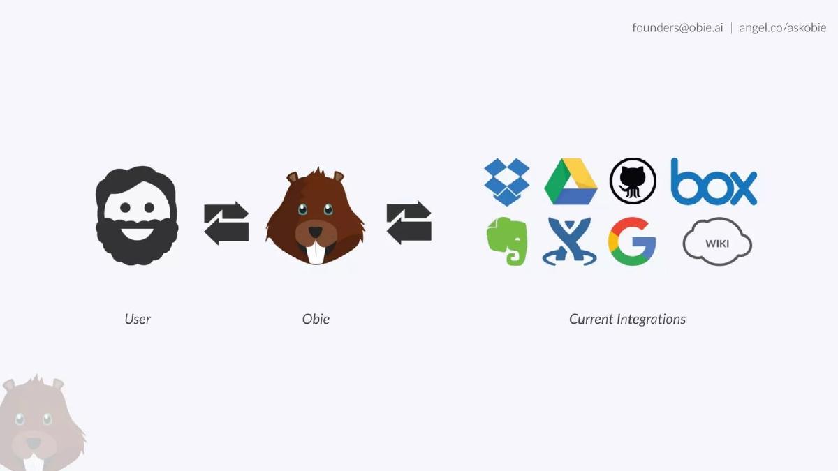
Slide 4: The Middleware Concept This slide visualizes the product architecture. It shows a 'User' on the left, the 'Obie' beaver in the center, and 'Current Integrations' on the right. Double-sided arrows indicate that Obie acts as the bidirectional bridge between the human and the data silos (Dropbox, Drive, GitHub, Box, Evernote, Confluence, Google, and Wiki). This slide clarifies that Obie is a retrieval layer, not a storage layer.
Slide 5: The User Experience (UX) Slide 5 provides a mockup of the product in action within a Slack interface. A user named James Tally asks, "How do I deploy my changes to production?" Obie responds instantly with a snippet from Confluence titled "Production Deploy Process." The mockup includes interactive elements like 'thumbs up/down' for feedback and a 'Submit An Answer' button. This slide is critical because it proves the 'No more software' claim—the user gets their answer exactly where they asked the question.
Team, Traction, and Social Proof (Slides 6-9)
Slide 6: The Founders The team slide features the three co-founders: Ravinda Seunath (CXO), Chris Buttenham (CEO), and Alex Sopinka (CTO). Rather than listing long resumes, the slide uses four logos for institutional credibility: University of Waterloo, McMaster University, Y Combinator, and IBM. The Y Combinator logo is particularly important here, as it serves as a proxy for quality and potential in the eyes of seed investors.
Slide 7: Traction and Growth This is the most data-dense slide in the deck, yet it remains simple. It shows a growth curve from June 2016 to April 2017. The headline figures are "1600 Teams" and "30% MoM Growth." The Y-axis starts at 100 and ends at 1600. This slide provides the 'why now' for investors, showing that the product has moved past the experimental phase and is seeing consistent, compounding adoption.
Slide 8: Customer Logos To validate the traction, Slide 8 displays a logo wall of customers. The logos include Mercer (a large global consultancy), Shutterfly, SweetIQ, ShopKeep, Sift Science, Soylent, and Envato. The diversity of these companies—ranging from enterprise consulting to consumer food products—suggests that the problem of internal knowledge management is not limited to a specific niche.
Slide 9: The Closing The final slide shows the team in an office setting, overlaid with the CEO's name and the company URL. It serves as a 'thank you' slide while keeping the focus on the human element of the startup. Notably, there is no 'Ask' here—no mention of the $766,900,000 raised (as per catalogue facts) or the specific terms of the round.
What Works in the Obie.ai Deck
1. Extreme Clarity of Purpose: By Slide 3, the investor knows exactly what the product does and, more importantly, what it doesn't do (it doesn't require a new UI). The 'No more software' hook is a powerful psychological trigger for enterprise investors who know how hard it is to get employees to adopt new tools.
2. Visual Proof of Integration: Slide 4 and Slide 5 work together to show that the product is already functional and integrated with the most common enterprise tools. By showing a real-world Slack interaction, the founders move the conversation from 'what if' to 'how it works.'
3. Momentum-Focused Traction: The 30% month-over-month growth figure on Slide 7 is the 'gold standard' for early-stage startups. By highlighting this specific metric, the founders demonstrate that they have found a repeatable way to acquire teams.
What is Missing from the Obie.ai Deck
1. The Business Model: There is no mention of how Obie.ai makes money. Is it per seat, per integration, or a flat monthly fee? Investors need to know if the 1,600 teams are paying customers or free users, as the valuation of the company depends heavily on this distinction.
2. Market Size (TAM): The deck assumes the investor already understands that knowledge management is a massive problem. While this may be true, a slide showing the Total Addressable Market (TAM) would help justify a larger valuation by showing the scale of the opportunity.
3. Competitive Landscape: Obie.ai was not the only bot in the Slack ecosystem in 2017. The deck fails to mention competitors or explain why their AI/retrieval engine is superior to native search functions within Slack or Google Drive.
4. The Ask: A pitch deck is a fundraising tool. Omitting the amount being raised, the intended use of funds, and the milestones the team hopes to reach with that capital is a significant gap. While this information is often shared in the verbal pitch, its absence in the deck makes it less effective as a standalone document.
What a Founder Should Copy
1. The 'Problem' Iconography: Slide 2 is a perfect example of how to show a problem without writing a paragraph. Founders should look for ways to use recognizable logos and symbols to illustrate the 'chaos' their product solves.
2. The Integration Slide: If your product relies on an ecosystem, Slide 4 is a great template. It clearly shows the product as the 'brain' or 'bridge' between the user and their existing data. It makes the product feel essential rather than optional.
3. Minimalist Design: The consistent use of whitespace and a limited color palette makes this deck very easy to digest in under two minutes. Founders should aim for this level of brevity, especially for a first-look deck intended to secure a meeting.
Final Analysis
The Obie.ai deck is a high-signal, low-noise presentation. It relies on the strength of its traction and the pedigree of Y Combinator to fill in the blanks left by the missing financial and market data. For a Seed round, where the goal is to sell the vision and the initial momentum, this minimalist approach is highly effective. However, for a Series A, the company would have needed to significantly expand on its unit economics and competitive defensibility.
Frequently asked questions
- What is the primary value proposition of Obie.ai according to the deck?
- The primary value proposition is reducing the friction of internal knowledge retrieval. By integrating with tools like Slack, Obie.ai allows users to ask questions and receive answers sourced from various silos (Google Drive, Confluence, etc.) without leaving their primary communication tool. The deck summarizes this as 'No more software,' implying that Obie.ai is an invisible utility rather than a new destination for employees.
- How does the deck demonstrate product-market fit?
- The deck uses a traction slide (Slide 7) showing a growth curve from 100 teams in June 2016 to 1,600 teams in April 2017. This represents a 16x increase in user base over ten months. Combined with the 30% month-over-month growth metric and a logo wall featuring diverse companies like Mercer and Soylent, the founders aim to prove that the demand for centralized knowledge access is universal across industries.
- Why is the 'No more software' claim significant on Slide 3?
- In 2017, 'SaaS fatigue' was becoming a major concern for IT departments. By stating 'No more software,' Obie.ai addresses the objection that companies don't want to manage another login or dashboard. It positions the AI as a bot that lives within Slack, making adoption easier because it requires no change in user behavior and no new interface for employees to learn.
- What are the most notable omissions in this pitch deck?
- The deck is missing several standard venture capital components: a business model (how they make money), a competitive landscape analysis, a market size slide (TAM), and a specific 'Ask' slide detailing how much capital they are raising and what the milestones will be. It relies almost entirely on the momentum of its user growth and the strength of the Y Combinator brand to carry the narrative.
- How does the team slide build investor confidence?
- Slide 6 uses high-authority logos to compensate for a lack of detailed bios. By featuring the Y Combinator logo, the team signals they have passed a rigorous vetting process. The inclusion of the IBM logo suggests technical experience in enterprise software, while the University of Waterloo and McMaster University logos point to a strong technical and academic foundation in a known Canadian tech hub.