Orderly Health raised $2.2 million in 2015 using a 12-slide deck that defied traditional pitch deck norms. Rather than dense paragraphs explaining healthcare interoperability, the deck relies on large-scale iconography and screenshots to demonstrate a conversational interface for medical data. The narrative moves quickly from the 'black box' of healthcare costs (Slide 2) to a massive $40 billion market opportunity (Slide 10). The deck's strength lies in its comparative data, claiming a 4x increase in activation and a 25x increase in engagement over existing solutions (Slide 8). While it lacks…
Key takeaways
- The deck uses a 'show, don't tell' approach, dedicating four slides (Slides 4-7) to visual platform demonstrations without descriptive text.
- Orderly Health identifies a $40 billion market opportunity focused on plan design, cost control, and treatment on Slide 10.
- The company reports a significant traction milestone of $200,000 in Annual Recurring Revenue (ARR) on Slide 9.
- Engagement metrics are a core highlight, with the platform claiming 25% engagement compared to 1% for existing solutions on Slide 8.
- The team slide (Slide 11) establishes high founder authority with logos from Kaiser Permanente, EA, Duke, and Stanford Business.
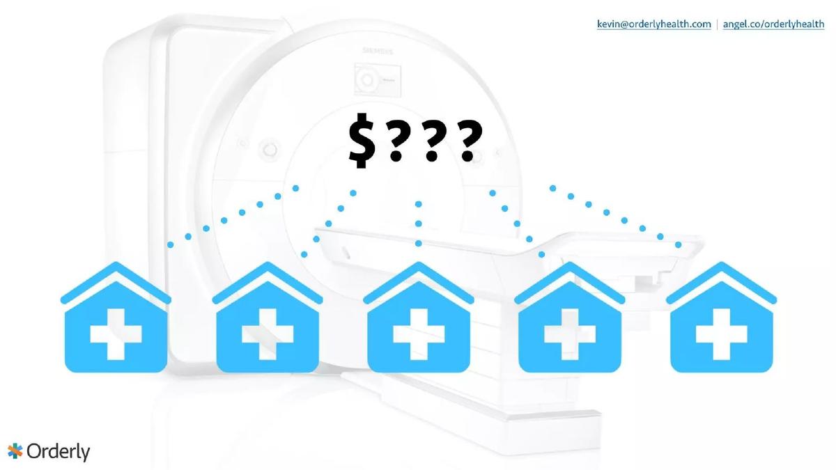
- The problem is visually framed as an information gap between patients and providers using a 'price tag' question mark on Slide 2.
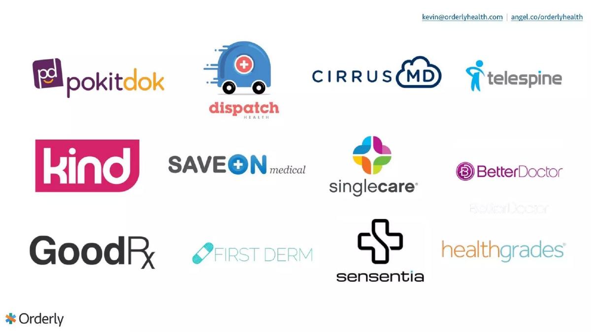
- The deck omits a traditional competition slide, instead showing a logo cloud of partners or ecosystem players on Slide 3.
- There is no explicit 'Ask' slide detailing how much capital is being raised or the intended use of funds within the 12 slides.
The Power of Visual Narrative in Healthcare
The Orderly Health pitch deck from 2015 is a striking example of minimalist design. In an industry as notoriously complex as healthcare data management, most founders feel the urge to over-explain. They use dense diagrams of HL7 feeds, HIPAA compliance checklists, and intricate payer-provider relationship maps. Orderly Health took the opposite path. With only 12 slides and fewer than 100 words of total text across the entire presentation, they let their metrics and their interface do the talking.
This teardown examines how a company can raise $2.2 million by focusing on a single core narrative: healthcare data is broken, and we have the engagement numbers to prove we fixed the interface for it.
The Hook: The Information Gap (Slides 1-3)
Slide 1: Title The deck opens with a clean, high-contrast logo. No tagline, no 'Uber for X' description. It establishes a professional, modern brand identity from the first second.
Slide 2: The Problem Instead of a slide titled 'The Problem' with five bullet points about price transparency, Orderly uses a single image. A Siemens MRI machine is shown in the background, with five blue hospital icons in the foreground. Above them sits a large '$???' graphic. This is a visceral representation of the consumer experience in healthcare: you know you need the service, you see the providers, but you have no idea what it will cost. It is an elegant way to frame the 'black box' of healthcare pricing without using a single word of jargon.
Slide 3: The Ecosystem This slide features a logo cloud including GoodRx, Healthgrades, BetterDoctor, PokitDok, and others. In many decks, this would be a 'Competition' slide. Here, it serves more as a 'Market Context' slide. It shows that Orderly is operating in a crowded, well-funded space, implying that while these companies exist, the problem illustrated on Slide 2 remains unsolved. It positions Orderly among peers rather than in a vacuum.
The Solution: Ubiquitous Access (Slides 4-7)
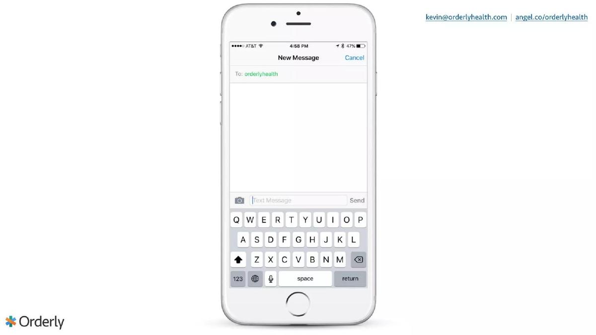
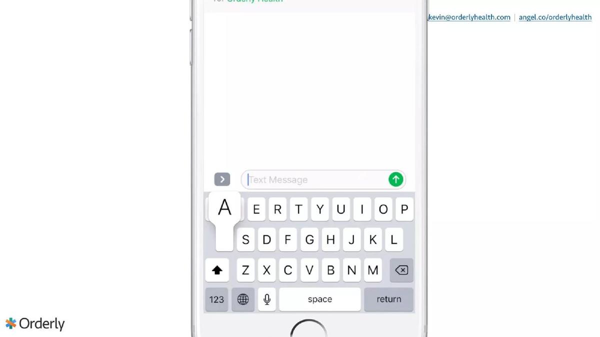
Slide 4 & 5: The Interface These slides are pure product demonstration. Slide 4 shows a blank iPhone message screen addressed to 'orderlyhealth.' Slide 5 shows a close-up of the keyboard. This sequence emphasizes the simplicity of the user experience. By choosing SMS as the primary demonstration medium, Orderly signals that their solution requires zero 'app fatigue'—users don't need to download a new portal; they just need to text.
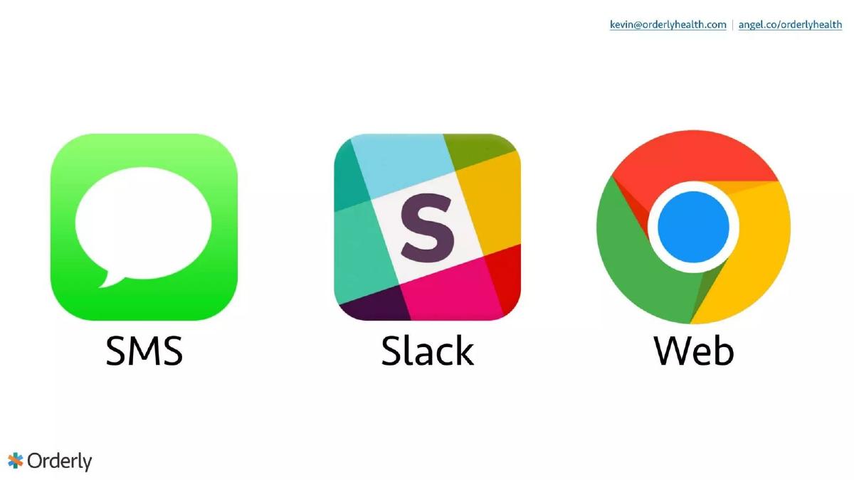
Slide 6: Multi-Channel Strategy Orderly expands the solution beyond SMS. This slide features the icons for SMS, Slack, and Google Chrome (Web). This communicates that Orderly is an API-first platform (as noted in their catalogue description) that can live wherever the user is. For an enterprise buyer, this suggests easy integration into existing workflows.
Slide 7: Future-Proofing with Voice and Social The narrative moves toward the 'cutting edge' of 2015. Icons for WeChat, Android, Facebook Messenger, and Apple are overlaid on images of an Amazon Echo and a Google Home. This slide tells investors that Orderly isn't just a chatbot; it is a conversational data layer capable of powering the next generation of hardware and software interfaces. It moves the company from a 'tool' to a 'platform.'
The Proof: Traction and Market Size (Slides 8-10)
Slide 8: Comparative Metrics This is arguably the most important slide in the deck. It presents a simple table comparing 'Existing Solutions' to 'Orderly.' Activation Rate jumps from 10% to 40% (a 4x increase ). Engagement jumps from 1% to 25% (a 25x increase ). In healthcare, where patient engagement is the 'holy grail' for insurers and employers, a 25% engagement rate is an extraordinary claim. By putting these numbers in large, bold font, Orderly forces the investor to ask: 'How are you doing this?' rather than 'What do you do?'
Slide 9: Revenue Traction The deck hits another high note with a single figure: $200,000 ARR . This slide validates that the product isn't just a cool demo; people are paying for it. The background image of a handshake reinforces the B2B nature of their revenue. For a 2015 seed-stage company, $200k ARR is a very strong signal of product-market fit.
Slide 10: Market Opportunity Orderly quantifies the prize. They claim a $40B Market Opportunity . They break this down into three pillars: Plan Design, Cost Control, and Treatment . This slide connects the simple SMS interface shown earlier to the massive economic levers of the healthcare industry. It suggests that by solving the 'interface' problem, they can capture value across the entire healthcare spend spectrum.
The Pedigree: Team and Closing (Slides 11-12)
Slide 11: The Team The team slide is heavy on institutional credibility. Kevin Krauth (CEO) is backed by logos from EA, Kaiser Permanente, and Duke. James Dickhoner, MD , brings the clinical weight of Cincinnati Children's and the business acumen of Stanford Business (Ignite). The supporting team of Zoë Adelman, Márcio Porto, and Jesse Roux rounds out the design and engineering talent. This slide answers the 'Why you?' question by showing a mix of consumer UX experience (EA) and deep healthcare system knowledge (Kaiser).
Slide 12: Contact The final slide returns to the conversational theme, showing a mock-up of a text conversation with an investor. It provides a Twitter handle, an AngelList link, and a 'founders@' email address. It is a consistent, branded end to a very tight presentation.
What Works in This Deck
1. Extreme Clarity: The deck is devoid of 'fluff.' Every slide has a single, clear purpose. By removing the distraction of long paragraphs, the founders ensure that the investor's eyes land exactly where they want: on the 25x engagement increase and the $200k ARR.
2. Metric-Driven Narrative: The jump from the problem (Slide 2) to the solution (Slides 4-7) is bridged by the data on Slide 8. The deck doesn't ask you to believe the solution is better; it shows you the data that proves it is better.
3. Visual Consistency: The use of white space, consistent iconography, and a limited color palette makes the company look more mature than a typical early-stage startup. It suggests a high level of attention to detail, which is a proxy for product quality in the eyes of an investor.
What Is Missing
1. The 'How' (Technical Architecture): While the deck mentions 'machine learning and artificial intelligence' in its self-description, there is no slide explaining the data engine. Investors in the 'Later' stage (as categorized) usually want to see how the data is ingested, cleaned, and secured, especially in a HIPAA-regulated environment.
2. Competition: Slide 3 shows other companies, but it doesn't explain Orderly's competitive advantage over them. Is it better data? Better NLP? Lower cost? The deck assumes the engagement metrics are enough of a differentiator.
3. The Ask: There is no slide stating how much money is being raised or what the milestones for the next 18 months are. While this information is often handled in the verbal pitch or a follow-up memo, its absence in the deck makes the presentation feel more like a 'teaser' than a full investment case.
What a Founder Should Copy
1. The Comparison Table: If you have metrics that are significantly better than the industry average, do exactly what Orderly did on Slide 8. Don't bury your 25x engagement in a bullet point. Put it in a table with an 'up' arrow and make it the focal point of the slide.
2. The 'Silent' Demo: Using a sequence of slides to show a user journey (Slides 4-5) is often more effective than a video that might not play or a live demo that might crash. It allows the founder to control the pace of the story.
3. Logo Authority: If your team has worked at prestigious institutions, don't just list the names. Use the logos. Slide 11 is a perfect example of using visual shorthand to build instant trust with an audience.
Final Thoughts
Orderly Health's 2015 deck is a masterclass in restraint. It trusts that the problem is obvious and the traction is undeniable. For founders in complex industries like healthcare, fintech, or devtools, this deck serves as a reminder that your job isn't to teach the investor your industry—it's to convince them that you are winning in it. By focusing on the 'What' ($200k ARR) and the 'Result' (25x engagement) rather than the 'How,' Orderly created a compelling, fast-moving pitch that clearly resonated with the market.
Frequently asked questions
- How does Orderly Health define its market size?
- On Slide 10, Orderly Health identifies a $40 billion market opportunity. They categorize this opportunity into three specific pillars: Plan Design, Cost Control, and Treatment. This broad figure suggests they view their data management platform as a horizontal layer affecting multiple high-value segments of the healthcare economy.
- What is the primary value proposition of the Orderly Health platform?
- The deck positions Orderly as a conversational interface that solves the 'black box' of healthcare pricing and access. By showing SMS, Slack, and Web icons on Slide 6, and voice assistants on Slide 7, the value prop is clear: making complex healthcare data accessible through the communication channels patients already use.
- What traction did Orderly Health have at the time of this pitch?
- Orderly Health demonstrated significant early-stage traction for a 2015-era startup. Slide 9 explicitly states they had reached $200,000 in Annual Recurring Revenue (ARR). Additionally, Slide 8 shows they had achieved a 40% activation rate and 25% engagement rate, vastly outperforming industry benchmarks.
- Who are the founders and what is their background?
- The team is led by Kevin Krauth (CEO) and James Dickhoner, MD. Krauth brings experience from Electronic Arts (EA) and Kaiser Permanente, while Dr. Dickhoner provides clinical authority with ties to Cincinnati Children's and Stanford Business. This combination of consumer tech, healthcare systems, and clinical expertise is a strong signal for investors.
- What is missing from the Orderly Health pitch deck?
- The deck is notably missing several 'standard' slides: there is no detailed competition matrix, no financial projections beyond the current ARR, no roadmap of future features, and no 'Ask' slide. It relies entirely on the strength of current traction and the team's pedigree to drive interest.