The GiveSurance pitch deck is a masterclass in minimalist design, utilizing only 12 slides to communicate a complex fintech-meets-philanthropy model. The company successfully raised $1M by focusing on high-level metrics—such as a 40% week-over-week growth rate and a $100 billion revenue potential—rather than bogged-down operational details. While the deck lacks traditional sections like a detailed competitive analysis or a clear 'Ask' slide with specific terms, it uses social proof through logos of major charities and insurance carriers to build immediate credibility. The visual-first approac…
Key takeaways
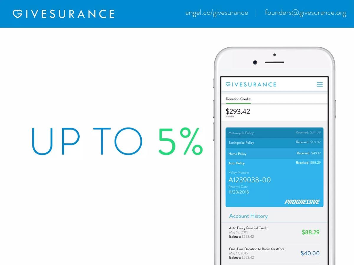
- The platform offers users 'up to 5%' back on insurance payments to be used as donation credits, as shown on slide 2.
- GiveSurance demonstrates early traction with a claim of $5M in insurance premiums added to the platform on slide 3.
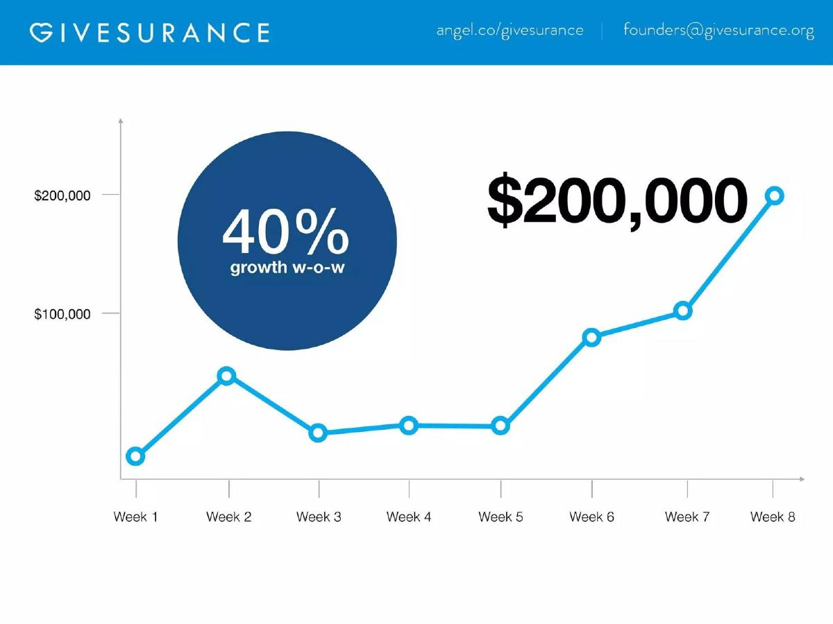
- Growth is highlighted through a 40% week-over-week increase, reaching a $200,000 milestone by week 8 on slide 5.
- The market opportunity is defined by 113 million donors in the U.S. and a $100 billion revenue potential on slide 8.
- The business model relies on a 30% commission fee taken from the insurance agency side, detailed on slide 10.
- The deck lists over 400 insurance carriers, including major names like Progressive, MetLife, and AIG, on slide 9.
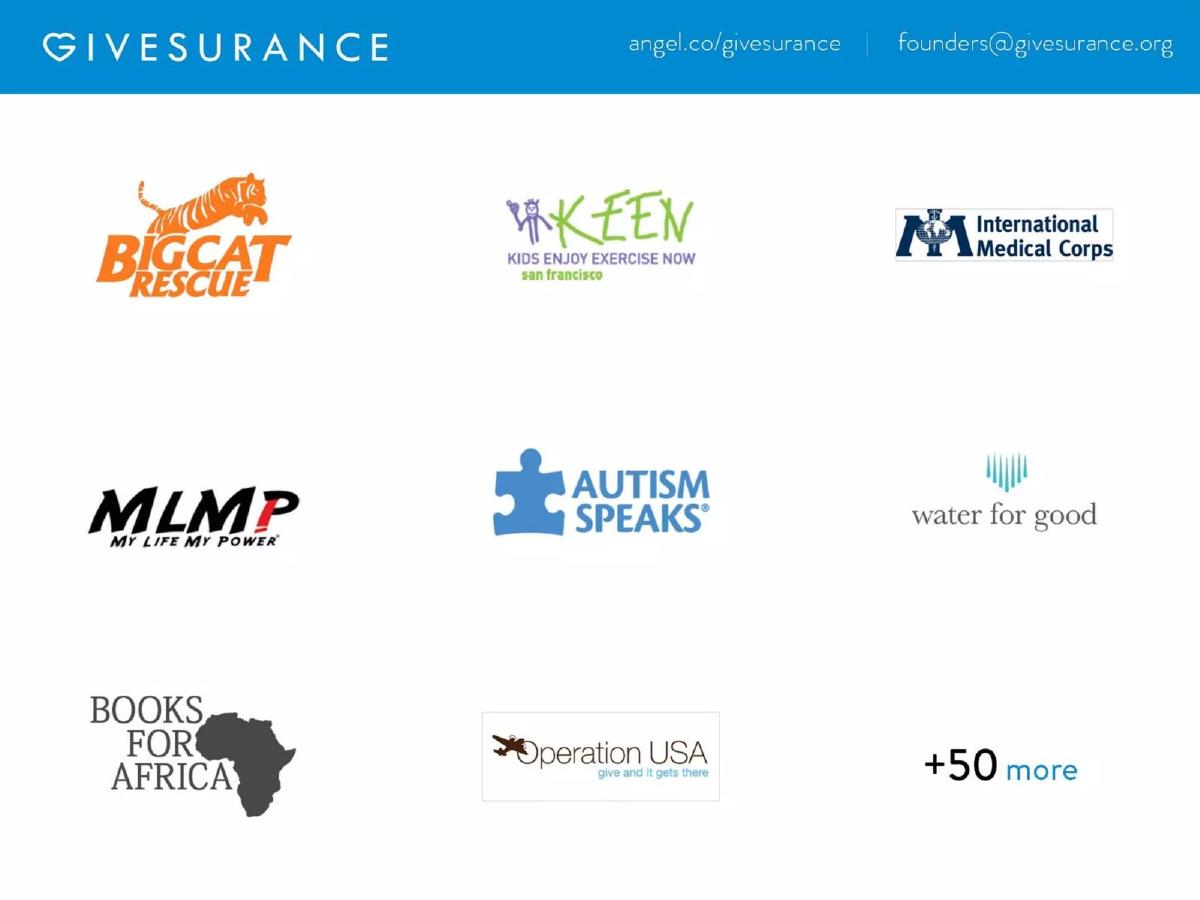
- Social proof is established via partnerships with over 50 charities, including UNICEF and Autism Speaks, on slides 4 and 7.
- Revenue projections suggest a path to $112M between 2015 and 2019 based on capturing 500,000 policies, per slide 10.
Introduction: The Minimalist Fintech Pitch
The GiveSurance deck from 2013 is a striking example of the 'less is more' philosophy in early-stage fundraising. With only 12 slides and almost no body text, the presentation relies on large typography, recognizable logos, and high-level metrics to tell its story. The core value proposition is simple: allow consumers to donate to charity using money they are already spending on insurance premiums, at no additional cost to them.
The Hook and Value Proposition (Slides 1-2)
Slide 1: Title The deck opens with a simple blue gradient and the GiveSurance logo—a heart combined with the letter 'G'—and the subtitle 'insurance rewards program.' It sets a friendly, philanthropic tone immediately.
Slide 2: The Core Offer This slide features a mobile app mockup and the text 'UP TO 5%.' The mockup shows a user's 'Donation Credit' balance of $293.42 and a list of policies (Motorcycle, Earthquake, Home, Auto) with corresponding credit amounts received. This slide effectively explains the product without a single bullet point: pay insurance, get credits, donate them.
Traction and Social Proof (Slides 3-4)
Slide 3: Momentum The company leads with a big number: '$5M Insurance Premium Added.' This is a clever way to show scale without necessarily revealing net revenue. It demonstrates that users are willing to move their high-value insurance policies onto the platform.
Slide 4: Charity Partners Social proof is critical for a donation platform. This slide displays logos for Big Cat Rescue, KEEN, International Medical Corps, MLMP, Autism Speaks, Water for Good, Books for Africa, and Operation USA. The '+50 more' tag indicates a growing ecosystem of non-profit beneficiaries.
Growth and User Acquisition (Slides 5-6)
Slide 5: The Growth Curve A line graph shows an 8-week period where the company reached a '$200,000' milestone (presumably in premiums or credits, though the Y-axis is not explicitly labeled). The headline metric here is '40% growth w-o-w,' which is the kind of 'up and to the right' momentum investors look for in early-stage ventures.
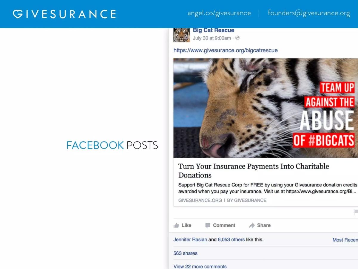
Slide 6: Marketing Strategy Instead of explaining their CAC (Customer Acquisition Cost) or marketing funnel, GiveSurance shows a Facebook post from Big Cat Rescue. The post has over 6,000 likes and 563 shares. This illustrates their viral loop: charities promote GiveSurance to their donors as a 'FREE' way to give, providing GiveSurance with a low-cost acquisition channel.
Market Size and Partnerships (Slides 7-9)
Slide 7: UNICEF A full slide is dedicated to the UNICEF logo. This serves as a massive credibility booster, implying a partnership or at least the ability for users to direct funds to one of the world's most recognizable NGOs.
Slide 8: The Opportunity The TAM (Total Addressable Market) slide lists '1 Million Charities in the U.S.,' '113 Million Donors in the U.S.,' and a '$100 Billion Revenue Potential.' These are broad, top-down numbers, but they serve to show the massive scale of the intersection between insurance and philanthropy.
Slide 9: Insurance Carriers To prove the technical feasibility, this slide lists major carriers like Progressive, MetLife, and AIG, with a note of '+400 more.' This reassures investors that the platform isn't limited to niche insurance providers.
Business Model and Projections (Slide 10)
Slide 10: Unit Economics This is the most 'dense' slide in the deck. It states: 'We keep 30% of the commission as a fee.' It then lays out a path to '$112M' in revenue between 2015-2019. The calculation is based on 500,000 policies with an 'Average Annual Fee' of $225. This clearly defines GiveSurance as a commission-based broker model rather than a pure SaaS play.
The Team and Contact (Slides 11-12)
Slide 11: Team The team slide features headshots and titles for six members: Jennifer Rasiah (CEO), Justin Pope (CTO), Bill Catanese (COO), Phillip Kang (DP), Denise Omana (Campaign Manager), and Horlendy Ramirez (Account Executive). Notably, there are no bios or previous company logos, which is a significant omission for a 'Later' stage or even a Seed deck.
Slide 12: Contact The final slide provides the email, website, and AngelList link. There is no closing statement or call to action.
What Works in the GiveSurance Deck
Clarity of Value Prop: Within two slides, the reader understands exactly what the product does. The use of a mobile mockup on slide 2 is far more effective than a paragraph of text explaining the credit system.
Leveraged Growth Story: Slide 6 is the strongest in the deck. It shows that GiveSurance doesn't have to spend millions on ads because their partners (the charities) are incentivized to do the marketing for them. This 'built-in' distribution is highly attractive to investors.
Visual Credibility: By surrounding their brand with logos like UNICEF, Progressive, and Autism Speaks, GiveSurance 'borrows' the trust those organizations have built over decades. For a startup handling financial transactions and insurance policies, this trust is mandatory.
What is Missing from the GiveSurance Deck
The 'Ask': There is no mention of how much money they are raising, what the valuation is, or what the milestones for the next 18 months look like. This is a glaring omission for a fundraising document.
Competitive Landscape: The deck assumes GiveSurance is the only way to do this. There is no mention of other 'round-up' apps or insurance-tech competitors. Investors need to know why this specific model will win over others.
Team Pedigree: While the team is shown, their qualifications are not. In fintech, where regulatory knowledge and industry connections are vital, knowing that the CEO or COO has 10+ years in insurance or finance is a major selling point that was left on the table.
Regulatory/Legal Framework: Insurance is a highly regulated industry. The deck doesn't address how they handle licensing across different states or the legalities of sharing commissions with non-profits (rebating laws), which would be a top-of-mind question for any sophisticated investor.
What a Founder Should Copy
The 'Big Number' Strategy: Use slides 3 and 5 as a template. Don't just say you are growing; show a specific, impressive number ($5M premiums) and a specific growth rate (40% w-o-w) in a font size that is impossible to miss.
Social Proof Layouts: The way slides 4 and 9 group logos is clean and professional. It shows breadth ('+50 more', '+400 more') without cluttering the slide.
Simplified Revenue Math: Slide 10 is a great example of how to present a revenue forecast. It breaks it down into three simple variables: Number of users x Average fee = Total Revenue. This makes the business model feel attainable and easy to audit.
Conclusion
GiveSurance's 2013 deck succeeded because it identified a massive, untapped pool of capital (insurance commissions) and a friction-free way to redirect it to a popular cause (charity). While the deck is light on operational details and team history, its visual clarity and strong emphasis on early traction were enough to secure a $1,000,000 investment. It serves as a reminder that at the early stages, a clear 'What' and a compelling 'Why' often outweigh a dense 'How.'
Frequently asked questions
- How does GiveSurance actually generate revenue?
- According to slide 10, GiveSurance acts as a specialized insurance agency or broker. They 'keep 30% of the commission as a fee.' By facilitating the insurance payment and directing a portion of the commission to a donation credit for the user, they retain a significant percentage of the standard broker commission as their primary revenue stream.
- What is the 'Up to 5%' figure mentioned on slide 2?
- This represents the 'Donation Credit' given back to the policyholder. When a user pays their insurance premium through the GiveSurance system, they receive a credit (up to 5% of the premium value) that they can then allocate to a charity of their choice within the platform.
- Is there a specific funding 'Ask' in this deck?
- No. The 12-slide deck completely omits a formal 'Ask' slide. While catalogue facts indicate they raised $1,000,000, the deck itself does not specify the amount being sought, the valuation, or the intended use of funds. This suggests the deck may have been used as a visual aid for a verbal presentation rather than a standalone document.
- How does the company acquire users?
- The deck implies a B2B2C strategy. Slide 6 shows a Facebook post from 'Big Cat Rescue' encouraging their followers to 'Turn Your Insurance Payments Into Charitable Donations.' By partnering with charities (slide 4) who have large existing donor bases, GiveSurance leverages the non-profits' marketing reach to acquire users at a lower cost.
- What insurance companies are compatible with GiveSurance?
- Slide 9 claims compatibility with '+400 more' carriers. It specifically highlights major industry players including Mercury Insurance, Safeco, Chubb, The Hartford, Progressive, AIG, Travelers, and MetLife, suggesting the platform is designed to work with most standard U.S. insurance providers.