Littlefund’s 9-slide pitch deck is an exercise in extreme minimalism, designed to capture the attention of seed investors by focusing on a massive, underserved demographic: 60 million millennial parents. The deck avoids the typical clutter of financial projections and complex architecture, instead leaning on high-level behavioral data and early traction metrics. With a 'gifting conversion' rate of 59% and a 1-in-3 referral sign-up rate, the founders demonstrate that their solution taps into a viral social loop. While the deck lacks a formal 'Ask' slide, business model details, or a competitiv…
Key takeaways
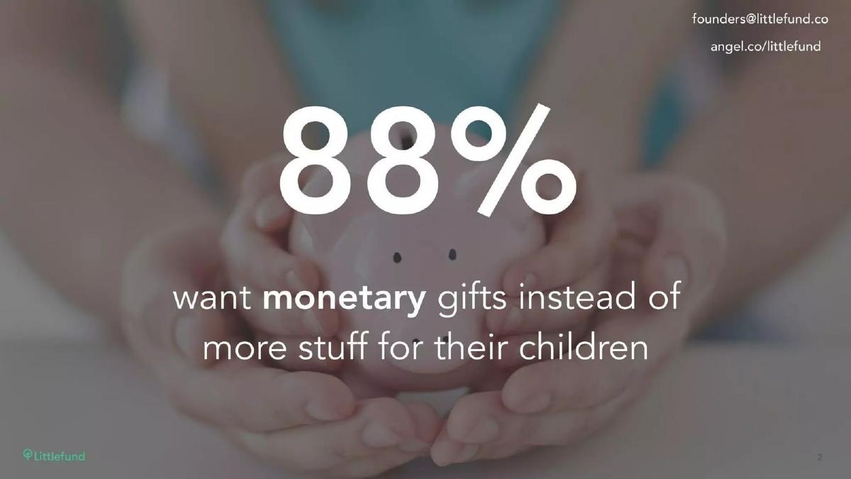
- The deck identifies a specific psychological shift: 88% of parents want monetary gifts instead of physical items for their children (Slide 2).
- The total addressable market is framed by a single demographic figure: 60 million Millennial parents (Slide 4).
- Product-market fit is hinted at through a 59% gifting conversion rate, suggesting high user intent (Slide 7).
- Organic growth is a core pillar of the pitch, evidenced by a 1 in 3 referral sign-up rate (Slide 7).
- The team slide leverages significant corporate pedigree, listing logos from Apple, IBM, Intuit, and CBS (Slide 8).
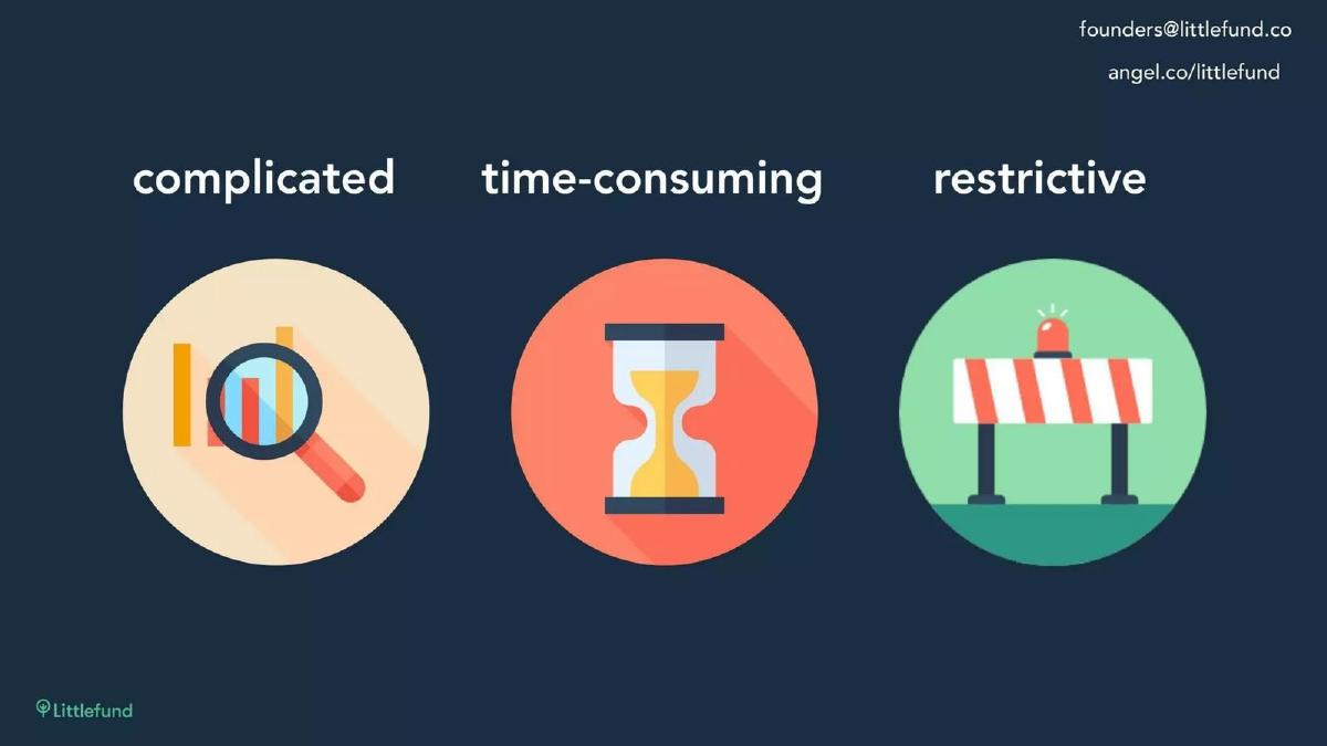
- The problem is defined by three friction points: current savings methods are complicated, time-consuming, and restrictive (Slide 3).
- The deck completely omits a financial 'Ask,' revenue model, or roadmap, focusing entirely on the 'Why' and 'Who' (Slides 1-9).
- Visual storytelling is prioritized, with more than half the slides containing fewer than ten words (Slides 1, 2, 4, 5, 6, 9).
The Minimalist Fintech Pitch: Littlefund’s 9-Slide Strategy
Littlefund’s pitch deck is a striking example of the 'less is more' philosophy in early-stage fundraising. At only 9 slides, it bypasses the dense charts and multi-year projections that often bog down fintech presentations. Instead, it focuses on a singular emotional and practical shift in the market: the transition from physical toys to digital savings for children. This teardown explores how a company can build a compelling case for a seed round by focusing almost entirely on demographic trends, user behavior, and team pedigree.
The Hook: Problem and Market Opportunity
Slide 1: Title Slide The deck opens with a clean, mint-green brand identity. The tagline, 'Helping families save more, together,' immediately establishes the social nature of the product. It isn't just a savings app; it is a collaborative tool. The inclusion of contact emails and an AngelList link in the corner signals that this is a working document for active outreach.
Slide 2: The Core Insight Littlefund leads with its strongest data point: '88% want monetary gifts instead of more stuff for their children.' This slide is the foundation of the entire pitch. It identifies a massive disconnect between what gift-givers provide (toys, clothes) and what parents actually desire (financial security). By starting here, Littlefund frames its existence not as a luxury, but as a solution to a widespread frustration.
Slide 3: The Friction The deck identifies three specific pain points regarding current savings options: they are 'complicated,' 'time-consuming,' and 'restrictive.' While it doesn't name competitors like 529 plans or traditional savings accounts, the icons and adjectives clearly target the bureaucratic hurdles of legacy banking. This sets the stage for a product that is the opposite: simple, fast, and flexible.
Slide 4: The Target Audience The market size is presented with extreme brevity: '60 million Millennial parents.' By focusing on a specific generation rather than a total dollar amount (TAM), Littlefund highlights a cohort known for mobile-first behavior and a preference for streamlined digital experiences. The background image of a sleeping infant reinforces the emotional stakes of the product.
The Solution: Product and User Experience
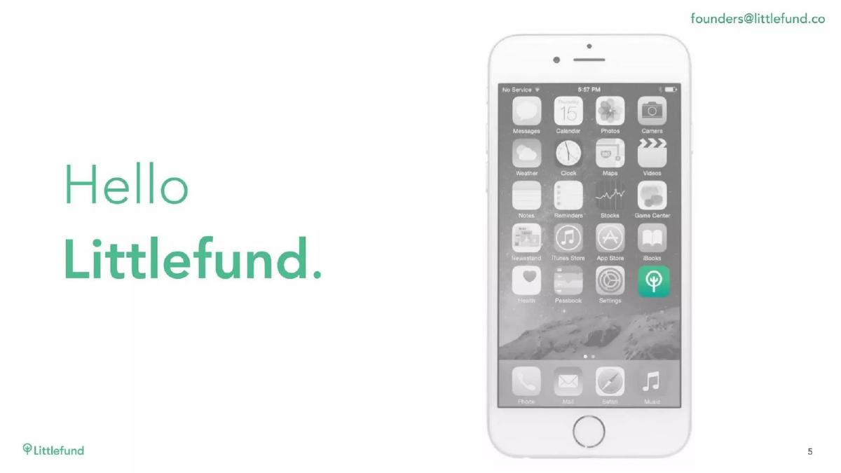
Slide 5: The Reveal The transition to the product is marked by a simple 'Hello Littlefund' next to an iPhone mockup. Interestingly, the mockup shows the app icon on a standard iOS home screen rather than an in-app screenshot. This emphasizes the 'mobile-first' nature of the solution—it lives where the user lives.
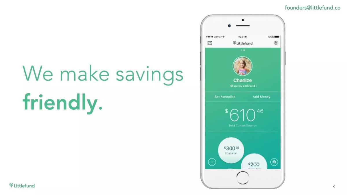
Slide 6: Product Interface This is the only slide that shows the actual UI. The headline 'We make savings friendly' is supported by a clean, bubble-based interface. We see a child’s profile ('Charlize'), a total savings balance of '$610.46,' and specific goals like 'Education' ($300.46) and 'Disneyland' ($200). This demonstrates that the app handles both long-term investment and short-term milestones, making the concept of 'savings' less daunting and more tangible.
The Proof: Traction and Team
Slide 7: Behavioral Traction Rather than showing a growth curve of total users, which might be modest at the seed stage, Littlefund focuses on efficiency metrics. They claim a '59% gifting conversion' and that '1 in 3 referrals sign up.' These are powerful numbers for a fintech app. A 59% conversion rate suggests that once a user is invited to give a gift, the friction is low enough that the majority follow through. The 33% referral rate indicates a high K-factor, which is essential for low-cost customer acquisition in a crowded market.
Slide 8: The Team The team slide is a 'who’s who' of tech giants. With founders and leads hailing from Apple, IBM, Intuit, and CBS, the deck communicates that while the company is small, the talent is 'big tech' caliber. Mimi Chan (CEO) and Isaac Dressman (CTO) are positioned as the core, supported by design and engineering talent. For a seed investor, this pedigree reduces the perceived execution risk of the project.
Slide 9: Closing The final slide repeats the logo and tagline over a background of $100 bills. It’s a literal representation of the company’s focus: money. It provides the same contact information as the first slide, closing the loop on the presentation.
What Works in the Littlefund Deck
1. Extreme Clarity of Purpose: Within the first 30 seconds, an investor knows exactly what Littlefund does, who it is for, and why it needs to exist. There is no jargon about 'blockchain-enabled ledgers' or 'synergistic financial ecosystems.' It is a 'friendly' way to save money for kids.
2. Focus on 'The Gap': The 88% statistic on Slide 2 is a perfect 'anchor' for a pitch. It creates a 'Wait, really?' moment that forces the investor to acknowledge the market opportunity. It turns a boring topic (savings) into a relatable human problem (too many toys).
3. High-Signal Traction: By highlighting conversion and referral rates, the founders prove that the product actually works. In fintech, the hardest part is often getting people to move money. A 59% conversion rate is a strong signal that they have solved the 'trust' and 'friction' barriers.
What is Missing from the Littlefund Deck
1. The Business Model: There is zero mention of how Littlefund makes money. Do they take a percentage of the gifts? Do they charge a subscription? Do they earn interest on the float? For a seed round, investors might be willing to wait for the answer, but its total absence is a significant omission.
2. The Ask: Perhaps the most surprising omission is the lack of a fundraising goal. Usually, a deck ends with 'We are raising $X million to achieve Y.' By leaving this out, the deck feels more like a teaser or a 'vision' deck than a formal request for capital.
3. Competitive Landscape: The 'savings for kids' space is crowded, ranging from 529 plans to apps like Greenlight or Acorns Early. Littlefund doesn't explain how it defends its position or why a parent wouldn't just use a Venmo pool or a traditional bank account.
4. Regulatory and Backend Details: Fintech is heavily regulated. The deck doesn't mention if they are a registered investment advisor (RIA), what bank they partner with to hold the funds, or how they handle the legal complexities of accounts for minors. This information is usually vital for fintech-specific investors.
What a Founder Should Copy
1. The 'One Big Stat' Opening: If you have a statistic that perfectly encapsulates the 'Why Now' of your business, put it on Slide 2. Don't bury it in a market size slide later on. Use it to build the narrative foundation.
2. Pedigree Branding: If your team has worked at recognizable companies, use those logos. Slide 8 does this perfectly—the logos are larger than the job titles, which allows the 'brand rub' to do the heavy lifting of establishing credibility.
3. Minimalist UI Mockups: Don't show every screen of your app. Show one screen that captures the 'Aha!' moment. Slide 6 does this by showing the 'Education' and 'Disneyland' bubbles, which explains the product's versatility better than a list of features ever could.
4. Consistent Visual Identity: The mint-green color palette is used consistently throughout, creating a sense of a finished, professional brand. This is a low-effort way to make a seed-stage company look much more established than it might actually be.
Final Thoughts
Littlefund’s deck is a 'teaser' designed to start a conversation rather than close a deal on the spot. It relies on the strength of a single consumer insight and the professional history of its founders. While it leaves many questions unanswered—particularly regarding revenue and regulation—it succeeds in making the 'problem' of child-gifting feel urgent and the 'solution' feel inevitable. For founders with a strong team and a clear value proposition, this minimalist approach can be a highly effective way to cut through the noise of a crowded inbox.
Frequently asked questions
- What is the primary value proposition of Littlefund?
- Littlefund positions itself as a 'friendly' savings and gifting app. Its primary value proposition is solving the friction associated with traditional college savings accounts or physical gift-giving. By allowing parents to easily receive monetary gifts from family and friends and automate their own savings, it turns a 'complicated and restrictive' financial task into a social, mobile-first experience for millennial parents.
- How does the deck demonstrate traction without a dedicated traction slide?
- Littlefund uses Slide 7 to present two high-impact ratios rather than raw user numbers. By showing a 59% gifting conversion and a 33% referral sign-up rate, they demonstrate that the product has inherent virality and that users are successfully completing the core action (gifting). This suggests a healthy 'k-factor' and strong engagement, which are often more important to seed investors than small absolute user counts.
- Is the lack of a business model a red flag in this deck?
- In a 2017 seed-stage fintech deck, the omission of a business model is common if the focus is on user acquisition and behavior. Investors in this space often look for 'platform plays' where monetization (via AUM fees, transaction fees, or lead generation for other financial products) is secondary to capturing the 'beginning of the financial journey' for a child. However, the lack of any mention of revenue is a notable gap.
- Why does the deck emphasize the 'Millennial parent' demographic so heavily?
- Millennials are the first generation of 'digital natives' to become parents at scale. Littlefund identifies 60 million of them on Slide 4. This demographic is significant because they are comfortable with mobile-first finance (Venmo, Robinhood) and are currently entering their peak earning and saving years, making them the most valuable cohort for long-term fintech platforms.
- What is missing from this deck that a typical founder should include?
- This deck is exceptionally lean. Most founders should include a 'The Ask' slide (how much money is being raised and what for), a 'Competition' slide (how they differ from 529 plans or apps like Acorns), and a 'Business Model' slide. Littlefund likely relied on the strength of their team's pedigree and the simplicity of their vision to secure meetings without these details.