Regard’s 2016 pitch deck is an exercise in extreme brevity, containing only seven slides. The company positions itself in the 'Income Insurance' space, promising a digital-first experience that delivers coverage 'within minutes.' The deck avoids dense text, opting instead for large-font market statistics and a single slide dedicated to unit economics. While it successfully identifies a massive problem—60 million U.S. households lacking emergency savings—it leaves significant gaps regarding product mechanics, competitive landscape, and the specific backgrounds of the founding team. This deck a…
Key takeaways
- The company defines its value proposition as providing 'Income Insurance Within Minutes' on slide 1.
- Regard identifies a target market of 60 million U.S. households currently without emergency savings on slide 3.
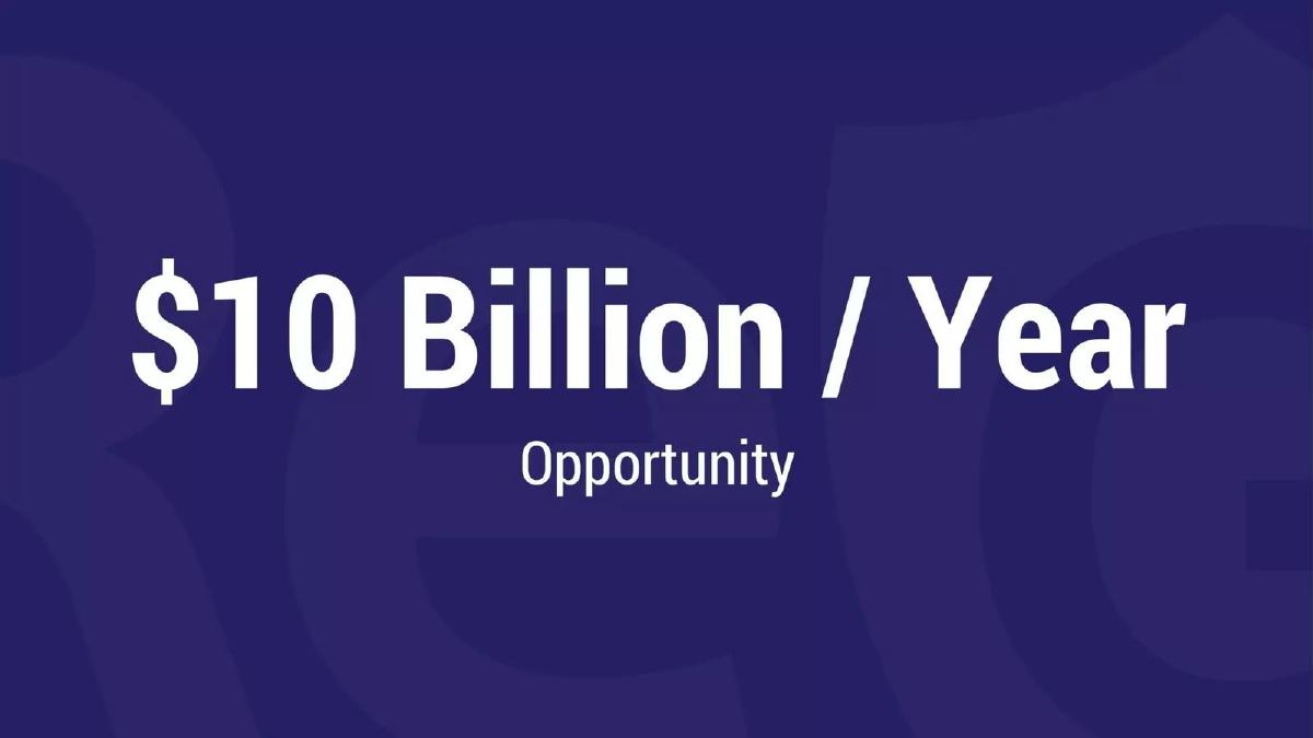
- The deck quantifies the total addressable market as a '$10 Billion / Year Opportunity' on slide 4.
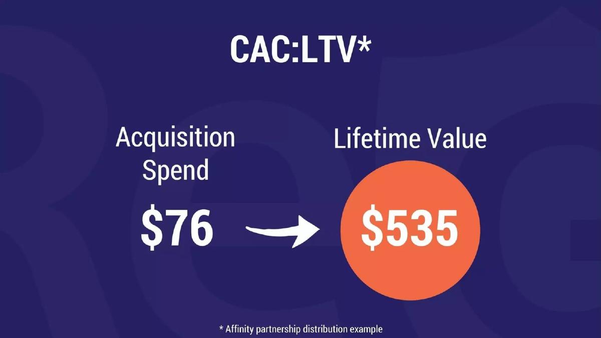
- Unit economics are presented as a $76 acquisition spend resulting in a $535 lifetime value on slide 5.
- The unit economics on slide 5 are specifically noted as an 'Affinity partnership distribution example.'
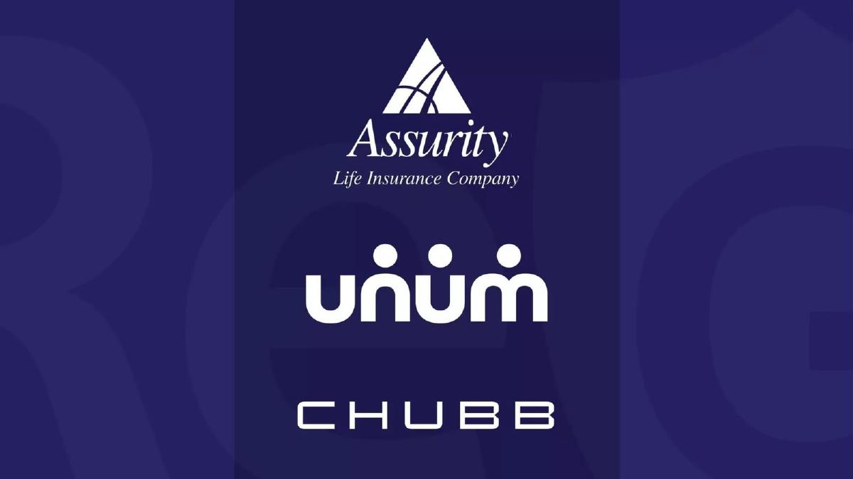
- Slide 6 displays logos for Assurity Life Insurance Company, Unum, and Chubb, implying existing partnerships or integrations.
- The team slide (slide 7) features only first names (Matthew, Patrick, Jay) and a contact email, omitting professional titles or history.
- There is no slide dedicated to the specific 'Ask' or the amount of capital being raised.
The Minimalist Approach to Insurtech
The Regard pitch deck from 2016 is a relic of a specific era of design: high contrast, minimal text, and a heavy reliance on the 'Takahashi Method' of presentation where one big idea dominates each slide. At only seven slides, it is one of the shortest decks in the StartupFundraising.com archive. It attempts to sell a vision of modernized income insurance by highlighting a massive social problem and a lucrative unit economic model.
Slide 1: The Hook
The cover slide introduces the brand and the core promise: Income Insurance Within Minutes . The logo features a shield icon, a standard trope in the insurance industry to signify protection and safety. The sub-headline is the most important part of this slide, as it identifies the 'speed' factor as their primary differentiator in a market known for weeks-long underwriting processes.
Slide 2: The Emotional Context
Slide 2 is an anomaly in professional pitch decks. It features three characters from The Simpsons: Dr. Hibbert, Blue-Haired Lawyer, and Mr. Burns. There is no text on this slide. In a live pitch, this slide likely served as a backdrop for the founder to discuss the 'villains' or the 'complexity' of the current insurance system—doctors, lawyers, and greedy corporate interests. Without the accompanying speech, however, the slide provides zero data and risks looking unprofessional to a cold reader.
Slide 3: The Problem Statement
Regard moves quickly to the macro-problem. 60 Million U.S. households w/o emergency savings is a stark, effective statistic. It defines the 'Who' of their target market. By focusing on the lack of savings, they are not just selling insurance; they are selling a replacement for an emergency fund. This slide is effective because it uses a large, reputable-sounding figure to create a sense of urgency.
Slide 4: Market Size
Following the problem, slide 4 quantifies the financial scale: $10 Billion / Year Opportunity . The deck does not specify if this is the Total Addressable Market (TAM), Serviceable Addressable Market (SAM), or a specific revenue projection. In the context of the previous slide, it likely represents the estimated premiums that could be collected from the 60 million households identified. It is a 'big enough' number to capture an investor's attention, though the lack of a source or calculation method is a notable omission.
Slide 5: The Business Case (Unit Economics)
This is the most substantive slide in the deck. It breaks down the CAC:LTV (Customer Acquisition Cost to Lifetime Value). It claims an Acquisition Spend of $76 leads to a Lifetime Value of $535 . A footnote clarifies that this is an Affinity partnership distribution example . This is a critical detail; it tells the investor that Regard is not planning to win via expensive Google Ads, but through B2B2C partnerships. The resulting 7x return on acquisition spend is a strong metric for a 2016-era insurtech startup.
Slide 6: The Ecosystem
Slide 6 displays three logos: Assurity Life Insurance Company, Unum, and Chubb . In the insurance world, these are 'carriers.' Their presence suggests that Regard has secured the necessary backing to actually issue policies. For a startup in a highly regulated industry, showing that you have the 'plumbing' sorted out with major incumbents is a vital de-risking step. However, the slide does not explain the nature of these relationships (e.g., are they signed contracts or just 'in talks'?).
Slide 7: The Team
The final slide shows a photo of three men labeled only as Matthew, Patrick, and Jay . An email address, hi@getregard.com , is provided in the corner. This is a significant weakness in the deck. Investors invest in people, especially at the early stage. By omitting surnames, titles, and past successes (e.g., 'Former VP at AIG' or 'Second-time founder'), the deck forces the investor to do their own research or wait for the meeting to understand if the team is actually qualified to disrupt a $10 billion industry.
What Works in the Regard Deck
The primary strength of this deck is its clarity of purpose . Within 60 seconds of clicking through, an investor knows exactly what Regard does (income insurance), who they sell to (households without savings), and how they make money (affinity partnerships with high LTV). The unit economics slide (Slide 5) is the anchor of the deck, providing a clear mathematical reason for the business to exist. By keeping the text to a minimum, the founders ensure that the few numbers they do show—60 million, $10 billion, $76 CAC—are memorable.
What is Missing
The omissions in this deck are extensive, likely because it was designed for a stage presentation rather than a PDF send-ahead. First, there is no product. There are no screenshots of the 'minutes-long' application process, which is their stated competitive advantage. Second, there is no competitive analysis. The deck ignores existing disability insurance providers and other fintechs moving into the space. Third, the team slide is anonymous. Providing only first names is a missed opportunity to build credibility. Finally, there is no 'Ask.' A pitch deck is a fundraising tool, yet this document never specifies how much money is being raised or what that money will be used to achieve (e.g., 'Raising $2M to hire engineering and close 5 more affinity partners').
What a Founder Should Copy
Founders should emulate the boldness of the problem/solution framing . Slide 3 and Slide 4 work perfectly together to establish a massive market. The use of a specific distribution example (the affinity partnership note on Slide 5) is also a smart move; it shows the founder has a specific 'wedge' into the market rather than just a general plan to 'market the product.' Finally, the visual consistency —using the same dark blue background and orange accents throughout—makes the deck feel like a cohesive brand, even if the content is sparse.
Final Analysis
The Regard deck is a 'teaser' deck. It is designed to provoke a question rather than provide an answer. While the $76 to $535 LTV ratio is a compelling hook, the lack of team pedigree and product evidence makes this a high-friction deck for cold outreach. It relies entirely on the charisma of 'Matthew, Patrick, and Jay' to fill in the gaps. For most founders, adding three to five more slides covering the 'How' (product), the 'Who' (detailed bios), and the 'How Much' (the ask) would make this a much more effective fundraising tool.
Frequently asked questions
- What is Regard's core product?
- Based on slide 1, Regard offers 'Income Insurance Within Minutes.' The deck suggests a digital platform that simplifies the traditionally slow process of obtaining disability or income protection insurance. By focusing on speed and accessibility, they target the millions of Americans who lack a financial safety net for unexpected loss of income.
- How does Regard plan to acquire customers?
- Slide 5 indicates that Regard utilizes 'Affinity partnership distribution.' This strategy involves partnering with established organizations or platforms to reach their existing member bases. The deck claims this method results in an acquisition spend of $76 per customer, which is significantly lower than typical direct-to-consumer insurance marketing costs.
- Who are the partners mentioned in the deck?
- Slide 6 features the logos of Assurity Life Insurance Company, Unum, and Chubb. These are major players in the insurance and disability benefits space. Their inclusion suggests that Regard acts as a distribution layer or technology interface for these established carriers, rather than underwriting the insurance themselves.
- What is the primary market gap Regard is addressing?
- Regard highlights a specific social and financial problem on slide 3: '60 Million U.S. households w/o emergency savings.' By framing the lack of savings as the problem, they position income insurance as the solution for financial stability when a breadwinner is unable to work.
- Is this deck sufficient for a seed round?
- By modern standards, this deck is incomplete. It lacks a clear product demo, a competitive analysis, a detailed roadmap, and a specific financial ask. While the LTV to CAC ratio of 7:1 (slide 5) is attractive, most investors would require significantly more detail on the team's expertise and the technology's defensibility before committing.