Yellowdig’s pitch deck is exceptionally lean, consisting of only 8 slides. It relies heavily on visual storytelling to establish the 'problem'—specifically the outdated user interface of legacy Learning Management Systems (LMS) like Sakai. The deck transitions quickly from the aesthetic failure of current systems to a sleek, Pinterest-like social interface for students. While it lacks traditional financial projections, market sizing (TAM/SAM/SOM), or a detailed business model, it compensates with strong early traction metrics: 7,000 students piloted the platform and generated 4,000 pages of c…
Key takeaways
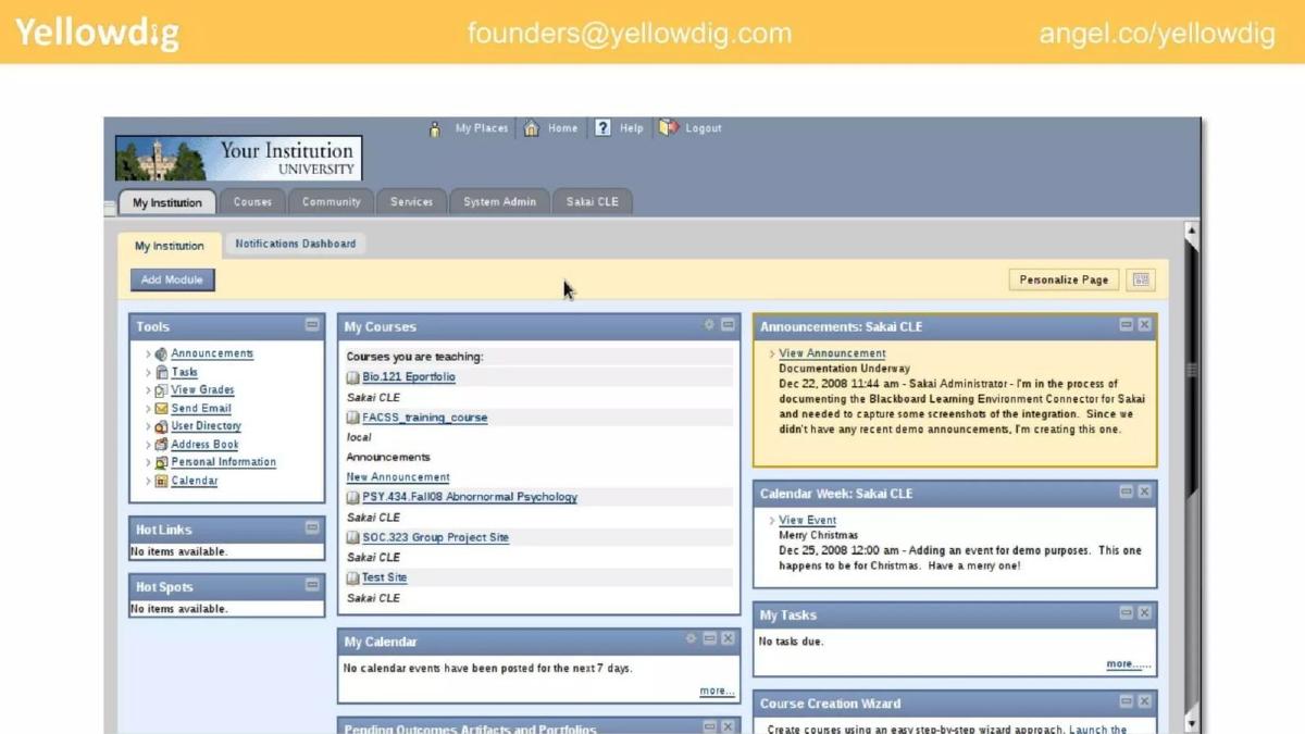
- The deck uses a visual 'Before and After' strategy, contrasting a cluttered legacy LMS (Slide 2) with Yellowdig's modern UI (Slide 4).
- Traction is quantified through engagement rather than revenue, citing 7,000 student pilots and 4,000 pages of user-generated content (Slide 6).
- The product value proposition is distilled into three core pillars: Ecosystem, Analytics, and Compliance (Slide 5).
- The team slide emphasizes academic and corporate pedigree, featuring logos from MIT, IIT Bombay, and Hitachi (Slide 7).
- The deck lacks a formal 'Ask' slide, omitting the specific dollar amount being raised or the intended use of funds.
- There is no mention of competition or a specific business model/pricing strategy within the 8 slides.
- The company sets a clear, singular milestone for its growth trajectory: reaching 100 universities by 2016 (Slide 8).
- The deck utilizes a consistent header with contact information (founders@yellowdig.com) and an AngelList link on every slide for easy investor follow-up.
The Narrative of Visual Contrast
Yellowdig’s pitch deck is a study in minimalism. At only 8 slides, it does not attempt to answer every possible due diligence question. Instead, it focuses on a singular narrative: the current state of higher education technology is broken, and Yellowdig is the modern solution. The deck relies on the 'show, don't tell' principle, using full-bleed images and screenshots to make its point. This approach is particularly effective in EdTech, where the 'problem'—clunky, decades-old software—is immediately recognizable to anyone who has stepped foot on a campus.
Slide 1: The Vision
The cover slide sets a broad, ambitious tone with the tagline: "Bringing Higher Ed to the 21st Century." The imagery of diverse students collaborating over a laptop reinforces the social and collaborative nature of the product. Notably, the header contains the company's contact email and AngelList URL, a practice maintained throughout the deck to ensure investors always have a path to action.
Slide 2: The Problem (Visualized)
Slide 2 is a screenshot of a legacy Learning Management System (LMS), specifically the Sakai platform. It is intentionally unappealing—gray, text-heavy, and cluttered with nested menus and 2008-era web design. There is no text on this slide explaining why it is bad; the visual speaks for itself. It represents the 'before' state of the student experience: a bureaucratic tool rather than a learning community.
Slide 3: The Human Element
Slide 3 transitions from the digital 'problem' to the physical 'ideal.' It shows students sitting on a lawn, interacting and sharing books. This slide serves as a bridge, suggesting that learning is inherently social and collaborative, but the software shown in the previous slide fails to capture this essence. It sets the stage for a digital solution that mimics this real-world interaction.
Slide 4: The Solution (The Product)
Slide 4 presents the Yellowdig interface on both a desktop (iMac) and a mobile device. The contrast with Slide 2 is stark. Yellowdig looks like a cross between Pinterest and a modern social feed. It features a 'Pin' button, a leaderboard, tags, and a clean, image-centric layout. By showing the mobile app alongside the desktop version, Yellowdig signals that it is meeting students where they are, unlike the desktop-bound legacy systems of the past.
Slide 5: The Value Pillars
Slide 5 distills the platform's utility into three circles overlaid on a classroom photo: Ecosystem, Analytics, and Compliance. This is a crucial slide for institutional sales. 'Ecosystem' implies it plays well with existing tools (LMS integration); 'Analytics' tells professors they can finally measure student engagement; and 'Compliance' reassures administrators that the platform meets the rigorous privacy and security standards required in education.
Slide 6: Traction and Proof of Concept
This is the 'meat' of the deck. Over a photo of a crowded lecture hall filled with laptops, the text states: "7K students piloted and created 4k Pages of user generated content." This metric is vital because it proves that Yellowdig isn't 'shelfware.' In the world of EdTech, many tools are purchased but never used. Showing that students are actively creating thousands of pages of content is a high-signal indicator of product-market fit and engagement.
Slide 7: The Pedigree
The team slide features three key executives: Shaunak Roy (Founder, CEO), Ilya Braude (CTO), and Scott Barnette (EVP, Sales). The strength of this slide lies in the logos. By associating the founders with MIT, IIT Bombay, Booz & Co., Drexel University, Cloudmine, and Hitachi , the deck establishes that the team has the intellectual horsepower and the enterprise sales experience necessary to navigate the complex, slow-moving world of university procurement.
Slide 8: The Goal
The final slide features an image of Usain Bolt sprinting, with a simple white circle containing the goal: "100 Universities by 2016." This provides a clear, measurable milestone for investors to track. It conveys a sense of urgency and speed, suggesting that the company is ready to scale its pilot success across the broader higher education market.
What Works in the Yellowdig Deck
The most successful element of this deck is its visual economy . It avoids the 'wall of text' trap that many early-stage founders fall into. By contrasting the Sakai screenshot with the Yellowdig UI, the founders make a compelling argument for their product without writing a single bullet point about 'user experience' or 'modern design.'
Furthermore, the traction metric chosen (user-generated content) is highly specific to the problem they are solving. If the problem is a lack of engagement in legacy systems, the proof of the solution must be high engagement. 4,000 pages of content from 7,000 students is a tangible result that an investor can understand.
What is Missing
While the deck is an excellent narrative tool, it leaves several critical questions unanswered for a 'Later' stage round (as categorized in the catalogue):
Business Model: There is no mention of how Yellowdig makes money. Is it a per-student SaaS fee? An institutional site license? A freemium model? · Market Size: The deck lacks a TAM/SAM/SOM slide. While the goal is 100 universities, investors need to know the total addressable market to understand the potential return on investment. · Competition: The deck ignores competitors like Piazza, Edmodo, or even the social features being built into modern LMS platforms like Canvas. · The Ask: Perhaps the most glaring omission is the lack of a funding request. The deck does not state how much money is being raised or what the '100 Universities' goal will cost in terms of burn.
What a Founder Should Copy
Founders should emulate the 'Header Strategy' used here. Including an email address and a link to a platform like AngelList on every single slide ensures that if a deck is shared or a single slide is screenshotted, the path back to the founder is never lost.
Additionally, the 'Before and After' visual comparison is a powerful way to establish a problem. If your product is a significant aesthetic or functional upgrade over a legacy incumbent, show the incumbent's interface. It creates an immediate, visceral understanding of why your product needs to exist.
Finally, the singular milestone on the closing slide is a great way to end a pitch. Instead of a vague 'Thank You' slide, ending on a specific growth target (100 Universities) leaves the investor with a clear picture of what success looks like for the next 12-18 months.
Frequently asked questions
- What is the primary problem Yellowdig is solving?
- Based on the visual evidence in Slide 2, Yellowdig is solving the 'engagement gap' caused by outdated, non-intuitive Learning Management Systems (LMS). Legacy systems are depicted as text-heavy, modular, and aesthetically dated, whereas Yellowdig proposes a 'social layer' that mimics modern social media platforms to encourage student interaction.
- How does Yellowdig prove market fit without revenue data?
- Yellowdig uses 'User Generated Content' (UGC) as a proxy for product-market fit. Slide 6 notes that 7,000 students created 4,000 pages of content. In EdTech, student adoption is often the hardest hurdle; by showing that students actually use the tool to create content, they prove the platform's 'stickiness' to institutional buyers.
- Who are the key members of the Yellowdig founding team?
- The team consists of Shaunak Roy (Founder/CEO), Ilya Braude (CTO), and Scott Barnette (EVP, Sales). Their backgrounds (Slide 7) include high-tier institutions and corporations such as MIT, IIT Bombay, Booz & Co., Drexel University, Cloudmine, and Hitachi, suggesting a mix of technical depth and enterprise sales experience.
- What are the three pillars of the Yellowdig platform?
- Slide 5 identifies Ecosystem, Analytics, and Compliance as the three core focus areas. This suggests the platform isn't just a social feed; it integrates with the existing school 'Ecosystem,' provides 'Analytics' for instructors to track engagement, and meets institutional 'Compliance' standards for security and privacy.
- What is missing from this pitch deck?
- This deck is missing several standard venture components: a Market Size (TAM) slide, a Competitor Matrix, a Business Model/Pricing slide, and a formal 'Ask' detailing the round size. It functions more as a 'teaser' or a presentation deck intended to be narrated by the founders.