iugu, the São Paulo financial-infrastructure company behind 'financial infrastructure in the cloud', published its own Series A-stage investor deck as a reusable template — 14 Keynote slides exported on 11 November 2015 under the filename 'Pitch Deck Template.key', with client logos replaced by 'BIG CASE #1-9', market-size values by '???', and the ask by 'xM PRE-MONEY'. What survives is the structure, and much of it is excellent: growth plotted as Achieved against Proposed, fixed expenses and gross profit on shared axes so the June 2014 crossover is visible, the currency declared on the cover…
Key takeaways
- iugu's 14-slide deck is a hybrid artefact: a real Series A-stage investor deck from a Brazilian payments-infrastructure company, deliberately published as a fill-in-the-blanks template with the confidential data stripped out, exported from Apple Keynote on 11 November 2015 under the internal filena…
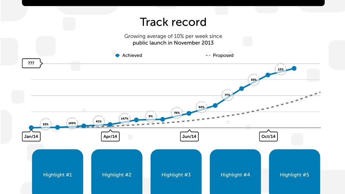
- The track-record slide claims 'growing average of 10% per week since public launch in November 2013', but the monthly readings plotted on the same slide include 9%, 35% and 12% — 10% weekly compounds to roughly 61% monthly, so the headline is three to five times the growth the chart actually shows.
- Compounding the ten plotted monthly figures gives roughly 34x growth across Jan/14 to Oct/14, an outstanding result that the deck oversells by a factor of about three with a rounder-sounding weekly rate its own chart disproves.
- Slide 7 is titled 'Revenue growth' and contains no revenue series — it plots gross profit against fixed expenses, which for a fee-per-transaction business leaves take rate, gross margin and revenue scale all unknowable.
- The two surviving hard numbers do not reconcile: 200+ clients at R$8.0k average ACV implies about R$1.6m annualised, while R$335k of monthly gross profit by Jul/15 annualises to roughly R$4.0m, with no as-of date printed on either slide.
- The competitor 2x2 shows three anonymised players while the deck's own footnote admits the original slide carried about thirty — in Brazilian payments in 2015 that meant omitting Cielo, Rede, PagSeguro and Stone from the picture.
- The strongest transferable ideas are the Achieved-versus-Proposed growth pairing, the expense-versus-gross-profit crossover chart that dates breakeven to June 2014, the currency declaration on the cover, and naming ABECS as the market-size source.
- The deck sells Retention as one of three product pillars and reports no churn, revenue churn or cohort data anywhere, despite a customer base composed entirely of startups; it also references 'cost of acquisition optimizations' without ever printing a CAC next to the R$8k ACV.
What this deck actually is
Fourteen slides, 1920 x 1080 points — true 16:9, screen-native, not a projector document — built in Apple Keynote on macOS 10.11.1 and exported on 11 November 2015 , then modified again on 13 November 2015 . The internal filename preserved in the PDF title field is "Pitch Deck Template.key" . That is not an accident and it is not the usual metadata slip you find in a founder's deck: iugu, the São Paulo payments-infrastructure company founded by Patrick Negri, deliberately published its own investor deck as a reusable template for other Brazilian founders.
Slide 1 says so in one line, in small grey type above the logo: "This isn't our original deck. Some data was changed or removed to allow publishing." Everything downstream has to be read through that sentence. The client logos are replaced with nine boxes reading BIG CASE #1 through BIG CASE #9. The market-size funnel has three tiers and all three values read ??? . The competitor map is labelled "Competitor #A, Competitor #B, Competitor #C" with a footnote admitting the original slide has about 30 competitors . The traction highlights are five blue tiles reading Highlight #1 to Highlight #5. The investment slide has an ask of xM PRE-MONEY and ??M zM from current investors . Even the closing slide's contact block is a placeholder: "CEO name / address@example.com / +55 DDD PHONE" .
So this is a hybrid artefact, and the classification matters more here than in any deck we have torn down. It is simultaneously a real Series A-stage investor deck from a company with genuine revenue and a real cap table, and a fill-in-the-blanks template that other founders were invited to copy. Its argument is not carried by numbers, because the numbers are gone. Its argument is carried by structure — the order of the slides, what each slide is asked to do, and what the founder considered non-negotiable enough to leave in even after scrubbing the confidential parts.
That makes it unusually useful and unusually dangerous. Useful, because you get to see the skeleton of a deck that actually raised money in the Brazilian market, with the flesh removed. Dangerous, because a template inherits every structural mistake of its source, and thousands of founders copied this one without ever seeing the numbers that made the original persuasive. Four slides in this deck are load-bearing in the original and load-nothing in the template — and those are precisely the four slides a copying founder will fill in worst.
Two things survived the scrub that should not have, and they are the most interesting findings in the file. First, the growth arithmetic on slide 6 does not reconcile with its own headline. Second, slide 7 is titled "Revenue growth" and plots no revenue at all.
Slide-by-slide walkthrough
Slide 1 — Cover
The iugu wordmark, the positioning line "financial infrastructure in the cloud" , a currency note reading "All values in Brazilian Reais (BRL)" , the publishing disclaimer, and a confidentiality footer: "This document contains confidential or proprietary information which may be legally privileged. It is intended only for the named recipients."
The positioning line is excellent and it is the reason this deck is still circulating a decade later. Five words, no adjectives, no "revolutionising", and it tells you the category (financial infrastructure), the delivery model (cloud) and, by implication, the customer (developers and product teams, not merchants walking into a branch). Compare it with what a 2015 Brazilian payments company would more typically have written — "the complete payments solution for your business" — and you can see the difference between a sentence that positions and a sentence that fills space.
The currency declaration on the cover is the single most-copyable detail in the deck and almost nobody does it. Every number that follows is in reais; the deck says so once, at the top, and never has to repeat it. For any company pitching cross-border — a Brazilian company raising from a US fund, an Indian company raising from Singapore — that one line removes an entire class of ambiguity from every chart in the document. It costs nine words.
The confidentiality footer, however, is now decoration. It appears on a deck that was published on the open internet by the company itself. Leaving a "confidential and privileged, named recipients only" notice on a document you have chosen to broadcast tells a careful reader that the footer is boilerplate the company applies without thinking — which slightly undercuts the credibility of everything else the document asserts about itself.
Slide 2 — Problem
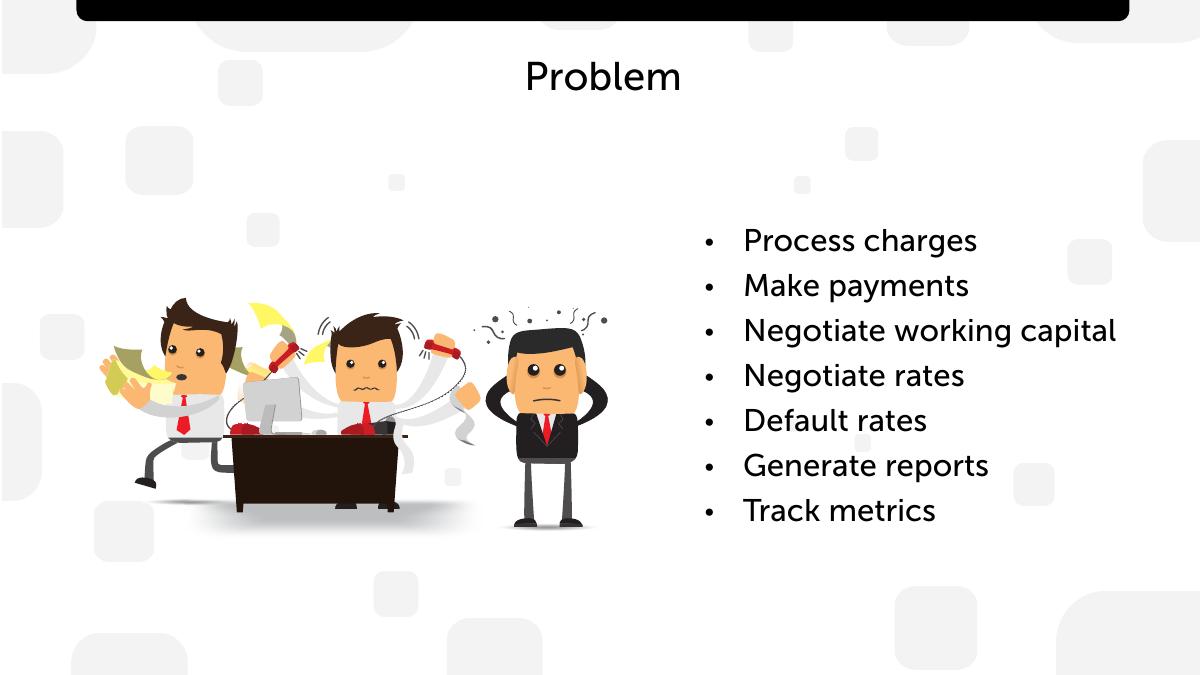
An illustration of three overwhelmed office workers buried in paperwork and phones, and a bulleted list of the jobs a Brazilian company has to do to get paid: process charges, make payments, negotiate working capital, negotiate rates, default rates, generate reports, track metrics .
This is a better problem slide than it first looks, because it is not a problem statement — it is a list of the operational jobs the customer currently performs manually . "Negotiate rates" and "negotiate working capital" are not abstractions in Brazil; they are literal recurring meetings with acquirers and banks that a small SaaS company has neither the volume nor the leverage to win. Listing them as chores rather than as pain adjectives is the right instinct, and it sets up the solution slide to say "we do those seven things for you".
What is missing is the thing almost every problem slide is missing: a number, a name, or a quote . There is no cost attached to any of the seven items — no "the average Brazilian SaaS company loses X% of revenue to failed recurring charges", no "boleto reconciliation takes N hours per month". There is no named customer saying it. The slide asserts a set of chores and asks the reader to supply the pain themselves. Because the data was scrubbed for publication we cannot know whether the original carried a figure here, but the template as published teaches the founder copying it that a problem slide is a bulleted list of nouns. It is not.
The illustration also does something subtle and worth noticing: it depicts the customer's employee , not the end consumer. That is correct for a B2B infrastructure company and it is a mistake many payments startups make in reverse, opening with a happy shopper. iugu opens with the exhausted finance person. That is the buyer.
Slide 3 — Solution
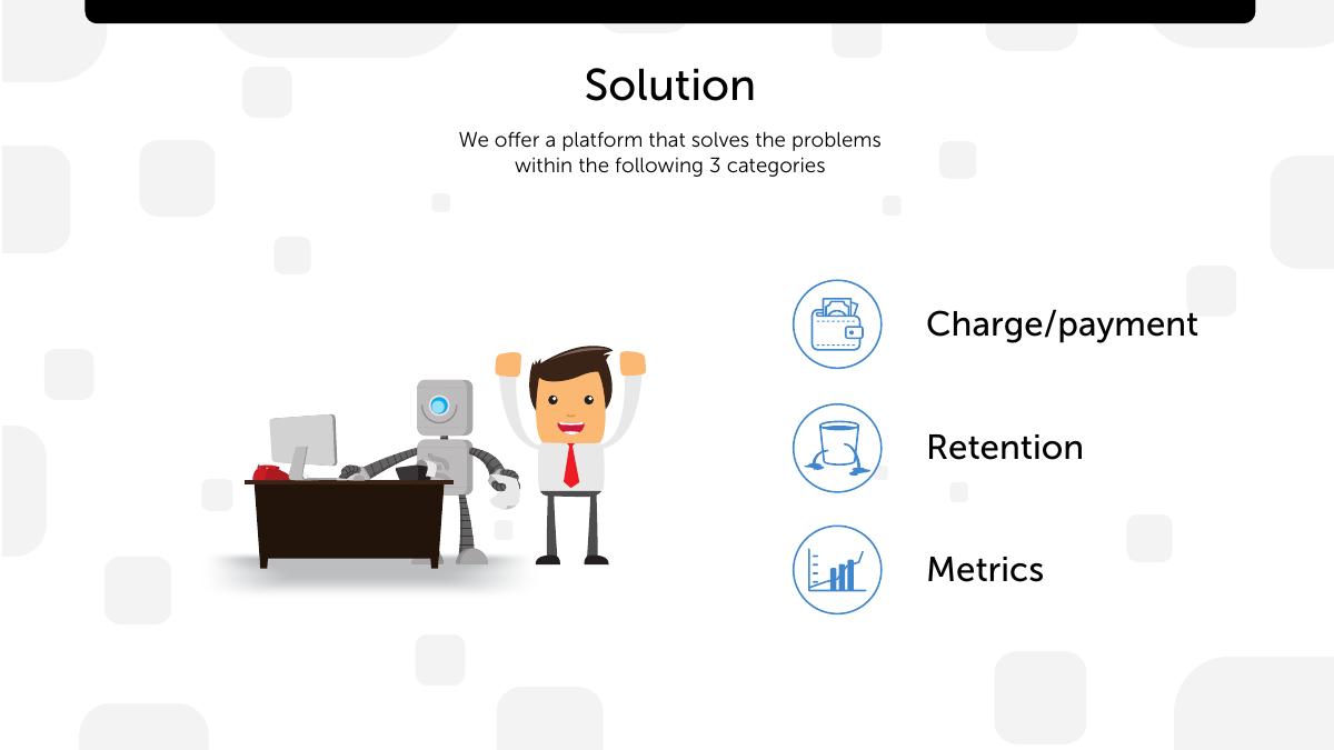
"We offer a platform that solves the problems within the following 3 categories", a robot-and-businessman illustration, and three icons: a wallet ( Charge/payment ), a leaking bucket ( Retention ), a bar chart ( Metrics ).
Collapsing a seven-item problem list into three named buckets is exactly the right move, and the mapping is legible: the seven chores on slide 2 all fall into charging, keeping the money once charged, and knowing what happened. The leaking-bucket icon for retention is the smartest single design decision in the deck — in recurring payments, involuntary churn from failed cards is a bucket with a hole in it, and one icon says it faster than a paragraph.
The weakness is that a three-word solution slide sitting directly after a seven-noun problem slide leaves the reader without a single concrete mechanism. There is no screenshot, no API call, no before-and-after. For a company whose whole positioning is "infrastructure in the cloud", the absence of any developer-facing artefact — five lines of code, a webhook payload, a dashboard — is a real gap . Stripe's contemporaneous decks and homepage won that market with seven lines of curl. iugu had the same product truth available and chose a robot cartoon.
Slide 4 — Business' target
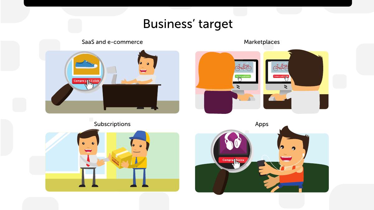
Four customer types, each with a small illustration: SaaS and e-commerce ("Compre com 1 click"), Marketplaces ("Vender seu produto"), Subscriptions ("Clube de Vinhos" — a wine club box), and Apps ("Comprar Música").
Naming four verticals with a concrete micro-example each is strong, and the wine club is the sort of specific, unglamorous, obviously-real example that makes a reader believe the company has actual customers. In 2015 Brazil, subscription boxes and marketplaces were the two fastest-growing categories of online commerce that the incumbent acquirers served worst — the split-payment and recurring-billing problems were genuinely unsolved. Choosing them is a defensible wedge.
But the slide is a list, not a prioritisation. Four target segments with no ranking, no relative size and no indication of which one is actually paying today reads to an investor as "we sell to everyone who has an internet business", which is the default answer of a horizontal infrastructure company that has not yet found its beachhead. The next slide says 200+ startups are using iugu; this slide does not say how those 200 split across the four boxes. That single missing breakdown is the difference between "we have four segments" and "we own subscriptions and are expanding into marketplaces".
Slide 5 — Clients
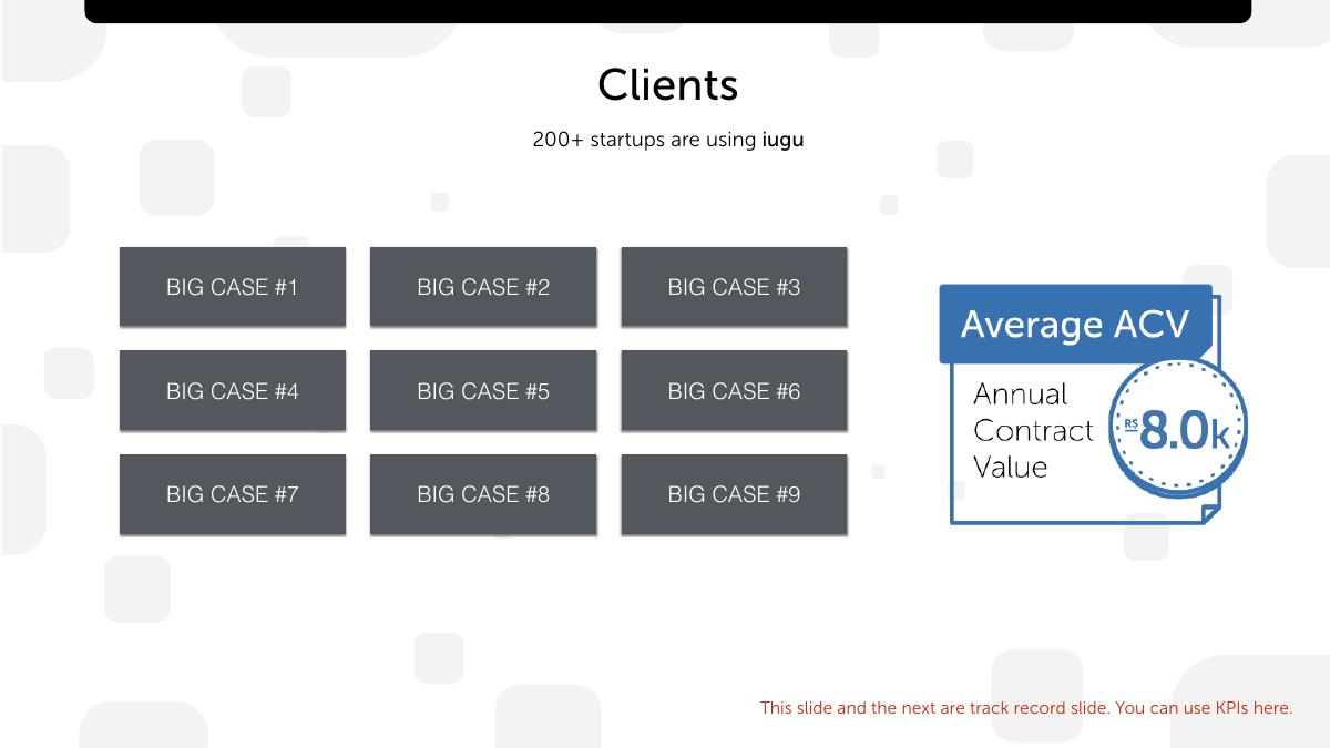
A headline claim — 200+ startups are using iugu — a 3x3 grid of logo placeholders reading BIG CASE #1 to BIG CASE #9, and a metric box: Average ACV (Annual Contract Value) R$ 8.0k . A note in the template's own voice adds: "This slide and the next are track record slides. You can use KPIs here."
Here is where the template's structure and its scrubbed data collide most usefully. The two surviving numbers are the only hard numbers in the entire deck, and they multiply: 200 clients x R$8,000 average ACV implies roughly R$1.6 million in annualised contract value . Hold that figure, because slide 7 will contradict it.
The choice to lead the client slide with ACV rather than logo count alone is correct and rare at this stage. A payments company that says "200 customers" is telling you about distribution; a payments company that says "200 customers at R$8k each" is telling you about the quality of those customers, which for a self-serve infrastructure product is the entire question. R$8k a year is a real business, not a hobby developer on a free tier — it implies the average client is processing meaningful volume, since the revenue is a fee on transactions.
The unforced error is calling the logo grid "BIG CASE". Even redacted, the label announces that the persuasive content of this slide is brand borrowing , and the template hands the copying founder nine empty boxes to fill with the largest names they can justify. Nine logos with no metric under any of them is a weaker slide than three logos with a result each. And "200+ startups" carries an unexamined risk that the deck never addresses: a customer base composed entirely of startups is a customer base with a structurally high mortality rate. There is no churn figure, no net revenue retention, no cohort — for a subscription-billing company, in a deck that dedicates an icon to Retention, that omission is conspicuous.
Slide 6 — Track record
A rising blue line labelled "Achieved" against a dashed grey "Proposed" line, with month markers at Jan/14, Apr/14, Jun/14 and Oct/14 and eleven bubbled percentages along the curve: 33%, 193%, 41%, 147%, 9%, 70%, 54%, 77%, 35%, 12% . The y-axis is unlabelled and its top value is a callout reading ??? . The subhead claims: "Growing average of 10% per week since public launch in November 2013." Below sit five empty tiles, Highlight #1 to Highlight #5.
This is the best-constructed slide in the deck and the one with the most serious arithmetic problem.
What it does right is the Achieved-versus-Proposed pairing . The dashed line is the plan the company presumably showed its existing investors; the solid line is what happened; the solid line is above it. Very few decks show the plan they set themselves and then show themselves beating it, and doing so converts a growth chart from a boast into a track record of forecasting accuracy. That is the difference between "we grew" and "we said we would grow and we did" — and it is why the slide is titled Track record rather than Growth.
Now the arithmetic. 10% per week compounds to roughly 61% per month and about 14,100% per year. The plotted bubbles are plainly monthly steps — they are spaced across a Jan/14-to-Oct/14 axis with ten to eleven readings — and the later ones read 9%, 35% and 12% . A 9% month is a 2.2% week. A 12% month is 2.9% a week. So the headline rate is three to five times the growth actually plotted in the second half of the chart , and the claim is anchored to "since public launch in November 2013", which by the Oct/14 marker is around fifty weeks. Compounded at the headline rate, fifty weeks of 10% weekly growth is a multiple of roughly 117x . Compounding the ten plotted monthly readings instead gives roughly 34x — an extraordinary result that the company then oversells by a factor of three.
That is the failure worth internalising: the real number, 34x in ten months, is spectacular, and the deck buries it under a rounder-sounding weekly rate that its own chart disproves. Any investor who divides 10% weekly into the 9% bubble will stop reading the chart and start auditing the founder. The deck also never says what is growing. Transactions? Volume? Revenue? Clients? The y-axis is a "???" and the metric is never named, which in the published template is defensible and in the original would have been the first question asked.
The five empty Highlight tiles are, structurally, the smartest thing on the page. They force the founder to annotate the curve with the events that caused the shape — the 193% spike, the 9% flat month — rather than leaving the line to speak for itself. A copying founder who fills those tiles with adjectives instead of events wastes the best real estate in the deck.
Slide 7 — Revenue growth
Two plotted series across nineteen months, Jan/14 to Jul/15: Fixed Expenses rising from R$75k to R$300k per month, and Gross Profit rising from R$10k to R$335k per month. The lines cross in June 2014 . Two summary bullets survive the scrub with their values zeroed: "current burn rate: 0K" and "gross profit 2015: ~0M" . Three more empty Highlight tiles sit beneath. The subhead reads: "Exceptional growth with managed expenses, marketing and cost of acquisition optimizations."
First, the slide is titled "Revenue growth" and contains no revenue line. It plots gross profit and fixed expenses. For a payments company those are wildly different quantities — gross profit is the net take rate after interchange and acquirer costs, and revenue could be five or ten times larger. A reader cannot compute a take rate, cannot compute gross margin, and cannot reconcile this slide with slide 5. Which brings us to the second problem.
Second, the two slides do not reconcile. Slide 5 implies about R$1.6m of annualised contract value from 200 clients at R$8k. Slide 7 shows R$335k of monthly gross profit by Jul/15, which annualises to roughly R$4.0m of gross profit — two and a half times the entire ACV base, before any cost of revenue. The two figures can only coexist if the client count grew substantially between the slides' respective as-of dates, or if ACV excludes transaction-fee revenue, or if the published numbers were altered independently of each other during the scrub. The deck offers no as-of date on either slide, so a reader cannot tell. Every deck with two numbers that imply a third should print the third itself , and this one leaves the reader to find a contradiction instead.
Third, the surviving bullets are internally inconsistent with the chart. The chart shows gross profit exceeding fixed expenses from June 2014 onward and by Jul/15 exceeding them by R$35k a month — a picture of a company at or past breakeven. Yet the slide still carries a line reading "current burn rate" . Both can be true (gross profit above fixed expenses says nothing about variable costs, taxes or capex), but the deck never resolves it, and the value that would have resolved it is redacted to 0K.
What the slide does brilliantly is the crossover . Plotting expenses and profit on the same axes so the reader can see the exact month the lines cross is far more persuasive than a revenue bar chart, because it answers the question an investor is actually asking — when does this stop consuming money? — with a picture instead of a promise. Almost no seed or Series A deck does this. It is the single most transferable idea in the whole file.
Slide 8 — Market size
A three-tier funnel: TRANSACTIONS VOLUME (Total Available Market) , VOLUME ON INTERNET (Serviceable Available Market) , SERVICES & APPS (Serviceable Obtainable Market) . All three values read ??? . A footnote states the sourcing: "Market Size and CAGR from ABECS and Banks Public data."
Redacted of numbers, the slide still teaches two things properly. The tiering is correct and, crucially, each tier is defined by a filter the company can actually apply — all card transactions, narrowed to the online share, narrowed to services and apps, which is the segment slide 4 named. That is a real TAM/SAM/SOM, not the usual "the global payments market is $2 trillion and we only need 1%".
And the footnote names the sources : ABECS is the Brazilian card industry association, and its data is public and checkable. Naming a national trade body rather than a paywalled analyst report is a credibility move that costs nothing and that most decks skip. A reader who wants to audit the funnel can.
The gap the template leaves is the one that matters most for a fee-per-transaction business: market size in transaction volume is not market size in revenue . iugu's take is a few points of every R$100. A funnel expressed in gross volume with no take rate applied invites the reader to imagine a revenue pool that is roughly thirty times larger than the one the company can actually address. The original almost certainly carried the numbers; the structure does not force the founder copying it to carry the take-rate conversion, and most will not.
Slide 9 — Competitor landscape
A 2x2 map. The y-axis runs from Basic Support at the bottom to Advanced Support at the top; the x-axis from Only transactions on the left to Value added services on the right. Plotted are Competitor #A, #B, #C, and iugu. Two footnotes: "Only considering value added services available in Brazil" and, remarkably, "Original slide has about 30 competitors."
The axis choice is genuinely good. Neither axis is a euphemism for "us versus them" — support quality and breadth of value-added services are both attributes a customer would independently rank, and both are attributes the company can actually be measured on. That is much harder to construct than the standard "Easy to use / Powerful" quadrant where the founder invents the two dimensions on which they happen to win.
The footnote, though, is an admission with teeth. A competitive landscape with about thirty players is not a positioning problem, it is a market-structure fact , and a 2x2 that shows three of them is choosing which fight to describe. Brazilian payments in 2015 contained Cielo, Rede, PagSeguro, Moip, Stone and a long tail — several with balance sheets and distribution iugu could not match. Any investor with Brazilian market knowledge knew that, and the deck's own footnote confirms the founder did too. The honest slide names the thirty, clusters them, and then explains why the cluster iugu sits in is defensible. The published template teaches the opposite lesson: put three competitors on a map and win the top right.
Slide 10 — Business model
"Fee over transactions". Two parallel flow diagrams, one for Credit Card and one for Bank Slip (boleto). Each starts with a circle reading R$100 Client Pays , passes through three stacked fee bars whose values are stripped to bare "R$", and ends in a circle reading R$93,00 Merchant Receives . Both diagrams are annotated in red: "Something like this…" and, in the corner, "Original slide has a nice graphical explanation".
This is the clearest slide in the deck. The R$100-in, R$93-out framing does in one picture what a pricing table cannot: it shows the whole value chain, including the parties iugu pays . Three deductions, three recipients, and the merchant's net at the bottom. An investor reads the total take (7 reais on 100) and can immediately ask the only question that matters — how much of that 7 does iugu keep versus pass to the acquirer and the bank?
Which the redaction removes. With all three bars stripped to "R$", the slide shows a 7% total cost to the merchant and zero information about iugu's share of it . In the original this would have been the most scrutinised slide in the document. It is also the slide where showing both rails side by side is the real insight: credit card and boleto have completely different cost structures, settlement timings and default profiles in Brazil, and putting them on the same axes with the same R$100 input invites the comparison. The deck sets up that comparison and then, because both diagrams carry identical R$93 outputs, implies the two rails cost the merchant exactly the same — which they do not. That is an artefact of the template, and it is exactly the kind of artefact a copying founder will inherit without noticing.
Slide 11 — Marketing strategy
Eight bullets: create content (educate market and natural SEO), events, accelerators & incubators, social networks, startup media, online advertising, startup groups, word of mouth ("Customers talk about us to other customers").
The channel list is credible and correctly ordered for the customer it serves — a company selling billing infrastructure to Brazilian startups genuinely does reach them through accelerators, startup media and content. Putting content and SEO first and paid advertising seventh reflects the actual economics of a low-ACV, self-serve product, and it is the right order.
But eight channels with no CAC, no attribution, no mix and no budget is a list of things the company does, not a strategy. The subhead on slide 7 explicitly claims "cost of acquisition optimizations" — so the company was measuring CAC — and this slide, the one place that number belongs, does not print it. With R$8k ACV on slide 5 and a CAC figure here, the reader could compute a payback period in seconds, and payback period is the number that decides whether a self-serve infrastructure company is a good business. The deck has both halves of the most important ratio in the document and never puts them in the same room.
Slide 12 — Team
Six people with photographs: Patrick Negri (CEO) , "seasoned Brazilian serial entrepreneur, founder at @iugu, strong background in tech industry, high scalability and large scale services"; Marcelo Paez (COO) , founder, "strong ERP and problem solving background, worked as a consultant at several multinational companies in Brazil and abroad"; Rosi Rodrigues , Product Evangelist, "director @ABStartups fostering the Brazilian startup ecosystem"; Alexandre Paez , Software Engineer, "pragmatic programmer with focus on Rails"; Brayan Di Palma , Software Engineer; Giovani Alves , Designer.
Notably, this slide was not redacted. Real names, real photographs, real roles — the founders scrubbed their revenue and their cap table and kept their faces, which tells you what they considered confidential and what they considered the point.
The strengths are real. The Rosi Rodrigues line is the strongest credential on the slide because it is a specific institutional role (director at ABStartups, the Brazilian startup association) that maps directly onto the distribution strategy on slide 11 — accelerators, startup groups, startup media. That is a team member whose network is a channel, and the deck lets the reader make that connection without spelling it out.
Two weaknesses. First, "seasoned serial entrepreneur" and "strong background in tech industry" are adjectives where the reader wants nouns : which companies, what outcome, how large was "large scale". A founder with a real track record should name it; a bio that describes the shape of experience rather than its content reads as though the content is thin, which in Negri's case it was not. Second, putting two software engineers and a designer on the same slide as the CEO and COO makes a six-person company look like a six-person company. At Series A that is fine and honest. It also means the slide answers "who is here" and never answers the question a growth-stage investor is holding: who is missing, and is the round paying for them? There is no gap analysis and no first hires named.
Competitors Three anonymised players on a 2x2; footnote admits ~30 exist The full landscape clustered, with iugu's defensible cluster explained
Business model R$100 in, R$93 out, all three fee bars stripped to "R$" Each deduction valued, showing iugu's net take versus acquirer and bank costs
Team Six real people, real photos, real roles — not redacted Identical, ideally with named prior companies instead of adjectives
Investment "xM PRE-MONEY", "??M zM from current investors", three investor slots Round size, pre-money, runway in months, named participating investors
Contact "CEO name / address@example.com / +55 DDD PHONE" Patrick Negri's direct line and a specific next step
How you would rebuild this deck today
Fix the growth claim to match the chart. Delete "10% per week" and write the number the data supports: "34x in ten months, every month above plan." Never let a headline rate exceed what your own plotted points prove — the audit takes an investor eight seconds and costs you the meeting. · Rename slide 7 and add the revenue line. Three series: revenue, gross profit, fixed expenses. Label the crossover month explicitly ("cash-flow positive from June 2014"). Print the take rate as a percentage somewhere on the page. · Reconcile clients to revenue on one page. Clients x ACV should visibly equal the revenue line, with an as-of date on both. If the two are measured differently, say so in a footnote rather than leaving a reader to find the gap. · Label the y-axis and name the metric. "Monthly transaction volume, R$m" beats an unlabelled curve with a "???" ceiling, however dramatic the shape. · Add a retention slide. Logo churn, revenue churn and net revenue retention by cohort. A subscription-billing company that sells retention and does not report its own is asking an obvious question of itself. · Fill the five Highlight tiles with events, not adjectives. "Boleto launched", "first marketplace client", "API v2" — annotate the causes of the curve's shape, especially the flat months. Explaining a 9% month builds more trust than hiding it. · Convert the market funnel to revenue. Take the SOM in transaction volume, apply your actual take rate, and show the resulting revenue pool. A smaller, honest number you can defend beats a large one that collapses under the first question. · Show all thirty competitors, then cluster them. Group by category — acquirers, gateways, sub-acquirers, billing layers — place yourself, and state plainly why the incumbents will not build your layer. A deck that names its giants is trusted on everything else. · Put CAC next to ACV. One line: CAC, ACV, payback period in months, split by channel if you have it. For a self-serve infrastructure product that ratio is the investment case. · Restate the ask as amount first. "Raising R$X on R$Y pre-money, Z months of runway, R$W already committed from existing investors" — then link each use-of-funds category to the milestone it buys. · Replace bio adjectives with nouns. Name the prior companies, the scale operated, the outcome. And add the roles you are hiring with this round, so the team slide answers "who is missing" as well as "who is here". · Close with a next step, not an email address. A data-room link and a stated close date convert a good meeting into a scheduled one.
The transferable lesson
iugu did something generous and slightly reckless: it published its own investor deck as a template so other Brazilian founders could copy the structure. The generosity is obvious. The recklessness is that a template transmits structure perfectly and judgement not at all . Every founder who downloaded this file inherited a genuinely good skeleton — currency declared on the cover, Achieved against Proposed, the expense/profit crossover, named market sources, a complete ask slide — and also inherited a growth headline that contradicts its own chart, a revenue slide with no revenue on it, a competitive map that hides twenty-seven players, and a market sized in the wrong unit.
The deeper point is about what redaction reveals. Strip the numbers out of a deck and what remains is the set of claims the founder thought were safe to publish. In iugu's case what remained was the team, the positioning line, the structure, and the sources — and what disappeared was every figure. That is the correct instinct about confidentiality, and it accidentally proves something about persuasion: with the numbers gone, this deck argues almost entirely through the shape of its evidence, and it still mostly works. The Achieved-versus-Proposed pairing persuades even with no values on the axis, because the relationship between the two lines is the argument.
Which means the reverse is also true, and it is the thing to take back to your own deck. If your slides only work when the numbers are large, your structure is doing none of the work. Cover your own figures with your hand and read your deck again. Does the order still make an argument? Does each chart still show a relationship rather than a level? Does the reader still know what you are asking for? If the answer is no, the numbers are not saving you — they are hiding the fact that nothing else is there.
And check your headline against your own chart before an investor does. iugu grew roughly 34x in ten months and told the world it grew 10% a week. The first number was true and extraordinary. The second was rounder, easier to say, and disproved by the picture printed directly beneath it.
Frequently asked questions
- What is iugu?
- iugu is a Brazilian financial-infrastructure company founded in São Paulo by Patrick Negri and Marcelo Paez, positioned as 'financial infrastructure in the cloud'. It provides charging, payment, recurring-billing, retention and metrics tooling for SaaS companies, e-commerce, marketplaces, subscription businesses and apps, monetised as a fee over each transaction on both credit card and boleto (bank slip) rails.
- Is the iugu pitch deck a real investor deck?
- It is both. iugu published its own investor deck as a reusable template for other founders, stating on slide 1 that 'this isn't our original deck — some data was changed or removed to allow publishing'. The structure, team slide, positioning and sources are real; client logos, market-size values, competitor names, financial summaries and the funding ask are replaced with placeholders like 'BIG CASE #1', '???' and 'xM PRE-MONEY'.
- What is wrong with the iugu growth chart?
- The subhead claims a growing average of 10% per week since the November 2013 public launch, but the percentages bubbled along the same curve are monthly steps that include 9%, 35% and 12%. Ten percent weekly compounds to about 61% per month and roughly 14,100% per year, so the headline is three to five times the plotted rate. The chart's own data implies roughly 34x growth over ten months — spectacular, and undersold by being overstated.
- How many slides is the iugu pitch deck?
- Fourteen slides at 1920 x 1080 points (16:9), built in Apple Keynote on macOS 10.11.1 and exported on 11 November 2015. The sequence is cover, problem, solution, business target, clients, track record, revenue growth, market size, competitor landscape, business model, marketing strategy, team, investment and key milestones, and a closing contact slide.
- Which slides should founders copy from the iugu deck?
- Three. The track-record slide plots Achieved against Proposed, so the reader sees not just growth but forecasting accuracy. The revenue slide plots fixed expenses and gross profit on shared axes so the crossover month — June 2014 — is visible rather than promised. And the cover declares 'All values in Brazilian Reais (BRL)' in nine words, removing currency ambiguity from every chart that follows.
- What would make an investor reject the iugu deck?
- A headline growth rate contradicted by the chart printed beneath it; a slide titled 'Revenue growth' with no revenue line; client count times ACV implying R$1.6m against a gross-profit line implying R$4.0m with no as-of dates; a competitor map showing three of roughly thirty players; no churn or retention data from a company that sells retention; and an ask expressed as a pre-money valuation with no round size, runway or use-of-funds-to-milestone linkage.