The Match Box pitch deck is a fascinating artifact of early mobile social discovery. Consisting of just 10 slides, it foregoes traditional business plan elements—like market size, competition, and team—in favor of a tight, character-driven narrative. The deck follows 'Matt,' a young man at a party who suffers from the 'Fear of Rejection.' Match Box is presented as the 'cure' through a 'Like or Not' game where connections are only revealed if interest is mutual. While the deck is light on business fundamentals, it is heavy on psychological insight. It identifies that the barrier to social inte…
Key takeaways
- The deck is built entirely around a single narrative persona ('Matt') to illustrate a psychological pain point.
- It identifies 'Fear of Rejection' as a massive market friction that can be solved through product mechanics.
- The 'Double Opt-In' (mutual liking) is presented as the 'Secret Sauce' or 'Cure' for social anxiety.
- Monetization is focused on 'Freemium' features and virtual goods, common in early mobile gaming and social apps.
- The deck uses WIFI-based hyper-location for better indoor accuracy and battery efficiency compared to 2012-era GPS.
- Major business elements—Team, Market Size, Competition, and Funding Ask—are completely missing from the slides.
- The UI mockups contain internal data inconsistencies (50 interests vs. 2 interests) that suggest a rushed or conceptual phase.
What this deck actually is
This is a 10-slide seed-stage pitch deck for Match Box , the application that would eventually become Tinder. The deck functions primarily as a narrative storyboard, focusing almost exclusively on a single user persona named "Matt" to illustrate the core value proposition: the elimination of the "fear of rejection" through mutual-opt-in discovery. It is an artifact of the early 2010s mobile app boom, emphasizing hyper-location and social graph integration via Facebook.
The single most important finding in this deck is its uncompromising focus on a specific psychological friction point . While most dating apps of the era focused on complex algorithms or long-form profiles, Match Box identifies the "Fear of Rejection" as the primary market barrier and proposes a mechanical solution (mutual liking) as the "cure." The deck is notably light on market size, competition, and team, suggesting it was used as a conceptual proof-of-concept rather than a comprehensive business plan. It relies on the "Double Opt-In" as its primary innovation, attempting to gamify social interaction through a "Like or Not" mechanic.
Slide-by-slide walkthrough
Slide 1: Title Slide
The deck opens with a minimalist title slide featuring the "Match Box" logo in an orange script font, accompanied by the tagline "the flirting game..." in a smaller, grey font. The background is a textured, light beige, setting a casual and approachable tone. There are no names of founders, no corporate entity name, no date, and no contact information present on this opening screen. The branding is front and center, but the slide provides no professional context for the viewer.
For an investor, this slide establishes the brand identity as something playful and informal rather than clinical or transactional. By calling it a "flirting game" instead of a "dating application" or "social network," the founders are attempting to lower the stakes for the user. This positioning suggests a focus on engagement and entertainment, potentially widening the top of the funnel compared to more serious matrimonial services. However, the lack of professional identifiers (names, titles, or a date) makes the deck feel like a preliminary internal concept rather than a formal pitch to external capital. It is an "impact" slide that fails to provide the basic metadata required for a business presentation.
The strongest version of this slide would retain the clear, approachable branding but include essential metadata. Adding the names of the founding team and a clear, high-level mission statement (e.g., "Revolutionizing social discovery through mutual intent") would provide immediate context. A subtitle indicating the stage of the pitch (e.g., "Seed Round, Q2 2012") would also help orient the investor regarding the maturity of the project. As it stands, the slide relies entirely on the presenter to establish who is behind the project and why they are qualified to build it.
Slide 2: Meet Matt
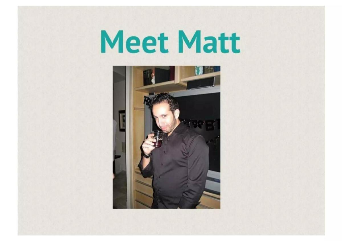
This slide introduces the protagonist of the deck’s narrative, "Matt." The slide features teal header text "Meet Matt" above a centered photograph of a man in a black shirt holding a drink in a room with a TV and shelving. The photo is candid and appears to be taken in a domestic setting, reinforcing the idea of a real person in a common social environment. There is no text on the slide other than the header and the implied identity of the person in the photo.
From an investor’s perspective, this is a classic "User Persona" slide. It attempts to put a face to the data and humanize the target market. By showing Matt in a social setting (a party or a gathering, as suggested by the drink and casual attire), the deck anchors the utility of the app in real-world social environments. However, the slide provides zero demographic data or psychographic profiling beyond the image. An investor is left to guess Matt's age, location, occupation, or why he specifically represents a large enough market segment to build a business around. Is Matt a college student, a young professional, or a generic stand-in for every single person on earth? The slide does not clarify.
A stronger version of this slide would include a few bullet points defining the "Matt" segment with quantitative data. For example, "Matt: 24, Urban Professional, spends 3 nights a week socializing but struggles to make new connections." This would transform the slide from a simple photo into a data-backed identification of a target market. It would move the narrative from "here is a guy" to "here is a representative of a 50-million-person demographic." Furthermore, the slide could benefit from mentioning the specific pain point Matt faces before the next slide introduces it, linking the persona more tightly to the problem.
Slide 3: The Social Friction
The narrative continues with the text: "Matt spots a girl he likes at a party... BUT, like most of us, Matt won't go over to say hello." The text is centered on the same light beige background, using teal for the narrative and red for the word "BUT" to signal a conflict. This slide identifies the specific moment of failure in current social interactions: the missed opportunity caused by inaction. It frames the problem as a universal human experience rather than a niche technical issue.
This slide works as a "Problem" slide, but it does so through storytelling rather than statistics. It highlights a universal social anxiety. By using the phrase "like most of us," the founders are attempting to build empathy with the investor, suggesting that the problem is ubiquitous and therefore the market for a solution is massive. The use of red for the "BUT" emphasizes the friction point that the app intends to solve. It effectively isolates the "last mile" of social discovery—being in the same room as someone but failing to bridge the gap between interest and interaction.
To make this stronger, the deck should quantify this "social friction." While the anecdote is relatable, adding a metric about the size of the "loneliness economy" or the percentage of singles who find traditional meeting methods (like bars or parties) stressful would provide a business case. A "Problem" slide is most effective when it pairs a relatable story with an undeniable market pain point expressed in numbers. Without data, the investor is forced to rely on their own personal anecdotal experience to decide if the problem is worth solving.
Slide 4: The Core Problem: Fear of Rejection
The deck doubles down on the psychological barrier with the text: "He has the same problem most of us do... FEAR OF REJECTION!" The words "FEAR OF REJECTION" are highlighted in large, red, all-caps text. This slide acts as the diagnosis for the symptoms described in Slide 3. It identifies the specific emotional wall the product is designed to dismantle, moving from a situational description to a psychological insight.
Investors reading this will see that the founders have identified a psychological insight rather than just a technical one. The deck argues that the barrier to meeting people isn't a lack of proximity (Matt is already at the party) or a lack of interest (Matt spots a girl he likes), but the risk of ego damage. This is a profound insight for a social app, as it suggests the "product" isn't the meeting itself, but the safety of the interaction. However, spending two full slides on this single narrative point is a luxury that few decks can afford, as it delays the introduction of the actual product and its mechanics. It risks becoming repetitive for a fast-moving investor.
The strongest version of this slide would combine the narrative of Slide 3 and Slide 4 into a single, high-impact "Problem Statement." This would free up space for a "Solution" slide that outlines the unique mechanism of the app earlier in the sequence. Consolidating the "why" allows more time for the "how." Additionally, the slide could benefit from a brief mention of why current solutions (online dating sites) fail to solve this specific "Fear of Rejection" in real-time, face-to-face environments.
Slide 5: The Cure: Product Introduction
This slide introduces the product as "Meet the cure... Match Box the flirting game..." It features the first look at the UI, showing a smartphone displaying the app's login screen. The screen contains a "Sign In With Facebook" button and a grid of user photos. The tagline explains the core mechanic: "Like people around you and get connected if they like you too." This slide marks the transition from the problem to the solution, positioning the app as the antidote to social anxiety.
This is the most critical slide in the deck because it introduces the "Double Opt-In" mechanic. For an investor, this is the "Secret Sauce." By requiring mutual interest before a connection is made, the app effectively eliminates the "Fear of Rejection" mentioned in the previous slide. The inclusion of the Facebook login is also a key technical detail, implying that the app will leverage existing social graphs to verify identity and reduce friction in account creation. It signals that the app is "socially validated" from the first click, solving the trust issue prevalent in early mobile dating.
A stronger version of this slide would explicitly call out the "Double Opt-In" as a proprietary or unique workflow (at the time). It should also explain why Facebook login is a strategic choice—namely for trust, safety, and rapid data acquisition. The visual of the grid is good, but the slide could benefit from a clearer call-out of the "Like/Pass" mechanic that defines the user experience. An investor needs to know not just what it does, but why this specific UX is a "game" rather than a chore.
Slide 6: The User Interface (Discovery)
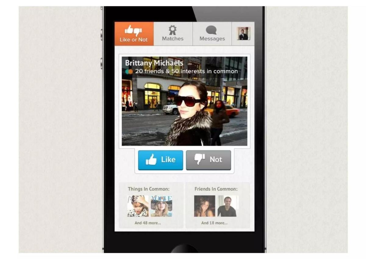
This slide shows the "Like or Not" interface using a profile for "Brittany Michaels." It provides a glimpse into the data richness of the app, highlighting: "20 friends & 50 interests in common." Below the profile picture are two prominent buttons: "Like" and "Not." The slide also lists "Things In Common: And 48 more..." and "Friends In Common: And 18 more..." which suggests a deep integration with the user's social graph to find points of relevance.
This slide demonstrates how the app provides "social proof" to the user. By showing mutual friends and interests, it moves beyond physical attraction and provides a basis for conversation. For an investor, this shows a sophisticated use of the Facebook API to create a more relevant and "safe" discovery experience. It also clarifies the binary nature of the interaction—you either like someone or you don't; there is no middle ground, which drives rapid decision-making. The slide effectively illustrates how the app handles "discovery" in a way that feels curated rather than random.
The strongest version of this slide would explain the algorithm behind these "Matches." How does the app decide who to show Matt? Is it just proximity, or is it weighted by the number of mutual friends? Including a brief mention of the "Hyper-location" technology here would reinforce the "Under the Hood" slide that comes later. Additionally, the slide should clarify if the "50 interests in common" is a realistic average or an edge case, as this number seems high for a typical user pair.
Slide 7: The Match
This slide displays the "Matches" screen, showing that "Brittany Michaels" has liked Matt back. The text reads: "People that like you back: Brittany Michaels." Notably, the data listed for Brittany has changed from the previous slide: it now says "20 friends & 2 interests." This is an internal inconsistency, as Slide 6 claimed they had "50 interests in common." The UI shows a simple list format for matches, emphasizing the successful connection.
For an investor, this is the "Resolution" of the narrative. Matt's problem (fear of rejection) has been solved because he only finds out about Brittany's interest once he has already expressed his own. The inconsistency in the number of interests (50 vs 2) is a minor detail that could suggest the mockups were created hastily or represent different stages of the user journey, but it detracts from the professional finish of the deck. Despite this, the core message remains clear: the system successfully identifies and facilitates mutual intent, which is the platform's primary value driver.
The strongest version of this slide would ensure data consistency across the mockups to avoid distracting the reader. More importantly, it should highlight the psychological reward—the "dopamine hit"—of receiving a match notification. This is the engine of the app's retention, and calling it out as a behavioral hook would make the business case much stronger. A "Match" isn't just a data point; it is a successful outcome of the "flirting game."
Slide 8: The Conversation
This slide shows a chat interface between Matt and Brittany. Matt Pouldar (using the founder's actual last name, which is the only place it appears in the deck) opens with: "Hey Brittany! Looks like we have so much in common. Great to meet you!" Brittany responds, "Heyyyy. Haha, yes we do. Wow this MatchBox thing is amazing! Surprised it works." The conversation concludes with Matt affirming that the app "really work[s]!" The UI includes a "Send" button and a timestamp of "2 min ago."
This is a "Validation" slide. It attempts to show the end result of the product: a successful social interaction. However, the dialogue feels highly scripted and "salesy," with the characters literally complimenting the app within the chat. Investors generally prefer to see user engagement metrics or testimonials from actual beta testers rather than a fictionalized dialogue that serves as a self-congratulatory advertisement for the software. Seeing the founder's name ("Matt Pouldar") in the mockup adds a touch of authenticity, but the conversation itself feels artificial.
The strongest version of this slide would replace the fictional dialogue with a list of "Key Engagement Features." For example: "In-app messaging to keep users in the ecosystem," or "Push notifications to drive return sessions." If a conversation is shown, it should feel authentic to how users actually communicate, rather than acting as a mouthpiece for the founders' value proposition. It should also emphasize how the common interests mentioned in the previous slides are used as "icebreakers" in the actual chat.
Slide 9: Under the Hood (Technical Features)
This slide moves away from the narrative to list technical features. The header bar says "NEW Signals for Relevance." The bulleted list includes: "Hyper-location (Using WIFI, not GPS)," "Mutual liking," "Social interests in common," and "Friends in common." This is the first time the deck attempts to explain the technical differentiation of the product.
This is the first and only technical slide. The mention of "Using WIFI, not GPS" for hyper-location is a specific technical choice, likely aimed at battery efficiency or indoor accuracy, which is crucial for the "party" or "bar" scenario where GPS signals are often weak. For an investor, this slide is quite thin. It doesn't explain the stack, the scalability, or any proprietary IP. It essentially restates the features already shown in the mockups under the guise of "technical signals." It fails to address the "how" in a way that would satisfy a technical due diligence process.
A stronger version would go much deeper into the "Signals for Relevance." It should explain the backend architecture that handles real-time location updates for thousands of concurrent users and how the matching engine prioritizes the queue. It should also address data privacy and security, especially given the reliance on real-time location tracking. A "Technical" slide should convince the investor that the team has a defensive moat or at least a highly optimized system that competitors would struggle to replicate.
Slide 10: Revenue Opportunity
The final slide outlines the business model under the header "Revenue Opportunity." It lists "In-app Purchases" with three specific tactics: "2 matches exposed for free $1 to see each new match thereafter," "Pay to send virtual flirt gifts (drink, rose, etc)," and "Pay to show up higher in Like or Not list." This slide is the first time the deck acknowledges that the "game" is also a business.
This slide is critical for demonstrating business viability. The model is a "Freemium" approach that creates artificial scarcity. The idea of charging "$1 to see each new match" is a direct tax on the core value proposition. While it shows a path to revenue, it could also be seen as a friction point that might stifle growth in a social network where liquidity (a high number of active users) is everything. An investor might worry that charging for the primary "win" state (the match) would discourage users from staying on the platform. The "virtual gifts" and "priority listing" are standard mechanics borrowed from gaming and early social discovery sites like Badoo.
The strongest version of this slide would provide revenue projections or unit economics. How many matches does an average user get? What is the projected conversion rate from free to paid? Additionally, the deck ends abruptly here. It lacks a "Team" slide, a "Market Size" slide, a "Competition" slide, and a "Call to Action" (how much are they raising?). Ending on a list of ways to charge users, without showing the team capable of executing it or the market they intend to capture, leaves the pitch feeling incomplete and lopsided toward monetization rather than growth.
Concrete fixes in priority order
Add a Team Slide: The most glaring omission is the absence of the founders. Investors invest in people at the seed stage. This slide must include photos, backgrounds, and relevant wins for every founder (e.g., "Founder of X," "Developer of Y"). · Quantify the Market: The deck relies on a single persona ("Matt"). It needs a TAM/SAM/SOM slide to show that there are millions of "Matts" and a multi-billion dollar opportunity in the "social discovery" or "dating" space. Use 2012-era data to support the scale. · Provide Competitive Analysis: Match Box does not exist in a vacuum. A slide comparing Match Box to existing players like Match.com, eHarmony, or Badoo is necessary to show how the "Double Opt-In" and "Hyper-location" are superior differentiators. · Define the "Ask": The deck ends without asking for money. It needs a "Funding & Use of Proceeds" slide detailing how much capital is being raised (e.g., "$500k for Seed") and exactly what milestones (user growth, geographic expansion) it will fund. · Fix Data Inconsistencies: Ensure the UI mockups are consistent (e.g., the "50 interests" on Slide 6 vs. "2 interests" on Slide 7) to demonstrate attention to detail and product coherence. · Evidence of Traction: Even if in a closed beta, the deck should include any early signals—user growth, number of matches made, or retention rates—to move the pitch from a "theoretical game" to a "proven engagement engine." · Professionalize the Dialogue: Replace the scripted chat in Slide 8 with a list of communication features or real user engagement stats. If showing a chat, make the dialogue feel like a natural user interaction rather than a marketing script.
Frequently asked questions
- What is the 'problem' Match Box is trying to solve?
- The deck identifies 'FEAR OF REJECTION' as the primary barrier to social interaction and proposes a 'Double Opt-In' (mutual liking) as the mechanical 'cure.'
- How does Match Box handle location tracking?
- Match Box plans to use 'Hyper-location' based on WIFI rather than GPS to connect people in immediate proximity, such as at a party or bar.
- How does the app intend to make money?
- The deck proposes charging $1 to see matches after the first two free matches, selling virtual gifts (roses, drinks), and charging for priority placement in the discovery list.
- Does the deck show any real user traction or data?
- No, the deck relies entirely on a fictionalized persona ('Matt') and a scripted chat between 'Matt' and 'Brittany' to show the product works.
- Who are the founders mentioned in the deck?
- Surprisingly, there is no team slide in this 10-slide deck. The only founder name appears as 'Matt Pouldar' in a chat mockup on Slide 8.
- How does the app use Facebook data?
- The deck highlights 'Social interests in common' and 'Friends in common' pulled from Facebook to provide social proof and icebreakers for users.