The nurseVersity pitch deck is a study in extreme minimalism. Spanning only nine slides, the deck avoids the traditional dense blocks of text found in early-stage EdTech presentations, opting instead for large-scale typography and simple iconography. The company highlights a significant pain point—that 50% of nursing students fail their first exam attempt—and counters it with a claim of a 100% pass rate for their users. While the deck successfully communicates traction, citing over 10,000 students helped, it is notably absent of a team slide, a detailed business model, or a specific financial…
Key takeaways
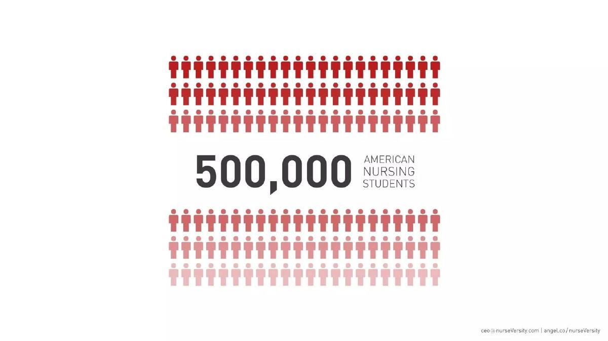
- The deck identifies a specific market of 500,000 American nursing students on slide 4.
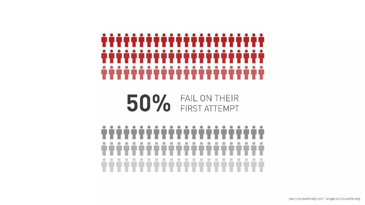
- A critical pain point is established on slide 5: a 50% failure rate on first exam attempts.
- The company claims a 100% pass rate for students using their platform on slide 6.
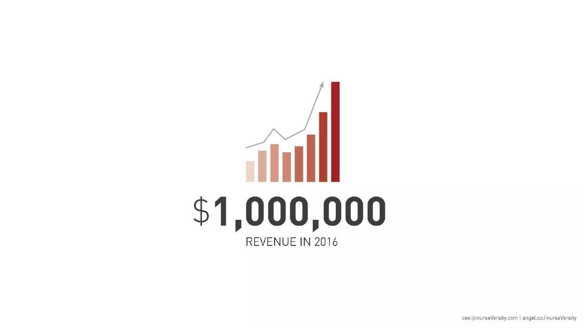
- Slide 2 sets a bold financial target of $1,000,000 in revenue for 2016.
- Traction is quantified on slide 8, stating they have helped over 10,000 students.
- The deck completely omits a team slide, leaving the founders' backgrounds to the verbal pitch or external links.
- There is no slide detailing the specific use of funds or the total amount being raised.
- The presentation relies on a 'less is more' aesthetic, with several slides containing fewer than ten words.
The Minimalism of the nurseVersity Pre-Seed Deck
The nurseVersity pitch deck, used to raise $125,000 in 2014, is an outlier in the EdTech space. Most education-focused decks are bogged down by pedagogical theory, complex regulatory frameworks, and dense competitive matrices. nurseVersity took the opposite approach, producing a 9-slide deck that functions more like a visual aid for a speech than a standalone document. It relies on massive numbers and stark contrasts to make its case.
The Opening Hook and Financial Ambition
Slide 1: Title Slide The deck opens with the nurseVersity logo and the tagline: "we help you plan, prepare, and then pass." The branding is clinical, using a red cross motif that immediately identifies the sector. The footer contains a contact email and an AngelList link, which was a standard practice for startups in the mid-2010s to provide investors with a path to deeper due diligence.
Slide 2: Revenue Projection Immediately following the title, the deck moves to a financial milestone: "$1,000,000 REVENUE IN 2016." This is a bold choice for a pre-seed deck. By placing a seven-figure revenue target on the second slide, the founders are signaling that this is a scalable business, not just a content play. The accompanying bar chart shows exponential growth, though it lacks a Y-axis with historical data, making it a purely directional graphic.
Defining the Market and the Failure Gap
Slide 3: About Us This is a transition slide featuring a top-down photo of a desk with a laptop, tablet, and coffee. Curiously, despite the title "ABOUT US," there is no information about the founders, their history, or their qualifications on this slide or any other. In a pre-seed round, the team is usually the most important factor; here, the founders choose to let the market data speak for them.
Slide 4: Market Size The deck quantifies the Total Addressable Market (TAM) with a single number: "500,000 AMERICAN NURSING STUDENTS." The use of red and pink human icons provides a visual sense of scale. This slide is effective because it narrows the focus to a specific, high-value niche rather than claiming a generic "education" market.
Slide 5: The Problem This is the 'villain' of the story. The slide states that "50% FAIL ON THEIR FIRST ATTEMPT." By highlighting such a high failure rate, nurseVersity establishes that the current status quo in nursing education is broken. For an investor, this represents a massive opportunity for a disruptor to capture value by improving outcomes.
The Solution and Traction
Slide 6: The Promise In direct response to the 50% failure rate, Slide 6 claims a "100% PASS WHEN USING THE NURSEVERSITY EXAM PREP PLATFORM." While a 100% success rate is a statistically difficult claim to maintain at scale, it serves as a powerful marketing hook. The background image shows diverse students smiling at a computer, reinforcing the positive outcome of the product.
Slide 7: Process & Platform This slide is the most abstract in the deck. Using two interlocking gears, it represents the "Process & Platform." It fails to explain what "The Adviser" technology is or how the proprietary adaptive learning works. In a modern deck, this would typically be where a founder includes a mobile app mockup or a workflow diagram.
Slide 8: Traction The deck concludes its data points with a traction slide: "WE HAVE HELPED OVER 10,000 STUDENTS." For a pre-seed company in 2014, 10,000 users is a significant milestone. It proves that there is organic demand for the product and that the founders have moved beyond the "idea" stage. The image of professionals jumping in the air is a standard stock photo choice for the era, meant to convey success and relief.
Slide 9: Closing The deck ends as it began, with the logo and tagline. There is no "Ask" slide, no breakdown of how the $125,000 would be spent, and no roadmap for future product development.
What Works in the nurseVersity Deck
The strength of this deck lies in its clarity of purpose . Within 60 seconds of flipping through these slides, an investor knows exactly who the customer is (nursing students), what the problem is (high failure rates), and that the product is already working (10,000 users). By stripping away the fluff, the founders forced the audience to focus on the most compelling metrics.
The visual consistency is also a plus. The red, white, and grey color palette is maintained throughout, creating a professional and cohesive brand identity. The use of large-format numbers makes the deck highly readable, even from the back of a room during a demo day pitch.
What is Missing
The most glaring omission is the Team Slide . In early-stage venture capital, investors are betting on the people. Without knowing if the founders are nurses, educators, or engineers, an investor has no way to judge their "founder-market fit." The catalogue description mentions that the content was designed by students and validated by educators, but none of these individuals are named or profiled in the deck.
Furthermore, the deck lacks a Business Model slide. While it mentions a $1M revenue goal, it doesn't explain how they get there. Is it a subscription model? A one-time fee per exam? A B2B sale to nursing schools? This information is vital for understanding the unit economics of the business.
Finally, the Competitive Landscape is ignored. In 2014, the exam prep market was already crowded with incumbents like Kaplan. A slide explaining why nurseVersity's "Adviser" technology was superior to existing solutions would have strengthened the case for a $125,000 investment.
What Founders Should Copy
Founders should emulate the metric-first storytelling seen on slides 4, 5, and 8. Instead of describing the market in paragraphs, nurseVersity uses three numbers (500,000 students, 50% failure, 10,000 users) to build a logical bridge to their solution. This is a highly effective way to gain momentum in a pitch.
The minimalist design is also worth noting. While this deck might be too sparse for a 'send-ahead' PDF, it is excellent for a live presentation. It ensures the audience is listening to the founder rather than reading a wall of text on the screen. If you are building a deck for a 3-minute pitch, the nurseVersity structure—one big idea per slide—is a gold standard to follow.
Frequently asked questions
- How much did nurseVersity raise with this deck?
- According to catalogue facts from pitchdeckhunt.com, nurseVersity raised $125,000 in 2014 during their Pre-Seed stage. The deck itself does not state the amount raised or the valuation, which is common for decks intended for live presentations where the 'ask' is discussed in person.
- What is the primary problem nurseVersity is solving?
- The deck focuses on the high stakes and high failure rates of nursing education. Slide 5 explicitly states that 50% of students fail on their first attempt. By positioning their platform as a solution that leads to a 100% pass rate (Slide 6), they address the anxiety and financial loss associated with failing nursing boards.
- Who is the target audience for this platform?
- The deck identifies the target audience on Slide 4 as the 500,000 American nursing students. The self-description also notes that the content is designed by students and reviewed by nurse educators, suggesting a peer-to-peer trust model within the nursing community.
- What metrics does the deck use to show traction?
- The deck uses two primary traction metrics. First, Slide 8 claims the company has already helped over 10,000 students. Second, Slide 2 shows a bar chart projecting $1,000,000 in revenue for the year 2016, indicating an aggressive growth trajectory from their 2014 founding.
- Is there a product demo in the deck?
- No. The deck is conceptual and high-level. Slide 7, titled 'Process & Platform,' uses an icon of two gears rather than showing screenshots of the actual software. The specific features mentioned in the company description—flashcards, videos, and 'The Adviser' technology—are not detailed on the slides.