Sparkly's 20-slide deck, built in Keynote and exported on 28 November 2016, pitched a game-engine-inspired technology that made the mobile web feel native, sold through a no-code template editor, with an MVP explicitly modelled on Facebook Canvas. The narrative pacing and the use of Famo.us's failure and Flipboard's success as category evidence are better than most seed decks. But the file labelled INVESTOR DECK on its cover contains no funding ask, no market size, no pricing, no unit economics and no contact details, every statistic in it is uncited, its x2/x5/x3 uplift figures carry no base…
Key takeaways
- Sparkly's 20-slide November 2016 deck is titled 'INVESTOR DECK' on the cover and contains no funding ask anywhere - no amount, no instrument, no valuation and no use of funds.
- The team slide is five solid black circles with no names, titles, photographs or bios, on a seed-stage deck where the team is the main thing being underwritten.
- The final slide contains one word, 'contact', with no email address, phone number, website or founder name.
- Every statistic in the deck is uncited, including the 86% native-app preference figure on which the entire premise rests, the $100K app development cost and the 3-6 month build time.
- Traction is shown as x2 conversion, x5 completion and x3 engagement uplift with no baselines, no sample size, no campaign count and no date range - only a footnote naming the comparison as 'a standard article or landing page'.
- The results slide shows five brand logos including Porsche, ynet, mako and McCann Tel Aviv, while the roadmap slide dates the company at exactly one service client in October 2016.
- The competitive section runs four slides and a 2x2 matrix in November 2016 without mentioning Google AMP or Progressive Web Apps, the two platform-owner initiatives aimed at the same problem.
- The roadmap projects $5,000 MRR in February 2017 to $80,000 MRR by March 2018 - 16x in thirteen months - with no pricing, no client count behind the figure and no cost line anywhere in the deck.
What this deck actually is
Twenty slides, built in Keynote on macOS 10.11.6 and exported to PDF on 28 November 2016 at 20:11 UTC. The document title in the file metadata is, literally, "Untitled". The cover is a blue-to-magenta gradient with the wordmark sparkly and two words underneath: INVESTOR DECK. So the intent is unambiguous, even if the file name never was.
The pitch is a mobile-web company. The argument runs: users overwhelmingly prefer native apps, native apps are expensive and slow to build, almost nobody downloads new apps anyway, and therefore the winning move is to make the mobile web feel native. Sparkly claims to have built a game-engine-inspired rendering technology that produces app-like mobile web experiences, wrapped in a no-code, template-driven, self-serve editor so that any brand or publisher can build one without developers.
That is a real 2016 thesis, and the timing is not stupid. Progressive Web Apps were a live idea, Google AMP had shipped in February of that year, and Facebook Canvas — the instant-loading full-screen ad format Sparkly explicitly copied for its MVP — was proving that people would engage with app-like content inside a browser context. There was a genuine question about who would own that layer outside Facebook's walls.
What the deck is not is a document an investor can price. Across twenty slides there is no funding ask, no valuation, no use of funds, no market size, no pricing, no unit economics, no customer count for today, no named customer contract, no churn, no CAC, no burn, no runway — and, most remarkably for a file whose cover says INVESTOR DECK, no team. The team slide is five black circles with no names, no titles, no faces and no bios. The final slide contains one word, "contact", and no contact details.
Sparkly is therefore an unusually clean specimen of a specific failure mode: a beautifully art-directed narrative deck that is 100% story and 0% underwriting. It is worth studying precisely because the storytelling is above average and it still would not survive a first meeting.
Slide-by-slide walkthrough
Slide 1 — Cover
Full-bleed blue-to-magenta gradient, the lowercase wordmark "sparkly" in heavy white sans-serif, and "INVESTOR DECK" beneath it. Nothing else.
The brand work is genuinely good — the gradient is confident, the logotype is clean, and the file looks like it was made by people who understand design, which matters when you are selling a product whose value proposition is "things we build feel better".
But the cover carries no date, no one-line description of what Sparkly does, no stage, no round, no geography and no founder name. The PDF's internal title is "Untitled". A deck that gets forwarded — and investor decks are forwarded constantly — arrives at the second reader with no way to introduce itself and no way to be versioned. "The no-code platform for app-like mobile web experiences" is nine words that would have fixed it, and the November 2016 date would have cost four more.
Slides 2–4 — The setup: 86%, the experience gap, the business impact
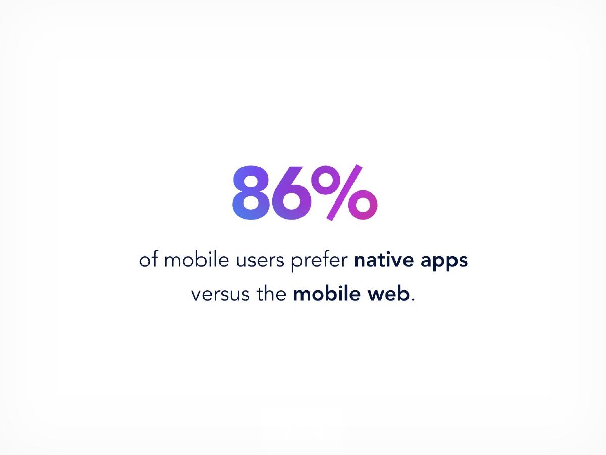
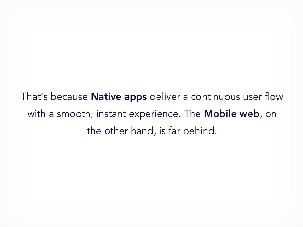
Three consecutive full-page statements. First: "86% of mobile users prefer native apps versus the mobile web." Then: "That's because native apps deliver a continuous user flow with a smooth, instant experience. The mobile web, on the other hand, is far behind." Then: "The gap between the two directly impacts engagement and conversion rates."
Structurally this is the best-executed sequence in the deck. One idea per slide, each one setting up the next, ending on the commercial consequence rather than the technical one. Most founders cram all three onto a single busy slide and lose the reader; Sparkly paces it like a keynote, because it was built in Keynote by someone who has watched good ones.
The problem is that 86% is a naked number. There is no source, no year, no geography, no sample, no study name. It is the single statistic on which the entire premise rests, and it is unattributable. In 2016 that figure was floating around from a widely-recycled comScore/Flurry-style measurement of time spent in apps versus mobile browsers — which is a very different claim from "prefer". Time spent in apps is dominated by a handful of messaging and social apps; it says almost nothing about whether a user prefers a brand's app to that brand's mobile site. An investor who knows the mobile data will notice the substitution immediately, and the whole ramp collapses with it.
Slides 3 and 4 then assert causation twice — apps feel better, therefore engagement and conversion are higher — with zero evidence. Not one benchmark, not one A/B result, not one cited industry conversion-rate comparison. The argument may well be right. The deck never proves it.
Slide 5 — Problem 1: apps are expensive and slow
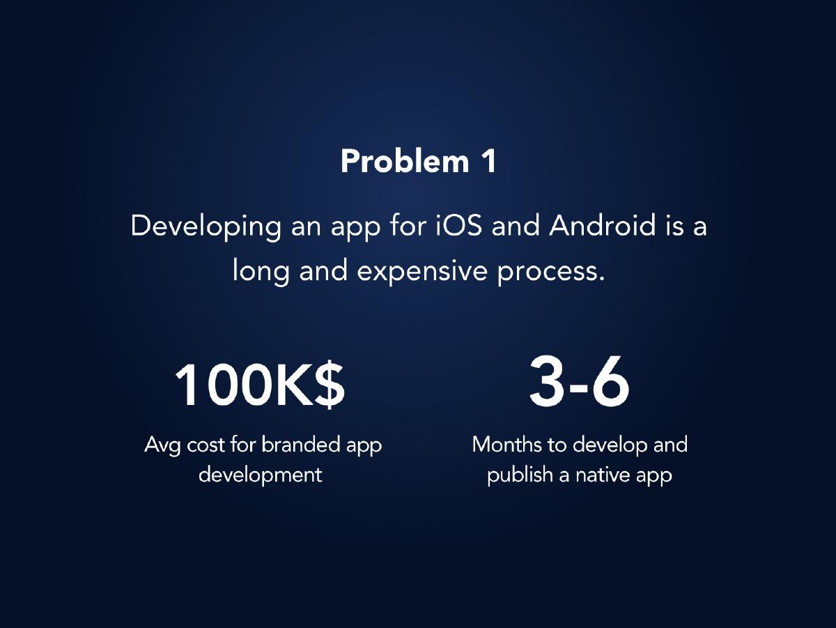
"Developing an app for iOS and Android is a long and expensive process." Two figures: $100K average cost for branded app development, and 3–6 months to develop and publish a native app.
These are plausible 2016 numbers and they are the right two variables — cost and time-to-market are exactly what a CMO cares about. Presenting them as two large numerals with short labels is the correct visual treatment.
Again, both are uncited. And more importantly, neither is anchored against Sparkly. The obvious, devastating comparison slide — "$100K and 4 months with an agency versus $X and 4 days with Sparkly" — is never drawn, here or anywhere else in the deck. The company states the cost of the alternative and never states its own price. That is not a rhetorical oversight; it is the missing business model.
Slide 6 — Problem 2: nobody downloads apps
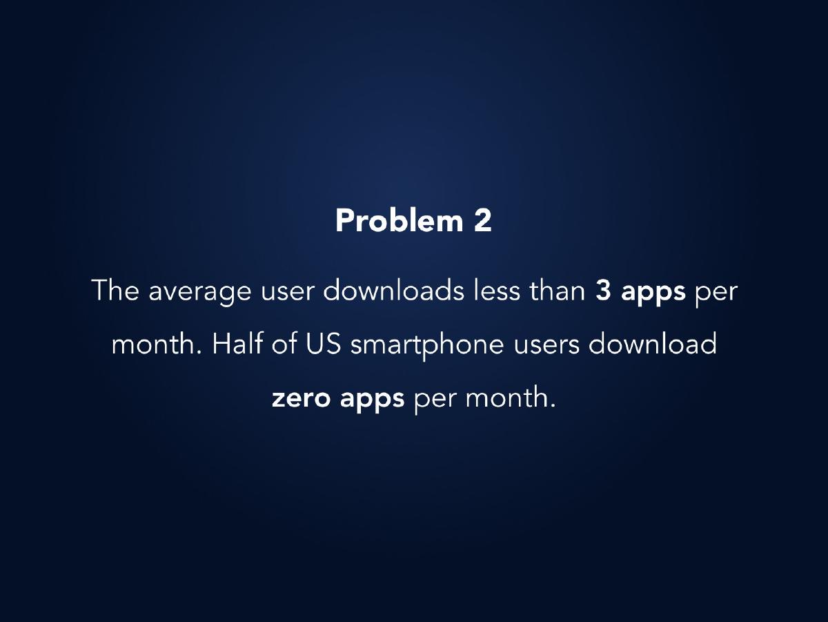
"The average user downloads less than 3 apps per month. Half of US smartphone users download zero apps per month."
This is the stronger of the two problem slides, and the "zero apps per month" statistic was a genuinely famous 2015–2016 finding. Using app-store fatigue to argue that even a well-built app cannot be distributed is the correct second blow after the cost argument.
But there is an unmanaged tension between slides 2 and 6 that an investor will catch within seconds. Slide 2 says users overwhelmingly prefer native apps. Slide 6 says users refuse to install them. Both can be true, and the reconciliation — "people prefer the app experience but reject the app install , so deliver the experience without the install" — is precisely Sparkly's insight. The deck never writes that sentence down. It leaves two apparently contradictory statistics adjacent and trusts the reader to build the bridge. Never make the investor do your synthesis; if they build the bridge themselves they may build it somewhere else.
Slides 7–10 — The prior art: Famo.us, Flipboard, and HTML5 games
Four slides on who else attacked this. Famo.us "raised $31M, with the mission to bridge the divide between apps and mobile web, with an open source JavaScript framework for developers — it was too complicated to take it for practical use cases — and failed." Flipboard "raised $210M for its UX driven app, wanted to bring their experience to the mobile web… reinvented the way a mobile web page is built and managed to create an app-like experience on the mobile web. Their engagement rates soared." Then: gaming vendors shipped fully-functional games that open instantly in the browser and can be saved to the home screen.
This is the most sophisticated section of the deck and it is doing something few founders attempt: using competitors' outcomes as evidence for the category rather than as threats to be dismissed. Famo.us is the cautionary tale that defines Sparkly's positioning by negation — the technology was right, the developer-framework packaging was wrong, so Sparkly ships templates and an editor instead. Flipboard is the proof point that the experience works when someone finally builds it properly. HTML5 gaming is the proof that the browser can carry it. Three slides, three different kinds of evidence, one conclusion.
Two problems. First, Famo.us raising $31M and failing is a double-edged citation: it also tells an investor that $31M of smart capital was incinerated in this exact category, and the deck never explains why Sparkly's approach survives what killed Famo.us beyond "it was too complicated". Second, and much more serious: this is a competitive landscape section written in November 2016 that never mentions Google AMP or Progressive Web Apps. AMP had launched in February 2016 and was already re-shaping mobile publishing; the PWA spec, service workers and add-to-home-screen were the defining browser story of that year — and slide 10 describes add-to-home-screen behaviour without ever naming it. Omitting the two platform-owner initiatives aimed at exactly your problem is the fastest possible way to make an investor assume you either have not looked, or have looked and did not like the answer.
Slides 11–12 — Solution
"Inspired by game engines, we've built a disruptive technology that enables us to create mobile web apps that act and feel like a native app." Then: "With templates for a variety of industries, we enable any publisher or brand to create mobile web apps without any coding skills."
The game-engine framing is a good one. It says something specific about how — pre-loading, sprite-style asset management, a render loop rather than a document — rather than the generic "our technology is faster". And splitting the technology claim from the distribution claim across two slides is right: the engine is the defensibility, the no-code editor is the go-to-market.
But "disruptive technology" is doing all the work and carries no proof. There is no architecture diagram, no load-time benchmark, no comparison against a standard mobile page, no patent, no engineering headcount, no explanation of what the engine actually does differently. In a deck where the core asset is a rendering technology, there is not one technical slide. And "templates for a variety of industries" names no industry — an investor cannot tell whether this is a retail tool, a publisher tool or a marketing-agency tool, which is the difference between three completely different companies.
Slide 13 — MVP: Facebook Canvas, off Facebook
"We took Facebook Canvas, the most popular marketing app in the world running only on Facebook, and experimented with its concept by developing a standalone product that delivers the same experience — anywhere on the web." There is an "Explore Facebook Canvas" link.
Honesty about the inspiration is a strength, and pointing at a live, well-understood Facebook product is a brilliant shortcut: any marketer in the room instantly knows what a Sparkly experience looks and feels like, with no demo required. Defining your MVP by reference to something the audience already uses is a legitimate and underused technique.
The risk it creates is never addressed. If your MVP is "Facebook Canvas but off Facebook", the first question is what happens when Facebook ships Canvas off Facebook — which it had every incentive to do, and which its ad network already did in adjacent formats. The second question is whether "same experience, anywhere" is a product or a feature. The deck raises the platform-dependency risk by choosing this framing and then walks past it.
Slide 14 — The editor
"We built a self-serve editor, empowering anyone with the ability to create this micro-app."
This is the commercially most important slide in the deck, because self-serve is what turns a services business into a SaaS business, and the roadmap two slides later is built entirely on that transition. It is one sentence and a small graphic. No screenshot of the editor, no workflow, no time-to-first-published-experience, no template gallery, no indication of what a non-developer can and cannot do. On a deck selling a no-code tool, the tool is never shown.
Slide 15 — Results and the logo wall
"The numbers were not surprising": x2 conversion rates uplift, x5 completion rates uplift, x3 engagement rates uplift, footnoted "Compared to a standard article or landing page." Beneath, five greyed logos: mako, ynet, McCann Tel Aviv, Porsche and K Logic.
Real multipliers from real campaigns are the best asset in this file, and the footnote defining the comparison baseline is a discipline most decks skip entirely. The logo set is also strategically coherent rather than random: two of Israel's largest media portals, a global agency's local office, one blue-chip brand and a marketing firm — that is a credible early-customer profile for a publisher/brand tool.
What is missing turns the slide from evidence into an anecdote. There is no baseline: 2x conversion from what to what? There is no sample size, no number of campaigns, no date range, no per-client breakdown, no statistical framing. Multipliers on unstated bases are the easiest numbers in venture to inflate, and every investor knows it. And the logos carry no relationship attached — the deck never says whether Porsche was a paying customer, a one-off agency deliverable through McCann, or a pilot. Slide 19 tells us that in October 2016 Sparkly had exactly one service client, which means at least four of those five logos cannot have been customers at the time this deck was made. A five-logo wall over a one-client business is the kind of gap diligence finds in one phone call.
The headline is a self-inflicted wound too. "The numbers were not surprising" tells the reader the results are unremarkable. The numbers are the strongest thing you have; do not open by shrugging at them.
Slide 16 — Competitive matrix
A 2×2 with SERVICE to SAAS on the horizontal axis and DEVELOPERS to NON-DEVELOPERS on the vertical. Famo.us sits bottom-left (service, non-developers). PlayCanvas, Create and a games-engine logo cluster top-right (SaaS, developers). Sparkly sits alone in the bottom-right corner: SaaS and non-developers.
Choosing "who is it for" and "how is it sold" as the two axes is a better choice than the usual price-versus-features cop-out, and the competitor placements are broadly fair — PlayCanvas and Create genuinely were developer tools.
It is nevertheless the most familiar anti-pattern in venture: the founder alone in the empty corner. The axes were selected because Sparkly occupies that quadrant, and the quadrant is empty partly because no one else defined the market that way. Famo.us — a developer framework if ever there was one — is placed on the non-developer half, which is simply wrong and suggests the chart was arranged for the outcome. And once again AMP, PWAs, Wix, Instapage, Ceros, Adobe and every marketing-cloud landing-page builder are absent, which is what actually stood between Sparkly and a non-developer's budget.
Slide 17 — Team: five black circles
The word TEAM, and five solid black filled circles arranged three-over-two. No names. No photographs. No job titles. No companies. No bios. No LinkedIn links. Nothing.
This is the defining failure of the deck and it is not a subtle one. At seed stage, with a pre-revenue product, no market sizing and no ask, the team is the investment. Five anonymous silhouettes tell a reader that either the deck was exported before the photos were placed and sent anyway, or the team was deliberately withheld. Both readings are fatal. The first says the company sends unfinished work to investors; the second says the founders will not tell you who they are before you commit.
It also silently answers the question the previous ten slides raised. A company claiming a proprietary game-engine-derived rendering technology needs to show the engineer who built it. Five black circles show nobody at all.
Slides 18–19 — The roadmap, printed in the wrong order
Two timeline slides. The one that appears first (page 18) runs: SaaS beta with 15 clients, May 17 → public beta, Aug 17 → Round A, Mar 18, flagged $80,000 MRR . The one that appears second (page 19) runs: service pilot with 1 client, Oct 16 → seed funding, Dec 16 → SaaS alpha with 5 clients, Feb 17, flagged $5,000 MRR .
The second half of the timeline is printed before the first half. A reader moving through the PDF in order encounters March 2018 before October 2016. This is almost certainly a Keynote export or slide-ordering mistake rather than a design decision, and that is exactly the point: nobody proofread the exported file before it went out under the words INVESTOR DECK. Small production errors in a company selling polish are read as evidence about the company.
The content underneath has bigger problems. The plan is $5K MRR in February 2017 growing to $80K MRR by March 2018 — a 16x increase in thirteen months — with no pricing, no average contract value, no client count behind the $80K, no sales headcount, no conversion assumptions and no cost line anywhere. Working backwards, 15 beta clients at $5K MRR implies roughly $333 per client per month; reaching $80K at that price needs around 240 paying customers, up from 15, in ten months, self-serve, with no marketing budget stated. The deck asserts the endpoint and shows none of the arithmetic.
And the actual position as of the deck's date, 28 November 2016, is one service client and no revenue milestone yet reached. Everything else on both timelines is forecast. "Seed funding, Dec 16" is the only reference to the round being raised in a document titled INVESTOR DECK — an event on a timeline, with no amount attached.
Slide 20 — "contact"
One word, in navy, centred on white: contact . No email address. No phone number. No website. No founder name. No meeting link.
An investor who has read nineteen slides, likes the thesis and wants to reply has literally nowhere to send the reply. Combined with the blank team slide, the file reads like a deck exported at 20:11 on a Monday night mid-edit, and shipped.
What this deck does better than most startup pitch decks
The narrative ramp is excellent. Five slides of setup — preference, why, commercial impact, cost problem, distribution problem — each carrying one idea, before the word "solution" ever appears. Most decks put the product on slide two. · It uses competitors as evidence, not as enemies. Famo.us as the cautionary tale, Flipboard as the proof the experience works, HTML5 games as the proof the browser can carry it. Three slides that make the category real without claiming there is no competition. · The Famo.us framing defines the company by negation. "The technology was right, the developer-framework packaging was wrong" is a genuinely sharp positioning move and explains the entire product strategy in one line. · The MVP is defined by reference to something the audience already uses. "Facebook Canvas, anywhere on the web" needs no demo — every marketer in the room sees the product instantly. · The results slide footnotes its baseline. "Compared to a standard article or landing page" is one line most founders never write, and it is the difference between a claim and a measurement. · The 2×2 axes are the right two questions. Who is it for, and how is it sold — far more useful than the usual features-versus-price grid. · The roadmap is dated and staged by client count. 1 client → 5 clients → 15 clients → public beta is a credible progression shape, and attaching MRR to two of the milestones is more than most seed decks do. · The art direction earns trust for the product claim. When you sell polish, looking polished is substantive evidence, and the gradient system and typography are consistently strong.
Where this deck would fail in an investor meeting
No ask. Twenty slides labelled INVESTOR DECK with no amount, no instrument, no valuation, no use of funds. "Seed funding, Dec 16" on a timeline is not an ask. · No team. Five black circles. No names, titles, faces or bios, in the slot that carries most of the seed decision. · No contact details. The closing slide is the word "contact" and nothing else. · No market size. No TAM, SAM or SOM, no count of brands or publishers, no digital marketing spend figure. The word "market" does not appear. · No pricing and no business model slide. The deck tells you an app costs $100K and never tells you what Sparkly costs. MRR appears only as a future flag on a timeline. · No unit economics. No CAC, no LTV, no gross margin, no churn, no burn, no runway, no headcount, no cost line of any kind. · Every statistic is uncited. 86%, $100K, 3–6 months, fewer than 3 downloads, half of users at zero — no source on any of them. · Uplift multipliers with no baselines. x2, x5 and x3 with no starting values, no sample size, no campaign count and no date range. · A five-logo wall over a one-client business. Slide 19 dates the service pilot at one client in October 2016; slide 15 shows five brand logos. · AMP and PWAs are never mentioned. The two platform-owner initiatives aimed at this exact problem, both prominent in 2016, are absent from a four-slide competitive section and a competitive 2×2. · The 2×2 is self-serving. Sparkly alone in an empty quadrant, with Famo.us miscategorised as a non-developer product. · Unresolved contradiction. Users prefer native apps (slide 2) but refuse to install them (slide 6), and the deck never writes the reconciling sentence. · Platform dependency unaddressed. An MVP defined as "Facebook Canvas off Facebook" invites the question of what Facebook does next; the deck does not answer it. · The technology is never shown. No architecture, no benchmark, no load-time comparison, no patent, for a company whose moat claim is a rendering engine. · The product is never shown. No screenshot of the editor, no screenshot of a finished experience, on a deck selling visual quality. · 16x MRR growth with no arithmetic. $5K to $80K in thirteen months, no price, no client count, no sales plan. · The timeline halves are in reverse order in the exported PDF. Nobody read the file before sending it. · No date on the cover and "Untitled" in the metadata. The deck cannot be versioned or introduce itself when forwarded.
Narrative deck vs investable deck
Problem framing Five slides, well paced, one idea each Same — this part is genuinely strong
Evidence for the problem Five uncited statistics Source, year and method on each figure
Product Described in prose, never shown One screenshot of the editor, one of the output
Technology moat "Disruptive", "inspired by game engines" A load-time benchmark against a standard page
Traction x2 / x5 / x3 with no baselines, 5 logos Baselines, sample size, date range, contract status per logo
Customers today 1 service client (inferable only from a timeline) Stated plainly on the traction slide
Business model Absent Price per seat or per experience, ACV, gross margin
Competition 2×2 with an empty corner; no AMP, no PWA The dangerous competitors named and answered
Team Five black circles Names, roles, the shipped thing each person built
Financials Two MRR flags on a roadmap 18-month plan with revenue, costs and headcount
Close The word "contact" Name, email, calendar link, data room
How you would rebuild this deck in twelve slides
Cover with a sentence and a date. "sparkly — app-like mobile web experiences, built without developers. Seed deck, November 2016." The wordmark stays; the ambiguity goes. · Compress the setup from five slides to two. Keep the pacing instinct but merge: one slide on the experience gap with a sourced statistic, one slide on why the app route is closed (cost, time, zero installs). Reclaim three slides for the things that are missing. · Source every number on the page. Small grey attribution under each figure — study, publisher, year. Uncited statistics are worse than no statistics, because they invite the reader to test one and disbelieve the rest. · Write the reconciling sentence. "People want the app experience and refuse the app install. We deliver the first without requiring the second." That single line is the company, and it is not in the deck. · Show the product twice. One screenshot of the editor mid-build with a stated time-to-publish, one of a finished experience on a phone. On a no-code visual tool, this replaces three paragraphs of adjectives. · Prove the engine with one benchmark. Time-to-interactive for a Sparkly experience versus a standard mobile landing page, same content, same device, same network. One bar chart does more for the moat claim than the word "disruptive". · Rebuild the results slide with baselines. "Across N campaigns for M clients between June and November 2016: conversion 1.8% → 3.6%, completion 12% → 60%, average session 22s → 66s." Same multipliers, now checkable. · Label the logo wall honestly. Mark which logos are paying clients, which are agency-delivered projects and which are pilots. One paying client stated plainly beats five ambiguous logos, because the ambiguity is what diligence punishes. · Answer AMP and PWAs head-on. A slide that names both, concedes what they solve, and explains why a templated, non-developer authoring layer survives on top of them. Naming your scariest competitor and then beating it is the strongest competition slide there is. · Put five faces on the team slide. Names, roles, and one shipped artefact each — especially whoever built the rendering engine. If the photos are not ready, ship names and roles in text; anonymous circles are strictly worse than plain type. · Turn the roadmap into a model. Price × clients = MRR at each milestone, with the sales motion and headcount that produces the client count. If $80K MRR needs 240 customers, say 240 and say how they arrive. · End with the ask and a way to reply. Amount, instrument, what the money buys in milestones, runway it creates, and a name, email and calendar link on the final slide.
The transferable lesson
Sparkly's deck fails at the two easiest slides to finish and the two hardest questions to dodge. The team slide and the contact slide take an afternoon; they were shipped blank. The ask and the model take a week of thinking; they were never attempted. Everything in between — the pacing, the competitor framing, the Facebook Canvas shortcut, the footnoted baseline — is above the median for a 2016 seed deck.
That is the pattern worth internalising, because it is extremely common and almost invisible from the inside. Founders rehearse the narrative until it is smooth, because the narrative is the part they enjoy and the part that gets applause in practice sessions. The parts that get underwritten — who you are, what it costs, what you are asking for, and how you get from one client to two hundred and forty — are the parts that get deferred to "the version I send after the meeting". Then a real investor opens the file, scrolls to the team slide out of habit, finds five black circles, and the narrative never gets read at all.
Before you send your next deck, do the two-minute version of this teardown on it. Open the PDF cold, as a stranger. Can you tell what the company does from page one? Is there a date? Is there a source under every number? Can you name the team? Is the product visible? Is there an amount? Is there an email address on the last page? If any answer is no, the deck is not finished, however good the story is.
Frequently asked questions
- What was Sparkly?
- Sparkly was an Israel-linked mobile web startup pitching in late 2016. It claimed a game-engine-inspired rendering technology that produced app-like experiences on the mobile web, delivered through a template-driven self-serve editor so brands and publishers could build them without developers. Its MVP was explicitly modelled on Facebook Canvas, the instant-loading full-screen ad format, rebuilt to run anywhere on the web rather than only inside Facebook.
- Is the Sparkly deck a real investor pitch deck?
- Yes. The cover carries the wordmark and the words 'INVESTOR DECK', and the file was exported from Keynote on 28 November 2016. It follows a recognisable seed sequence of problem, prior art, solution, MVP, results, competition, team and roadmap. What makes it unusual is that despite being labelled an investor deck it contains no funding ask, no team names and no contact details.
- What is the biggest problem with the Sparkly pitch deck?
- The two slides that carry the seed decision are blank. The team slide is five black circles with no names or titles, and the closing slide is the word 'contact' with no email address. Beyond that, the deck has no ask, no market size, no pricing and no unit economics, so an investor who likes the thesis has neither anyone to evaluate nor anywhere to reply.
- Which slides should founders copy from this deck?
- The opening ramp and the prior-art section. Slides 2 to 6 carry one idea each - users prefer app experiences, here is why, here is the commercial impact, apps cost $100K, nobody installs them - which paces far better than the usual crowded problem slide. And slides 7 to 10 use Famo.us's failure, Flipboard's success and HTML5 gaming as three different kinds of evidence that the category is real, which is more persuasive than claiming there is no competition.
- Why are uplift multipliers like 'x2 conversion' a problem in a pitch deck?
- Because a multiplier without a baseline is unfalsifiable. Doubling conversion from 0.4% to 0.8% and from 4% to 8% are very different businesses, and the reader cannot tell which one they are looking at. Sparkly's x2, x5 and x3 figures come with no starting values, no sample size, no campaign count and no date range. State the before and after numbers, how many campaigns produced them and over what period; the multiplier is then a summary rather than a claim.
- What should a 2016 mobile web startup have said about AMP and PWAs?
- It should have named both and beaten them. Google AMP launched in February 2016 and Progressive Web Apps with service workers and add-to-home-screen were the defining browser story of that year, so any investor reading a mobile-web pitch in November 2016 had both in mind. Sparkly's slide 10 even describes add-to-home-screen behaviour without naming PWAs. The strong move is a slide that concedes what the platform initiatives solve and explains why a templated non-developer authoring layer still captures value on top of them.