Totspot’s 2013 seed deck is a textbook example of a traction-first presentation. With only 11 slides, the company successfully communicated a clear value proposition: a mobile-only marketplace for children's resale fashion. The deck avoids dense technical jargon, opting instead for high-impact metrics like a 30% month-over-month growth rate and a staggering 65% repeat buyer rate. By positioning the business as 'unit profitable' with a 20% marketplace fee and zero inventory risk, the founders de-risked the investment for seed-stage participants. While the deck lacks a formal 'Ask' slide or a d…
Key takeaways
- The deck highlights a 30% monthly growth in purchases from January to July on slide 2.
- Retention is a core strength, with slide 3 reporting that 65% of users are repeat buyers.
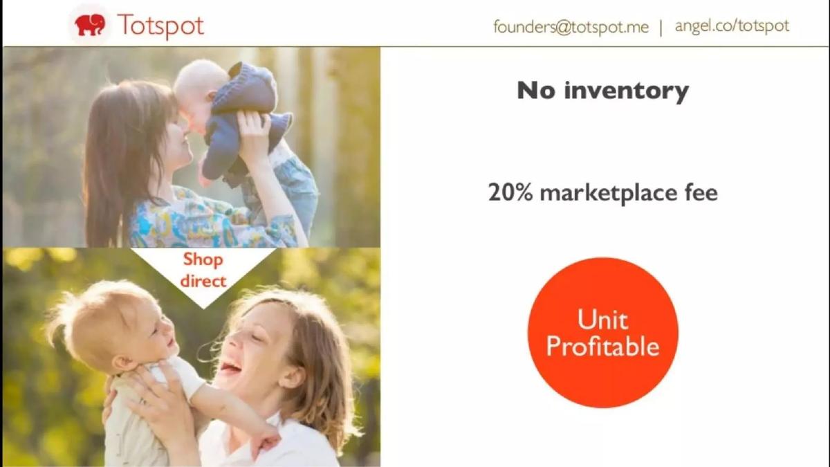
- The business model relies on a 20% marketplace fee with no inventory overhead, as stated on slide 4.
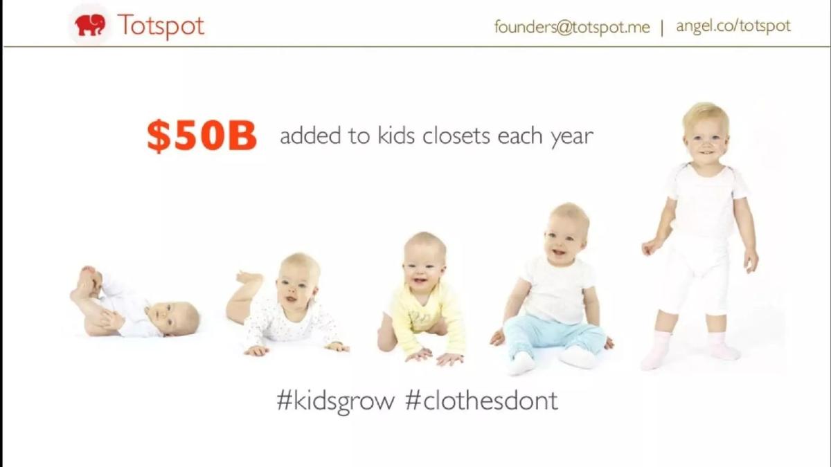
- The market size is defined by the $50B added to kids' closets annually, according to slide 5.
- User engagement is exceptionally high, with users spending an average of 20 minutes daily in the app (slide 8).
- The company reached a $200,000 run rate by the time of the pitch, noted on slides 3 and 10.
- The team slide (slide 9) emphasizes pedigree with logos from IIT, Wharton, Berkeley, Samsung, and Yahoo.
- The deck utilizes a 'mobile-first' narrative, emphasizing Instagram-like ease for selling in under 60 seconds.
The Lean Marketplace Narrative
Totspot’s pitch deck is a lean, 11-slide document that prioritizes traction over theory. In the 2013 venture climate, mobile marketplaces were beginning to explode, and Totspot positioned itself as the vertical leader for the children's segment. The deck is visually sparse, using large typography and lifestyle photography to convey a sense of simplicity—a direct reflection of the product’s core value proposition: making resale as easy as using Instagram.
Slide 1: The Hook
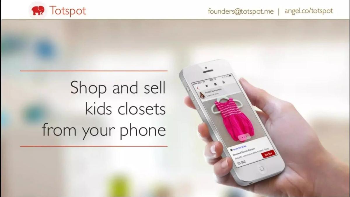
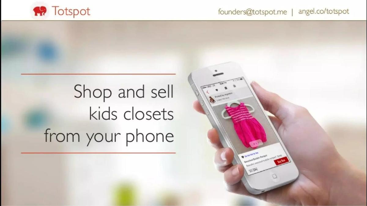
The cover slide establishes the brand identity immediately with the red elephant logo and a clear, one-sentence value proposition: "Shop and sell kids closets from your phone." The inclusion of a high-quality mockup of the app on an iPhone 5 places the product front and center. Notably, the header includes direct contact information and an AngelList link, signaling that the founders were actively in 'fundraising mode' and transparent about their presence on investment platforms.
Slides 2-3: The Traction Powerhouse
Most decks wait until the end to show traction; Totspot leads with it. Slide 2 presents a line graph of 'Purchases' showing a clear upward curve from January to July. While the Y-axis is labeled in increments of 1,000, the most prominent feature is the orange circle declaring "30% Monthly" growth. This immediately answers the investor's most pressing question: is there demand?
Slide 3 doubles down on quality of growth. It highlights two critical figures: "65% repeat buyers" and a "> $200K run rate." For a seed-stage company, a 65% retention rate is elite. It suggests that once a parent uses the platform, they find enough value to return, which significantly lowers the long-term pressure on marketing spend. The run rate figure provides a concrete sense of the business's current scale.
Slide 4: The Business Model
Slide 4 addresses the 'how.' It lists three key points: "No inventory," a "20% marketplace fee," and the claim that they are "Unit Profitable." By specifying 'No inventory,' Totspot distinguishes itself from 'managed' marketplaces that require warehouses and logistics staff. This is a high-margin, scalable software play. The 20% fee is standard for the era, and the 'Unit Profitable' stamp is designed to reassure investors that the company isn't just buying growth at a loss.
Slide 5: The Market Opportunity
The market slide is simple and effective. It uses a visual progression of a child growing from an infant to a toddler to illustrate the problem. The figure "$50B added to kids closets each year" defines the Total Addressable Market (TAM). The hashtags "#kidsgrow" and "#clothesdont" serve as a pithy summary of why this market exists: children are a biological engine for consumption and waste, creating a perfect environment for a resale marketplace.
Slides 6-7: The User Experience
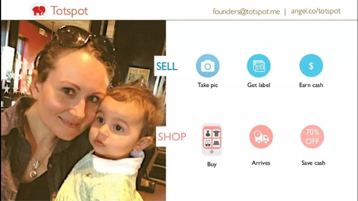
Slide 6 breaks down the 'Sell' and 'Shop' flows using simple iconography. Selling is a three-step process: "Take pic," "Get label," and "Earn cash." Shopping is equally streamlined: "Buy," "Arrives," and "Save cash" (noting a 70% discount). This slide emphasizes the 'Instagram-like ease' mentioned in the company's self-description.
Slide 7 provides a 'User Persona' or case study, showing a mother and child with the figures "$800 earned" and "$1200 shopped." This illustrates the 'circular economy' of the platform—users aren't just one-off sellers; they are active participants who reinvest their earnings back into the marketplace, further driving the 65% repeat buyer rate mentioned earlier.
Slide 8: Engagement Metrics
This slide is perhaps the most important for a mobile-first company. It claims "42% MAU" (likely referring to a specific engagement ratio or daily-to-monthly active user metric) and "20 min daily." Spending 20 minutes a day in a shopping app is an extraordinary amount of time, putting Totspot in the same engagement tier as social media platforms. For investors, this data point proves that Totspot isn't just a utility; it's a destination.
Slide 9: The Team
The team slide features four key members: Vikrant Ramteke (Engineering), Vijay Ramani (Product/UX), Sarah Kamsoshy (Community), and Samantha Fein (Marketing). The pedigree is strong, featuring logos from IIT, Wharton, Berkeley, and Syracuse for education, and Samsung, Yahoo, and Chictopia for professional experience. This balance of technical, product, and community expertise is ideal for a marketplace startup.
Slides 10-11: The Summary and Close
Slide 10 acts as a 'Why Now' or summary slide, reiterating the "Mobile marketplace for moms," "$200,000 run rate," "30% M.o.M" growth, and "65% repeat" rate. It synthesizes the entire deck into three icons. The final slide (Slide 11) is a simple contact page with the elephant logo and the founders' email address.
What Works
Metric-First Approach: By putting the 30% growth and 65% retention rates on slides 2 and 3, the founders immediately grabbed the attention of data-driven investors. They didn't hide their performance behind fluff.
Visual Simplicity: The deck is not cluttered. Each slide has one job and one primary number to remember. This makes the deck highly 'skimmable,' which is essential when analysts are reviewing hundreds of decks a week.
Focus on Unit Economics: Explicitly stating 'Unit Profitable' and 'No inventory' on slide 4 addresses the biggest fears investors have about e-commerce: that the business will bleed cash on shipping and warehousing as it scales.
What is Missing
The Ask: The deck never specifies how much capital is being raised or what the milestones for the next 18 months look like. While this information is often handled in the verbal pitch, its absence in the deck makes it harder for the document to stand alone as a complete investment proposal.
Competitive Landscape: In 2013, Poshmark and ThreadUp were already gaining significant traction. The deck makes no mention of how Totspot defends its niche against these larger players or how it differs from local options like Craigslist or Facebook groups.
Customer Acquisition Cost (CAC): While the deck boasts about retention, it says nothing about how much it costs to acquire a new 'mom' for the platform. Without CAC data, the 'Unit Profitable' claim is only half of the story.
What a Founder Should Copy
The 'Circular' Case Study: Slide 7, showing a user who both earns and spends significant amounts on the platform, is a brilliant way to visualize marketplace health. Founders should always try to show how their users interact with both sides of their ecosystem.
Pedigree Branding: The team slide (Slide 9) is a masterclass in using logos to build instant credibility. Even if you are a first-time founder, highlighting the most recognizable brands you've worked for or studied at can offset perceived risk.
Engagement Over Downloads: Totspot focused on '20 minutes daily' rather than 'total app downloads.' Downloads are a vanity metric; time spent is a proof of value. Founders should identify their 'stickiness' metric and make it a centerpiece of their deck.
Frequently asked questions
- What was the primary revenue model for Totspot?
- As shown on slide 4, Totspot operated as a pure-play marketplace. They charged a 20% marketplace fee on transactions. Crucially, the slide notes they carry 'No inventory,' meaning they avoided the capital-intensive logistics of traditional resale models like ThreadUp, instead facilitating peer-to-peer sales directly through their mobile application.
- How did Totspot demonstrate product-market fit in this deck?
- Product-market fit was demonstrated through high-frequency usage and retention metrics. Slide 8 shows that 42% of Monthly Active Users (MAU) were highly engaged, and users spent an average of 20 minutes daily on the platform. Combined with the 65% repeat buyer rate on slide 3, these figures suggested a 'sticky' product that parents integrated into their daily routines.
- What market gap did Totspot aim to fill?
- The deck identifies a massive, recurring spending habit: $50 billion is added to kids' closets each year (slide 5). The tagline '#kidsgrow #clothesdont' highlights the inherent inefficiency in children's fashion, where clothes are outgrown quickly, creating a constant supply of high-quality used goods and a constant demand for affordable replacements.
- Is there a competitive analysis included in the deck?
- No. The 11-slide deck completely omits a competitive landscape or 'magic quadrant' slide. Instead of comparing themselves to eBay or Poshmark, the founders focused entirely on their own internal growth metrics and the simplicity of their mobile user experience to prove their right to win in the vertical.
- What information is missing from the Totspot pitch deck?
- The deck is missing several standard components: a detailed breakdown of the 'Ask' (how much they are raising and for what), a roadmap of future features, a competitive analysis, and a slide on Customer Acquisition Cost (CAC). It relies almost exclusively on the momentum of their current traction to tell the story.