The TouristEye pitch deck from 2010 is a lean, 24-slide presentation that prioritizes traction and user behavior over dense financial modeling. At the time of the pitch, the company had already secured 500,000 downloads and 40,000 Monthly Active Users (MAU), providing a strong foundation for their seed round. The deck's primary strength lies in its 'Unfair Advantage' section, which equates 5 million user 'wishes' to 5 million points of purchase intent. By showing a 22% click-through rate on personalized offers—claimed to be 10x higher than industry giants like Expedia and TripAdvisor—TouristE…
Key takeaways
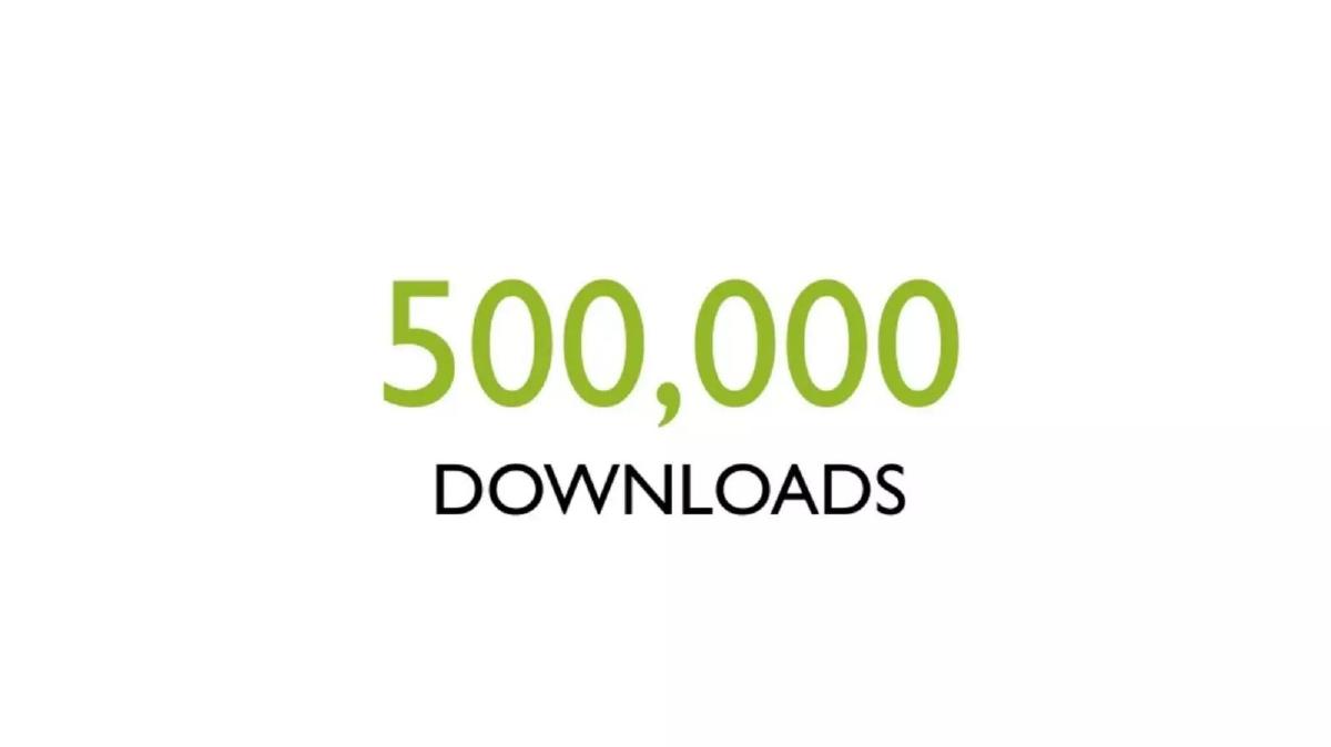
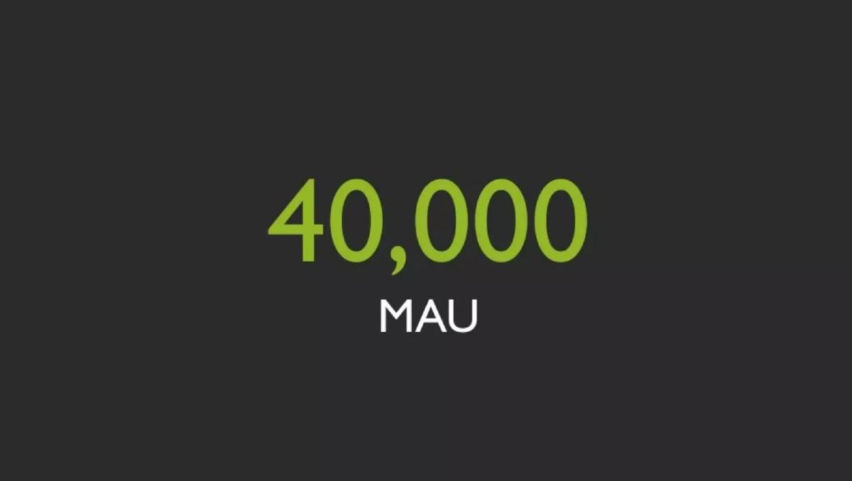
- The company led with massive traction, citing 500,000 downloads on slide 2 and 40,000 MAU on slide 3.
- A strategic partnership with Virgin America was used as a primary credibility signal on slide 4.
- The problem statement is simplified to a single provocative phrase: 'Travel Guides Suck' on slide 5.
- Product functionality is demonstrated through user-generated 'wishlists' across various niches like Napa wineries and kiteboarding (slides 12-14).
- The deck claims an 'Unfair Advantage' by converting 5 million user 'wishes' into actionable purchase intent on slide 19.
- Conversion metrics are the star of the show, with slide 22 highlighting a 22% click rate, which is framed as 10x the industry standard on slide 23.
- The funding ask was $1 million, with a note that $300,000 had been previously raised (slide 24).
- The deck completely omits a team slide, competitive landscape analysis, and a detailed roadmap.
The Power of Minimalist Traction: The TouristEye Teardown
The 2010 TouristEye pitch deck is a relic of the early mobile era, yet it contains lessons in narrative clarity that remain relevant today. At 24 slides, it moves quickly, relying on large typography and full-bleed imagery to tell a story of rapid growth and high-intent user data. This was a deck designed for a high-tempo pitch, likely used in an environment where the founders had only a few minutes to capture an investor's imagination.
The Hook: Traction First (Slides 1-4)
Slide 1 introduces the brand with the tagline "Personalizing the Travel Experience." It is clean and professional, but the real work begins immediately after. Most decks wait until the middle to show traction; TouristEye leads with it. Slide 2 displays "500,000 DOWNLOADS" in massive green text, followed by Slide 3 showing "40,000 MAU" (Monthly Active Users). By the ten-second mark, an investor knows this isn't just an idea—it's a product with a significant user base.
Slide 4 adds a layer of institutional credibility by showing the Virgin America logo with the text "PARTNER OF." This is a classic 'borrowed authority' move. For a seed-stage startup in 2010, having a major airline as a partner suggested that the technology was robust enough for enterprise integration and that the brand had reached a level of market maturity.
The Problem: Personalization vs. Generic Guides (Slides 5-11)
Slide 5 is blunt: "Travel Guides Suck." This sets up a series of visual comparisons. The deck uses a 'persona' approach, showing different types of travelers—a family (Slide 6), a backpacker (Slide 8), and a young couple (Slide 10). After each persona, the deck overlays a screenshot of TripAdvisor's "Top Things to Do in Madrid" (Slides 7, 9, 11). The red boxes around the generic museum listings highlight the problem: TripAdvisor gives the same advice to everyone, regardless of their specific needs or travel style. It’s an effective way to demonstrate a gap in the market without using a single bullet point of text.
The Solution: User-Generated Intent (Slides 12-17)
The solution is presented through the lens of the product's interface. Slides 12, 13, and 14 show specific user-created wishlists: "Best wineries in Napa Valley," "Best beaches for kiteboarding," and "Best kid-friendly summer vacations." This demonstrates the platform's versatility and its ability to cater to the 'long tail' of travel interests that generic guides miss.
Slides 15 and 16 transition the product to different form factors, showing the interface on a tablet and a mobile phone. Slide 16 specifically highlights a green button: "GET THIS TRIP OFFLINE." In 2010, offline access was a killer feature for international travelers trying to avoid massive roaming charges, and TouristEye correctly identifies this as a core value proposition.
The Business Case: The 'Unfair Advantage' (Slides 18-23)
The deck shifts from product features to business logic on Slide 18 , titled "An Unfair Advantage..." This leads to Slide 19 , which is arguably the most important slide in the deck. It states: "5MM WISHES = 5MM PURCHASE INTENT." This is the bridge between a 'cool app' and a 'valuable business.' By framing user engagement as 'purchase intent,' they are speaking the language of advertisers and affiliate partners.
Slides 20 and 21 illustrate how this intent is monetized: "Personalized offers based on intent," represented by icons for flights, hotels, and tickets. The validation for this model comes on Slide 22 , which simply says "22% CLICK RATE." Slide 23 then provides the context: this 22% is compared to a "10X" multiplier over industry giants like Expedia, TripAdvisor, Orbitz, and Kayak. This is a bold claim, but it effectively positions TouristEye as a high-efficiency conversion engine compared to the 'noisy' traditional search engines.
The Ask and Omissions (Slide 24)
The final slide ( Slide 24 ) contains the financial ask: "RAISING $1MM" with a note that "$300K PREVIOUSLY RAISED." It also includes the AngelList URL, which was a relatively new and powerful signal for tech investors at the time.
What Works
Traction-led Narrative: Leading with 500,000 downloads immediately de-risks the investment in the eyes of a seed investor. · Visual Problem/Solution: The use of personas and the TripAdvisor comparison is much more memorable than a list of complaints about the travel industry. · Metric Focus: The 22% click-through rate is a 'holy grail' metric that suggests a massive potential for affiliate revenue. · Simplicity: The deck uses very little text, making it perfect for a live presentation where the speaker provides the detail while the slides provide the impact.
What is Missing
Team Slide: This is the most glaring omission. In a seed round, the team is often more important than the product. The deck provides no information on the founders' backgrounds or technical expertise. · Competition: While it mocks TripAdvisor, it doesn't provide a standard competitive matrix or explain how it will defend its position against other emerging mobile travel apps. · Financial Projections: There is no mention of burn rate, revenue targets, or how the $1 million will be allocated (e.g., hiring, marketing, R&D). · Roadmap: The deck shows what the product is now, but not where it is going. There is no vision for future features or geographic expansion.
What a Founder Should Copy
The 'Intent' Frame: If your app collects user data, don't just call it 'engagement.' Frame it as 'purchase intent' or 'high-signal data' to show how it translates to revenue. · Comparison by Persona: If your product is a 'personalized' version of a generic incumbent, show exactly how the incumbent fails different types of users. · The 10x Claim: If you have a metric that is significantly better than the industry average, make that the centerpiece of your business case. · Minimalist Design: Use large fonts and clear imagery. If an investor has to squint to read your slide, you've already lost their attention.
Frequently asked questions
- What was the primary traction metric for TouristEye?
- TouristEye focused heavily on its user base and engagement. According to slides 2 and 3, the app had reached 500,000 downloads and 40,000 Monthly Active Users (MAU). Furthermore, slide 19 notes that users had generated 5 million 'wishes,' which the company interpreted as high-intent data for future travel purchases.
- How did TouristEye differentiate itself from competitors like TripAdvisor?
- The deck uses a visual comparison on slides 7, 9, and 11, showing TripAdvisor's generic 'Top Things to Do' lists as insufficient for specific traveler personas (families, backpackers, etc.). TouristEye positioned itself as a personalized alternative that uses collaborative wishlists to provide better recommendations than static guides.
- What was the monetization strategy presented in the deck?
- The strategy was based on lead generation and affiliate revenue. Slides 20 and 21 describe 'Personalized offers based on intent' for flights, hotels, and tickets. The company validated this by showing a 22% click-through rate on slide 22, suggesting their targeted approach was significantly more effective than traditional travel search engines.
- Who were the founders of TouristEye?
- While the deck itself does not include a dedicated team slide—a notable omission—the catalogue listing identifies the co-founders as Ariel Camus and Javier Fernandez Escribano. The deck only provides a general 'founders@touristeye.com' contact on the title and closing slides.
- What happened to TouristEye after this pitch?
- The company successfully raised its seed funding and was eventually acquired by Lonely Planet in 2013. This outcome validated the deck's premise that a mobile-first, high-intent travel planning tool was a valuable asset for established travel media brands.