The Usetrace pitch deck is a rare example of a fully hand-drawn presentation that managed to secure $287,400 in Seed funding. Eschewing traditional corporate templates, the 11-slide deck uses simple stick figures and bold, handwritten text to communicate a complex technical problem: the inefficiency of manual software testing. By focusing on a single core metric—that developers waste 20% of their time on 'boring work'—and backing it up with $14k MRR from 65 companies, the founders proved that high-fidelity design is secondary to clear value propositions and validated traction. While it lacks…
Key takeaways
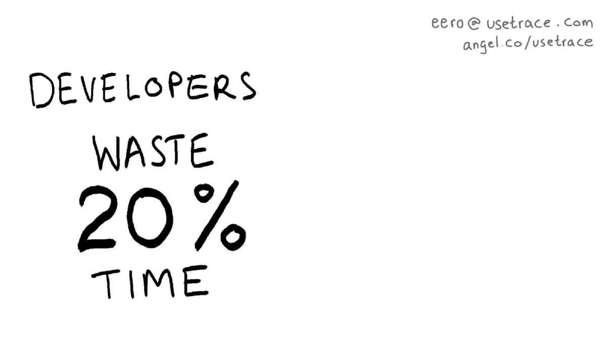
- The deck identifies that developers waste 20% of their time on non-innovative tasks on slide 3.
- Usetrace claims to enable 12x faster iteration for software development teams on slide 5.
- The company quantifies its value proposition as $250k saved, though the specific timeframe or cohort is not defined on slide 6.
- Traction is clearly stated as 65 companies using the platform on slide 7.
- Financial performance is disclosed as $14k MRR (Monthly Recurring Revenue) on slide 8.
- The team consists of three members with previous experience at Nokia, NextS, and GrowVC as shown on slide 10.
- The deck completely omits a competition slide, a business model slide, and a specific funding ask.
- The visual style is entirely hand-drawn, using a minimalist black-and-white palette throughout all 11 slides.
The Hand-Drawn Disruptor: Usetrace's 2011 Seed Deck
The Usetrace pitch deck is a masterclass in minimalist storytelling. In an era where pitch decks were becoming increasingly bloated with data visualizations and corporate stock photography, Usetrace opted for a hand-drawn, almost childlike aesthetic. This teardown examines how 11 simple slides managed to convey enough value to secure a $287,400 Seed round.
The Problem and the 'Boring Work' (Slides 1-3)
Slide 1 is a minimalist title slide featuring only the company name, 'Usetrace,' in a bold, hand-drawn font. The inclusion of an email address and an AngelList link in the top right corner immediately signals that this is a fundraising document intended for direct outreach.
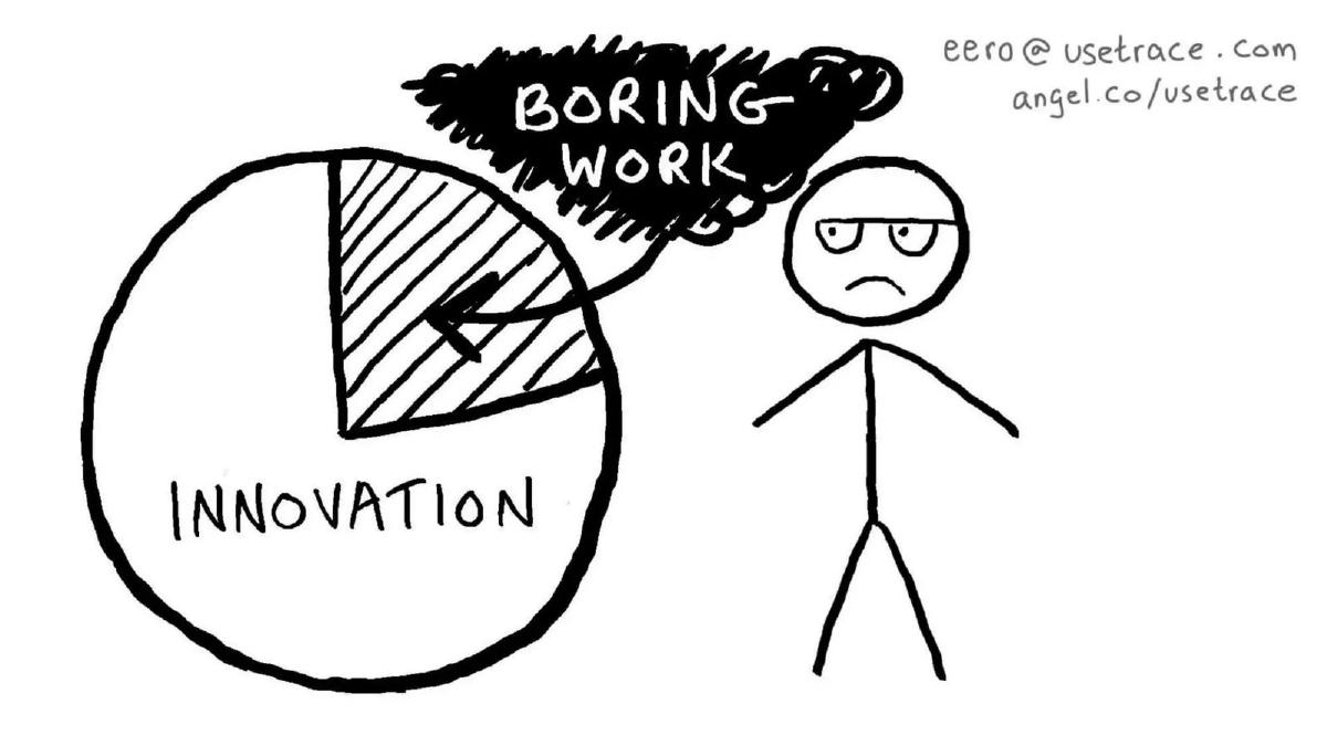
Slide 2 introduces the core conflict. It features a stick figure with a frown, looking at a pie chart where a significant wedge is labeled 'Boring Work.' This is a classic 'show, don't tell' approach to the problem of developer productivity. By labeling the non-innovative tasks as 'boring,' the founders tap into the emotional frustration of their target user base.
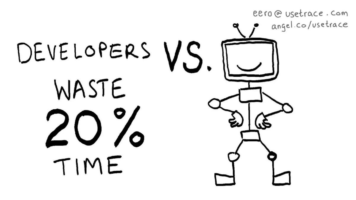
Slide 3 quantifies that frustration. It states, 'DEVELOPERS WASTE 20% TIME.' This is the 'anchor metric' for the entire deck. It provides a clear, easy-to-remember figure that justifies the existence of a productivity tool. However, the slide lacks a citation for this data, relying on the investor's intuition that developers spend one day a week on maintenance and testing.
The Solution and Value Proposition (Slides 4-6)
Slide 4 introduces the 'hero' of the story: a smiling robot. The text 'DEVELOPERS VS. WASTE 20% TIME' suggests that the robot (the Usetrace software) acts as a shield or a replacement for that wasted effort. It is a highly metaphorical way to present a technical product, omitting any mention of APIs, scripts, or browser environments.
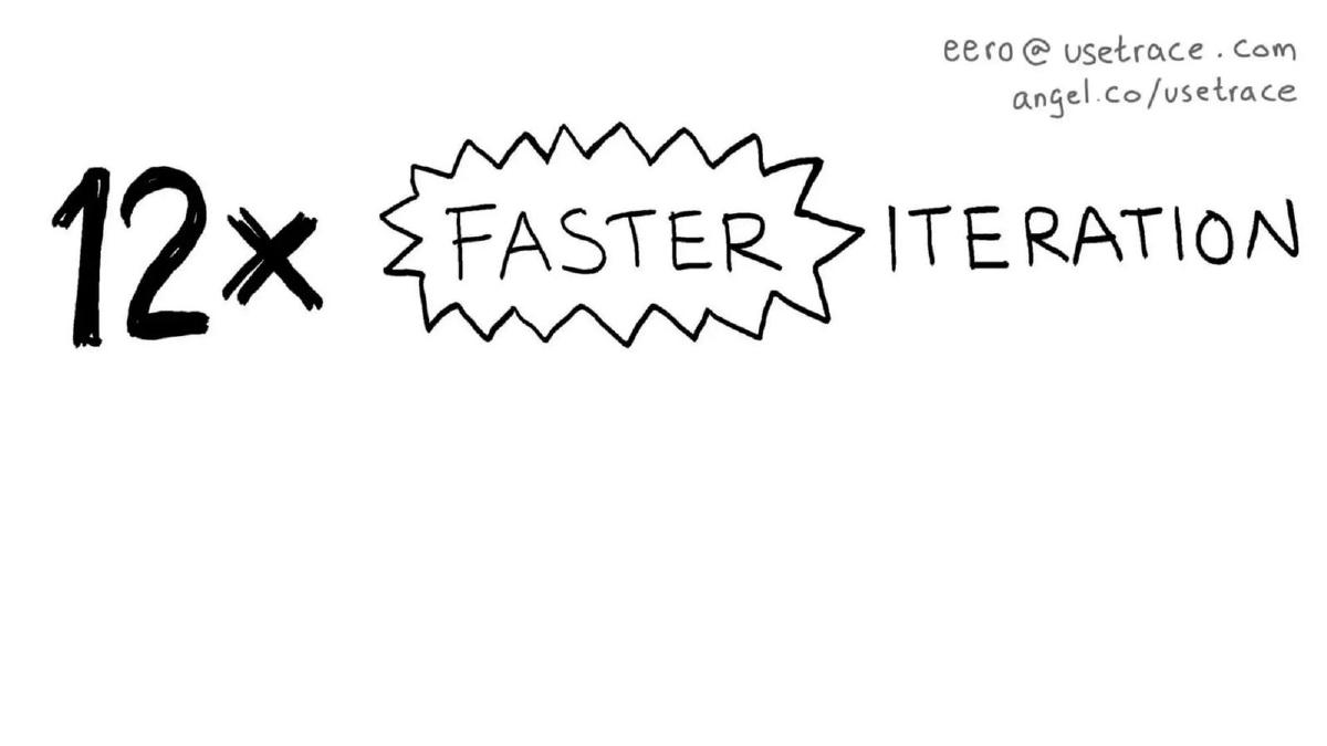
Slide 5 provides the first efficiency claim: '12x FASTER ITERATION.' This is a bold claim. In the context of 2011, agile development was becoming the standard, and the ability to iterate faster was a top-tier priority for CTOs. Again, the deck relies on the magnitude of the number rather than a technical explanation of how that speed is achieved.
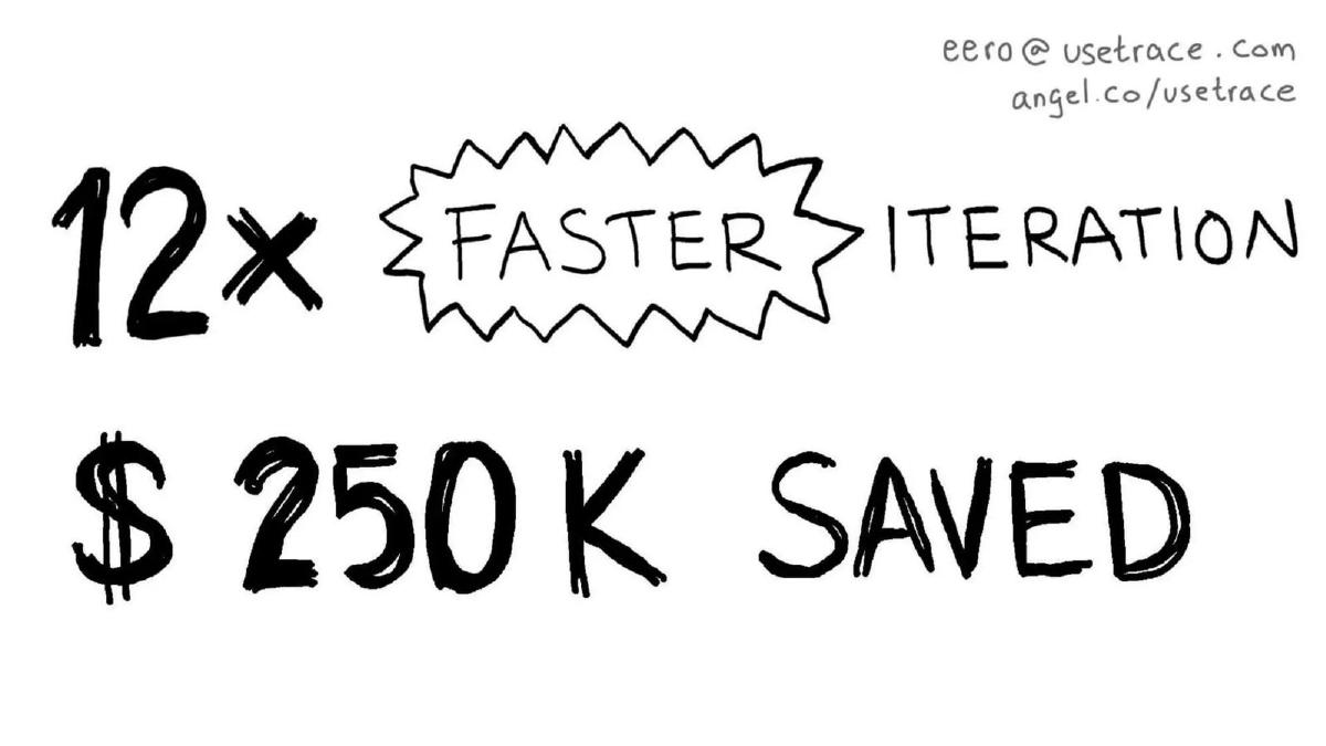
Slide 6 translates time into currency, claiming '$ 250 K SAVED.' This slide is crucial because it moves the conversation from 'developer happiness' to 'business ROI.' While it doesn't specify if this is per year, per team, or a total across their current customer base, it gives investors a figure to associate with the product's impact.
Traction and Growth (Slides 7-9)
Slide 7 and Slide 8 should be viewed as a single unit of proof. Slide 7 simply says '65 COMPANIES,' and Slide 8 adds '$ 14 K MRR.' This is the strongest part of the deck. For a Seed-stage company in 2011, having 65 paying customers and over $160,000 in annual run rate is exceptional. It proves product-market fit far more effectively than a complex technical diagram would.
Slide 9 shows a 'SIGN UPS' chart. It is a hand-drawn bar chart with an upward-curving arrow and a small surfer riding a wave. While the chart lacks a Y-axis with specific numbers, the visual momentum reinforces the MRR figures shown previously. It suggests that the $14k MRR is not a plateau but a point on a steep growth trajectory.
The Team and the Vision (Slides 10-11)
Slide 10 introduces the founders: Arto Vuori, Eero Heino, and Jussi Holm. The slide uses logos to establish credibility, highlighting Nokia and GrowVC . In the Finnish startup ecosystem of 2011, Nokia experience was a significant badge of technical competence. The inclusion of the hashtag #CMAX.gg at the bottom suggests this deck may have been used at a specific event or demo day.
Slide 11 brings the narrative full circle. It repeats the pie chart from Slide 2, but this time, the 'Boring Work' wedge has been removed, leaving a glowing circle of 'INNOVATION' and a smiling stick figure. It is a simple, effective closing image that summarizes the company's mission: to eliminate the drudgery of testing so developers can focus on building.
What Works in the Usetrace Deck
Extreme Clarity: The deck focuses on one problem (wasted time) and one solution (automation). It does not get bogged down in the 'how' of the technology, which can often confuse non-technical investors. · Strong Traction: Leading with $14k MRR is a power move. It shifts the investor's mindset from 'Is this a good idea?' to 'How big can this get?' · Memorable Branding: The hand-drawn style makes the deck stand out. In a pile of 50 decks, an investor will remember 'the one with the stick figures.' · ROI Focus: By putting a dollar amount ($250k) on the savings, the founders speak the language of the person writing the check.
What is Missing from the Usetrace Deck
The 'Ask': There is no slide stating how much money they are raising or what they plan to do with the capital. This is a significant omission that requires the founder to fill in the blanks during a live pitch. · Market Size (TAM): There is no mention of how many developers exist globally or how large the software testing market is. Investors need to know if this is a billion-dollar opportunity or a niche tool. · Competition: The deck ignores the existence of other testing frameworks. In 2011, Selenium was already established. A slide explaining why Usetrace is better than existing open-source or enterprise tools was needed. · Business Model: While they show MRR, they don't explain their pricing tiers or how they acquire customers (Go-To-Market strategy).
What a Founder Should Copy
The 'One Metric Per Slide' Rule: Usetrace puts very little text on each slide. This forces the audience to listen to the speaker rather than reading the screen. · Quantified Value Propositions: Don't just say your tool is 'fast.' Say it is '12x faster.' Don't just say it 'saves money.' Say it 'saves $250k.' · Founder Pedigree: Use recognizable logos (like Nokia) to borrow authority, especially if you are a first-time founder. · Emotional Resonance: Identifying 'Boring Work' as the enemy is a brilliant way to build rapport with anyone who has ever managed a development team.
Frequently asked questions
- How much did Usetrace raise with this deck?
- According to the catalogue facts, Usetrace raised $287,400 in Seed funding in 2011. This is a relatively standard seed round for the era, especially for a company based in the Nordic ecosystem (having participated in Startup Sauna).
- What is the primary value proposition of Usetrace?
- The deck focuses on time reclamation. Slide 3 states that developers waste 20% of their time, and slide 5 promises 12x faster iteration. The goal is to move developers from 'boring work' (testing) to 'innovation' by using their automated robot technology.
- Does the deck explain how the technology works?
- No. The deck is extremely high-level. It uses a robot icon on slide 4 to represent the solution but does not mention 'Testing-as-a-Service' or 'end-to-end testing' explicitly on the slides; these details are only found in the company's self-description.
- Is the $14k MRR significant for a 2011 Seed deck?
- Yes. In 2011, $14,000 in Monthly Recurring Revenue ($168k ARR) was a strong signal for a Seed-stage startup. It demonstrated that 65 companies were willing to pay for a tool that was likely still in its early stages.
- What are the biggest risks in this deck's structure?
- The lack of a 'Market' slide and a 'Competition' slide are major omissions. Investors in the DevOps and testing space usually want to see how a tool differentiates itself from incumbents like Selenium or newer cloud-based testing suites.