The Usefinally (branded as Back Office in the deck) pitch deck is a rare example of extreme minimalism. Spanning only 9 slides, the presentation eschews detailed product explainers, competitive matrices, and financial projections in favor of three core pillars: massive traction, high retention, and founder experience. By leading with $1M ARR and 40% month-over-month growth on slide 2, the founders immediately established credibility that allowed them to skip standard narrative filler. The deck relies heavily on visual shorthand—logos of enterprise clients and simple icons—to communicate a com…
Key takeaways
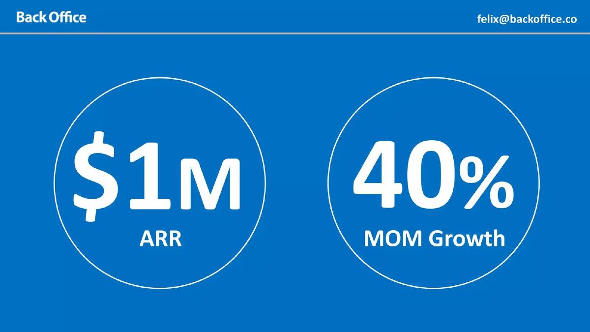
- The deck leads immediately with traction, citing $1M ARR and 40% MOM growth on slide 2.
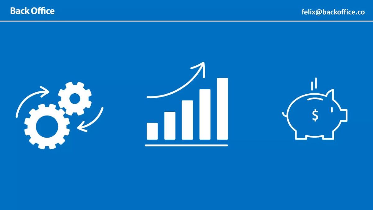
- Product functionality is reduced to three simple icons on slide 4, representing automation, growth, and savings.
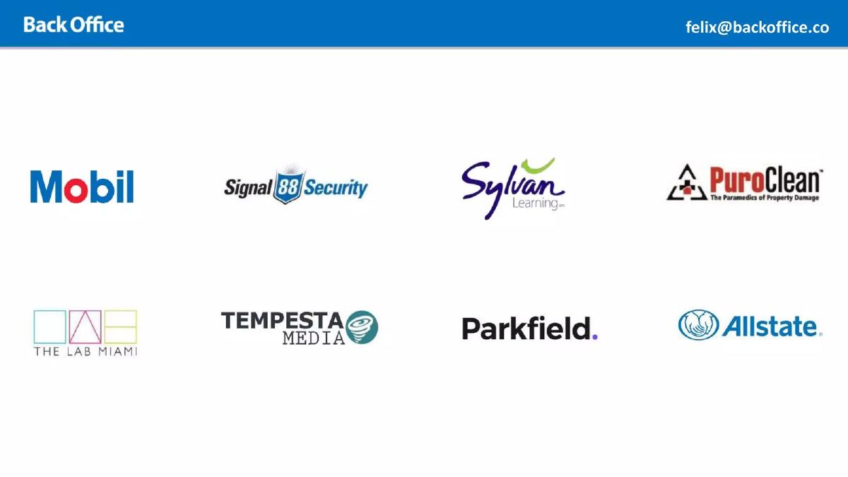
- Social proof is established through a logo wall on slide 5 featuring major brands like Mobil and Allstate.
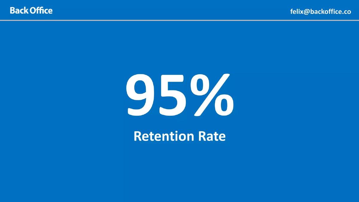
- Customer satisfaction is distilled into a single metric: a 95% Retention Rate on slide 6.
- Market size is presented as a single, unadorned figure of $180Bn on slide 7.
- The team slide (slide 8) focuses exclusively on '3 Successful Exits' rather than specific roles or educational backgrounds.
- There is no 'Ask' slide, no use of funds, and no roadmap included in the 9-slide sequence.
- The deck uses a consistent, high-contrast blue and white visual theme with minimal text density.
The Power of the 'Traction First' Narrative
The Usefinally deck (presented under its former name, Back Office) is a masterclass in brevity. In an industry as dense and regulated as accounting and fintech, the instinct for most founders is to over-explain. Usefinally does the opposite. They provide a 9-slide sequence that functions more like a high-impact billboard than a traditional presentation. The core thesis of this deck is: 'We are growing at an astronomical rate, we have done this before, and the market is massive.'
Slide 1: Title Slide
The deck opens with a clean blue background, the logo 'Back Office,' and the sub-headline 'Automated Accounting for Small Businesses.' It is functional and clear. There are no decorative elements, which sets the tone for the efficiency-focused product they are selling.
Slide 2: The Hook
This is the most important slide in the deck. Instead of starting with a problem statement, Usefinally leads with two massive circles containing $1M ARR and 40% MOM Growth . By placing these figures on slide 2, the founders immediately answer the investor's most pressing question: 'Is there product-market fit?' The 40% month-over-month growth rate is particularly aggressive for a company already at a $1M run rate, making the rest of the deck almost a formality.
Slide 3: The Problem
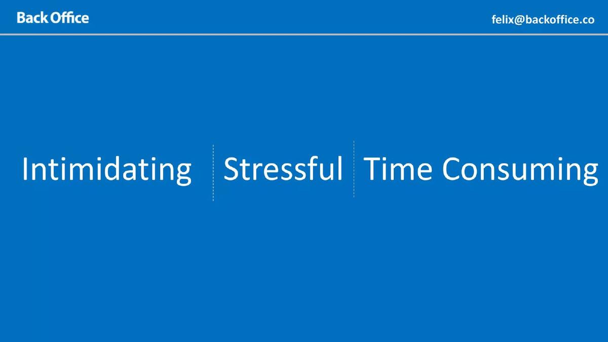
Slide 3 identifies the emotional state of the customer. It lists three words: Intimidating | Stressful | Time Consuming . It does not explain why accounting is these things; it assumes the investor already knows. This brevity keeps the momentum moving toward the solution.
Slide 4: The Solution (Visual Shorthand)
Rather than showing a dashboard or a list of features like 'bank reconciliation' or 'tax filing,' slide 4 uses three white line icons. The first is a set of gears (automation), the second is a bar chart with an upward arrow (growth), and the third is a piggy bank (savings). This slide communicates the value proposition—efficiency, scaling, and cost reduction—without technical jargon.
Slide 5: Social Proof
The logo wall on slide 5 is impressive for a Seed-stage company. It features Mobil, Signal 88 Security, Sylvan Learning, PuroClean, The Lab Miami, Tempesta Media, Parkfield, and Allstate . The inclusion of household names like Mobil and Allstate suggests that their 'small business' solution has enterprise-grade reliability or is being utilized by franchisees of large networks.
Slide 6: Retention
Slide 6 features a single metric: 95% Retention Rate . In SaaS, especially in the 'prosumer' or small business space, churn is often the silent killer. By highlighting a 95% retention rate, Usefinally proves that once a customer starts using their automated accounting, they don't leave. This reinforces the 'Stressful/Time Consuming' problem from slide 3—once the pain is removed, the customer is locked in.
Slide 7: Market Size
Slide 7 displays $180Bn in large white text. There is no breakdown of TAM, SAM, or SOM. While typically a weakness, in this deck, it serves as a simple 'scale' indicator. The founders are signaling that they are playing in a massive sandbox where a $1M ARR is just the tip of the iceberg.
Slide 8: The Team
The team slide features Felix Rodriguez, Glennys Rodriguez, and Edwin Mejia. The headline is the only text that matters: 3 Successful Exits . This tells the investor that this is not the founders' first rodeo. They have successfully navigated the lifecycle of a startup three times, which justifies the $1.8M Seed ask and the high valuation that usually accompanies such metrics.
Slide 9: The Closing
The final slide repeats the branding and the core metrics: $1M ARR and 40% MOM Growth . It includes the contact email 'felix@backoffice.co' (which appeared in the top right corner of every slide). It ends the deck exactly where it began—on the strength of the numbers.
What Usefinally Omitted (And Why It Worked)
This deck is notable for what it lacks. There is no Competitive Landscape slide. The founders likely felt that with 40% MOM growth, they didn't need to explain why they were better than QuickBooks or Xero; the numbers were doing the talking. There is also no Unit Economics slide (LTV/CAC), no Product Roadmap , and no Use of Funds . In a typical Seed deck, these omissions would be red flags. However, for a team with three exits and a $1M run rate, these details are usually handled in the due diligence data room rather than the pitch deck.
What Founders Should Copy
1. The 'Traction First' approach: If your numbers are your strongest asset, don't bury them on slide 10. Put them on slide 2. It changes the entire context of the meeting from 'Could this work?' to 'How big can this get?'
2. Extreme Text Reduction: Most slides in this deck have fewer than five words. This forces the investor to listen to the founder rather than reading the slides. It also makes the deck highly 'skimmable' for associates at VC firms who spend only seconds on an initial review.
3. Outcome-Based Icons: Instead of showing a complex software interface that might look dated in six months, Usefinally used icons to represent the result of using the software. This is a powerful way to communicate value to non-technical investors.
Final Analysis
The Usefinally deck is a 'flex.' It is designed to show that the company is a rocket ship that is already leaving the launchpad. While the $1.8M raised in 2019 is a solid Seed round, the deck's minimalism suggests the founders were likely oversubscribed and could afford to be brief. For founders without $1M in ARR, this deck is a dangerous template to follow, but for those with significant traction, it is a perfect example of how to stay out of the way of your own success.
Frequently asked questions
- How can a deck with only 9 slides raise $1.8M?
- Usefinally succeeded because their metrics were undeniable. Slide 2 shows $1M ARR and 40% month-over-month growth. For a Seed round, these figures are exceptionally high. When the traction is that strong, investors require less 'convincing' through long-form text. The deck acts as a teaser to secure a meeting where the details are discussed, rather than a stand-alone business plan.
- Why is there no product demo or screenshot in the deck?
- The founders chose to focus on outcomes rather than features. Slide 4 uses icons to suggest that the software handles the 'gears' of the business to produce 'growth' and 'savings.' By omitting screenshots, they avoid getting bogged down in UI critiques and keep the investor focused on the business's financial performance and market demand.
- What does the '3 Successful Exits' on the team slide signify?
- This is a massive de-risking signal. It tells investors that Felix Rodriguez, Glennys Rodriguez, and Edwin Mejia have built and sold companies before. For a $1.8M Seed round, an experienced team is often more important than the specific product details, as it suggests the founders know how to navigate the scaling process and achieve a liquidity event.
- Is the $180Bn market slide effective without context?
- In this specific deck, yes. Because the previous slides established that they are already capturing revenue ($1M ARR) from major brands (Mobil, Allstate), the $180Bn figure on slide 7 serves as a simple reminder of the ceiling. It doesn't need a bottom-up analysis because the top-line growth rate already proves they have found a scalable vein in that market.
- Should most founders copy this minimalist style?
- Only if they have similar metrics. This style is 'The Traction Deck.' If a startup has low revenue or slow growth, a 9-slide deck with no detail will look like a lack of effort. Usefinally used minimalism to signal that their business is so simple and successful that it doesn't need a complex explanation.