VenueSpot, an online marketplace for event venues, utilized a highly minimalist 11-slide deck to secure $60,000 in seed funding in 2013. The deck is notable for its lack of dense text, instead relying on large-scale figures and simple iconography to convey market size, unit economics, and early traction. While it omits traditional sections like a detailed competitive analysis or a specific 'ask' slide, it compensates with strong social proof from enterprise customers like Google and IBM. The deck effectively highlights a $40B market opportunity and a compelling $800 profit-per-event metric, d…
Key takeaways
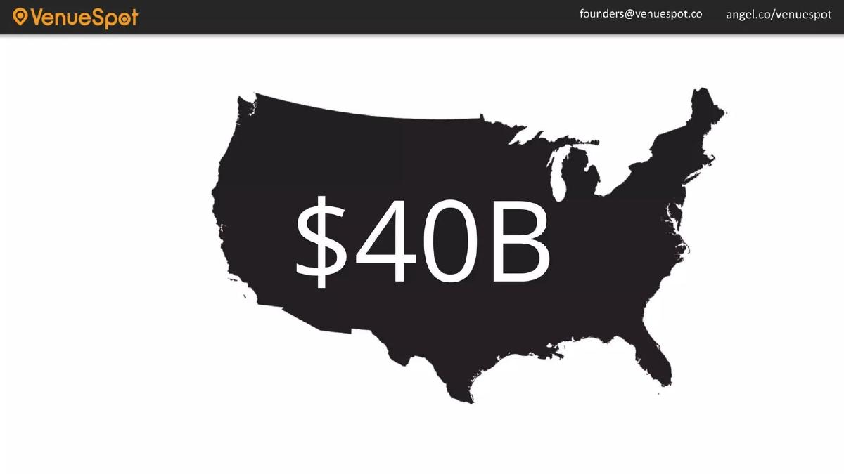
- The deck identifies a $40B market opportunity in the United States on slide 2.
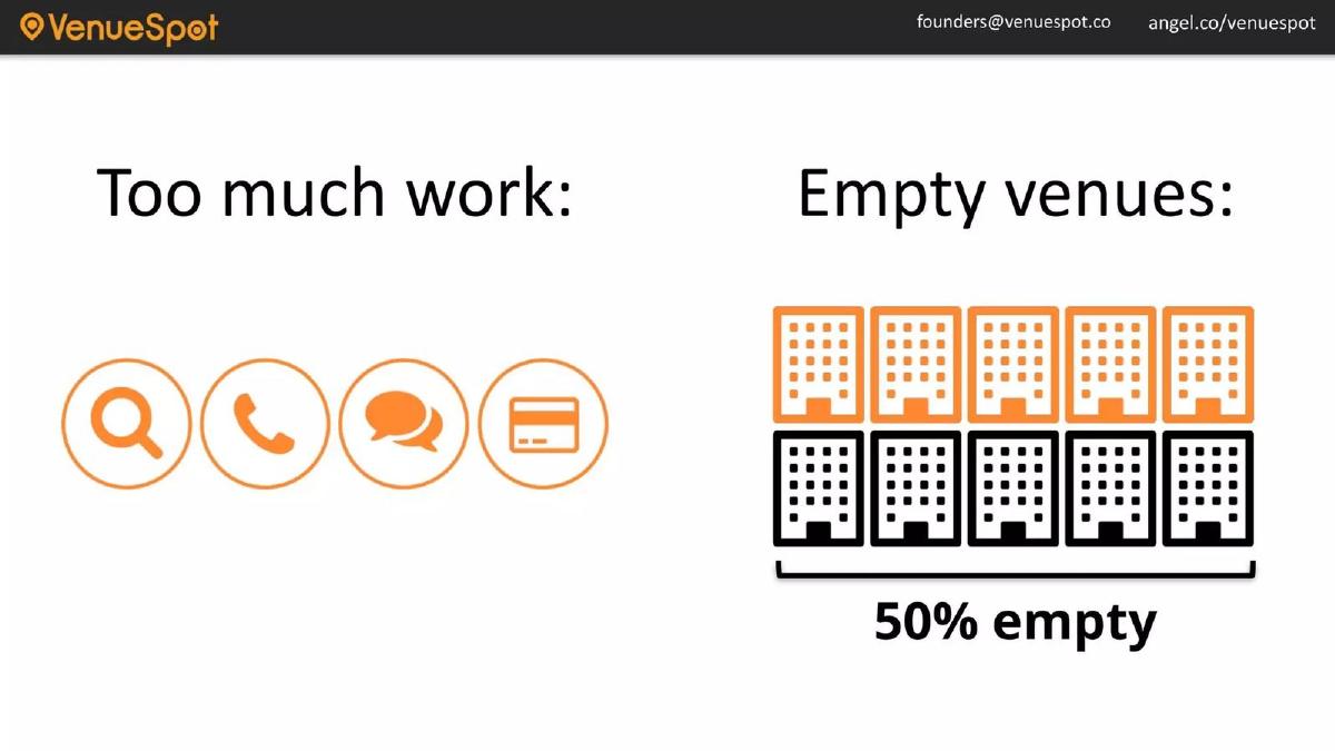
- VenueSpot addresses a dual-sided problem: high friction for organizers and 50% vacancy for venues, as shown on slide 3.
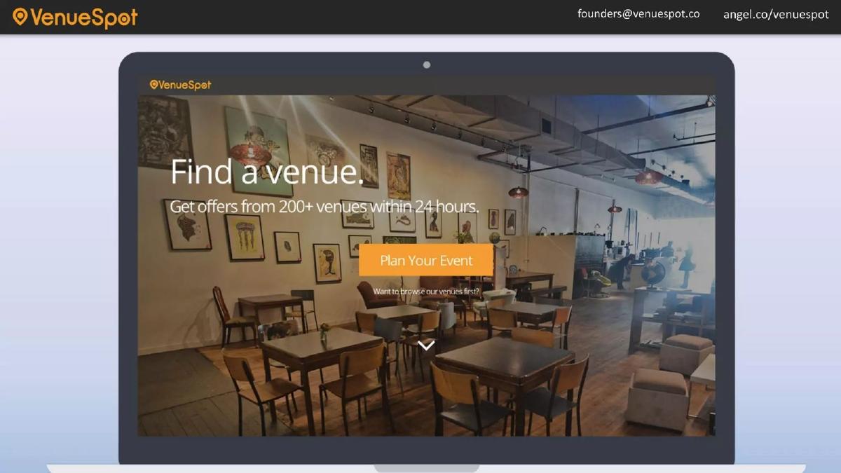
- The platform claims users can receive offers from over 200 venues within 24 hours (slide 4).
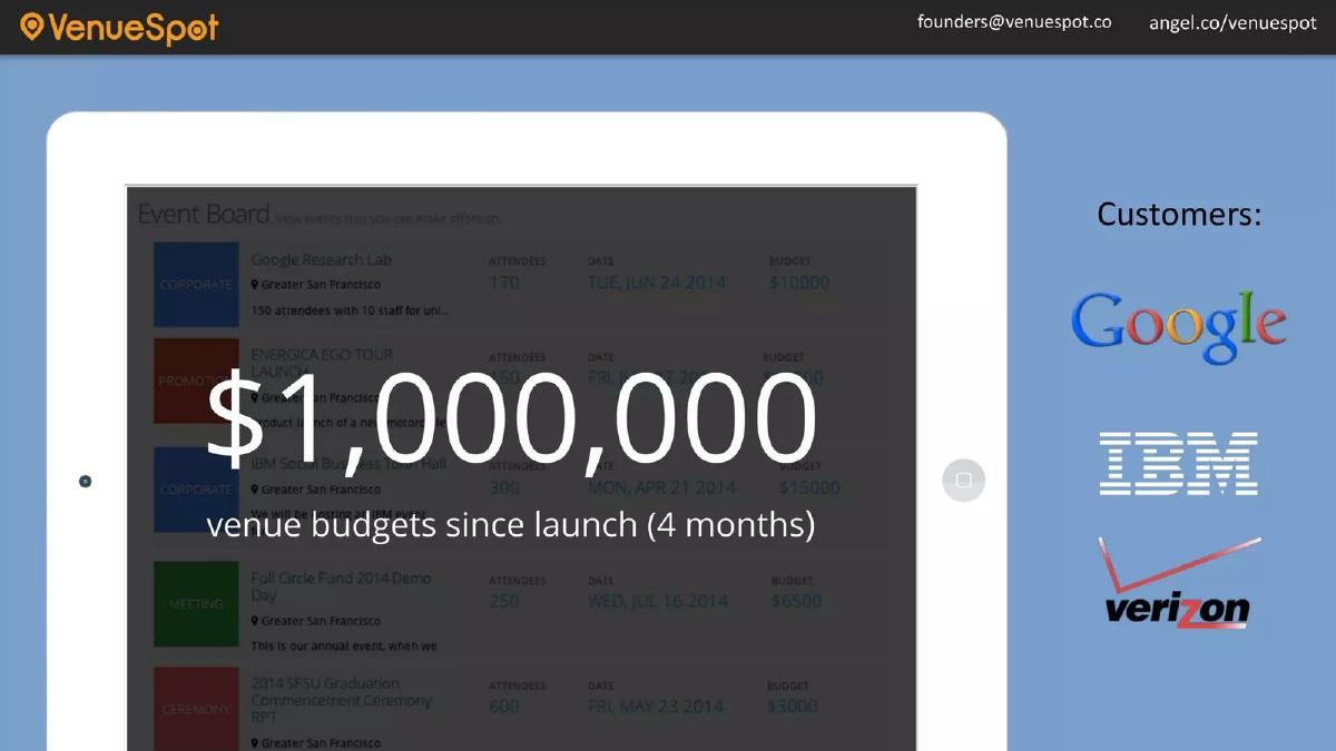
- Early traction is demonstrated by $1,000,000 in venue budgets processed within the first four months (slide 6).
- Unit economics are highly favorable, with a $12 Customer Acquisition Cost (slide 7) against an $800 profit per event (slide 8).
- The company reported 50% month-over-month growth in events posted between December and March (slide 9).
- The team slide (slide 10) leverages logos from major corporations like EA, Dell, and Credit Suisse to establish credibility.
- The deck completely omits a formal 'Ask' slide, leaving the specific funding requirements unstated within the presentation.
The Minimalist Approach to Seed Fundraising
The VenueSpot pitch deck from 2013 is a relic of an era where 'less is more' was the dominant design philosophy for startups coming out of accelerators. At only 11 slides, the deck avoids the dense paragraphs and complex charts common in later-stage presentations. Instead, it uses a 'one big idea per slide' format. This teardown examines how VenueSpot used this brevity to highlight a massive market gap and impressive early unit economics to raise its initial $60,000 seed round.
Slide 1: Title and Mission
The cover slide is functional and clear. It features the VenueSpot logo—a location pin containing a circle—and the tagline "Connecting event organizers to venues." The background image shows a speaker on a stage in front of a large audience, immediately grounding the company in the professional events space. Contact information, including an AngelList URL and a founders' email address, is present at the top, which is a standard practice for decks intended for asynchronous viewing by investors.
Slide 2: Market Size
Slide 2 is a classic 'Big Number' slide. It shows a silhouette of the United States with "$40B" written across it in large white text. There is no source cited for this figure, and no breakdown of how much of that $40B is reachable (SAM) or obtainable (SOM). While it establishes the scale of the industry, it lacks the nuance that modern investors typically look for regarding specific market segments.
Slide 3: The Problem Statement
The problem is presented as a two-sided pain point. On the left, under the heading "Too much work:" , four icons represent searching, calling, emailing, and paying. This illustrates the high-friction manual process event planners face. On the right, under "Empty venues:" , a graphic shows ten buildings, five of which are orange (occupied) and five of which are black (empty), with the caption "50% empty." This is a powerful visual representation of underutilized assets, a core theme in the sharing economy and marketplace startups of the early 2010s.
Slide 4: The Solution (Landing Page)
VenueSpot introduces its solution through a screenshot of its website. The headline on the page reads, "Find a venue. Get offers from 200+ venues within 24 hours." This slide serves two purposes: it shows that a product actually exists and it makes a specific, measurable promise to the user (200+ venues, 24-hour turnaround). The 'Plan Your Event' call-to-action button is prominent, emphasizing the platform's focus on conversion.
Slide 5: Product Workflow
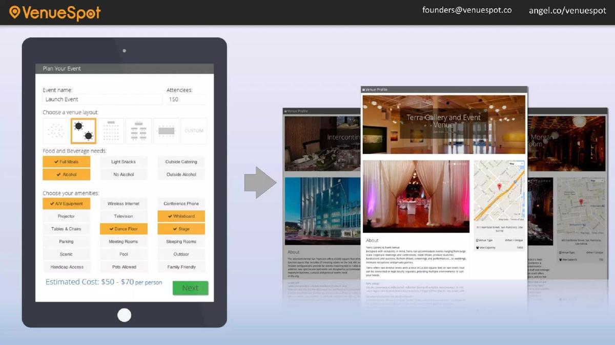
This slide uses a tablet mockup to show the user interface for organizers. The form includes fields for event name, attendee count (150 in the example), venue layout, food and beverage needs (with "Full Meals" and "Alcohol" selected), and amenities like "Whiteboard" and "Dance Floor." An "Estimated Cost: $50 - $70 per person" is shown at the bottom. An arrow points to venue profiles, including the 'Terra Gallery and Event Venue' in San Francisco. This demonstrates the platform's ability to handle complex requirements and provide immediate cost transparency.
Slide 6: Traction and Social Proof
This is arguably the strongest slide in the deck. It features a massive "$1,000,000" figure with the subtext "venue budgets since launch (4 months)." To the right, it lists three major corporate logos: Google, IBM, and Verizon. The background shows an 'Event Board' with specific listings, such as a 'Google Research Lab' event for 170 attendees with a $10,000 budget. This slide proves that the platform isn't just for small parties; it is being used by blue-chip companies for significant spends.
Slide 7 & 8: Unit Economics
Slides 7 and 8 break down the business model with extreme simplicity. Slide 7 shows "$12 CPA" (Customer Acquisition Cost), and Slide 8 shows "$800 profit per event." By separating these onto two slides, the founders force the investor to sit with each number. The implication is a highly scalable business where the lifetime value (LTV) or even the single-transaction value vastly exceeds the cost to acquire the customer. However, the deck does not explain how the $12 CPA is achieved or whether the $800 is a commission or a flat fee.
Slide 9: Growth Velocity
The traction slide shows a line graph of "Events Posted" from December to March. The graph shows a sharp upward trajectory, labeled with "50% MoM." The Y-axis is labeled with increments of 12.5, 25, 37.5, and 50. While the absolute numbers are relatively low (peaking at just under 50 events in March), the percentage growth rate is intended to show momentum and product-market fit.
Slide 10: The Team
The team slide features four members: Jerome (CEO), Tom (CTO), Cleve (BD), and Vivian (BD). Rather than writing bios, the slide uses logos to communicate pedigree. Jerome is associated with Telus and SFU ; Tom with EA and Dell ; Cleve with Credit Suisse and Michigan Ross School of Business ; and Vivian with UNIDO and UBC . This 'logo-dropping' is a shortcut to establish credibility, suggesting the team has experience in enterprise sales, technology, and finance.
Slide 11: Contact
The final slide is a simple black screen with the VenueSpot logo and the same contact information found on the cover slide. It provides a clean end to the presentation but misses the opportunity to reiterate the 'Ask' or a final compelling vision statement.
What Works in the VenueSpot Deck
The primary strength of this deck is its clarity of data. By putting single metrics like '$12 CPA' or '$800 profit' on their own slides, the founders ensure that these numbers are the main takeaway. They don't get lost in a sea of bullet points. The use of enterprise social proof (Google, IBM) is also highly effective for a seed-stage company, as it mitigates the perceived risk of the marketplace not being able to attract high-value demand.
The visual storytelling regarding the problem (Slide 3) is also excellent. It uses icons and a simple occupancy graphic to explain a complex market inefficiency in seconds. This is much more effective than a slide full of text explaining the difficulties of venue procurement.
What is Missing from the VenueSpot Deck
The most glaring omission is the Funding Ask. The deck never specifies how much money the company is looking to raise, what the valuation expectations are, or how the funds will be allocated (e.g., hiring more BD staff vs. marketing spend). While this might have been handled in a verbal pitch, a standalone deck usually benefits from a clear 'use of proceeds' slide.
Additionally, there is no Competitive Analysis. The event space was already crowded in 2013, and investors would naturally want to know how VenueSpot differs from established players or other emerging startups. The deck also lacks a Revenue Model explanation. While it mentions '$800 profit,' it doesn't clarify if they take a percentage of the booking, charge a subscription to venues, or use a lead-generation fee model.
What a Founder Should Copy
Founders should emulate the metric-to-slide ratio found here. If you have a truly impressive number—like a very low CPA or high growth rate—give it its own slide. Don't bury your 'leadin' in a list of secondary facts. The clean UI screenshots (Slide 5) are also a great way to show product maturity without needing a live demo.
Finally, the use of logos for team credibility is a smart move for founders who may not have a long list of previous startups. By associating themselves with reputable institutions and corporations, they borrow authority. However, founders today should be prepared to back those logos up with specific details about their accomplishments at those organizations during the Q&A session.
Conclusion VenueSpot's deck is a textbook example of a seed-stage 'teaser' deck. It focuses on the 'what' and the 'how much' rather than the 'how.' While it leaves many questions unanswered regarding competition and long-term strategy, its ability to showcase $1M in processed budget and 50% MoM growth in just 11 slides makes it a compelling argument for a $60,000 investment.
Frequently asked questions
- What was the primary value proposition for event organizers?
- According to slide 4 and the company description, the primary value for organizers is the reduction of 'painful' manual searching. By posting event details on VenueSpot, organizers receive bids from multiple venues within 24 hours, providing better value and selection without the traditional friction of calling and negotiating with individual spaces.
- How did VenueSpot demonstrate early market validation?
- VenueSpot used slide 6 to showcase $1,000,000 in total venue budgets processed through the platform in its first four months. They bolstered this figure by displaying the logos of high-profile enterprise customers, including Google, IBM, and Verizon, which suggests the platform was capable of handling professional-grade corporate events early on.
- What are the unit economics disclosed in the deck?
- The deck presents very aggressive unit economics for a seed-stage startup. Slide 7 lists a Customer Acquisition Cost (CPA) of just $12, while slide 8 claims a profit of $800 per event. This represents a nearly 67x return on acquisition costs, though the deck does not specify if this profit is gross or net.
- Does the deck include a competitive landscape analysis?
- No. The 11-slide deck entirely omits a competitor slide. It focuses exclusively on the internal metrics and the broad market problem (50% empty venues) rather than positioning itself against existing players like Cvent or local listing sites. This is a common omission in very early-stage, minimalist 'teaser' decks.
- What information is missing regarding the team's background?
- While slide 10 provides photos and titles (CEO, CTO, and two BD roles), it does not list specific years of experience or previous successful exits. It relies on corporate logos (Telus, EA, Dell, Credit Suisse) and university logos (SFU, Michigan, UBC) to imply expertise rather than detailing the founders' specific roles at those organizations.